
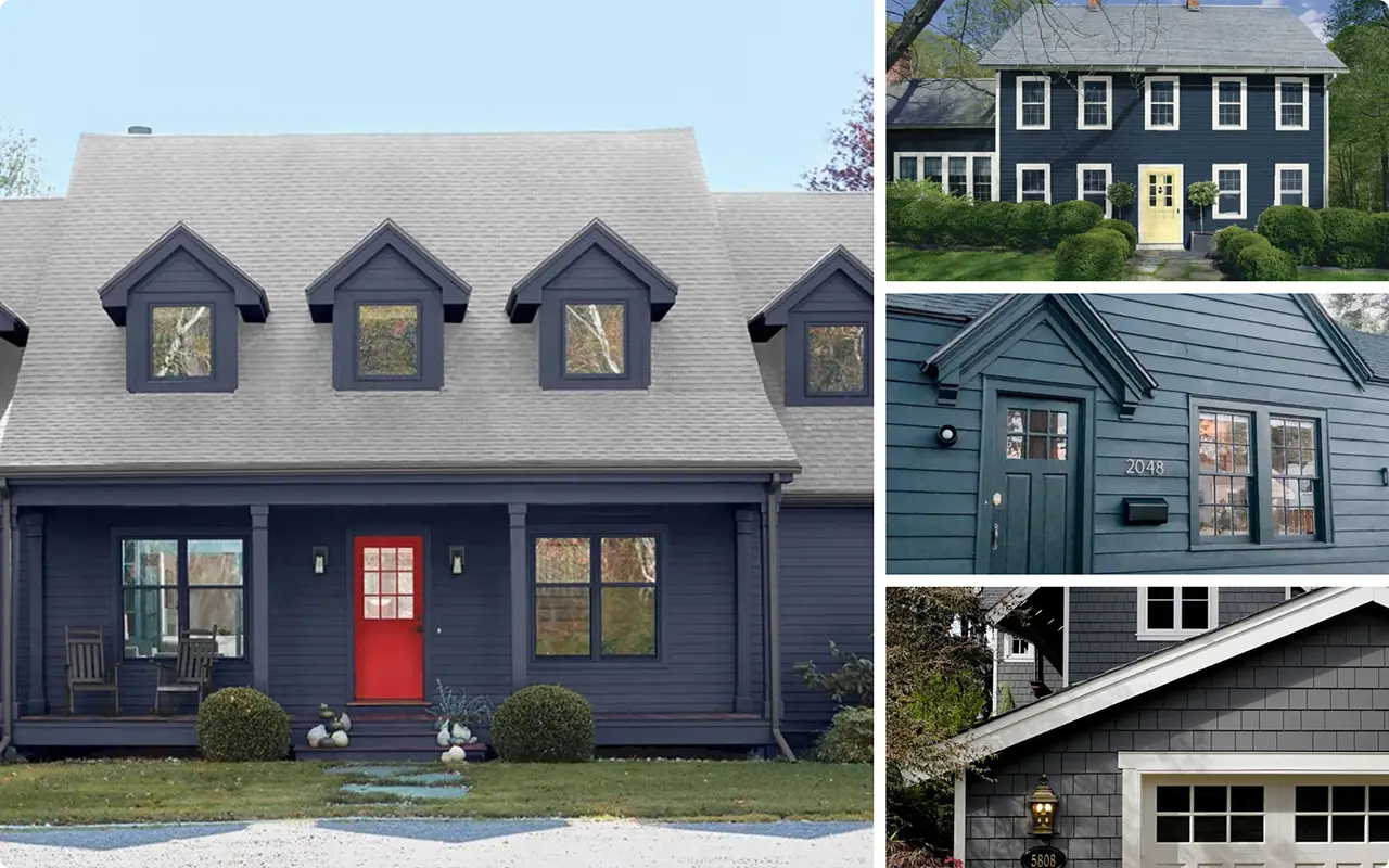
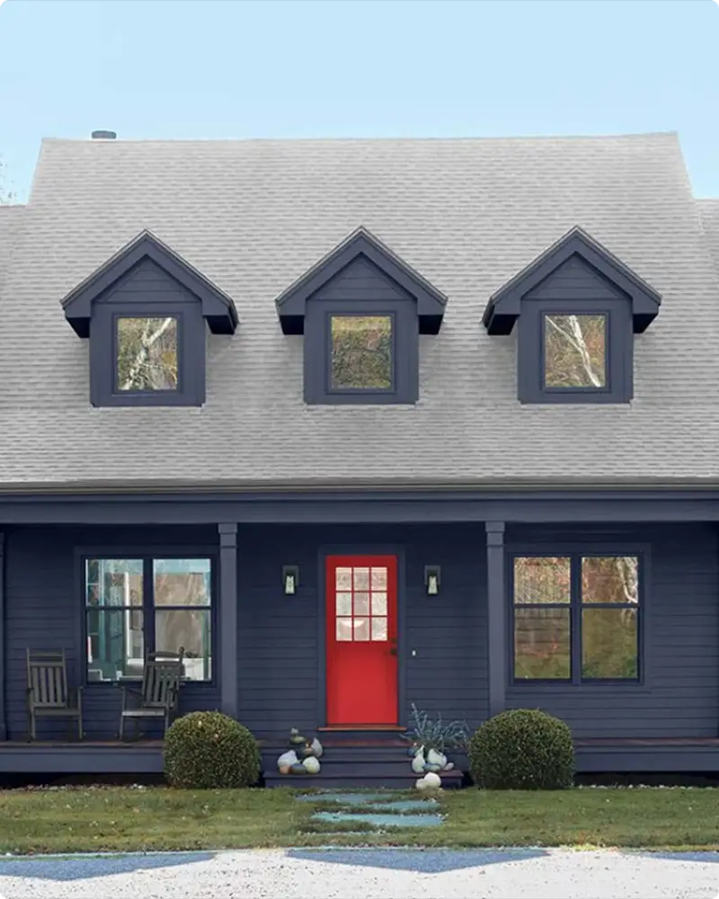
There’s something irresistibly bold about a dark exterior. I used to scroll past photos of homes cloaked in deep navy, charcoal gray, or inky green, thinking they looked incredible—but probably too daring for my own house.
But the more I looked, the more I noticed how these moody colors weren’t just a passing trend. They had staying power.
They made simple architecture look refined. They made older homes feel fresh. And they looked beautiful in every season—from sun-drenched summer days to misty winter mornings.
That’s when I started exploring darker paint options, and let me tell you, Benjamin Moore has some of the best in the game.
Their palette goes beyond basic black or navy—they offer rich, nuanced tones that completely transform a home’s exterior.
Whether you’re drawn to deep blues, stormy greens, or soft charcoals, I’ve rounded up 17 stunning colors that might just convince you to go to the dark side.
Also Read: 25 Best Benjamin Moore Exterior Paint Colors
How Do You Choose the Best Dark and Moody Exterior Paint Color?
Choosing a dark paint color for your exterior is definitely not a one-size-fits-all situation.
I learned this the hard way after falling in love with a charcoal shade on Pinterest, only to realize it looked flat and cold on my own house. So here are a few lessons I’ve picked up that might save you some frustration:
1. Pay Attention to Undertones
A color might look like a true black or gray at first glance, but it could lean blue, green, or even purple in different lighting. That slight undertone can make all the difference once the color is on a large surface like your siding.
2. Test In Real Light, Morning, Noon, and Evening
Exterior colors shift constantly with the light. What looks bold and elegant in bright sun might feel too dark or dreary on a shaded facade. Always test samples on multiple sides of your home.
3. Consider Your Surroundings
Is your home surrounded by trees? Bathed in direct sun all day? Near a beach? The natural environment plays a huge role in how a dark color reads. Deep forest green might disappear into heavy landscaping, while a smoky navy might pop beautifully against neutral stone.
4. Don’t Forget the Details
Trim, shutters, front doors, and hardware really come into play with dark colors. I find that pairing a moody base with lighter or contrasting accents can add just the right amount of balance and drama.
5. Trust Your Gut, But Double-check With Samples
Sometimes the color you’re drawn to initially isn’t the one you end up choosing—and that’s okay. Seeing how a paint color behaves in your unique space is always more important than going by swatches alone.
Top 17 Dark and Moody Exterior Paint Colors From Benjamin Moore
Here’s a curated list of 17 stunning Benjamin Moore colors that bring moody, bold energy to any home exterior:
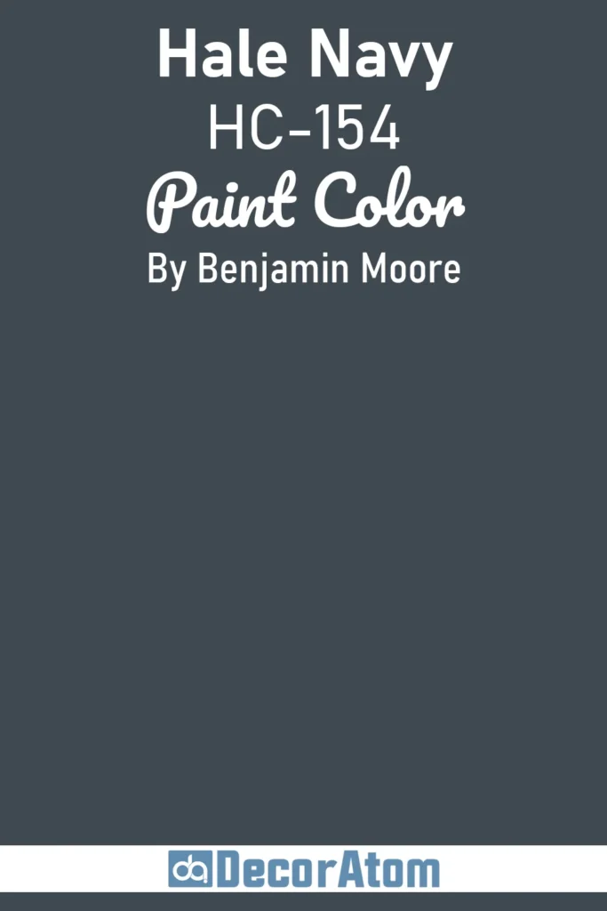
1. Hale Navy HC-154
💥🎁 Christmas & Year-End Deals On Amazon !
Don't miss out on the best discounts and top-rated products available right now!
*As an Amazon Associate, I earn from qualifying purchases.
Hale Navy is one of those colors that always looks timeless, no matter the architectural style. I’ve seen it on everything from classic Colonials to coastal cottages, and it never feels out of place.
It’s a true navy—rich, bold, and dramatic without veering into black. On exteriors, it carries this grounded confidence that works beautifully against crisp white trim or even wood accents.
If you’re looking for a color that offers depth without feeling too heavy, Hale Navy is a safe bet.
It pairs well with metal roofing, stonework, and natural surroundings, making it a standout choice for a dark, moody palette with a sophisticated edge.
2. Wrought Iron 2124-10
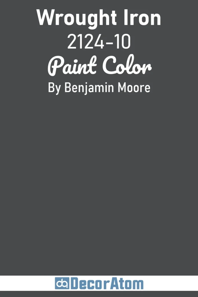
Wrought Iron is not quite black, and that’s what makes it special. It’s a soft, smoky charcoal with blue undertones that keeps it from feeling flat or stark.
I love using this on exteriors because it feels dramatic but livable. It’s less severe than a true black, which means it plays nicely with other materials—think warm wood shutters, brass fixtures, or even aged brick.
If you’re going for a moody modern farmhouse look or want to give your home a sleek update without going pitch black, Wrought Iron hits the sweet spot.
3. Hidden Falls 714
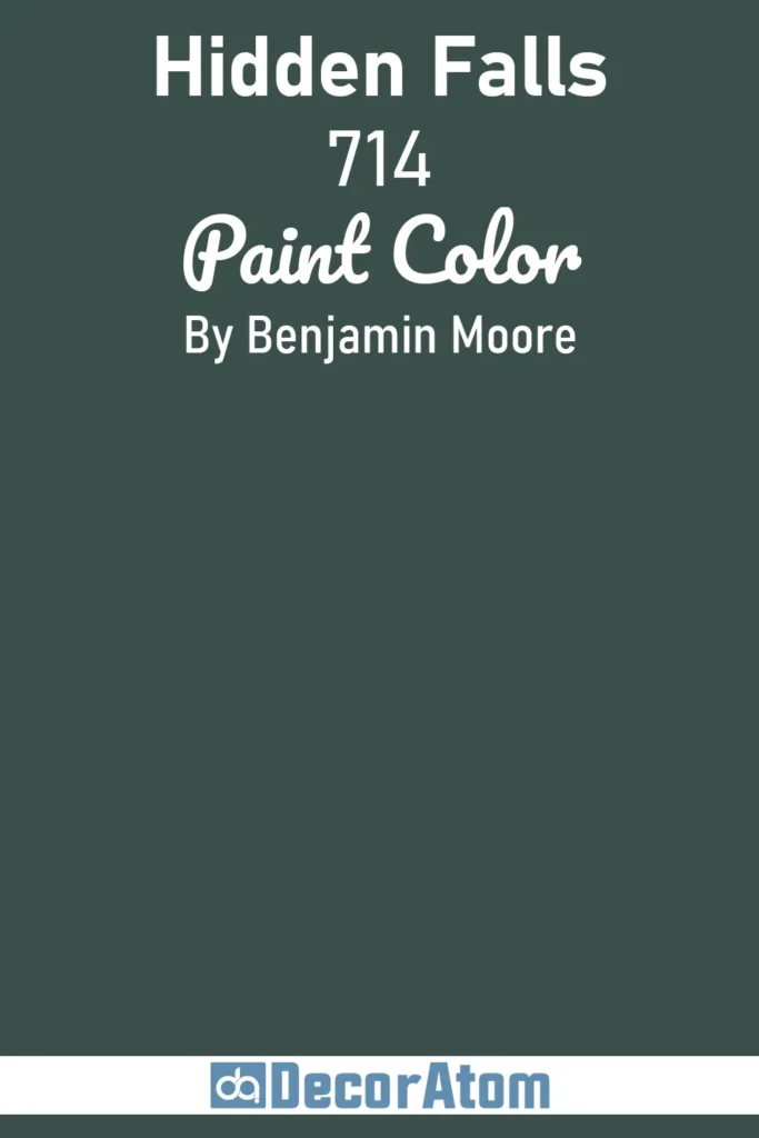
Hidden Falls is a deep, woodsy green that brings a ton of richness and character to a home’s exterior.
It’s the kind of color that feels like it belongs nestled in nature, surrounded by trees or perched on a mountainside. This green leans cool, with bluish undertones that give it a calming, almost shaded forest feel.
It’s especially striking on homes with rustic siding, stonework, or natural textures. If you want something outside the usual navy or charcoal but still dark and grounding, Hidden Falls is a fantastic alternative.
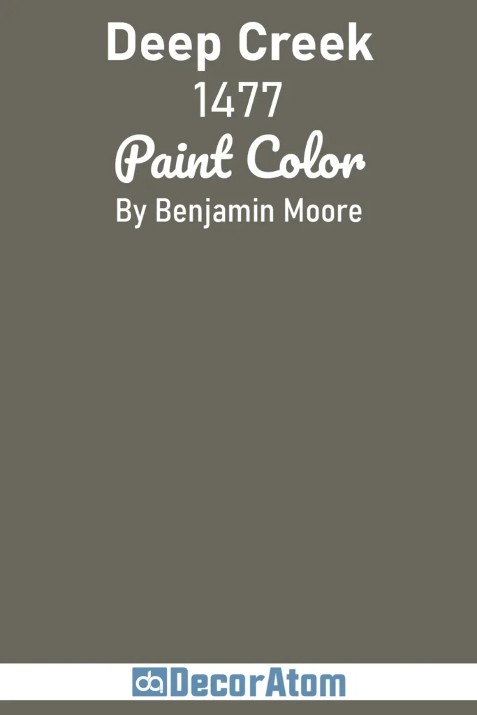
4. Deep Creek 1477
💥🎁 Christmas & Year-End Deals On Amazon !
Don't miss out on the best discounts and top-rated products available right now!
*As an Amazon Associate, I earn from qualifying purchases.
Deep Creek walks the line between a smoky taupe and a moody brown-gray. It’s complex in the best way—it shifts depending on the light, sometimes pulling more gray, other times bringing out warm earthy notes.
I like to think of it as a sophisticated neutral that’s bold enough for a dramatic look but not too dark to feel overwhelming.
On exteriors, it adds depth and elegance, especially when paired with creamy whites, weathered wood, or bronze hardware. It’s a quiet statement-maker that works well in both traditional and contemporary settings.
5. French Beret 1610
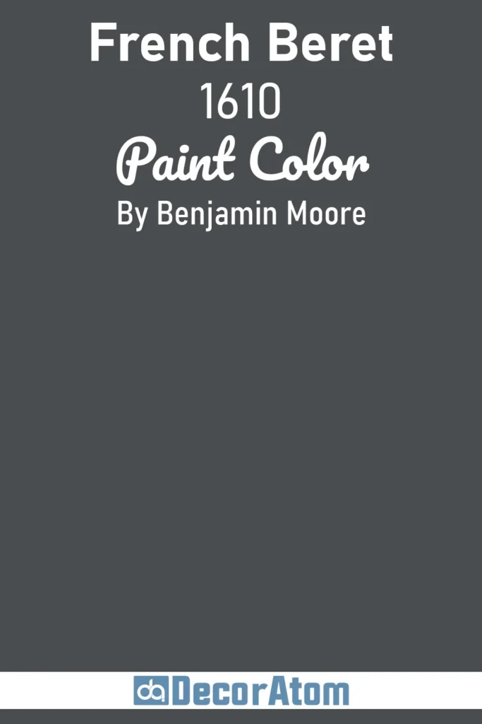
French Beret is like a little black dress for your home—elegant, versatile, and endlessly chic. It’s a deep gray with blue undertones, and while it reads almost black, there’s just enough softness to give it a velvety quality.
What I love about this color is how refined it looks on exteriors. Whether it’s a townhouse, a Craftsman, or a modern build, French Beret gives it a sense of quiet luxury.
It contrasts beautifully with light stone, clean trim, or brushed gold accents. If you want something moody and urban but not too cold, this one delivers.
6. Black Panther 2125-10
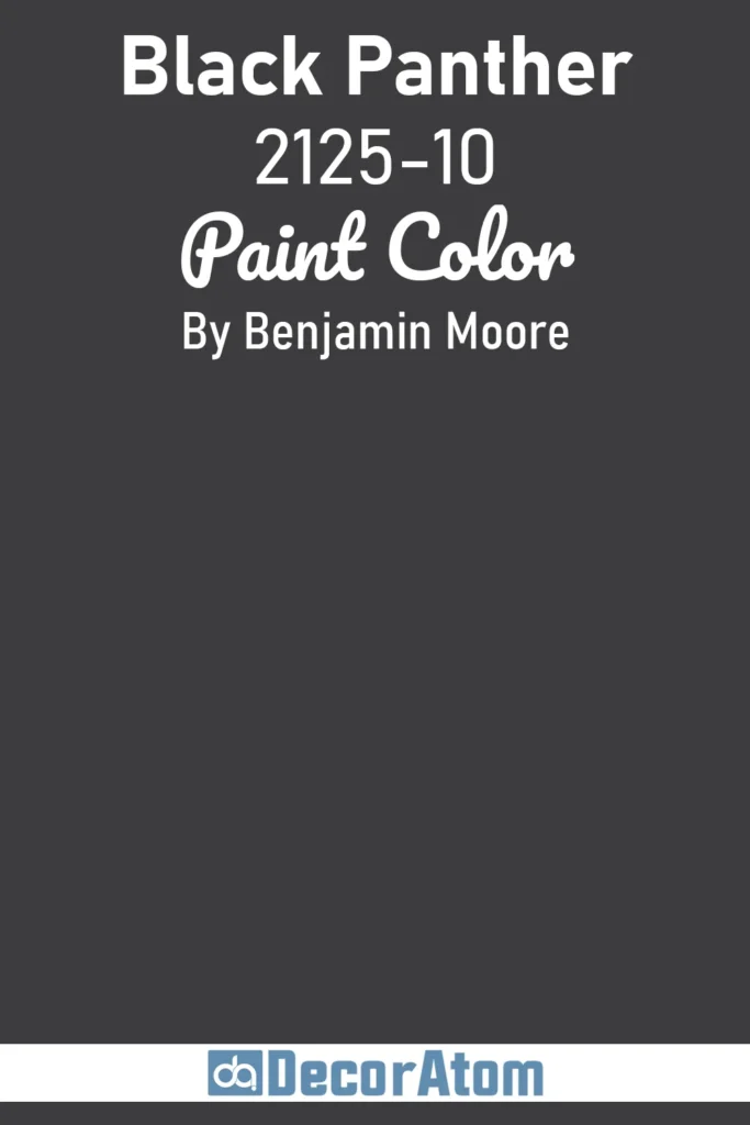
Black Panther is deep, bold, and unapologetically dark. Unlike other charcoals that lean blue or green, this one stays rich and inky with just a touch of softness.
It’s dramatic but not harsh. When used on exteriors, it creates this stunning, high-impact look that feels fresh and daring. I’ve seen it paired with both stark white trim for high contrast and warm wood tones for balance.
It’s especially good for modern architecture, where clean lines and minimalism shine. If you’re ready to go bold, Black Panther knows how to make an entrance.
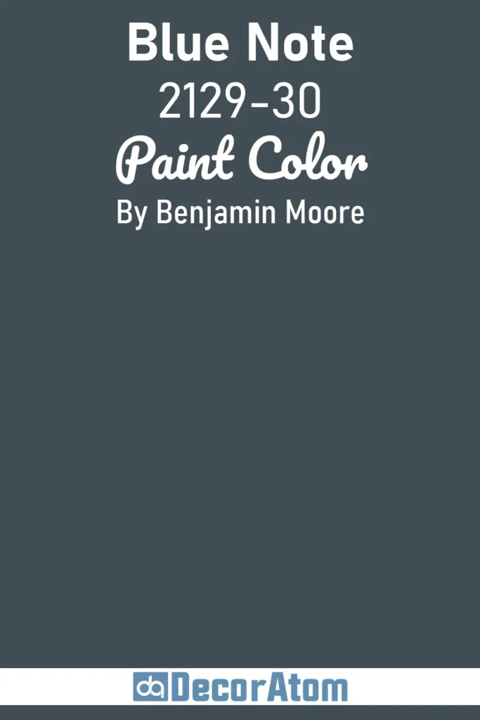
7. Blue Note 2129-30
💥🎁 Christmas & Year-End Deals On Amazon !
Don't miss out on the best discounts and top-rated products available right now!
*As an Amazon Associate, I earn from qualifying purchases.
Blue Note is one of those colors that catches your eye immediately—it’s deep, bold, and has this mysterious elegance to it. It’s not quite navy, not quite teal, but somewhere intriguing in between.
I love how it shifts throughout the day: moody and cool in the morning, deep and dramatic by evening. On exteriors, it’s a striking choice that doesn’t scream for attention but still leaves a strong impression.
It works beautifully with light stone, natural wood, or even matte black accents. If you’re leaning into moody vibes with a hint of color, Blue Note is a strong contender.
8. Black Forest Green HC-187

There’s something quietly powerful about Black Forest Green. It’s almost black in certain lighting, but with rich green undertones that come alive in natural settings.
It feels grounded, earthy, and elegant without being too trendy. I love this shade on homes that are surrounded by trees or set into a landscape—it blends while still standing out.
Paired with copper gutters, white trim, or even black windows, it creates this lush, dramatic look that feels timeless. If you’re drawn to dark exteriors but want something with a bit of nature’s touch, Black Forest Green is it.
9. Ashley Gray HC-87
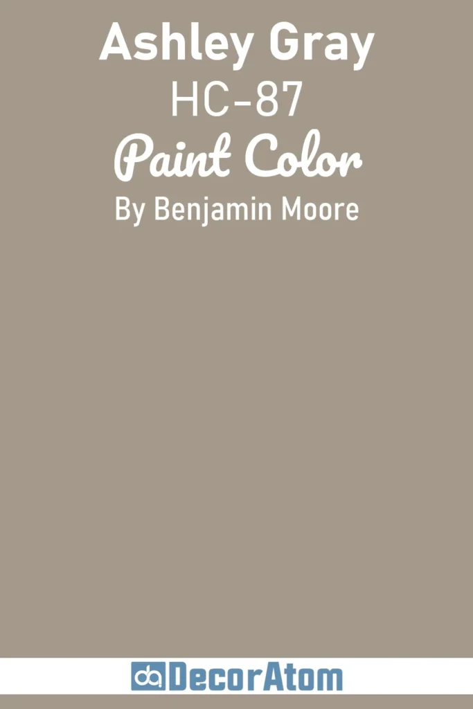
Ashley Gray is one of those versatile, slightly under-the-radar colors that really shines in the right setting. It’s a deep greige—gray with warm brown undertones—that feels cozy and refined.
On an exterior, it doesn’t read too dark or heavy but still adds plenty of mood and sophistication. It’s ideal if you want a more approachable dark exterior, especially for traditional or transitional homes.
I’ve seen it look amazing with creamy trim and wood doors, or even with sleek black accents for a more modern vibe. It’s a color that says “classic” without being boring.
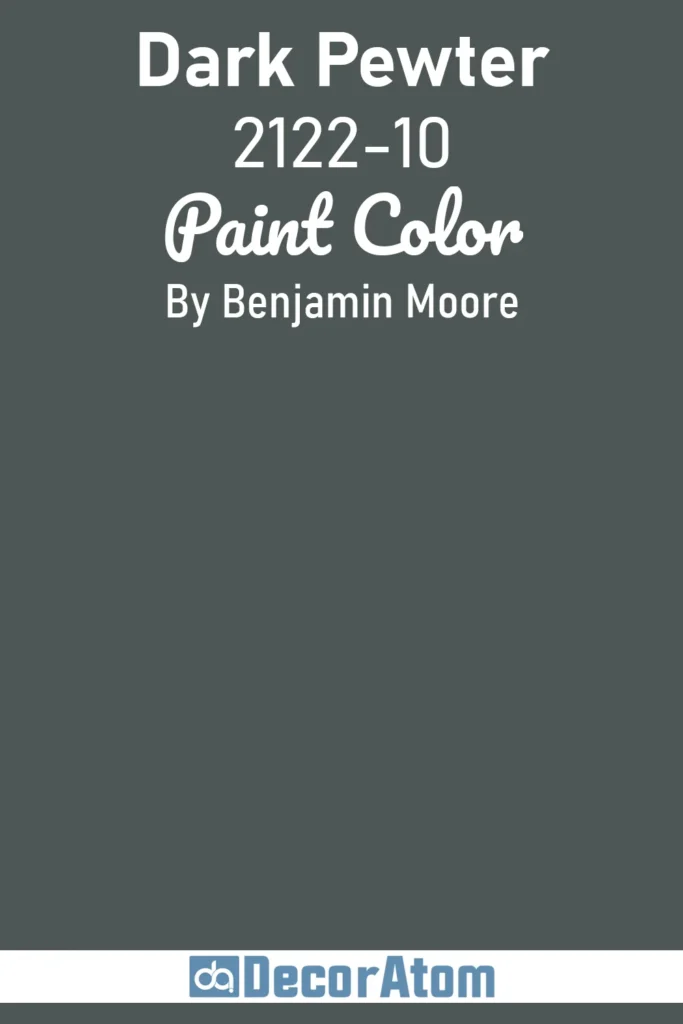
10. Dark Pewter 2122-10
💥🎁 Christmas & Year-End Deals On Amazon !
Don't miss out on the best discounts and top-rated products available right now!
*As an Amazon Associate, I earn from qualifying purchases.
Dark Pewter is bold and confident without being overbearing. It has a complex depth to it—a mix of charcoal, slate, and a whisper of green. This gives it a moody, stormy quality that works beautifully on exteriors.
It can make a traditional home feel more modern or give a newer build an added layer of richness. I especially love how it plays with texture: against smooth siding, it looks sleek; paired with stone or brick, it creates this grounded, earthy contrast.
If you want something darker than a mid-tone gray but softer than jet black, Dark Pewter fits the bill.
11. Appalachian Brown 2115-10
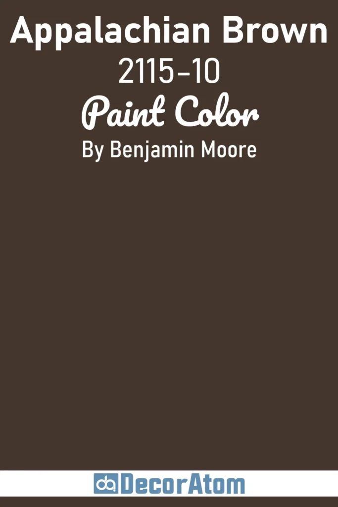
Appalachian Brown is the kind of color that instantly adds warmth and depth to a home. It’s a deep, rich brown with a slight reddish undertone that keeps it from feeling too flat or muddy.
I find this shade particularly beautiful on Craftsman or rustic-style homes—it feels cozy, grounded, and very inviting. When paired with natural stone or soft tan trim, it gives off this earthy, heritage-inspired vibe.
What’s nice is that it brings a moody aesthetic without going into the typical gray or black territory. It’s bold, but it still feels approachable and warm.
12. Gentleman’s Gray 2062-20
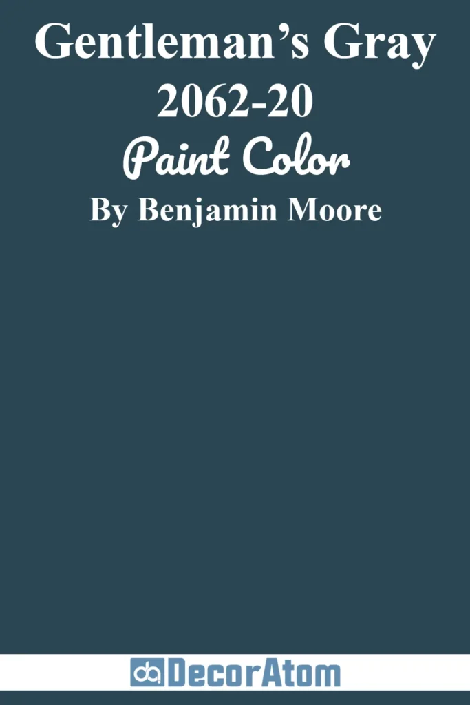
Despite the name, Gentleman’s Gray isn’t just gray—it’s a deep blue with a striking sophistication. Think navy with an extra dose of character.
This color is perfect if you want something darker than a typical blue but not quite as intense as black. On exteriors, it reads crisp and tailored, especially with white or off-white trim.
I’ve also seen it used beautifully with brass fixtures or even natural wood tones for contrast. It has this old-school charm mixed with modern depth that gives a home a refined, confident look without being flashy.
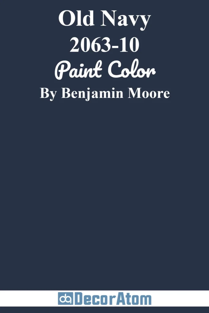
13. Old Navy 2063-10
💥🎁 Christmas & Year-End Deals On Amazon !
Don't miss out on the best discounts and top-rated products available right now!
*As an Amazon Associate, I earn from qualifying purchases.
Old Navy is all about boldness and clarity. It’s a true navy—clean, dark, and deeply saturated. This one doesn’t have the gray softness that other navies might offer, and that’s what makes it stand out.
When used on a home’s exterior, it looks crisp and commanding, especially against bright white or creamy trim.
It’s particularly striking on coastal-style homes, colonial architecture, or even newer builds looking for a dramatic upgrade. If you’re after a bold color that still feels timeless, Old Navy brings that classic energy in a powerful way.
14. Steel Wool 2121-20
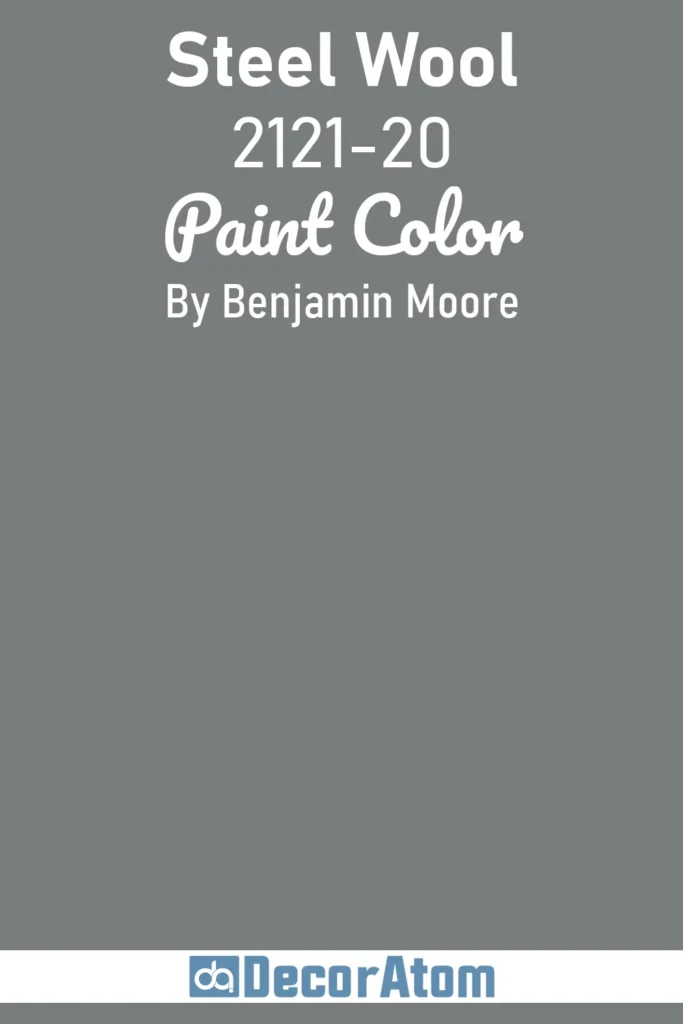
Steel Wool is a cool, industrial gray that leans into moodiness without being overpowering. It has a steely, almost slate-like feel that looks sharp and grounded on modern exteriors.
This shade plays well with raw materials—concrete, metal, cedar—making it a favorite for urban homes or contemporary styles. It also works beautifully on exteriors with minimal ornamentation, letting the color do the talking.
What I like most is that it’s dark without being too heavy, making it perfect for someone who wants moody tones with a bit of restraint.
15. Soot 2129-20
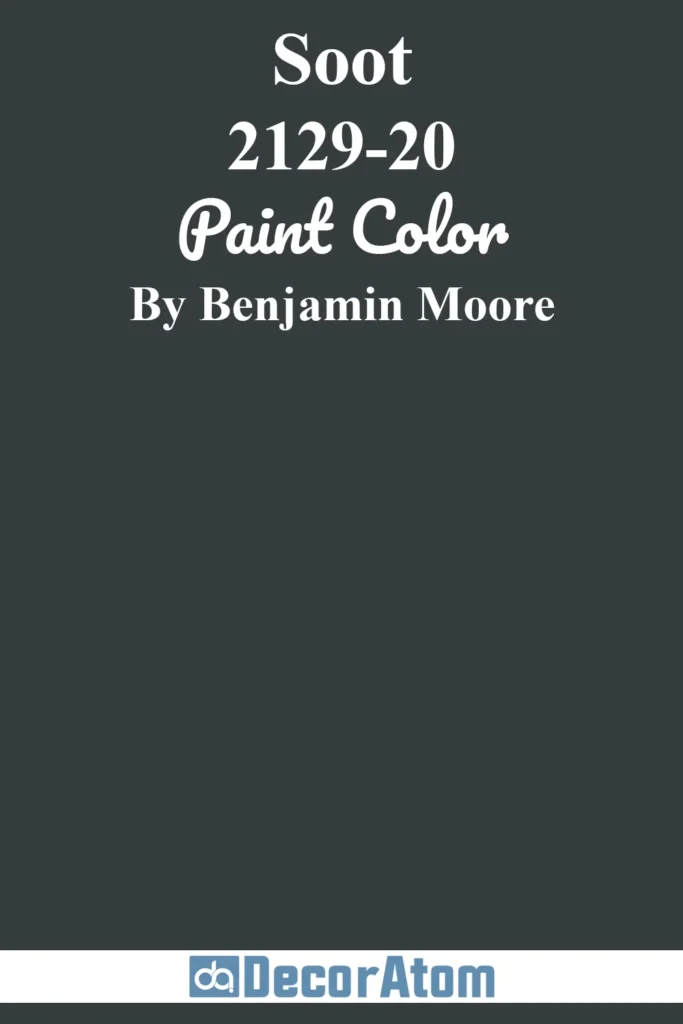
Soot is one of the darkest grays in the Benjamin Moore lineup, and it means business. This color almost reads as black but carries a smoky softness that gives it character.
It’s deeply pigmented and incredibly dramatic—ideal for homes that want a sleek, bold look without going full-on black. Whether you use it on siding, trim, or even the front door, Soot delivers maximum impact.
It’s especially effective on modern homes or paired with stone and sharp architectural lines. It’s moody, minimal, and full of presence.
16. Amherst Gray HC-167
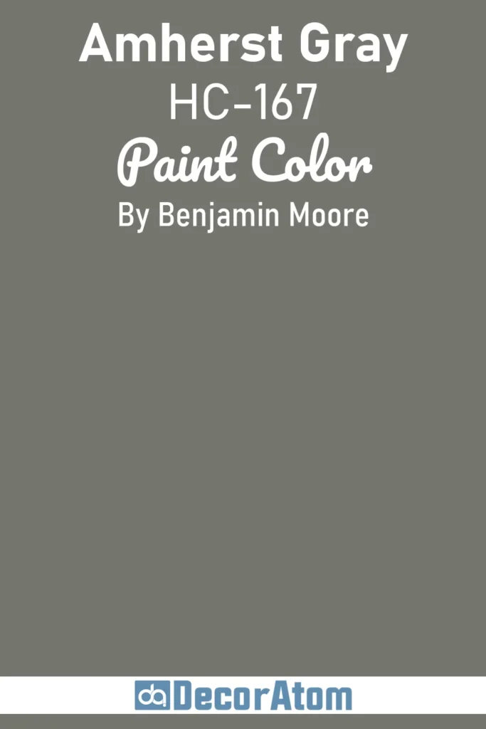
Amherst Gray is a deep, refined charcoal that works beautifully across a range of architectural styles. It leans slightly warm, which softens the boldness just enough to keep it feeling welcoming.
I’ve seen this used on everything from traditional homes to modern builds, and it always looks smart. It’s dark enough to make a statement but has enough balance to remain neutral.
Pair it with crisp white trim for contrast or with darker elements like black accents for a more layered, moody look. It’s dependable and stylish without being too daring.
17. Deep Space 2125-20
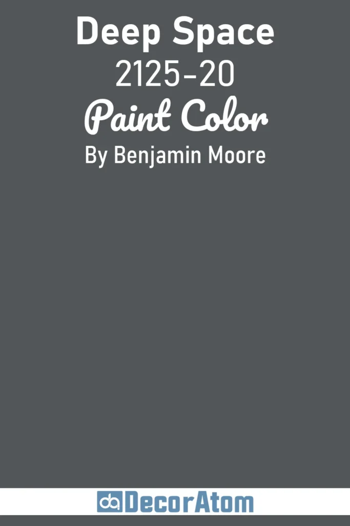
Deep Space is a fitting name for this mysterious, almost cosmic charcoal. It has this dramatic presence that feels both modern and edgy.
There’s a bit of blue and violet undertone hiding in it, which gives it a cooler vibe compared to warmer grays. On exteriors, it creates a moody, architectural look that feels intentional and bold.
I especially love it when used in minimalist color palettes—think black windows, clean lines, and just the right amount of contrast. It’s not a mainstream choice, but that’s exactly why it stands out.
While this post focuses on Benjamin Moore, I couldn’t ignore the fact that Sherwin-Williams also has some show-stopping dark shades. If you’re comparing brands or just exploring your options, here are 15 standout moody colors from Sherwin-Williams that deserve a look
Final Thoughts
There’s something powerful about painting a house in a dark, moody shade. It’s bold, sure—but it’s also timeless.
Whether you go with a deep navy like Hale Navy or a shadowy green like Black Forest Green, the key is finding a color that feels right for your home.
What I love about Benjamin Moore’s dark palette is the complexity behind each color.
These aren’t just blacks and grays—they’re layered with subtle warmth, cool undertones, and just enough edge to make your home stand out without screaming for attention.
If you’re on the fence, grab a few peel-and-stick samples or paint large swatches directly on your exterior. Live with them for a few days. Check them in different lighting.
And most importantly—trust your instincts. A dark exterior isn’t just a design choice—it’s a whole mood.