
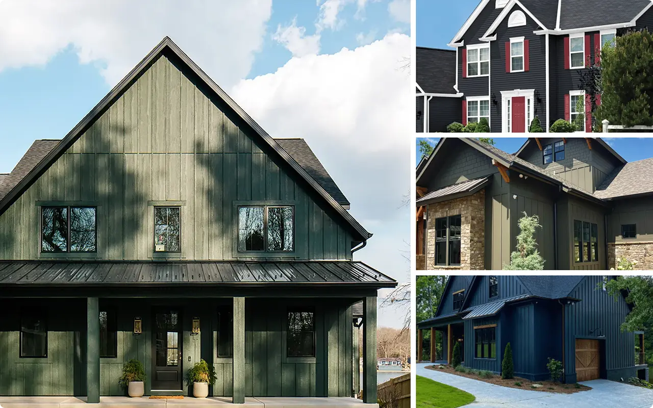
I never used to think twice about dark paint colors for exteriors. They felt risky—maybe even a little too bold. But the first time I saw a home painted in a moody charcoal or deep forest green, it completely changed my perspective.
There’s a richness and drama in darker tones that lighter neutrals just can’t replicate.
Dark and moody colors bring out the architectural details of a home, create contrast with landscaping, and offer a sophisticated, grounded look that feels intentional.
Sherwin-Williams has a fantastic range of these shades—blacks that lean earthy, grays with depth, and greens that look almost black in the right light.
If you’re considering a dramatic update to your home’s exterior, I’ve rounded up 15 of the most striking dark and moody Sherwin-Williams paint colors to help you narrow down your favorites.
How Do You Choose the Best Dark and Moody Exterior Paint Color?
Choosing the perfect dark exterior color isn’t just about picking the deepest black on the chart. Here are a few key things I always consider before settling on a moody shade:
1. Understand the Undertones
Dark colors can carry subtle undertones—some lean cool (like navy or charcoal), while others feel warmer (like deep browns or olive blacks). For example, Iron Ore has a softer, warmer tone compared to the bold neutrality of Tricorn Black. Understanding these nuances will help you choose a color that harmonizes with your roof, landscaping, and surroundings.
2. Test in Natural Light
Dark colors behave differently depending on light exposure. A color that looks soft and muted on a sample swatch might appear much darker on a full wall under direct sunlight—or even cooler in shade. I always recommend sampling your top picks on a few areas of the home and checking them throughout the day.
3. Consider the Architecture
Your home’s style can guide your color choice. A craftsman or cabin-style home pairs beautifully with earthy shades like Urbane Bronze or Sealskin, while modern homes can pull off dramatic tones like Caviar or Cyberspace for a sleek, high-contrast finish.
4. Don’t Forget the Accents
Dark exteriors work best when paired with complementary trim and accent colors. Crisp white trim, natural wood elements, copper fixtures, or matte black accents can really elevate a moody base color.
Also Read: 23 Best Exterior Paint Colors to Try
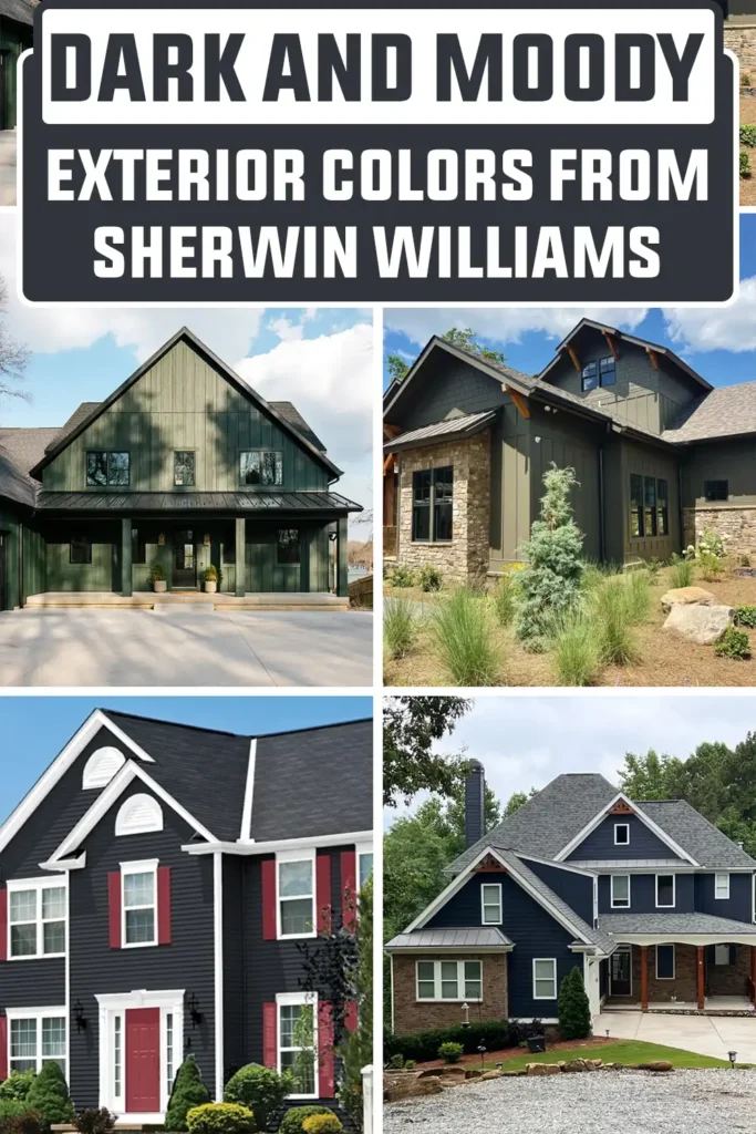
Top 15 Dark and Moody Exterior Colors From Sherwin Williams
Here’s a curated list of 15 stunning Sherwin-Williams colors that bring moody, bold energy to any home exterior:
1. Cyberspace SW 7076
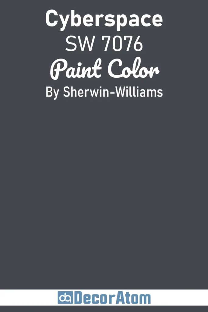
Cyberspace is one of those colors that surprises you the more you look at it. It’s technically a deep navy with strong gray undertones, but it almost reads as a soft black in certain lighting—especially on large exterior walls.
What makes it so versatile is that it has just enough blue to give it character, but not so much that it feels nautical or overly vibrant.
I’ve seen it work beautifully on both traditional and modern homes, especially when paired with crisp white trim or warm wood accents. If you’re looking for something moody but not pitch black, Cyberspace is a great in-between.
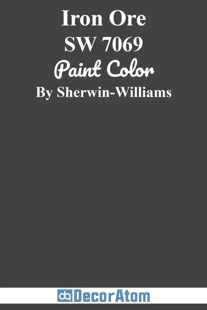
2. Iron Ore SW 7069
💥🎁 Christmas & Year-End Deals On Amazon !
Don't miss out on the best discounts and top-rated products available right now!
*As an Amazon Associate, I earn from qualifying purchases.
Iron Ore is one of Sherwin-Williams’ most beloved dark shades—and for good reason. It’s not a harsh black, but a soft, velvety charcoal with subtle warmth.
In the right light, it can even lean slightly brown or green, giving it an earthy richness that makes it feel grounded and timeless.
I especially love it on craftsman or farmhouse exteriors where it brings depth without looking stark. It pairs beautifully with natural wood tones, creamy whites, or even brushed gold fixtures for a modern twist.
Also Read: Iron Ore SW 7069 Paint Color Review
3. Jasper SW 6216
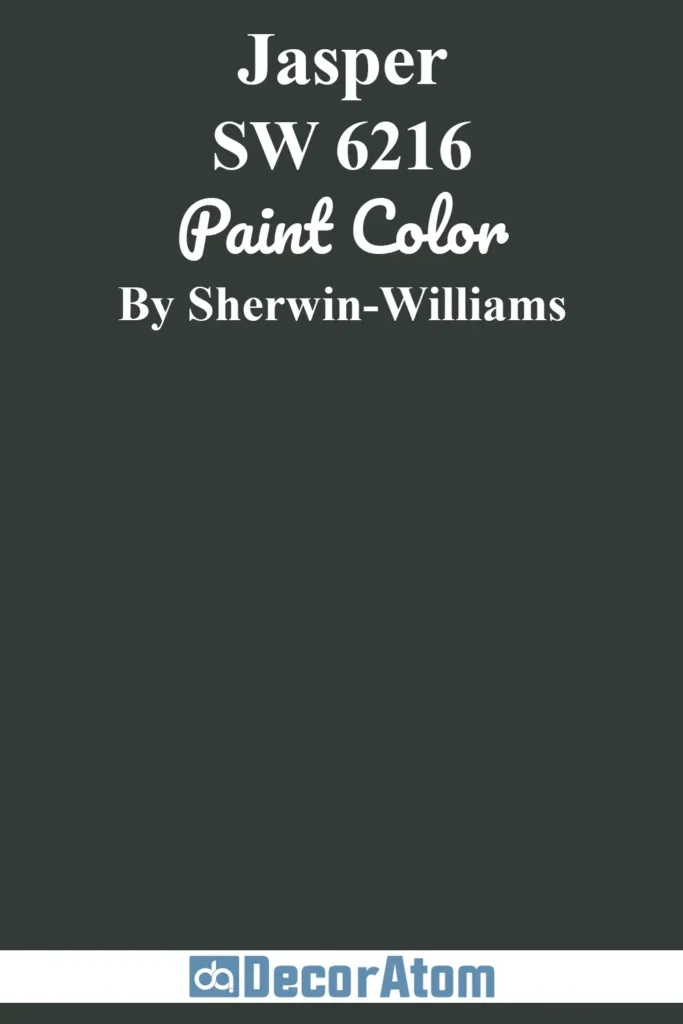
Jasper is a dark, dramatic green that feels like a walk through an evergreen forest.
It’s moody, yes, but it also has a deep connection to nature, which makes it perfect for homes that are surrounded by trees or set against a mountainous backdrop.
Unlike some greens that skew too bright or too cool, Jasper has a richness that feels calm and confident. I find it works best on exteriors when paired with stone, warm browns, or even copper gutters for a rustic-luxe vibe.
4. Urbane Bronze SW 7048
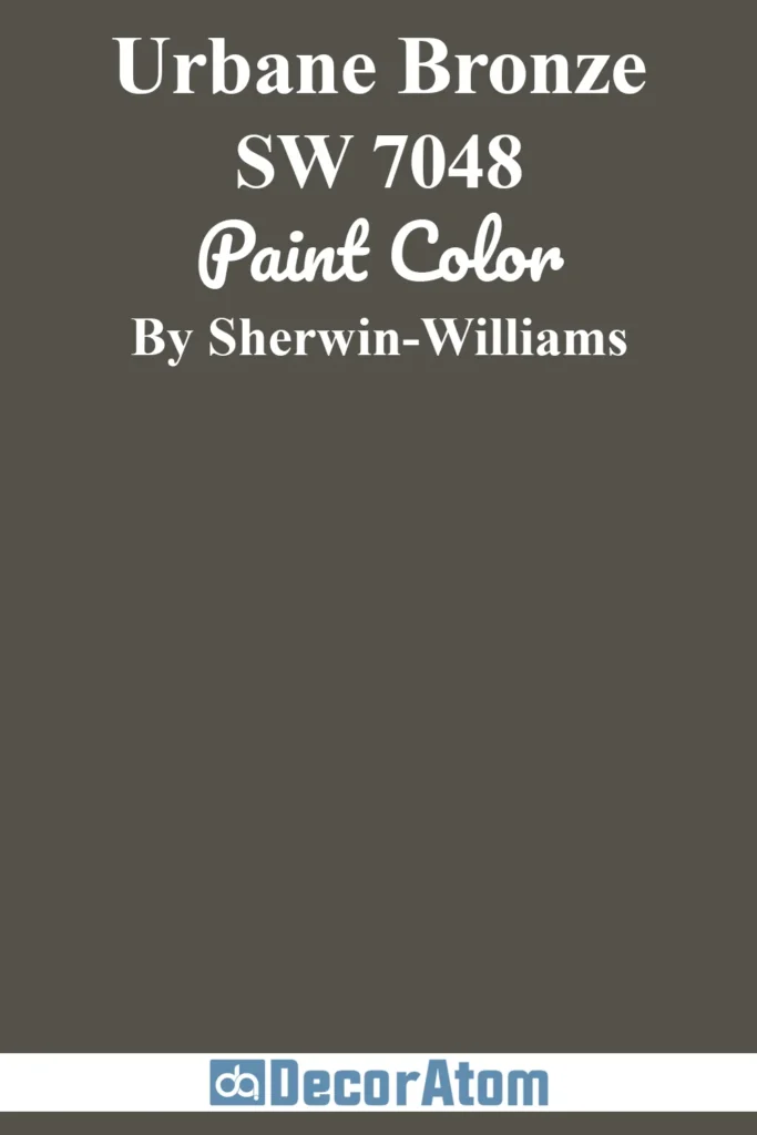
Urbane Bronze isn’t just a trendy color—it’s a grounded, earthy neutral with surprising depth. It blends brown, gray, and a whisper of green into one beautiful moody tone that works wonderfully on exteriors.
There’s something about Urbane Bronze that feels both modern and organic, which is why it was named Color of the Year a few years back.
I’ve seen it look stunning on wood-sided homes, stucco, and even brick. It gives a cozy, lived-in elegance that doesn’t scream for attention but still makes an impression.
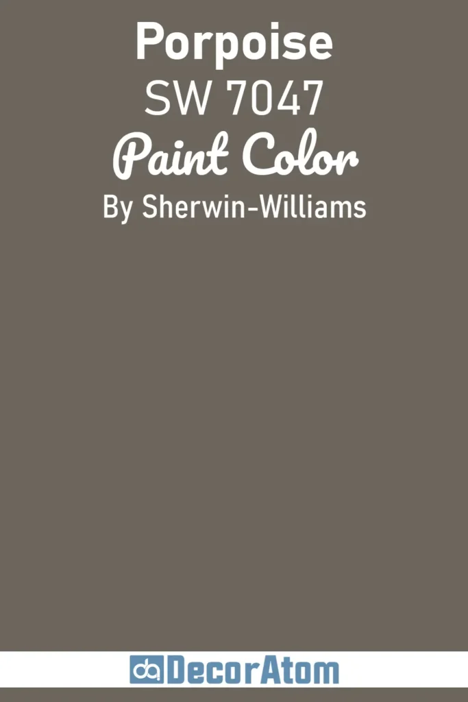
5. Porpoise SW 7047
💥🎁 Christmas & Year-End Deals On Amazon !
Don't miss out on the best discounts and top-rated products available right now!
*As an Amazon Associate, I earn from qualifying purchases.
Porpoise sits right in that sweet spot between gray and taupe. It’s a medium-dark tone that doesn’t go too warm or too cool, which makes it an excellent backdrop for a wide range of accent colors.
On exteriors, it feels soft yet grounded—a bit like a storm cloud right before the rain hits.
I like it on homes where you want something moody but not overly dramatic. It pairs nicely with both black and white trim and looks especially good with natural stone or light wood accents.
6. Thunderous SW 6201
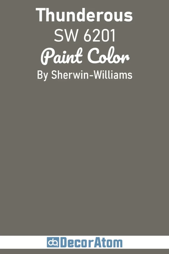
Thunderous is one of those colors that feels instantly cozy and mysterious at the same time. It’s a deep olive-gray with a hint of brown that gives it warmth without losing its moody edge.
What I like about Thunderous is how it can blend seamlessly with natural surroundings, especially in wooded or rural settings.
It has a softness to it that makes it less intense than a pure charcoal or black, but still bold enough to make a statement. Try it with creamy white trim or matte black accents for contrast.
7. Rock Bottom SW 7062
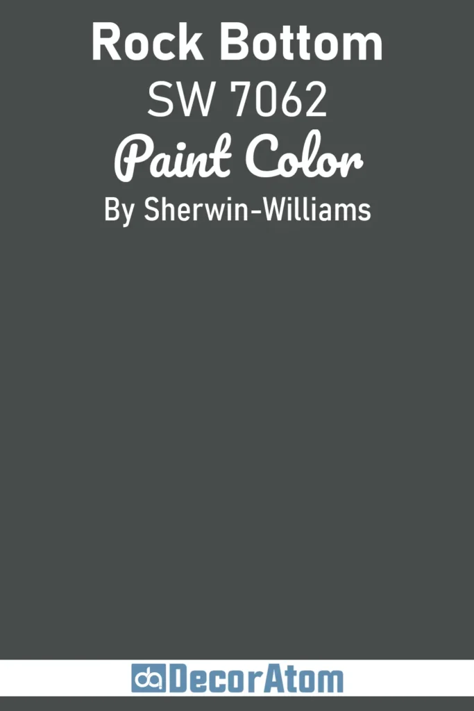
Rock Bottom leans into deep green territory with a heavy dose of gray, making it feel both dramatic and earthy. It’s the kind of color that makes your home feel tucked away, almost like a hidden gem.
I find it works beautifully on exteriors with stonework, dark roofing, or wood siding. It brings a richness that’s hard to match with lighter colors and offers a beautiful contrast when used with lighter, natural materials.
If you love the idea of a dark exterior but want more complexity than plain black, Rock Bottom is a fantastic choice.
8. Greenblack SW 6994

💥🎁 Christmas & Year-End Deals On Amazon !
Don't miss out on the best discounts and top-rated products available right now!
*As an Amazon Associate, I earn from qualifying purchases.
Greenblack is exactly what it sounds like—a rich black that leans green, giving it an unexpected and subtle twist.
It’s a sophisticated alternative to traditional black, especially if you’re looking to warm up the look just a bit. On exteriors, Greenblack can shift dramatically depending on the lighting.
In bright sun, it hints at a pine or forest tone, while in shade, it settles into a moody, near-black hue. It’s particularly striking on modern exteriors with sharp lines, but it also works well in rustic settings when paired with wood and stone.
9. Caviar SW 6990
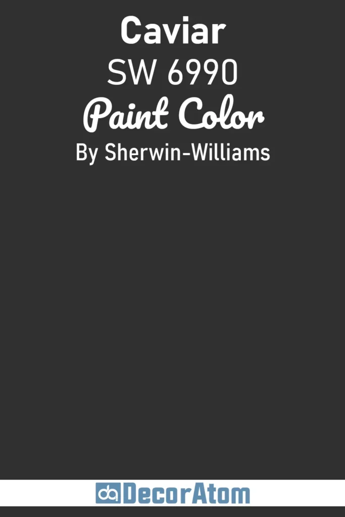
Caviar is one of those colors that oozes elegance without trying too hard. It’s a true black, but unlike flat or overly stark blacks, Caviar has a velvety richness to it.
Think of it like the tuxedo of exterior paint colors—classic, refined, and endlessly versatile.
It works beautifully on traditional homes for a more formal look, but it can also be stunning on a modern or mid-century home if you’re going for that sleek, high-contrast finish.
What I love most is how well it pairs with luxe materials like brass lighting, natural stone, or even deep green landscaping. It’s dark, yes, but never dull.
10. Sealskin SW 7675
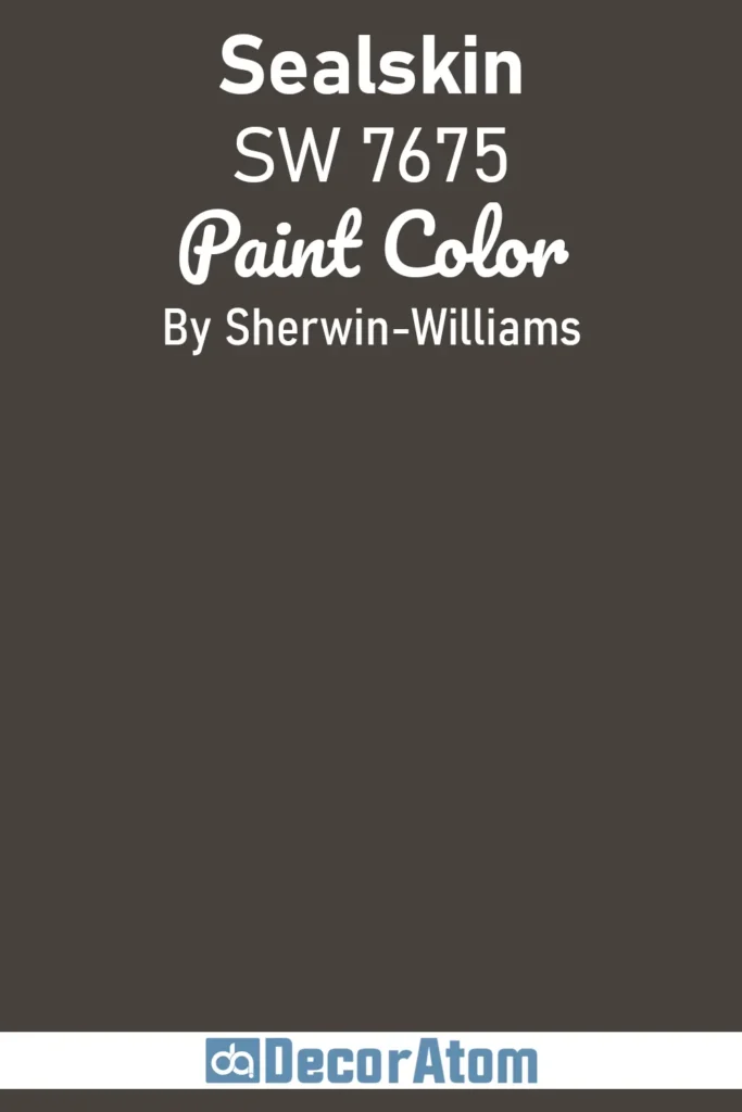
Sealskin is like a cozy espresso—deep, warm, and incredibly inviting. It’s not quite black, but it’s richer than a typical brown or gray.
It’s the kind of color that adds serious depth to your exterior without feeling cold or industrial. I’ve seen it used on cabin-style homes in the woods and on modern builds with metal and glass, and in both cases, it felt grounded and sophisticated.
This color really shines when it’s paired with lighter neutrals like greige or off-white on trim or with copper fixtures for a bit of contrast.
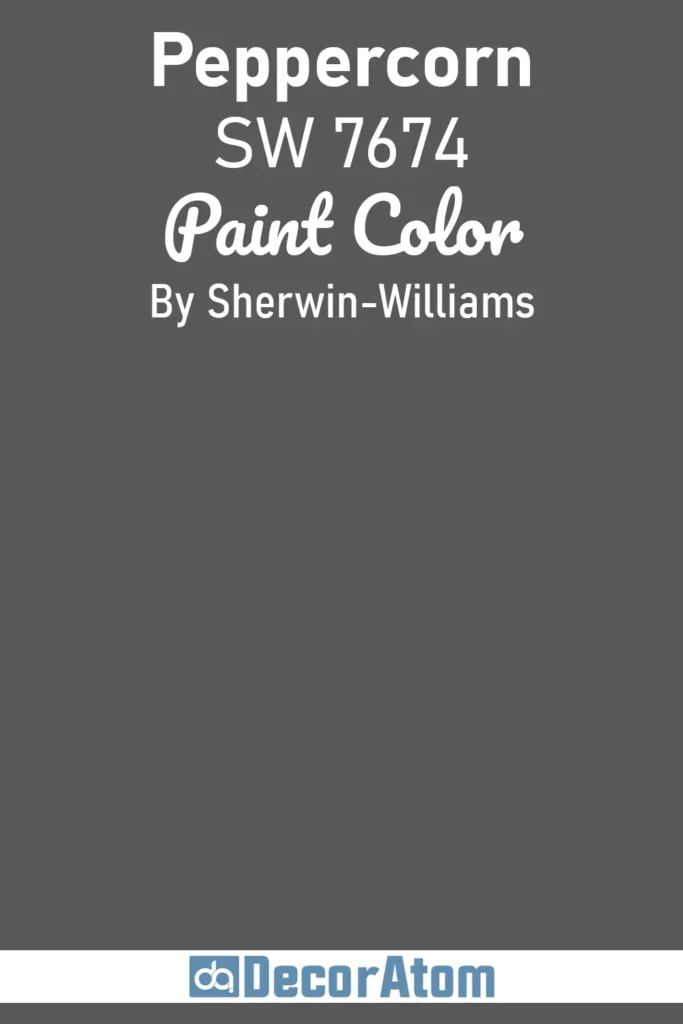
11. Peppercorn SW 7674
💥🎁 Christmas & Year-End Deals On Amazon !
Don't miss out on the best discounts and top-rated products available right now!
*As an Amazon Associate, I earn from qualifying purchases.
Peppercorn is often described as a dark gray, but that really undersells how layered and beautiful it can be. Depending on the light, it can take on hints of charcoal, slate, or even a soft blue tone.
It’s moody without being overwhelming and makes a strong impact while still feeling approachable. On home exteriors, it brings a clean, tailored look that works well across a variety of architectural styles.
I like it best when paired with creamy white trim or natural materials like stone or brick—it softens the drama just enough to keep things balanced.
12. Grizzle Gray SW 7068
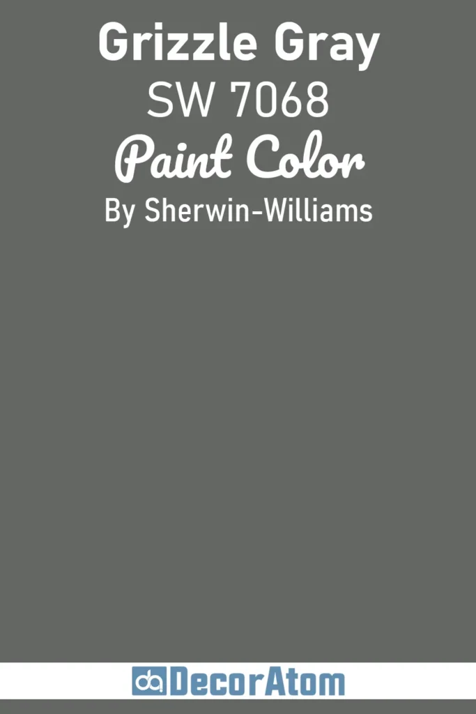
Grizzle Gray is a deep, earthy tone with green undertones that give it an outdoorsy, almost mossy feel. It’s darker than your typical gray but has more movement and complexity than black or charcoal.
If you’re aiming for a color that feels connected to nature but still has that bold, moody edge, Grizzle Gray fits the bill.
It looks incredible on craftsman or bungalow-style homes, especially when surrounded by lots of trees or foliage. Try it with stone accents or natural wood trim to really bring out its organic character.
13. Dark Night SW 6237
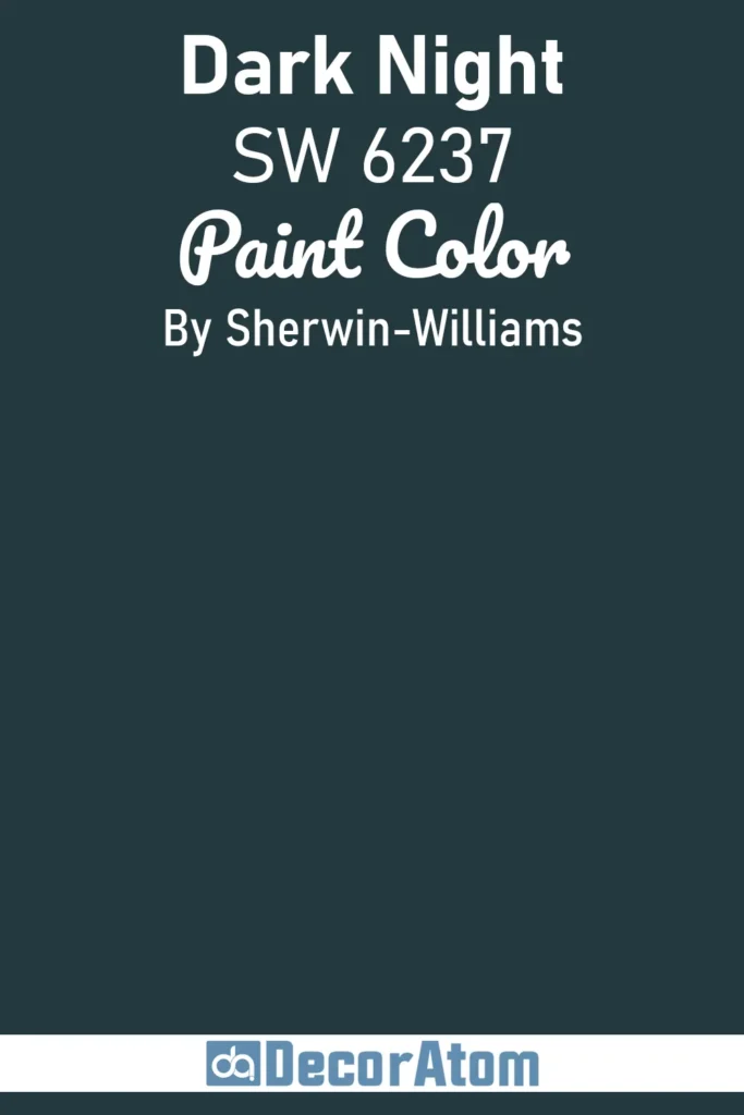
Dark Night brings a moody, almost romantic energy to the table. It’s a deep navy with a hint of green, giving it the feel of a midnight sky or deep ocean water.
It’s bold, yes, but it doesn’t scream for attention—it draws you in. I love how this color works on coastal homes just as well as it does on sleek urban builds.
It plays well with brass or copper accents and can be softened with warm whites or even creamy tans for a more balanced look. If you want something moody that isn’t black or gray, Dark Night might be your favorite.
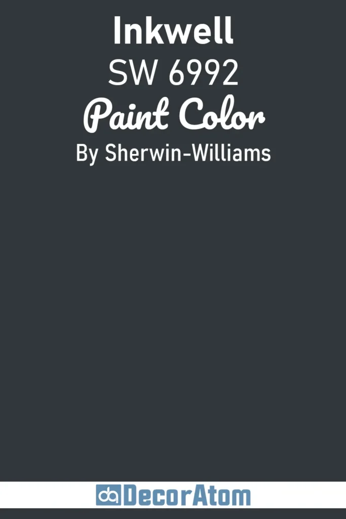
14. Inkwell SW 6992
💥🎁 Christmas & Year-End Deals On Amazon !
Don't miss out on the best discounts and top-rated products available right now!
*As an Amazon Associate, I earn from qualifying purchases.
Inkwell is one of those chameleon colors that shifts depending on the light and the materials around it.
At first glance, it looks black. But then you catch it in different lighting and start to notice the deep blue undertones. It’s sleek, polished, and just a little mysterious.
I’ve seen it used on both traditional and ultra-modern exteriors, and in both cases, it delivered a quiet drama that felt intentional and stylish.
If you want your exterior to feel bold but still nuanced, Inkwell delivers that richness with depth to spare.
15. Black Fox SW 7020
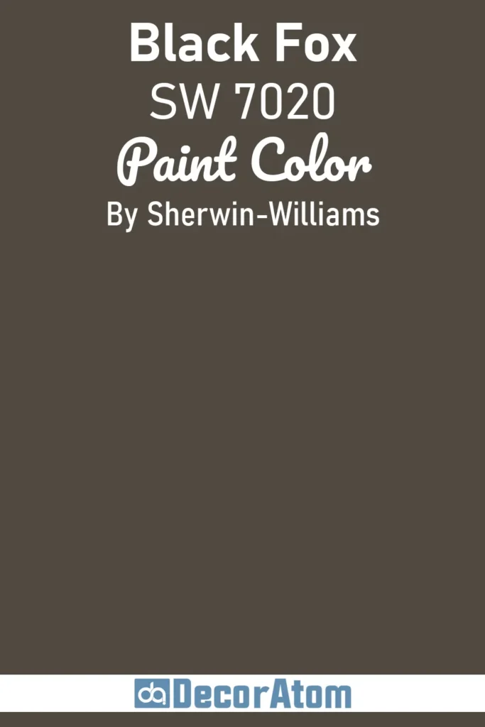
Black Fox is a softer, warmer alternative to pure black. It leans into chocolate brown territory without fully committing, which makes it feel earthy and understated.
This is a great option if you’re nervous about going too dark but still want that moody look. It’s especially beautiful on exteriors with lots of natural elements—think wooden beams, stone foundations, or even just a backdrop of trees.
The warmth in Black Fox makes it feel welcoming and timeless, which is hard to pull off with most near-black shades.
Final Thoughts
Choosing a dark and moody color for your exterior might feel like a big leap—but it’s one that can pay off in a big way.
These shades from Sherwin-Williams aren’t just about looking bold—they’re about creating a sense of place, grounding your home in its environment, and making a lasting impression.
Each of the 15 colors on this list has its own mood and story to tell, whether you’re drawn to the smoky calm of Peppercorn, the earthy richness of Urbane Bronze, or the mysterious edge of Dark Night.
The right color can completely transform the way your home feels—from the street, and from your own front porch.
So if you’ve been eyeing something deeper, richer, and moodier than your usual go-to, maybe this is the perfect time to lean into the dark side—confidently and beautifully.