
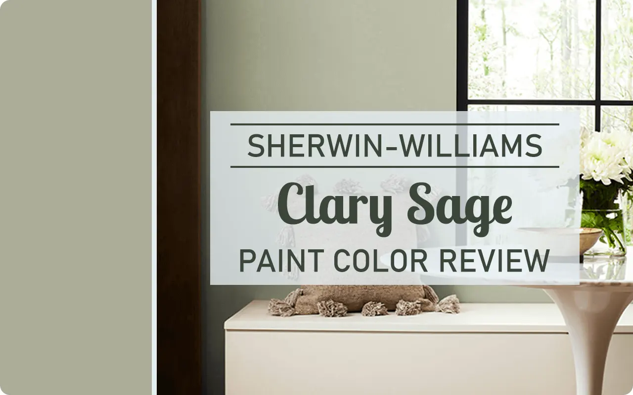
When I first encountered Sherwin Williams Clary Sage in a friend’s newly renovated sunroom, I was immediately struck by its subtle sophistication.
This Sherwin Williams shade has become one of my go-to recommendations for clients seeking something beyond the typical greige trend but not ready to commit to a bold statement color.
As someone who’s tested countless paint colors across hundreds of homes, I’ve developed a particular fondness for versatile mid-tones that create atmosphere without overwhelming a space.
Clary Sage sits perfectly in this sweet spot – neither too bold nor too timid.
In this review, I’ll break down everything you need to know about this increasingly popular shade, from its technical specifications to real-world applications.
Having used it in various settings over the past few years, I’ve gathered insights that go beyond the paint chip to help you determine if it’s the right choice for your home.

What Color is Clary Sage SW 6178?
Clary Sage SW 6178 is a sophisticated medium-toned sage green with subtle gray undertones. It falls into what I’d call the “natural neutrals” category – colors that echo elements found in nature while functioning essentially as neutrals in interior design.
When clients ask me to describe it, I often say it’s like the soft underside of a sage leaf that’s been lightly dusted with morning frost.
The gray influence tames what could otherwise be a more straightforward green, giving it a mature, restrained quality that works beautifully in contemporary homes.
The name comes from the clary sage plant, and I find it’s quite fitting – the paint color captures that dusty, muted green quality of the herb’s leaves.
It’s green enough to be recognized as such, but muted enough that some might describe it as a greenish-gray rather than a grayish-green, depending on the lighting conditions and surrounding colors.
How to Know if a Paint Color Is Right for You?
Would you like to sample Clary Sage SW 6178 paint color? I recommend using Samplize. They offer 9”x14.75”” peel-and-stick paint swatches that make testing colors super simple. Just stick it on your wall, move it around if needed, and when you’re done, peel it off and toss it. No mess, no cleanup. It’s quick, easy, and way more convenient!

Advantages of using peel and stick paint samples:
- EASY TO USE: Simply move your SAMPLIZE paint sample around the room to test under a variety of lighting conditions.
- AFFORDABLE: Budget-friendly solution and no more buying inaccurate swatches, rollers, wasted paint.
- SUPER FAST DELIVERY: Depending on your location, 1 day delivery is possible.
- ORDER FROM HOME: Save a trip to the store looking for samples.
- NO MESS: SAMPLIZE uses real paint samples with zero-mess
- NO WASTE: No leftover cans or wasted paint.
Is It a Warm Or Cool Color?
This question comes up constantly with my clients, and with Clary Sage, the answer is nuanced. Technically, Clary Sage leans slightly cool due to its gray undertones. However, it also contains subtle warm undertones that become more apparent in certain lighting situations.
I’d categorize it as a relatively balanced color that leans just slightly to the cool side.
This balanced nature is actually one of its greatest strengths – it doesn’t swing dramatically warm or cool, which contributes to its versatility across different spaces and lighting conditions.
In north-facing rooms, which receive cooler light, the cooler aspects of Clary Sage become more pronounced.
In warm-lit spaces, particularly those with abundant afternoon western sun, the warmer undertones emerge more clearly.
This chameleon-like quality makes it adaptable to various settings.
LRV of Clary Sage SW 6178
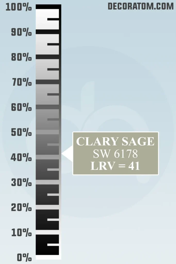
The Light Reflectance Value (LRV) of Clary Sage SW 6178 is 40.96, placing it in the medium range of the LRV scale. For those unfamiliar with LRV, it measures how much light a color reflects, with 0 being absolute black and 100 being pure white.
With an LRV of 40.96, Clary Sage reflects a moderate amount of light. I’ve found this particularly beneficial in spaces that struggle with lighting issues.
It’s dark enough to provide definition and character without absorbing too much light, which would make a space feel smaller or darker.
In my experience renovating older homes with limited natural light, this mid-range LRV performs beautifully – it adds color and personality without darkening the space excessively.
Conversely, in bright, sun-drenched rooms, it provides enough depth to prevent washing out completely.
Undertones of Clary Sage SW 6178
Understanding undertones can make or break a paint selection, and Clary Sage has a fascinating profile.
Its primary undertones are gray and a hint of blue, but there’s also a subtle earthy quality that prevents it from feeling too cool or clinical.
What makes this color tricky – and I’ve seen this surprise homeowners who didn’t test properly – is that the undertones shift considerably depending on surrounding colors and lighting conditions.
Next to warm woods or brass fixtures, the gray-blue undertones become more apparent. Place it alongside cooler whites or silver metallics, and the earthier notes emerge.
I once used Clary Sage in a kitchen with warm terracotta tiles, and the contrast brought out unexpected blue undertones that weren’t visible on the sample card.
This taught me to always test this color in the actual space where it will live, taking note of fixed elements like flooring, countertops, and cabinetry that might influence how the undertones read.
How Does Lighting Affect Clary Sage SW 6178?

If there’s one thing I’ve learned after using Clary Sage in dozens of homes, it’s that this color transforms dramatically with lighting changes.
This transformative quality can be either its greatest strength or its greatest challenge, depending on your perspective.
In natural northern light, which tends to be cooler and bluer, Clary Sage often displays more of its gray and blue undertones. The color can appear more muted and sophisticated in this light.
Under eastern morning light, it brightens and shows more of its green character. I particularly love it in east-facing breakfast nooks, where it creates a fresh, energizing atmosphere for starting the day.
Western afternoon light, which tends to be warm and golden, brings out the warmer, earthier aspects of Clary Sage. The color deepens and becomes more grounded in this light.
In southern exposure, which provides strong, warm light throughout the day, Clary Sage often appears lighter and more washed out. The strong light can diminish some of its depth.
As for artificial lighting, LED bulbs with cooler color temperatures (4000K+) tend to emphasize the color’s cooler gray-blue aspects.
Warmer bulbs (2700-3000K) bring out more of the earthy, natural green qualities. I typically recommend warm white LED bulbs around 3000K to strike a balanced appearance.
Trim Colors to Pair With Clary Sage SW 6178
Finding the perfect trim color to complement Clary Sage can elevate the entire look of a room. After numerous projects using this versatile shade, I’ve developed some reliable pairings that consistently deliver beautiful results.
For a classic, clean approach, Pure White SW 7005 provides enough contrast without stark opposition. Unlike brighter whites that might create too harsh a transition, Pure White offers a soft, light backdrop that allows Clary Sage to shine without competition.
When working with older homes or spaces with a vintage aesthetic, I often reach for Alabaster SW 7008. Its subtle warmth harmonizes with the earthy qualities in Clary Sage, creating a cohesive, timeless look. The creamy undertones in Alabaster soften the transition between the trim and wall, resulting in a more integrated appearance.
For modern interiors seeking a crisp contrast, High Reflective White SW 7757 delivers dramatic definition. This bright, clean white creates a contemporary frame for Clary Sage, enhancing its sophisticated character.
I recently used this combination in a mid-century modern renovation, and the contrast beautifully highlighted the architectural details.
When designing spaces with a warmer aesthetic, Dover White SW 6385 pairs beautifully with Clary Sage. Its subtle yellow undertones complement the earthy aspects of Clary Sage without competing with it. This combination feels especially welcoming in living areas and bedrooms.
For those seeking a monochromatic approach, Ethereal White SW 6182 offers a lighter version within the same color family. This creates a subtle, sophisticated look where the trim appears as a lighter shade of the wall color rather than a contrasting element.
Colors Similar to Clary Sage SW 6178
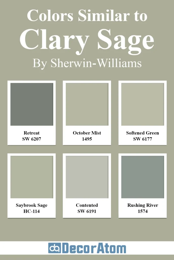
When exploring colors similar to Clary Sage, I’ve found several options that capture a similar essence while offering subtle variations that might better suit specific spaces or lighting conditions.
Sherwin Williams Retreat SW 6207
Retreat is like Clary Sage’s slightly cooler cousin. With an LRV of 38, it’s nearly identical in depth but leans more into the blue-gray spectrum than Clary Sage’s green-gray profile.
I recently used Retreat in a coastal-inspired guest bedroom where Clary Sage felt too earthy. The additional blue undertones created a more serene, water-inspired feel while maintaining that sophisticated muted quality.
Retreat works particularly well in spaces with blue or navy accents, creating a cohesive color story that feels intentional rather than matched.
In north-facing rooms, be aware that Retreat can appear quite cool, sometimes reading almost as a pale blue-gray rather than a green.
Benjamin Moore October Mist 1495
As part of Benjamin Moore’s Color of the Year collection, October Mist offers a slightly more green-forward alternative to Clary Sage. With an LRV of 46, it’s noticeably lighter and brighter while maintaining that sage character.
Where Clary Sage whispers its green notes, October Mist states them more clearly. I’ve found October Mist particularly successful in spaces that need a bit more energy and lightness without stepping fully into vibrant territory.
It pairs beautifully with natural wood tones, especially white oak and walnut. In one project, I used October Mist in a home office that needed to feel both calming and energizing – it struck the perfect balance between focus and tranquility.
Sherwin Williams Softened Green SW 6177
Positioned directly above Clary Sage in the Sherwin Williams color deck, Softened Green is essentially a lighter version with an LRV of 53. It maintains the same undertone profile but with a softer, more diluted appearance.
I’ve found Softened Green to be an excellent alternative for clients who love the character of Clary Sage but need something lighter for spaces with limited natural light.
The two colors also work beautifully together in a main color/accent color relationship. In a recent project, I used Clary Sage as an accent wall with Softened Green on remaining walls, creating depth without contrast.
The transition between the two shades was subtle yet added wonderful dimension to the room.
Benjamin Moore Saybrook Sage HC-114
Part of Benjamin Moore’s Historic Collection, Saybrook Sage offers a more traditional take on the sage green family. With an LRV around 40, it’s similar in depth to Clary Sage but contains more yellow undertones, giving it a warmer, more traditional character.
I’ve found Saybrook Sage performs beautifully in historic homes or spaces with antique furnishings where Clary Sage might feel too contemporary. The additional warmth makes it especially compatible with brass fixtures and warm-toned woods.
In a Colonial revival dining room I designed last year, Saybrook Sage created a perfect backdrop for mahogany furniture that would have clashed with the cooler undertones of Clary Sage.
Sherwin Williams Contented SW 6191
Contented presents an interesting alternative that sits in the same color family but leans more into the beige territory while maintaining green undertones.
With an LRV of 47, it’s lighter than Clary Sage and reads as a greige with green influence rather than a true sage green. I’ve recommended Contented to clients who love the idea of Clary Sage but are concerned about committing to a more definitive green.
In spaces with abundant warm light, Contented can sometimes read almost as a neutral with just a hint of green sophistication. I’ve found it pairs exceptionally well with limestone and travertine materials, making it a great option for spaces with natural stone features.
Benjamin Moore Rushing River 1574
Rushing River offers a more dramatic alternative to Clary Sage with an LRV of 32, making it slightly deeper. It contains more prominent blue undertones, creating a sage that shifts more dramatically toward the blue-gray side of the spectrum in certain lights.
In a master bathroom renovation with cool marble and chrome fixtures, I selected Rushing River when Clary Sage felt too warm. The deeper value creates a more cocooning effect, making it excellent for spaces where you want to create intimacy.
Be aware that in poorly lit areas, Rushing River can appear quite dark, sometimes reading as a muted charcoal with green undertones rather than a definitive sage.
Colors that Go With Clary Sage SW 6178

Finding the perfect companion colors for Clary Sage can elevate your space from simply pleasant to truly designer-worthy. After using this versatile color in countless projects, I’ve discovered several pairings that consistently create beautiful, harmonious spaces.
Sherwin Williams Alabaster SW 7008
Alabaster deserves special mention as one of my favorite colors to pair with Clary Sage. This soft, warm white provides the perfect backdrop that allows Clary Sage to truly shine.
Unlike starker whites, Alabaster contains subtle warm undertones that complement the earthy aspects of Clary Sage without competing with its complexity.
I recently completed a living room where we painted the walls Clary Sage and used Alabaster for ceiling, trim, and built-in bookcases.
The result was breathtaking – sophisticated and soothing without feeling flat or boring. The warmth of Alabaster prevented the contrast from feeling too stark or clinical, creating instead a layered, thoughtful look.
Alabaster’s LRV of 82 provides enough contrast with Clary Sage to create definition while maintaining a soft transition.
This pairing works particularly well in spaces with natural light, where the subtle undertones of both colors can interact throughout the day, creating a living, breathing space that changes with the light.
Sherwin Williams Repose Gray SW 7015
When looking for a neutral companion to Clary Sage, Repose Gray offers a sophisticated alternative to white.
This light warm gray with an LRV of 58 creates a beautiful tonal relationship with Clary Sage, as both colors contain gray undertones that speak to each other.
I’ve used this combination in open floor plans where I wanted connection between spaces without using the same color throughout. In one project, we painted the kitchen Repose Gray and the adjoining dining room Clary Sage.
The transition felt intentional yet subtle – the spaces maintained their distinct identities while clearly belonging to the same design vision.
What makes Repose Gray particularly successful with Clary Sage is its chameleon-like quality. The subtle warm undertones prevent it from feeling cold against Clary Sage’s earthy character.
This pairing creates spaces that feel curated rather than matched – the hallmark of thoughtful design.
Sherwin Williams Naval SW 6244
For a more dramatic pairing that still feels completely natural, Naval creates a stunning companion to Clary Sage. This deep navy blue with an LRV of 4 creates a striking contrast while maintaining a connection through the cool undertones present in both colors.
I used this combination in a home office where Naval covered the built-in cabinetry and Clary Sage adorned the walls. The result was sophisticated and grounding – professional without feeling corporate.
The pairing feels derived from nature, reminiscent of the ocean meeting a misty shoreline.
What I particularly love about this combination is how the colors enhance each other. Naval makes Clary Sage appear lighter and more distinctly green, while Clary Sage highlights the rich depth of Naval.
This pairing works beautifully in spaces where you want to create drama without resorting to black, which can sometimes feel too harsh against Clary Sage’s subtle character.
Sherwin Williams Intellectual Gray SW 7045
For those seeking a monochromatic approach, Intellectual Gray offers a beautiful neutral companion that sits in the same color family as Clary Sage but without the green undertones.
With an LRV of 48, it’s lighter than Clary Sage but not dramatically so, creating a subtle contrast that adds dimension without obvious shifts.
I recently used this combination in a master bedroom suite, with Intellectual Gray in the bedroom and Clary Sage in the attached sitting area. The transition was nearly seamless while still providing enough variation to define the separate functional areas.
What makes this pairing successful is the shared gray undertone that creates cohesion while the slight color shift adds interest. This combination works particularly well in spaces where you want a serene, harmonious feel without resorting to a single color throughout.
Sherwin Williams Creamy SW 7012
When seeking a warm white that enhances the natural, organic feel of Clary Sage, Creamy offers the perfect solution. With an LRV of 81 and subtle yellow undertones, it brings out the earthy aspects of Clary Sage while providing enough contrast for definition.
In a recent kitchen renovation, we used Clary Sage on the lower cabinets with Creamy on the uppers and walls. The combination felt warm and inviting while maintaining a clean, contemporary look.
The yellow undertones in Creamy connected beautifully with the natural wood flooring, creating a cohesive space that felt intentionally designed rather than randomly assembled.
What I particularly appreciate about this pairing is how it enhances the organic quality of Clary Sage without becoming too theme-driven or obvious. The space feels naturally harmonious rather than deliberately matched.
Sherwin Williams Urbane Bronze SW 7048
For a rich, dramatic pairing that still feels organic and natural, Urbane Bronze creates a stunning partnership with Clary Sage.
This deep, warm brown with strong gray undertones (LRV 8) creates a sophisticated contrast while maintaining a connection through shared earthy qualities.
I used this combination in a living room where we painted a feature fireplace wall in Urbane Bronze with surrounding walls in Clary Sage. The effect was striking yet completely harmonious – like elements found together in nature.
The depth of Urbane Bronze made the subtle green in Clary Sage more apparent, while Clary Sage prevented Urbane Bronze from feeling too heavy or dark.
This pairing works particularly well in spaces with abundant natural light or in rooms where you want to create a cocooning effect without using true black, which can sometimes feel too stark against Clary Sage’s nuanced character.
Where to Use Clary Sage SW 6178?
One of the qualities I most appreciate about Clary Sage is its remarkable versatility across different spaces in the home. Having used it extensively in various settings, I’ve discovered how this adaptable color can transform each room uniquely while maintaining a cohesive feel throughout a home.
Sherwin Williams Clary Sage In the Bedroom
The bedroom might be my favorite application for Clary Sage. This color creates a serene sanctuary that promotes rest without feeling boring or flat. The color’s natural associations bring an organic tranquility that synthetic colors simply can’t match.
In primary bedrooms, I’ve found Clary Sage creates a sophisticated backdrop that works with virtually any bedding color scheme. Its muted quality means you can change accessories seasonally without needing to repaint.
Last year, I used it in a main bedroom suite where the clients wanted something calming but not baby blue or beige. The Clary Sage walls paired beautifully with cream linens, natural wood furniture, and brass accents.
For guest bedrooms, Clary Sage offers a gender-neutral option that feels welcoming to all visitors. The color reads as intentional and designed without being polarizing or trend-driven.
In children’s rooms, particularly those designed to grow with the child, Clary Sage provides a mature backdrop that works equally well with playful primary colors for younger years and more sophisticated accent colors for teens.
The gentle gray undertones in Clary Sage also make it an excellent choice for bedrooms with irregular lighting. Unlike clearer greens that can appear sickly in certain lights, Clary Sage maintains its sophisticated character throughout the day.
Sherwin Williams Clary Sage In the Bathroom
Bathrooms present unique challenges with moisture, variable lighting, and often limited space. Clary Sage rises to these challenges beautifully, creating spa-like tranquility that enhances the bathroom experience.
In powder rooms, where you can afford to be a bit more dramatic, Clary Sage provides enough color to make a statement without overwhelming the typically small space.
I recently used it in a powder room with brass fixtures and walnut accents, and the combination felt luxurious and custom.
For primary bathrooms, particularly those with natural marble or stone, Clary Sage creates a seamless connection with natural materials.
The color’s chameleon-like quality means it complements both warm travertine and cool Carrara marble equally well.
In bathrooms with limited natural light, which can make some colors appear dull or flat, Clary Sage maintains its dimension thanks to its middle-range LRV. It neither darkens the space excessively nor washes out under artificial lighting.
One particularly successful application I’ve found is using Clary Sage as a wall color with white subway tile wainscoting. The contrast creates a clean, classic look that nods to traditional design while feeling current and fresh.
Sherwin Williams Clary Sage In the Living Room
The living room serves as the heart of many homes, and Clary Sage creates an ideal backdrop for gathering and conversation. Its balanced nature avoids the extremes that can make a space feel either too energetic or too subdued for comfortable socializing.
In open-concept living areas, Clary Sage provides enough color interest to feel intentional without competing with architectural features or statement furniture pieces.
I’ve found it particularly successful in homes with natural views, as it creates a beautiful transition between indoor and outdoor spaces.
For more formal living rooms, Clary Sage brings a sophisticated presence without the heaviness of deeper colors.
In a recent project with high ceilings and substantial crown molding, Clary Sage highlighted the architectural details while maintaining a welcoming atmosphere.
In smaller living spaces, this color’s reflective qualities help prevent the room from feeling cramped. I recently used it in a compact city apartment where it expanded the visual space while providing more character than a standard white or beige.
What I particularly appreciate about Clary Sage in living areas is its ability to bridge traditional and contemporary design elements.
I’ve successfully paired it with both classic rolled-arm sofas and sleek modern furniture, making it an excellent choice for transitional spaces.
Sherwin Williams Clary Sage For the Exterior
While interior applications of Clary Sage often steal the spotlight, this versatile color performs beautifully as an exterior option as well. Its natural, organic quality makes it an excellent choice for homes seeking connection with their surroundings.
On craftsman-style homes, Clary Sage creates a sophisticated yet appropriate historical reference. I recently worked on a 1920s bungalow where we used Clary Sage as the main body color with cream trim and charcoal accents.
The house immediately gained curb appeal while maintaining its architectural integrity.
For modern exteriors, particularly those with clean lines and minimal ornamentation, Clary Sage provides subtle color interest without the starkness of grays or the predictability of beiges.
On a contemporary farmhouse, we paired Clary Sage with black window frames and a natural wood door for a striking yet harmonious combination.
In wooded settings, Clary Sage creates a natural connection with the surroundings without attempting to match or compete with the landscape. The color’s gray undertones help it stand out from greenery while still feeling connected to the natural environment.
For exterior applications, I particularly appreciate how Clary Sage maintains its character in different lights throughout the day.
Unlike some exterior colors that can appear drastically different from morning to evening, Clary Sage maintains a consistent presence while subtly shifting with the changing light.
Sherwin Williams Clary Sage in Kitchen and Kitchen Cabinets
The kitchen presents one of the most exciting applications for Clary Sage, offering multiple ways to incorporate this versatile color into the heart of the home.
As a cabinet color, Clary Sage creates a distinctive look that avoids the ubiquitous white or gray without venturing into trendy territory that might quickly date your kitchen.
I recently completed a kitchen renovation using Clary Sage on the perimeter cabinets with a walnut island, and the combination created a warm, inviting space that felt both current and timeless.
For clients hesitant to commit to colored cabinets throughout, Clary Sage makes an excellent choice for kitchen islands. Paired with white or wood-tone perimeter cabinets, a Clary Sage island creates a grounded focal point that anchors the space without overwhelming it.
As a wall color with white cabinets, Clary Sage provides a sophisticated backdrop that elevates the entire kitchen.
Unlike stark whites or primary colors that can make a kitchen feel either clinical or childish, Clary Sage creates an atmosphere of casual elegance perfect for both everyday use and entertaining.
What makes Clary Sage particularly successful in kitchens is its compatibility with various countertop materials. It harmonizes beautifully with warm butcher block, crisp white quartz, and natural stone varieties.
This versatility makes it an excellent choice for kitchen updates where replacing countertops might not be in the budget.
In open kitchens that flow into living areas, Clary Sage creates a natural continuation between spaces without requiring the exact same color throughout.
Its neutral quality means it plays well with adjacent colors while maintaining its own distinctive character.
Comparing Clary Sage SW 6178 With Other Colors
Understanding how Clary Sage compares to other popular colors can help you determine if it’s the right choice for your space. Having used Clary Sage alongside many other colors in various projects, I’ve gained insights into these color relationships that go beyond what you’d see on a paint strip.
Sherwin Williams Clary Sage vs Sherwin Williams Sea Salt SW 6204
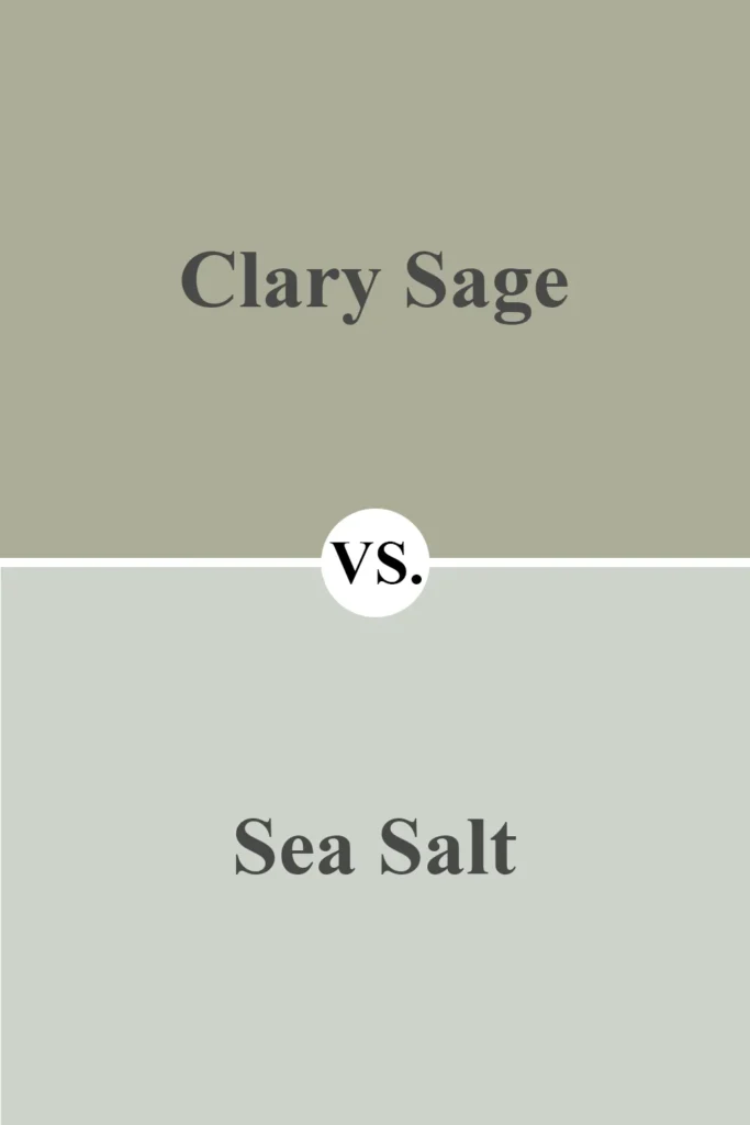
Sea Salt is often considered Clary Sage’s lighter, more coastal cousin. With an LRV of 63 compared to Clary Sage’s 37, Sea Salt is significantly lighter and brighter. While both colors contain gray undertones, Sea Salt leans more heavily into blue-green territory, creating a spa-like, airy feeling.
In a recent project, I needed to choose between these two for a master bath. Ultimately, Clary Sage won for its more sophisticated depth, while Sea Salt felt slightly too beachy for the overall design direction.
Where Sea Salt can sometimes read as a distinctly coastal color, Clary Sage maintains its versatility across design styles.
The difference becomes particularly apparent in evening light, when Sea Salt can wash out significantly while Clary Sage maintains its presence and depth. If you’re torn between these two, consider your lighting conditions and whether you want a more definitive color presence (Clary Sage) or a lighter, airier feel (Sea Salt).
Sherwin Williams Clary Sage vs Benjamin Moore Revere Pewter

Revere Pewter has dominated the neutral scene for years, and comparing it with Clary Sage reveals interesting distinctions. While both colors operate in the “complex neutral” category with gray bases, Revere Pewter leans into warm beige undertones where Clary Sage embraces green.
With an LRV of 55, Revere Pewter reflects significantly more light than Clary Sage, making it appear lighter on walls. In a sunroom project where I tested both, Revere Pewter read almost as a light beige in bright conditions, while Clary Sage maintained its distinct character.
What’s interesting about this comparison is how differently these colors interact with furnishings. Revere Pewter tends to recede and let other elements take center stage, functioning almost as a true neutral.
Clary Sage, with its definitive green personality, becomes more of a design statement while still functioning as a sophisticated backdrop.
Sherwin Williams Clary Sage vs Sherwin Williams Evergreen Fog

As Sherwin Williams’ 2022 Color of the Year, Evergreen Fog represents a deeper, more saturated take on the gray-green concept.
With an LRV of 30 compared to Clary Sage’s 37, Evergreen Fog creates a more dramatic statement while maintaining the sophisticated gray undertones.
I recently used these colors in adjacent spaces – Clary Sage in a dining room and Evergreen Fog in a cozy home library.
The relationship worked beautifully, with Evergreen Fog creating a more cocooning atmosphere while Clary Sage offered a lighter touch in the space meant for gathering and conversation.
The primary difference lies in how these colors respond to light. In dim conditions, Evergreen Fog can read almost as a muted hunter green, while Clary Sage maintains its lighter, more versatile character.
If you’re drawn to the gray-green family but concerned about creating too dark a space, Clary Sage offers a more forgiving option.
Sherwin Williams Clary Sage vs Sherwin Williams Accessible Beige
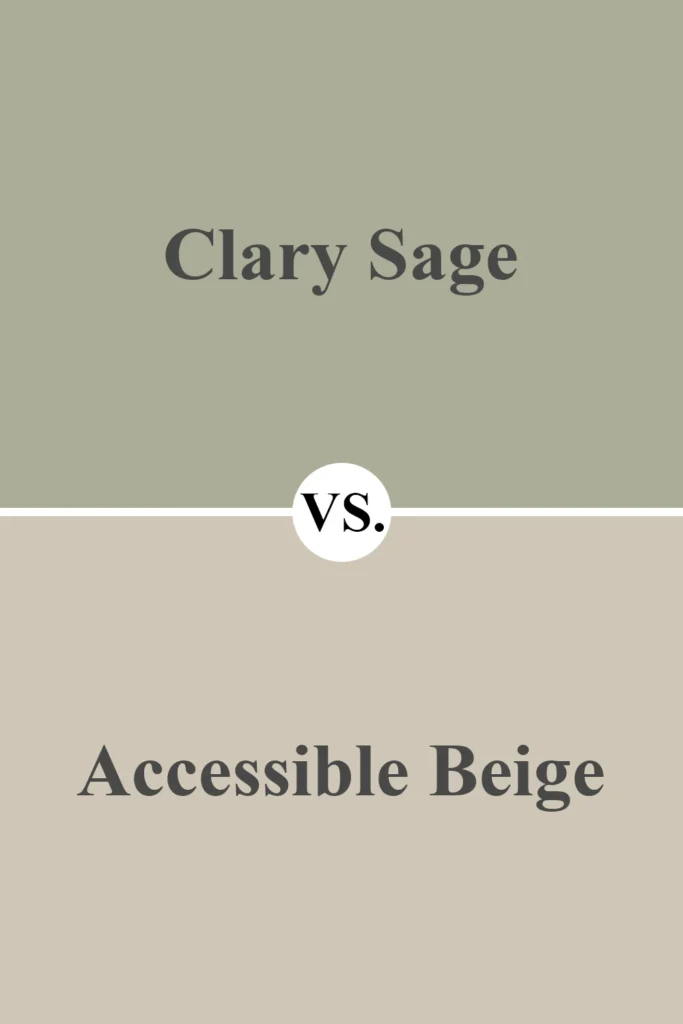
Accessible Beige represents the warmer neutral territory in comparison to Clary Sage’s cool green-gray approach. With an LRV of 58, Accessible Beige appears considerably lighter on walls and creates a warmer, more traditional feeling in a space.
In a kitchen project where the client was deciding between these two colors for cabinetry, Clary Sage ultimately created a more distinctive design statement while Accessible Beige felt safe but less memorable.
Where Accessible Beige disappears into the background, Clary Sage maintains a subtle presence that elevates the design.
The most significant distinction emerges in how these colors pair with other elements. Accessible Beige works harmoniously with warm woods and earth tones but can clash with cooler materials.
Clary Sage’s balanced nature allows it to bridge both warm and cool elements, making it more versatile across different material palettes.
Sherwin Williams Clary Sage vs Benjamin Moore Sage Wisdom

Despite similar names, these colors offer distinctly different approaches to sage green. Benjamin Moore’s Sage Wisdom presents a clearer, more saturated green with fewer gray undertones than Clary Sage.
With comparable LRV values, the distinction lies not in lightness but in clarity and undertones.
In a sunroom where I tested both colors, Sage Wisdom read as a definitive green with vintage appeal, while Clary Sage maintained its sophisticated gray-green character.
Sage Wisdom makes a more direct color statement, while Clary Sage offers subtlety and versatility.
This comparison perfectly illustrates why considering undertones is crucial when selecting paint colors. Despite both being “sage greens,” these colors create entirely different atmospheres.
Sage Wisdom pushes a space toward a more garden-inspired, somewhat vintage direction, while Clary Sage maintains a contemporary, sophisticated presence.
Sherwin Williams Clary Sage vs Farrow & Ball Pigeon

For clients with luxury budgets, Farrow & Ball’s Pigeon often enters the conversation alongside Clary Sage. Both colors occupy the sophisticated gray-green territory, but with notable differences.
Pigeon contains more prominent blue undertones, creating a cooler overall impression than Clary Sage’s balanced character.
In northern light, these differences become particularly apparent, with Pigeon displaying its blue-gray heart while Clary Sage maintains its more neutral stance.
The distinctive mineral pigments in Farrow & Ball paints also create a depth and luminosity that differs from Sherwin Williams’ formulation.
While both colors offer sophisticated takes on the gray-green concept, Clary Sage typically proves more versatile across different lighting conditions.
Pigeon can sometimes read quite blue in certain lights, which might not align with all design visions. When clients ask me about the difference, I often recommend Clary Sage for spaces with variable or challenging lighting conditions, where its more balanced nature provides greater forgiveness.
Click here to get a Peel & Stick paint sample of Clary Sage
Final Thoughts On Clary Sage SW 6178 Paint Color by Sherwin-Williams
After working with Clary Sage across countless projects, from historic renovations to contemporary new builds, I’ve developed a genuine appreciation for its remarkable versatility and subtle sophistication.
It’s become my go-to recommendation for clients seeking a color with personality that won’t dominate a space or quickly date their design.
What continues to impress me about Clary Sage is its chameleon-like ability to adapt to different environments while maintaining its essential character.
Unlike some colors that can dramatically shift or disappoint in certain lighting conditions, Clary Sage remains consistently beautiful across various exposures and times of day.
For homeowners tired of gray but hesitant to embrace bold color statements, Clary Sage offers the perfect middle ground – enough color to feel intentional without the commitment of a more saturated hue.
Its natural, organic quality connects interior spaces with the outside world, creating environments that feel grounded and harmonious.
If you’re considering Clary Sage for your home, I strongly recommend testing it in your specific space before committing. While it’s remarkably versatile, the complex undertones interact uniquely with each home’s lighting and existing elements.
Sample boards moved around the room at different times of day will reveal Clary Sage’s full potential in your space.
In my years of working with paint colors, few have proven as consistently successful as Clary Sage.
Whether on kitchen cabinets, bedroom walls, or exterior siding, this sophisticated gray-green continues to create spaces that feel both current and timeless – the ultimate goal of thoughtful interior design.