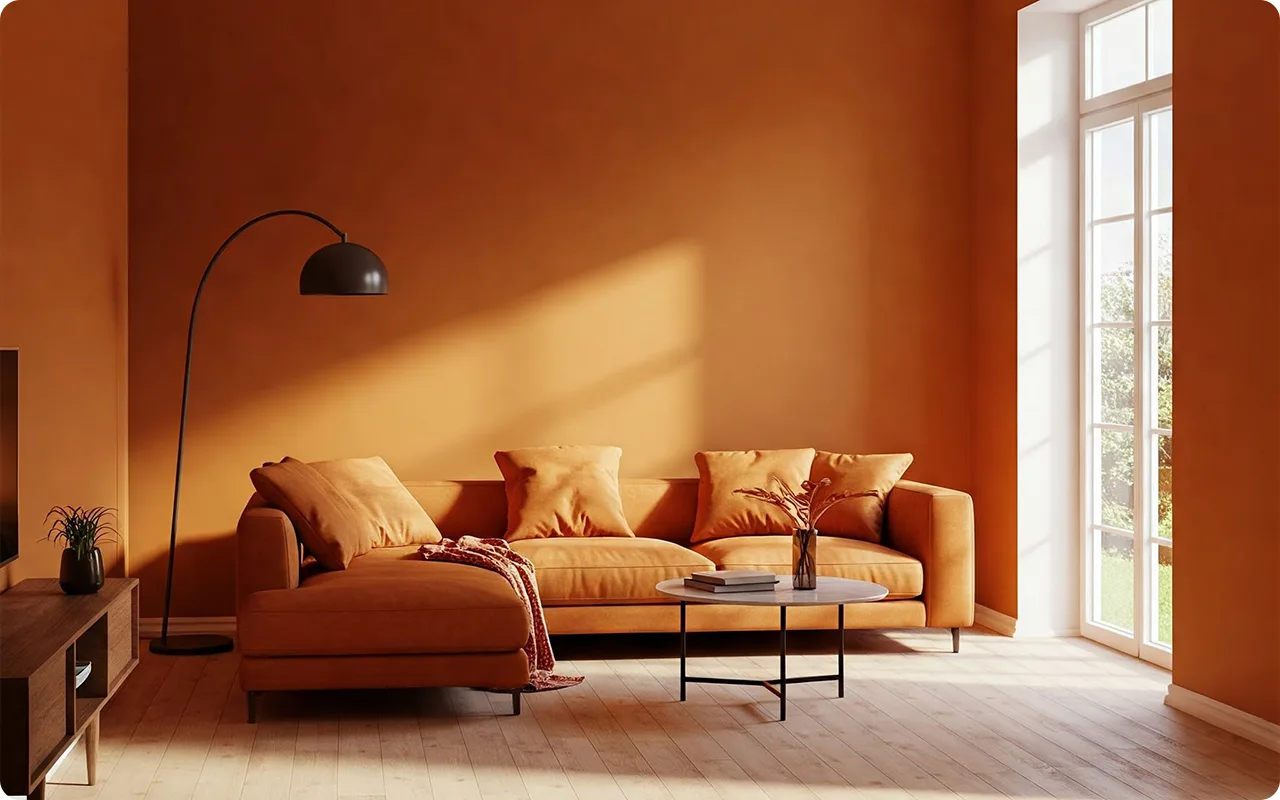
If you’re looking to give your living room a fresh, bold makeover, paint is one of the easiest (and most impactful) ways to do it.
While neutrals are always a safe bet, there’s something undeniably exciting about a living room that’s full of rich, vibrant color.
Bold shades make a statement—they bring personality, energy, and a sense of adventure to your space.
Now, I know that picking bold colors can feel intimidating, but trust me, it’s all about finding the right hue that feels right for you.
Whether you want deep blues, fiery reds, or lush greens, bold paint colors can completely transform the vibe of your living room and create a space that’s uniquely yours.
In this post, I’m sharing some of my top 17 picks for bold living room paint colors.
These shades will not only make your space feel dramatic but also cozy and inviting.
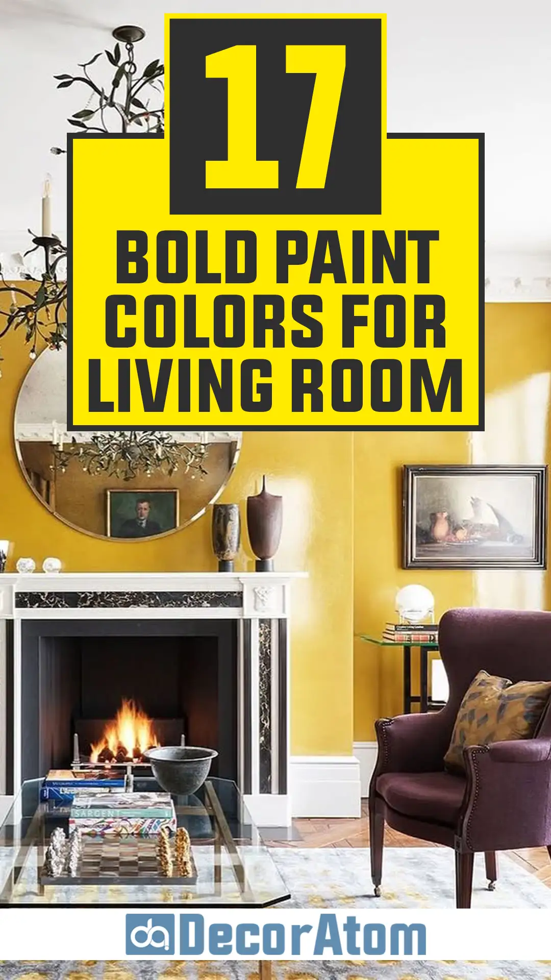
What are Bold Paint Colors?
Bold paint colors are those that make a strong visual impact, adding personality, depth, and drama to a space. These colors are rich, saturated, and eye-catching, often standing out as a focal point in a room.
Unlike soft neutrals or muted shades that blend seamlessly into the background, bold colors command attention and set the tone for the entire space.
Bold colors can be bright and vibrant, like deep reds, electric blues, and jewel-toned greens, or they can be dark and moody, such as charcoal black, navy blue, or emerald green.
What makes a color “bold” depends on its intensity and how it interacts with the surrounding elements in a room.
A bold paint color in a living room doesn’t necessarily mean the entire space has to be covered in that hue. It can be used as an accent wall, a backdrop for artwork, or even on the ceiling to create a unique design statement.
The key to using bold colors effectively is balance—pairing them with the right furnishings, lighting, and complementary shades to ensure the space feels cohesive rather than overwhelming.
Tips for Choosing Bold Paint Colors for the Living Room
- Consider the Mood You Want to Create
Bold colors evoke emotions, so it’s important to think about the mood you want in your living room. For a lively, energetic space, shades like rich oranges, deep yellows, or bright blues can add vibrancy. If you prefer a cozy and sophisticated atmosphere, darker shades like forest green, navy, or deep plum can create a luxurious, intimate feel. - Test Paint Samples in Different Lighting
Lighting dramatically affects how a bold color appears. Natural light, warm artificial lighting, and even the direction your windows face can alter the color’s undertones. Always test large swatches of paint on different walls and observe how the color changes throughout the day before committing. - Pair with Complementary Colors
Bold colors work best when they are balanced with other elements in the room. If you choose a dramatic wall color, consider keeping the furniture or decor in more neutral or complementary shades. For instance, a bold emerald green wall pairs beautifully with warm wood tones, gold accents, or soft beige furnishings. - Start Small if You’re Unsure
If committing to an entire room in a bold shade feels intimidating, start with a single accent wall or a bold-painted ceiling. You can also introduce bold colors through furniture, rugs, or decor before deciding to go all-in with paint. - Use Bold Colors to Highlight Architectural Features
If your living room has beautiful moldings, wainscoting, or built-in bookshelves, consider painting them in a bold shade while keeping the walls neutral. This technique adds depth and drama without overwhelming the space. - Balance Bold with Texture and Pattern
To keep a bold-colored living room from feeling too heavy, incorporate textures and patterns that add dimension. Soft fabrics, natural wood, metallic accents, or patterned rugs can create visual interest and prevent the space from looking flat. - Don’t Forget the Ceiling
A bold ceiling can be an unexpected yet stunning way to introduce color into a living room. A rich navy, deep burgundy, or charcoal gray ceiling paired with lighter walls can create a sophisticated and cozy ambiance. - Trust Your Instincts
The best bold color for your living room is one that resonates with you and makes you happy. If a certain shade excites you, don’t be afraid to take the plunge. Bold choices often lead to the most stunning and unique spaces!
Top 17 Bold Paint Colors for Living Room
If you’re ready to go beyond neutrals and embrace drama, richness, and energy, these colors will give your living room the bold, unforgettable look it deserves.
1. Deep Navy Blue
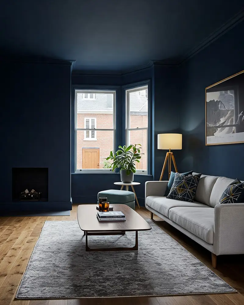
Deep navy is the ultimate bold neutral. It’s rich, moody, and effortlessly stylish, making it perfect for a dramatic living room.
Unlike lighter blues, which can feel airy and coastal, a deep navy grounds the space with a sense of sophistication and elegance. It pairs beautifully with crisp whites for a high-contrast, classic look, or you can warm it up with gold accents and wood tones for a more inviting atmosphere.
Whether you prefer modern, traditional, or eclectic decor, navy blue adapts effortlessly while maintaining its bold character.
🖌 Try This Shade: Sherwin Williams Naval – A deep, true navy that feels both classic and contemporary.
2. Emerald Green
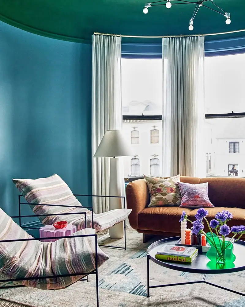
Emerald green is one of the most luxurious bold paint colors for a living room. It has a jewel-like vibrancy that instantly adds richness and depth to a space.
This shade works particularly well in rooms with high ceilings, large windows, or good natural light, where it can truly shine. Emerald green pairs beautifully with brass, velvet furnishings, and dark wood tones, creating an opulent, high-end feel.
It’s the perfect choice for those who love a dramatic, nature-inspired aesthetic that still feels refined and elegant.
🖌 Try This Shade: Benjamin Moore Hunter Green – A deep, slightly muted emerald that feels rich yet sophisticated.
3. Mustard Yellow

Mustard yellow is bold, energetic, and surprisingly versatile. It brings warmth and vibrancy to a living room, creating an inviting and cozy space with a vintage-modern appeal.
Unlike bright, lemony yellows, mustard has a muted, earthy quality that allows it to feel bold without being overwhelming.
It pairs exceptionally well with deep blues, forest greens, and charcoal grays, making it a fantastic statement color for those who want to embrace warmth and character in their living space.
🖌 Try This Shade: Farrow & Ball India Yellow – A rich mustard tone with a hint of warmth, perfect for adding depth.
4. Plum Purple
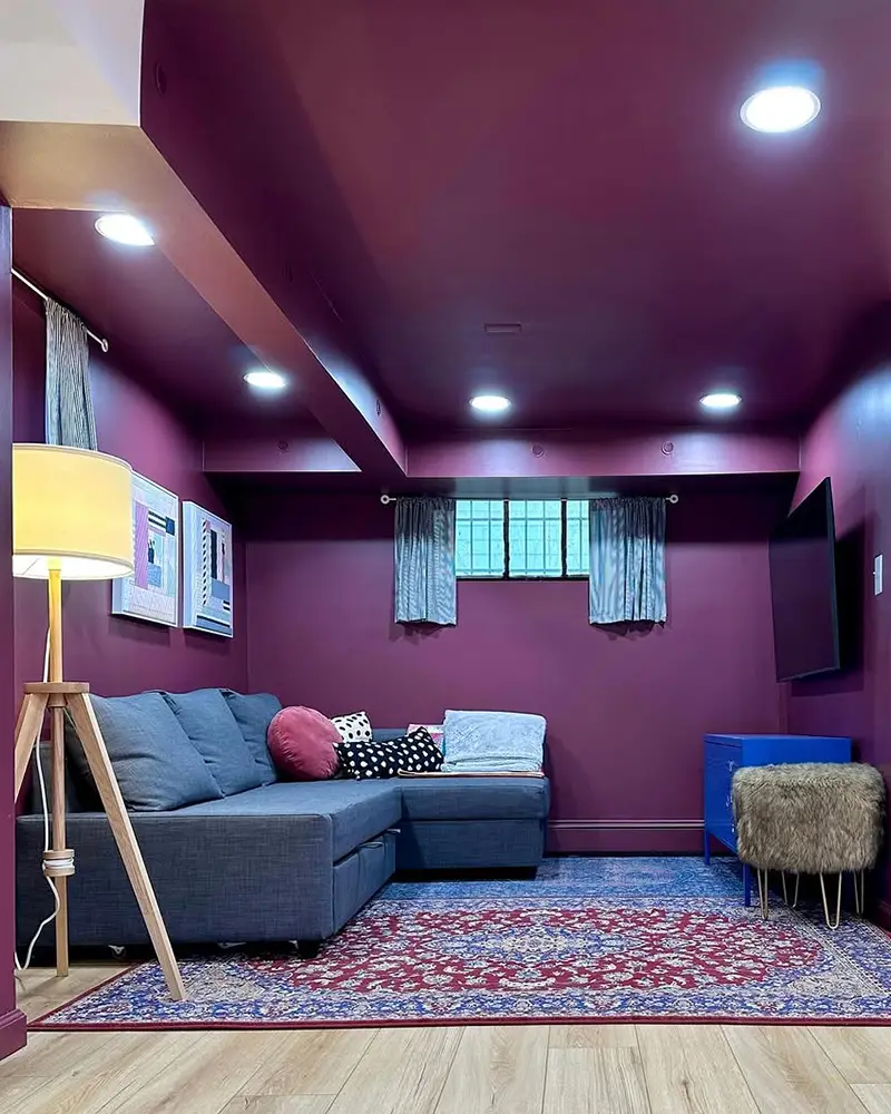
Plum purple is the definition of bold sophistication. It’s dramatic, moody, and incredibly stylish, making it a top choice for a luxurious living room.
This color creates a regal and intimate feel, perfect for spaces that need a little extra drama. It pairs beautifully with soft grays, deep greens, or warm metallics like bronze and gold.
Whether you’re going for a modern glam look or a more traditional, vintage-inspired space, plum purple adds depth and richness in a way few other colors can.
🖌 Try This Shade: Sherwin Williams Mature Grape – A deep, moody purple with just the right amount of vibrancy.
5. Bold Coral
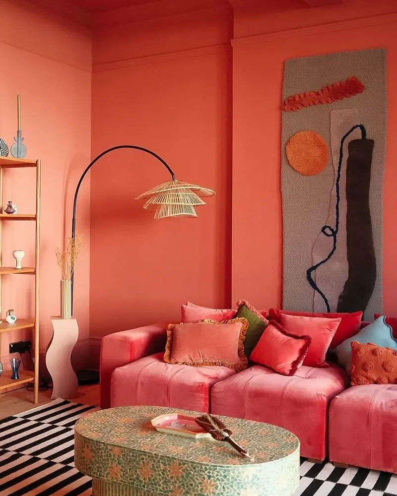
If you want a bold color that feels fun, energetic, and full of personality, coral is the perfect choice.
It’s a vibrant blend of pink and orange that immediately brightens up a living room while maintaining a sophisticated edge. Coral works beautifully with navy blue, deep green, and even warm neutrals like beige or taupe.
It’s a fantastic way to add warmth and playfulness to a space without feeling too overpowering.
🖌 Try This Shade: Benjamin Moore Coral Gables – A bright yet balanced coral that adds vibrancy without being too intense.
6. Cosmic Black
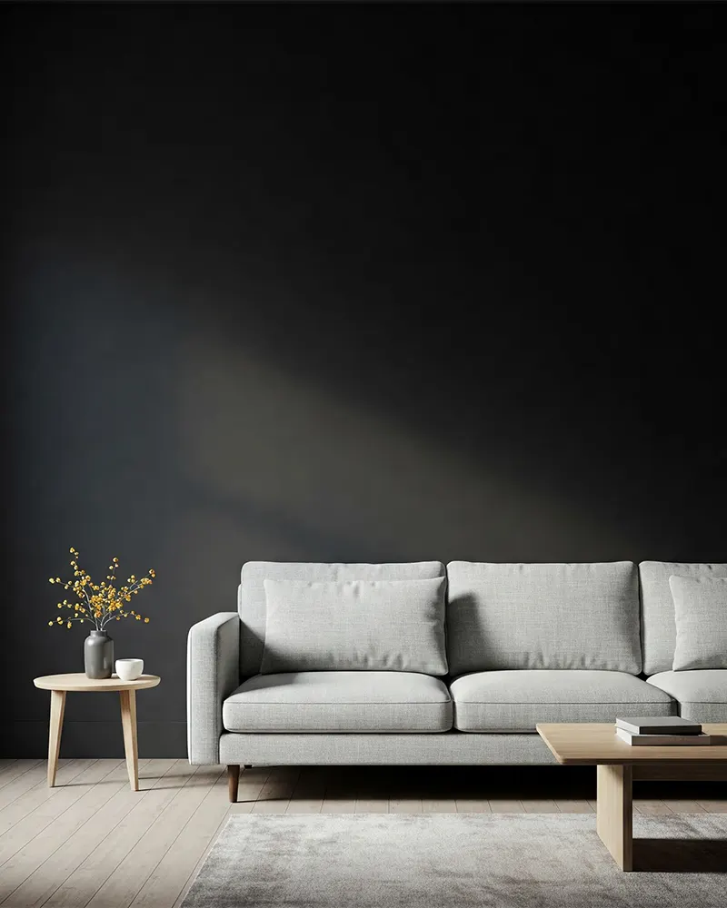
Few colors are as bold and commanding as black. It’s sleek, modern, and completely transforms a living room into a space of high contrast and drama.
A black living room makes a statement like no other, especially when paired with soft, textured furnishings or metallic accents. If you’re worried about black feeling too heavy, balance it with warm wood tones, soft cream accents, and strategic lighting.
A black living room feels chic, moody, and incredibly stylish, making it one of the most striking choices for bold color lovers.
🖌 Try This Shade: Sherwin Williams Tricorn Black – A deep, true black that feels crisp and modern.
7. Burgundy
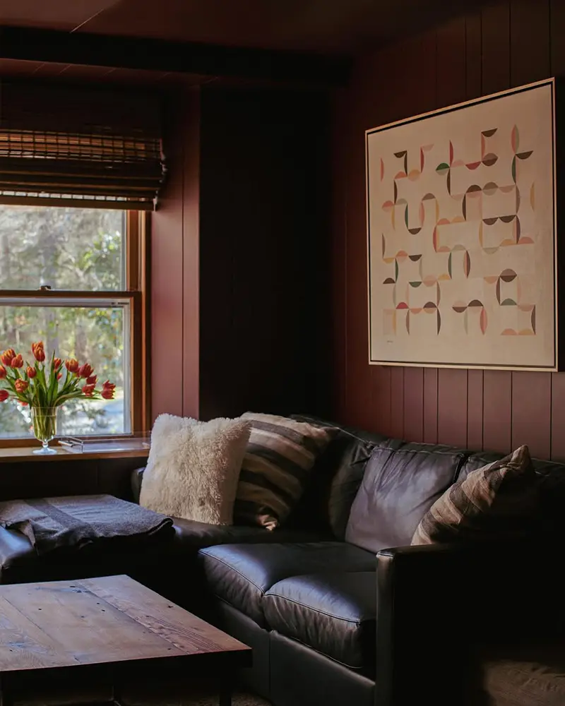
Burgundy is a deep, sultry color that brings warmth, elegance, and a hint of drama to a living room.
It has a luxurious, wine-inspired richness that feels both classic and modern at the same time. This color works beautifully with gold accents, deep grays, and even muted pinks for a stunning contrast.
Burgundy is perfect for those who love a deep, romantic color that still feels sophisticated and inviting.
🖌 Try This Shade: Behr Burgundy – A rich, velvety burgundy that makes a space feel cozy and luxurious.
8. Burnt Orange
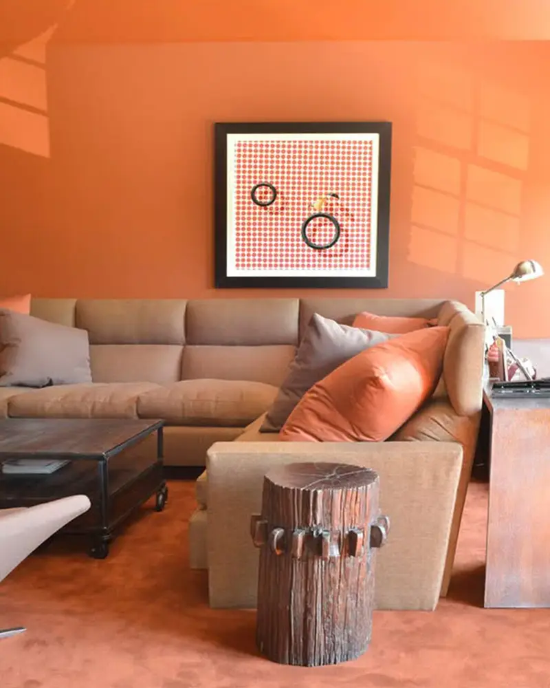
Burnt orange is a bold yet warm color that instantly creates an inviting atmosphere. It has a rustic, earthy feel while still bringing a dramatic pop of color to a living room.
This shade is perfect for those who love a mid-century modern or bohemian aesthetic, as it pairs beautifully with deep blues, rich browns, and textured textiles like leather or woven fabrics.
A burnt orange living room feels cozy, bold, and effortlessly stylish.
🖌 Try This Shade: Sherwin Williams Cavern Clay – A warm, earthy burnt orange with a desert-inspired feel.
9. Marine Blue
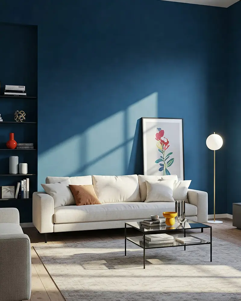
Marine blue is a striking shade that brings a bold, moody depth to a living room. It has a slightly muted, ocean-inspired quality that makes it feel both dramatic and calming at the same time.
Unlike brighter blues, marine blue leans into a sophisticated, almost mysterious aesthetic. It pairs beautifully with crisp whites, sandy neutrals, or even deep greens for a layered, modern look.
🖌 Try This Shade: Behr Inked – A deep marine blue that feels rich and elegant without being too dark.
10. Charcoal Gray
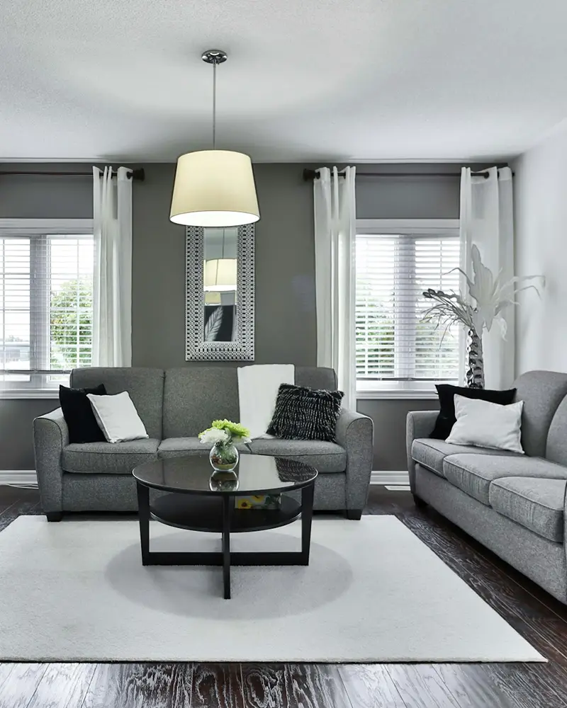
Charcoal gray is the perfect balance between bold and neutral. It’s dark enough to make a statement but still versatile enough to work with a variety of styles.
Unlike flat blacks, charcoal gray has depth, making it feel softer and more inviting. This shade works beautifully in a modern living room with crisp white trim, warm wood accents, and plenty of layered textures.
It’s moody without feeling too heavy, making it a top choice for those who want a bold but livable look.
🖌 Try This Shade: Sherwin Williams Peppercorn – A deep charcoal gray that’s bold yet balanced, perfect for dramatic walls.
11. Fiery Red
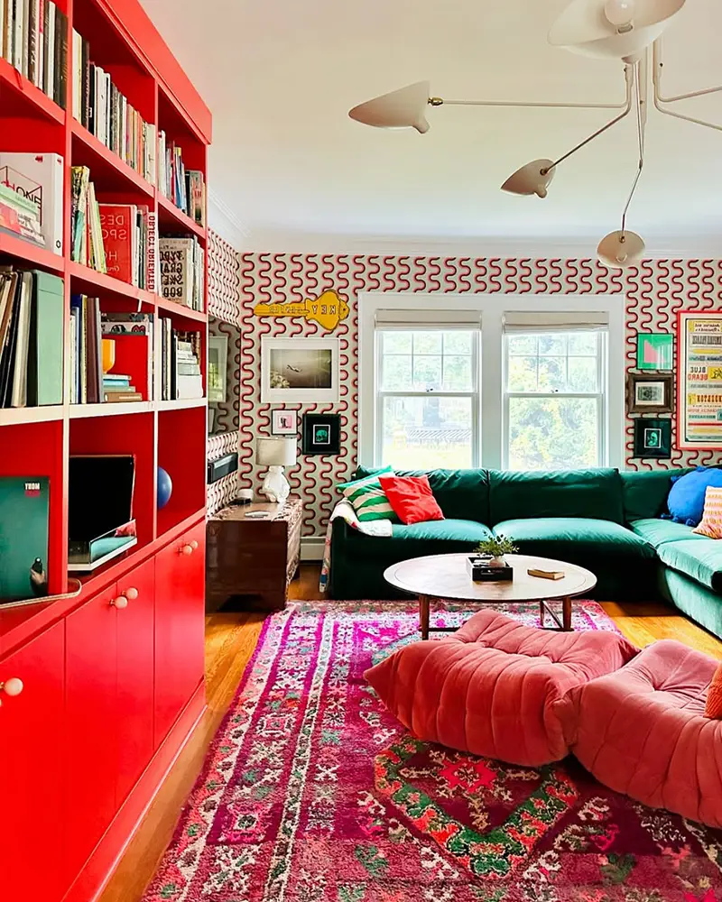
Nothing commands attention quite like a bold red living room. It’s vibrant, passionate, and full of life.
Fiery red is a great choice for those who love warmth and drama in their space. While it might seem like a daring choice, red can be surprisingly sophisticated when paired with deep wood tones, neutral furnishings, or metallic accents.
It creates a cozy yet high-energy atmosphere, making it ideal for social gatherings and lively spaces.
🖌 Try This Shade: Benjamin Moore Caliente – A striking, deep red with just enough warmth to feel inviting.
12. Teal Blue

Teal is one of those bold colors that manages to feel both rich and refreshing at the same time.
It’s a blend of blue and green, creating a jewel-toned effect that feels luxurious and eye-catching. Teal works beautifully in both modern and vintage-inspired spaces, pairing well with warm woods, deep reds, or even mustard yellow for a fun contrast.
It’s a fantastic way to add personality to your living room while maintaining a sense of sophistication.
🖌 Try This Shade: Behr Ocean Abyss – A deep, dramatic teal that brings richness and vibrancy to a space.
13. Forest Green
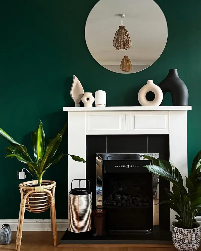
Forest green is a bold yet grounding color that makes a living room feel deeply connected to nature. It’s rich, dramatic, and incredibly stylish, giving off a warm, cozy vibe.
This shade pairs beautifully with earthy tones, warm metallics, and natural textures like leather, stone, or wood.
Whether you want a classic, elegant space or something more rustic and organic, forest green is a top-tier choice for a bold yet livable color.
🖌 Try This Shade: Sherwin Williams Ripe Olive – A deep, earthy green that feels both moody and timeless.
14. Cobalt Blue
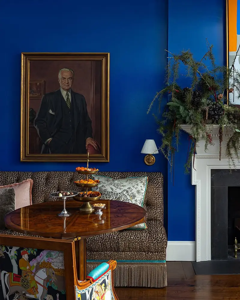
If you love a bright, electric statement color, cobalt blue is the way to go. It’s a high-impact shade that immediately energizes a living room.
Unlike navy, which is deep and moody, cobalt is bold and lively, making it a fantastic choice for a contemporary or eclectic space.
It works beautifully against crisp white trim, deep wood tones, or even paired with unexpected colors like burnt orange or mustard yellow for a striking contrast.
🖌 Try This Shade: Benjamin Moore Patriot Blue – A bold, rich cobalt blue with a vibrant, dramatic flair.
15. Ruby Red
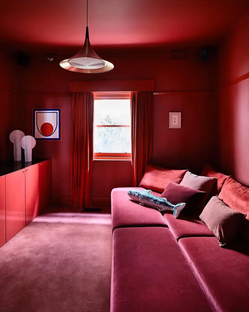
Ruby red is a deeper, more sophisticated take on bold red. It leans into a jewel-toned elegance, making it feel rich and inviting rather than overwhelming.
This shade works beautifully in traditional, modern, or vintage-inspired living rooms, adding warmth and a sense of luxury.
When paired with deep greens, moody blues, or even soft blush tones, ruby red creates a striking, high-end aesthetic that feels timeless.
🖌 Try This Shade: Sherwin Williams Radish – A deep ruby red with a velvety, jewel-toned depth.
16. Moody Turquoise
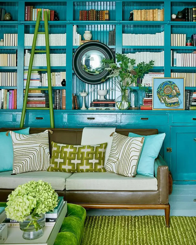
Moody turquoise is a stunning blend of blue and green with a slightly dark, mysterious quality.
It’s the perfect bold shade for a living room that needs drama without feeling overly intense. Unlike bright turquoise, which can feel playful, a moody version has depth and sophistication, making it a fantastic choice for those who love rich colors.
It pairs beautifully with warm neutrals, deep gold accents, or even dark wood furniture.
🖌 Try This Shade: Farrow & Ball Vardo – A rich, deep turquoise with just the right amount of moodiness.
17. Olive Green
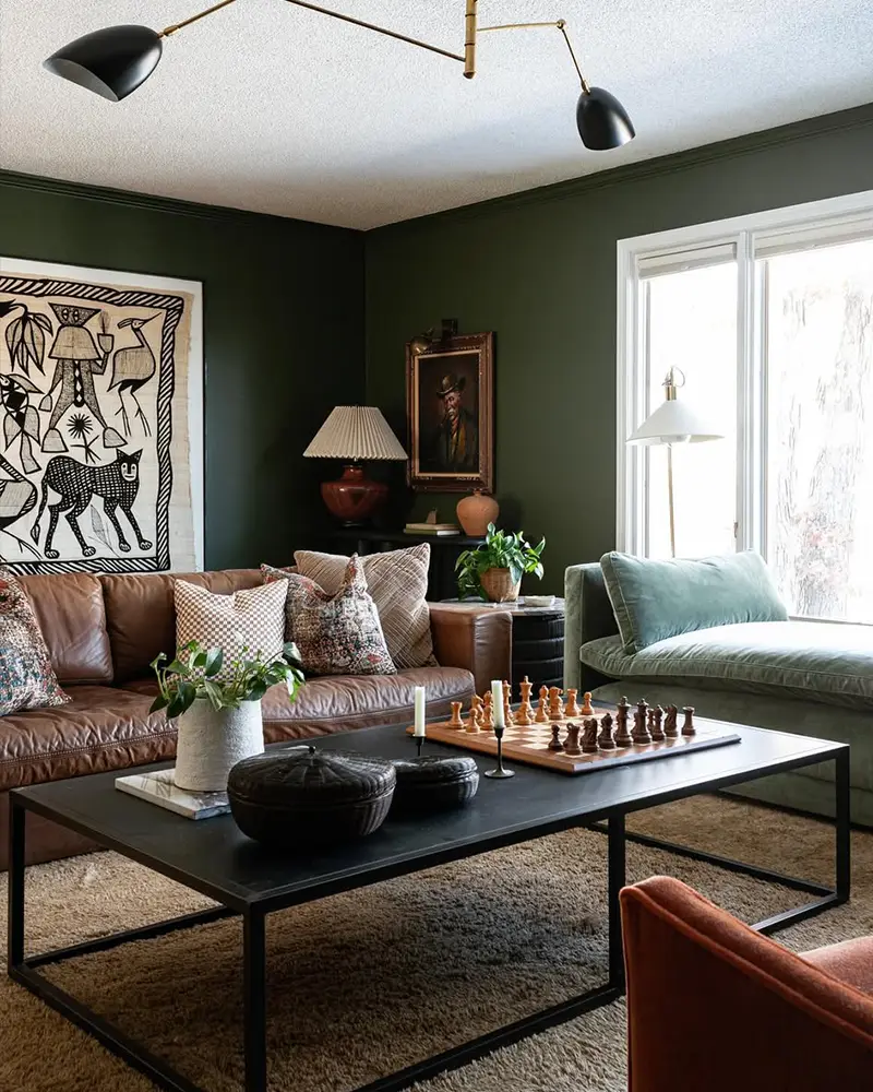
Olive green is a muted, earthy take on bold color. It’s rich, grounding, and brings a touch of nature into the living room while still making a statement.
Unlike bright greens, olive has a slightly subdued, sophisticated quality, making it a perfect choice for those who want a bold color that still feels organic and relaxed.
It works well with deep burgundies, warm golds, and soft neutrals for a beautifully balanced space.
🖌 Try This Shade: Benjamin Moore Dakota Shadow – A deep, warm olive green with an effortlessly bold presence.

