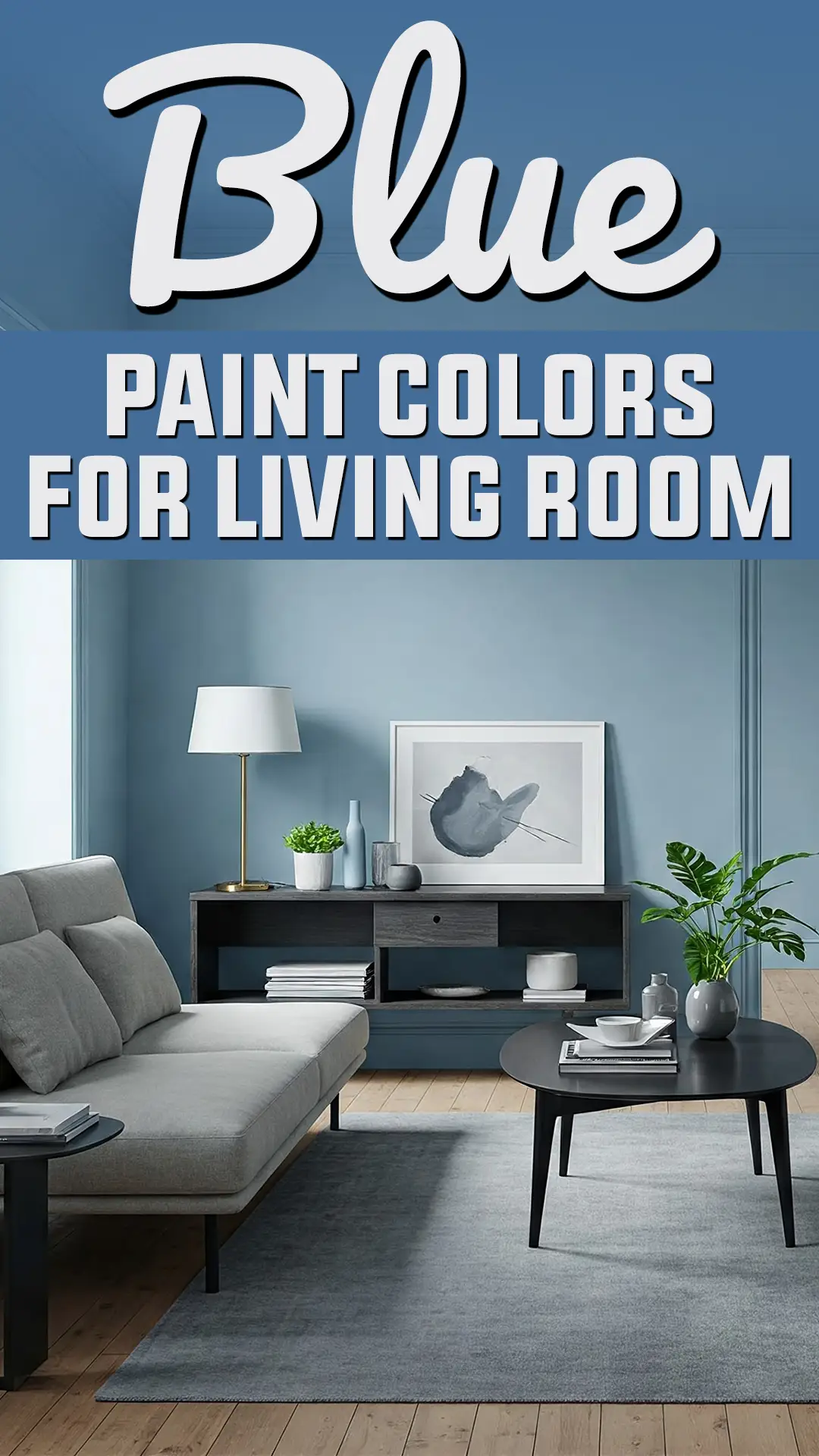
When it comes to creating a living space that feels both inviting and distinctive, few color choices offer the versatility and timeless appeal of blue.
Beyond mere aesthetic preference, blue paint creates a psychological foundation for your living room – the heart of your home where you both recharge and connect with others.
Blue stands apart from trendy colors that quickly feel dated. From the palest sky blue to the deepest navy, blue paint colors possess a unique duality – they can make a definitive statement while functioning essentially as neutrals in your decorating scheme.
This remarkable versatility is why blue consistently ranks among designers’ favorite choices for living rooms across diverse styles and settings.
What makes blue particularly special is its psychological impact. Research has shown that blue tones can actually lower blood pressure and heart rate, creating spaces that naturally promote relaxation and well-being.
Yet unlike some calming colors that risk feeling flat or uninspiring, blue retains visual interest and depth that keeps spaces feeling dynamic and engaging.
The challenge, of course, lies in finding the perfect blue amid the seemingly endless options available. The blue that transforms your specific living room depends on numerous factors: your natural lighting, architectural features, existing furnishings, and the atmosphere you hope to create.
A blue that looks magnificent in a sun-drenched southern exposure might fall flat in a north-facing room. The shade that complements traditional furniture might overwhelm contemporary pieces.
That’s why I’ve carefully curated this collection of seventeen exceptional blue paint colors – each one tested and proven across countless real-world applications. These aren’t simply pretty blues; they’re problem-solving colors that address specific living room challenges while creating spaces of exceptional beauty and livability.
Whether you’re seeking a whisper-light blue that expands your space, a sophisticated mid-tone that balances between statement and subtlety, or a dramatic navy that cocoons you in elegant comfort, you’ll find your perfect blue within this thoughtfully selected palette.
Why Choose Blue Paint Colors for Living Room?
Blue paint creates a versatile foundation for living rooms, offering numerous psychological and design benefits. Blue evokes feelings of calm and tranquility, making it perfect for spaces where you relax and entertain.
Research suggests blue can actually lower blood pressure and heart rate, creating a peaceful atmosphere after a hectic day.
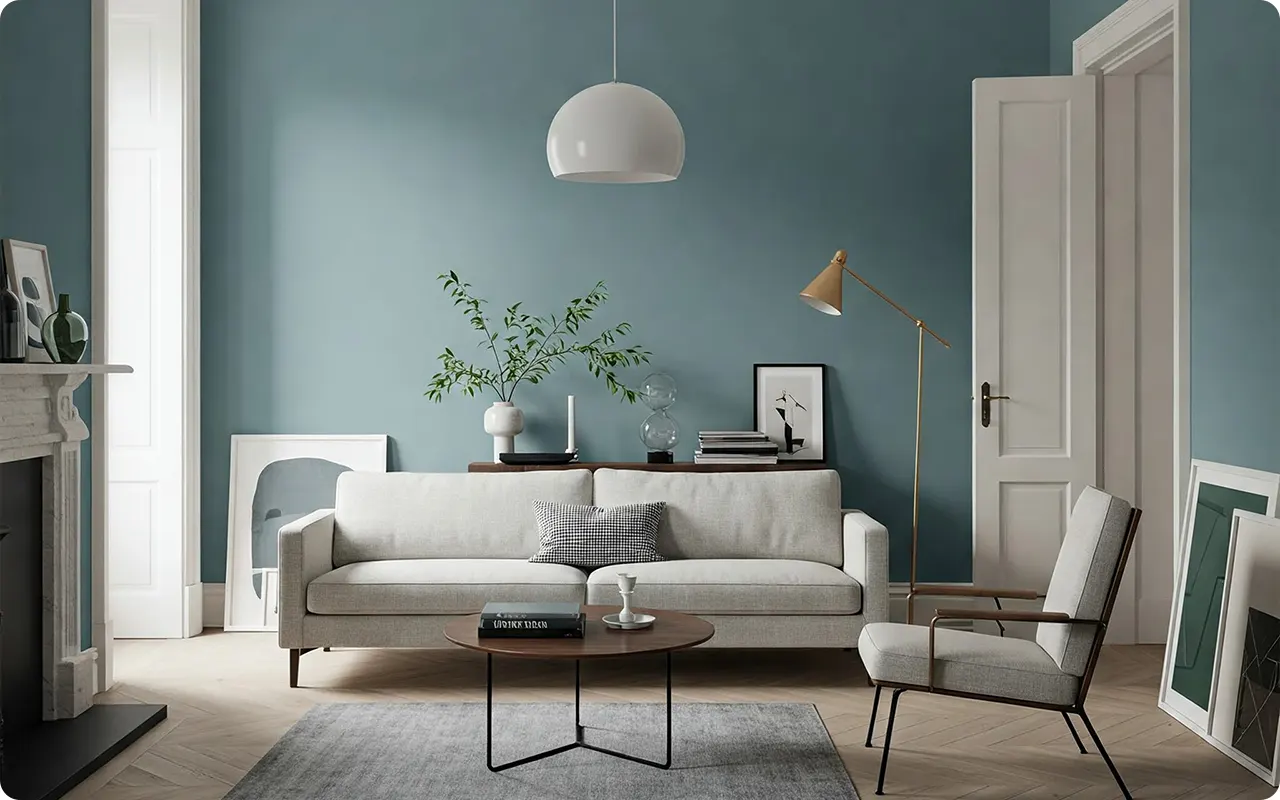
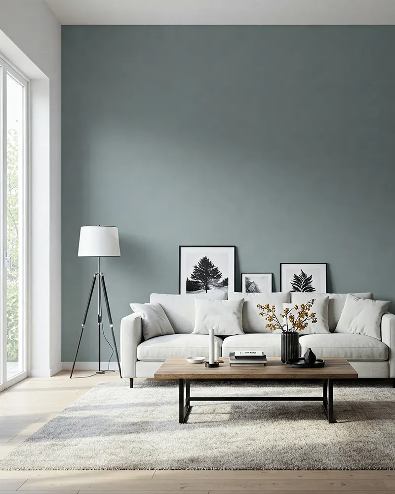
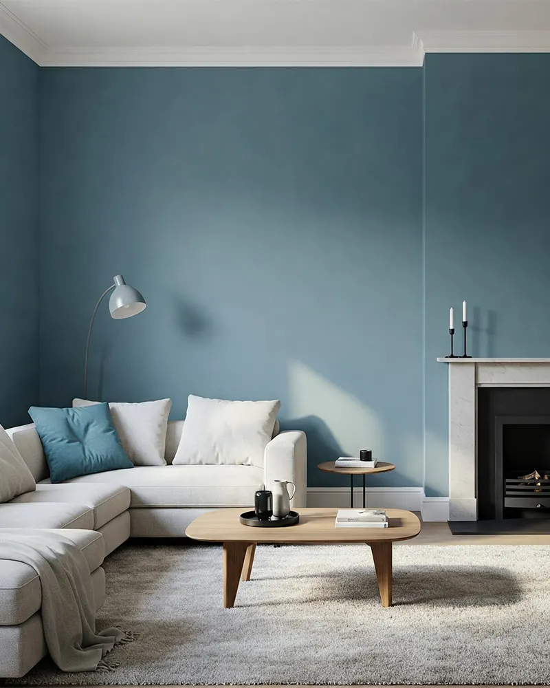
From a design perspective, blue provides exceptional versatility. Lighter blues make rooms feel more spacious and airy, while deeper navy or indigo tones add sophistication and drama. Blue also works beautifully across design styles – from coastal and traditional to modern and contemporary.
Unlike trendy colors that quickly date, blue has timeless appeal. Navy blue in particular has become recognized as a “new neutral” that works as well as beige or gray but with more personality.
Blue also transitions seamlessly between seasons – feeling cool and refreshing in summer while creating a cozy, enveloping atmosphere in winter when paired with warm lighting and textiles.
Tips for Choosing Best Blue Paint Colors for Living Room
Consider natural lighting: Rooms with northern exposure tend to cast a cooler light, so warmer blues with gray or green undertones help balance this effect. Southern-facing rooms with abundant natural light can handle cooler, crisper blues.
Assess your ceiling height: For rooms with lower ceilings, lighter blues create an illusion of more height and space. Taller rooms can support deeper blues, which help create a more intimate feeling.
Test samples properly: Paint large sample boards (at least 2×2 feet) rather than directly on walls, and move them around the room throughout the day to observe how lighting changes the color appearance.
Think about undertones: Blues can have undertones of gray, green, or purple that significantly affect how they look. Gray-blues tend to be sophisticated and neutral, green-blues feel fresh and natural, and purple-blues create a rich, regal impression.
Consider room function: Is your living room primarily for relaxing, entertaining, or family activities? Softer, lighter blues promote relaxation, while more saturated blues create energy and encourage socialization.
Coordinate with existing elements: Consider fixed features like flooring, stone fireplaces, or architectural details when selecting your blue shade to ensure harmony.
What Colors Complement Blue Paint Colors in Living Room?
Neutrals: White and cream create classic, fresh combinations with blue, highlighting its depth. Gray pairs beautifully with blue for a sophisticated, contemporary look. Natural wood tones warm up blue’s coolness and add organic texture.
Metallics: Gold and brass accents add warmth and luxury to blue rooms, creating a timeless elegance. Silver and chrome provide a clean, modern contrast, especially with deeper blues.
Complementary colors: Orange and coral (blue’s complementary colors) create vibrant, energetic contrasts when used as accents through pillows, artwork, or small furniture pieces.
Analogous colors: Green and purple, which sit beside blue on the color wheel, create harmonious combinations. Teal and aqua can create a serene, coastal feeling, while lavender and blue create a soft, romantic atmosphere.
Earthy tones: Terracotta, camel, and olive add warmth and grounding to blue rooms while providing sophisticated contrast.
When accessorizing a blue living room, consider incorporating a combination of these complementary colors through textiles, artwork, and decorative objects to create a balanced, cohesive space that still offers visual interest and depth.
Top 17 Blue Paint Colors for Living Room
Each of these seventeen blues represents the absolute pinnacle of what blue paint can offer your living room.
Beyond simply looking beautiful, these colors have been proven through countless real-world applications to create spaces with remarkable livability, sophistication, and timeless appeal.
The perfect blue transforms your living room from a simple space into a true sanctuary – one that both energizes and relaxes, impresses guests while comforting family.
These particular shades have earned their places on this list through their exceptional performance, remarkable complexity, and unparalleled ability to create living rooms that feel simultaneously personal and universally appealing.
Light Blues
1. Benjamin Moore Breath of Fresh Air

This whisper-light blue truly lives up to its name. It’s that perfect barely-there blue that transforms with the lighting throughout the day.
In morning sun, it reads as a soft sky blue, while evening light brings out subtle gray undertones. It’s especially magical in rooms with lots of natural light, creating an expansive, airy feeling that never feels cold.
2. Sherwin-Williams Icelandic

If you’re worried about blue feeling too cold, Icelandic is your answer. This pale blue carries warm undertones that keep it feeling cozy rather than clinical.
It pairs beautifully with cream, beige, and natural woods, making it perfect for transitional or farmhouse-inspired spaces. It’s light enough to work as a neutral but still has enough color to stand on its own.
3. Behr Watery

Despite its name, there’s nothing wishy-washy about this color. This pale aqua-blue has just enough green to feel fresh and natural without screaming “beach house.”
It’s especially effective in rooms that don’t get ideal lighting, as its slight warmth prevents it from looking flat or dingy in dimmer conditions.
4. Farrow & Ball Light Blue

Don’t let the simple name fool you—this is a sophisticated blue with complex gray-green undertones that change dramatically with the light.
In bright spaces, it’s a clear, traditional blue, while in shadowy corners, it deepens to a beautiful dusty teal. This historical color brings instant character to contemporary spaces.
Medium Blues
5. Benjamin Moore Van Deusen Blue

This is that elusive “perfect blue” many designers swear by. It’s a medium-toned blue with subtle gray undertones that reads as elegant in any lighting condition.
Not too dark, not too light, it creates a sophisticated backdrop that works particularly well in traditional living rooms with classic furniture pieces and brass accents.
6. Sherwin-Williams Foggy Day

The name captures it perfectly—this blue has the soft, diffused quality of a misty morning. It’s a true chameleon that can appear more gray or more blue depending on your lighting and décor.
This versatility makes it an excellent choice if you like to change accessories seasonally, as it adapts beautifully to warm or cool accent colors.
7. Farrow & Ball Stone Blue

This historical blue has stood the test of time for good reason. It carries a depth rarely found in mid-tone blues, with subtle slate undertones that give it a grounded, earthy quality.
It’s particularly magical in rooms with both morning and evening light, as it shifts from bright and clear to deep and mysterious as the day progresses.
8. Benjamin Moore Mount Saint Anne

This blue-green medium tone has a unique ability to feel both refreshing and calming. Its subtle green undertones bring a natural element that pairs beautifully with houseplants and natural textiles.
It’s especially effective in living rooms that open to outdoor spaces, creating a seamless indoor-outdoor flow.
9. Behr French Colony
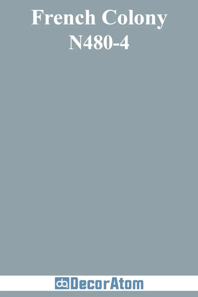
This dusty colonial blue carries historical weight without feeling stuffy. It’s a medium blue with subtle gray undertones that create depth without darkness.
It works particularly well in rooms with traditional architectural details like crown molding or wainscoting, highlighting these features without overwhelming them.
Blue-Grays
10. Sherwin-Williams North Star

If you’re hesitant about going too blue, this blue-gray delivers subtle color while functioning essentially as a neutral.
It’s that rare color that looks equally good with warm woods and cool metals, making it incredibly versatile for various furniture styles. In morning light, it leans more blue; by evening, it transforms into a sophisticated gray.
11. Benjamin Moore Boothbay Gray

Despite its name, this is definitely a blue-gray that leans more blue than gray. It has a wonderful clarity that stays true throughout the day rather than shifting dramatically.
This consistent quality makes it ideal for open-concept spaces where you need a color that performs well under various lighting conditions.
12. PPG Annapolis Blue

This maritime-inspired blue-gray evokes the color of distant ocean horizons. It’s slightly deeper than most blue-grays, giving it more presence while still maintaining versatility.
It pairs exceptionally well with crisp whites and natural linens, creating a refined coastal look without resorting to nautical clichés.
Deep Blues
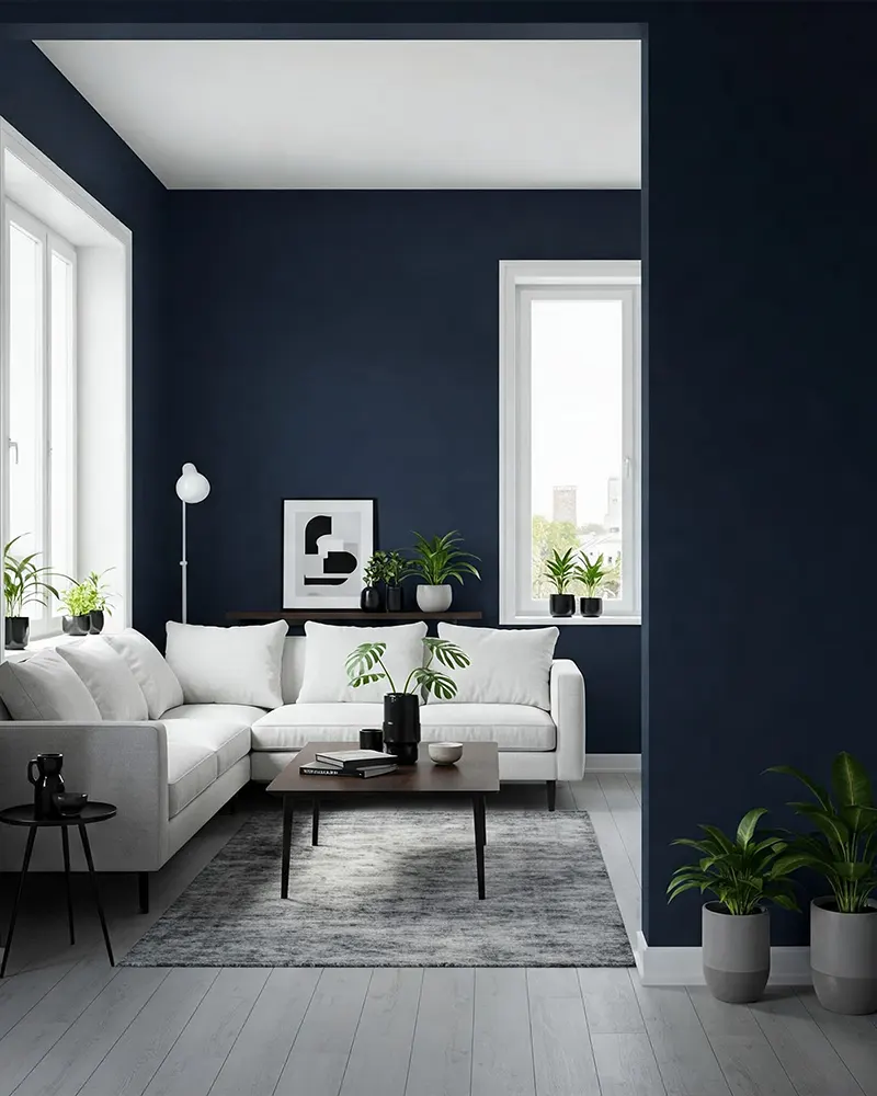
13. Benjamin Moore Hale Navy

Ask any designer for their go-to navy, and Hale Navy frequently tops the list. This deep blue somehow avoids looking black even in low light, maintaining its true navy character at all times.
It has the unique ability to make a room feel both larger and cozier simultaneously, creating depth that draws you in rather than closing down the space.
14. Sherwin-Williams Naval

This is navy blue perfected—deep and rich without appearing black in shadowy corners. It carries subtle undertones that keep it from feeling flat or one-dimensional.
While bold, it functions almost as a neutral, pairing beautifully with everything from coral and brass to crisp whites and natural woods.
15. Farrow & Ball Stiffkey Blue

This inky blue has an unmistakable depth that photographs beautifully and creates instant drama. Named after the blue-black mud of Stiffkey Beach in Norfolk, it carries natural undertones that keep it from feeling cold despite its depth.
It’s particularly striking in rooms with substantial natural light, where its complex undertones truly shine.
16. Benjamin Moore Gentleman’s Gray

Despite its name, this is decidedly blue, not gray—a deep, dramatic blue with subtle green undertones that create unexpected richness.
It’s that rare dark color that doesn’t require perfect lighting to work well, as its depth creates interest even in dimmer spaces. It pairs beautifully with cognac leather and brass for a sophisticated, library-inspired living room.
17. Behr Midnight Show

This blue-black creates dramatic impact while still reading definitively as blue rather than black. It has an almost velvety appearance on walls that adds remarkable texture and depth.
While dark, it creates a cocooning effect rather than a gloomy one, especially when paired with strategic lighting and reflective surfaces.