
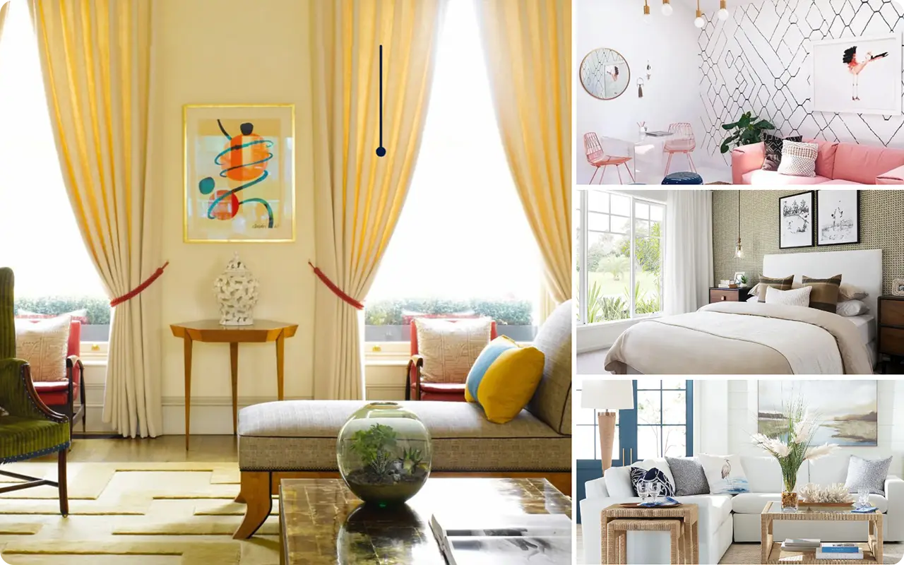
There’s something undeniably calming about coastal interiors. Maybe it’s the way soft blues and breezy neutrals mimic the shoreline, or how gentle greens and sun-washed yellows feel like summer all year long.
I’ve always been drawn to that coastal look—not the kitschy anchors and seashells everywhere kind, but the quiet, elegant style that feels light, airy, and grounded in nature.
Over the years, I’ve explored so many paint colors trying to recreate that feeling in different rooms, and time after time, I’ve found myself coming back to Sherwin Williams.
Their coastal-inspired palette is full of dreamy blues, calming neutrals, and nature-kissed greens that truly bring the beach to your doorstep—no matter where you live.
So, if you’re ready to bring that relaxed, vacation-like vibe into your home, these 21 Sherwin Williams coastal paint colors are a great place to start.
Also Read: 31 Most Popular Sherwin Williams Paint Colors
What are Coastal Paint Colors?
Coastal paint colors are inspired by the natural elements you’d find along the shoreline—soft skies, foamy waves, sandy beaches, sea glass, and weathered driftwood.
These shades tend to be light, fresh, and airy, often featuring soft blues, seafoam greens, gentle neutrals, and sun-bleached pastels.
They’re not bold or overly saturated—instead, they bring a sense of calm and openness to a space, much like standing at the edge of the ocean.
Whether you’re channeling a breezy Cape Cod cottage, a tropical seaside villa, or a minimalist modern beach home, coastal paint colors help set the perfect laid-back tone.
Where to Use Coastal Paint Colors
The beauty of coastal colors is that they work just about anywhere in the home.
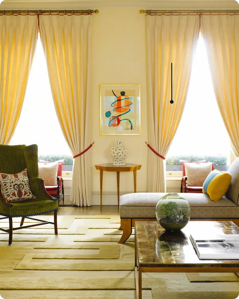
In living rooms, they create a welcoming and serene backdrop, especially when layered with textures like linen, rattan, and light wood.
Bedrooms painted in coastal tones instantly feel more restful, like a weekend escape.
Bathrooms and laundry rooms are also perfect spots—especially when you want to bring in that fresh, clean, spa-like feeling.
Kitchens and dining areas look beautiful with soft blues and greens on cabinets or walls, while an entryway painted in a coastal shade can set a calm, welcoming tone as soon as you walk in.
Even outdoor spaces—like a porch ceiling painted in sky blue or a coral-colored front door—can carry that coastal vibe outside.
How to Pick The Best Coastal Paint Color?
Choosing the right coastal paint color starts with the feeling you want to evoke. Do you prefer soft and airy, or bold and nautical?
Start by thinking about the natural elements that inspire you—maybe it’s the misty gray of a foggy morning, the pale aqua of tide pools, or the golden warmth of beach grasses.
Consider how much natural light your space gets, too. Rooms with lots of sunlight can handle cooler tones like blue-grays and seafoam, while darker rooms might need warmer neutrals or sun-kissed yellows to stay inviting.
Don’t be afraid to sample a few shades on your wall and see how they shift throughout the day.
Coastal colors can be surprisingly chameleon-like—they’ll look different in morning light, late afternoon, and under artificial lighting. That’s part of their charm!
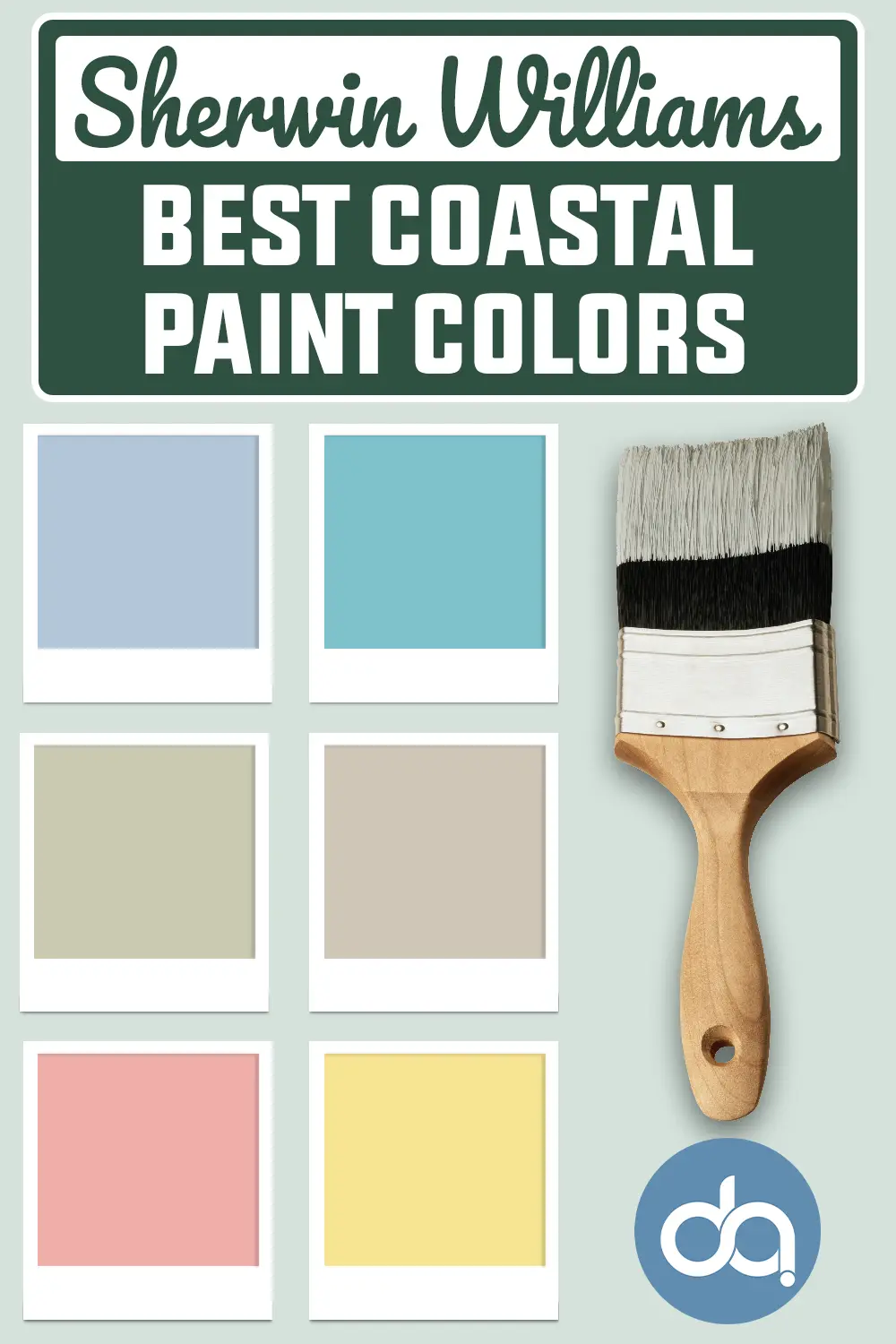
Top 21 Sherwin Williams Coastal Paint Colors
Now that you’ve got a feel for what coastal colors are and how to use them, let’s dive into the best part—exploring the actual colors!
I’ve gathered 21 of my favorite Sherwin Williams coastal paint shades, organized into soothing neutrals, oceanic blues, gentle greens, sun-washed yellows, and playful pinks.
Each one brings a unique mood, but all of them can help you capture that relaxed, effortless coastal style.
Best Sherwin Williams Coastal Neutrals
If you love the idea of creating a serene, beach-inspired home, start with a palette grounded in coastal neutrals.
These calming shades echo sandy shores, driftwood, soft seashells, and sun-bleached fabrics.
They’re versatile enough to use throughout your entire home and serve as a beautiful base for layering in bolder coastal colors.
1. Samovar Silver SW 6233

Samovar Silver is a quiet, silvery gray with a subtle blue undertone that immediately brings to mind misty mornings by the sea.
It’s cool and sophisticated without feeling cold, which makes it ideal for a spa-inspired bedroom or a soft, serene living space.
This color catches the light beautifully and pairs well with clean whites, soft aquas, and sandy beige for a true coastal balance.
2. Comfort Gray SW 6205

Despite its name, Comfort Gray leans more green than gray, with a hushed quality that’s incredibly soothing.
It’s one of those shades that shifts beautifully throughout the day, moving between seafoam and misty sage depending on the light.
I love using it in bedrooms or reading nooks where you want a touch of color that still feels tranquil and grounded.
Also Read: Comfort Gray SW 6205 Paint Color Review
3. Greek Villa SW 7551
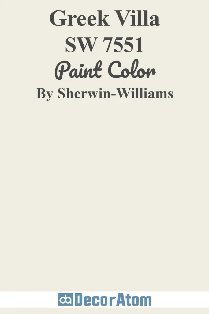
Greek Villa is a soft, creamy white with just enough warmth to keep it from feeling stark. It’s not too yellow, not too beige—just the right shade of coastal white that feels sun-washed and timeless.
Use it as an all-over wall color or on trim and cabinetry to give your other colors a clean, airy contrast. It’s also one of Sherwin-Williams’ most popular whites for good reason—it plays well with nearly everything.
4. Accessible Beige SW 7036
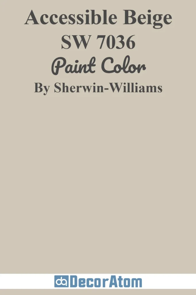
Accessible Beige has a cozy, sandy quality that makes it a perfect nod to the beach without going full-on tan.
This warm greige has subtle gray undertones that keep it modern, and it’s one of those colors that adapts beautifully to its surroundings.
In a coastal setting, it works effortlessly alongside woven textures, creamy whites, and sea-glass tones.
Also Read: 17 Best Neutral Paint Colors for Living Room
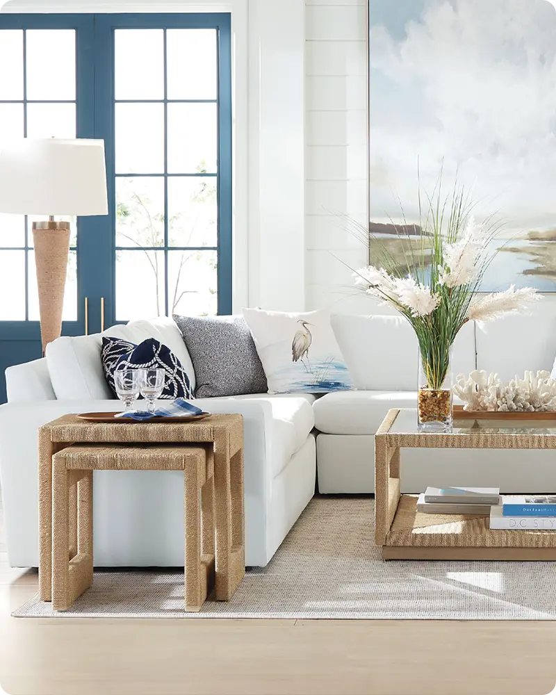
Best Sherwin Williams Coastal Blue Colors
If there’s one color that instantly brings the coast to mind, it’s blue. But not just any blue—think the hazy hue of a morning sky, the clear aqua of shallow waters, or the deep, moody navy of the ocean at dusk.
Sherwin Williams has mastered these seaside-inspired shades, offering a wide range of blues that work beautifully in beachy interiors.
Some of these colors are soft and barely-there, perfect for creating a light and airy feel, while others lean into that classic nautical charm.
5. Topsail SW 6217

Topsail is one of those barely-there blues that’s perfect if you want just a whisper of color. It has a gentle green undertone that feels fresh and breezy—like a soft wind blowing through sheer linen curtains.
This shade is particularly beautiful in sun-filled rooms, where it enhances the natural light without overwhelming the space.
6. Upward SW 6239

Named Sherwin-Williams’ Color of the Year for 2024, Upward is a dreamy blue-gray that evokes the quiet calm of early morning skies.
It has a softness that makes it easy to live with, and you can use it almost like a neutral. I love how it looks in bedrooms, hallways, or even on cabinetry when paired with warm whites and brushed nickel finishes.
7. Watery SW 6478

Watery is a vibrant aqua with just the right touch of green, like sunlight reflecting on shallow coastal waters.
It brings an energetic yet relaxed vibe to any room, and it’s especially striking in bathrooms, kitchens, or as an accent wall.
The color shifts beautifully depending on the time of day and adds an uplifting coastal charm without feeling juvenile.
8. Blissful Blue SW 6527

Blissful Blue is a soft, powdery blue that feels like a peaceful day under clear skies.
There’s something effortlessly happy about this color—it doesn’t try too hard but still makes an impact. Use it in bedrooms, nurseries, or beach-themed guest rooms, especially if you’re after a color that feels both classic and fresh.
9. Rapture Blue SW 6773

Rapture Blue is for those who want something a little bolder, a little brighter.
It’s a turquoise-meets-aqua shade that brings a cheerful, tropical flair to a coastal palette.
I think it’s ideal for accent walls, beach house doors, or even furniture—anywhere you want a splash of playful energy that still feels connected to the ocean.
10. Naval SW 6244

Naval is a rich navy that’s deep and dramatic, yet surprisingly calming. It’s not too dark to be used as a main wall color, especially in cozy spaces like a study or a bedroom.
It also works beautifully with crisp whites, warm wood tones, and metallic accents to create a classic coastal look that leans a little more sophisticated and timeless.
Also Read: 17 Best Coastal Blue Paint Colors
Best Sherwin Williams Coastal Green Paint Colors
Green is an essential part of a coastal palette, especially when you want to bring the natural world indoors.
These Sherwin-Williams greens echo everything from dune grasses to seaweed and driftwood-covered shores. They’re soft, muted, and always calming—ideal for relaxed spaces that feel grounded and connected to the coast.
11. Sea Salt SW 6204

Sea Salt is one of the most beloved coastal paint colors out there—and for good reason. It’s a soft green with distinct blue undertones, giving it that perfect misty, beachy vibe.
It’s understated enough to use as a whole-room color but has just enough hue to keep it interesting. I’ve seen it work beautifully in bathrooms, bedrooms, and even kitchens—it instantly brings a sense of calm, like stepping into a beachside retreat.
Also Read: Sea Salt SW 6204 Paint Color Review
12. Oyster Bay SW 6206
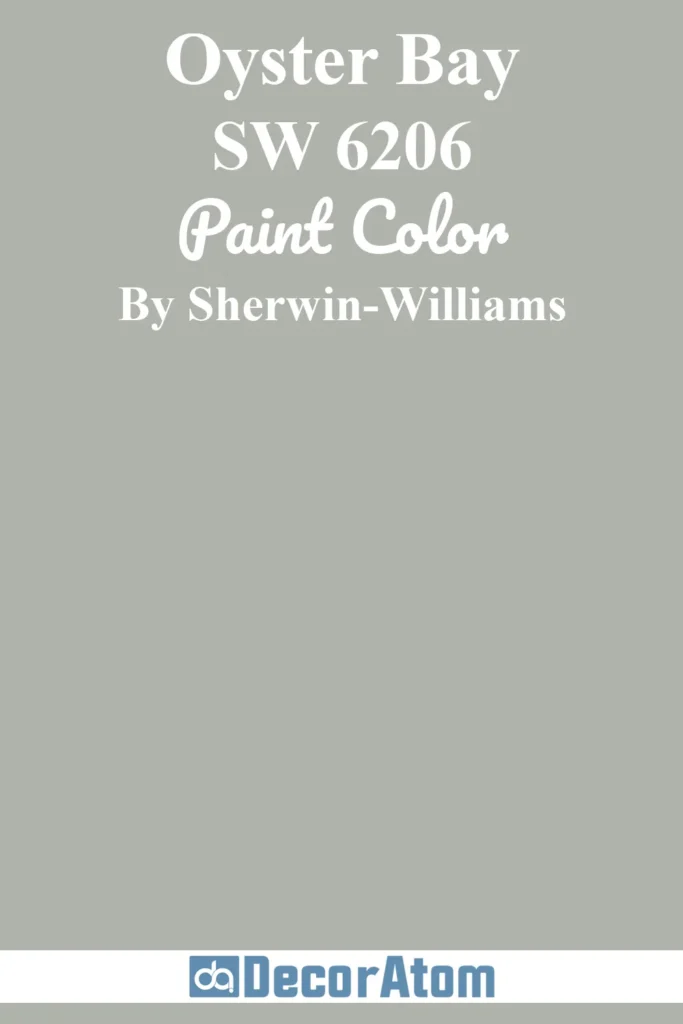
Oyster Bay takes the calm vibe of Sea Salt and adds a little more depth and moodiness. It has earthy green-gray tones that feel natural and grounded—like the weathered shells and driftwood you find on a quiet beach walk.
It’s sophisticated without being fussy and pairs beautifully with stone finishes, woven textures, and soft whites. Ideal for spaces where you want a bit more contrast but still want to keep things coastal and easy.
13. Clary Sage SW 6178

Clary Sage is a warm, soft green with a hint of yellow that makes it feel more botanical than aquatic—but still completely at home in a coastal setting. It reminds me of dune grasses swaying in the breeze or the gentle green of sea oats.
It’s lovely in kitchens, dining rooms, or anywhere you want a nature-inspired green that’s inviting and mellow. Pair it with creamy whites, rattan furniture, or brass accents for a relaxed, earthy look.
Also Read: Clary Sage SW 6178 Paint Color Review
14. Restful SW 6458

True to its name, Restful is a mid-tone green with cool undertones that instantly puts you at ease. There’s a slight aqua feel to it, making it perfect for vintage-inspired bathrooms or charming guest rooms.
It has that mid-century coastal vibe—especially when combined with light woods and a few nautical touches. If you’re drawn to greens that still whisper “ocean,” this is one to sample.
15. Recycled Glass SW 7747

Recycled Glass is a cool, refreshing green that looks like sea glass tumbled smooth by years in the tide. It’s light and uplifting but not overly pastel, with a crystalline clarity that works well in modern coastal spaces.
It’s perfect if you want something subtle yet with personality—great on cabinetry, entryways, or even ceilings for a touch of unexpected charm.
Also Read: 17 Best Sherwin Williams Sage Green Paint Colors
Top Sherwin Williams Coastal Yellow Paint Colors
Yellow may not be the first color you think of for a coastal space, but it has its place—especially when you’re trying to capture that warm, sun-kissed glow.
These soft yellows feel cheerful and organic, like golden beach grass or a sunny shoreline morning. Used thoughtfully, they can bring beautiful balance to a coastal palette.
16. Wheat Grass SW 6408

Wheat Grass is a mellow, earthy yellow with a hint of gold that reminds me of sun-dried dune grass or fields waving near the sea.
It’s not too bright, not too muted—just the right in-between shade for those who want warmth without going full sunflower.
This one looks beautiful in rooms with lots of natural light, especially when grounded by pale woods and neutral accents.
17. Lucent Yellow SW 6400

Lucent Yellow is soft and glowy, like early morning sunlight through a gauzy curtain.
It has a pale golden quality that leans warm but never brassy, making it a surprisingly good alternative to beige or off-white if you want to warm up a space without going bold.
I especially like this shade in living rooms or kitchens with lots of natural textures—think rattan, linen, and light oak.
18. Fun Yellow SW 6908
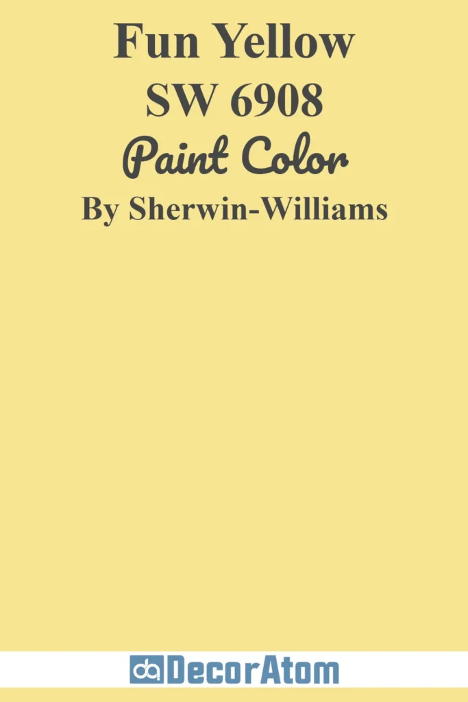
Fun Yellow lives up to its name. It’s a cheerful pastel with a bit of retro flair—like a scoop of lemon sorbet or a vintage beach umbrella.
It works well as an accent in a coastal Boho space, and I’ve seen it look fantastic in kids’ rooms or eclectic sunrooms. Use it in small doses if you’re color-shy, or lean into the playful vibe with layered pastels and lots of natural light.
Also Read: 15 Best Butter Yellow Paint Colors
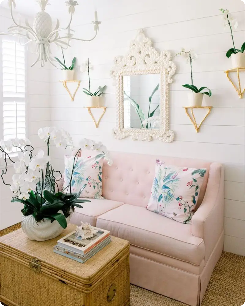
Top Sherwin Williams Coastal Pinks
Coastal pinks add a soft, playful touch—think coral reefs, seashells, and rosy sunsets. These shades feel vibrant yet grounded, and they work best as accents or statement moments within a larger palette.
Whether you want something bold or something barely there, these pinks bring warmth and whimsy to your beachy design.
19. Lei Flower SW 6613
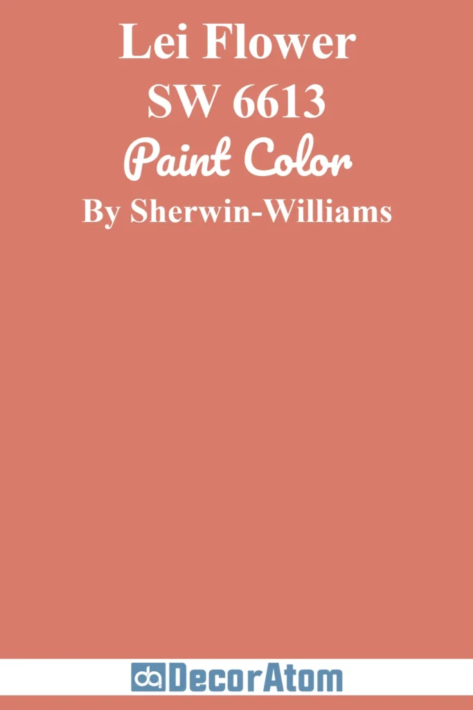
Lei Flower is a lush pink with terracotta undertones, making it more grounded than sweet. It reminds me of hibiscus flowers or coral rock formations on a tropical beach.
This color pairs beautifully with greens, warm woods, or even mustard tones for a fresh, eco-chic palette. It’s especially striking when used in artwork, accent walls, or textiles.
20. Youthful Coral SW 6604
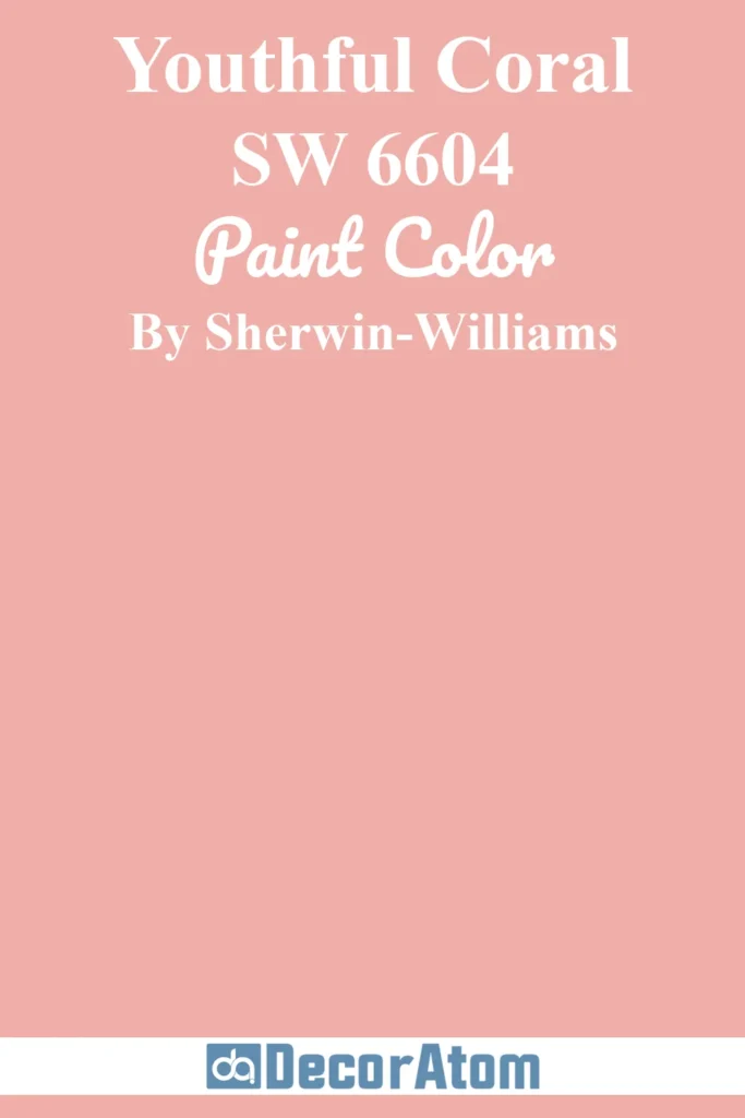
Youthful Coral is bold, fun, and beach-ready. It’s a bright coral with a pink undertone that feels cheerful without being garish.
This one works well in coastal bathrooms, entryways, or as a pop of color on a front door or piece of furniture. Pair it with crisp white or soft beige for a look that feels both energetic and balanced.
21. Rachel Pink SW 0026

Rachel Pink is a vintage-inspired blush that feels romantic and soft—like seashells collected at low tide or the sky just before sunset.
It has a charming, almost nostalgic quality to it that makes it ideal for bedrooms or cozy sitting areas.
This color pairs wonderfully with aged brass, creamy whites, and muted greens for a sophisticated coastal vibe with just a hint of whimsy.
Final Thoughts
Remember, there’s no one-size-fits-all approach to coastal design. Some spaces call for airy whites and soft neutrals, while others shine with ocean blues, warm greens, or even playful coral tones.
Don’t be afraid to sample a few and see how they look in your lighting and space. Paint is one of the simplest (and most affordable) ways to refresh your home—and when you get the color right, everything else seems to fall into place.
So whether you’re redoing a whole room or just looking to add a splash of the sea somewhere small, I hope this list helps you find your perfect coastal color match.
Also Read: 17 Best Coastal Paint Colors for Living Room