Blue has always held a special place in my heart when it comes to color choices for the home.
There’s something about it that feels both timeless and fresh, a color that can calm your nerves after a long day but also bring a burst of energy when you want it to.
Whether it’s the soft whisper of a pale blue wall or the bold drama of a deep navy accent, blue has this incredible versatility that makes it my go-to recommendation for so many spaces.
Over the years, I’ve tested and lived with countless shades, but Sherwin-Williams blues have consistently stood out for their depth, personality, and ability to adapt to different moods and styles.
That’s why I’m excited to share my top 21 Sherwin-Williams blue paint colors that cover everything from dreamy pastels to moody midnight hues.
If you’ve ever wondered which blue might work best in your home, you’re in the right place.
Also Read: 17 Best Sherwin Williams Blue Gray Paint Colors
What are Blue Paint Colors?
When we talk about blue paint colors, we’re referring to any hue that falls within the blue spectrum, from the palest sky blues to the deepest navy tones.
Blue paint colors can range widely in tone and temperature. Some lean toward the cooler end, feeling crisp and refreshing, while others carry warm undertones that add coziness and richness.
What makes blue so fascinating is its incredible variety. It can evoke the calmness of the ocean, the vastness of the sky, or the mystery of twilight.
Blue also has the unique ability to either recede visually, making rooms feel bigger, or create a striking, enveloping cocoon depending on how dark or light it is.
In paint, blue is a classic choice for everything from kitchens and bathrooms to bedrooms and even exterior doors.
Where to Use Blue Paint Colors?
Blue is one of the most versatile colors for home interiors and exteriors, and its applications are nearly endless.
For rooms where you want to promote relaxation and calm, like bedrooms and bathrooms, softer blue shades create a peaceful sanctuary.
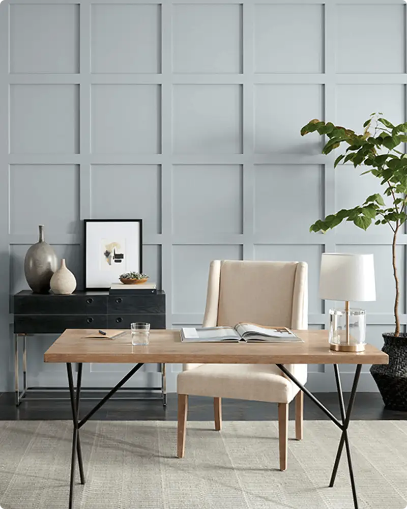
On the other hand, bolder blues work beautifully in living rooms, dining rooms, or offices to add drama and personality.
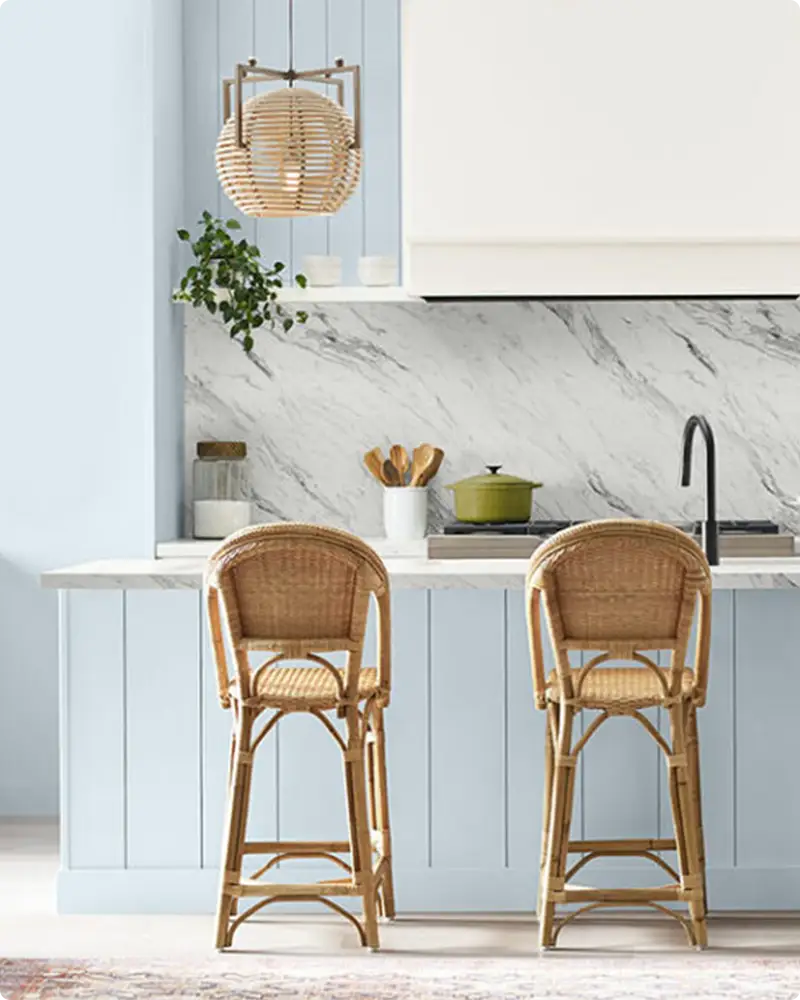
Kitchens are also a fantastic place to experiment with blue paint, especially on cabinets or accent walls.
Blues pair well with stainless steel appliances and natural materials, giving a modern yet timeless vibe. Don’t forget about entryways and front doors, deep navy or rich cobalt blues make inviting, confident first impressions.
Even in smaller spaces like laundry rooms or powder baths, blue can bring a sense of freshness and style without overwhelming the senses.
💥🎁 Christmas & Year-End Deals On Amazon !
Don't miss out on the best discounts and top-rated products available right now!
*As an Amazon Associate, I earn from qualifying purchases.
Also Read: 23 Best Moody Blue Paint Colors
Colors to Pair with Blue Paint Colors
One of the joys of blue is how well it plays with other colors. Crisp whites are the classic companion, creating a clean, coastal-inspired look that’s both bright and timeless.
Soft neutrals like beige, taupe, or warm grays offer a more subdued pairing, perfect for creating a cozy, layered space.
For a bit more contrast and richness, consider pairing blue with warm wood tones, brass, or gold accents, these add warmth and balance to cooler blues.
If you’re feeling adventurous, blues also work beautifully with blush pinks, mustard yellows, or even deep greens to create vibrant, unexpected palettes.
When working with navy or darker blues, lighter colors in the same room can help keep things balanced and prevent the space from feeling too heavy.
Also Read: 17 Best Blue Paint Colors for Living Room
Tips for Choosing The Best Blue Paint Colors
Choosing the right blue can feel overwhelming because of the sheer number of options, and Sherwin-Williams offers a fantastic range. Here are some tips I’ve learned along the way to help narrow down your choices:
1. Consider the Light
Blue changes dramatically with light. Test your paint samples at different times of day and in various lighting conditions to see how the undertones shift.
2. Think About Mood
What feeling do you want to create? Soft blues for calm and serenity, or bold blues for energy and drama? Let your mood guide your choice.
3. Pair with Existing Elements
Look at your room’s existing furniture, flooring, and fixtures. Choose a blue that complements rather than clashes with these elements.
4. Test Large Swatches
Small samples are helpful, but painting a large patch on your wall gives a more accurate sense of how the color will feel in the space.
5. Ask for Expert Advice
Sherwin-Williams stores often offer color consultation services, and many have helpful online tools for visualizing color combinations.
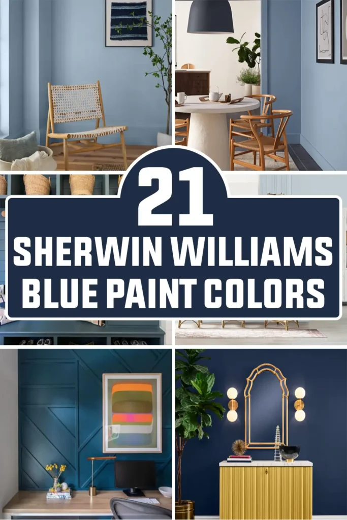
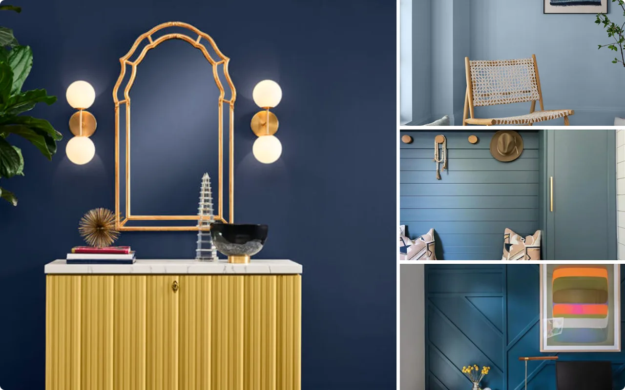
Top 21 Sherwin Williams Blue Paint Colors
Here are my favorite Blue paint colors from Sherwin Williams to decorate with.
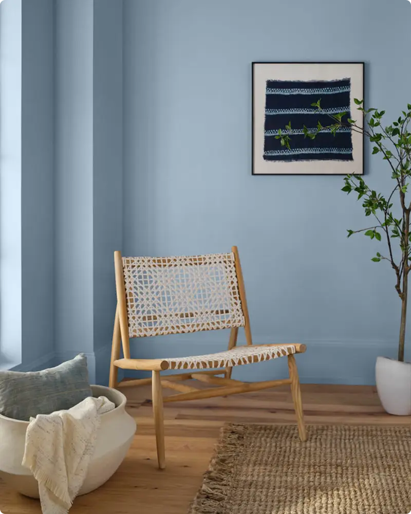
1. Upward SW 6239
Upward is the kind of soft, airy blue that instantly lifts the mood of a space, hence the name. It’s Sherwin-Williams’ 2024 Color of the Year, and for good reason.
There’s a quiet calmness to it that makes any room feel a little more open and serene. What sets it apart is the subtle periwinkle undertone, giving it just a hint of personality without veering too far into purple territory.
I love using Upward in bathrooms for a spa-like retreat or in a living room with lots of white and natural light. It pairs beautifully with warm wood tones and even richer navy accents for balance.
2. North Star SW 6246
💥🎁 Christmas & Year-End Deals On Amazon !
Don't miss out on the best discounts and top-rated products available right now!
*As an Amazon Associate, I earn from qualifying purchases.
North Star feels like a gentle breeze on a clear day. It’s a light blue with just enough gray in it to tone things down and keep it from feeling juvenile or overly pastel.
This is a great color for those who want a cool, clean look without committing to stark gray or icy tones.
It works wonders in bedrooms, especially those with good natural light, and also looks fantastic on cabinetry if you’re going for that classic cottage look.
Pair it with crisp whites or deeper charcoal accents for a well-rounded palette.
3. Silvermist SW 7621
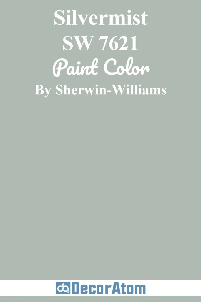
Silvermist is a true shapeshifter. Depending on the lighting and the surrounding decor, it can lean more green, gray, or blue. That’s what makes it so versatile.
It’s one of those colors that brings a soft, soothing vibe wherever it goes, and it’s especially fitting for anyone drawn to the “coastal grandma” aesthetic, think layered neutrals, soft textures, and vintage charm.
Silvermist feels right at home in living rooms, bedrooms, and even entryways, acting as a grounding backdrop for other subtle tones. It’s relaxed without feeling too muted.
4. Dew Drop SW 9641

Dew Drop is that whisper of blue you get when the sky is just starting to lighten at dawn. It’s light and fresh, with a soft greenish undertone that keeps it from reading icy.
This is an excellent choice for anyone who wants a barely-there blue that still adds some life to a neutral room. It works beautifully in nurseries, bathrooms, and small bedrooms where you want a sense of airiness.
I also find Dew Drop particularly charming when paired with warm whites and sandy beiges, it creates a delicate, natural palette that feels effortless.
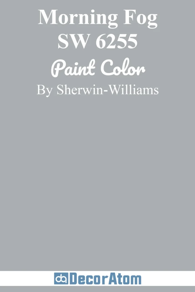
5. Morning Fog SW 6255
💥🎁 Christmas & Year-End Deals On Amazon !
Don't miss out on the best discounts and top-rated products available right now!
*As an Amazon Associate, I earn from qualifying purchases.
There’s something peaceful about Morning Fog. It has a balanced mix of blue and gray, leaning more cool but never feeling too cold. It reminds me of that misty horizon line you see on early mornings by the water.
This is a medium-tone blue-gray that’s excellent for creating a calming atmosphere, especially in rooms that get lots of daylight. It’s a great color if you want depth without going too dark.
Try it in a home office or guest bedroom with white trim and natural textures like linen or rattan to keep it grounded and cozy.
6. Stardew SW 9138

Stardew feels like a soft exhale. It has that dreamy, dusty quality that walks the line between gray and blue, with a touch of warmth depending on the lighting.
It’s not quite pastel, not quite bold, just somewhere in that perfect in-between space that makes it so restful to look at. I love Stardew for bedrooms and bathrooms where you want a hint of color without overwhelming the space.
Pair it with brass accents and natural wood for a relaxed, modern feel. It also works nicely in kitchens when you want something fresh but understated.
7. Windy Blue SW 6240
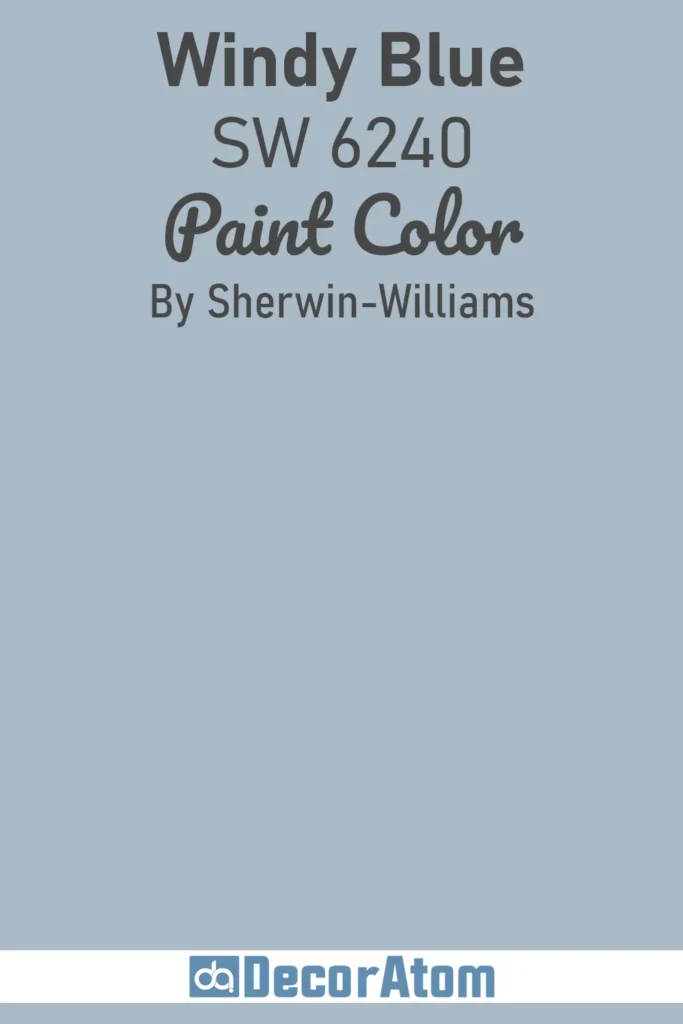
Windy Blue has this gentle charm that makes it feel like a summer day by the coast. It’s a classic mid-tone blue, not too gray and not too vibrant, right in that sweet spot.
There’s something very inviting about it, especially in spaces where you want a bit of cheer without going bold. I’ve seen it used beautifully in bedrooms, mudrooms, and even dining spaces where it adds a fresh touch without being distracting.
Windy Blue plays well with white shiplap, soft wood tones, and neutral textiles, giving it that easy, casual vibe.
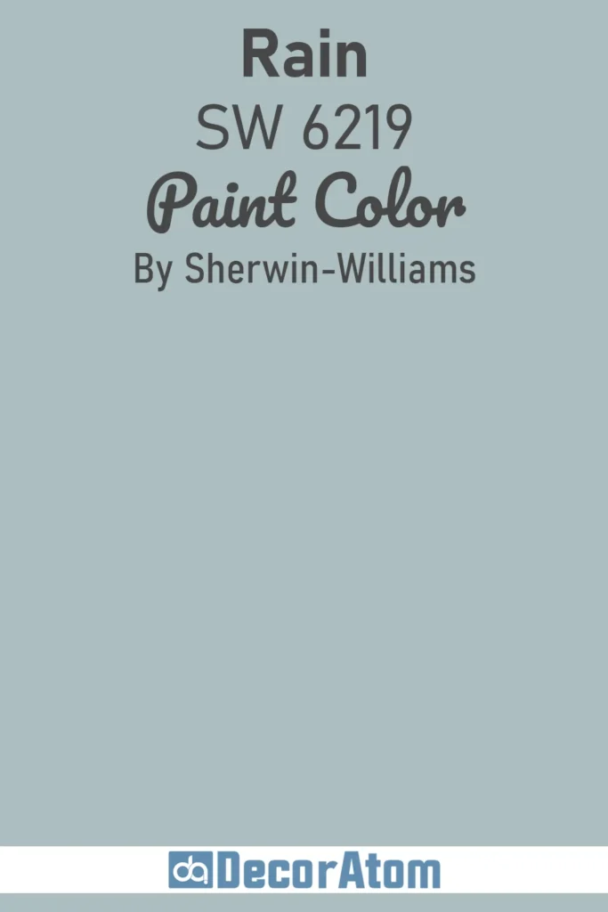
8. Rain SW 6219
💥🎁 Christmas & Year-End Deals On Amazon !
Don't miss out on the best discounts and top-rated products available right now!
*As an Amazon Associate, I earn from qualifying purchases.
Rain is one of those colors that just feels thoughtful and grounded. It has a slate-like quality, with deep gray-blue tones that bring a bit of drama in a very refined way.
If you’re into moody, introspective spaces, this one’s worth a look. It’s ideal for libraries, dining rooms, or even kitchen islands if you want something a little unexpected.
Rain looks stunning against white trim and works especially well with aged brass or matte black hardware. It’s sophisticated without trying too hard.
9. Turkish Tile SW 7610
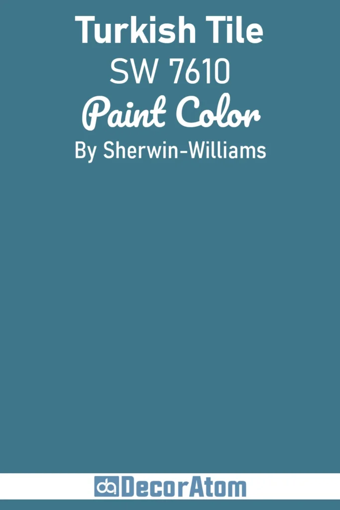
Turkish Tile is bold, rich, and unapologetically vibrant. It’s a deep teal-blue with jewel-tone intensity, making it a fantastic choice for high-impact areas like accent walls or cabinetry.
This color is dramatic in the best way, it holds its own against equally strong shades like emerald green or deep burgundy, but it also pops beautifully against warm neutrals.
I’ve seen it used in eclectic living rooms and stylish powder baths with high gloss finishes for maximum wow factor. If you’re feeling adventurous, this is your color.
10. Hyper Blue SW 6965
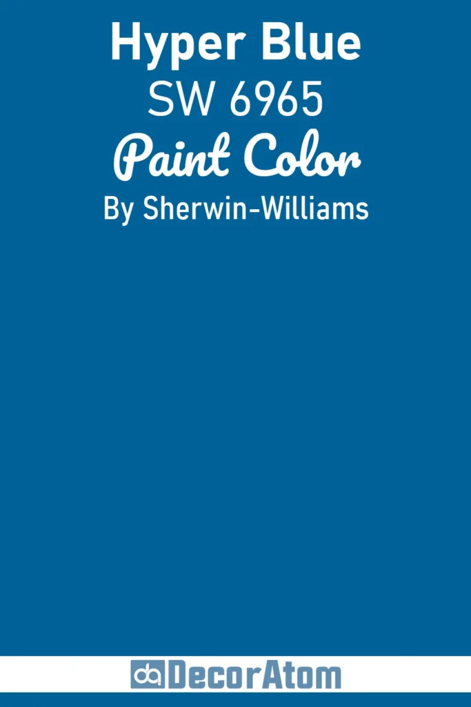
Hyper Blue doesn’t hold back. This is an electric, high-energy blue that’s full of personality. It reminds me of pop art or a vivid mural, t’s playful and loud, in the best possible way.
If you’re designing a kid’s room, creative studio, or even a fun game room, Hyper Blue brings in that bold punch you might be craving.
I wouldn’t recommend it for all four walls unless you really want to make a statement, but it shines as an accent color or even on a piece of furniture. Pair it with high-contrast colors like red, yellow, or white for an ultra-fun combo.
11. Blue Chip SW 6959

💥🎁 Christmas & Year-End Deals On Amazon !
Don't miss out on the best discounts and top-rated products available right now!
*As an Amazon Associate, I earn from qualifying purchases.
Blue Chip is a bright, cheerful cobalt blue that instantly energizes a space without overwhelming it.
What I love about this color is its vintage vibe, there’s a certain mid-century charm in its slight violet undertone that feels both classic and playful. It’s fantastic on woodwork, cabinets, or even a front door that you want to feel welcoming and bold.
Blue Chip works beautifully alongside crisp whites and soft grays, but don’t hesitate to pair it with warm wood tones or brass accents to balance its brightness.
12. Cloudless SW 6786
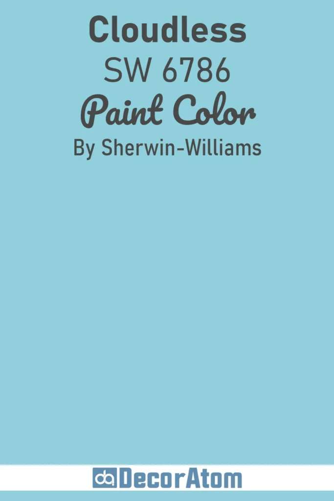
Cloudless is the kind of blue that transports you back to endless summer skies, fresh, vibrant, and just on the edge of turquoise.
It feels open and optimistic, the perfect choice if you want to brighten a family kitchen or playroom.
Cloudless pairs wonderfully with whites and sandy neutrals, giving a casual, breezy vibe to any room. It’s lively without being overwhelming, which makes it versatile enough for large spaces or smaller accents alike.
13. Moonmist SW 9144
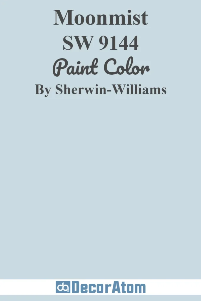
Moonmist feels like the gentle glow of a moonlit night, soft and serene with a slight hint of gray to keep it grounded.
It’s a soothing blue that works particularly well in bedrooms or bathrooms where you want to create a calming retreat.
I think Moonmist strikes a perfect balance, it’s light enough to feel airy but with enough depth to avoid feeling washed out. Combine it with creamy whites and muted metallics for an elegant, peaceful atmosphere.
14. Aleutian SW 6241
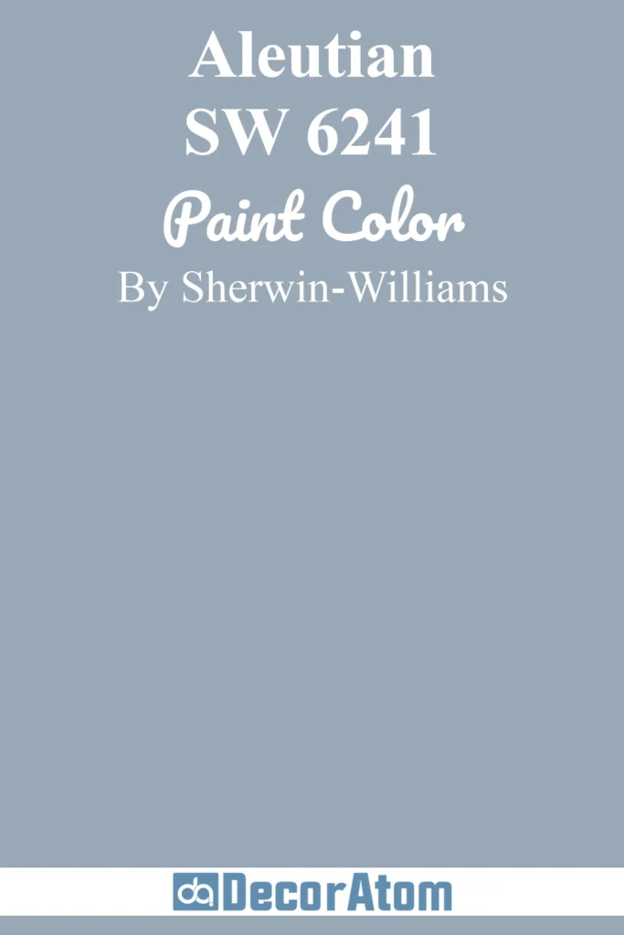
Aleutian is a moody, stormy blue with subtle green undertones that give it a little extra complexity. It’s the kind of color that feels strong and stable, perfect for spaces where you want a sense of calm and focus.
This is a great option for a study, library, or even a cozy living room. Aleutian pairs beautifully with natural wood, leather, and warm metals like copper or brass, adding richness without feeling heavy.
15. Distance SW 6243
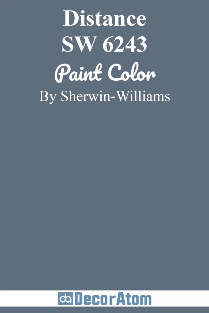
Distance has this cool, almost misty quality that reminds me of looking out over a fog-covered lake early in the morning.
It’s a soft blue-gray with just enough color to feel fresh but muted enough to serve as a subtle backdrop.
I like this one in hallways, bedrooms, or bathrooms, anywhere you want to introduce a little color that won’t compete with your furnishings. Distance works well with whites, light wood tones, and soft greens for a layered, serene palette.
16. Inky Blue SW 9149
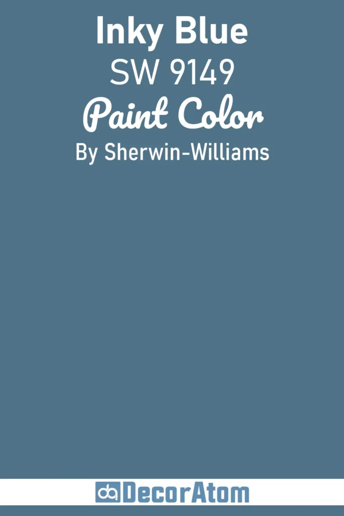
Inky Blue is exactly what it sounds like: a deep, rich blue with a slightly blackened edge. It’s luxurious and dramatic without feeling heavy, making it a striking choice for accent walls, built-ins, or even cabinetry.
This color demands attention but also creates a cozy, enveloping feeling, Perfect for moody bedrooms or sophisticated living spaces. Pair it with warm golds or creamy neutrals to keep the mood inviting and balanced.
17. Salty Dog SW 9177
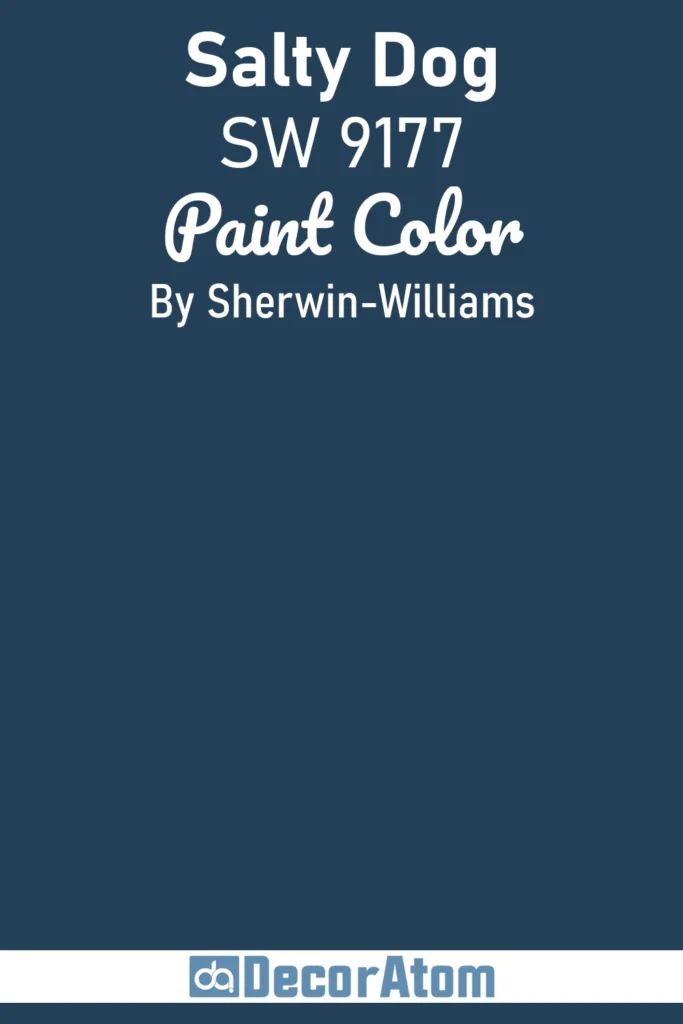
Salty Dog is a perfect navy with just the right amount of brightness to avoid feeling flat or dull.
It’s the kind of color that instantly brings a nautical vibe but with enough warmth and complexity to work beyond coastal styles.
I love how it adds depth to kitchens, dining rooms, or front doors, especially when paired with crisp whites and natural textures like jute or linen. Salty Dog strikes a wonderful balance between classic and contemporary.
18. Dark Night SW 6237
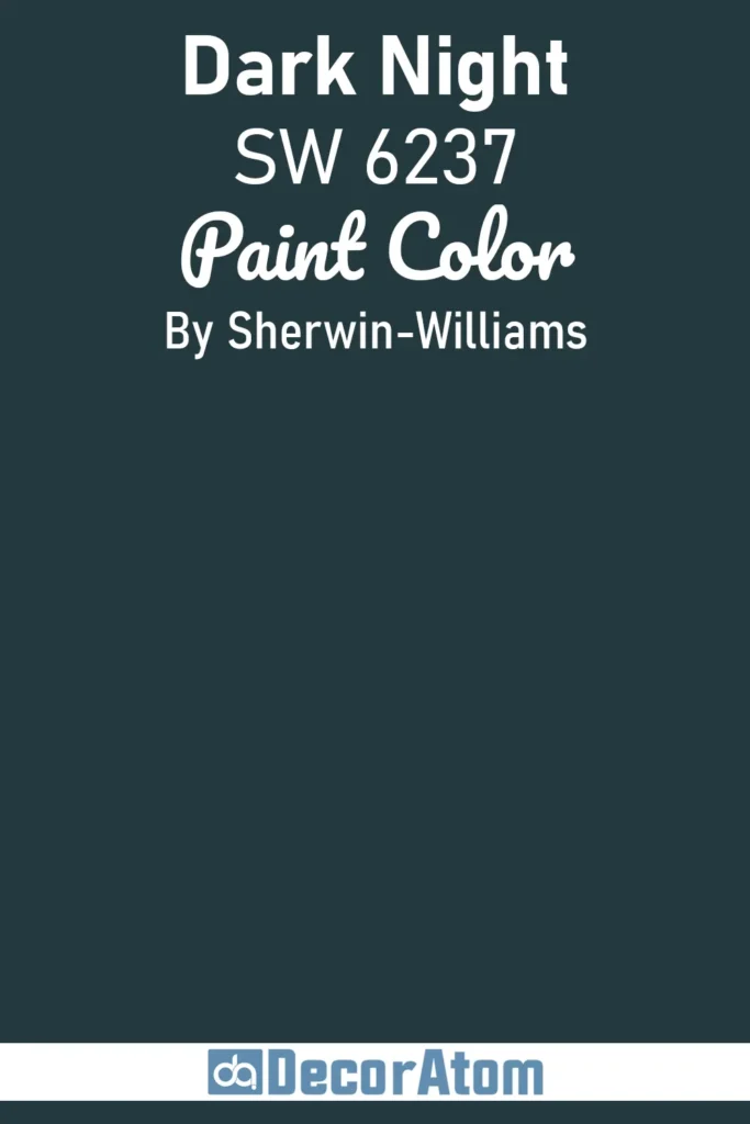
Dark Night is a deep, inky blue that almost feels like velvet draped over a room.
It’s one of those colors that’s both dramatic and sophisticated, ideal for creating a bold, intimate atmosphere.
This shade works beautifully in bedrooms, lounges, or dining rooms where you want to dial up the moodiness without tipping into black.
I recommend pairing it with rich textures, think velvet cushions, satin throws, and warm metallics like brass or gold for a luxurious feel.
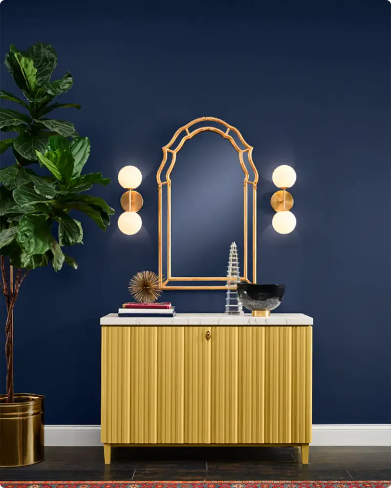
19. Naval SW 6244

Naval has been a Sherwin-Williams favorite for good reason, it’s a rich, classic navy with a slightly muted tone that makes it incredibly versatile. It’s equally at home on trim, doors, or as a main wall color.
I love how Naval feels timeless and solid, perfect for spaces that want to evoke calm and confidence.
It’s especially striking paired with whites and warm woods, lending itself well to both modern minimalism and cozy, traditional interiors.
20. In the Navy SW 9178
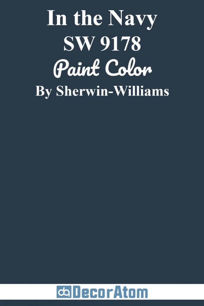
In the Navy leans into the deep, saturated side of blues with a true classic navy feel. It’s bold and grounding, excellent for adding weight to a room without making it feel smaller or oppressive.
This color works great on exterior doors, cabinetry, or accent walls where you want to make a statement.
When balanced with soft neutrals or crisp whites, In the Navy can create a fresh, nautical-inspired space that feels polished and inviting.
21. Mount Etna SW 7625
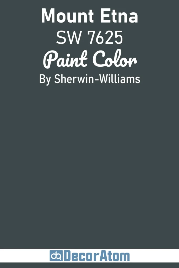
Mount Etna is a smoky, charcoal-blue that hints at storm clouds rolling over a mountain ridge.
It’s dramatic and moody, perfect for spaces where you want a strong visual impact but still want to maintain elegance.
I like using Mount Etna in living rooms or dining areas that have plenty of light to offset the depth of the color.
It pairs beautifully with warm metals, deep greens, and textured fabrics for a rich, layered look.
Final Thoughts
Blue paint colors hold a timeless appeal, and Sherwin-Williams offers an exceptional palette that can suit nearly every style and mood.
Whether you want to create a serene retreat, a bold statement, or a versatile backdrop, there’s a blue on this list for you.
Take your time exploring the options, test your favorites, and don’t hesitate to embrace the personality that blue brings to your home.
After all, the right shade can completely transform a space, making it feel more like you.