
Blue gray paint colors offer a versatile middle ground between classic neutrals and cooler tones.
When used well, they add depth, softness, and sophistication to a space without overwhelming it.
The challenge lies in finding the right tone—some blue grays lean too cool, others too muted, and many shift significantly depending on lighting.
Over the years, I’ve tested way too many samples (and repainted more than I care to admit), but these 17 Sherwin Williams blue gray paint colors are the ones that stood out.
Some are light and breezy, others are rich and dramatic, but all of them feel grounded and timeless.
If you’re looking for a color that works in pretty much any space, I think you’ll find something here worth trying.
What are Blue Gray Paint Colors?
Blue gray paint colors are exactly what they sound like—shades that blend blue and gray into one balanced, muted tone. But don’t let that simplicity fool you.
Some blue grays lean cool and icy, while others have a warm, stormy undertone.
What makes them special is that they combine the freshness of blue with the grounded, neutral vibe of gray. The result is a color that feels both soothing and modern.
Depending on the lighting, a blue gray might look more blue during the day and more gray at night.
That subtle shift is part of the appeal—it keeps your space interesting without being too bold or trendy.
Where to Use Blue Gray Paint Colors?
One of the reasons I love blue gray is how incredibly adaptable it is. These colors work just about anywhere in the house.
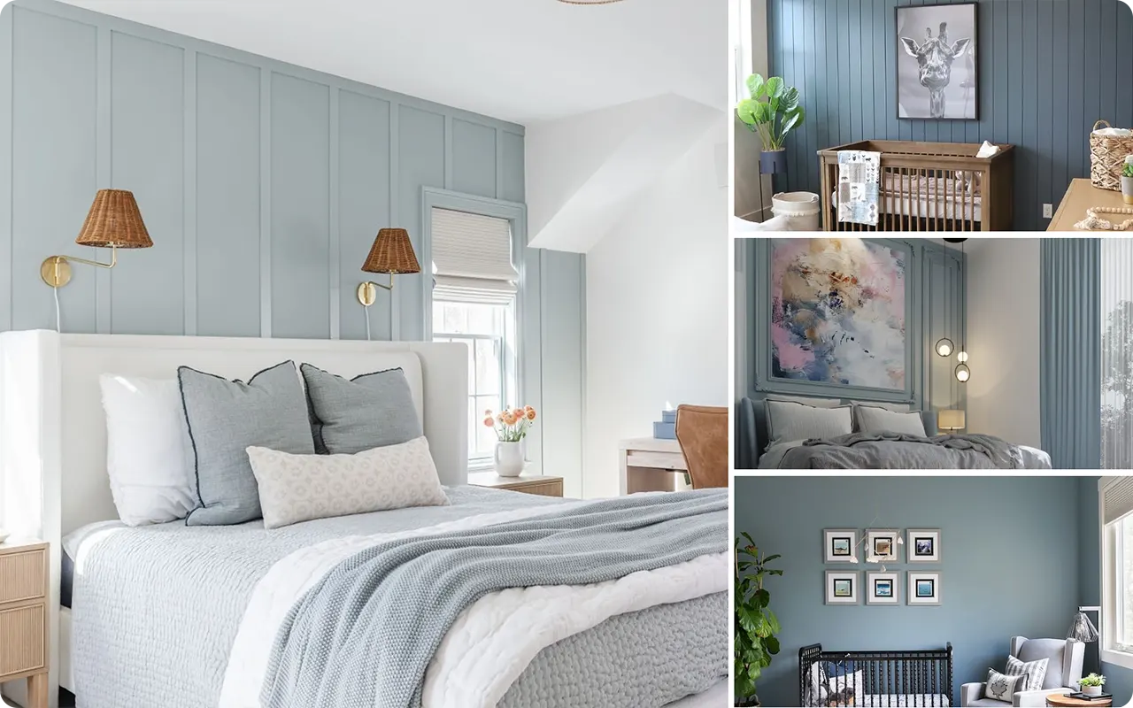
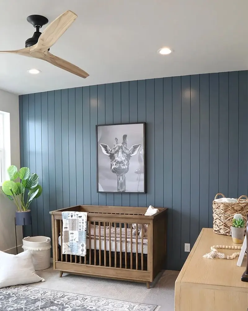
I’ve used soft blue grays like Misty or Rock Candy in bedrooms and bathrooms where I want a light, airy feel.
Darker shades like Storm Cloud or Waterloo are perfect for making a statement—think dining rooms, home offices, or even built-in cabinetry.
Blue grays also work wonderfully in kitchens, whether on walls or lower cabinets, especially when paired with white countertops and warm metallics.
And if you’re looking to refresh a front door or a piece of furniture, these tones give you just enough color without going over the top.
Colors to Pair with Blue Gray Paint Colors
Blue gray pairs beautifully with a wide range of other colors, which is part of what makes it so easy to decorate around.
For a clean and timeless look, I like to pair it with crisp white trim—Sherwin Williams Pure White is a favorite.
If you want to warm things up, add in soft creams, natural wood tones, or touches of beige.
I’ve also had success pairing deeper blue grays with warm brass hardware or leather accents for a cozy, layered look.
Want something a little more modern? Pair blue gray walls with black fixtures or charcoal accents.
For a fresh, coastal feel, mix in pale greens, soft blush, or muted tan.
Tips for Choosing the Best Blue Gray Paint Colors
Choosing the right blue gray comes down to lighting and how much saturation you’re comfortable with. Here are a few things I’ve learned from trial and error:
1. Always Test Samples
Blue gray colors shift dramatically in different lighting. What looks soft and neutral on a paint chip can look way more blue—or even purple—on the wall.
2. Pay Attention to Undertones
Some lean cooler (with hints of icy blue or green), while others feel warmer and moodier.
3. Use Light Strategically
If your room has limited natural light, go for a softer shade like Upward or North Star. In bright rooms, deeper colors like Jubilee or Slate Tile can shine without feeling too dark.
4. Think About the Mood
If you want something peaceful and relaxing, go lighter. For drama and depth, the darker shades really deliver.
Top 17 Sherwin Williams Blue Gray Paint Colors
Here are my favorite Blue Gray paint colors from Sherwin Williams to decorate with.
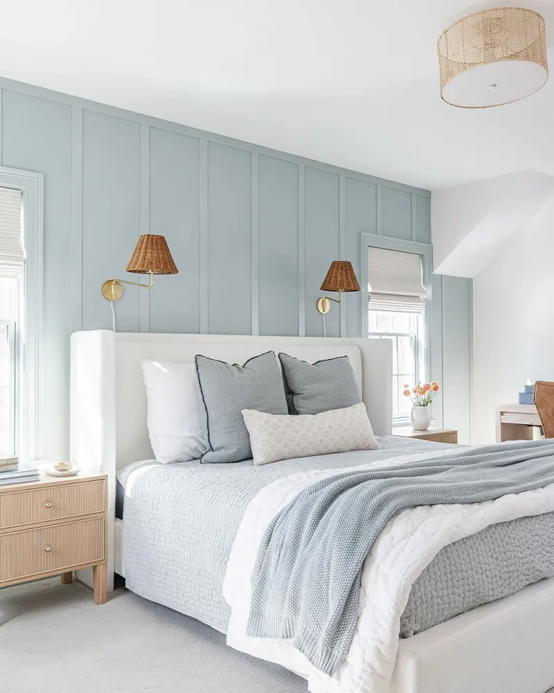
1. Sherwin Williams Upward – Color of the Year 2024
This color made waves when Sherwin Williams named it the Color of the Year 2024, and honestly, it’s easy to see why.
Upward is a soft, optimistic blue with the perfect touch of gray to keep it grounded. It doesn’t scream for attention but still brings that fresh, airy vibe into a room.
I’ve found it especially calming in bedrooms or reading nooks, where you want a peaceful escape without going full-on pastel.
It pairs well with crisp whites, natural textures, or even a bold navy for contrast.
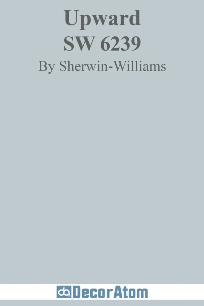
2. Sherwin Williams Rock Candy
Rock Candy leans cool—very cool. It’s a pale, icy blue-gray that almost disappears into white in bright light.
But that’s what makes it so useful. It gives just enough color to add depth to walls without overwhelming a space.
I’ve used this in small bathrooms and narrow hallways to reflect light while still offering that subtle tint of blue.
It also plays nicely with stainless steel and marble, so it’s a top contender for modern kitchens and baths.
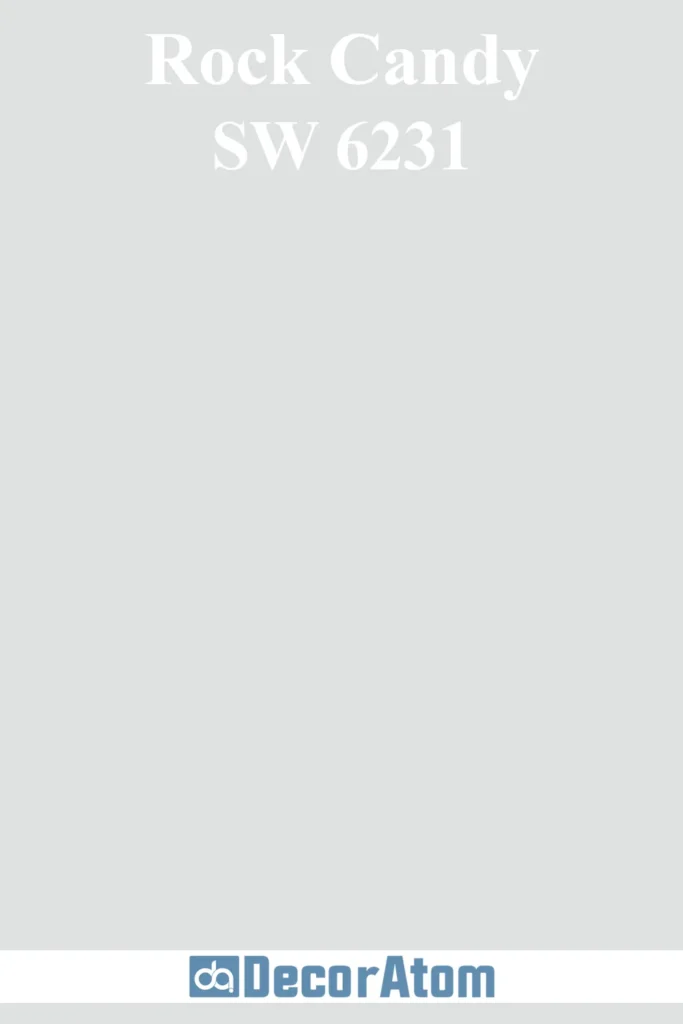
3. Sherwin Williams Krypton
Krypton feels like a true middle-of-the-road blue gray. It’s deeper than Rock Candy but not so dark that it closes in a space.
The gray in it helps tone down the blue, making it more sophisticated than playful.
I love how it shifts depending on the light—cooler in daylight, moodier at night.
It looks stunning with light oak floors or even warm brass fixtures, offering a beautiful balance between cool and cozy.
4. Sherwin Williams Aleutian
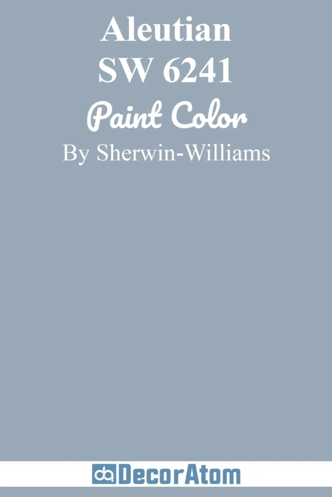
Aleutian has that washed denim vibe—understated but stylish. It brings a relaxed, lived-in feel to a space.
What makes this color stand out to me is its ability to feel soft and strong at the same time.
It’s a bit dustier than the others, which makes it ideal for creating that cozy, classic look.
I’ve seen it work beautifully in dining rooms with wainscoting, or even on kitchen cabinets for a calm but elegant feel.
5. Sherwin Williams Morning Fog
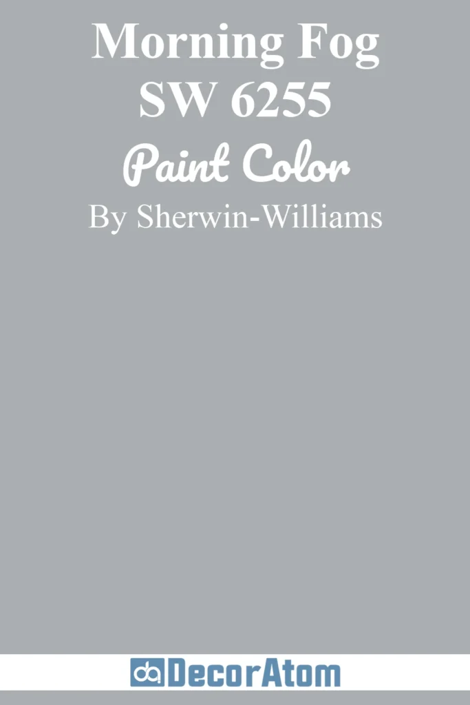
True to its name, Morning Fog has this misty, serene energy that reminds me of early mornings by the coast.
It sits right between blue and gray, and it behaves like a chameleon depending on the time of day.
It’s great if you’re looking for a color that brings mood without being too bold.
I personally love it in offices or living rooms—especially when paired with soft whites or deep charcoal accents.
6. Sherwin Williams Moonmist
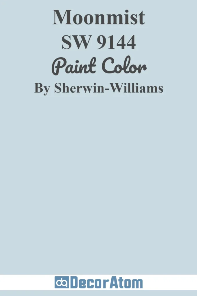
Moonmist is one of those soft-spoken colors that still manages to be memorable.
It’s a gentle blend of blue and gray with the faintest whisper of green in some lighting, which gives it a unique depth.
I like to think of it as a dreamy wall color for a nursery or a spa-like bathroom. It doesn’t demand attention but quietly transforms the mood of a space.
Light wood tones and muted golds really bring it to life.
7. Sherwin Williams North Star

North Star is one of those timeless shades that quietly works its magic in the background. It leans slightly more blue than gray, but still feels grounded and neutral enough for any room.
What I love most is how effortlessly it fits into both traditional and contemporary spaces. It reads clean and airy, especially in rooms with good natural light.
It’s a safe pick for whole-house color schemes or even exterior siding.
8. Sherwin Williams Debonair
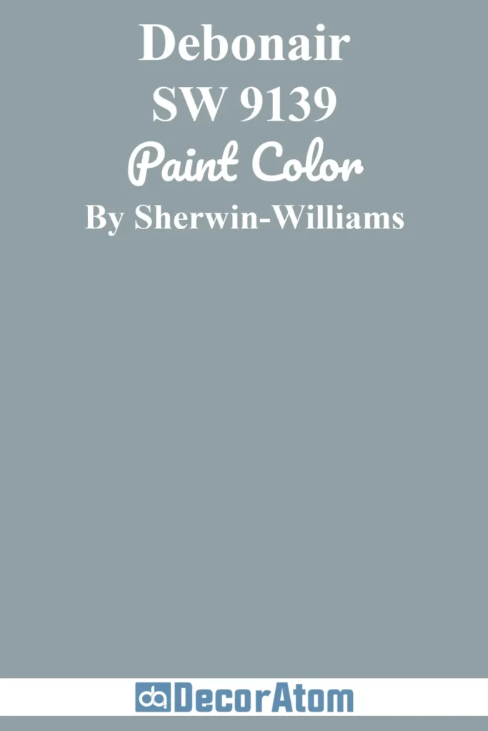
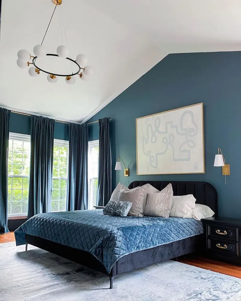
Debonair is such a rich, dashing color—it lives up to its name. It’s a deeper blue gray, almost stormy, but still refined. This one has personality.
It’s perfect if you’re going for a moody, dramatic look without going too dark. I’ve seen it look stunning in dining rooms with black accents or as a statement wall behind a bed.
It also works well with leather textures and warm metallics like copper or bronze.
9. Sherwin Williams Misty
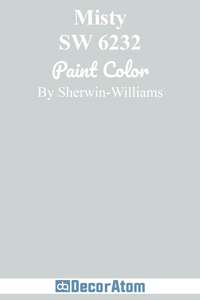
Misty is a crowd favorite for a reason. It’s incredibly versatile—light enough to use in almost any room, but with just enough gray-blue pigment to make it feel sophisticated.
I’ve used Misty in everything from bedrooms to laundry rooms, and it never disappoints. It’s especially helpful in south-facing rooms where you want to tone down the yellow of natural sunlight.
It pairs beautifully with white trim and cool-toned countertops.
10. Sherwin Williams Distance
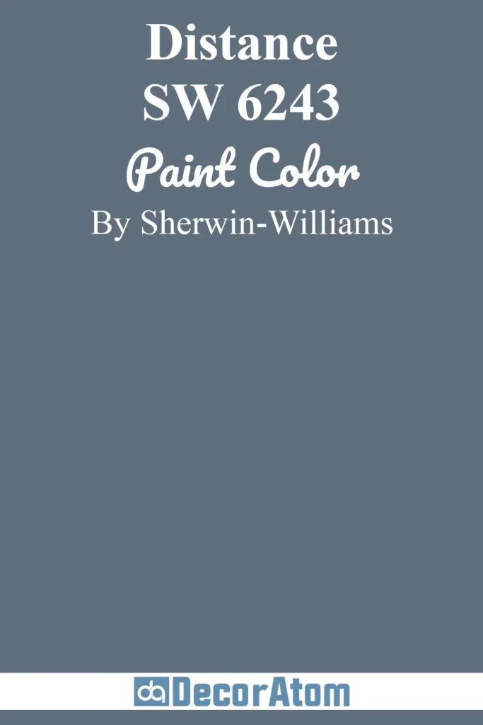
Distance brings depth without feeling dark. It’s a cool, muted blue-gray that adds character without overwhelming a space. It reminds me of deep twilight skies—serene but strong.
This one is great for accent walls, built-ins, or even a bold bathroom. I’ve seen it look especially rich against crisp white trim and black hardware.
If you want something bolder than Misty or Upward but still approachable, Distance might be your perfect middle ground.
11. Sherwin Williams Storm Cloud

Storm Cloud is bold, dramatic, and unapologetically moody. It’s a deep blue-gray with serious presence—perfect if you’re craving depth and contrast.
I tend to reserve this one for spaces where you want a little drama: think dining rooms, powder baths, or even a striking entryway.
When paired with warm woods or soft creams, it takes on an elegant, almost tailored look. It’s not a color that fades into the background—and that’s exactly what I love about it.
12. Sherwin Williams Stardew
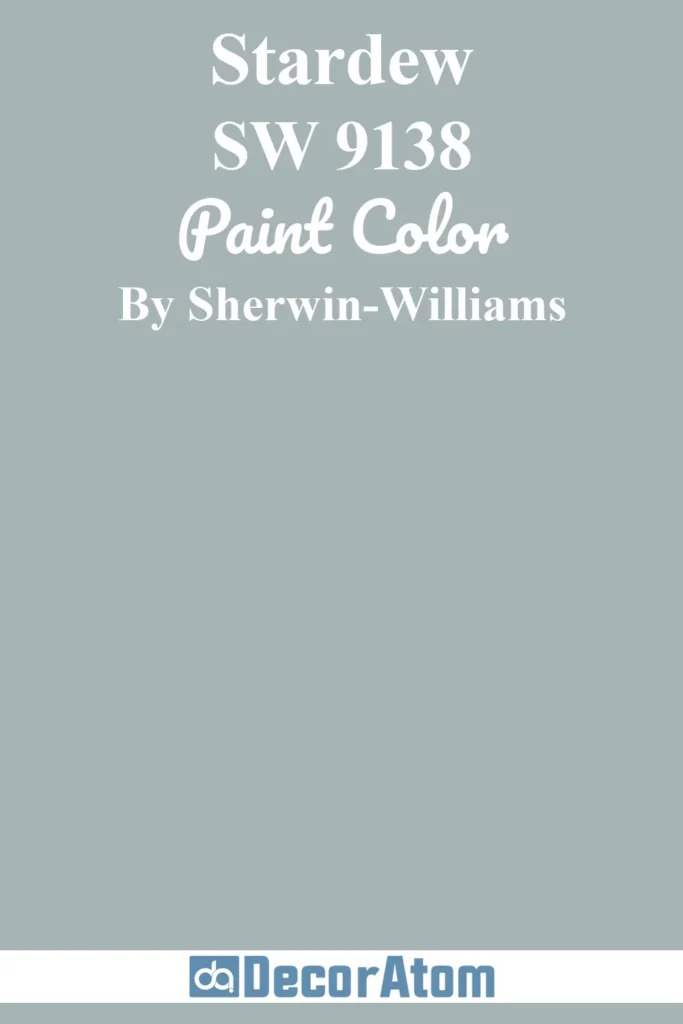
Stardew has this soft, whimsical quality that feels fresh and peaceful. It leans more blue than gray, but the muted undertone keeps it from feeling too sweet.
It reminds me of vintage linens or the inside of a sea shell—gentle, nostalgic, and light. I’ve used it in bedrooms and home offices where I wanted something uplifting but not flashy.
It pairs beautifully with soft blushes, taupes, and even aged brass if you want a slightly romantic, lived-in look.
13. Sherwin Williams Slate Tile
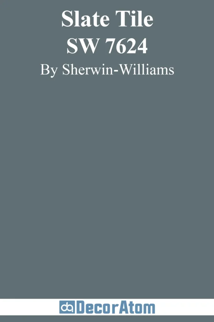
If you’re going for a bold, slate-inspired wall color with cool undertones, this is it.
Slate Tile is a deep blue-gray that edges close to navy, but still feels earthy and grounded. It adds serious sophistication to a space.
I love using it on cabinetry, especially in kitchens or bathrooms with crisp white counters.
It also works surprisingly well on exteriors when you want a rich, coastal-inspired look. This is one of those colors that photographs beautifully and looks even better in person.
14. Sherwin Williams Smoky Blue
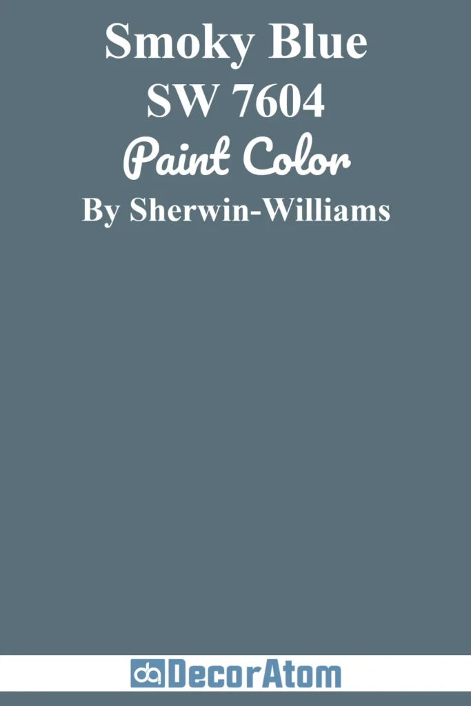
Smoky Blue is rich, confident, and timeless. It leans more toward the navy end of the blue-gray spectrum but has just enough softness from the gray undertone to keep it from feeling harsh.
There’s something incredibly grounding about this color—it brings a cozy, almost nostalgic feel to a room.
I love using it in spaces where you want a strong, saturated look without going too dark. Think lower kitchen cabinets, a study with leather chairs, or a bedroom with warm white bedding and wood tones.
It also plays well with vintage brass and cream textiles for that old-world charm. If you’re craving a deeper blue-gray that still feels elegant and livable, Smoky Blue is a solid bet.
15. Sherwin Williams Samovar Silver
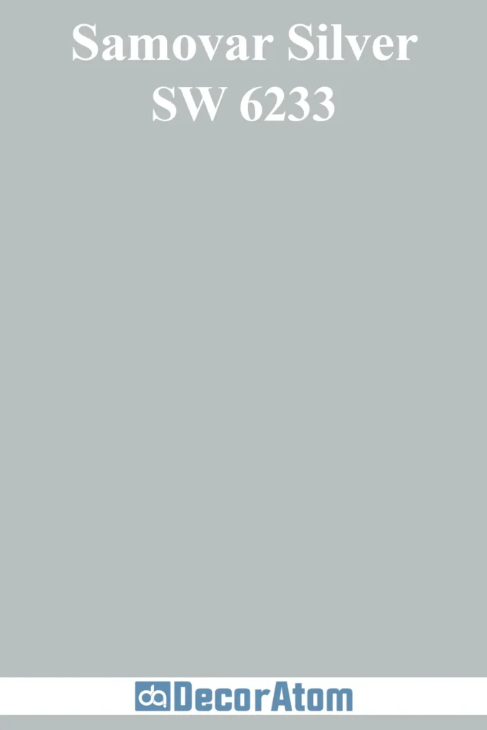
Samovar Silver is one of those perfectly balanced colors that sits right on the fence between gray and blue. It’s soft, elegant, and flexible.
I’ve used this in living rooms and kitchens where I wanted a hint of color without pulling the focus away from furniture or finishes.
It’s a great option if you like Misty but want something just a touch more refined and gray-forward.
Bonus: it works really well with both brushed nickel and matte black finishes.
16. Sherwin Williams Jubilee
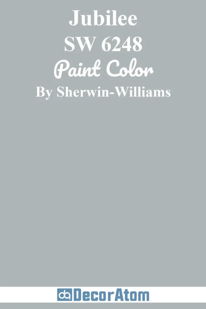
Jubilee is a medium blue-gray that reads classic and tailored. It’s got a certain crispness to it that makes it feel structured and pulled-together, even in casual spaces.
I often recommend it for home offices, libraries, or even foyers—places where you want a little personality, but nothing too distracting.
When paired with white trim and natural light, Jubilee feels clean and confident. It’s also a great backdrop for artwork or gallery walls.
17. Sherwin Williams Waterloo
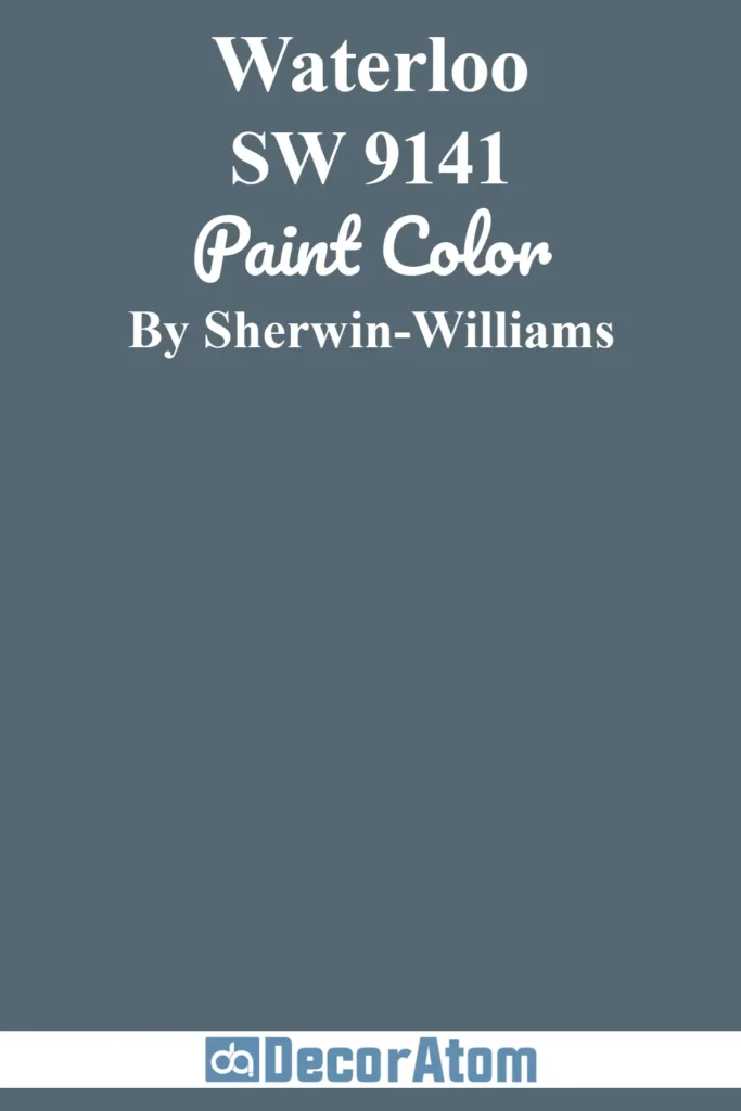
Waterloo is deep, rich, and full of character. It’s more saturated than most on this list—a true blue with a strong gray base that keeps it sophisticated.
I like to think of it as the grown-up version of navy. It brings warmth and depth to cabinetry, accent walls, or even exteriors.
It works beautifully with warm whites, leather textures, and gold or bronze hardware.
If you’re looking for a showstopper that’s still grounded, Waterloo delivers.
Final Thoughts
Blue gray is one of the most flexible color families I’ve worked with—it adapts beautifully to a variety of spaces, styles, and lighting situations.
With the right tone, blue gray can be both calming and refined, offering that perfect balance between color and neutrality.
I hope this list of 17 favorites helps you find one (or two!) that feel just right for your space.