
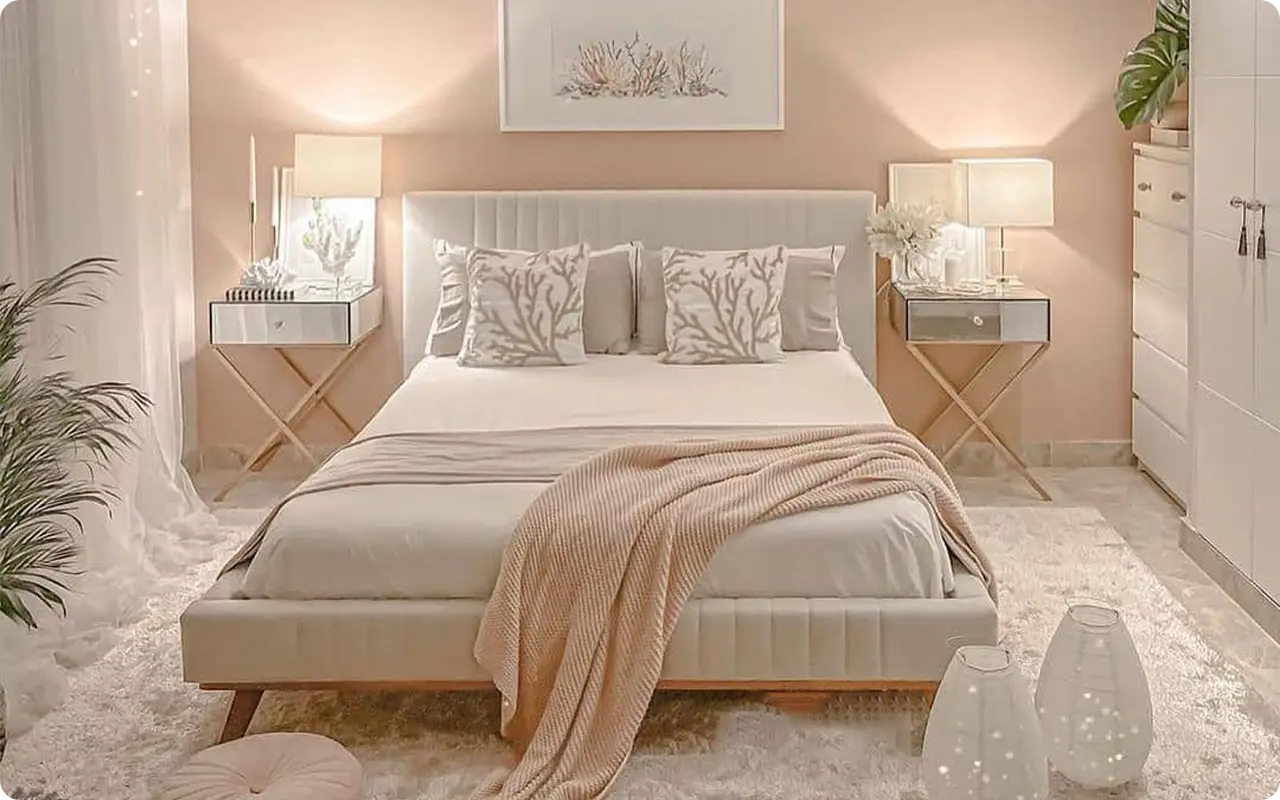
There’s something deeply personal about the way a bedroom feels—and for me, color plays a huge part in that.
I’ve spent years trying to figure out which shades help me feel truly at peace at the end of a long day.
Through all the experimenting and repainting, one thing has become clear: the right paint color can turn an ordinary bedroom into a calming escape.
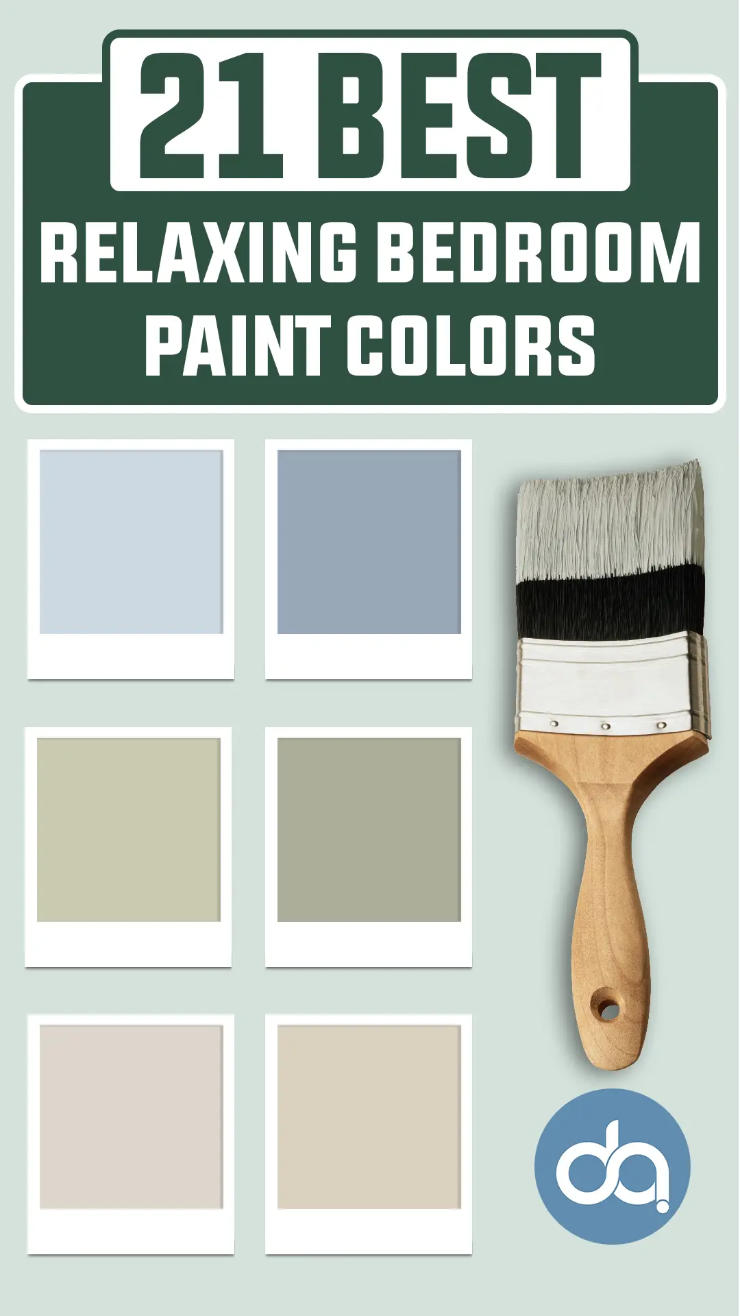
That’s why I pulled together this list of the 21 best relaxing bedroom paint colors.
These shades aren’t just pretty—they create a mood. Each color here has a soothing quality I’ve either personally tried or admired in real spaces.
So if you’re ready to refresh your bedroom and want it to feel like a quiet retreat, this list is a great place to start.
What are Relaxing Paint Colors?
Relaxing paint colors are shades that help reduce visual noise and create a calming atmosphere.
They tend to have lower saturation, softer undertones, and a subtle presence on the walls—nothing too bright, too dark, or overly stimulating.
These colors often draw from nature: think sky blues, leafy greens, ocean grays, or sand-toned neutrals. But it’s not just about the hue—it’s about how that color behaves in the room.
Relaxing colors tend to absorb or reflect light gently, creating a peaceful backdrop that makes it easier to unwind.
They’re the kind of colors you don’t really notice right away, and that’s exactly why they work—they let the room (and your mind) breathe.
How to Pick Relaxing Paint Colors for Your Bedroom?
Choosing a relaxing color for your bedroom isn’t just about picking your favorite shade—it’s about how that color makes you feel in the space. Here are a few things I’ve learned along the way that might help:
1. Pay Attention to Undertones
Even soft colors can feel “off” if the undertone clashes with your room’s lighting or furnishings. For example, a blue with a purple undertone can feel cooler than one with a hint of green. Look for undertones that match the mood you want—warm for cozy, cool for fresh and airy.
2. Test It in Natural and Artificial Light
Colors can shift dramatically throughout the day. What looks soft and dreamy in the morning might feel dull or even stark at night. I always recommend sampling a few options on your actual wall and observing them over a day or two.
3. Consider How You Use the Space
If your bedroom is where you wind down with a book, a moody gray or sage green might feel grounding. But if it’s your sunny morning space, a breezy blue or pale neutral might help you start your day gently. The vibe you want should guide your palette.
4. Less Saturation, More Softness
Highly saturated or bold colors can be fun, but they usually bring energy—not calm. For a relaxing bedroom, go for soft, muted shades that sit quietly in the background.
5. Think About the Full Room Experience
Paint is just part of the equation. Your bedding, curtains, flooring, and even artwork will influence how a color feels. Choose a shade that complements your other textures and tones rather than competes with them.
At the end of the day, trust how the color makes you feel. The best relaxing bedroom paint color is the one that puts your mind at ease the moment you walk into the room.
Top Relaxing Paint Colors for Bedroom
Here are my list of the best relaxing paint colors for bedroom to decorate with.
Serene Blue Paint Colors
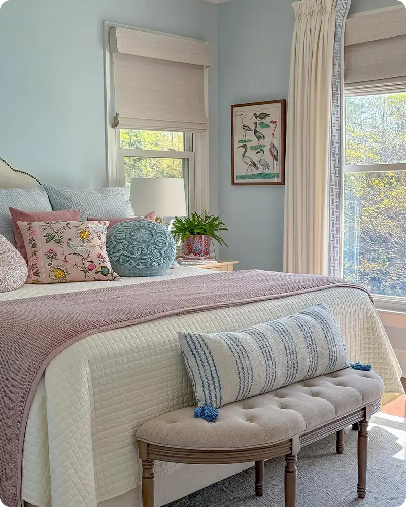
Blue has this natural ability to quiet the mind—it’s like taking a deep breath just by looking at it.
Whether you lean toward cool pastels or dusty, muted tones, these serene blues help create bedrooms that feel peaceful and emotionally grounding.
They work especially well if you’re after a space that feels airy, open, and emotionally uncluttered.
Behr Watery

There’s something instantly calming about Behr Watery. It’s a soft, breezy blue-green that feels like a coastal breeze drifting through the room.
It’s not too bright and not too dull—just the right blend of seafoam and sky. I love how it changes slightly with the light, sometimes leaning more blue, other times more green.
This shade works beautifully with white bedding, natural wood furniture, or soft sandy neutrals for a laid-back, restful bedroom.
Benjamin Moore Arctic Blue

Arctic Blue by Benjamin Moore gives off an icy, delicate charm without feeling cold or sterile. It’s like the faint blue of snow under morning light—crisp, clean, and fresh.
This one pairs really well with cool grays, silvery metallics, and simple linens. It brings in that cool-headed calm that helps clear your mind at the end of the day, especially if you prefer a more minimal, quiet bedroom look.
Sherwin Williams Icelandic

Icelandic is the kind of blue that almost whispers. It has a dreamy pastel softness to it, with just a hint of lavender underneath depending on the lighting.
It doesn’t overwhelm the room—it just lightly washes the walls in color. I’ve seen it used in both traditional and modern bedrooms, and it always seems to lend this quiet elegance that feels incredibly soothing.
Benjamin Moore White Satin

White Satin is a delicate, whispery blue with a soft gray undertone that gives it a sophisticated edge.
It’s one of those colors that almost reads like a neutral but still carries that cool, airy feeling that blue brings to a space.
I love how it reflects light during the day, making the room feel fresh and open, yet still cozy at night under warm lighting.
If you’re looking for something that feels crisp without being cold—and calming without being too pale—White Satin hits that sweet spot beautifully.
Sherwin Williams Aleutian

Aleutian is a dusty, stormy blue that brings a bit more mood to the space while still feeling very calm. It’s grounded—less airy than a pastel—but not dark enough to weigh things down.
I’d say it works best if you want your bedroom to have a little character and coziness without going too bold. It pairs well with muted creams and soft leathers or linen tones for a tailored but tranquil vibe.
Sherwin Williams Blissful Blue

The name says it all—Blissful Blue is light, cheerful, and easy on the eyes. It leans a bit more toward the traditional baby blue but with a softness that makes it feel grown-up and serene.
If you’re looking for something airy and uplifting, this is a great pick. It looks especially beautiful in bedrooms with a lot of natural light, white accents, and breezy fabrics like cotton or gauze.
Benjamin Moore Sheer Bliss

Sheer Bliss has a gentle, almost powdery quality that makes it feel like a breath of fresh air. It’s a soft blue with just enough pigment to add color without overwhelming the space.
I think it works really well in bedrooms where you want that barely-there touch of color—especially when you combine it with crisp whites and soft, textured fabrics like a chunky knit throw or gauzy curtains.
Gentle Green Paint Colors
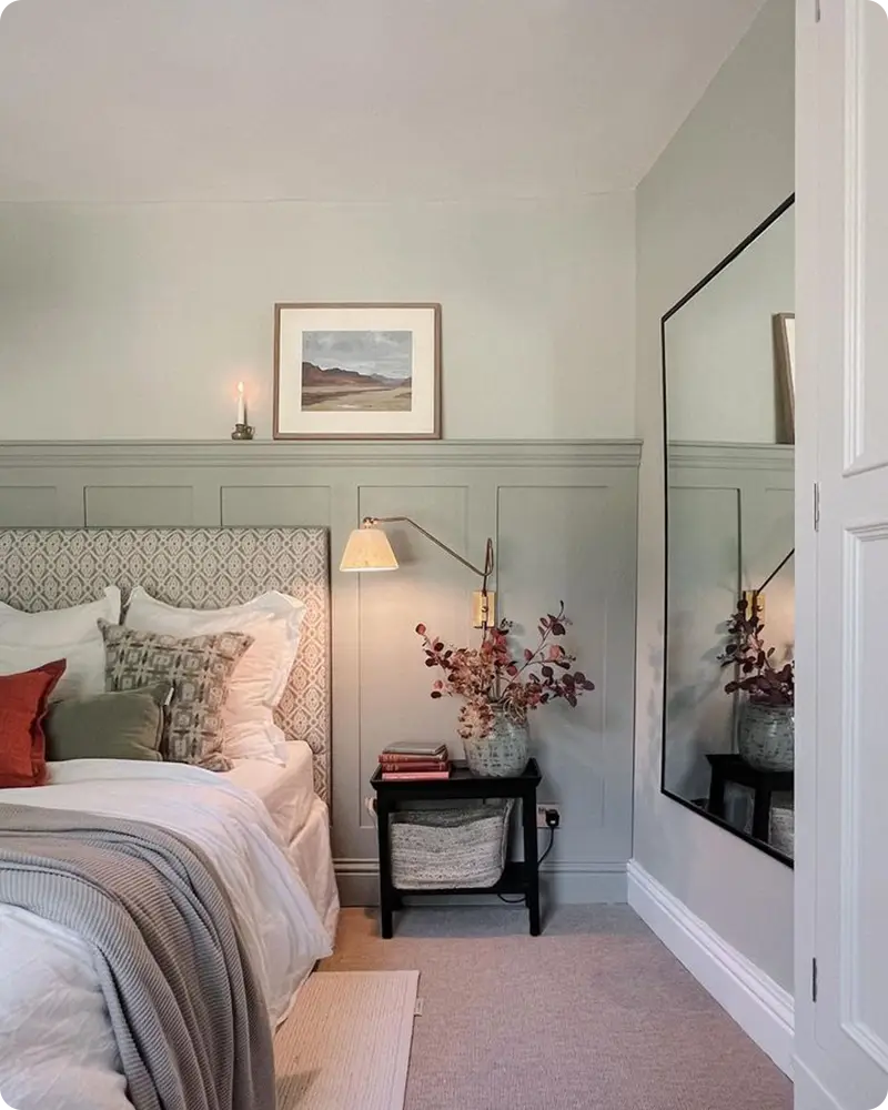
Green naturally evokes growth and calm—it’s the color of balance and fresh starts. These gentle greens don’t shout for attention, but they still bring a soft energy to the room.
If you’re drawn to nature or want your bedroom to feel like a restful escape, these shades make that connection effortless.
Behr Back to Nature

Back to Nature is a fresh, botanical green that brings the outdoors in without being too earthy or dark. It has a yellow undertone that gives it a little warmth, making it feel inviting and peaceful.
If you like the idea of waking up in a room that feels like a garden escape, this is a lovely choice. I’ve seen it paired beautifully with rattan accents, soft beiges, and whitewashed woods for a calm, nature-inspired retreat.
Benjamin Moore Soft Fern

Soft Fern is one of those greens that feels almost like a neutral—it blends in easily but still adds life to the space. It’s gentle, with just a hint of gray, and it brings that leafy, restorative vibe without being too bold or trendy.
This is the kind of color I’d use in a bedroom that needs a bit of freshness without disrupting a cozy, classic palette. It works wonderfully with natural textures and soft, pale fabrics.
Sherwin Williams Sea Salt

Sea Salt is probably one of the most loved relaxing colors out there—and for good reason. It sits right in that perfect spot between green and gray, with a softness that adapts beautifully to different lighting.
Sometimes it looks more blue-green, other times more silvery sage. It has a spa-like feel without trying too hard. I’ve seen it in bedrooms styled both coastal and modern farmhouse, and it never feels out of place.
Benjamin Moore Guilford Green

Guilford Green walks that fine line between modern and timeless. It has a graceful softness, almost like olive that’s been lightened with a touch of gray.
It gives off that fresh-but-not-flashy feel, perfect for a bedroom that leans a little traditional or even cottagecore. Pair it with creamy whites or soft floral prints, and it instantly makes the space feel put-together and easygoing.
Sherwin Williams Clary Sage

Clary Sage brings warmth and grounding to the room in a way that feels deeply comforting. It’s a muted, earthy green with a hint of gray that makes it feel mature and stable.
I love how this color works in bedrooms with darker wood furniture or brass fixtures—it brings richness and depth without sacrificing the calm.
Benjamin Moore Grecian Green

This one’s a little more unique. Grecian Green has a subtle historic feel—like something you’d find in a quiet European cottage.
It’s soft, dusty, and a little muted, which makes it ideal for a room that leans romantic or vintage. It’s green, yes, but with a twist that makes it feel more soulful and artistic.
Benjamin Moore Spring Meadow

Spring Meadow feels fresh, optimistic, and just a little bit whimsical. It’s brighter than the others on this list, but not overwhelming.
There’s a youthful, sunny quality to it—perfect if you want your bedroom to feel full of light and life. I’d keep everything else in the room soft and simple to let this color shine without overstimulation.
Soft Gray and Neutral Paint Colors
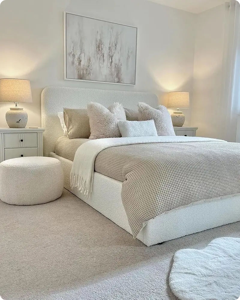
Sometimes, the most relaxing spaces are built on colors that don’t demand attention.
These soft grays and gentle neutrals create the perfect canvas for layered textures, cozy linens, and personal touches.
They’re subtle, elegant, and incredibly versatile—ideal for winding down at the end of the day.
Behr Silver City

Silver City is a true cool gray, and it brings a clean, airy look to the bedroom. It doesn’t lean too blue or purple, which makes it great for pairing with almost any accent color.
I like this one for modern or minimalist bedrooms where the goal is clarity and calm. It’s simple, stylish, and stays in the background—exactly where a restful wall color should be.
Benjamin Moore Balboa Mist

Balboa Mist is warm, light, and just the tiniest bit moody. It’s a greige (gray + beige) that changes slightly with the light, sometimes looking almost creamy, other times soft and foggy.
It’s a perfect “quiet” color—never boring, but never overpowering. This one is ideal if you want a color that feels both refined and cozy at the same time.
Benjamin Moore Classic Gray

Classic Gray is like the softest whisper of color. It leans warm, with a hint of beige that keeps it from feeling too cool or flat.
It’s a favorite among designers for good reason—it’s incredibly versatile, and it creates a restful, light-filled space that always feels calm and inviting. If you want something barely there, but not plain white, this is it.
Sherwin Williams Repose Gray

Repose Gray is a staple in the world of neutrals, and it works beautifully in a bedroom setting. It’s a medium-light gray with just enough warmth to feel cozy but still reads fresh and modern.
It holds its own next to crisp whites and pairs nicely with both cool and warm palettes, which makes decorating around it super flexible.
Sherwin Williams Agreeable Gray

Agreeable Gray is one of those magical neutrals that works in just about any space. It’s soft, warm, and completely unfussy.
I like it in bedrooms where you want things to feel approachable, grounded, and relaxed without committing to a strong color presence.
It creates the kind of backdrop that lets your textures, lighting, and personal style do the talking.
Benjamin Moore Pale Oak

Pale Oak is warm, subtle, and incredibly comforting. It leans slightly taupe but never looks muddy or too beige.
It has a sophisticated softness that makes a bedroom feel warm without being yellow-toned. If you’re into layered neutrals, woven accents, and a soft glow, this color sets the perfect tone.
Benjamin Moore Edgecomb Gray

Edgecomb Gray strikes a beautiful balance between warm and cool—it’s not quite beige, not quite gray, and it plays well with both.
I’ve seen it used in everything from cozy cottages to transitional homes, and it always brings a sense of calm and balance to the space.
It’s the kind of color that makes your bedroom feel like a personal retreat without needing much else.