Creating the perfect yoga room is all about crafting a space that fosters calm, relaxation, and focus.
The right paint color plays a huge role in setting the tone for your practice, whether you’re doing gentle stretches, meditating, or engaging in a more active flow.
I’ve spent a lot of time exploring how color affects mood, and when it comes to yoga rooms, the right shades can make all the difference.
The colors you choose can either inspire tranquility or help you feel more energized and connected to your body.
In this post, I’m sharing 17 of the best paint colors for yoga rooms that do just that.
From soft, grounding greens to serene blues and subtle neutrals, each of these colors has been selected for its ability to enhance the peaceful, mindful atmosphere that makes a yoga room truly special.
Why You Will Love These Paint Colors for Your Yoga Room
The colors on this list weren’t chosen randomly. Each one has a purpose, a way of influencing your mindset while you move, meditate, or simply sit in stillness.
- They promote relaxation and focus. Soft, muted tones create a tranquil atmosphere, helping you clear mental clutter and stay present in your practice.
- They work beautifully with natural light. A well-lit yoga space enhances the effect of calming colors, making the room feel open and airy rather than overwhelming.
- They create a harmonious energy. Colors like soft greens, airy blues, and warm neutrals connect to elements of nature, grounding your practice and bringing in a sense of balance.
- They complement different design styles. Whether your yoga space is minimalist, bohemian, or spa-like, these colors work seamlessly with various decor choices.
Tips for Choosing The Best Paint Colors for Yoga Rooms
Selecting a paint color for a yoga room isn’t quite the same as choosing one for a bedroom or living room. The goal here is to foster relaxation and mindfulness while avoiding anything too visually distracting. Here’s how to find the right shade:
- Stick to soft, muted tones. Bright, saturated colors can feel energizing or even overwhelming, which isn’t ideal for a yoga space. Instead, opt for colors with a slightly subdued quality.
- Consider how the lighting affects the color. Natural light will make colors appear lighter and more vibrant, while dim or artificial lighting can soften them. Test swatches at different times of the day.
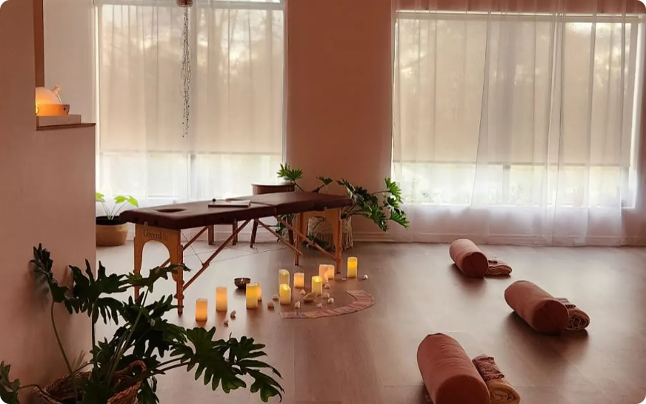
- Think about the overall feel you want. Do you want a space that feels airy and fresh? Try a cool blue or soft gray. Want something grounding? Go for earthy greens or warm taupe. Prefer a cozy, cocoon-like space? A warm neutral might be perfect.
- Take inspiration from nature. Yoga is all about balance, and colors found in nature—like soft blues of the sky, the greens of leaves, or the warm beiges of sand—can create a sense of calm and connection.
- Pair the right decor with your paint choice. A soothing color can be enhanced with the right elements, like natural wood, soft textiles, and plants to bring in an organic feel.
With the right color, your yoga room can become more than just a space—it can be a retreat, a sanctuary, and a place that nurtures both your body and mind.
17 of the Best Paint Colors for Yoga Rooms
1. Sherwin-Williams Lite Lavender

When you think of a peaceful yoga room, a soft lavender might not be the first color that comes to mind, but it truly excels in creating a tranquil atmosphere.
Lite Lavender offers a gentle touch of color that isn’t overpowering. Its cool undertones and subtle nature make it an ideal backdrop for stretching or meditation.
The calming effect of lavender is known to promote relaxation and reduce stress, making it perfect for a space dedicated to mindfulness and movement. It helps create a serene, almost dreamy vibe, which is exactly what you want in a yoga room.
2. Benjamin Moore Harbor Haze

Harbor Haze is a stunning mix of blue and gray, delivering a subtle coastal vibe that helps to clear your mind and center your focus.
Its soft, muted nature calms the senses without being too heavy, and it can easily adapt to different lighting conditions, making it versatile throughout the day.
Whether you have morning sunlight streaming through or soft, muted evening light, this color will always feel serene and inviting. Harbor Haze creates a quiet space that encourages relaxation and mindfulness, making it a great choice for any yoga room.
3. Benjamin Moore Blue Rapids

Blue Rapids is an energizing yet calming shade of blue that brings the tranquility of water into your yoga room. Inspired by the flow of a river, this color promotes clarity and calmness while still offering a refreshing, vibrant tone.
It’s a perfect option if you’re looking to energize your practice without overwhelming the senses. Blue Rapids can help foster a soothing, meditative environment, making it easier to flow through yoga poses and clear your mind.
Its ability to evoke both movement and stillness is what makes it so appealing.
4. Sherwin-Williams Green Earth

Green Earth is a wonderful earthy shade that evokes a sense of grounding and connection to nature. Its natural, muted green tone creates a peaceful environment that feels fresh and rejuvenating.
Green is known to have a calming effect on the mind, and this color brings the restorative power of nature into your space.
By choosing Green Earth, you’re not just creating a beautiful space; you’re cultivating an atmosphere that promotes balance, relaxation, and mindfulness—essential elements for any yoga practice.
5. Sherwin-Williams Grey Mist

Grey Mist is a soft, airy gray with just the right amount of warmth to make it feel inviting without being too heavy. This color is perfect for creating a peaceful, neutral backdrop for your yoga space, allowing you to focus on your practice rather than the room itself.
Its calming qualities come from its neutrality, as gray has been shown to reduce tension and anxiety. Grey Mist offers a gentle, quiet energy that supports concentration and promotes a peaceful atmosphere for yoga.
6. Benjamin Moore Peace and Happiness

The name says it all—Peace and Happiness is a color that radiates tranquility and positivity. This light, serene shade of blue is the perfect tone for fostering a calm and uplifting environment.
It helps create an ambiance where you can let go of your worries and focus solely on your practice. It’s a gentle, quiet color that helps bring balance to the room while also lifting your mood.
The light blue hue of Peace and Happiness can inspire a sense of peace in both your mind and body, making it a perfect choice for yoga.
7. Sherwin-Williams Warming Peach

Warming Peach offers a unique blend of warmth and subtlety. Its soft, peachy tones bring a sense of comfort and softness to the room, making it feel welcoming and nurturing.
Unlike more intense oranges or reds, Warming Peach stays soft and soothing, creating a space where you can unwind and let go of stress. It’s a great choice for those who want a bit of warmth without the intensity.
It evokes feelings of support and rejuvenation, encouraging relaxation during your practice.
8. Benjamin Moore Serenity

Serenity is an ideal choice for anyone looking to create a calm, peaceful yoga environment. This muted, soft blue brings to mind the clarity of a calm sky or a peaceful sea.
It’s the perfect color to help create an environment conducive to deep breathing, reflection, and mindfulness. Serenity provides just the right amount of calmness to support your practice while avoiding any distractions.
It’s a versatile color that works well with a variety of design styles, adding a touch of peace to any yoga space.
9. Sherwin-Williams Sleepy Blue

Sleepy Blue is a gentle, calming blue that’s ideal for a yoga room. It has a soft, muted quality that makes it perfect for creating a restful environment.
This shade of blue is known for its ability to lower stress levels and help promote relaxation, which is exactly what you need in a space dedicated to yoga.
Sleepy Blue encourages a calm, quiet atmosphere where you can center your thoughts and focus on your movements. It’s subtle, gentle, and perfect for cultivating a peaceful energy.
10. Benjamin Moore Tranquility

Tranquility is the perfect name for this soft, tranquil blue-green color. It embodies the essence of peace and calm, creating a serene environment that supports relaxation and meditation.
The cool undertones of Tranquility help reduce mental clutter, creating a space where you can truly tune into your body and breath. It evokes feelings of quietude, which is exactly what you need for a productive yoga session.
Tranquility is a color that promotes clarity and calmness, making it a wonderful addition to any yoga room.
11. Sherwin-Williams Sea Salt

Sea Salt is a cool, refreshing color that draws inspiration from the sea and sky. Its soft, muted greenish-blue undertones create a sense of tranquility and calm.
This color has a cleansing, purifying effect on the space, making it ideal for creating an atmosphere of rejuvenation. Sea Salt encourages deep breathing and relaxation, which is key when practicing yoga.
It pairs beautifully with natural wood tones, plants, and minimalistic decor to help create a serene sanctuary where you can fully unwind.
12. Benjamin Moore Healing Aloe

Healing Aloe brings the calm, soothing energy of aloe vera into your yoga space. The soft, muted green offers a peaceful, natural vibe that encourages relaxation and rejuvenation.
This color is perfect for those who want to create a spa-like atmosphere in their yoga room. It’s a gentle color that evokes healing and wellness, making it ideal for a space dedicated to mindfulness.
Healing Aloe helps you unwind and reconnect with your body, fostering a calming environment for any type of practice.
13. Sherwin-Williams Repose Gray

Repose Gray is a warm, neutral gray that feels both elegant and soothing. It’s a versatile color that complements a wide range of decor styles, making it perfect for creating a peaceful, calming yoga room.
This gray is neither too cool nor too warm, striking the perfect balance to create a relaxed and inviting atmosphere. Repose Gray promotes clarity and focus, which is essential when engaging in yoga or meditation.
It’s a fantastic option for those looking to keep things simple, elegant, and calming.
14. Benjamin Moore Soft Fern

Soft Fern is a soft, earthy green that evokes feelings of peace and balance. This color brings the outdoors in, creating a calming atmosphere that feels connected to nature.
Soft Fern is perfect for a yoga room because it helps ground your practice and creates a nurturing environment for mental clarity and physical flexibility.
The gentle green tones are known to have a calming effect, making it easier to focus on your breathing and movement. It’s a color that invites harmony and healing into your space.
15. Sherwin-Williams Eider White

Eider White is a soft, light gray with just a hint of warmth, giving it a cozy, inviting feeling. It’s the perfect neutral color to create a serene backdrop for your yoga practice.
This gentle, subdued hue enhances natural light and makes the room feel open and airy. Eider White encourages focus and relaxation, making it an excellent choice for yoga practitioners who want a subtle, peaceful space to deepen their practice.
It’s versatile, timeless, and helps maintain a calm, quiet energy throughout your sessions.
16. Benjamin Moore Ballet White

Ballet White is a soft, creamy off-white that has a delicate touch. It’s a color that helps create a light, open space, perfect for yoga and meditation.
Ballet White reflects natural light beautifully, helping to brighten the room without overwhelming it. It has a soft warmth that promotes comfort and relaxation, making it a great choice for those who prefer a minimalist design.
This color helps maintain a peaceful, serene energy while allowing the natural light to enhance the space throughout the day.
17. Sherwin-Williams Opaline

Opaline is a soft, dreamy blue-green that brings a sense of tranquility and calm. It has a gentle, airy feel that works wonderfully in a yoga room.
Opaline encourages deep breaths and relaxation, making it an ideal choice for any practice that involves mindful breathing or meditation.
This color invites serenity and helps to clear your mind of distractions, allowing you to focus completely on your practice. Opaline creates a peaceful atmosphere that supports both physical and mental relaxation, perfect for unwinding after a long day.
Final Thoughts
These 17 paint colors stand out for their ability to create peaceful, calming environments—just what you need in a yoga room.
They set the tone for a space where you can escape the stresses of the outside world, center yourself, and fully embrace your practice.
Whether you’re looking for a soothing blue, a grounding green, or a neutral tone that lets your mind settle, these colors are the perfect foundation for a serene and mindful yoga space.