
I’ve worked with enough north-facing rooms to know they can be deceptively tricky when it comes to choosing the right paint color.
You pick something that looks perfect on the swatch or even in a sunlit store, only to have it turn cold, gray, or flat once it hits your walls. I’ve been there, and I know how frustrating that can be.
Over time, I’ve learned that the secret isn’t avoiding color, but choosing the right kind of color that plays well with cooler, indirect light.
In this post, I’m sharing my top 21 paint colors that actually thrive in north-facing rooms, creating spaces that feel warm, inviting, and alive, no matter what time of day it is.
What Is a North-facing Room?
A north-facing room is exactly what it sounds like: a room where the primary windows face north.
Because the sun rises in the east and sets in the west, and stays mostly in the southern half of the sky, north-facing rooms get the least amount of direct sunlight throughout the day.
Instead of warm, golden rays, you’ll notice these spaces tend to have a cooler, more muted natural light, which can subtly influence how paint colors appear on your walls.
Is There a Problem with a North-facing Room?
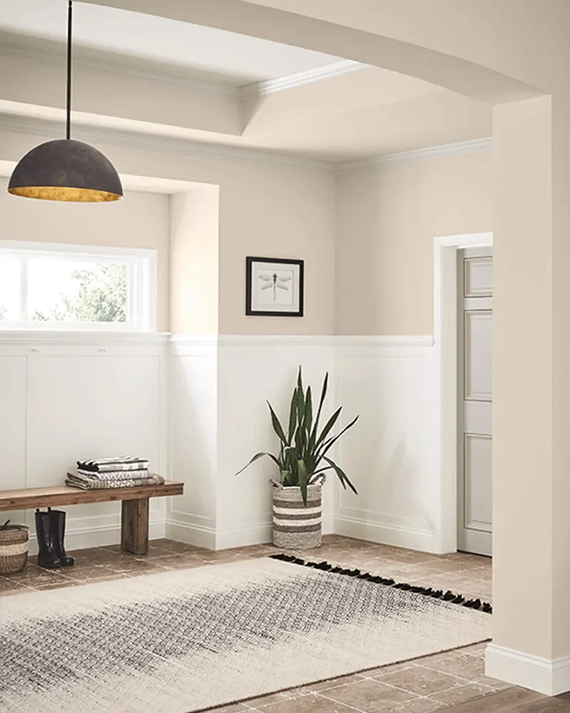
Not exactly, but north-facing rooms do pose some unique challenges, especially when it comes to color. The lack of direct sunlight can make some paint colors appear duller, cooler, or even bluish-gray, particularly in the morning and late afternoon.
Whites can feel icy, grays can look flat, and bolder colors may lose their vibrancy. That doesn’t mean a north-facing room is doomed to feel cold or uninviting—it just means you need to be a bit more intentional with your color choices.
With the right paint, these rooms can feel just as warm and welcoming as a sun-soaked space.
Why Light Direction Matters
Light plays a huge role in how we perceive color, and the direction your room faces changes the quality of that light. North-facing light is typically cooler, softer, and more diffused throughout the day.
It lacks the warmth and golden tones you’d get from southern or western exposures, which can cause certain paint colors, especially those with cool undertones, to feel chilly, shadowy, or just plain lifeless.
That’s why warm paint colors are usually the best choice for north-facing rooms. Shades with creamy, peach, beige, yellow, or red undertones help offset the cool natural light and make the space feel more balanced and inviting.
Even if you’re using a neutral palette, leaning slightly warm can make all the difference.
💥🎁 Christmas & Year-End Deals On Amazon !
Don't miss out on the best discounts and top-rated products available right now!
*As an Amazon Associate, I earn from qualifying purchases.
What to Look for in a Paint Color for a North-facing Room
When choosing a paint color for a north-facing room, your goal is to add warmth and softness without overwhelming the space. Here are a few things I always keep in mind:
Undertones Matter: Choose colors with warm undertones—yellows, reds, peaches, and warm taupes help balance out the cool light.
Stay Away from Cool Grays and Stark Whites: These can feel cold and flat under northern exposure.
Consider LRV (Light Reflectance Value): A higher LRV means the color reflects more light, which is helpful in rooms that don’t get much sun.
Use Soft Neutrals and Warm Midtones: Beige, warm gray (greige), soft green, creamy white, or muted blush can work beautifully.
Test in Natural Light: Always test your paint swatches at different times of the day in the actual room—colors shift more than you think.
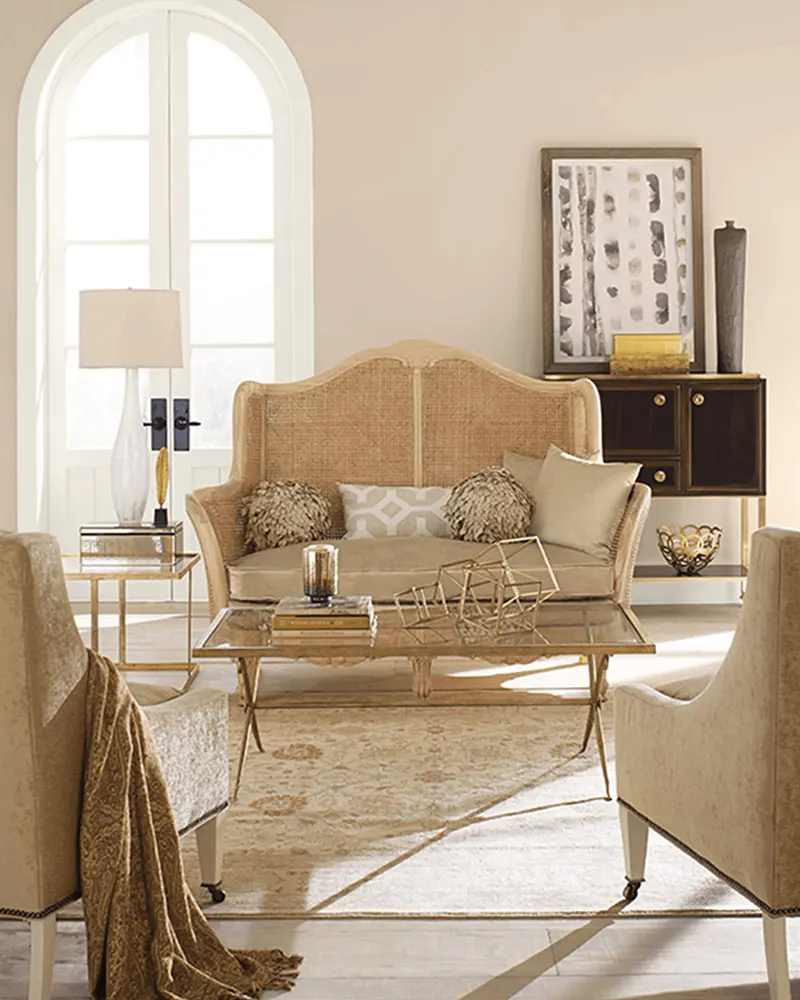
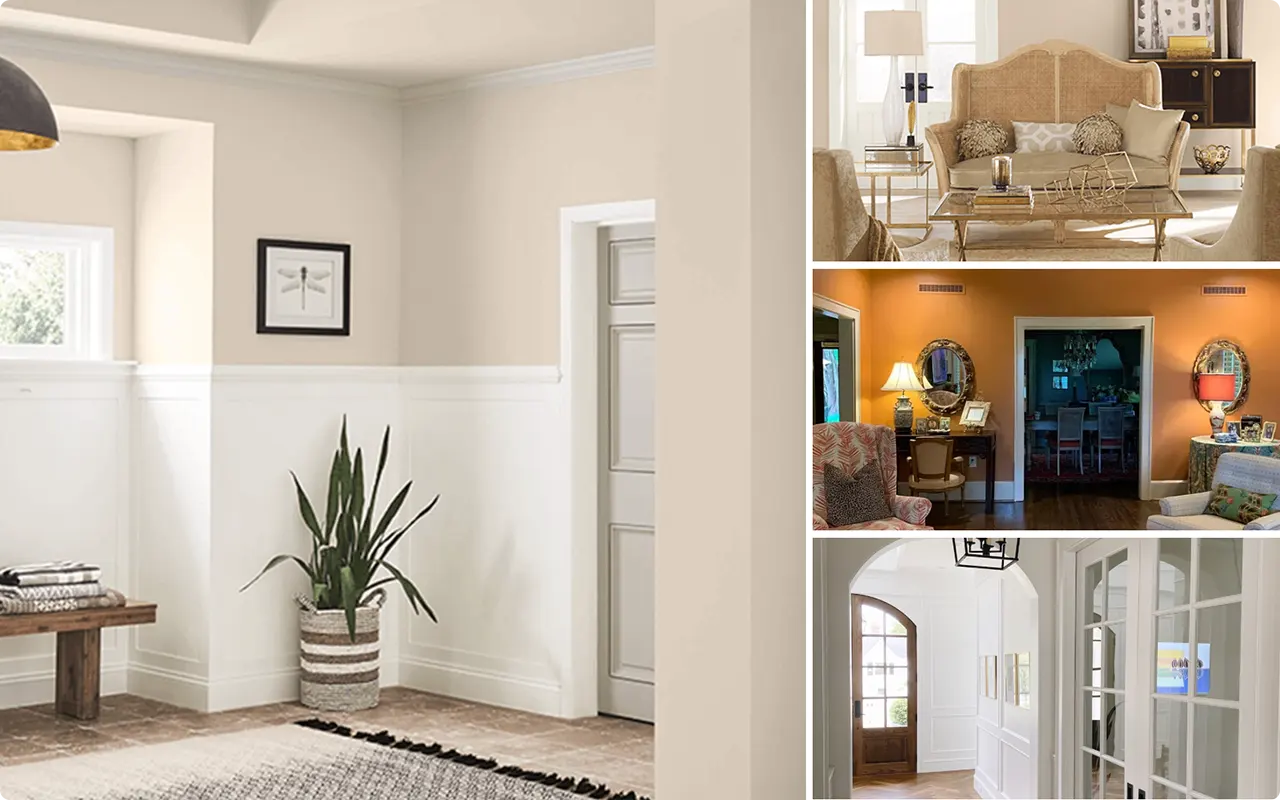
21 Best Paint Colors for a North-facing Room
After working on dozens of north-facing rooms—bedrooms, living rooms, home offices—I’ve come to rely on a curated list of paint colors that consistently work well with cool, indirect light.
To keep things simple, I’ve broken the list into two parts: one with my favorite Benjamin Moore shades, and another with tried-and-true Sherwin-Williams colors. Each one offers something unique, and I’ll walk you through what makes them special and why they work so well in rooms with cooler northern exposure.
11 Best Paint Colors for a North-facing Room from Benjamin Moore
Here are eleven Benjamin Moore paint colors that bring out the best in a north-facing room, whether you’re going for a cozy, airy, or elegant look.
1. Rodeo 1534

💥🎁 Christmas & Year-End Deals On Amazon !
Don't miss out on the best discounts and top-rated products available right now!
*As an Amazon Associate, I earn from qualifying purchases.
Rodeo is one of those colors that doesn’t shout for attention but quietly makes everything else look better. It sits somewhere between a warm gray and a muted greige, depending on the light.
In a north-facing room, where cool light dominates, Rodeo leans into its warm gray side—subtle, sophisticated, and calming. It has just enough depth to feel grounded, but it still keeps the space feeling open and soft.
2. White Chocolate OC-127

This isn’t your standard stark white. White Chocolate has creamy undertones that bring a gentle warmth, which is exactly what you want when you’re working with a room that lacks strong sunlight.
In cooler light, it doesn’t turn blue or gray—instead, it feels cozy and almost golden. It’s a beautiful backdrop if you’re trying to brighten up the space without going full-on beige or yellow.
3. Timid White OC-39

Timid White is a shy, whisper-soft off-white with a warm, peachy undertone that feels inviting without being overwhelming.
I’ve used it in north-facing bedrooms and home offices where a little lightness was needed, but I didn’t want things to veer into cold or stark territory.
It works especially well if your decor features warm woods or soft neutrals—it lets them shine without clashing.
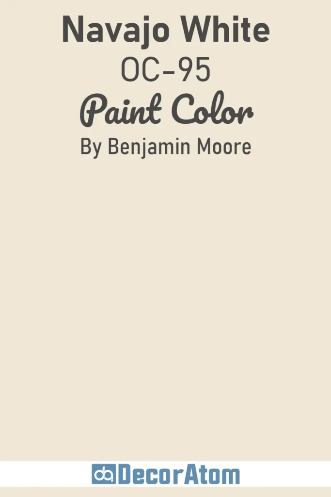
4. Navajo White OC-95
💥🎁 Christmas & Year-End Deals On Amazon !
Don't miss out on the best discounts and top-rated products available right now!
*As an Amazon Associate, I earn from qualifying purchases.
Navajo White is a classic for a reason. It’s not really white—it’s more of a warm, creamy beige that just happens to live in the white family.
In a north-facing space, it immediately softens the cool light, giving the whole room a more welcoming tone. I love pairing this color with natural materials—think rattan, linen, and warm wood—for a laid-back, timeless feel.
5. Elephant Tusk OC-8

There’s something quietly elegant about Elephant Tusk. It’s a soft neutral with hints of yellow and beige, but it never feels too warm or too cool.
In north-facing rooms, it helps neutralize the chilly cast and creates a warm, lived-in feeling. I often recommend this one for living rooms or open-plan areas where you want a little richness without adding too much color.
6. Lenox Tan HC-44

Lenox Tan is rich, classic, and surprisingly versatile. At first glance, it might seem too deep for a dim space, but with the right white trim or ceiling color, it absolutely sings in a north-facing room.
Its yellow-orange undertone brings warmth and coziness, making it a great choice for living rooms, dining rooms, or even dens. It has enough depth to anchor a space without making it feel heavy.
7. Potters Clay 1221

💥🎁 Christmas & Year-End Deals On Amazon !
Don't miss out on the best discounts and top-rated products available right now!
*As an Amazon Associate, I earn from qualifying purchases.
If you’re looking for a warm, earthy statement, Potters Clay is a beautiful option. It’s a terracotta-inspired shade with a strong orange undertone, which naturally counteracts the cool, indirect light in a north-facing room.
I wouldn’t use it on every wall, but as an accent—or even for an entire room with lots of white trim—it brings a bold, rustic charm. It’s perfect for cozy studies, reading nooks, or eclectic bedrooms.
8. Weston Flax HC-5
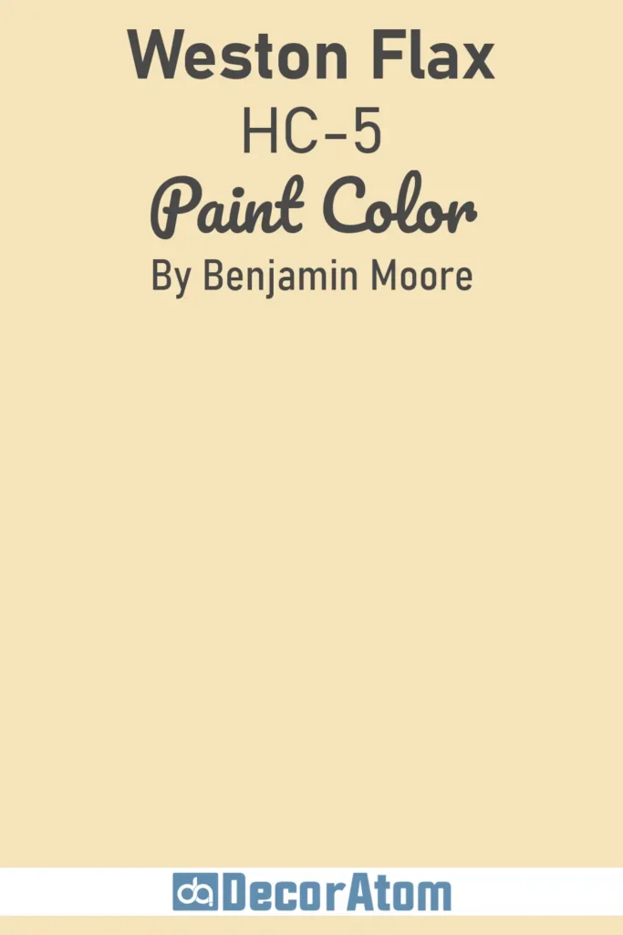
Weston Flax is like bottled sunlight. It’s a soft, buttery yellow that immediately warms up any space, especially those with colder northern exposure.
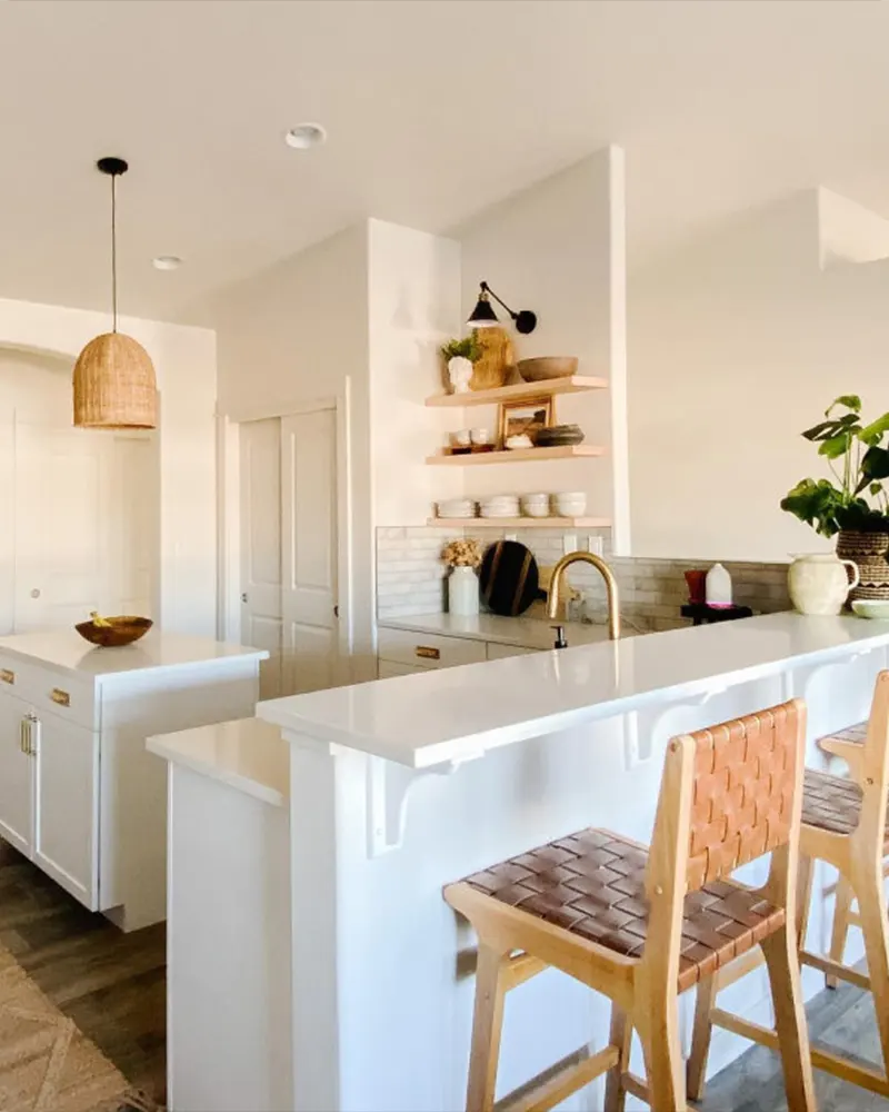
The trick with this one is balance—pair it with crisp white trims or lighter neutrals to keep it feeling fresh and not too golden. It’s cheerful without being loud, and it’s especially lovely in kitchens or breakfast nooks.
9. Head Over Heels AF-250

This blush-toned neutral is surprisingly adaptable. Head Over Heels has a soft pink-beige base that warms up beautifully in cooler light.
In a north-facing bedroom or hallway, it reads warm and cozy, not sweet or overly feminine. It’s one of those colors that plays well with warm metallics, soft textiles, and natural textures—very forgiving and modern.
10. Satchel AF-240

💥🎁 Christmas & Year-End Deals On Amazon !
Don't miss out on the best discounts and top-rated products available right now!
*As an Amazon Associate, I earn from qualifying purchases.
Satchel is a deep, golden brown that can look incredibly rich in the right setting.
In a north-facing room, it brings drama and warmth, especially when paired with lighter, creamy whites or warm metallics like brass or bronze.
I like this shade on accent walls, cabinetry, or even built-ins—it adds depth and character without feeling too dark or moody.
11. Palladian Blue HC-144

Palladian Blue is one of the few blue-leaning colors I’ll confidently use in a north-facing room. That’s because it has just enough green and gray in it to keep it from going icy.
Instead, it reads soft, breezy, and surprisingly warm—like sea glass in filtered light. It works beautifully in bathrooms, bedrooms, or even laundry rooms when you want a cool color that still feels welcoming.
10 Best Paint Colors for a North-facing Room from Sherwin Williams
Sherwin-Williams has a strong lineup of colors that work particularly well in north-facing rooms. These ten colors can help bring balance, comfort, and warmth to the cooler light of a north-facing room.
1. Kilim Beige SW 6106

Kilim Beige is one of those go-to neutrals I keep coming back to. It’s a warm, earthy beige with subtle peachy undertones that help it feel sunny and comforting—even in a room with little natural warmth.
In a north-facing space, it works hard to counteract the coolness of the light without looking too yellow or pink. I love it for living rooms, hallways, and open-concept areas where you want consistency and softness.
2. Creamy SW 7012

As its name suggests, Creamy is a gentle off-white with a rich, buttery undertone. In cool light, it still manages to feel soft and inviting rather than stark or gray.
I’ve used it in bedrooms and kitchens alike, especially when I want the walls to feel light but not sterile.
It plays beautifully with both traditional and modern decor, and it’s one of the few off-whites that doesn’t shift dramatically throughout the day.
3. Antique White SW 6119

Antique White is one of those timeless colors that never really goes out of style. It’s a soft, creamy off-white with warm undertones that subtly lean beige, which helps neutralize the cool, shadowy light in north-facing rooms.
Unlike brighter whites that can feel stark or blue in this kind of light, Antique White adds a gentle glow without overwhelming the space.
It’s an ideal choice for traditional or transitional interiors, especially if you’re going for a warm, comforting backdrop that works well with wood tones, warm metals, or earth-toned textiles.
4. Agreeable Gray SW 7029

Agreeable Gray lives up to its name—it’s one of the most versatile greiges out there. With just enough warmth to avoid turning cold, it stays beautifully balanced even in northern light.
It works specially well in spaces where you want a soft, modern backdrop but don’t want to commit to a beige or taupe. I often recommend it for whole-house color schemes because it adapts so well to changing light.
5. Natural Linen SW 9109
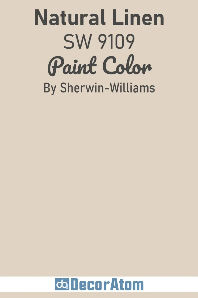
Natural Linen is a light, warm neutral with a touch of beige and taupe woven together. In a north-facing room, it reads soft and earthy without looking muddy or dull.
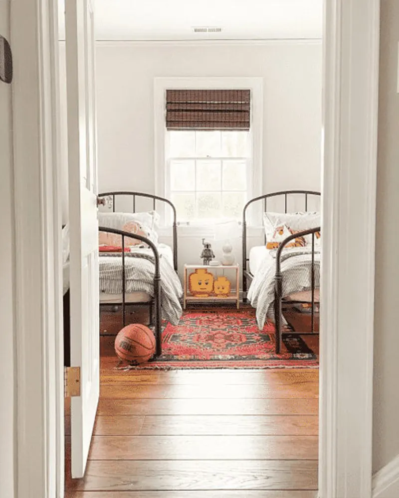
It has a subtle elegance that works especially well in bedrooms or sitting rooms, particularly if you pair it with soft white trim and layered textures like linen, wool, or warm woods.
6. Grassland SW 6163

Grassland brings a soft, muted sage green to the table—perfect for adding a bit of color without overwhelming the space.
While sage tones can sometimes lean cool, this one has an underlying warmth that plays nicely with northern light. It’s calming and serene, ideal for bedrooms, bathrooms, or anywhere you want to create a nature-inspired retreat.
7. Worldly Gray SW 7043

Worldly Gray is slightly cooler than Agreeable Gray, but it still carries enough warmth to hold its own in a north-facing room.
It sits somewhere between gray and beige, making it incredibly flexible with a wide range of accent colors.
If you’re not quite ready to go full-on greige but want something that feels sophisticated and grounded, Worldly Gray is a great choice.
8. Aesthetic White SW 7035

Aesthetic White is one of my secret weapons for low-light spaces. It’s a soft, off-white with warm undertones that never feels too creamy or too stark.
In a north-facing room, it subtly reflects light while adding a hint of cozy warmth. I’ve used it in everything from small bedrooms to larger dining rooms, and it always makes the space feel just a bit more welcoming.
9. Moderate White SW 6140
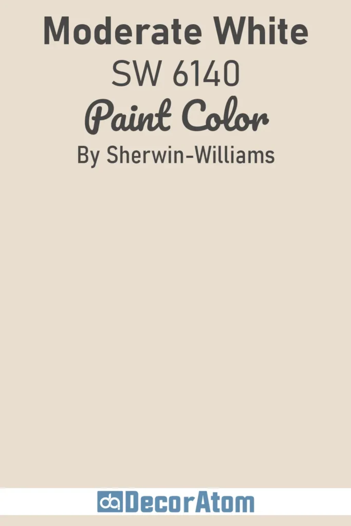
Moderate White is a creamy beige that doesn’t overdo it. It has soft peach and yellow undertones that gently warm up a space, making it perfect for north-facing rooms that need a little extra life.
It works well as a whole-room color or even just on a single wall to create warmth and contrast with cooler elements like gray tile or white cabinetry.
10. Egret White SW 7570

Egret White is a refined, pale greige with a touch of softness that keeps it from going flat. It’s light enough to work as a whole-room color, but has just enough pigment to create a bit of contrast with white trim.
In north-facing rooms, it maintains its warmth and subtle elegance, making it ideal for spaces where you want something airy, but not stark or washed out.
Paint Tips for North-facing Rooms
Here are a few practical tips I’ve picked up along the way for making north-facing rooms feel their best:
Choose warm lighting: Use light bulbs with a soft white or warm glow (2700K–3000K) to mimic sunlight and warm up the space.
Balance with warm materials: Layer in warm woods, woven textures, warm-toned textiles, and brass or gold accents.
Use white trim strategically: A warm white trim (like Benjamin Moore’s White Dove or Sherwin-Williams’ Alabaster) can brighten up the space and help the wall color pop without adding coldness.
Add mirrors or glass decor: Reflective surfaces can help distribute the light and make the room feel more open and bright.
Don’t be afraid of contrast: Using slightly deeper warm tones can make a room feel cozier than pale colors that wash out in cool light.
Final Thoughts
A north-facing room doesn’t have to feel cold or uninspiring. With the right paint color, and a little design intention, you can transform it into one of the coziest, most inviting spots in your home.
It’s all about working with the light, not against it. I hope this list gave you some helpful inspiration and practical guidance as you choose the perfect color for your space.
If you’ve tried any of these shades, or found a hidden gem I missed, feel free to drop it in the comments. I’d love to hear what’s worked for you.