
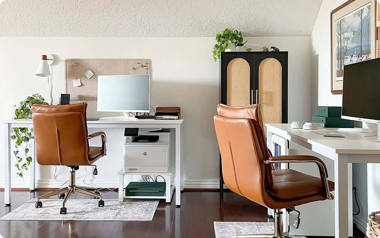
Your office paint color is more than just a backdrop—it’s the foundation of how you feel and work in the space. The right color can boost focus, enhance creativity, or set a calming tone for long workdays.
But here’s the tricky part: choosing a color that strikes the perfect balance between inspiring and practical.
Maybe you’ve seen those dreamy Pinterest offices—moody walls with warm lighting, soft neutral tones that make the space feel expensive, or deep blues that scream productivity.
But when it comes to your own office, how do you decide? Should you go bold or keep it subtle? Warm or cool? Energizing or relaxing?
I’ve narrowed down 17 incredible office paint colors that check all the right boxes.
Whether you want a space that feels rich and sophisticated, fresh and airy, or creatively charged, there’s a shade here that will transform your workspace into a place you actually want to spend time in.

The Impact of Light in an Office
Lighting is the secret ingredient that can make or break a paint color. The same shade of gray that looks perfect in a bright, sunlit room might turn murky and dull in a space with minimal natural light. So before you commit to a color, take a good look at how light plays in your office throughout the day.
- Natural Light: If your office gets plenty of daylight, you have more flexibility with color. Soft whites, deep greens, and rich browns will shine beautifully without feeling too heavy. Just keep in mind that north-facing rooms tend to bring out cooler undertones, while south-facing spaces warm everything up.
- Artificial Light: If your office relies mostly on lamps or overhead lighting, pay attention to the bulb temperature. Warm bulbs (2700K-3000K) will soften colors and make them cozier, while cool bulbs (4000K-5000K) will sharpen them and add a crisper look.
- Small vs. Large Spaces: Darker colors can make a small office feel intimate and sophisticated, while lighter tones can open up the space and make it feel bigger. If your office is compact, don’t be afraid to go moody—just balance it with good lighting and lighter furniture.

Why You Will Love These Paint Colors for Your Office
Every color on this list was chosen with an office space in mind. These aren’t just pretty colors—they’re practical, stylish, and work in real-life settings. Here’s what makes them stand out:
- They enhance productivity. Some shades naturally help with focus and mental clarity. Blues and greens are known to reduce stress and improve concentration, while warm neutrals create a sense of stability.
- They make your office feel intentional. A thoughtfully chosen paint color can elevate your workspace from a basic home office to a well-designed, inspiring environment.
- They adapt to different styles. Whether you’re going for modern, classic, moody, or minimal, these colors work beautifully across different aesthetics.
- They feel professional but not boring. Offices don’t have to be cold and corporate. These colors strike the right balance between stylish and functional, making your space both work-friendly and visually appealing.
If you want an office that feels polished, inspiring, and tailored to your personal style, these 17 colors deliver exactly that.

💥🎁 Christmas & Year-End Deals On Amazon !
Don't miss out on the best discounts and top-rated products available right now!
*As an Amazon Associate, I earn from qualifying purchases.
Tips for Choosing the Best Paint Colors for an Office
Selecting the right office paint color isn’t just about picking a shade you like—it’s about creating an environment that supports your workflow. Here are a few key tips to keep in mind:
- Consider how you work. Do you need a calming space for deep focus, or do you thrive in a more energetic environment? Soft neutrals and greens promote relaxation, while deep blues and rich browns add sophistication and depth.
- Factor in lighting. Like I mentioned earlier, lighting changes everything. A color that looks perfect in bright daylight might feel too dull under artificial lighting. Always test swatches before committing.
- Think about longevity. Trends come and go, but your office should feel timeless. A color like Benjamin Moore Edgecomb Gray or Sherwin-Williams Inkwell will still look amazing years down the road.
- Use color psychology. Different colors evoke different moods. Blues encourage focus, greens promote balance, and warm tones add a cozy, inviting touch. Choose a color that aligns with how you want to feel in your office.
- Balance bold choices with neutrals. If you love a deep, moody color like Benjamin Moore Graphite or Sherwin-Williams Sealskin, pair it with lighter furniture, white trim, or metallic accents to keep the space from feeling too heavy.
At the end of the day, the best office paint color is one that makes you feel good. Whether you’re going for a high-end, executive vibe or a light and airy workspace, this list has a color that will help you create an office you actually want to work in.
Top 17 Paint Colors For An Office
1. Benjamin Moore Van Buren Brown

Brown might not be the first color you think of for an office, but Van Buren Brown is here to change that. This deep, chocolatey brown creates an incredibly sophisticated and grounded environment—perfect if you want your office to feel rich, professional, and timeless.
Dark brown shades have a way of adding warmth without feeling too bold, making them a great alternative to black. Pair it with warm lighting and wood accents for a workspace that feels both classic and cozy.
2. Benjamin Moore Slate Teal

For those who want an office that sparks creativity without being over-the-top, Slate Teal is a perfect choice. This color blends the richness of teal with a muted, sophisticated undertone, making it a fantastic alternative to the usual blues and greens.
Slate Teal is bold but not loud, refined but not boring. It has enough saturation to energize the space while still feeling professional. If your office has white trim or warm wood furniture, this color will create a striking contrast that looks effortlessly stylish.
It’s also a color that transitions beautifully between daylight and evening lighting, keeping the space looking polished at all hours.
3. Benjamin Moore Graphite

💥🎁 Christmas & Year-End Deals On Amazon !
Don't miss out on the best discounts and top-rated products available right now!
*As an Amazon Associate, I earn from qualifying purchases.
Few colors command attention the way Graphite does. This deep, charcoal gray is perfect for a modern office, creating a dramatic yet incredibly sleek atmosphere. If you’re aiming for a space that feels high-end and focused, Graphite delivers.
Dark colors in an office can feel risky, but this shade is beautifully balanced—it doesn’t lean too cool or too warm, making it easy to work with.
The key is to pair it with lighter elements—think soft white trim, metallic fixtures, and natural textures like leather or linen. If you’re after an office that feels powerful yet stylish, Graphite will make a strong statement without overwhelming the room.
4. Sherwin-Williams Inkwell

Inkwell is one of those rare near-black colors that feels bold but never harsh. It’s deep, mysterious, and packed with personality, making it a fantastic choice for an office that leans moody and sophisticated.
What makes Inkwell stand out is its subtle blue undertone, which keeps it from feeling too heavy. This means it works beautifully in offices with plenty of natural light, creating a rich, cocoon-like effect.
It’s the kind of color that transforms a space into something truly special—ideal for those who love a refined, dramatic backdrop for their workspace.
5. Sherwin-Williams Timeless Taupe

Not every office color needs to be bold to make an impact. Timeless Taupe is the ultimate balance between warmth and neutrality, creating a space that feels welcoming and versatile.
This is a taupe that doesn’t go too pink or too gray—it’s perfectly centered, making it adaptable to different lighting conditions. If you want an office that feels calming but still has personality, this is a fantastic pick.
It works beautifully with both dark and light furniture, and it won’t go out of style anytime soon.
6. Benjamin Moore Van Deusen Blue

💥🎁 Christmas & Year-End Deals On Amazon !
Don't miss out on the best discounts and top-rated products available right now!
*As an Amazon Associate, I earn from qualifying purchases.
Blue is a classic office color for a reason—it’s known for boosting focus and productivity. But Van Deusen Blue takes it up a notch by adding depth and richness, making it feel more sophisticated than your typical office blue.
This is a blue that works in any setting. It has just enough gray to keep it from feeling too vibrant, but it still brings a strong presence to the space.
Whether you’re pairing it with crisp white trim or warm wood tones, Van Deusen Blue is one of those colors that always looks put-together and polished.
7. Benjamin Moore Majestic Yellow

Most people wouldn’t immediately think of yellow for an office, but hear me out—Majestic Yellow is a game-changer. This is not a bright, in-your-face yellow; it’s a rich, golden shade that brings warmth and positivity into the room.
Yellow is a color associated with energy and optimism, and in an office setting, that can be a huge boost. Majestic Yellow works best in spaces with plenty of natural light, where it takes on a beautiful glow.
If you want an office that feels uplifting and full of creative energy, this is the perfect shade to bring in some warmth without overpowering the space.
8. Benjamin Moore Edgecomb Gray
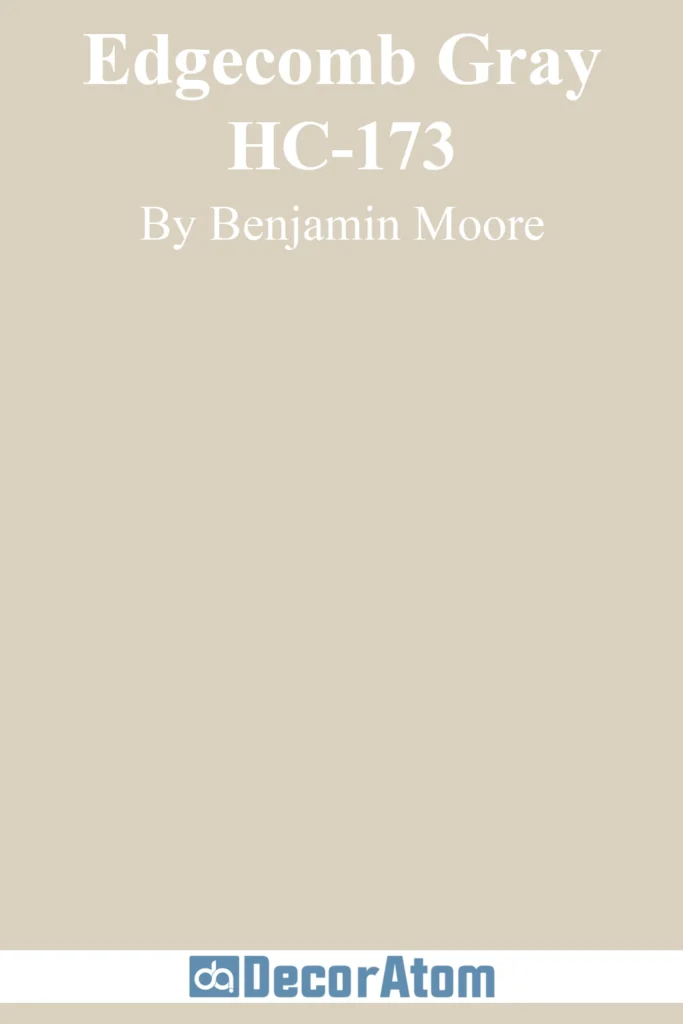
If you’re looking for a foolproof neutral, Edgecomb Gray is a top-tier choice. This warm greige is one of Benjamin Moore’s most popular shades, and for good reason—it works everywhere.
Edgecomb Gray is light enough to keep an office feeling airy, but it has enough warmth to make the space feel inviting. It’s the kind of color that looks expensive without trying too hard.
If your office doubles as a guest room or multi-use space, this is a fantastic choice because it’s adaptable and never feels out of place.
9. Benjamin Moore Revere Pewter

💥🎁 Christmas & Year-End Deals On Amazon !
Don't miss out on the best discounts and top-rated products available right now!
*As an Amazon Associate, I earn from qualifying purchases.
Revere Pewter is a powerhouse neutral—soft, warm, and endlessly versatile. It’s a bit deeper than Edgecomb Gray, making it a great option if you want a touch more depth in your office color.
What makes Revere Pewter so special is its ability to shift beautifully in different lighting. In a bright office, it feels airy and light.
In a dimmer space, it takes on a cozy, enveloping feel. It pairs seamlessly with everything from crisp white trim to bold accent colors, making it an easy, low-maintenance choice that still feels intentional.
10. Sherwin-Williams Sealskin

For those who love deep, moody colors, Sealskin is a must-try. This deep, rich brown is bold, but it has a softness to it that keeps it from feeling too stark.
Sealskin brings warmth and sophistication to an office, making it a fantastic choice for anyone who wants a color that feels both dramatic and inviting.
It pairs beautifully with lighter neutrals and warm wood tones, creating a space that feels refined and cozy at the same time. If you’re drawn to dark, earthy tones but want something more unique than black or gray, Sealskin is an incredible option.
11. Benjamin Moore Dove Wing

For those who love a soft, airy workspace, Dove Wing is the ultimate office-friendly white. This isn’t a stark, cold white—it has just enough warmth to make a room feel inviting while still maintaining a clean, bright aesthetic.
Dove Wing is perfect if you want your office to feel open and spacious. It works beautifully in rooms with plenty of natural light, where it takes on a subtle glow, but it also holds up well in spaces with artificial lighting, never feeling too sterile.
If you want a crisp yet welcoming office that pairs with just about any decor style, Dove Wing is an effortless choice.
12. Sherwin-Williams Greenfield

💥🎁 Christmas & Year-End Deals On Amazon !
Don't miss out on the best discounts and top-rated products available right now!
*As an Amazon Associate, I earn from qualifying purchases.
Green is a fantastic color for an office because of its grounding, and restorative qualities, and Greenfield is one of the best deep greens out there. It’s a rich, sophisticated shade that adds a sense of depth without feeling too dark or heavy.
This is the kind of green that instantly makes a space feel established and polished. If you want an office that feels calm yet confident, Greenfield is a phenomenal pick.
Pair it with brass accents, warm wood tones, and crisp white trim for a high-end, nature-inspired workspace.
13. Sherwin-Williams Silver Strand

Silver Strand is the perfect soft, muted gray-green for a tranquil, focused office environment. It has a subtle blue-green undertone that keeps it from feeling flat, making it a refreshing yet neutral choice.
This color is ideal for those who want a workspace that promotes clarity and calmness. It’s light enough to keep a room feeling open but has enough character to stand on its own.
If your office has soft, natural lighting, Silver Strand will take on an airy, almost spa-like quality, creating a stress-free zone perfect for deep concentration.
14. Benjamin Moore Hale Navy

There’s something about Hale Navy that just works in an office. It’s deep, rich, and strikingly elegant, making it the perfect choice for those who want a bold yet classic workspace.
Hale Navy is one of the most versatile dark blues—it pairs beautifully with both warm and cool tones, so it plays well with natural wood furniture, crisp whites, or even brass and gold accents.
This is a color that feels professional yet creative, sophisticated yet inspiring. If you want a strong, confident office color, Hale Navy is a no-brainer.
15. Sherwin-Williams Linen White

If you want a softer, more traditional office color that still feels fresh and timeless, Linen White is a wonderful option. It’s a warm, creamy white that brings a touch of coziness to an office without feeling yellow or overly warm.
Linen White is perfect for those who want a neutral office but find cooler whites too stark. It pairs beautifully with wood tones and warm accents, creating a space that feels inviting and relaxed.
If you’re working with a smaller office and want it to feel light and airy while still having some warmth, Linen White is an easy, classic choice.
16. Benjamin Moore Sparrow

Sparrow is a deep, moody taupe that brings a sense of warmth and sophistication to an office space. It’s rich, earthy, and has just enough gray to keep it feeling modern rather than overly brown.
This is a fantastic choice for those who want a cozy, enveloping office that feels both elegant and comfortable. Sparrow pairs beautifully with soft whites, warm woods, and even black or brass accents.
If you love the idea of a darker, more intimate workspace but don’t want to go full-on charcoal or black, Sparrow is a refined middle ground.
17. Sherwin-Williams Softened Green

For an office that feels refreshing and connected to nature, Softened Green is the perfect choice. This gentle, muted green has a softness to it that makes a room feel peaceful and balanced.
Green is known for its calming and restorative properties and softened green strikes the perfect balance of being present without being overpowered.
It pairs well with light wood tones, crisp whites, and soft neutrals, making it an excellent choice if you want a space that feels fresh, creative, and welcoming.
Final Thoughts
There you have it—the best 17 paint colors for an office, each with its own personality and purpose.
Whether you want a deep, dramatic space or a light, airy one, this list has a color that will help you create the perfect environment for productivity and inspiration.
