
Choosing the right paint color for your living room can feel like a big decision — and honestly, it is!
The living room is where life happens, from slow coffee mornings to lively gatherings with friends. It deserves a color that feels timeless, inviting, and versatile.
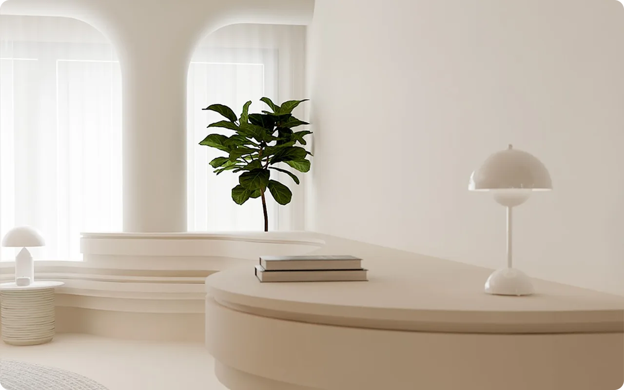
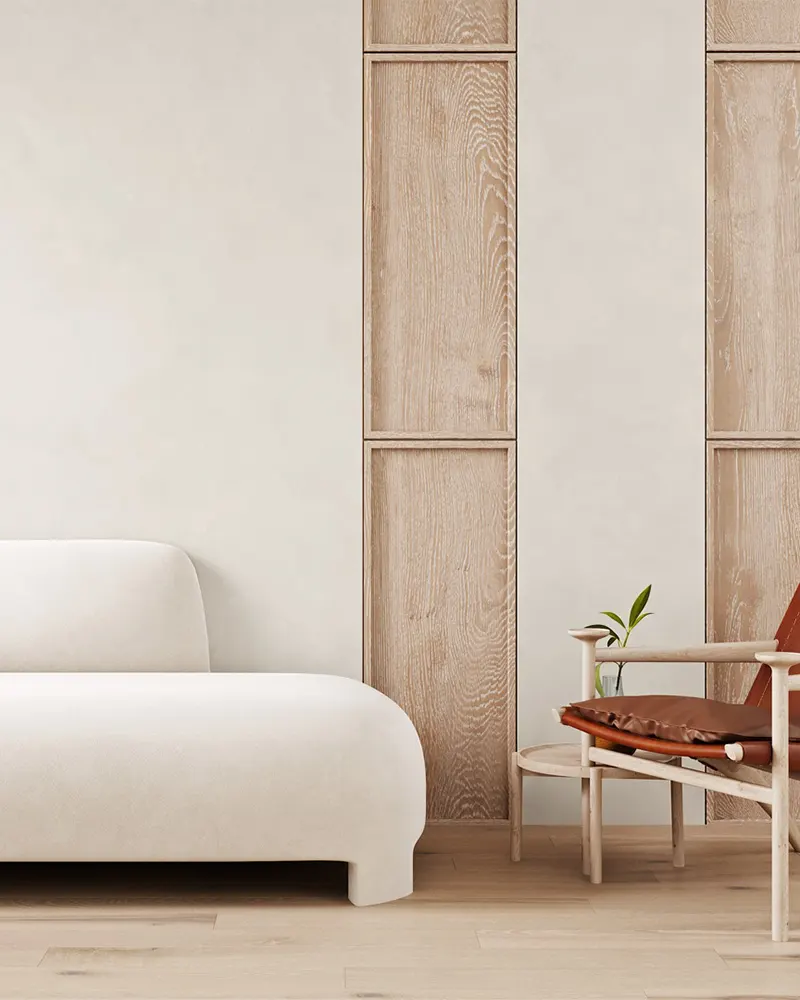
That’s where off-white paint colors come in. They offer the perfect balance between brightness and warmth, giving your space a light, airy feeling without it ever feeling cold or sterile.
In this blog post, I’m sharing my favorite 15 off-white paint colors that truly shine in living rooms, creating spaces that feel fresh, cozy, and endlessly stylish.
What are Off White Paint Colors?
Off-white paint colors sit somewhere between true white and light neutrals like cream, beige, or soft gray.
They still read as “white” to the eye, but they carry subtle undertones — like a whisper of warmth, a hint of coolness, or even a delicate touch of color.
This softness makes off-whites feel more welcoming and less stark than pure whites.
Depending on the undertones, some off-whites can feel warm and creamy, while others feel fresh and crisp.
They’re incredibly versatile and can adapt beautifully to different lighting conditions, furnishings, and decorating styles.
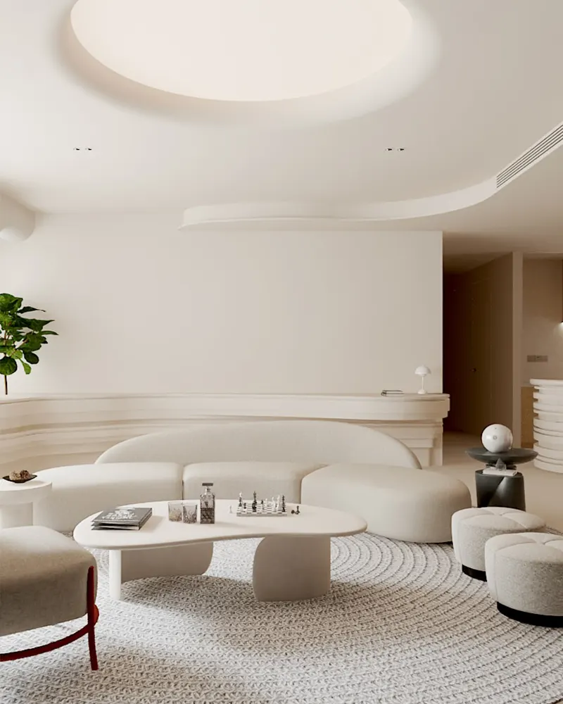
Why Choose Off White Paint Colors for Living Room?
Off-white paint colors bring a perfect balance of lightness and softness to a living room.
Unlike a pure, bright white that can sometimes feel too harsh or clinical, off-whites create a more comfortable and livable backdrop.
They reflect plenty of natural light, helping a space feel larger and more open, but their subtle undertones add just enough warmth or depth to make the room feel grounded and cozy.
Off-whites are also endlessly versatile — they work beautifully with traditional, modern, farmhouse, and even coastal styles.
Whether you want a calm, serene atmosphere or a bright, welcoming space for entertaining, off-white paint is a foolproof foundation for any living room.
Tips for Choosing the Best Off White Paint Color for Living Rooms
Finding the best off white paint color for living rooms can truly transform the feel of your home. These helpful tips will guide you toward picking the perfect shade that fits your style, lighting, and decor:
1. Pay Attention to Undertones
Not all off whites are created equal. Some off-white paint colors have warm undertones like yellow, beige, or pink, while others lean cooler with hints of gray or green. Always test samples in your own space to see which undertone works best with your living room’s furniture, lighting, and overall vibe.
2. Test Paint Colors in Natural and Artificial Light
Lighting plays a huge role in how an off white shade will look on your walls. The best off white paint color for living rooms should feel beautiful all day long — not just under bright afternoon sun. Test your favorite colors on different walls and observe how they shift between natural daylight and evening lamp light.
3. Consider Your Living Room’s Furniture and Decor
Your existing furniture and accessories will influence how an off white paint color reads in your space. Warm off-whites with creamy or beige undertones often pair beautifully with rich woods and earthy tones. Cooler off-whites with a gray base can complement modern, minimalist furniture for a clean, crisp look.
4. Decide on the Mood You Want to Create
Think about the atmosphere you want your living room to have. For a fresh, airy feel, choose a cooler off white with subtle gray or blue undertones. If you want a cozy, welcoming vibe, go with a warmer off white that feels soft and creamy.
5. Don’t Be Afraid to Layer Different Off Whites
Some of the most stunning living rooms layer multiple off whites for depth and interest. Using a slightly different shade on your trim, walls, and ceiling can create a subtle but beautiful contrast. Just make sure the undertones work together to keep the look cohesive and elegant.
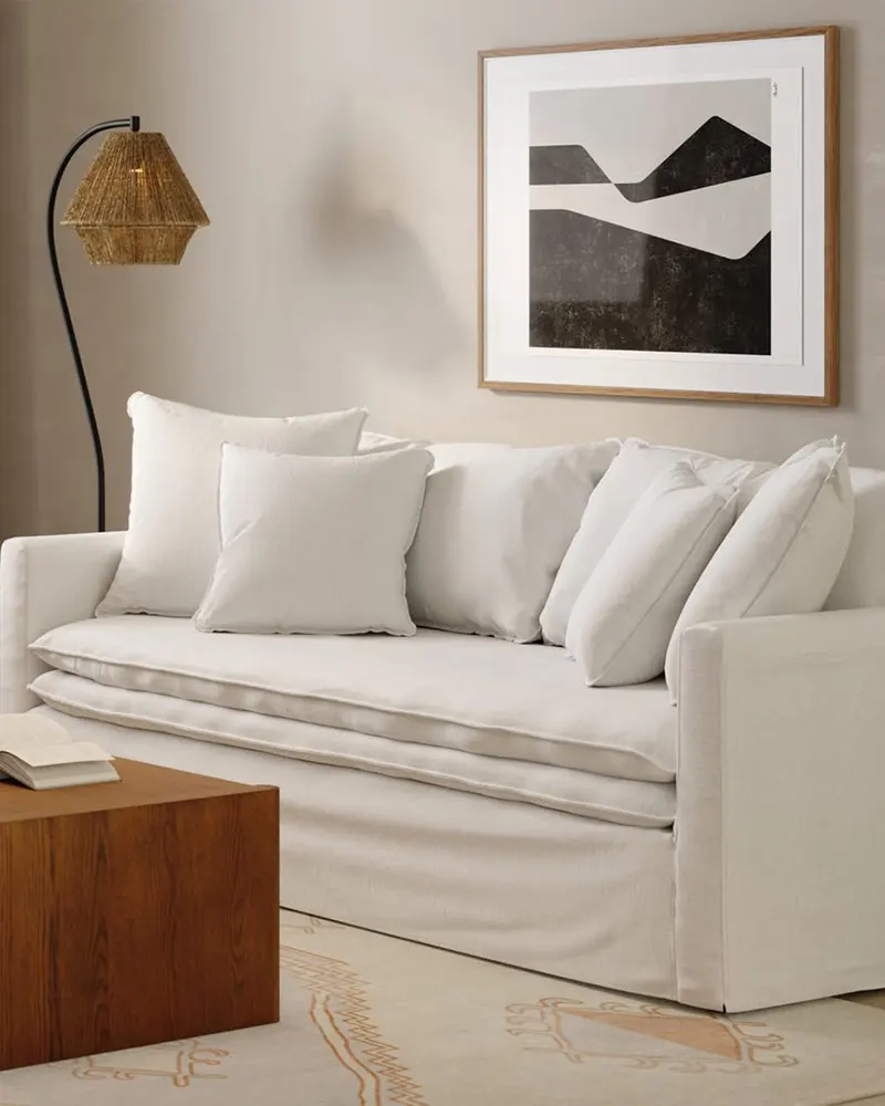
What Colors Complement Off White Paint Colors in Living Room?
One of the best things about off-white walls is how easy they are to style. They act as a soft, neutral backdrop that pairs beautifully with a wide range of colors. Here are a few combinations that always work:
- Deep Charcoals and Soft Grays: Add depth and sophistication without overwhelming the softness of the off-white.
- Earthy Greens and Olive Tones: These colors bring warmth and a natural feeling that complements creamy and beige-toned off-whites perfectly.
- Navy and Dusty Blues: These cooler tones contrast beautifully with off-whites, creating a balanced and calming palette.
- Warm Woods and Natural Textures: Think rattan, linen, leather, and oak — these elements highlight the warmth in off-white tones.
- Pops of Black or Brass Accents: Adding contrast through black frames or brass lighting gives off-white walls a modern, polished look without making the space feel heavy.
- Blush Pinks and Soft Terracottas: If you love a slightly more colorful, cozy look, muted pinks or earthy oranges feel inviting and stylish against an off-white backdrop.
Ultimately, off-white walls are like a blank canvas — you can go bold, you can go soft, you can mix and match styles, and it all still feels cohesive.
Top 15 Off White Paint Colors for Living Room
Here are my favorite Off White paint colors for living room to decorate with.
1. Sherwin-Williams Alabaster

Sherwin-Williams Alabaster is one of those rare off-whites that feels both cozy and airy at the same time.
It’s a warm off-white with just the right hint of creaminess to soften a living room without making it feel yellow.
With an LRV (Light Reflectance Value) of 82, it reflects a lot of natural light, making spaces feel more open and welcoming.
Alabaster works beautifully with both modern and traditional decor, and it’s particularly stunning when paired with warm wood accents or soft grays.
It creates a calm, inviting living room that feels timeless, not trendy.
2. Benjamin Moore Linen White

Linen White by Benjamin Moore brings a lovely old-world charm to a living room.
It’s a warm, creamy off-white with a noticeable buttery undertone that adds softness and character. This is the kind of color that instantly warms up a space, making it feel cozy without being too heavy.
Linen White works especially well in traditional and transitional living rooms, and it pairs effortlessly with warm-toned furniture, beige, and even muted greens.
If you want a living room that feels like it’s bathed in afternoon sunshine, Linen White is a beautiful choice.
3. Behr Whipped Cream

Behr’s Whipped Cream is a soft, clean off-white that strikes a great balance between warm and fresh.
It has a delicate touch of warmth, but it leans more neutral than creamy, making it super versatile.
In a living room, Whipped Cream can act as a bright, fresh backdrop for any style—from cozy cottage to contemporary minimalist.
It’s light enough to make small living rooms feel larger, but it still has enough softness to prevent the space from feeling sterile or cold.
4. Sherwin-Williams Natural Linen

Natural Linen by Sherwin-Williams sits right on the edge between off-white and very light beige.
It’s a warm, earthy off-white with subtle tan undertones, making it feel grounded and sophisticated. In a living room, Natural Linen brings an effortless sense of comfort.
It’s perfect for creating that relaxed, casual elegance that feels lived-in yet polished.
Pair it with soft blues, muted greens, or creamy whites for a serene, layered look that feels welcoming without trying too hard.
5. Behr Blank Canvas

Blank Canvas by Behr is a true soft, warm off-white that feels refreshing yet cozy—a rare combination.
Named Behr’s 2023 Color of the Year, it’s designed to be the ultimate blank slate, but it’s far from boring.
Blank Canvas has a whisper of warmth that helps it work beautifully in living rooms, making spaces feel bright without feeling stark.
It’s the kind of color that lets your furniture and décor shine while still providing a rich, welcoming backdrop.
If you want a living room that feels clean, calm, and full of possibility, Blank Canvas is an excellent choice.
6. Benjamin Moore Horizon

Benjamin Moore’s Horizon is technically a very soft, cool-toned gray, but in bright living rooms, it easily reads as an off-white with a misty, ethereal feel.
It has blue undertones that give it a crisp, airy quality without feeling icy. Horizon is perfect for a living room where you want a light, open feel with just a hint of cool sophistication.
It pairs beautifully with navy, charcoal, and fresh whites, creating a space that feels peaceful and modern without being too sharp.
7. Farrow & Ball Wevet

Wevet by Farrow & Ball is a delicate, almost translucent off-white with the subtlest cool gray undertone.
It’s clean without being cold, and its soft character makes it perfect for creating a fresh, understated living room.
Wevet adapts beautifully to changing light, sometimes looking almost pure white and other times taking on a soft, silvery glow.
It’s a fantastic backdrop for both colorful and neutral furnishings, offering just enough pigment to avoid feeling flat but staying quietly elegant.
8. Sherwin-Williams Oyster White

Sherwin-Williams Oyster White is an off-white with a slight green-gray undertone that gives it a muted, earthy feel.
It’s one of those colors that shifts with the light—sometimes reading more beige, sometimes a soft, earthy white.
In a living room, Oyster White creates a very grounded, calming atmosphere.
It’s ideal if you want a soft, subtle color that still has a bit of character. This one pairs especially well with organic textures, like natural wood, linen, and woven baskets.
9. Farrow & Ball Dimity

Dimity by Farrow & Ball is a beautiful warm off-white with a very soft pinkish-beige undertone. It’s elegant, gentle, and quietly uplifting.
In a living room, Dimity brings a soft warmth that’s understated but full of charm. It has a way of making spaces feel subtly rosy and cozy without ever crossing into looking pink.
Dimity looks particularly lovely with warm neutrals, soft blues, and antique wood tones, creating a space that feels both classic and fresh.
10. Benjamin Moore Calm

Calm by Benjamin Moore lives up to its name perfectly. It’s a soft, cool-toned off-white with a whisper of gray and a barely-there violet undertone that gives it a serene, airy feel.
In a living room, Calm creates a peaceful, light-filled atmosphere that feels gentle and easy to live in.
It’s the perfect choice if you want your living room to feel restful and expansive. Calm pairs beautifully with soft grays, blues, and muted blush tones for an elegant, harmonious space.
11. Benjamin Moore Silver Satin

Silver Satin by Benjamin Moore is a soft, misty off-white with cool gray undertones.
It’s incredibly refined — almost like a whisper of color — and gives a living room a sophisticated, airy quality without feeling stark.
Silver Satin is perfect if you want your space to feel fresh but still grounded. Depending on the light, it can lean just a touch more silvery or stay a soft warm gray, which adds a layer of quiet interest.
It pairs effortlessly with deep blues, crisp whites, and natural textures, creating a calm and elevated living room atmosphere.
12. Benjamin Moore White Dove

Benjamin Moore’s White Dove is one of the most beloved off-whites for good reason.
It’s warm without being yellow, soft without being dull, and bright without being stark.
White Dove has a creamy undertone that feels incredibly inviting, making it perfect for living rooms where you want a cozy but clean look.
It’s flexible enough to pair with just about any color palette, from deep charcoals to earthy greens to airy blues. If you’re dreaming of a classic, timeless living room that feels bright and welcoming, White Dove is a true crowd-pleaser.
13. Sherwin-Williams Greek Villa

Greek Villa by Sherwin-Williams is a warm off-white that leans a little softer and creamier than a pure white, but never turns yellow or dingy.
It has a cozy, sunlit feeling that works wonders in a living room, especially if you want your space to feel both bright and comfortable.
Greek Villa looks amazing with natural wood tones, soft greens, and warm grays, making it a favorite for farmhouse, transitional, and even modern spaces.
It’s the kind of color that feels instantly homey — like you could kick off your shoes and stay awhile.
14. Farrow & Ball Pointing

Pointing by Farrow & Ball is a beautiful, warm off-white with the softest hint of red pigment, giving it a gentle, almost creamy glow.
Named after the color of the mortar used in brickwork, it has a natural, slightly lived-in feel that’s perfect for creating an inviting living room.
Pointing doesn’t feel sterile or overly crisp; instead, it brings a cozy, sun-warmed feeling to a space.
It pairs beautifully with classic neutrals, muted blues, and rustic textures, making it a fantastic choice if you want a living room that feels timeless yet full of character.
15. Benjamin Moore Swiss Coffee

Swiss Coffee by Benjamin Moore is one of those classic off-whites that feels rich, warm, and effortlessly elegant.
It has subtle creamy and greige undertones that give it depth and warmth without feeling heavy. In a living room, Swiss Coffee creates a soft, welcoming atmosphere that feels polished but never fussy.
It plays beautifully with natural wood tones, soft blues, deep charcoals, and warm metallics like brass.
If you’re looking for an off-white that feels a little more substantial and layered than a stark white, Swiss Coffee is a beautiful, versatile choice.