
There’s something undeniably captivating about moody paint colors. They add depth, sophistication, and a touch of drama to any space, transforming ordinary walls into something truly memorable.
From cozy bedrooms to elegant living rooms, moody hues create an atmosphere that feels intimate, stylish, and intentional.
Unlike light or pastel shades, dark and moody colors evoke emotion, they can make a large room feel cozier, highlight architectural details, and serve as a stunning backdrop for furniture, art, and decor.
In this guide, we’ll explore 15 of the best dark and moody paint colors, why they work so well, and how you can use them to elevate your home.
*This post contains affiliate links. For more details see my full disclosure.
What are Moody Paint Colors?
Moody paint colors are deep, rich, and often muted shades that evoke a sense of drama, elegance, or intimacy in a space. These colors typically sit on the darker side of the spectrum, with low light reflectance values (LRVs), meaning they absorb more light rather than reflecting it.
Moody colors aren’t just “dark”; they are layered and complex, often with subtle undertones that reveal themselves depending on the lighting. For example, a deep navy might reveal violet undertones in certain rooms, or a muted green may carry hints of gray that shift throughout the day.
Some common characteristics of moody colors include:
- Depth: They create dimension and make a space feel rich and grounded.
- Versatility: They can be dramatic when paired with metallics and bold furniture, or cozy and calming when combined with soft textures and neutrals.
- Atmosphere: Moody colors set a tone, romantic, sophisticated, or even mysterious, making them perfect for bedrooms, dining rooms, libraries, and statement walls.
Ultimately, moody paint colors are about creating emotion and style, turning walls into more than just a backdrop, they become a design element in themselves.
How to Pick The Best Moody Paint Colors?
Choosing the perfect moody paint color can feel intimidating, but it becomes easier when you consider a few key factors:
1. Room Size and Lighting
Dark colors can make a small room feel cozy but may overwhelm a poorly lit space. Natural light can soften moody hues, while dim rooms may require lighter accents or complementary textures to prevent the color from feeling too heavy.
2. Undertones
Many dark paints have subtle undertones, blue, green, plum, or brown, that affect how the color reads in your room. For example, a navy with gray undertones may feel cooler, while one with violet undertones will feel warmer and richer. Always test paint samples on your walls and observe them at different times of day.
3. Purpose and Mood
Consider the mood you want to create. Deep blues and greens are calming and elegant, dark browns and plums feel cozy and intimate, while blackened grays add drama and sophistication.
4. Complementary Colors and Decor
Think about your furniture, flooring, and accessories. Moody colors pair beautifully with metallic accents (brass, gold, or chrome), natural wood tones, and soft textiles. Contrasting lighter trims or ceilings can also enhance the depth of the color.
5. Finish Matters
The finish of the paint can alter how moody a color feels. Matte or eggshell finishes are soft and sophisticated, while semi-gloss or satin finishes can add subtle reflections that make a dark wall feel more dynamic.
By considering these factors, you can confidently select a moody color that enhances your space rather than overpowering it.
How to Know if a Paint Color Is Right for You?
The best way to see if a paint color works for your home is to test it on your wall. Look at it over a few days in different lighting; morning, afternoon, and evening, to see how it really feels.
You can do this by getting a sample from the paint store and using a brush put it up on the walls, but then you are left with a can that you can’t do anything with. Those samples are used with poor-quality paint and aren’t meant for use on your walls permanently.

Instead, I recommend going with Samplize. They are a company that will send you a 9”x14.75” peel and stick swatch of a paint color that you can stick to the wall. When you are done just peel it off and throw it away.
It’s easy and much less messy!
Top 15 Dark & Moody Paint Colors
Now that you understand the appeal and characteristics of moody colors, here’s our curated list of 15 standout shades from top paint brands:
Best Moody Colors from Sherwin Williams
1. Naval SW 6244

Naval is a deep, timeless navy blue with a rich, velvety finish. Unlike brighter navies, Naval has a grounding quality that makes it feel both sophisticated and serene.
It was Sherwin-Williams’ 2020 Color of the Year, and for good reason, it creates moody, dramatic spaces while still feeling classic. Naval is incredibly versatile: in bedrooms, it sets a calming, cocoon-like mood, especially when paired with brass lamps, crisp white bedding, or wood accents.
In dining rooms and living rooms, it brings a polished, tailored vibe, especially alongside marble, leather, or gold hardware. As an exterior color, Naval looks striking on front doors, shutters, or siding, especially when paired with clean white trim.
2. Pewter Green SW 6208
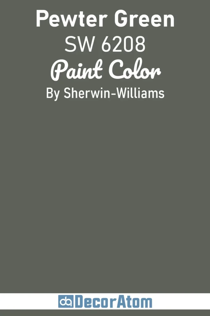
Pewter Green is a muted, earthy green with strong gray undertones, making it both grounded and versatile. It carries a historic, almost timeless quality that feels rich and enveloping without being overwhelming. This shade is a go-to for kitchens, especially on cabinetry where it pairs beautifully with white quartz counters and brushed gold hardware.
It also shines in studies or dens, giving off a classic library vibe when styled with leather chairs and built-in bookcases. Outdoors, Pewter Green makes an elegant exterior paint option, especially when paired with natural stone or white trim.
3. Iron Ore SW 7069
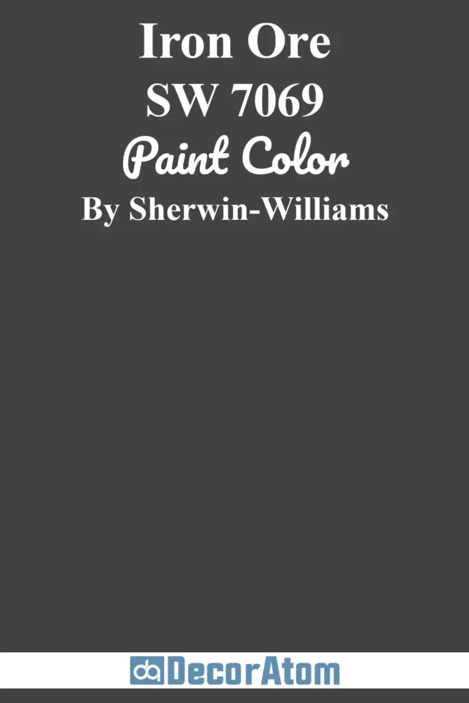
Iron Ore is one of Sherwin-Williams’ most beloved moody shades, a near-black with soft charcoal undertones. Unlike stark black, Iron Ore has a velvety quality that makes it sophisticated and versatile.
It’s often used on interior doors, trim, or kitchen cabinetry to add depth and contrast without the harshness of jet black. As a wall color, it works well in modern, minimalist interiors, creating a cocooning atmosphere in bedrooms or media rooms.
Pair with light neutrals for contrast, or go monochromatic with darker accents for a dramatic, high-end look.
4. Sable SW 6083
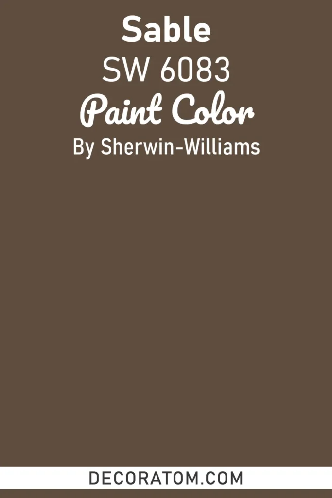
Sable is a deep, warm brown that leans into the richness of chocolate tones. It feels inviting, earthy, and grounding, making it ideal for spaces where comfort is the goal. This shade is perfect for traditional dining rooms with candlelit ambiance, or for home offices where you want to feel focused and enveloped.
Pair Sable with warm metals like brass or bronze, and layer in soft textures like velvet or leather for a cozy, moody vibe. On exteriors, it adds a sophisticated twist to farmhouse or Craftsman-style homes when paired with off-white trim.
5. Smoky Blue SW 7604
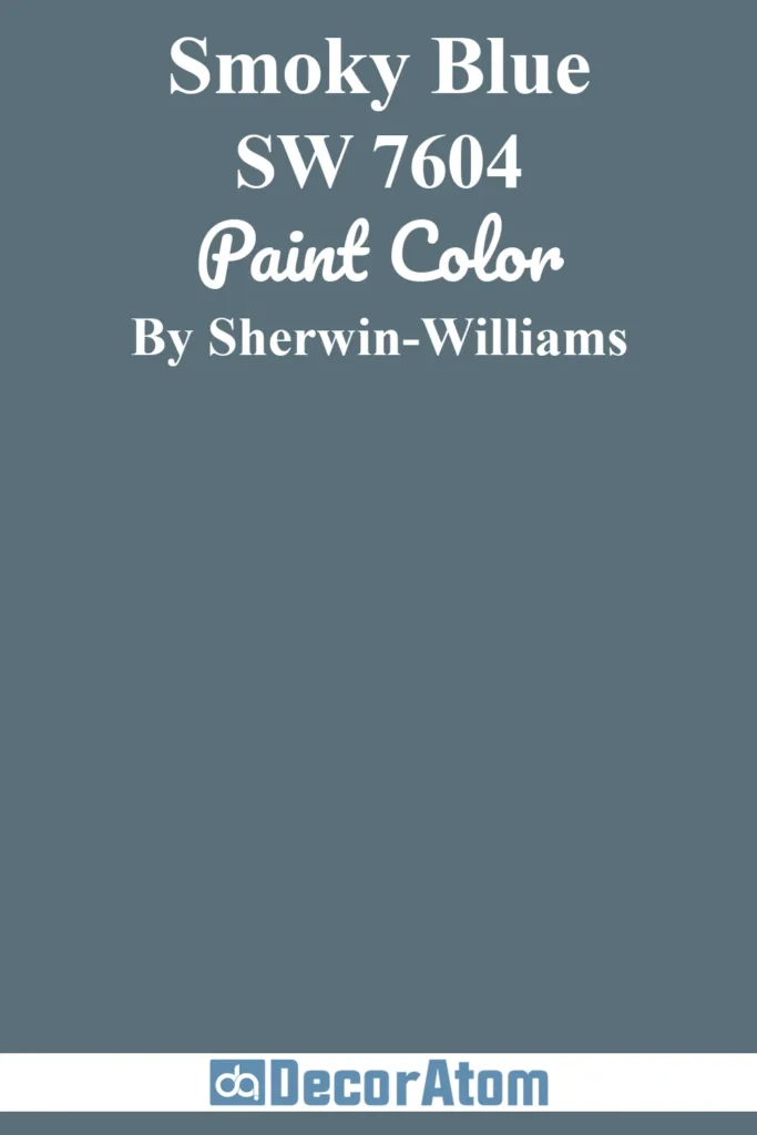
Smoky Blue is a muted navy that carries subtle gray undertones, making it softer and smokier than a classic deep blue. This color has a sophisticated calmness to it, perfect for creating elegant interiors that still feel approachable.
It’s an excellent choice for bedrooms and bathrooms where you want to bring in a moody vibe without going fully dark. It also works beautifully on cabinetry, especially when paired with brushed nickel or brass hardware.
For a bold, cohesive look, try using Smoky Blue on both walls and trim, paired with natural wood flooring and warm accent lighting.
Best Moody Colors from Benjamin Moore
6. Black Pepper 2130-40
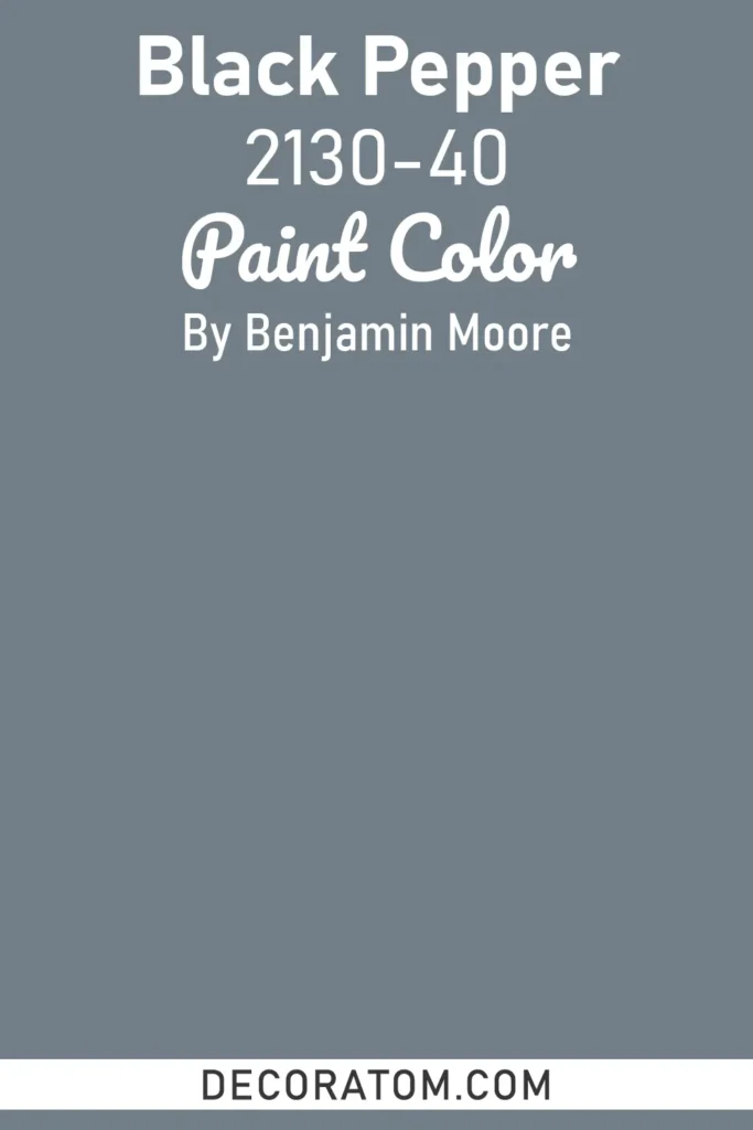
Black Pepper is a deep gray with subtle blue undertones, striking the balance between charcoal and slate. This shade has a refined, urban edge, perfect for creating a contemporary moody atmosphere.
It works especially well in living rooms and bedrooms, where it provides depth without fully crossing into black. Pair it with crisp white trim for contrast, or lean into the drama with layered grays and metallic accents.
In dining spaces, it sets the stage for an intimate, modern look, especially under dim lighting.
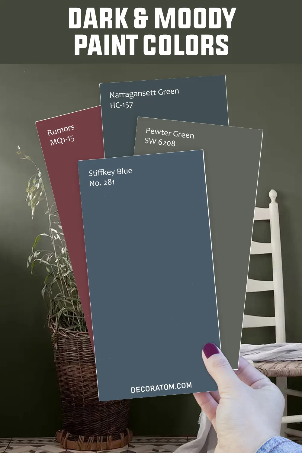
7. Narragansett Green HC-157
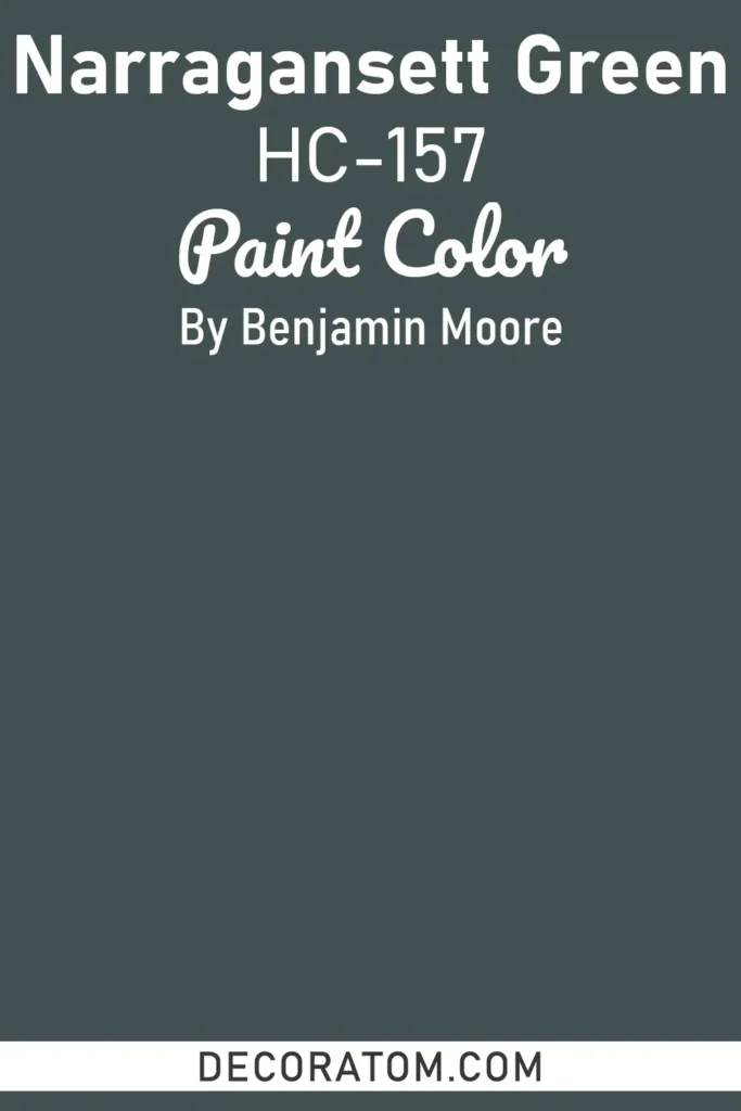
Narragansett Green is a dramatic, blackened teal that reads differently depending on lighting. In bright daylight, it shows off its rich blue-green depth, while in dimmer settings it leans closer to a moody navy.
With an LRV of only 9, it’s one of Benjamin Moore’s darkest historic shades, making it ideal for creating bold, enveloping spaces. It’s a designer favorite for kitchens and built-ins, especially when styled with brass or copper fixtures.
In living rooms, pair it with creamy whites or soft neutrals to balance its intensity, or go bold with rich leathers and patterned textiles for a cozy, eclectic feel.
8. Dark Olive 2140-30
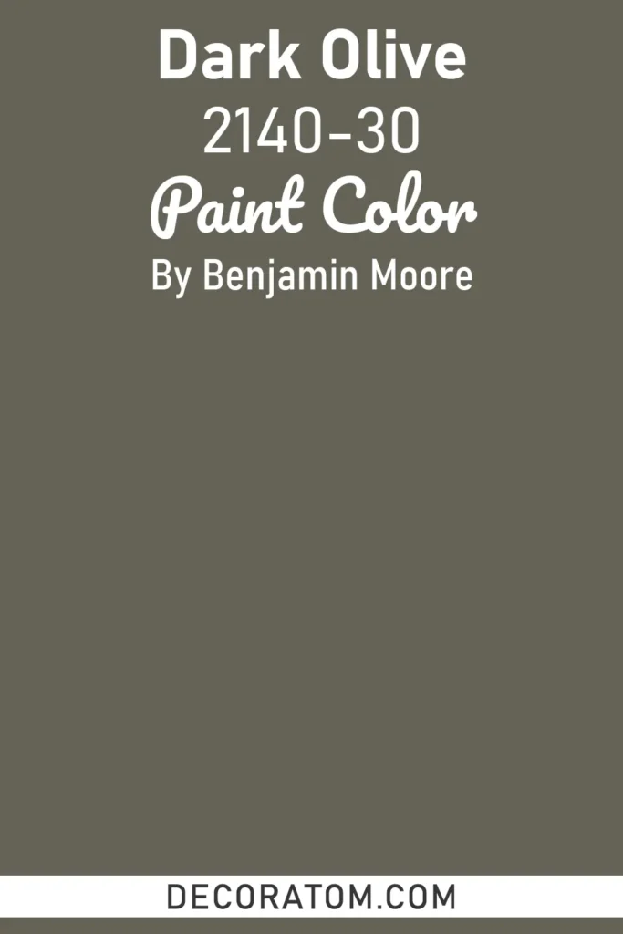
Dark Olive is a deep, organic green with muted, earthy undertones. It creates a sophisticated yet natural backdrop, perfect for homeowners who want a moody vibe with a touch of nature.
Dark Olive pairs beautifully with wood elements, from rustic oak beams to modern walnut cabinetry, making it an excellent choice for kitchens and living rooms alike.
In bedrooms, it provides a calming, grounded environment when paired with linen bedding and natural textures. On exteriors, it works well alongside stone or brick, creating a timeless, classic look.
9. Townsend Harbor Brown HC-64
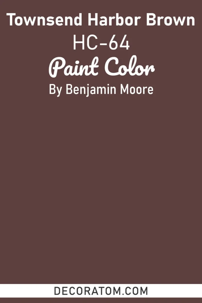
Townsend Harbor Brown is a rich, dark brown from Benjamin Moore’s Historic Collection. With subtle undertones of plum and black, it feels luxurious, traditional, and moody all at once.
This shade is ideal for formal dining rooms, studies, or libraries, where its depth creates an intimate, elegant atmosphere. Paired with cream trim and warm lighting, it evokes an old-world charm that feels timeless.
For a modern twist, Townsend Harbor Brown can also be styled with sleek metallics, black accents, and textured fabrics to create a dramatic yet sophisticated living space.
Best Moody Colors from Behr
10. Cracked Pepper PPU18-1
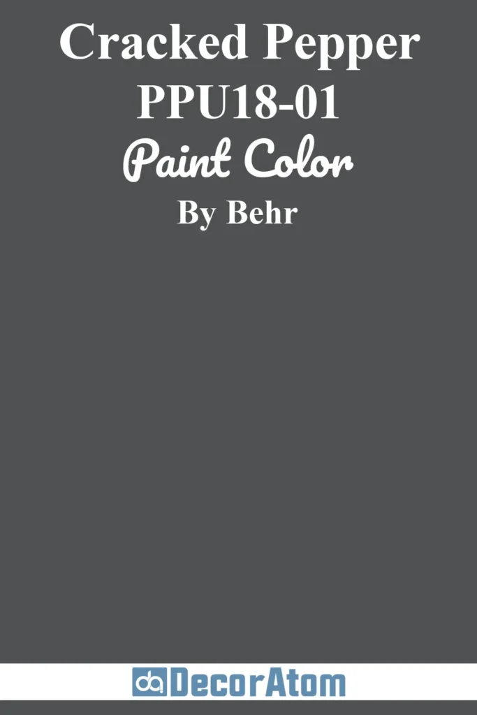
Cracked Pepper is one of Behr’s most versatile moody shades, sitting right at the edge of black and deep charcoal gray. Unlike a flat black, this color has a softness that makes it approachable for both interiors and exteriors.
It’s a designer favorite for cabinetry, interior doors, and accent walls, offering a sleek modern feel without feeling too stark. In living rooms, Cracked Pepper pairs well with warm wood tones and layered neutrals for a balanced look.
On exteriors, it creates a bold statement when paired with crisp white trim or natural stone, making it a contemporary alternative to classic black.
11. Rumors MQ1-15
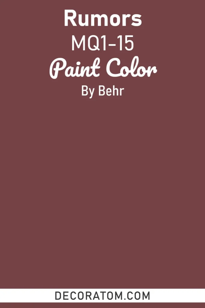
Rumors is a rich, wine-inspired plum that exudes warmth, drama, and a touch of romance. Its undertones lean toward deep burgundy with hints of brown, making it a versatile choice for moody interiors.
Perfect for bedrooms or dining rooms, Rumors creates a cocoon-like effect that feels both intimate and luxurious. Style it with brass fixtures, soft candlelight, and velvet fabrics for a truly dramatic space.
For a modern edge, pair it with matte black accents or balance it with creamy neutrals to let the plum tones shine without overwhelming the room.
12. Dark Everglade HDC-CL-21A
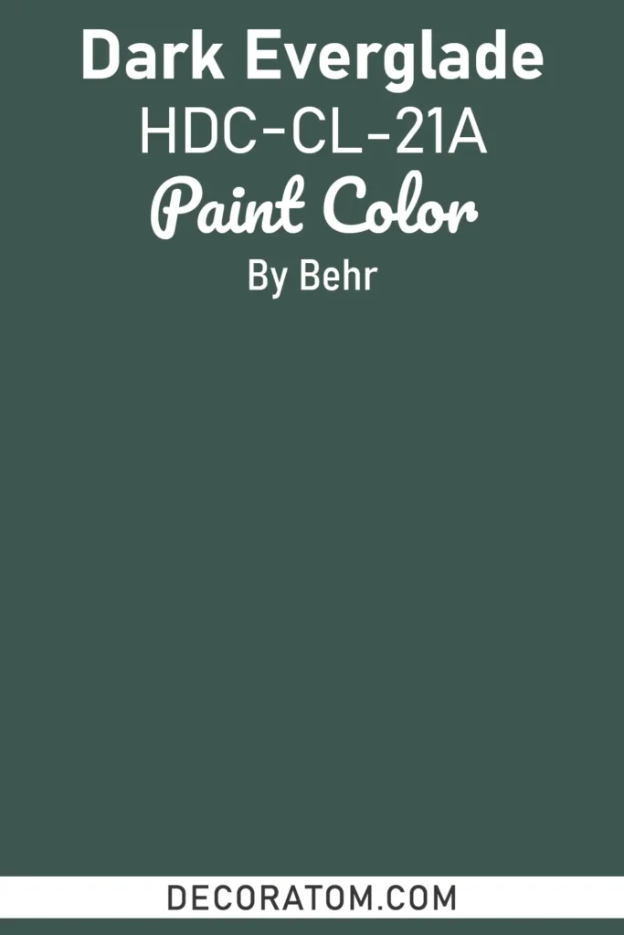
Dark Everglade is a lush, saturated green that feels like stepping into a forest at dusk. With its strong teal undertones, this shade balances nature-inspired calm with bold depth.
It’s ideal for creating a dramatic kitchen when used on cabinetry, especially with marble counters and gold hardware. In living rooms, it pairs beautifully with warm leathers, natural woods, and brass accents for a classic moody aesthetic.
For exteriors, Dark Everglade brings richness and dimension, standing out beautifully against lighter trim or stone details.
Best Moody Colors from Farrow & Ball
13. Pelt 254
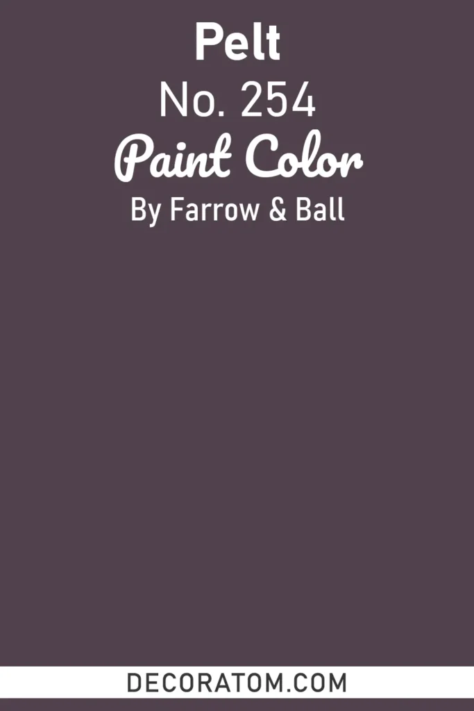
Pelt is a luxurious, deep aubergine with rich purple undertones that border on black in low light. It’s one of Farrow & Ball’s most dramatic shades, often used to create enveloping, sophisticated interiors.
In bedrooms, Pelt evokes a sense of romance and drama, especially when styled with velvet textiles and gold accents. In dining rooms or libraries, it feels regal and old-world, perfect for homeowners who love a touch of drama.
Pair it with warm whites for contrast, or lean into the moody aesthetic with dark woods and soft lighting.
14. Stiffkey Blue 281
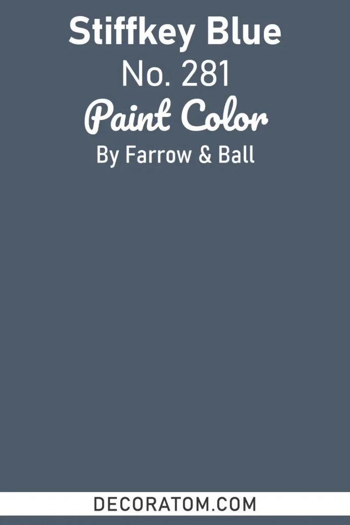
Stiffkey Blue is a deep navy with inky gray undertones, inspired by the Norfolk coast’s mudflats. It’s a complex shade that can read nautical in bright light but turns almost black in shadow, giving it a versatile moody edge.
Stiffkey Blue is a top choice for cabinetry, accent walls, and even full rooms where you want drama without true black. It pairs beautifully with brass, warm woods, and crisp whites, and works especially well in coastal or modern homes seeking a sophisticated dark blue.
15. Brinjal 222
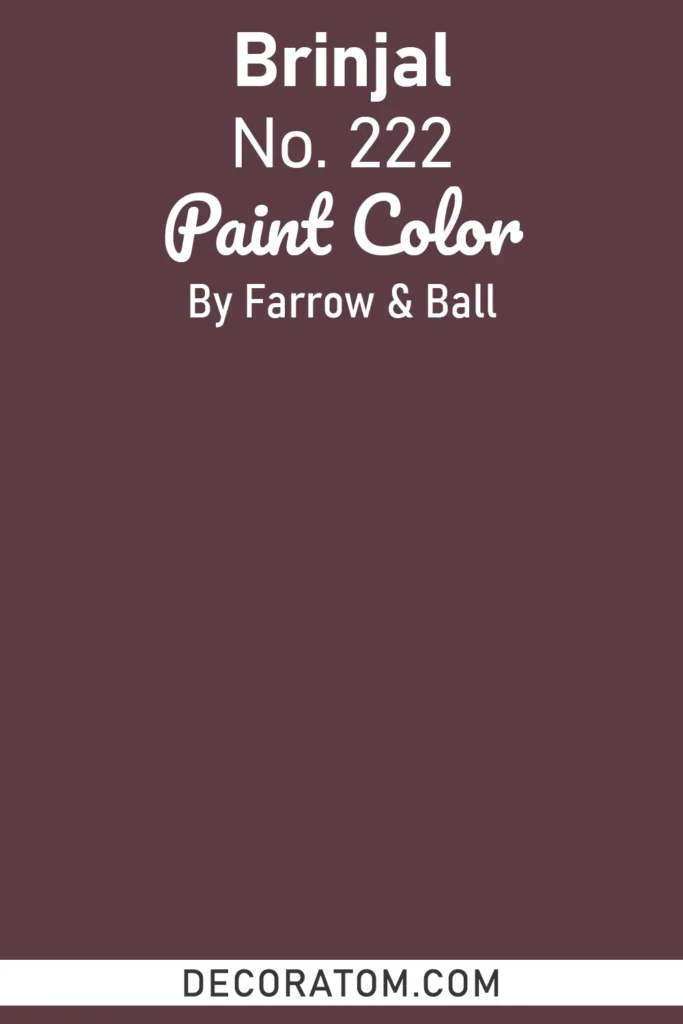
Brinjal is a rich, deep aubergine with red and plum undertones that give it warmth and vibrancy while still feeling moody. This shade is both exotic and cozy, making it a standout choice for dining rooms, bedrooms, or hallways.
In traditional settings, Brinjal pairs beautifully with warm wood furnishings and classic patterns. In modern spaces, it can be styled with sleek black accents, creamy neutrals, and metallic finishes for a bold yet elegant look.
Its name comes from the glossy skin of an eggplant, and like its inspiration, it brings depth and a subtle touch of drama to any interior.
FAQs About Dark & Moody Paint Colors
Are moody colors suitable for small rooms?
Yes! Moody colors can make small rooms feel cozy and intimate. However, in very small or poorly lit spaces, extremely dark shades may feel cramped. To avoid this, pair moody walls with lighter trim, reflective surfaces, or plenty of natural and layered artificial lighting.
Which rooms work best with dark and moody paints?
Dark and moody colors are versatile, but they’re particularly striking in:
- Bedrooms: create a calming, cocoon-like retreat.
- Dining rooms: add drama and elegance, perfect for entertaining.
- Living rooms: make a large space feel intimate and cozy.
- Kitchens & cabinets: deep blues, greens, and charcoals add sophistication.
- Libraries or home offices: enrich the space with warmth and focus.
How do lighting and undertones affect moody paint colors?
Moody colors can change dramatically depending on the light. Natural light can soften a dark hue, while dim lighting may intensify its depth. Undertones (blue, green, purple, brown) also affect how the color reads, so a navy with violet undertones may appear warmer than one with gray undertones. Always test samples in your space before committing.
Can moody colors be used on ceilings and trim?
Absolutely! Using moody colors on ceilings or trim can create a cohesive, dramatic look. For ceilings, choose slightly lighter tones to avoid making the space feel too enclosed. Dark trim can provide striking contrast with lighter walls or coordinate with dark walls for a sophisticated monochromatic effect.
What are the best colors to pair with moody walls?
Moody colors pair beautifully with:
- Light neutrals like whites, creams, and beiges for contrast.
- Metallic accents such as brass, gold, or chrome for elegance.
- Natural wood tones to add warmth and texture.
- Soft fabrics (linen, velvet) to balance intensity and create a cozy atmosphere.
Are moody colors hard to decorate around?
Not at all! While moody colors are bold, they act as a versatile backdrop. They allow furniture, art, and decor to stand out. Start with neutral furniture, then layer in complementary accent pieces, textures, and metallics for a balanced, sophisticated space.
Can moody colors be used outdoors?
Yes! Dark and moody colors like deep greens, blues, and charcoals look stunning on exterior walls, doors, shutters, or trim. They provide curb appeal, contrast beautifully with natural stone or lighter trim, and make a home look sophisticated and timeless.
Do dark colors make a room look smaller?
Dark colors can make a room feel cozier, but if balanced with natural light, lighter accents, and reflective surfaces, they don’t have to feel cramped. In fact, they can add dimension, making architectural features pop.