
There’s just something about moody blues that draws me in every time.
They’re deep, dramatic, and incredibly versatile—perfect when you’re craving a little more soul and sophistication in a space.
Unlike bright or cheerful blues, moody blues bring a grounded, often introspective feel.
They can be bold and expressive or calm and cozy, depending on how you use them.
And honestly? They’re some of the most rewarding paint colors to work with.
Over the years, I’ve found myself returning to these stormy, inky shades for everything from quiet bedrooms to statement kitchen cabinets.
If you’re looking for a color that feels timeless but still tells a story, a moody blue might just be the perfect fit.
What Makes a Blue “Moody”?
Not every blue gets to call itself moody. To earn that title, a blue has to have depth—whether that comes from rich pigment, smoky undertones, or that perfect balance of gray, green, or black mixed in.
Moody blues often live in the deeper end of the spectrum, but it’s not just about being dark.
It’s about how the color feels. These shades evoke emotion: calm, introspection, mystery, even a bit of drama.
They might remind you of the ocean at dusk, a midnight sky, or a worn navy coat.
What they aren’t is flat or one-note. The best moody blues have layers—hints of teal, charcoal, or even violet that shift depending on the light. That’s what gives them their magic.
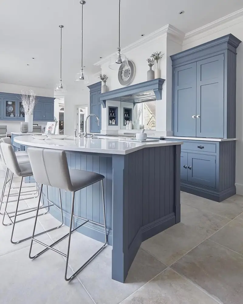
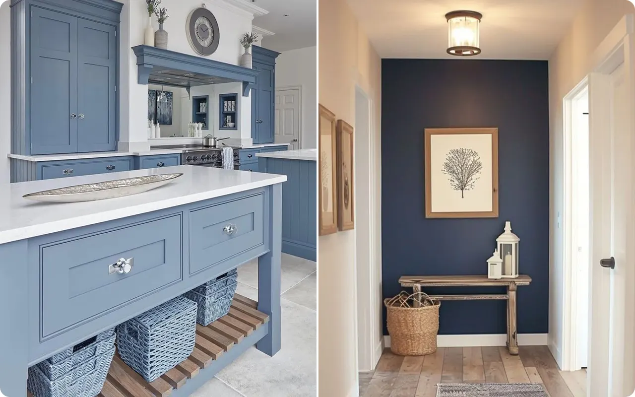
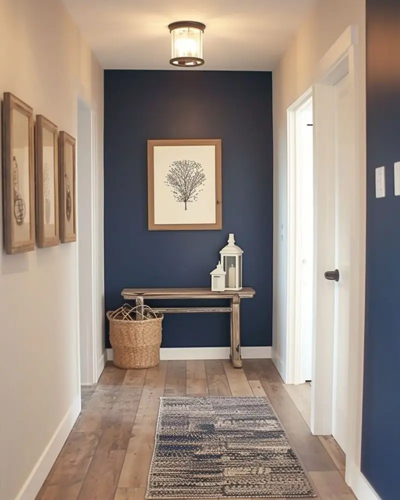
Where to Use Moody Blue Paint Colors
Moody blues are surprisingly flexible. They work beautifully in intimate, cozy spaces like bedrooms, home libraries, or powder rooms—anywhere you want to create a sense of calm and depth.
But don’t shy away from using them in larger spaces either. I’ve seen moody blues look absolutely stunning on kitchen cabinets, accent walls, even entire dining rooms when paired with the right lighting and contrast.
They can add elegance to traditional interiors, or bring bold contrast in modern, minimalist spaces.
And if you’re feeling adventurous, try one on a front door or exterior siding for serious curb appeal. These colors are moody, yes—but they can also be incredibly welcoming.
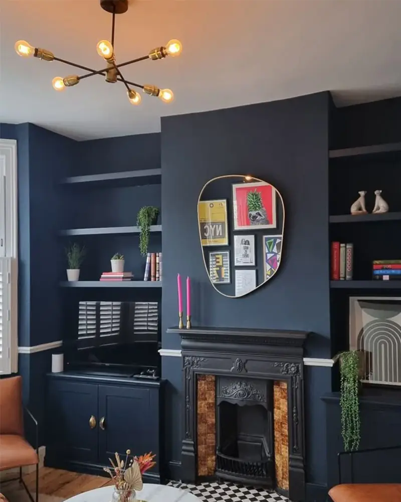
Colors to Pair with Moody Blues
One of the reasons I love moody blues so much is how beautifully they play with other colors.
For a classic, high-contrast look, crisp whites or soft creams always do the trick. They make the blue feel cleaner and brighter while still keeping the depth.
Warm metallics like brass or gold bring out the richness of navy tones and add a bit of glam.
If you want to lean into the drama, pair moody blues with charcoal, black, or deep greens for a luxe, layered vibe.
And for a more laid-back, earthy palette? Try warm taupes, camel tones, dusty blush, or even wood finishes—they all create that perfect cozy balance without competing with the blue. It’s all about the mood you’re trying to set.
Tips for Choosing the Best Moody Blue Paint Colors
Choosing the right moody blue can be a little tricky—what looks rich and inky in a photo might pull gray, teal, or even purple in your own space. Here are a few tips I’ve picked up over time:
- Test it in different lighting. Natural light, artificial light, and even the direction your windows face can completely change how the color looks. Always sample it first!
- Check the undertones. Some moody blues lean green, others go gray or black. Know what you’re drawn to—and what clashes with your existing decor.
- Pair it with the right finish. In smaller rooms or darker spaces, a satin or eggshell finish can help bounce light. For cabinets or doors, a semi-gloss or matte can add extra character.
- Use contrast intentionally. These colors thrive when paired with contrast—don’t be afraid of light trim, warm woods, or bold accent colors to break things up.
- Trust your gut. At the end of the day, mood is personal. The “right” moody blue is the one that makes you feel something when you walk into the room.
Top 23 Moody Blue Paint Colors
Here are my favorite Moody Blue paint colors to decorate with.
1. Benjamin Moore Hale Navy

Hale Navy is the kind of deep, dependable blue that never lets me down.
It walks the line between classic and dramatic with ease—dark enough to anchor a room but never flat or lifeless.
There’s a richness to it that feels both timeless and modern, and when paired with crisp whites or soft neutrals, it suddenly becomes this bold statement piece.
In a room with natural light, Hale Navy shows just enough softness to keep things cozy, but under dimmer lighting, it turns into a powerful, moody backdrop that feels like a warm hug.
2. Farrow & Ball Railings

Railings may technically lean toward a blue-black, but I can’t resist including it here because of how beautifully that deep indigo undertone sneaks through.
It’s dramatic in the most grown-up, chic way. In daylight, it reveals its blue soul just enough to feel layered and thoughtful.
But come evening, it transforms into this inky, shadowy blue that adds instant intrigue to any space.
I love it on cabinetry or even an entire room—it’s sophisticated, mysterious, and just the right amount of moody.
3. Sherwin-Williams Charcoal Blue

Charcoal Blue is a smoky, sultry stunner that toes the line between navy and charcoal gray.
There’s a sense of calm to it, but also a certain edge that makes it stand out in all the right ways.
It’s not your typical blue—it has that soft, desaturated quality that feels grounded and elegant.
In a space with warm wood or brushed brass accents, this color really comes alive.
4. Benjamin Moore Deep Royal

Deep Royal is the definition of a brooding blue.
It’s moody, no doubt, but there’s a richness and clarity to it that keeps it feeling regal rather than gloomy.
The name says it all—this one feels refined and dignified, with a deep jewel-tone energy that works beautifully in formal dining rooms, libraries, or even on a dramatic ceiling.
It plays well with warm whites, soft golds, and velvety textures, giving the space a kind of old-world charm with a modern twist.
5. Farrow & Ball Stiffkey Blue

Named after the muddy, wind-swept beaches of North Norfolk, Stiffkey Blue is one of those colors that feels rooted in nature.
It’s a bold navy, but there’s a salty, almost coastal quality to it that makes it feel more approachable than most deep blues.
Depending on the light, it can read as a true navy or something slightly more marine.
I love how it pairs with crisp whites for a nautical vibe—or with soft grays and taupes for something a little more moody and romantic.
6. Sherwin-Williams Naval
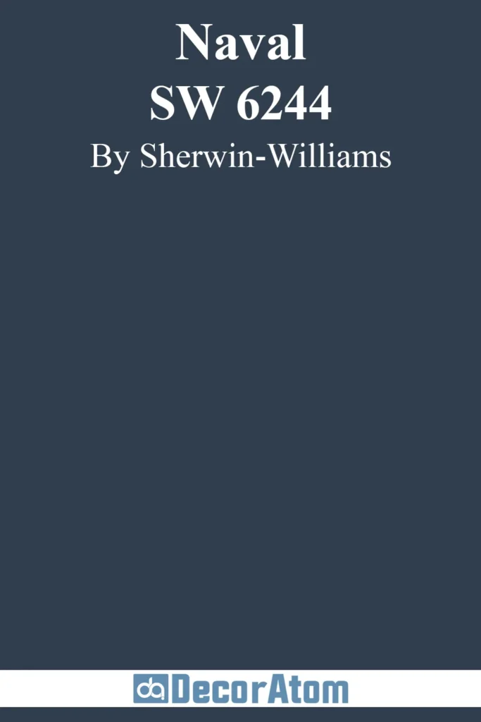
Naval is that classic, all-American navy that manages to feel both commanding and calming.
It’s got just the right balance of depth and sophistication, making it an easy go-to for anyone dipping their toes into the world of moody blues.
There’s a slight warmth to it that prevents it from ever feeling too cold, which is why I love using it in bedrooms and offices.
It’s strong, yes—but also so soothing in a way that makes you want to sink right into it.
7. Benjamin Moore Blue Note

Blue Note is deep, soulful, and a little bit dramatic—in the best possible way.
It leans just far enough into blackened navy territory to feel mysterious, but it still holds onto its blue identity, especially when the light hits just right.
This one is a showstopper in small, enclosed spaces like powder rooms or entryways where you want that enveloping, cocoon-like vibe.
I also love it paired with high-gloss finishes for a bit of moody glam.
8. Farrow & Ball Down Pipe

Down Pipe is moody with a capital M. Technically a lead-gray with blue undertones, it absolutely earns a spot on this list because of how stormy and atmospheric it feels.
It’s a favorite for accent walls, millwork, or even entire rooms when you’re after that moody, heritage-inspired look.
Under certain lighting, that blue undertone creeps forward in the most elegant way, giving the color a depth that shifts and changes throughout the day. It’s sophisticated, brooding, and quietly bold.
9. Sherwin-Williams Indigo Batik
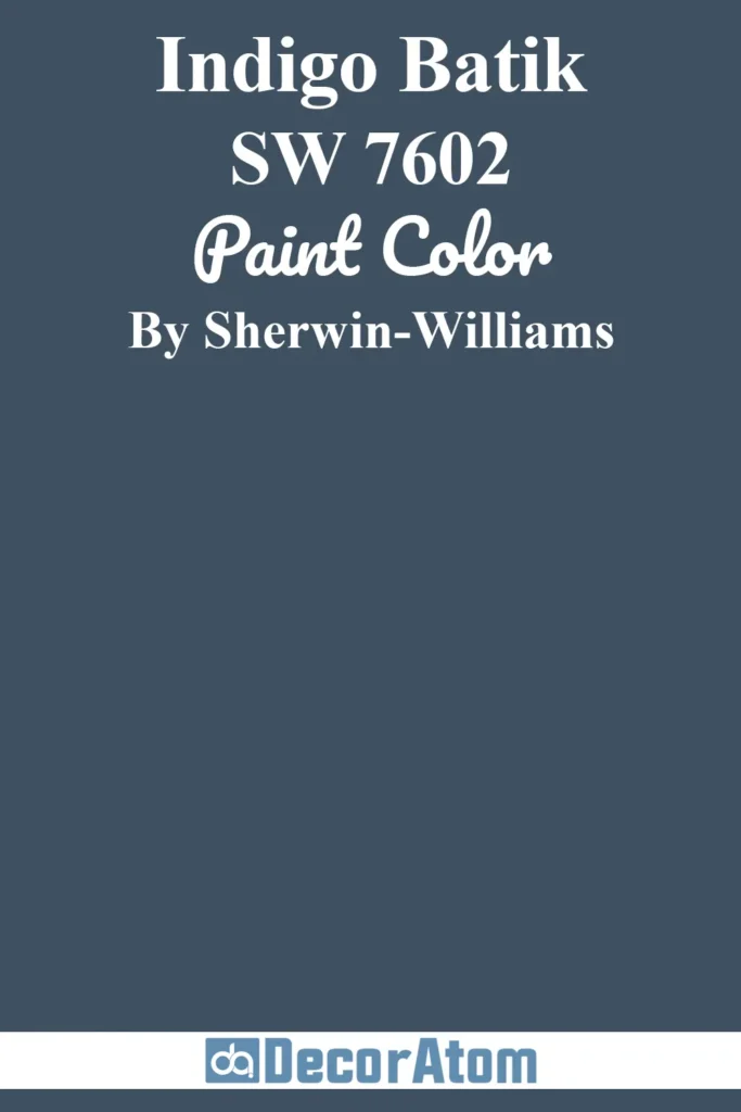
There’s something undeniably stylish about Indigo Batik.
It leans a little brighter than some of the others on this list, but it still brings that dramatic depth I crave in a moody blue.
There’s a slightly denim-like quality to it—a rich, inky blue that feels casual yet refined.
It’s perfect for spaces that want personality without feeling too heavy.
Pair it with warm wood, creamy whites, or even deep mustard accents and you’ve got yourself a palette that sings.
10. Farrow & Ball Hague Blue
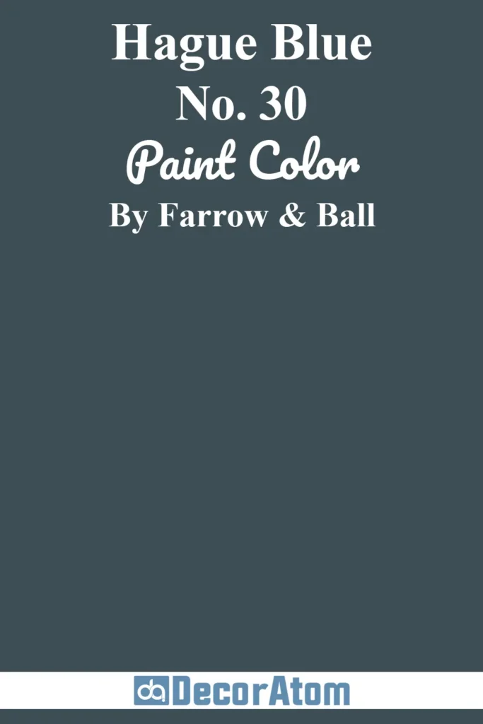
Hague Blue is one of those iconic colors that deserves every bit of its cult following.
It’s rich, deeply pigmented, and carries a touch of green that gives it a velvety, oceanic quality.
When used in a space with low lighting, it becomes incredibly dramatic and moody.
In brighter rooms, that hint of green makes it feel lush and almost regal.
I love it with aged brass, crisp white trim, or earthy textures like linen and leather. It’s moody elegance at its finest.
11. Behr Midnight Blue
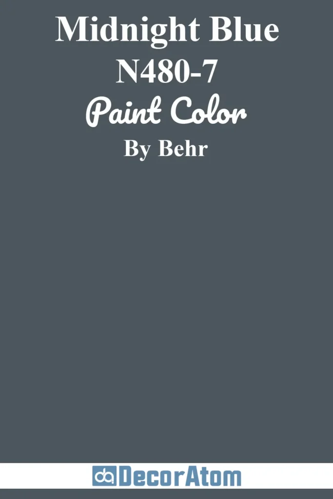
Midnight Blue from Behr is a deep, classic navy with a midnight sky kind of allure.
It’s smooth, saturated, and has just enough intensity to create contrast without overwhelming a space.
What I love about it is how versatile it is—it works beautifully in both traditional and modern settings.
It’s a no-fail choice for kitchen islands, bedroom walls, or moody powder rooms. Clean lines and soft lighting really bring this color to life.
12. Benjamin Moore Gentleman’s Gray

Despite the name, Gentleman’s Gray is anything but just gray—it’s a rich, green-tinged navy that oozes sophistication.
There’s a tailored, masculine vibe to it, but it doesn’t feel cold or stark.
Instead, it brings a sense of refinement and coziness, especially when paired with warm leather, wood tones, or aged brass.
It’s one of those deep colors that shifts with the light and always feels interesting, never flat.
Perfect for studies, libraries, or anywhere you want a touch of drama.
13. Benjamin Moore Stormy Sky

Stormy Sky is one of those colors that captures exactly what it sounds like—a brooding, dramatic blue-gray that feels like a gathering thunderstorm.
It’s saturated without being overpowering, and the gray undertone gives it that perfect moody softness.
I love it for creating a restful, cocoon-like atmosphere in bedrooms or reading nooks.
It’s a calming color, but with a bit of grit and edge that keeps it from feeling too muted or washed out.
14. Sherwin-Williams Anchors Aweigh
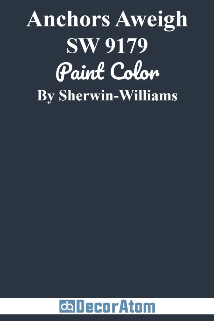
Anchors Aweigh has that deep navy richness that feels sturdy and grounded, yet there’s something quietly bold about it.
It doesn’t scream for attention, but it commands a room with its smooth, inky depth.
This color really shines in coastal-inspired spaces, but it can just as easily take on a modern, dramatic role when styled with contrast—think crisp white trim, brass hardware, or even a matte black accent.
15. Benjamin Moore Newburyport Blue
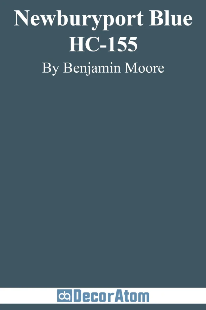
Newburyport Blue is a cool, classic navy with a sophisticated feel that leans just enough into slate territory to feel fresh.
It has a historic charm to it—like something you’d see on a centuries-old front door—but it also works beautifully inside when you’re after a strong, clean moody blue.
There’s a clarity to the tone that feels balanced and reliable, making it a great choice for both traditional and modern spaces.
16. Benjamin Moore Van Deusen Blue

Van Deusen Blue is crisp, structured, and quietly bold.
It’s a deep navy that brings elegance without being too heavy, and there’s a touch of steeliness that keeps it feeling fresh and current.
I love it in dining rooms or as an accent wall in living spaces—it provides just the right amount of drama.
It’s one of those blues that pairs well with everything from soft pastels to rich jewel tones, making it a favorite for layered, eclectic spaces.
17. Sherwin-Williams Dark Night
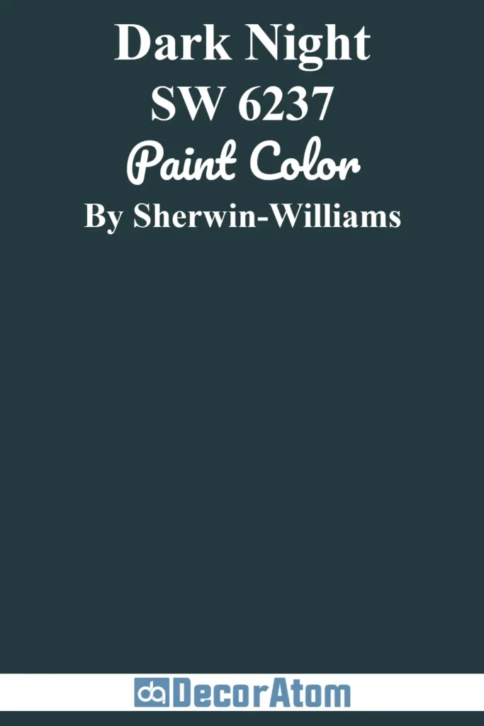
Dark Night is a moody dream—it’s deep, almost teal-leaning navy with a velvety richness that feels lush and luxurious.
There’s this gentle green undertone that gives it extra depth, making it feel a little mysterious and a lot sophisticated.
This color really thrives in low light, where it turns into this enveloping, elegant tone that makes you want to curl up with a blanket and a good book.
It’s one of my favorites for moody, intimate spaces.
18. Benjamin Moore Deep Space

Deep Space is a smoky, mysterious blue with a heavy dose of gray—it’s like looking at navy through a foggy lens.
There’s something so soothing about it, but it still has that strong, grounded presence that moody blues are known for.
I love using it in modern interiors with clean lines and minimal decor—it lets the color speak without distraction.
It’s a refined kind of moody that works beautifully in both residential and professional settings.
19. Behr Blue Dusk

Blue Dusk has a hazy, twilight quality that’s incredibly calming and poetic.
It sits somewhere between denim and stormy sky, with a soft edge that makes it feel more romantic than dramatic.
There’s just enough saturation to give the room definition, but it’s gentle on the eyes, especially in spaces with limited natural light.
I think it’s a great choice for bedrooms, guest rooms, or anywhere you want a hint of moodiness without going full navy.
20. Sherwin-Williams Bunglehouse Blue
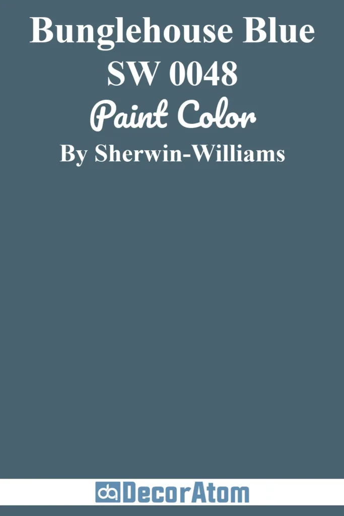
Bunglehouse Blue is one of those hidden gems in the Sherwin-Williams collection.
It’s a historic-looking blue with deep teal undertones that give it a rich, earthy elegance.
It feels cozy, grounded, and almost a little vintage—in the best way.
I especially love this shade for interiors that mix old and new, or homes with craftsman details.
It pairs beautifully with warm wood tones, amber lighting, and creamy neutrals.
21. Sherwin-Williams Stargazer
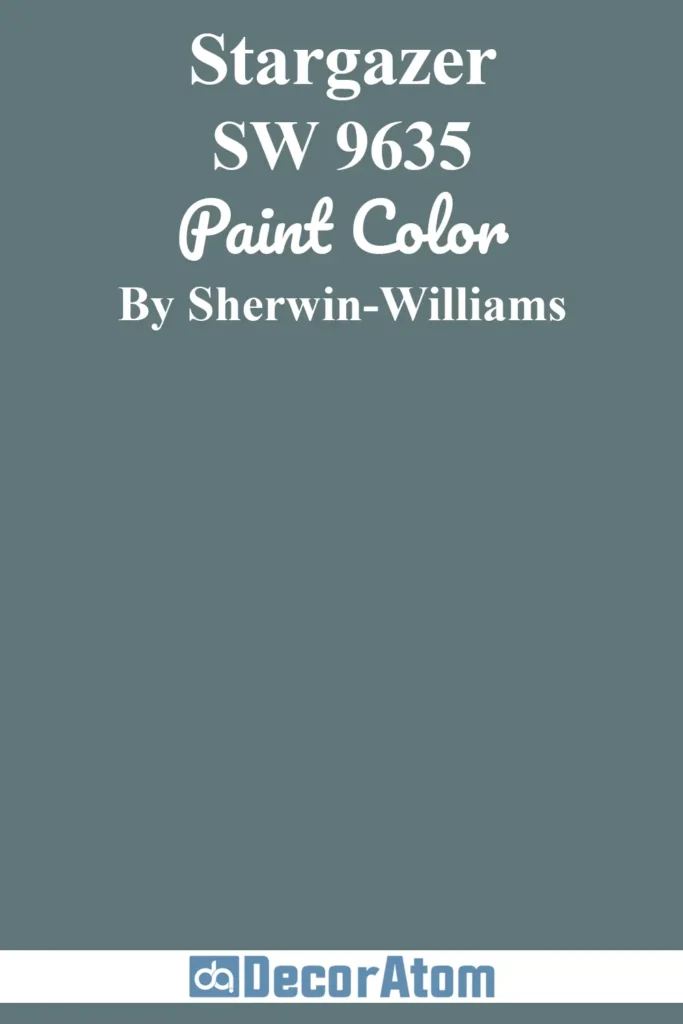
Stargazer is a moody, mid-toned blue with a celestial vibe—it’s not quite navy, not quite gray, but something beautifully in between.
There’s a softness to it that feels dreamy and expansive, like a clear night sky just after sunset.
It’s perfect for rooms where you want a deep color that won’t overpower the space.
It has enough depth to be interesting but still feels airy compared to some of the darker blues on this list.
22. Sherwin-Williams Morning at Sea
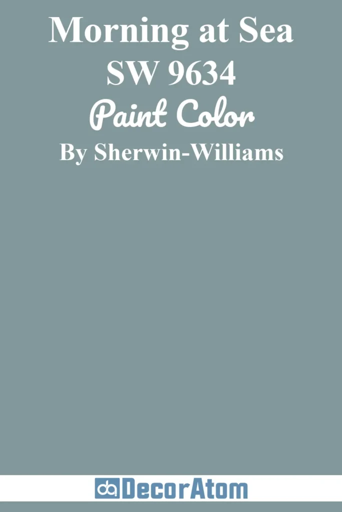
Morning at Sea has this quiet elegance—like a foggy coastal morning with the softest breeze.
It’s a medium-deep blue with just a touch of gray and slate, making it feel serene but still moody enough to earn its spot.
It’s less intense than a true navy, which makes it a great choice for full-room coverage without feeling overwhelming.
I love pairing it with muted creams, light oak, and aged bronze for a tranquil, lived-in feel.
23. Benjamin Moore Polo Blue

Polo Blue is one of those sophisticated, dark blues that feels both traditional and timeless.
There’s a slight green undertone that gives it a tailored, almost menswear-like polish.
It’s deep enough to feel moody and dramatic, but the clarity of the color keeps it from veering into overly shadowy territory.
It’s a fantastic choice for offices, dining rooms, or any space where you want to evoke that rich, library-inspired charm.