
Choosing the right exterior paint color can completely transform the look and feel of your home.
It’s not just about curb appeal—it’s about creating a first impression that reflects your style, complements your architecture, and holds up beautifully against the elements.
And with today’s modern design trends, exterior color palettes are moving beyond the expected.
Think soft off-whites, moody charcoals, earthy greens, and warm greiges—all curated to give your home a fresh, updated look.
In this post, I’m sharing 19 of the best modern exterior paint colors I’ve seen making waves in 2025.
These shades range from crisp and classic to bold and sophisticated, and they all have one thing in common: they make a statement without shouting.
Whether you’re planning a full repaint or just gathering ideas, you’ll find plenty of inspiration here.
What Is the Most Popular Modern Exterior Paint Color in 2025?
For 2025, off-whites and soft greige tones continue to dominate modern exterior design.
One standout shade that keeps appearing on trend-forward homes is Benjamin Moore White Dove OC-17.
It’s not a stark, cold white—instead, it has a creamy warmth that works beautifully in both bright sunlight and shade. It’s versatile enough for traditional homes and sleek enough for contemporary styles.
Another strong contender is Sherwin-Williams Jogging Path SW 7638, a warm greige that feels grounded and sophisticated.
Both of these colors reflect the broader trend toward understated elegance—subtle hues that enhance the architecture rather than overpower it.
What Paint Finish Should I Use on the Outside of My House?
For exteriors, satin (or low-luster) is the go-to finish for most siding.
It strikes the perfect balance: it’s smooth enough to look refined, yet has just enough sheen to resist moisture, mildew, and dirt.
Satin finishes are also easier to clean than flat finishes, making them a practical and attractive choice.
For trim, doors, and shutters, many homeowners opt for semi-gloss to create a subtle contrast and add a bit more durability to those high-touch areas.
Avoid flat or matte finishes on exterior surfaces unless you’re going for a very specific look—they can be harder to clean and less resistant to weather.
💥🎁 Christmas & Year-End Deals On Amazon !
Don't miss out on the best discounts and top-rated products available right now!
*As an Amazon Associate, I earn from qualifying purchases.
How Many Colors Should Be In an Exterior Color Palette?
A well-balanced exterior color palette typically includes two to three main colors:
- Base color – for the siding or main body of the house.
- Trim color – for window frames, fascia, soffits, and doors.
- Accent color (optional) – for the front door, shutters, or architectural details.
Keeping the palette tight helps your home look cohesive and modern. Too many colors can overwhelm the design, while too few may fall flat.
If you’re going for a bold or contemporary look, contrast can be your friend—think charcoal siding with bright white trim and a pop of color on the front door.
If you prefer something more subtle and sophisticated, try sticking within a tonal family (like warm taupes and creams) for a soft, modern result.
How Do You Choose the Best Modern Exterior Paint Color?
Start by looking at the permanent features of your home—the roof color, stonework, landscaping, and neighborhood vibe all influence what will look cohesive.
Then think about your home’s style and size. For instance, lighter colors can make a small home feel larger, while deeper tones add drama and contrast to larger or more modern structures.
Consider the lighting as well. A color that looks soft and neutral on a paint swatch might appear stark in full sun or washed out in shade. Sampling is key—test a few colors on different sides of your house and look at them at various times of day.
Lastly, ask yourself what kind of personality you want your home to project: classic and timeless, clean and contemporary, or warm and welcoming?
Choosing a modern exterior paint color is part design, part intuition—and getting it right can make your entire home feel brand new.
Top 19 Modern Exterior Paint Colors
Here are the best paint colors for your modern home.
1. Benjamin Moore French Canvas OC-41
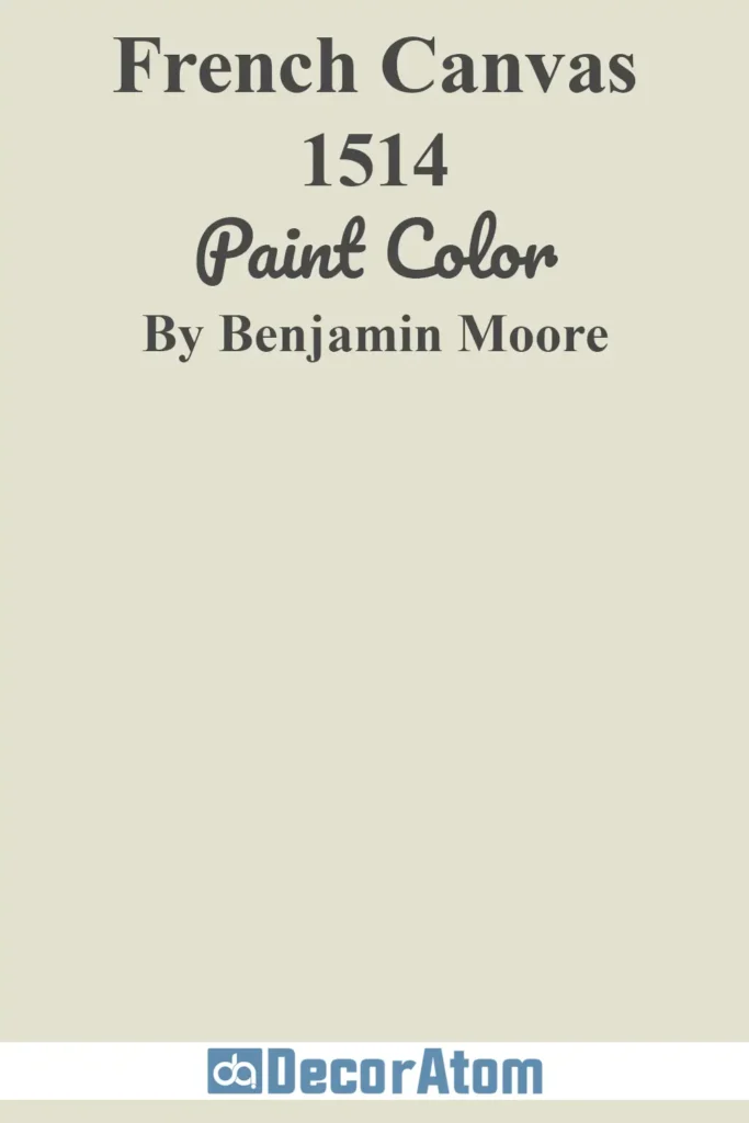
French Canvas is one of those understated neutrals that feels timeless without being boring.
It sits somewhere between a creamy white and a very light beige, with just enough warmth to avoid feeling sterile.
On modern exteriors, it gives homes a soft, elegant glow—especially when paired with darker trim or natural wood accents.
Thanks to its warm undertone, French Canvas looks especially beautiful in morning or golden hour light, but it holds its color well in full sun too.
It’s a smart choice for stucco homes, modern farmhouses, and contemporary new builds where you want a light exterior that feels inviting, not stark.
2. Benjamin Moore White Dove OC-17

💥🎁 Christmas & Year-End Deals On Amazon !
Don't miss out on the best discounts and top-rated products available right now!
*As an Amazon Associate, I earn from qualifying purchases.
A fan favorite for years, White Dove has earned its spot as one of the most beloved exterior whites—and for good reason.
It’s a creamy, soft white with a subtle warm undertone that reads clean but not cold. On exteriors, White Dove provides a classic, refined look without veering into “builder-basic” territory.
It reflects just enough light to brighten a home’s facade, but still has enough depth to handle direct sunlight without washing out.
Whether you’re painting a sleek modern home or giving a traditional Craftsman a fresh update, White Dove is a sophisticated pick that plays well with brick, stone, or bold accents.
3. Benjamin Moore Swiss Coffee OC-45

Swiss Coffee has a cozy richness that makes it feel like a comforting blanket wrapped around your home.
It’s an off-white with gentle beige undertones, which makes it a favorite for modern exteriors aiming for warmth and softness.
Unlike cooler whites, Swiss Coffee doesn’t go gray in shaded areas, and it pairs beautifully with earthy or muted hues like olive green or charcoal.
This is a top choice for Mediterranean-style homes, desert modern builds, and transitional designs where you want warmth without going full tan or beige.
4. Sherwin-Williams Extra White SW 7006
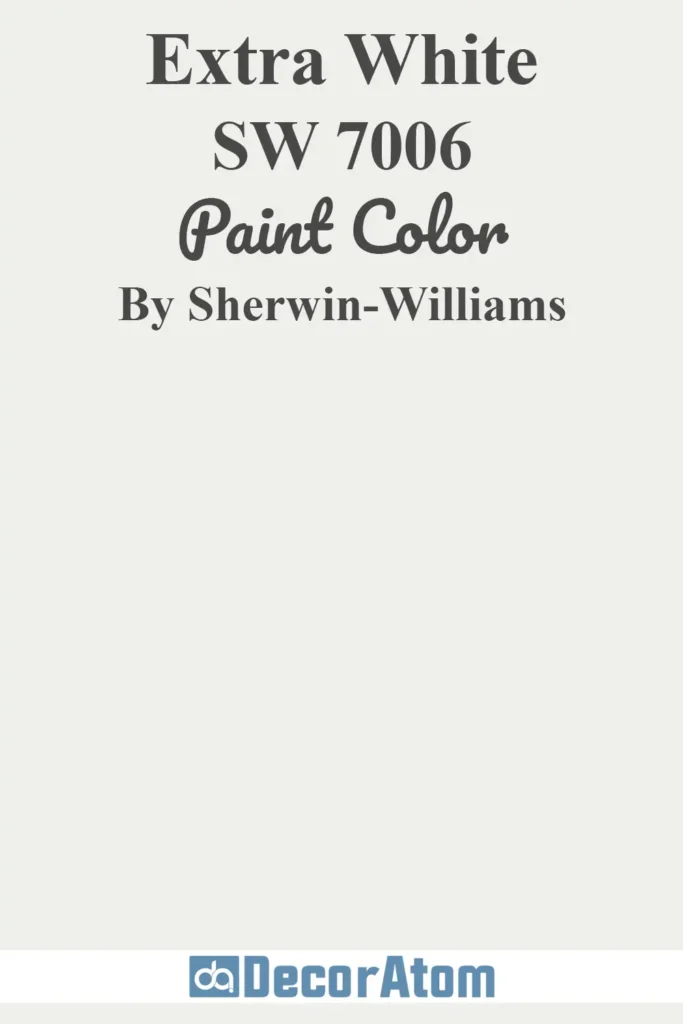
If you’re after a crisp, ultra-clean white that still feels livable on an exterior, Extra White might be your new best friend.
It’s one of Sherwin-Williams’ brightest whites, and it reads as a true, neutral white with very cool undertones.
This makes it especially striking on modern or minimalist exteriors with bold geometry and high contrast trim.
In full sun, Extra White holds its brightness and doesn’t yellow or fade—ideal for contemporary homes that lean sleek and graphic.
Pair it with black, navy, or natural wood tones for a truly modern aesthetic.
5. Benjamin Moore Revere Pewter HC-172

💥🎁 Christmas & Year-End Deals On Amazon !
Don't miss out on the best discounts and top-rated products available right now!
*As an Amazon Associate, I earn from qualifying purchases.
Revere Pewter is one of those chameleon colors that works beautifully both inside and out.
For exteriors, this soft greige has just enough warmth to feel earthy, yet stays grounded in a cool base that resists turning yellow.
It reads differently depending on the light—sometimes more gray, sometimes more beige—which adds a layer of depth that makes it a favorite for modern-traditional homes.
Revere Pewter works especially well on homes with stone accents or shaded facades where you want color that won’t go flat.
6. Benjamin Moore Boothbay Gray HC-165
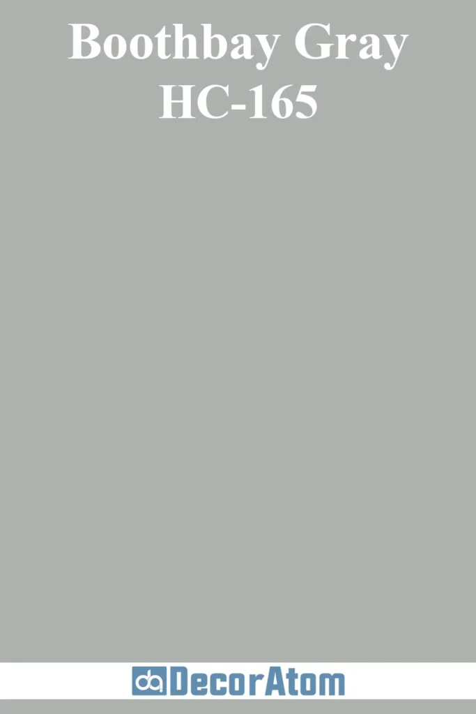
Boothbay Gray offers a coastal modern vibe without being too beachy.
This mid-tone gray has a distinct blue undertone, giving it a misty, almost nautical feel.
It’s a calming choice for exteriors, and looks especially beautiful on homes surrounded by greenery or set against overcast skies.
In bright light, the blue undertone becomes more pronounced, making it a fantastic choice if you want subtle color without going too bold.
Boothbay Gray looks stunning on Cape Cod homes, modern cottages, and contemporary farmhouse exteriors with white or natural wood trim.
7. Sherwin-Williams Birdseye Maple SW 2834
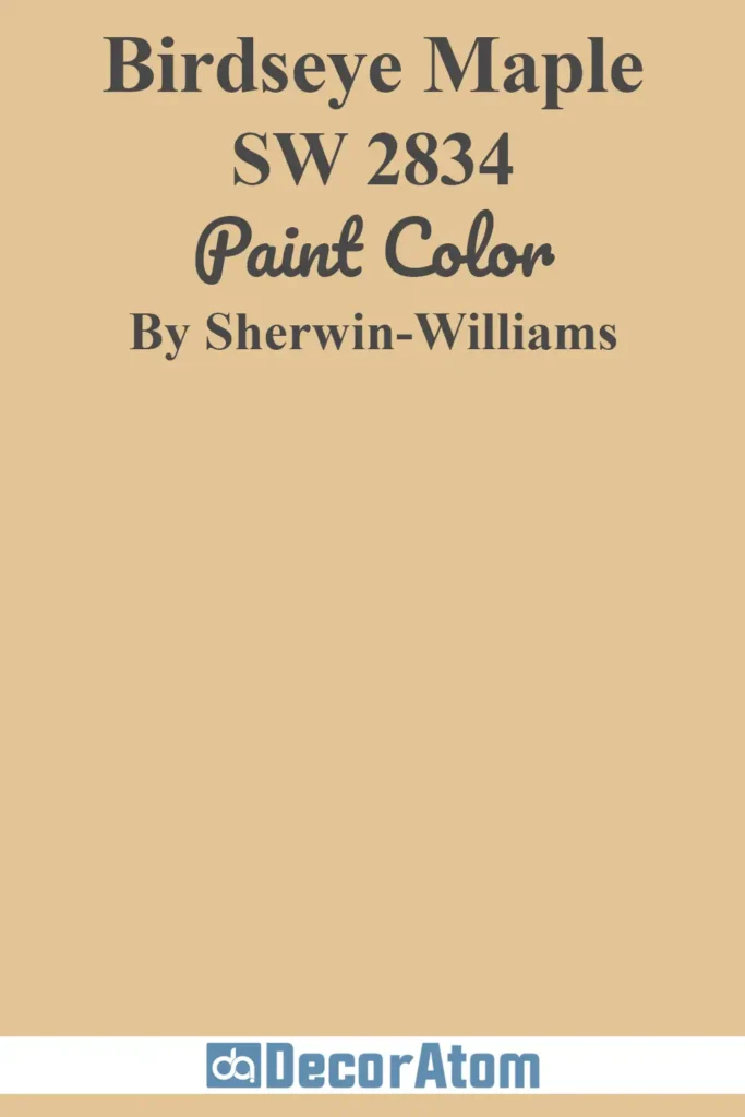
Birdseye Maple is one of those unique shades that doesn’t get enough attention.
It’s a soft, historic tan with a touch of warmth and just a whisper of peachiness in the undertone.
On exteriors, it adds a sense of heritage and grounding, making it perfect for homes that want to nod to tradition while still feeling current.
It complements clay roofing, natural stone, and green landscaping beautifully.
Try it on bungalows, updated colonials, or modern ranch homes where you want something earthy but elevated.
8. Sherwin-Williams Wool Skein SW 6148

💥🎁 Christmas & Year-End Deals On Amazon !
Don't miss out on the best discounts and top-rated products available right now!
*As an Amazon Associate, I earn from qualifying purchases.
Wool Skein strikes that perfect balance between beige and greige, making it an excellent modern exterior neutral.
It has a warm, slightly sandy undertone that keeps it from feeling too gray, but it’s still neutral enough to pair with both warm and cool accents.
This is a popular pick for homes that want a soft, earthy facade without going dark. In full sun, Wool Skein looks creamy and calming.
On shaded parts of the house, it holds its tone well and doesn’t go muddy. It’s a versatile option for modern suburban homes and transitional styles alike.
9. Benjamin Moore Charcoal Slate HC-178
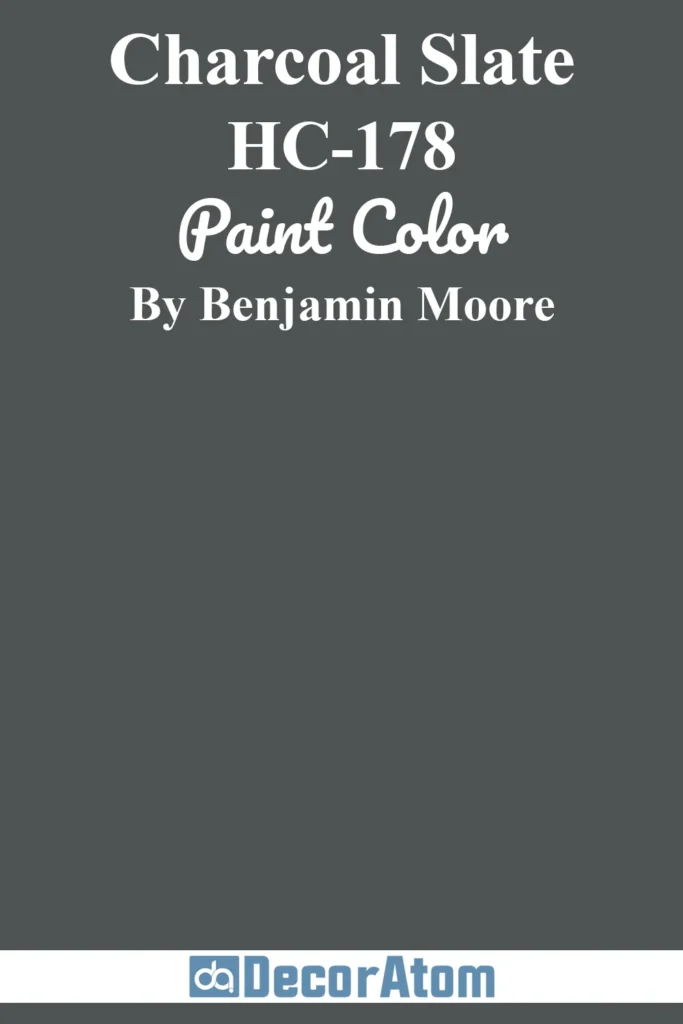
Looking for drama and depth? Charcoal Slate delivers. This bold, moody gray is rich and grounded, with cool blue undertones that keep it from feeling flat or lifeless.
On modern exteriors, it creates a sophisticated, high-contrast backdrop—especially when paired with crisp white trim or warm wood doors.
This is a color that thrives in natural light but holds its own in shadows, giving your home an edge without being overwhelming.
It’s especially striking on modern cabins, sleek mid-century ranches, and urban row homes.
10. Sherwin-Williams Retreat SW 6207

Retreat is one of those nature-inspired colors that brings a sense of calm to a home’s exterior.
It’s a muted green-gray with slightly earthy undertones, making it feel both grounded and serene.
On modern homes, Retreat blends beautifully with the landscape, especially if you’re surrounded by trees or natural textures like stone and wood.
In full sun, the green tones become more noticeable, giving the home a soft organic vibe.
It’s a smart pick for Craftsman bungalows, mountain cabins, and modern-rustic builds that want to feel connected to their surroundings.
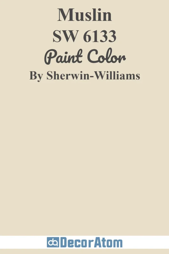
11. Sherwin-Williams Muslin SW 6133
💥🎁 Christmas & Year-End Deals On Amazon !
Don't miss out on the best discounts and top-rated products available right now!
*As an Amazon Associate, I earn from qualifying purchases.
Muslin is one of those quietly elegant neutrals that adds warmth without stealing the spotlight.
This soft, beige-meets-cream shade has subtle yellow undertones that make it feel sun-warmed and grounded—perfect for exteriors that need a hint of earthiness without veering into tan or gold.
In direct sunlight, Muslin reflects a creamy softness, while in shade, it deepens just enough to keep your exterior from feeling flat.
It works especially well on traditional homes being updated with a modern twist—think ranchers, colonials, or transitional builds that want timeless curb appeal.
12. Benjamin Moore Gray Owl 2137-60
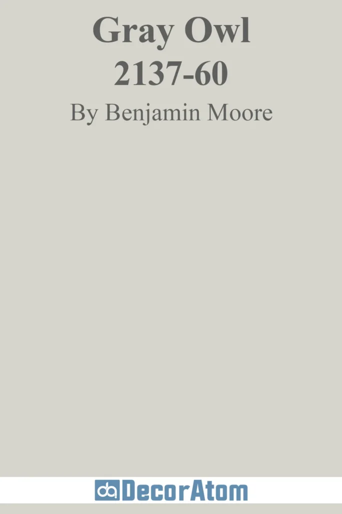
Gray Owl is a modern classic—a light gray with crisp cool undertones and just a touch of green that keeps it from feeling sterile.
On exteriors, it reads as a fresh and modern gray, especially under natural light where its cool tones shine through.
It’s a great choice if you want a sleek, neutral base that works with black trim, white accents, or even wood tones.
While it’s light, it has just enough saturation to avoid looking washed out in bright sunlight.
It’s particularly popular for mid-century modern homes, modern farmhouses, and Scandinavian-inspired exteriors.
13. Benjamin Moore Baby’s Breath OC-62
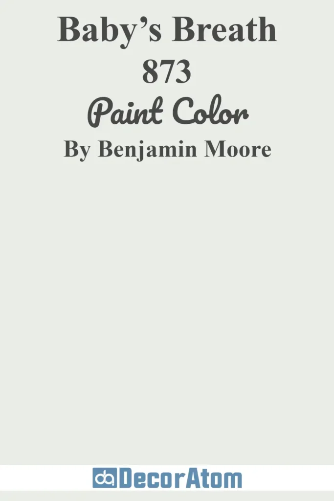
Baby’s Breath is an ultra-light whisper of color—somewhere between white and the faintest hint of gray.
It’s ideal for homeowners who want a clean, soft exterior that’s less stark than pure white but more refined than cream.
This color’s subtle cool undertones make it an especially good match for contemporary architecture or homes that get lots of bright light.
On exteriors, it gives off a breezy, airy look that feels peaceful and modern without being icy.
It’s an especially beautiful choice for beach homes, contemporary cottages, and minimalist builds.
14. Sherwin-Williams Tatami Tan SW 6116
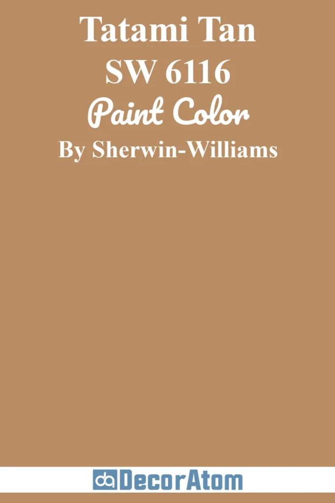
Tatami Tan brings an earthy, lived-in warmth to any exterior.
With its natural golden-beige undertone, it mimics the color of dried grass or aged limestone—making it a strong fit for homes that lean organic or Mediterranean.
In sun, it glows softly; in shade, it deepens into a more substantial, comforting tone.
This color is perfect for homes in desert landscapes or wooded areas where you want your paint to echo nature rather than contrast it.
Pair it with terracotta, off-white trim, or deep greens for a perfectly modern-earthy vibe.
15. Sherwin-Williams Breezy SW 7616
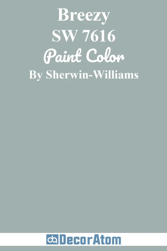
As its name suggests, Breezy brings a light, coastal energy to the exterior of a home.
This soft blue-gray feels fresh and relaxed, with just enough color to make a statement while still staying sophisticated.
It works particularly well on homes with lots of natural surroundings or coastal influence.
In bright light, the blue tones become more apparent, while in the shade, it softens to a misty gray-blue.
Breezy is a great pick for contemporary cottages, beach-inspired builds, or craftsman homes looking for a modern color with personality.
16. Sherwin-Williams Silvermist SW 7621
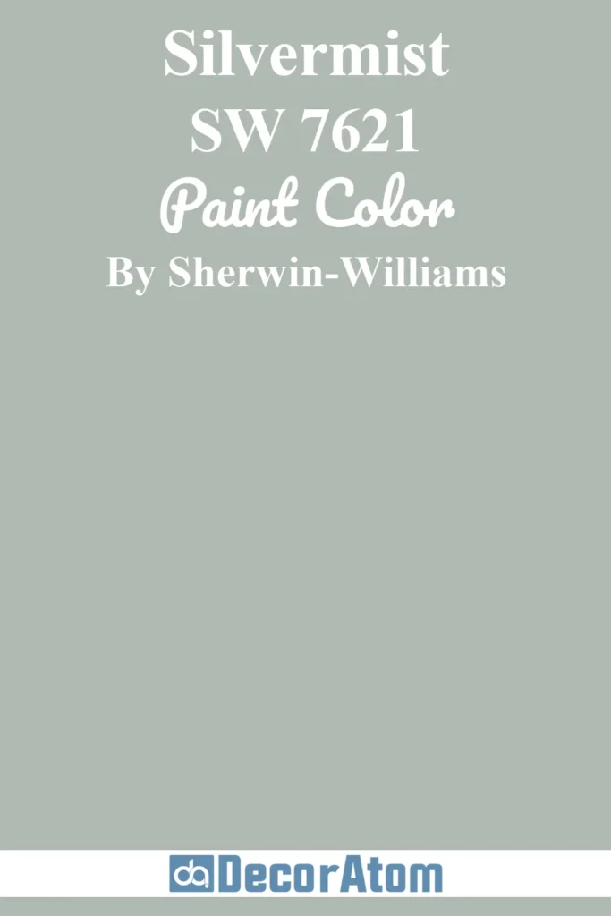
Silvermist is one of those magical in-between colors—equal parts green, blue, and gray—that adapts beautifully to different lighting and settings.
On exteriors, it has a soothing, nature-inspired vibe that makes it ideal for homes near water or surrounded by trees.
It’s muted enough to feel modern, yet still has character. In strong sunlight, Silvermist leans more green-blue; in shaded areas, the gray undertones become more noticeable.
It’s a top choice for Craftsman homes, cabins, and coastal modern builds that want a little mood without going too dark.
17. Benjamin Moore Wrought Iron 2124-10
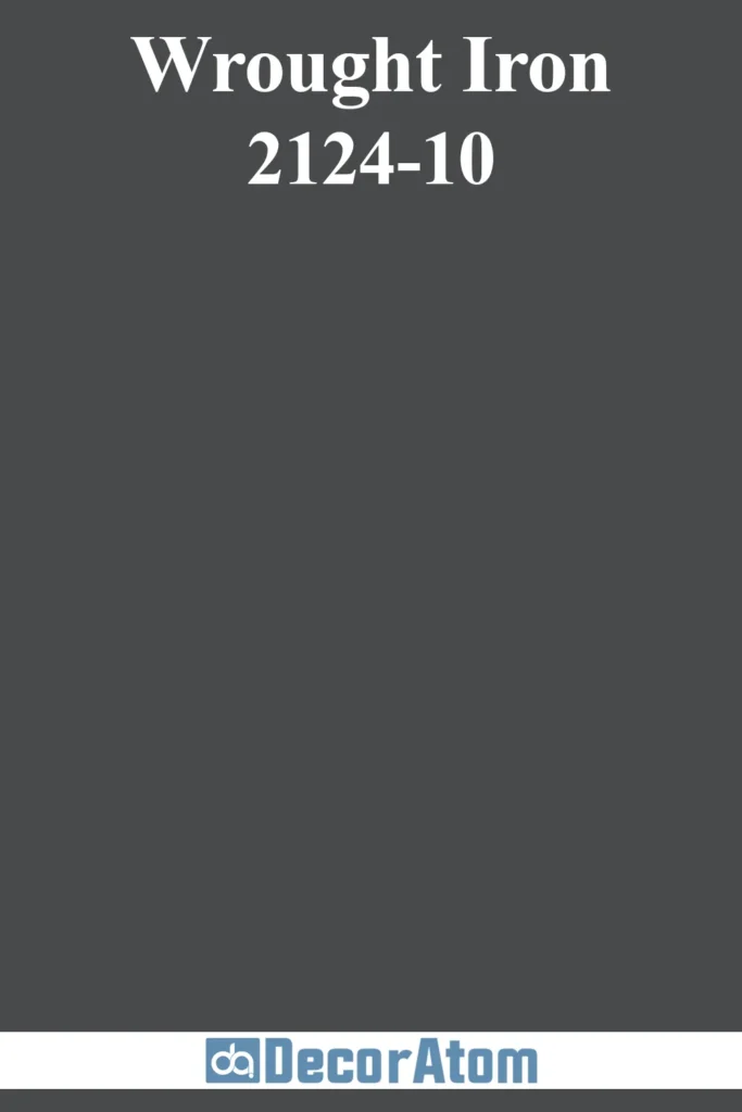
Wrought Iron is not your average black. It’s a deep, moody charcoal with rich blue undertones that give it a velvety sophistication—perfect for modern exteriors where drama and contrast are key.
Unlike a stark jet black, Wrought Iron has depth and softness, making it easier to live with.
It stands up to bright sun and shaded areas alike, and works beautifully on everything from board-and-batten farmhouses to minimalist cube-style homes.
Use it as a main body color for bold curb appeal or as a trim/accent against lighter shades for modern contrast.
18. Sherwin-Williams Jogging Path SW 7638
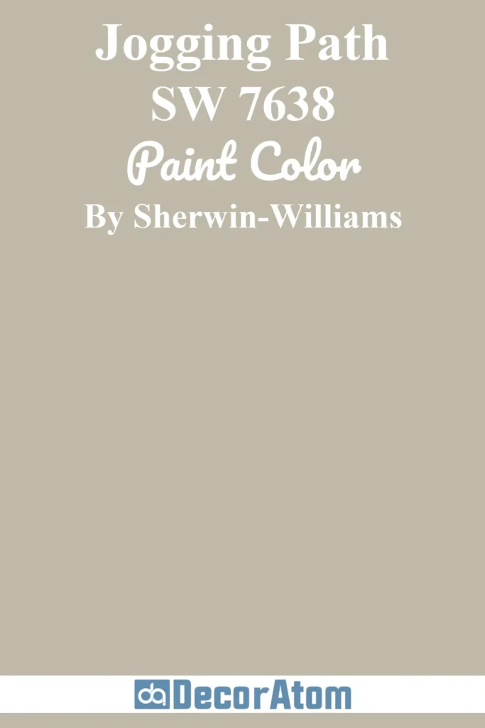
Jogging Path is an understated greige that manages to feel both cozy and contemporary.
With its blend of warm beige and cool gray, it’s a natural choice for homeowners who want versatility and softness.
On exteriors, it shifts gently depending on the light—sometimes reading more beige, other times more gray.
It pairs effortlessly with off-white trim, stone accents, or wood features.
Jogging Path suits transitional and ranch-style homes especially well, offering a grounded exterior that still feels fresh and updated.
19. Sherwin-Williams Anjou Pear SW 6381
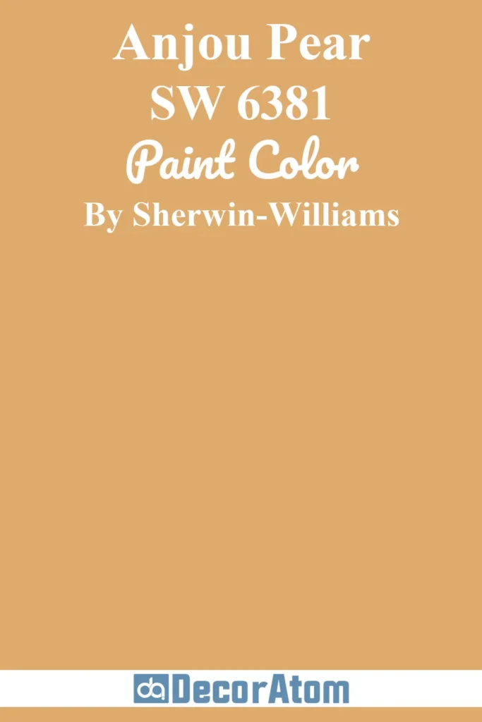
Anjou Pear is a bold, unexpected choice that’s gaining traction in modern design circles.
This rich, golden-green hue adds a sense of personality and depth to exteriors, especially when paired with natural materials like dark wood or slate stone.
It’s earthy yet vibrant, warm yet grounding—making it perfect for homeowners who want to stand out without overwhelming.
In full sun, its golden tones shine; in shade, its olive undertones emerge.
It’s a gorgeous option for modern desert homes, eco-conscious builds, or any design aiming for a sophisticated organic palette.