

Mint green paint comes in so many beautiful variations—from soft, icy pastels to barely-blue mints with a touch of gray.
Some lean more green, others flirt with blue, and a few surprise you with their subtle depth.
What they all have in common is that refreshing, spa-like energy that makes them perfect for bedrooms, bathrooms, kitchens, and even playful accents in more neutral spaces.
In this post, I’ve rounded up my favorite mint green paint colors—13 shades that really stood out for their beauty, versatility, and that unmistakable fresh feeling.
Each one brings something a little different to the table, and I’ll walk you through what makes them special, where they shine best, and why they’re worth considering for your next paint project.

What are Mint Green Paint Colors?
Mint green paint colors are soft, refreshing shades that blend green with a hint of blue and often a touch of white to keep things airy.
Imagine the coolness of a fresh-picked mint leaf or the subtle sweetness of mint chip ice cream—that’s the vibe.
They’re lighter and less saturated than traditional greens, making them feel more tranquil and breezy rather than bold or earthy.
Mint greens often fall somewhere between pastel green and aqua, which is why they can sometimes lean cool or warm depending on the undertone.
Some mint shades carry a whisper of blue, making them feel crisp and spa-like.
Others lean ever so slightly toward yellow or gray, which can warm them up or tone them down.
What makes mint green so loved is its versatility—it’s vibrant enough to add personality, but still subtle enough to feel relaxing.

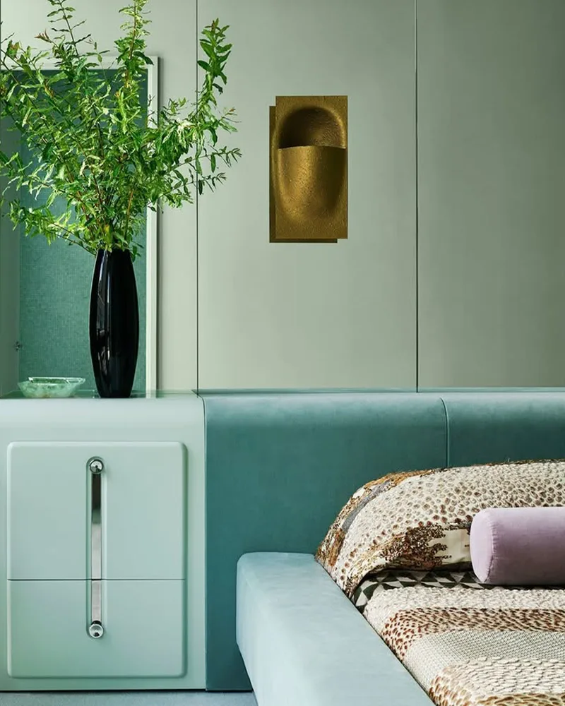
Where to Use Mint Green Paint Colors
Mint green can work just about anywhere you want a space to feel fresh, clean, and soothing. It’s especially lovely in:
- Bathrooms – Mint green has a natural spa-like quality that makes it a go-to for creating a calm, clean retreat.
- Bedrooms – Light mint walls can help set a peaceful tone, especially in children’s rooms or guest spaces where you want things to feel welcoming but not overstimulating.
- Kitchens – Mint green cabinetry or walls feel vintage-chic and work beautifully with white tile or brass hardware.
- Living Rooms – In well-lit spaces, mint green adds a cheerful energy without overpowering the room.
- Nurseries – Gender-neutral and sweet, mint green creates a soft, dreamy atmosphere for little ones.
Because of its lightness and freshness, mint green is especially well-suited to rooms with natural light—it picks up on that brightness and glows.

Colors to Pair with Mint Green
Mint green plays really well with others. Depending on the mood you’re aiming for, you can steer it in a few different directions:
- Crisp Whites – A classic pairing that keeps things fresh and clean. Perfect for trims, ceilings, or cabinetry.
- Soft Grays or Greiges – These neutrals balance mint’s playful side and help ground it, especially in modern or transitional spaces.
- Pale Blush or Peach – For a soft, romantic palette. These warmer tones create a gentle contrast that feels soothing.
- Navy or Deep Teal – If you want to bring depth or sophistication, darker blues can create a striking balance with mint’s lightness.
- Warm Woods and Naturals – Light oak, rattan, and woven textures help mint feel more organic and grounded, especially in coastal or boho-inspired rooms.
- Brass or Gold Accents – Metallics give mint a little bit of glamour without overwhelming its soft aesthetic.
Mint green is more flexible than people think—it can lean preppy, coastal, retro, or modern depending on how you style it.
Tips for Choosing The Best Mint Green Paint Colors
With so many minty shades out there, it can be tricky to pick the perfect one. Here are a few tips that can help you narrow it down:
- Pay Attention to Undertones – Some mint greens lean blue, others lean yellow, and a few carry hints of gray. The undertone can completely change how the color feels. Cooler mints feel crisp and modern, while warmer ones feel softer and more inviting.
- Test in Different Lighting – Mint green is especially sensitive to light. What looks perfect in a bright, south-facing room might feel icy in a north-facing space. Always test samples on multiple walls and observe them at different times of day.
- Coordinate with Surroundings – Consider your flooring, trim, countertops, and furniture. A mint green that looks dreamy on a swatch might clash with beige tile or deep wood tones.
- Don’t Skip the Sample Pots – Mint can surprise you once it’s on the wall. Sampling a few favorites side by side will help you see which one truly suits your space.
The Best Mint Green Paint Colors
Here are my favorite Mint Green paint colors to decorate with.
1. Benjamin Moore Minty Green
Minty Green by Benjamin Moore is the kind of color that immediately lifts the mood in a space.
It’s a soft, delicate green with just the right amount of brightness to make it feel cheerful without being over the top.
What I love about Minty Green is how balanced it is—it’s unmistakably green, but it’s cooled down enough by its subtle blue undertones to give it that fresh, minty feel we all associate with the name.
This is one of those colors that brings a hint of nostalgia—like an old-fashioned candy shop or a vintage farmhouse kitchen—while still feeling fresh and current in modern spaces.
It works beautifully in bedrooms, bathrooms, or even an entryway if you want to make a light and friendly first impression.
It made this list because it nails that classic mint green tone so many people look for, and it manages to feel clean and happy without being too punchy.
2. Benjamin Moore Palladian Blue

Okay, I know what you’re thinking—Palladian Blue isn’t technically a mint green in the traditional sense.
But hear me out. Palladian Blue walks that perfect line between soft blue and green, with a touch of gray to tone it down.
When you see it on the wall, it often leans into a fresh green-blue that’s exactly what many people think mint green should look like—especially if they’re drawn to that spa-like, airy vibe.
Its muted undertones make it incredibly sophisticated. It doesn’t scream “color,” but it’s far from boring.
This is a favorite for serene bedrooms, sunlit bathrooms, or even large open spaces where you want a subtle wash of color that still feels grounded.
3. Benjamin Moore Fresh Mint

Fresh Mint is such a gentle, calming green—it almost feels like a soft breath of spring air.
It has a very pale, whisper-light appearance that makes it perfect for smaller rooms, nurseries, or anywhere you want a quiet and uplifting atmosphere.
It leans more green than blue, and it has a touch of warmth that keeps it from feeling too cold or sterile.
What sets Fresh Mint apart is how subtle it is. It’s not going to be the bold statement color in a room, but that’s part of its charm.
It creates an atmosphere that feels clean and natural, almost like an herbal infusion.
4. Benjamin Moore Creme de Mint

Creme de Mint is a shade that feels both playful and sophisticated.
It leans a bit deeper than the whisper-light mints, but it still keeps that soft and gentle energy.
This one has a slightly creamy base, which adds warmth and depth, making it feel inviting rather than icy.
What I love about Creme de Mint is how adaptable it is.
It can lean vintage when paired with warm woods and retro accents, or go modern when surrounded by crisp whites and sleek hardware.
It’s definitely a standout for mint lovers who want a little more saturation without stepping into bright green territory.
5. Sherwin Williams Window Pane

Sherwin Williams Window Pane is one of the most versatile minty colors out there.
It’s technically a green-blue, but when it’s on the wall, it reads like a barely-there mint that changes subtly with the light.
In bright rooms, it can feel more crisp and blue; in warmer lighting, the green undertones start to shine.
It’s light, airy, and absolutely perfect if you want your space to feel calm and open.
This one looks stunning in coastal interiors, especially paired with white wainscoting or natural textures like rattan and linen.
6. Sherwin Williams Rainwashed

Rainwashed is one of those cult-favorite colors that people keep coming back to—and for good reason.
It’s a dreamy blend of green and blue with soft gray undertones, giving it that peaceful, watery look that feels like a spa retreat.
It’s not a bold mint, but it belongs on this list because it hits that same refreshing, calming note.
It’s slightly more complex than a straightforward mint, but that’s what makes it so appealing.
It has enough saturation to be noticed, but it still feels muted and serene.
People love this color for bedrooms and bathrooms because it has such a relaxing quality, and it also plays beautifully with natural light.
It’s one of those paints that shifts and evolves throughout the day, always looking soft and polished.
7. Benjamin Moore Frosty Mint
Frosty Mint is exactly what its name suggests—a crisp, cool mint with icy undertones that feel like a breath of fresh air.
It leans more toward a pastel tone, with a whisper of blue that gives it a refreshing, almost peppermint quality.
This one feels very youthful and cheerful, which is why it’s a favorite for playrooms, laundry rooms, and breezy guest spaces.
Its lightness makes it a great option if you’re looking to add a little personality to a space without committing to a bold or saturated color.
It’s a great example of a true pastel mint that doesn’t feel too sugary—it has a clean, refined look that still brings the fun.
8. Sherwin Williams Mint Condition

Mint Condition is a more vibrant take on mint, with a brightness that gives it a cheerful and energetic presence.
It’s one of the more saturated minty shades on this list, leaning a bit more green than some of the cooler, blue-toned options.
If you’re looking for a color that reads clearly as mint without any ambiguity, this might be your winner.
It has a playful personality that works really well in kitchens, bathrooms, or even on cabinetry if you want a fun pop.
Despite its boldness, it still feels light enough to use across all four walls without overwhelming the space.
9. Benjamin Moore Beach Glass
Beach Glass is the grown-up, sophisticated cousin of mint green.
It has a deeper, more grounded tone with gray and green in perfect balance.
While it doesn’t scream “mint” the way some others do, it gives off that serene, refreshing vibe that mint greens are known for—just in a more muted, coastal-inspired way.
This is a perfect choice if you love the idea of mint but want something a little more subtle, a little more complex.
It’s ideal for larger spaces or open floor plans where you want a hint of color without going too pastel.
10. Benjamin Moore Baby Green
Baby Green is a soft, charming shade that feels just like its name—sweet, gentle, and light-hearted.
It leans more toward the green side of mint with a soft touch of warmth, making it feel cozy rather than icy.
This is a lovely option for nurseries, powder rooms, or anywhere you want a calming color with a little personality.
What I love about Baby Green is that it doesn’t try too hard.
It’s not too trendy or too bold—it’s just an easygoing, pleasant color that brings light and life into a room.
It’s a great choice for anyone who wants a whisper of green without it taking over the whole space.
11. Benjamin Moore Cool Mint

Cool Mint is a classic pale mint that really leans into that icy-fresh aesthetic.
It’s got a bit more blue in it than green, which gives it a very crisp, clean appearance.
This is a go-to for bathrooms or modern kitchens where you want that fresh, invigorating look.
It has a brightness that works well in small spaces or areas with limited light, helping them feel more open and clean.
12. Sherwin Williams Blue Sky

Blue Sky may read more blue than green at first glance, but in the right lighting, especially with white trim and soft accents, it reveals a soft green tint that feels mint-adjacent.
It’s light, breezy, and gives that same sense of openness and ease that true mint greens offer.
What makes this color stand out is its versatility. It works well as a wall color or ceiling accent and pairs beautifully with whites, grays, and even natural wood.
It’s a fun, uplifting option for spaces where you want a minty blue that doesn’t overpower the room.
13. Sherwin Williams Drizzle

Drizzle is deeper than your typical mint green, but it still carries that green-blue balance that puts it in the mint family—just with more drama.
It has more saturation and mood, which makes it a great option for accent walls, cabinetry, or bold design moments.
What makes Drizzle special is that it brings a more mature, moody take on mint.
It’s a great alternative if you want something a little more dynamic but still fresh and coastal.