
You know that feeling when you walk into a room and it just feels right? That calm, cozy vibe that makes you want to settle in and never leave.
It’s not just about the furniture or the decor—it’s the color on the walls that sets the tone.
I remember when I first discovered mineral gray. I had been searching for the perfect shade for my living room, something that felt grounded yet serene.
And when I finally found it—a soft, subtle gray with hints of cool blue—it was like the room just clicked.
It was soothing but still had a certain depth to it, almost like a soft, foggy morning.
Mineral gray paint does that. It’s one of those colors that’s quiet but powerful, offering just the right balance of warmth and coolness.
Whether you’re looking to create a calm retreat in your bedroom or give your kitchen a more sophisticated feel, mineral gray works everywhere.
It pairs effortlessly with almost anything and instantly gives a room a serene, timeless vibe.
In this post, I’m going to share 19 of the best mineral gray paint colors that can transform your space into something special.
From soft silvery tones to deeper, more dramatic grays, these shades are perfect for creating that peaceful, welcoming atmosphere we all crave.

What are Mineral Gray Paint Colors?
Mineral gray paint colors are inspired by the raw, organic beauty of natural stone—think slate, granite, concrete, and weathered rock.
These grays often carry muted undertones of blue, green, violet, or even beige, giving them a grounded and layered feel.
They’re not icy or sterile like some modern grays, nor overly warm or taupe-toned. Instead, mineral grays strike a beautiful balance: soft yet strong, cool yet comforting, elegant but never flashy.
What sets mineral grays apart is that they have a slightly weathered, earthy look that feels timeless.
They’re often mid-toned to deep, though lighter mineral grays exist too.
The common thread is their connection to nature—like the color of overcast skies, pebbles smoothed by water, or stones warmed by the sun.
These colors bring a sense of calm and sophistication to a space without overwhelming it.

Where to Use Mineral Gray Paint Colors
Mineral gray paint colors are incredibly versatile, which is why they work well in just about every room of the home. If you’re drawn to colors that feel grounded and serene, this palette delivers.
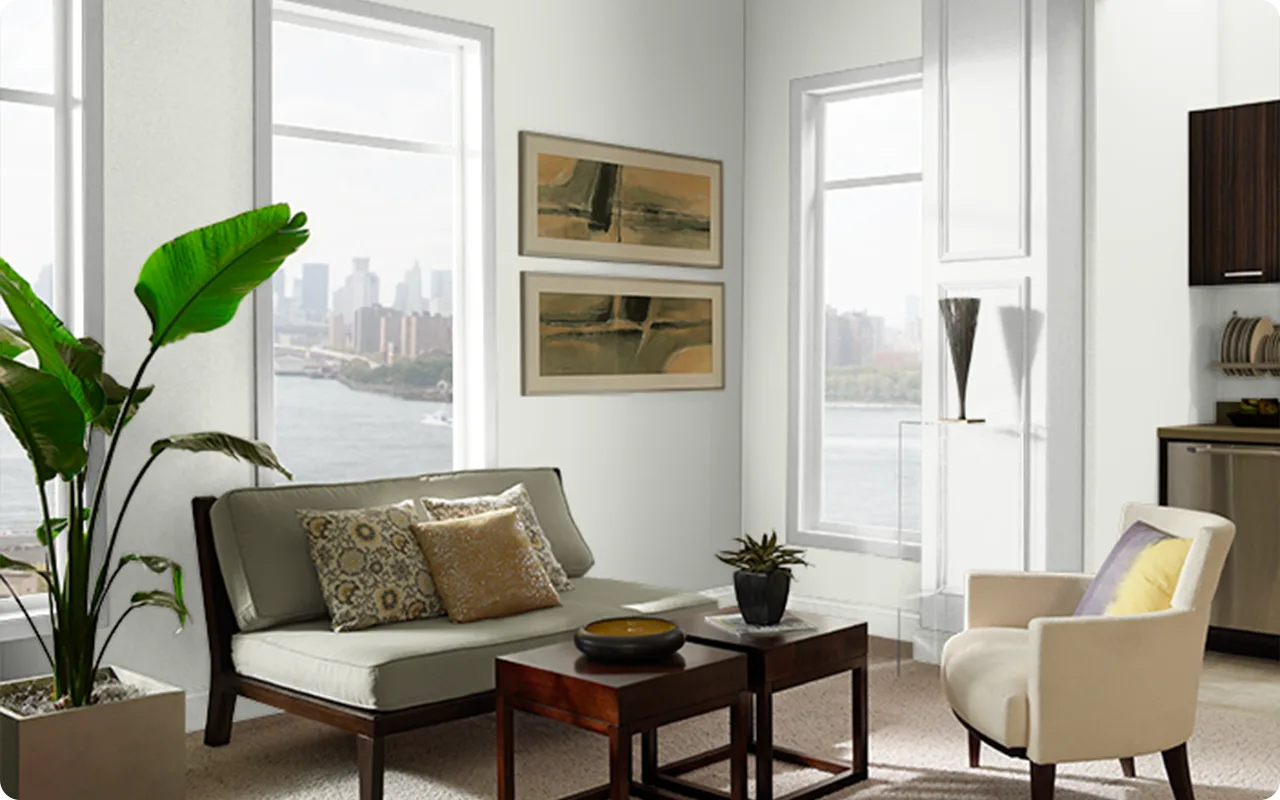
In the living room, mineral grays can create a calming atmosphere that plays well with both cool-toned and warm-toned furniture. Pair them with soft whites, wood accents, and layered textiles for a relaxed yet refined vibe.
For bedrooms, lighter mineral grays like Benjamin Moore Gray Owl or Behr Silver Ash can set a peaceful tone, especially when paired with linen bedding and natural wood.
In kitchens and bathrooms, mineral grays bring a sophisticated edge—especially when used on cabinets. Darker shades like Kendall Charcoal or Gauntlet Gray make cabinetry feel rich and substantial, while paler tones keep things airy and elegant.
Even in home offices or hallways, mineral grays are a smart pick. They add just enough contrast to feel interesting, but they’re never loud or distracting.

💥🎁 Christmas & Year-End Deals On Amazon !
Don't miss out on the best discounts and top-rated products available right now!
*As an Amazon Associate, I earn from qualifying purchases.
What Is The Most Popular Mineral Gray Paint Color For 2025?
The standout mineral gray for 2025? Without a doubt—Sherwin Williams Mineral Gray. It’s having a major moment this year, and it’s easy to see why.
This shade has that perfect balance of depth and softness, with subtle undertones that shift depending on the light—sometimes cooler, sometimes just a bit warm.
It’s a true chameleon, and that’s exactly what makes it so popular.
Designers and homeowners alike are turning to Mineral Gray for its moody, modern look that still feels incredibly livable.
It’s showing up everywhere—from kitchen cabinets to full-room makeovers—and it plays well with natural textures like stone, wood, and metal.
In short, it feels current without being trendy, which is exactly what people want in 2025.

Tips for Choosing The Best Mineral Gray Paint Colors
Choosing the right mineral gray for your space can feel tricky, especially since these colors tend to shift in different lighting. Here are a few tips to make the process easier:
1. Always sample before you commit. Mineral grays often look different on the wall than they do on a swatch. Lighting, flooring, and surrounding finishes can all bring out different undertones—so test it out in your space and at different times of day.
2. Think about the room’s direction. North-facing rooms often make mineral grays read cooler and moodier. South-facing light brings out warmth and softness. East and west-facing rooms shift dramatically throughout the day, so it’s even more important to see the color in action.
3. Pay attention to undertones. Some mineral grays lean blue (like Behr Platinum), while others carry a touch of green (like Benjamin Moore Nimbus) or even lavender (like Farrow & Ball Plummett). Knowing the undertone will help you coordinate with flooring, tile, countertops, and fabrics.
4. Match the mood to the depth. Want a cozy, cocoon-like space? Try a darker mineral gray like Gauntlet Gray or Kendall Charcoal. Want something airy and soft? Go with a lighter mineral gray like Silver Ash or Gray Owl.
The Best Mineral Gray Paint Colors
Here are my favorite Mineral Gray paint colors to decorate with.
1. Sherwin Williams Mineral Gray

Sherwin Williams Mineral Gray is the paint color that inspired this whole post, and for good reason.
It’s a rich, medium-to-deep gray with subtle blue undertones that give it that unmistakable mineral edge.
There’s something effortlessly elegant about this color—it feels bold without being overpowering, grounded yet still soft on the eyes.
In natural light, you might notice it leaning a bit cool, while in lower light, it reveals a deeper, more slate-like personality.
What makes Mineral Gray stand out is how balanced it is. It doesn’t feel overly trendy, yet it absolutely fits into modern design.
Whether you’re painting an accent wall, cabinetry, or even an entire room, this shade brings a quiet drama that feels elevated and refined.
It pairs beautifully with warm woods, crisp whites, and even pops of black for a more contemporary look.
If you’re looking for a shade that feels rooted in nature yet sleek enough for a modern home, this one’s a star.
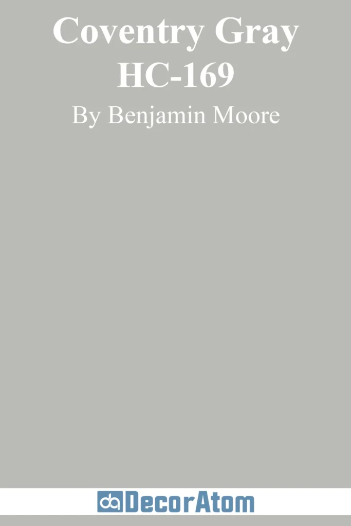
2. Benjamin Moore Coventry Gray
💥🎁 Christmas & Year-End Deals On Amazon !
Don't miss out on the best discounts and top-rated products available right now!
*As an Amazon Associate, I earn from qualifying purchases.
Coventry Gray is what I’d call a true classic. It’s a soft, medium gray with just a hint of blue, making it a perfect mineral-inspired hue.
It’s cooler than some of the grays on this list, but it never feels cold or uninviting.
Instead, it gives off a calming, tailored vibe—like a well-fitted blazer or a misty morning sky.
This is one of those grays that can adapt beautifully depending on the space.
In a room with lots of natural light, the subtle blue undertone shows through more clearly. In lower light, it softens into a slightly cooler neutral.
People love Coventry Gray because it’s understated and clean—it doesn’t try to steal the show, but it always looks elegant.
It’s especially gorgeous in bedrooms, living rooms, and hallways where you want something sophisticated but not too dark.
3. Behr Silver City

Behr’s Silver City is a soft and slightly silvery gray that leans toward the cooler side, but still has enough warmth to keep it from feeling sterile.
It’s not too dark, not too light—right in that sweet spot that works in just about any space. What I love about Silver City is how easy it is to live with.
It doesn’t jump out at you, but it still adds a touch of polish to a room.
The undertones here are very subtle, but there’s just enough blue in the mix to give it that mineral gray feel.
It reads clean and neutral in most lighting conditions, and it works beautifully with both modern and transitional design styles.
If you want a safe, reliable gray that still has personality, Silver City is a fantastic pick.
It looks especially sharp with white trim or paired with darker gray or black accents.
4. Sherwin Williams Repose Gray

Repose Gray is one of those grays that everyone seems to fall in love with once they try it.
It’s technically a warm gray, or “greige,” but it still qualifies as a mineral gray thanks to its soft, weathered appearance and slight blue-violet undertone.
It’s one of the most versatile colors on this list because it walks that fine line between warm and cool.
This color changes beautifully depending on the light. In bright natural light, it leans a bit cooler and you might notice the faintest whisper of purple.
In artificial lighting or darker rooms, it can warm up slightly without turning beige.
Repose Gray is a favorite for open floor plans, bedrooms, and living rooms because it acts as a perfect backdrop for nearly any décor style—farmhouse, modern, minimalist, you name it.
It’s approachable, relaxed, and just refined enough to feel upscale.
5. Benjamin Moore Nimbus

💥🎁 Christmas & Year-End Deals On Amazon !
Don't miss out on the best discounts and top-rated products available right now!
*As an Amazon Associate, I earn from qualifying purchases.
Nimbus is a soft, silvery gray with gentle blue and violet undertones that shift subtly throughout the day.
It’s airy without being too light, and it has that cloudy, stone-like quality that really defines what a mineral gray should look like.
Nimbus doesn’t scream for attention, but it has this beautiful, almost poetic presence that quietly transforms a space.
What makes Nimbus special is its softness. It’s not overly pigmented, which allows it to work in both large, open areas and smaller, more intimate spaces.
If you’re looking for a gray that feels sophisticated but still light enough to brighten a room, Nimbus is a winner.
I especially love it in bedrooms, bathrooms, and even home offices—it helps create a peaceful, focused atmosphere without ever feeling stark.
6. Farrow & Ball Plummett

Plummett is bold, moody, and full of character. This is a deep, cool gray with strong blue and violet undertones—perfect for someone who isn’t afraid of a little drama.
It’s darker than many other grays on this list, which makes it ideal for accent walls, cabinetry, or even entire rooms if you’re going for a more cocoon-like effect.
This is definitely a mineral-inspired shade—it has the richness of slate and the weight of wet concrete, but with a beautifully smooth finish.
In well-lit spaces, you’ll notice a slightly steely blue cast. In lower light, it deepens into a stormy, almost charcoal-like gray.
If you want a gray that makes a strong style statement while still staying rooted in nature, Plummett is a stunning option.
7. Sherwin Williams Dorian Gray

Dorian Gray is a medium-to-dark gray with warm undertones and a hint of greige running through it.
It’s richer and more substantial than some of the lighter mineral grays, but it doesn’t veer into charcoal territory.
This shade gives off a cozy, grounded feeling, almost like a well-worn river stone—solid, dependable, and full of character.
It’s a great choice for someone who wants a gray that’s got depth without being too dark.
You can use Dorian Gray on walls, built-ins, or even kitchen cabinets, and it always looks intentional.
It plays well with whites, natural wood tones, and muted metallics, making it super flexible in both traditional and contemporary spaces.
If you want a mineral gray with warmth and weight, Dorian Gray delivers.
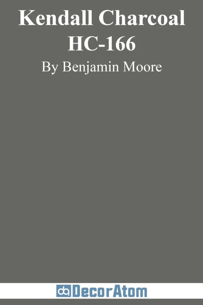
8. Benjamin Moore Kendall Charcoal
💥🎁 Christmas & Year-End Deals On Amazon !
Don't miss out on the best discounts and top-rated products available right now!
*As an Amazon Associate, I earn from qualifying purchases.
Kendall Charcoal is one of the boldest colors on this list. It’s a deep, rich charcoal gray with a strong green undertone that keeps it from feeling too cold or flat.
This is the kind of gray you turn to when you want a look that’s dramatic and refined—like a tailored wool suit or a slate mountain wall.
Despite its depth, Kendall Charcoal has a way of making a room feel more intimate and elegant rather than closed-in.
It’s stunning on kitchen cabinets, interior doors, or even full walls in a cozy den or library.
Pair it with creamy whites or soft beige upholstery for contrast, or lean into the moodiness with darker accents and textured finishes.
It’s definitely a statement gray, and it’s one of the best examples of how mineral tones can be bold yet timeless.
9. Behr Platinum

Behr Platinum is a cool, silvery gray with a refined, almost icy appearance.
It leans more toward the modern end of the mineral gray spectrum, with just a whisper of blue and a touch of steeliness that gives it a crisp, clean vibe.
It’s not as dark as some other grays, which makes it a great option for open-plan homes or any room where you want a bright yet grounded palette.
What sets Platinum apart is its sleekness. It looks amazing in spaces with lots of glass, metal, or modern design elements.
It’s also a great companion for both darker grays and softer whites, making it easy to coordinate.
If you’re aiming for a clean, contemporary mineral gray that still feels connected to nature, Behr Platinum checks all the boxes.
10. Behr Lunar Surface

Behr Lunar Surface is a soft, medium-light gray that brings to mind the dusty surface of—you guessed it—the moon.
It’s got a subtle blue undertone that gives it a slightly cool, almost ethereal feel, but it still reads neutral enough to work in a variety of settings.
It has that classic mineral gray vibe, with just a hint of something otherworldly.
This is the kind of color that quietly transforms a room without overpowering it.
It’s beautiful in living rooms, nurseries, or even bathrooms where you want a bit of serenity. It plays nicely with soft whites, pale wood tones, and brushed metals.
Lunar Surface is especially nice if you want something with more personality than a basic light gray but still soft enough to feel airy and open.
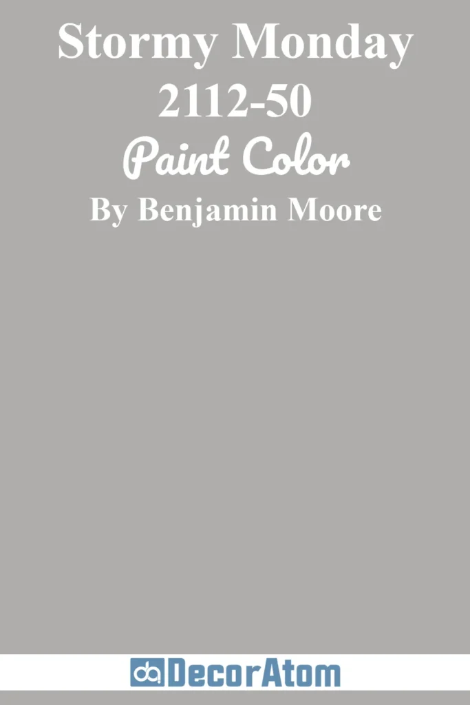
11. Benjamin Moore Stormy Monday
💥🎁 Christmas & Year-End Deals On Amazon !
Don't miss out on the best discounts and top-rated products available right now!
*As an Amazon Associate, I earn from qualifying purchases.
Stormy Monday is exactly as it sounds—an elegant and moody gray that evokes the quiet, atmospheric feeling of a gray sky before a storm.
This deep, mineral-inspired gray carries subtle blue and green undertones, making it feel both calm and cool at the same time.
It’s a perfect shade if you’re seeking a refined, sophisticated atmosphere that feels grounded yet not overwhelming.
One of the things that makes Stormy Monday special is its ability to adapt to different lighting conditions.
In natural light, it holds onto its cool undertones, bringing a touch of crispness to the room.
When the light dims, though, it transforms into a deeper, more dramatic shade, adding an almost ethereal quality to the space.
It’s fantastic in spaces where you want to add some character and elegance, like a dining room, study, or living room.
Pair it with silver, white, or even deep charcoal accents, and you’ll have a striking, contemporary design.
12. Behr Silver Feather

Behr Silver Feather is a light, airy gray that has the softest hint of silver, making it an almost ethereal choice.
It’s a classic cool mineral gray with subtle undertones of blue and violet, giving it a polished and serene quality that works well in a variety of spaces.
Silver Feather feels fresh and modern, yet still timeless enough to not feel overly trendy.
What makes Silver Feather special is its versatility. It’s light enough to be used in smaller spaces without feeling cramped, and it brightens up rooms while maintaining that mineral, natural feel.
It’s ideal for bedrooms, bathrooms, and entryways, especially if you want a sophisticated, soft backdrop for other design elements.
It pairs beautifully with both darker accents (like deep navy or charcoal) or lighter tones (such as whites and creams).
The subtle sheen from the silver undertones gives it just enough depth to feel like a true statement color without overwhelming the room.
13. Sherwin Williams Worldly Gray

Worldly Gray is a beautiful balance of warm and cool, making it a true “greige” with mineral gray undertones.
It has a soft, almost earthy feel thanks to its hint of beige, but the gray provides enough modern flair to make it feel fresh and polished.
The gentle taupe undertones keep this color from leaning too cool or too warm, so it fits well into both traditional and contemporary homes.
This is the kind of color you can use with confidence because it’s so adaptable.
In well-lit spaces, it leans a little cooler, showcasing the gray notes, while in darker rooms, it warms up and feels more like a soft taupe.
It’s perfect for creating a relaxed, welcoming environment in living rooms, kitchens, or even hallways.
It works well with natural wood tones, soft whites, and muted metallics, giving it a cozy yet sophisticated appeal.
If you want a neutral that feels a bit more grounded and earthy, Worldly Gray is an excellent choice.
14. Benjamin Moore Gray Owl
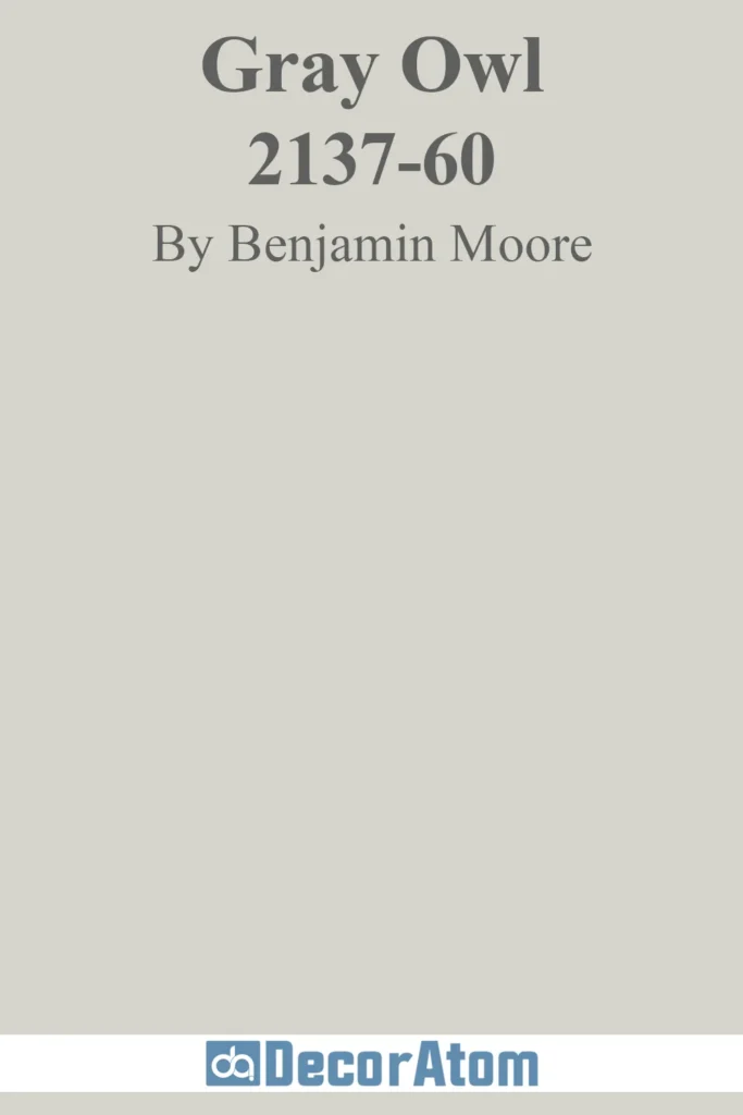
Gray Owl is a highly regarded classic and one of the most popular gray paint colors in the world.
It’s a soft, light gray with the slightest undertones of green and blue that give it that mineral-like, cool effect.
This shade feels clean and crisp, yet not stark, with just enough depth to keep it from feeling too washed out.
What makes Gray Owl stand out is its ability to work well in almost any room and with any style.
Whether you’re using it on the walls of a modern living room, a traditional bedroom, or even a kitchen, Gray Owl adapts beautifully.
The subtle coolness gives it an almost serene quality, while the undertones keep it soft and inviting.
It works especially well in spaces that get a lot of natural light, where it can truly shine and feel almost like a whispering fog.
If you want a mineral gray that is light, soft, and endlessly versatile, Gray Owl is a fantastic choice.
15. Farrow & Ball Blackened

Blackened is one of those colors that leaves a lasting impression.
It’s a deeply atmospheric gray with rich blue-gray undertones that make it feel dramatic and slightly mysterious.
The color is perfect for spaces where you want to create a bold, moody, yet refined look.
It’s a deeper gray, almost verging on charcoal, but with the soft, slightly faded quality that gives it its “mineral” edge.
What makes Blackened so captivating is its understated depth. It’s not as heavy as a pure charcoal gray, but it still carries that same weight and sophistication.
It’s perfect for accent walls, libraries, or cozy living rooms where you want to add a layer of drama without being too dark.
When paired with white trim or rich, jewel-toned accents, Blackened becomes even more captivating, providing a perfect backdrop for more vivid design elements.
If you’re drawn to deep, moody grays with a touch of mystery, Blackened is a great choice.
16. Behr French Silver

French Silver is a light, sophisticated gray that carries just a hint of cool blue, giving it a soft, silvery glow.
It’s a delicate, refined color that works wonders in spaces where you want a bit of sparkle without being too bold or overpowering.
The slight bluish undertone gives it that mineral quality, but it still reads as a clean, neutral gray overall.
What makes French Silver stand out is its ability to brighten up a room while still feeling grounded.
It pairs beautifully with both cool and warm accents, making it adaptable for various design styles, from modern to traditional.
The light, almost reflective quality makes it perfect for spaces that benefit from a little added light, such as small rooms, hallways, or bathrooms.
It’s an elegant and timeless choice that gives rooms a polished look without becoming too cold or sterile.
17. Sherwin Williams Gauntlet Gray

Gauntlet Gray is a powerful, bold gray with deep undertones that lean toward charcoal, making it one of the darker colors on this list.
Despite its deep color, it doesn’t feel oppressive because it has a rich, almost velvety quality that makes it feel both sophisticated and approachable.
It’s a gray with weight, yet it’s still warm enough to avoid feeling too harsh or industrial.
What makes Gauntlet Gray special is its depth and versatility. It pairs beautifully with white, soft neutrals, and even rich accent colors like navy, mustard, or deep green.
It works wonderfully in larger spaces like living rooms, dining rooms, or even exterior accents, where you want to create a bold statement.
Gauntlet Gray also adds a sense of drama and luxury to rooms, making it a favorite for anyone who wants a modern, chic space with a bit of gravitas.
18. Behr Silver Ash

Behr Silver Ash is a cool-toned gray with hints of blue that give it that sleek, metallic feel.
It’s a light-to-medium gray that exudes freshness, making it a great choice for modern homes and spaces that need a bit of brightness.
While it’s on the cooler side, Silver Ash is soft enough to avoid feeling too sterile, keeping a subtle warmth that gives it a welcoming feel.
This color is ideal for anyone looking for a clean, modern gray that doesn’t overwhelm the senses.
It’s perfect for open-plan spaces, hallways, or even home offices where you want a neutral backdrop that still has some personality.
The cool undertones give it a refreshing, airy feel, while still maintaining the earthy, natural essence of a mineral gray.
If you’re after a contemporary, chic, and understated gray, Silver Ash is a solid pick.
19. Behr Classic Silver
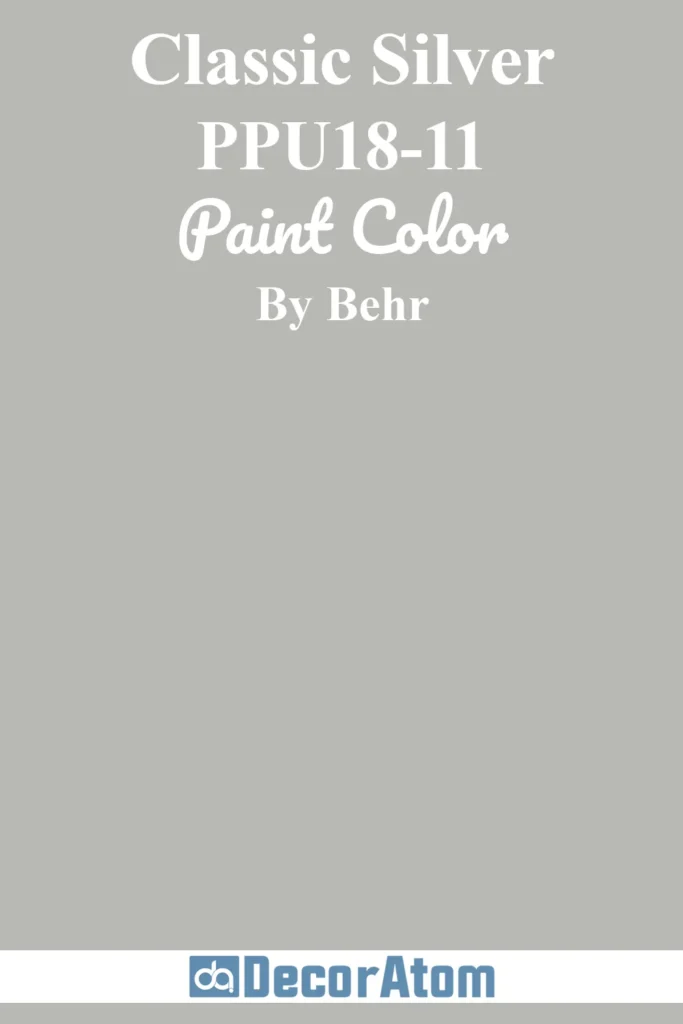
Behr Classic Silver is a light, soft gray with a very faint blue undertone, giving it that mineral, slightly weathered vibe.
It’s a versatile color that feels fresh, open, and airy, while still having enough depth to keep it grounded.
It’s perfect for people who love light gray tones but want a little more richness and warmth than a pure silver or white.
What makes Classic Silver particularly appealing is its gentle, welcoming nature.
It’s an easy color to live with in almost any room, from bedrooms to kitchens to hallways.
The faint blue undertone keeps it feeling crisp and clean, but it doesn’t lean too cool, so it works well with a wide variety of accent colors.
Whether you’re going for a minimalist look or something more eclectic, Classic Silver gives you the flexibility to create a calm, inviting space.