
There’s something timeless about mid-century modern homes—flat planes, wide eaves, natural materials, and that perfect blend of simplicity and statement.
But the exterior paint color you choose can either highlight those classic lines or completely dull them down.
That’s why finding the right paint color matters more than most people realize.
Mid-century homes often work best with earthy neutrals, muted greens, smoky blues, and rich, moody tones—all grounded in nature, but with just enough character to turn heads.
Whether you’re preserving the original charm of a 1950s gem or simply love the look and want to give your home a modern-meets-retro update, the right exterior palette can transform your curb appeal instantly.
In this post, I’ve rounded up 19 of the best mid-century modern exterior paint colors from Benjamin Moore and Sherwin-Williams.
These shades work beautifully on ranch-style homes, split-levels, and modernist builds alike.
What Is the Most Popular Mid-Century Modern Exterior Paint Color in 2025?
In 2025, Benjamin Moore White Dove (OC-17) continues to reign as one of the most popular exterior paint colors for mid-century modern homes—and it’s not hard to see why.
This soft, warm white has a creamy undertone that gives it just enough warmth without feeling yellow or dated.
It’s a beautiful match for mid-century architecture, especially when used on homes with wood or stone accents.
Homeowners love it because it balances that clean, modern feel with a timeless softness that doesn’t go out of style.
It also plays incredibly well with contrasting trim or bold front doors—so you can keep things minimal or add pops of personality, depending on your vibe.
What Paint Finish Should I Use on the Outside of My House?
For exteriors, satin or low-luster finishes are typically the best choice for most surfaces.
Satin offers just a hint of sheen—it’s not shiny, but it’s not completely flat either.
This makes it ideal for showcasing the texture of your siding while still being durable enough to handle the elements.
Satin finish resists mildew and is easier to clean than flat finishes, which is especially helpful if you live in an area with a lot of dust, pollen, or humidity.
For trim, doors, or other architectural details, you might want to go with a semi-gloss finish.
It’s more reflective, which helps accentuate those features, and it stands up well to frequent touching and weather exposure.
Avoid flat or matte finishes on exteriors unless you’re painting brick or stucco and you’re specifically going for that ultra-modern, chalky look—just be aware that flat paints are harder to clean and may show wear more quickly.

💥🎁 Christmas & Year-End Deals On Amazon !
Don't miss out on the best discounts and top-rated products available right now!
*As an Amazon Associate, I earn from qualifying purchases.
How Many Colors Should Be In an Exterior Color Palette?
Most mid-century modern exteriors look best with a palette of 2 to 3 colors. Keeping it simple allows the architecture to speak for itself. Typically, you’ll want:
- A main body color – this is the dominant color of the house, often a neutral or earthy tone.
- A trim color – usually a contrasting neutral like bright white, soft black, or warm beige.
- An accent color – this might be reserved for the front door, eaves, or unique design features. Think deep blues, greens, or even a warm brick red.
Some homes can pull off a fourth color—especially if you’re working with mixed materials like brick, wood, and stucco—but sticking to three keeps things cohesive and true to the mid-century aesthetic.
How Do You Choose the Best Mid-Century Modern Exterior Paint Color?
Choosing the best paint color for a mid-century modern exterior comes down to balancing authenticity, personal style, and your home’s environment. Here are a few key things to keep in mind:
- Look at the architecture. Mid-century homes often have clean lines, natural materials, and large windows. Choose colors that enhance—not compete with—those features. Earthy browns, olives, warm grays, and crisp whites all work beautifully.
- Consider your surroundings. Does your home sit in a lush, green landscape? A muted green or soft tan will complement the setting. Is it in a desert climate? Warm neutrals or rusty reds might feel more natural.
- Use contrast strategically. Mid-century homes often shine with contrast—think dark trim on a light house, or vice versa. It helps define the architectural lines without overwhelming them.
- Embrace bold accents. One of the fun parts of this style is how well it supports bold front doors or color-blocked panels. A pop of color—deep blue, mustard yellow, or retro orange—can give your home personality while still feeling era-appropriate.
- Test before you commit. Always sample your colors in natural light on your actual exterior. Colors can shift dramatically between morning and evening light—or from shade to full sun.
Top 19 Mid-Century Modern Exterior Paint Colors
Here are the best paint colors for Mid-Century modern homes from popular brands.
Mid-Century Modern Exterior Paint Colors From Benjamin Moore
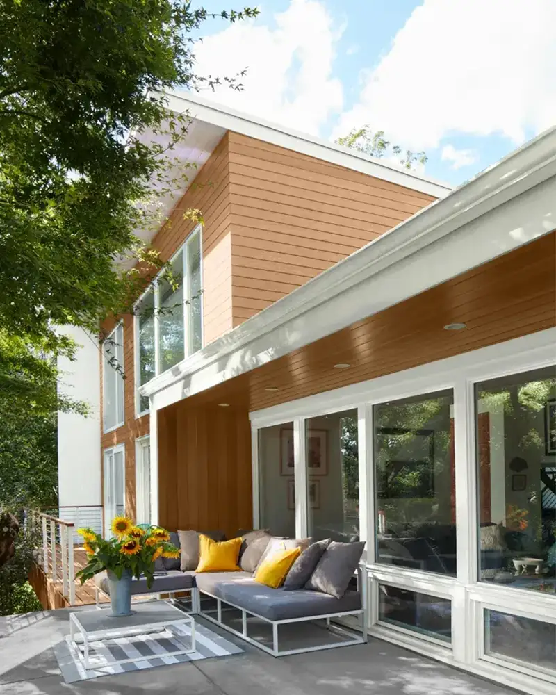
1. Benjamin Moore White Dove OC-17

White Dove is a classic soft white that feels clean without being stark or sterile.
It has just a whisper of warm creamy undertones, which makes it an ideal exterior color for mid-century modern homes that lean into natural textures like stone, wood, or brick.
In bright daylight, White Dove reflects light beautifully and can appear nearly pure white, but in shaded areas or under overhangs, that hint of warmth subtly emerges—keeping it grounded and welcoming.
It’s especially striking on homes with flat or low-pitched roofs, allowing architectural lines to take center stage without overpowering the palette.
2. Benjamin Moore Revere Pewter HC-172

💥🎁 Christmas & Year-End Deals On Amazon !
Don't miss out on the best discounts and top-rated products available right now!
*As an Amazon Associate, I earn from qualifying purchases.
Revere Pewter is that perfect bridge between traditional and modern.
As a warm gray with soft beige undertones—often called “greige”—it delivers a grounded, earthy tone that complements the warm woods and natural stonework often found on mid-century exteriors.
It has a calm, balanced feel that changes slightly with the light: it can look more taupe on overcast days and cooler gray in full sun.
Revere Pewter suits ranch-style and split-level homes beautifully, especially when paired with white or charcoal trim for contrast.
3. Benjamin Moore Maryville Brown HC-75
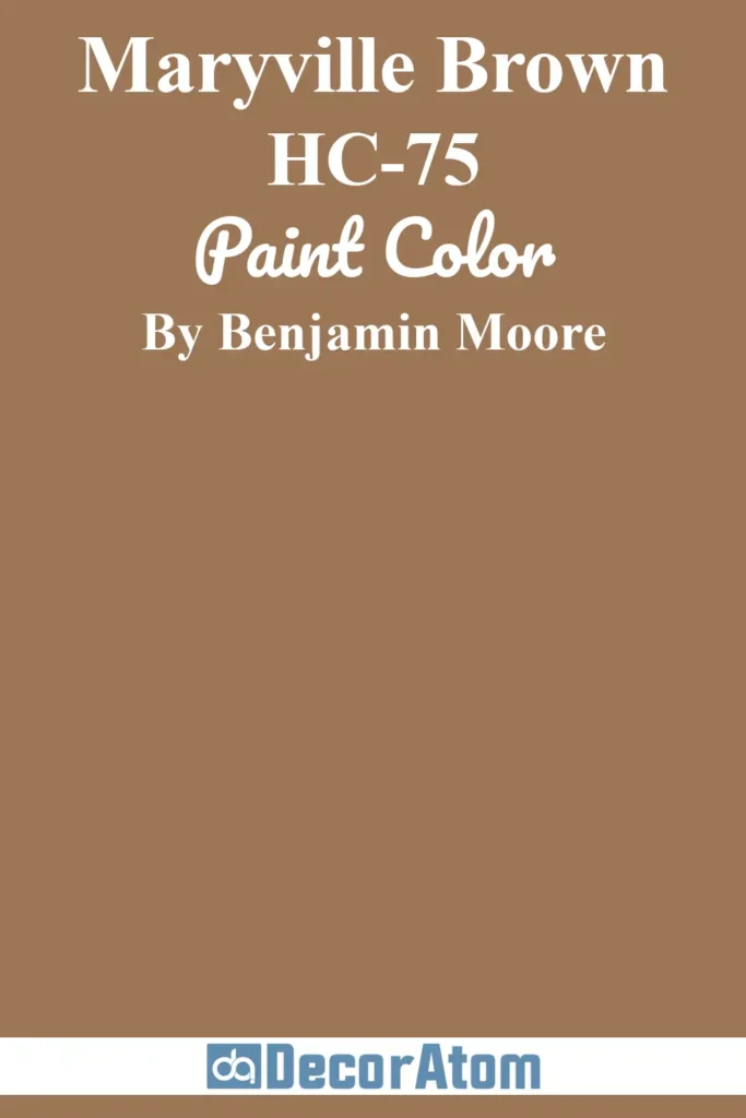
Maryville Brown brings serious warmth and depth to the exterior of a home.
This rich, earthy brown has undertones of rust and deep clay, giving it a grounded, natural quality that resonates with the color palettes of the 1950s and 60s.
It plays especially well with brick, stone, and horizontal wood siding. In brighter daylight, the red undertones peek through slightly, adding visual interest without becoming too bold.
Maryville Brown is perfect for homes nestled in wooded lots or desert landscapes, where the exterior should harmonize with the surroundings rather than compete.
4. Benjamin Moore Black Beauty 2128-10
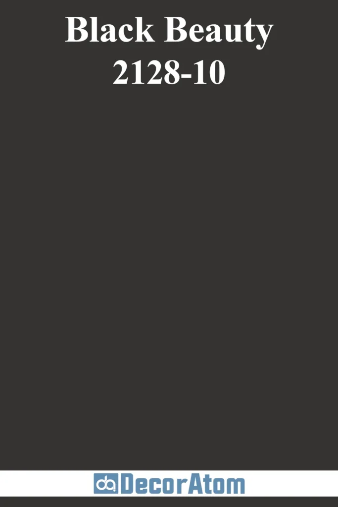
Black Beauty is a bold and sophisticated black with subtle warmth, which prevents it from feeling too harsh or industrial.
It’s the kind of color that instantly makes a home feel modern, clean-lined, and timeless.
On mid-century exteriors, Black Beauty is often used to dramatic effect—either as the main body color with warm wood accents or as a striking trim or door color.
In sunlight, it softens ever so slightly, but it still holds a strong, elegant presence. It’s an excellent choice for homes with simple, geometric facades where color can make a bold architectural statement.
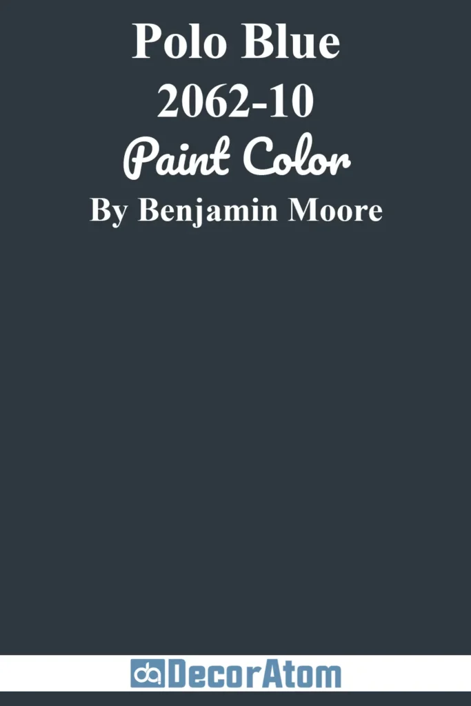
5. Benjamin Moore Polo Blue 2062-10
💥🎁 Christmas & Year-End Deals On Amazon !
Don't miss out on the best discounts and top-rated products available right now!
*As an Amazon Associate, I earn from qualifying purchases.
Polo Blue is a deep, saturated navy with strong gray undertones, which gives it a moody, almost smoky quality.
It’s perfect for homeowners who want to go dark without defaulting to black or charcoal. On mid-century homes, this blue works beautifully with warm woods, brass hardware, and crisp white or off-white trim.
In brighter sunlight, the gray in Polo Blue becomes more noticeable, lending a muted sophistication, while in low light or cloudy weather, it reads as a classic deep navy.
It’s especially effective on homes with strong horizontal lines or board-and-batten siding.
6. Benjamin Moore Cloud Cover OC-25
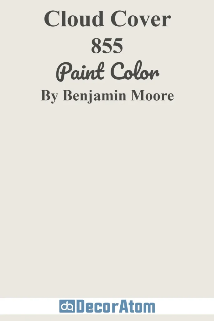
Cloud Cover is a cool, soft white with just a hint of gray in its undertone, making it feel modern and effortless.
Unlike pure whites, which can feel clinical on exteriors, Cloud Cover has a subtle softness that suits the airy, expansive feeling of mid-century architecture.
It holds up beautifully in strong sunlight without glaring and won’t yellow over time.
Cloud Cover pairs well with black, charcoal, or even olive green accents and works best on homes with flat planes, clean lines, and minimalist detailing.
7. Benjamin Moore Peale Green HC-121
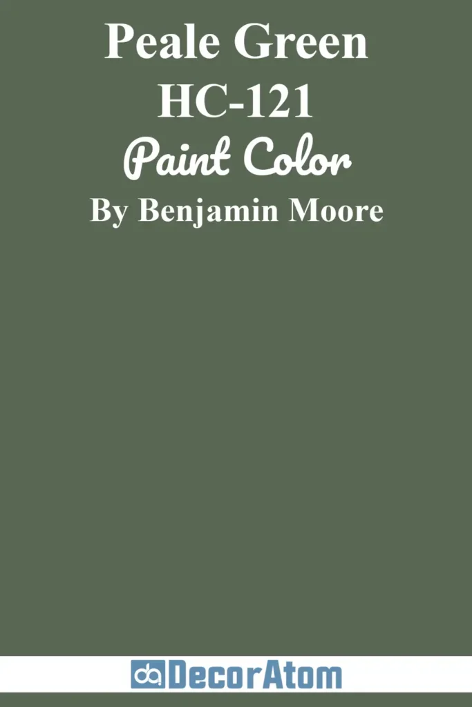
Peale Green is a rich, historical green with deep olive and brown undertones.
It has a heritage feel, but its earthy depth makes it right at home on a mid-century modern exterior—especially those that feature natural stone, slate, or stained wood.
It responds to natural light by revealing different aspects of its tone: sometimes appearing like a forest green, other times a muted moss.
Peale Green suits wooded properties or homes designed to blend into their environment, offering a sense of organic harmony that’s key to mid-century design principles.
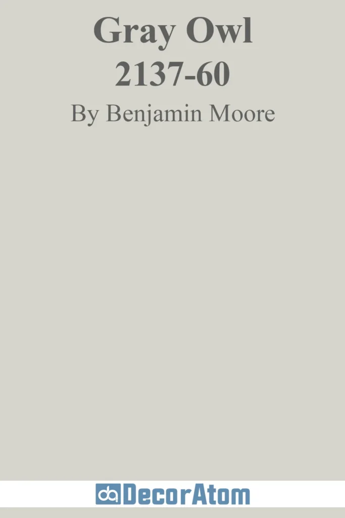
8. Benjamin Moore Gray Owl OC-52
💥🎁 Christmas & Year-End Deals On Amazon !
Don't miss out on the best discounts and top-rated products available right now!
*As an Amazon Associate, I earn from qualifying purchases.
Gray Owl is a true chameleon—an adaptable light gray that shifts with the light and setting.
It has subtle green and blue undertones, which keep it from feeling too cold or too beige. On an exterior, Gray Owl offers a clean, modern look without veering into icy territory.
In bright daylight, it can appear more silvery and cool, while in the shade, its softer, slightly greenish undertones come forward.
Gray Owl is a natural fit for mid-century homes with crisp architectural lines, especially when paired with darker accent colors like charcoal, navy, or black.
9. Benjamin Moore Boston Brick 2092-30
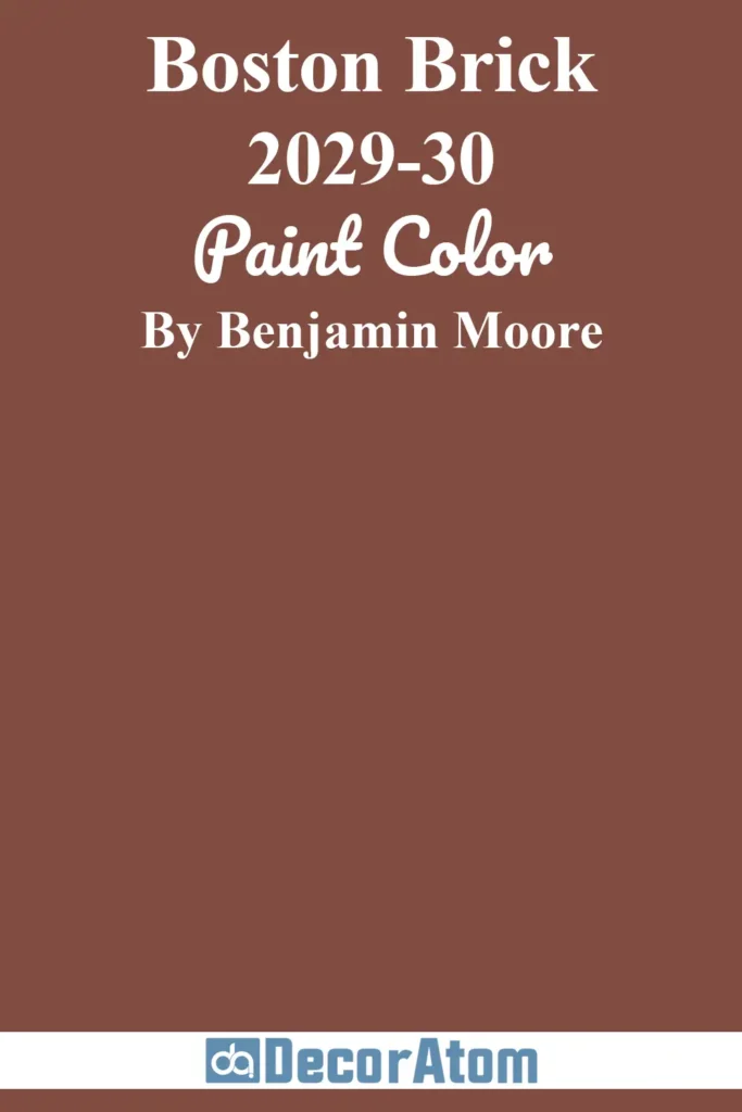
Boston Brick is a bold, deep red with strong brown undertones—a modern twist on the classic red brick tone.
It has warmth and richness but avoids feeling too traditional or colonial. This color thrives on homes that already incorporate natural brick or terracotta tones, enhancing their character while giving them a sleek, modern edge.
It’s particularly striking when contrasted with dark charcoal trim or paired with natural wood accents. Boston Brick is ideal for mid-century homes in urban or historic neighborhoods, where you want to make a statement while respecting the era.
10. Benjamin Moore Natural Cedartone ES-45
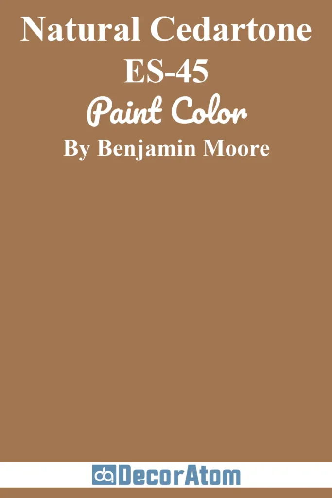
Natural Cedartone brings a soft, wood-inspired warmth that instantly evokes the natural materials central to mid-century design.
It’s a golden, honeyed brown with orange undertones that mimic the look of freshly stained cedar siding.
It looks especially beautiful in sunlight, where it glows with warmth and energy, but it also holds its own in shadow, offering a cozy, lived-in vibe.
This color is ideal for homes with exposed wood siding or those looking to recreate a natural wood appearance with paint or stain. It pairs beautifully with dark browns, mossy greens, and charcoal grays.
Mid-Century Modern Exterior Paint Colors From Sherwin-Williams
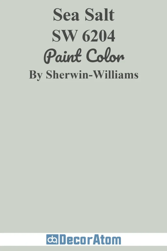
11. Sherwin-Williams Sea Salt SW 6204
💥🎁 Christmas & Year-End Deals On Amazon !
Don't miss out on the best discounts and top-rated products available right now!
*As an Amazon Associate, I earn from qualifying purchases.
Sea Salt is a fan favorite for good reason. This soft, muted greenish-blue with gray undertones offers a breezy, coastal-inspired feel without being overly colorful.
On a mid-century exterior, it works beautifully as a main body color or accent—especially when paired with white trim and natural wood tones.
In sunlight, Sea Salt appears more green; in shade or cooler lighting, it shifts toward a soft blue-gray.
Its tranquil, nature-inspired vibe suits homes that want to blend into their environment or evoke a subtle nod to retro pastels in a thoroughly modern way.
12. Sherwin-Williams Extra White SW 7006
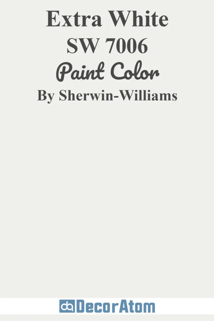
Extra White is one of the crispest, brightest whites in Sherwin-Williams’ collection, and it’s a staple for modern homes aiming for a clean, sharp aesthetic.
With its minimal undertone (just a touch of cool), this white feels fresh and contemporary—perfect for emphasizing the architectural geometry of mid-century homes.
It reflects a lot of light, so it can appear quite stark in direct sun, but that’s exactly what makes it a striking choice when contrasted with darker accent colors like charcoal, navy, or sage.
It’s an excellent trim or body color for anyone going for a sleek, minimalist look.
13. Sherwin-Williams Birdseye Maple SW 2834
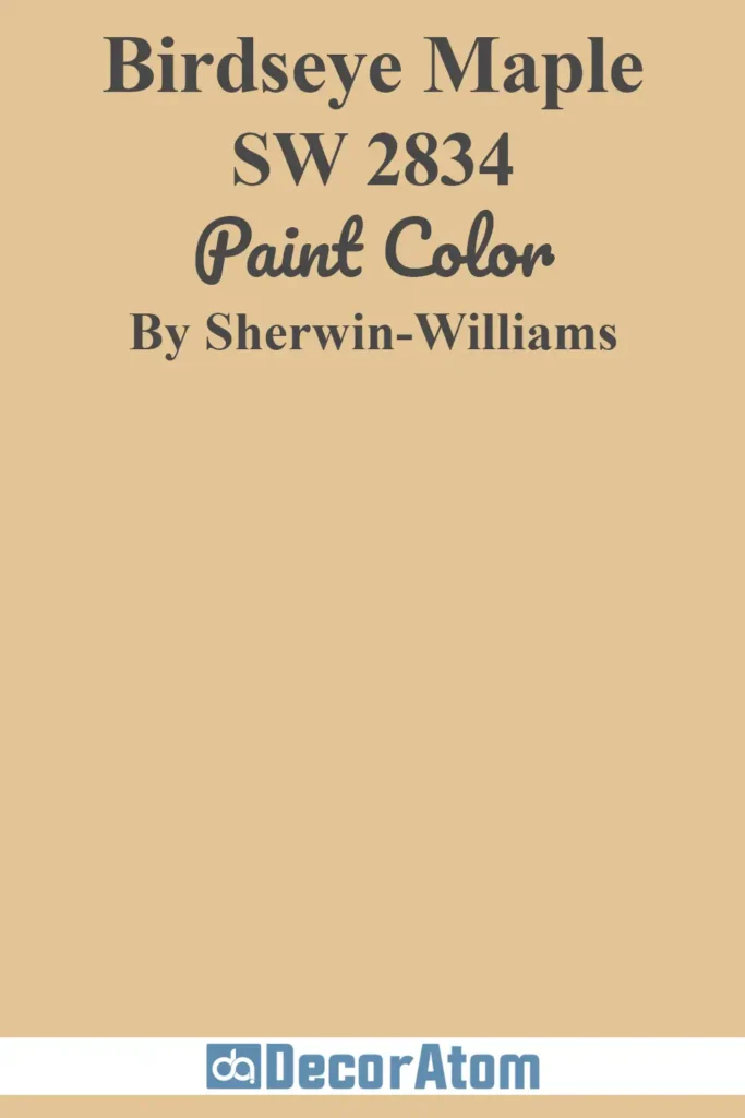
Birdseye Maple is a warm, golden tan that evokes the natural hues of wood and sun-baked stone.
It’s soft without being bland, and it delivers a gentle nod to the mid-century palette of warm earth tones. With its subtle orange and caramel undertones, this color brings warmth and dimension to flat-panel facades and wood siding.
In sunlight, it brightens into a soft amber; in shade, it becomes more subdued and grounded.
Birdseye Maple looks especially inviting on homes with long horizontal lines and expansive windows that connect the indoors with the outdoors.
14. Sherwin-Williams Wool Skein SW 6148

Wool Skein is a creamy, warm neutral that walks the line between beige and greige.
It’s an understated choice that pairs effortlessly with wood accents, dark trim, or earthy landscaping. With soft yellow-beige undertones, it adds warmth without veering into golden territory.
On mid-century exteriors, it feels calm and timeless—ideal for homeowners who want a neutral with personality. In strong sun, Wool Skein lightens considerably, creating a sun-washed effect, while in overcast light, it holds onto its cozy warmth.
This shade is especially nice for homes in desert or arid regions.
15. Sherwin-Williams Muslin SW 6133
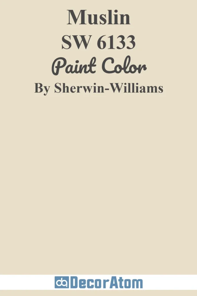
Muslin is a soft, subdued tan with a hint of gray—an elegant neutral that feels relaxed and approachable.
It works especially well on ranch-style homes or mid-century designs that use a mix of materials like brick, wood, and stone.
Its subtle warm undertones keep it from feeling flat, and it’s versatile enough to pair with both cool and warm accents.
In full sun, Muslin appears lighter and more neutral; in shadow, its earthy undertones become more prominent.
It’s a solid choice for homeowners who want a grounded exterior color that still feels light and airy.
16. Sherwin-Williams Sage SW 2860
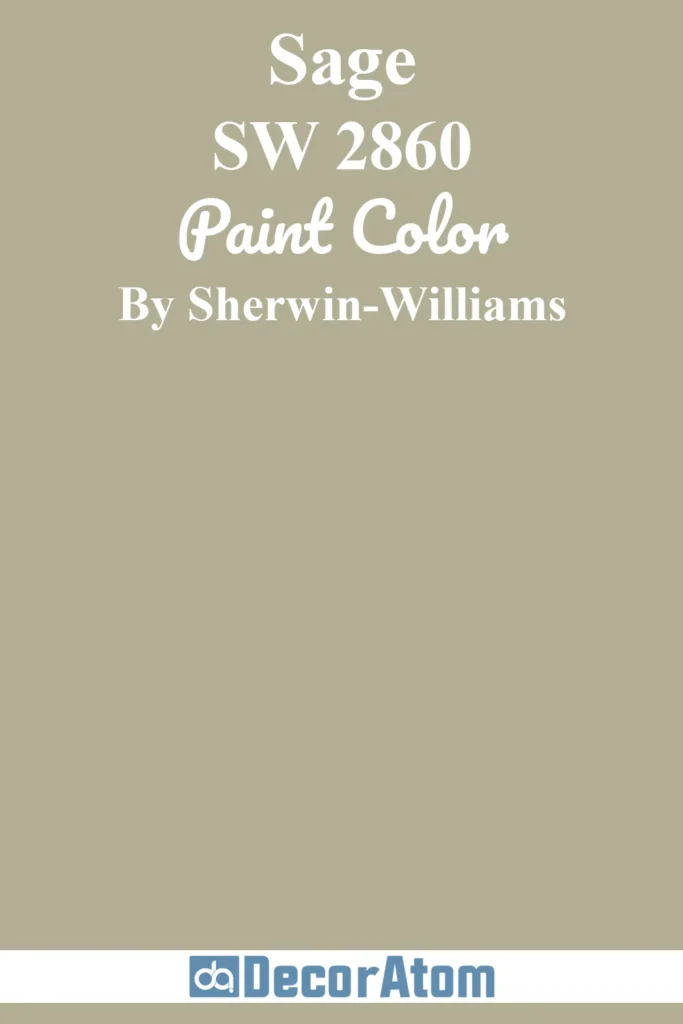
Sage is exactly what you’d expect—a timeless, earthy green with subtle gray and brown undertones. It’s grounded and peaceful, inspired by the muted greens of nature.
On mid-century exteriors, Sage is a perfect nod to the organic architecture of the era, especially when combined with natural stone, wood beams, or copper accents.
In bright sun, the green tones soften and warm slightly; in cooler lighting, the gray undertones give it a sophisticated, muted character.
This is a wonderful choice for homes surrounded by trees or landscaping that you want the home to feel connected to.
17. Sherwin-Williams Breezy SW 7616
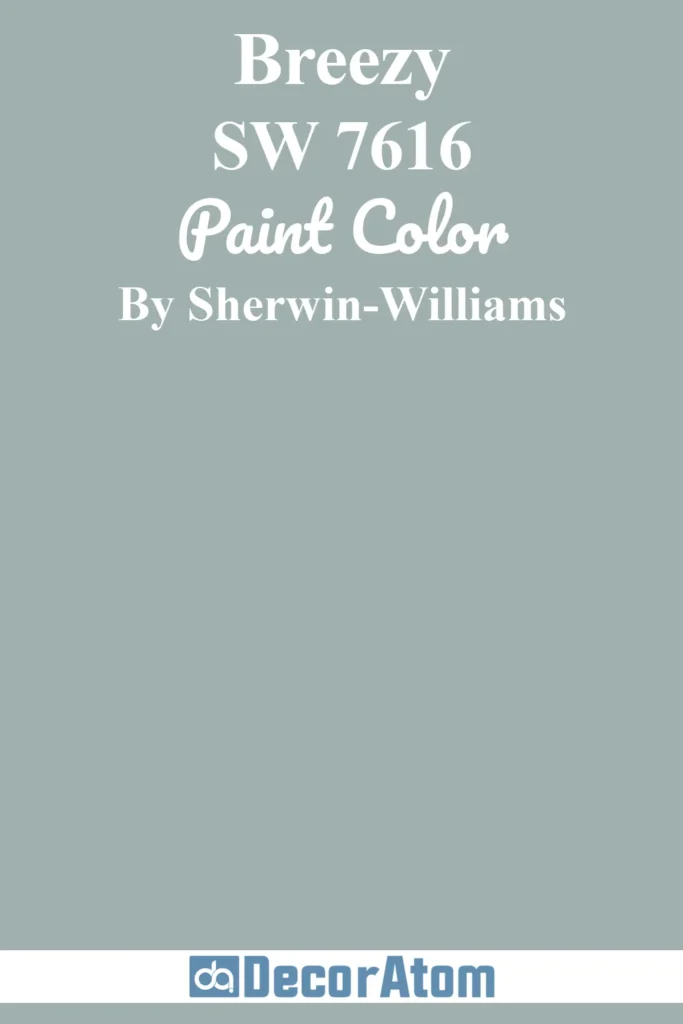
Breezy is a soft, dusty blue with a touch of gray, giving it a weathered, coastal vibe that feels both vintage and modern.
It’s a great choice for homeowners who want color without making too bold a statement.
On mid-century homes, Breezy pairs beautifully with white trim and natural wood doors or eaves.
It has just enough pigment to add character without overwhelming the architecture. In sunlight, the gray in Breezy helps prevent it from reading too bright; in shade, it leans more blue.
It’s a fresh, airy choice that still honors a classic mid-century feel.
18. Sherwin-Williams Anjou Pear SW 6381
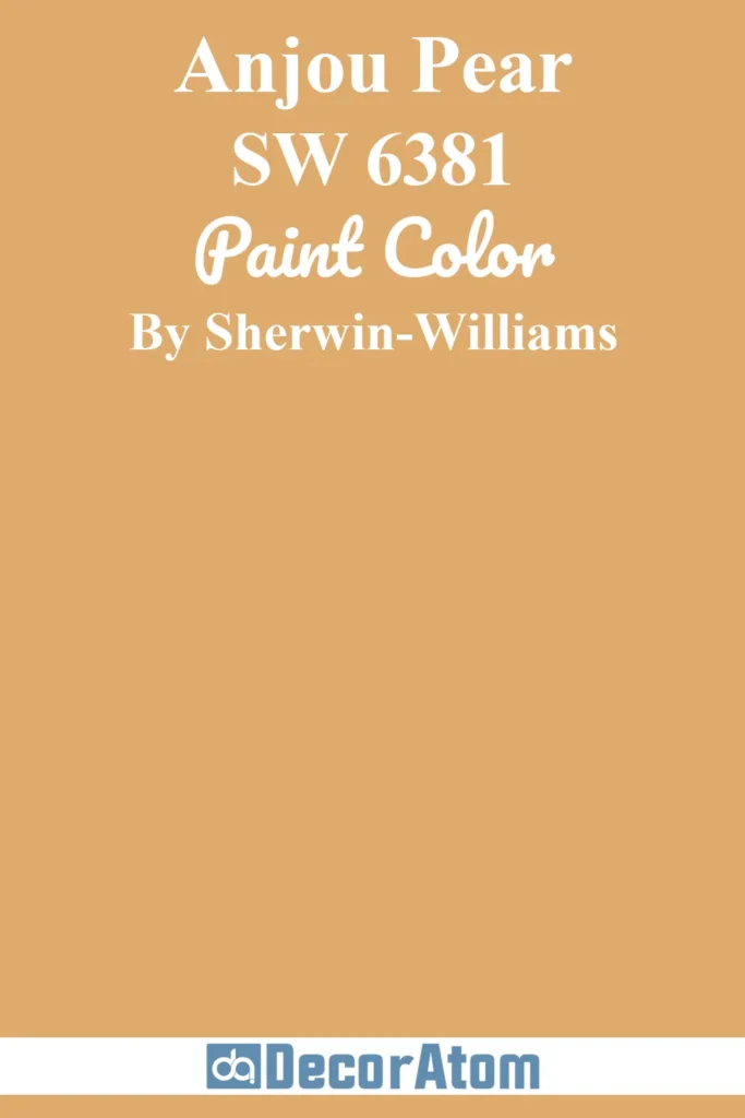
Anjou Pear is a warm, inviting yellow-green with golden undertones.
It’s vibrant but grounded, offering a retro twist that feels right at home on mid-century exteriors—especially if you want to lean into the playful side of the era.
It plays well with natural materials and can be used as a main body color or bold accent. In full sun, Anjou Pear becomes brighter and sunnier; in shade, it takes on a richer olive tone.
It’s ideal for adventurous homeowners looking to embrace a little mid-century funk while keeping things cohesive and natural.
19. Sherwin-Williams Bungalow Beige SW 7511
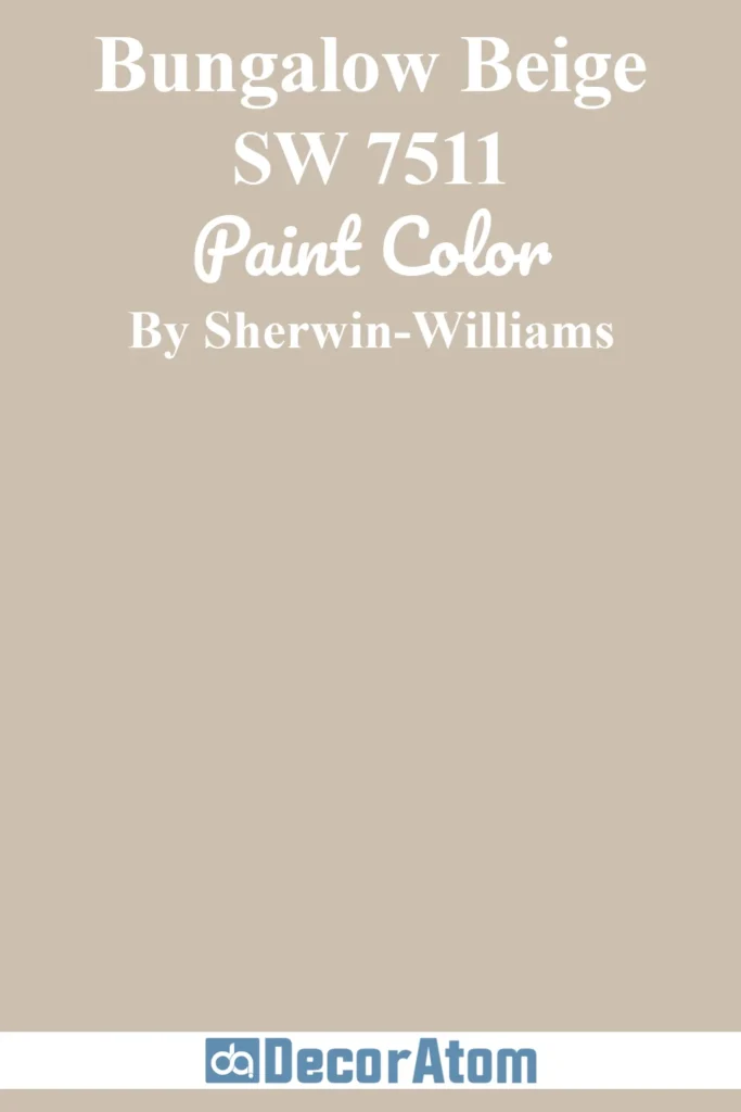
Bungalow Beige is a soft, sandy neutral with warm undertones that feel welcoming and sun-kissed.
It’s subtle and versatile, perfect for creating an understated yet stylish mid-century look. With just a hint of peachy warmth, it avoids feeling too gray or washed out.
In bright daylight, it appears light and clean; in dimmer lighting, its warmth adds a cozy, grounded effect.
Bungalow Beige works especially well on stucco or smooth siding and pairs beautifully with charcoal, navy, or sage green accents for a timeless, balanced exterior.