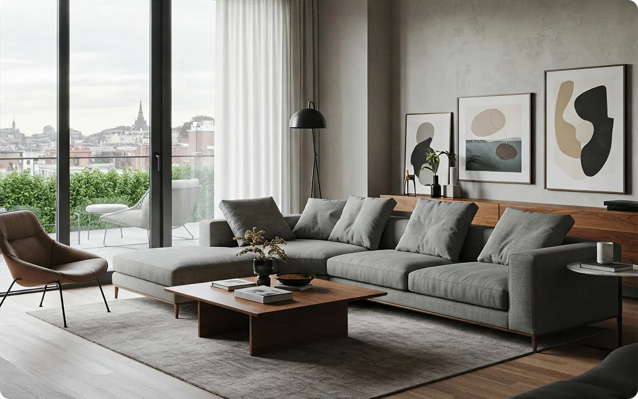
Choosing the perfect paint color for your living room can feel like an impossible task. With endless shades of neutrals, blues, greens, and earthy tones, how do you decide which one will bring the right mood and personality to your space?
The living room is the heart of the home—a place for relaxing, entertaining, and making memories—so the color on the walls needs to set the right tone.
To make things easier, I’ve rounded up 31 of the best living room paint colors that designers and homeowners love.
From warm and inviting neutrals to bold statement shades, these colors have the power to transform your space and complement your style.
Whether you’re looking for something light and airy, deep and moody, or perfectly balanced in between, there’s a shade here that will bring your vision to life.
How to Pick Perfect Living Room Paint Colors?
Choosing the perfect paint color for your living room can feel overwhelming, but it doesn’t have to be. Here’s a step-by-step guide to help you find the right shade that complements your space, lighting, and style.
1. Consider the Mood You Want to Create
Do you want your living room to feel cozy and warm? Airy and fresh? Sophisticated and dramatic? Colors have a huge impact on the mood of a space. Soft beiges, warm grays, and creamy whites create an inviting, comfortable feel. Cool blues and greens bring a sense of calm. Deep charcoals and rich navy tones add elegance and drama.
2. Pay Attention to Natural Light
Lighting plays a major role in how a color looks. A paint color that appears warm and inviting in a sunlit room might look cooler in a space with limited natural light.
- North-facing rooms tend to bring out cooler tones, so warm neutrals or soft, warm colors can help balance the light.
- South-facing rooms get lots of natural light, making both warm and cool colors look vibrant.
- East-facing rooms have warm morning light but cooler afternoon tones, so a balanced neutral works well.
- West-facing rooms get warm, golden light in the evening, which can enhance rich, warm hues.
3. Test Samples in Different Lighting
A color can look completely different in the morning, afternoon, and evening. Buy sample pots of your top choices and paint large swatches on multiple walls. Observe how the color changes throughout the day under both natural and artificial lighting.
4. Think About Your Existing Décor
Your furniture, flooring, and décor should all work with your wall color. If you have warm-toned wood floors or earthy furniture, a warm neutral like Sherwin-Williams Accessible Beige or Benjamin Moore Revere Pewter can tie everything together. For modern spaces with cooler tones, consider a soft greige or muted blue-gray.
5. Decide Between Warm and Cool Undertones
Even neutral colors have undertones that can lean warm (yellow, red, brown) or cool (blue, gray, green). A color like Sherwin-Williams Balanced Beige has warmth but still feels modern, while a shade like Benjamin Moore Stonington Gray leans cool for a more crisp, airy look.
6. Use the 60-30-10 Rule for a Balanced Palette
A well-balanced living room follows the 60-30-10 rule:
- 60% is your dominant color (walls, large furniture pieces).
- 30% is a secondary color (accent furniture, rugs).
- 10% is your accent color (throw pillows, décor).
For example, if you choose a soft greige for the walls, a deeper blue-gray for the furniture, and warm gold accents, the space will feel cohesive.
7. Choose the Right Finish
The paint finish can affect how the color looks and how durable it is:
- Matte/Flat: Great for hiding imperfections but not as easy to clean.
- Eggshell: A soft, subtle sheen that’s easy to maintain—ideal for living rooms.
- Satin: More durable with a bit more sheen, good for high-traffic areas.
31 Best Living Room Paint Colors from Sherwin-Williams & Benjamin Moore
A living room should feel inviting, stylish, and comfortable, and paint plays a huge role in setting that tone. The right shade can brighten a space, make it feel cozy, or add a touch of elegance. Below is an in-depth guide to the best living room colors, including warm whites, greiges, beiges, soft blues, and rich statement shades.
Warm Neutrals & Off-Whites
1. Sherwin-Williams Alabaster (SW 7008)

Alabaster is a soft, creamy white with warm beige undertones, making it perfect for a cozy and inviting living room. Unlike stark whites, it has a gentle warmth that prevents a sterile feel while still keeping the space bright and airy. In north-facing rooms, Alabaster’s warmth helps counteract cool natural light, while in south-facing spaces, it takes on an even warmer glow. It pairs beautifully with crisp white trim like Sherwin-Williams Pure White (SW 7005), soft greiges, and warm wood tones.
2. Benjamin Moore Swiss Coffee (OC-45)

Swiss Coffee is a warm, creamy white with subtle beige undertones that give it a timeless elegance. Slightly warmer than Alabaster, this shade is a favorite for traditional and farmhouse-style living rooms. It remains warm and inviting in low-light spaces while appearing closer to an off-white in brighter rooms. It pairs effortlessly with soft blues, light grays, and natural wood furniture.
3. Sherwin-Williams Pure White (SW 7005)

💥🎁 Christmas & Year-End Deals On Amazon !
Don't miss out on the best discounts and top-rated products available right now!
*As an Amazon Associate, I earn from qualifying purchases.
A soft white with a hint of warmth, Pure White is a versatile option for modern, contemporary, and traditional homes. It’s not too bright or too cool, making it an ideal backdrop for artwork and furniture. Under natural light, it reads as a bright white, while artificial lighting brings out a slight warmth without veering yellow. This shade works beautifully with darker grays, navy blue, and warm beiges.
4. Benjamin Moore White Dove (OC-17)

White Dove is a designer-favorite creamy white with a soft gray undertone. It provides a sophisticated yet inviting feel, striking the perfect balance between warmth and neutrality. In cooler lighting, its gray undertones keep it looking crisp, while in warmer settings, it leans slightly creamier without appearing yellow. White Dove complements greiges, taupes, and natural wood accents beautifully.
5. Sherwin-Williams Shoji White (SW 7042)

Shoji White is an off-white with subtle greige undertones, adding depth and warmth to a space. This color is ideal for those who want a soft white with character, making it a perfect choice for cozy and comfortable living rooms. In bright spaces, it appears off-white, while in darker rooms, its beige tones become more pronounced. It pairs well with deep greens, charcoal grays, and warm wood accents.
Soft & Warm Grays (Greiges & Taupes)
6. Sherwin-Williams Repose Gray (SW 7015)

💥🎁 Christmas & Year-End Deals On Amazon !
Don't miss out on the best discounts and top-rated products available right now!
*As an Amazon Associate, I earn from qualifying purchases.
Repose Gray is a light gray with warm taupe undertones, offering the perfect balance between cool and warm. It’s an excellent greige option for both modern and traditional living rooms. In north-facing rooms, it can lean slightly cooler, whereas south-facing spaces bring out more of its warmth. It looks stunning alongside soft whites, deep blues, and warm wood finishes.
7. Benjamin Moore Classic Gray (1548)
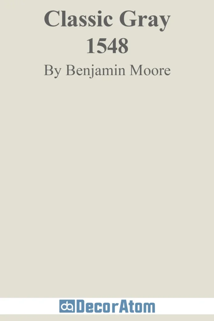
Classic Gray is a warm gray-beige hybrid that appears soft and understated, making it an excellent backdrop for open-concept living spaces. In bright lighting, it can read as off-white, while in lower light, it takes on a subtle greige appearance. This versatile shade pairs well with off-whites, warm tans, and deep greens.
8. Sherwin-Williams Agreeable Gray (SW 7029)

One of the most popular greiges, Agreeable Gray leans slightly beige, creating a cozy yet modern atmosphere. It’s warmer than Repose Gray, making it an excellent choice for an inviting living space. Under cool light, it reads as a true greige, while in warm lighting, its beige undertones become more noticeable. It complements soft whites, muted blues, and dark wood furniture effortlessly.
9. Benjamin Moore Revere Pewter (HC-172)

💥🎁 Christmas & Year-End Deals On Amazon !
Don't miss out on the best discounts and top-rated products available right now!
*As an Amazon Associate, I earn from qualifying purchases.
Revere Pewter is an earthy greige with subtle green undertones, giving it a cozy and sophisticated feel. It’s a timeless classic that works beautifully in traditional living rooms. In north-facing rooms, its green undertones become more apparent, while in brighter spaces, it leans more beige. It pairs well with warm wood tones, crisp whites, and deep blues.
10. Sherwin-Williams Accessible Beige (SW 7036)

Accessible Beige is a modern beige with a touch of gray, ensuring it never feels outdated. It’s a warm, neutral choice that keeps a space feeling soft and inviting. Unlike traditional beiges, it has a subtle greige quality, preventing it from looking too yellow. It remains consistently warm in all lighting conditions, with deeper beige tones appearing in low-light settings. It pairs beautifully with soft greens, deep grays, and crisp whites.
Soft & Cozy Beiges
11. Benjamin Moore Manchester Tan (HC-81)

Manchester Tan is a classic beige that leans warm without feeling heavy. Its subtle golden undertones add just the right amount of warmth, making it a go-to for traditional and transitional living rooms. In bright natural light, it reads as a soft, neutral beige, while in dimmer settings, its golden warmth becomes more pronounced, creating a cozy and inviting atmosphere. This color pairs beautifully with crisp whites, soft greens, and deep browns, making it a timeless choice for those who want a refined yet welcoming space.
12. Sherwin-Williams Balanced Beige (SW 7037)

💥🎁 Christmas & Year-End Deals On Amazon !
Don't miss out on the best discounts and top-rated products available right now!
*As an Amazon Associate, I earn from qualifying purchases.
A modern beige with a hint of gray, Balanced Beige is a perfect middle ground between warm and cool neutrals. It has just enough warmth to keep a space feeling inviting but never looks too yellow. In sun-filled rooms, its warmth is more apparent, while in cooler lighting, the gray undertones help it maintain a balanced, sophisticated feel. It’s a great choice for contemporary or transitional spaces and pairs effortlessly with muted blues, off-whites, and dark woods for a stylish yet cozy living room.
13. Benjamin Moore Shaker Beige (HC-45)

For those who love a deeper, richer beige, Shaker Beige is a warm, earthy neutral with the slightest hint of orange. It creates a welcoming and cozy ambiance, making it perfect for living rooms where comfort is key. In spaces with ample natural light, the color appears more muted and neutral, while in lower light, it deepens into a rich, enveloping beige. It pairs especially well with deep greens, warm grays, and crisp white trim, giving a space a grounded, sophisticated feel.
14. Sherwin-Williams Kilim Beige (SW 6106)

Kilim Beige brings a touch of warmth with soft peachy undertones that add depth and character without feeling overly orange. It’s a fantastic choice for those who want a warm neutral that still feels fresh and airy. In cooler lighting, its peach undertones provide a subtle warmth, preventing it from feeling flat, while in warm lighting, it takes on a golden glow. This color pairs beautifully with dark greens, deep browns, and crisp white trim for a cozy, inviting living space.
Calming Blues & Blue-Grays
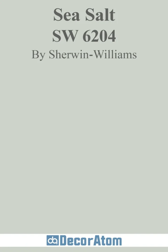
15. Sherwin-Williams Sea Salt (SW 6204)
💥🎁 Christmas & Year-End Deals On Amazon !
Don't miss out on the best discounts and top-rated products available right now!
*As an Amazon Associate, I earn from qualifying purchases.
One of the most beloved soft blues, Sea Salt is a chameleon-like color that shifts between blue-green and gray depending on the lighting. It has an airy, spa-like quality that makes it a perfect choice for those looking to bring a sense of calm into their living room. In bright natural light, it reads as a soft blue, while in artificial light, the green undertones emerge slightly, adding a bit of warmth. It pairs effortlessly with warm whites, sandy beiges, and light grays, creating a serene and welcoming atmosphere.
16. Benjamin Moore Palladian Blue (HC-144)
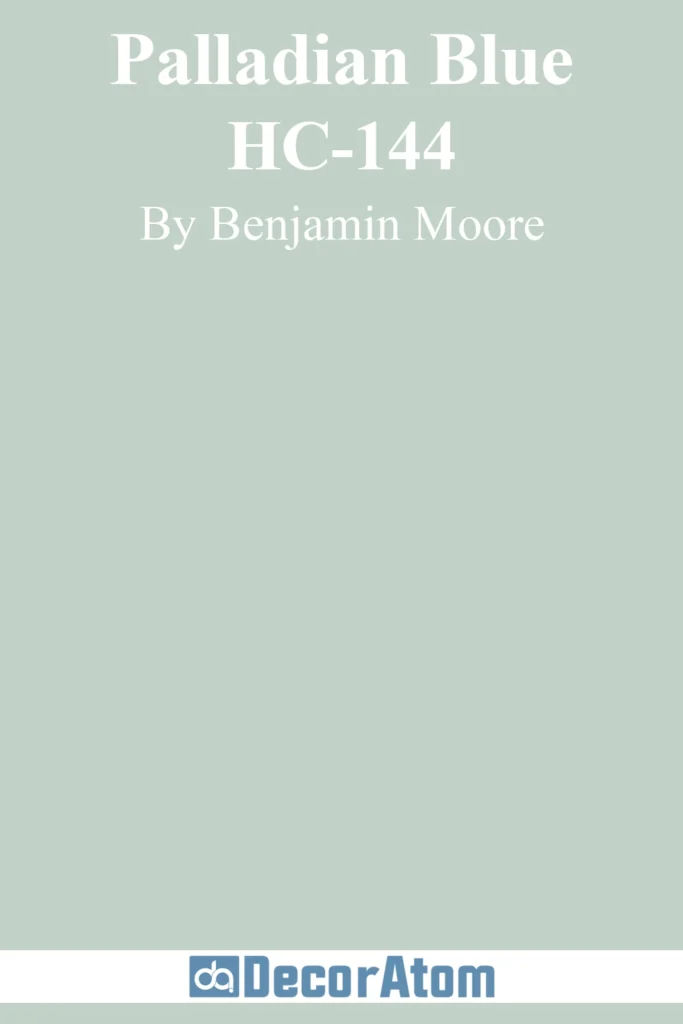
Palladian Blue is a fresh, airy blue with soft green and gray undertones, making it ideal for a coastal-inspired or light-filled living space. It brings a refreshing, uplifting quality to a room without being too bold or overpowering. In north-facing rooms, it leans slightly gray, giving it a sophisticated softness, while in south-facing rooms, it takes on a light aqua feel. It works beautifully with crisp whites, warm wood tones, and sandy neutrals, creating a breezy, elegant look.
17. Sherwin-Williams Misty (SW 6232)

Misty is a subtle, cool-toned blue-gray that offers a refreshing, airy feel without overwhelming a space. It’s a fantastic choice for modern and coastal-inspired interiors, giving a room a soft, calming presence. In lower light, it leans more gray, keeping it neutral and sophisticated, while in brighter spaces, the blue tones become more pronounced. It pairs especially well with dark grays, crisp whites, and warm wood finishes for a balanced, contemporary look.
18. Benjamin Moore Smoke (2122-40)

For those who love a bit more depth in their blues, Smoke is a rich, moody blue-gray that adds character and sophistication to a living room. It has just the right balance of blue and gray, making it adaptable to both warm and cool color schemes. In north-facing rooms, the gray tones are more prominent, creating a soft, muted effect, while in brighter spaces, it takes on a richer, softer blue appearance. It pairs beautifully with warm whites, soft grays, and natural wood furniture for a cozy yet refined aesthetic.
Sophisticated Greens
19. Sherwin-Williams Evergreen Fog (SW 9130)

Evergreen Fog is a muted sage green with soft gray and blue undertones, making it an elegant choice for a calming, nature-inspired living room. It’s a fantastic way to introduce color without going too bold, giving a space an earthy, peaceful feel. In dim lighting, the gray tones keep it subtle and neutral, while in bright natural light, the green feels fresh and airy. It pairs beautifully with warm neutrals, deep browns, and soft whites for a sophisticated yet cozy look.
20. Benjamin Moore Saybrook Sage (HC-114)

Saybrook Sage brings a touch of nature indoors, offering a soothing, grounded feel to any living space. This soft sage green has a hint of warmth from its subtle yellow undertones, making it a great choice for those who want a classic green without it feeling too cool. In bright rooms, it appears as a fresh, muted green, while in shaded areas, its warmth becomes more noticeable. It works beautifully with deep wood tones, crisp whites, and soft beiges for a timeless, natural aesthetic.
Bold & Dramatic Colors
21. Sherwin-Williams Urbane Bronze (SW 7048)

Rich and moody, Urbane Bronze is a deep brown with subtle gray undertones that add a modern, sophisticated edge. This color is perfect for creating a dramatic yet inviting living space, pairing beautifully with warm neutrals, gold accents, and natural textures. In natural light, it reads as a soft, luxurious brown, while in dim settings, it takes on a deeper, more intimate tone. For a striking yet warm aesthetic, pair it with warm beiges, soft creams, and muted greens.
22. Benjamin Moore Hale Navy (HC-154)

Hale Navy is the ideal navy—deep, rich, and refined without being too dark or overwhelming. Its subtle gray undertones keep it from feeling too bold, allowing it to add depth and sophistication while remaining versatile. In bright rooms, it appears slightly lighter and more vibrant, while in low light, it deepens into a dramatic, cozy shade. It pairs effortlessly with soft whites, warm wood tones, and brass accents, making it a stunning choice for both classic and modern spaces.
23. Sherwin-Williams Iron Ore (SW 7069)

For those who love a near-black statement, Iron Ore is a deep charcoal with soft brown undertones, adding warmth to its bold presence. It’s the perfect choice for an accent wall or even an entire room if you’re looking for a dramatic, contemporary feel. In bright light, it appears as a deep charcoal, while in lower light, it takes on an almost velvety black look. Pair it with crisp whites, rich wood tones, and metallic finishes for a sophisticated, high-contrast style.
Warm Earthy Tones
24. Sherwin-Williams Warm Stone (SW 7032)
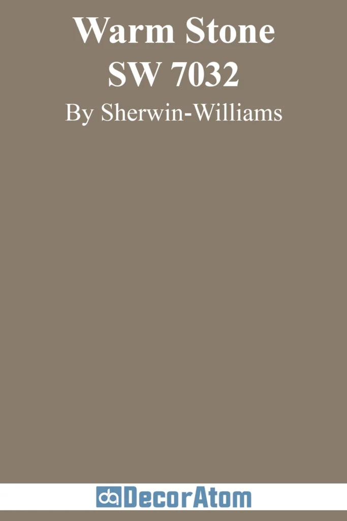
Warm Stone is a deep greige with rich brown undertones, giving it a cozy yet sophisticated presence. This color works beautifully in earthy, organic-inspired living rooms, bringing warmth and depth without feeling too dark. In bright spaces, it softens into a neutral greige, while in low light, the brown warmth deepens, making the space feel intimate and grounded. It pairs beautifully with soft creams, deep greens, and wood accents for a natural, inviting atmosphere.
25. Benjamin Moore Alexandria Beige (HC-77)
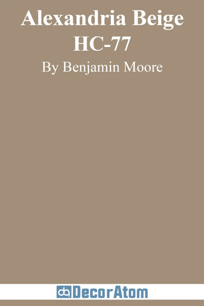
For a deep, elegant beige with golden undertones, Alexandria Beige is a timeless choice. It has a cozy, traditional feel while still being versatile enough for transitional spaces. In bright natural light, it reads as a soft, neutral beige, while in dimmer settings, its golden warmth becomes more pronounced. This makes it an excellent choice for rooms that need a touch of warmth without going too dark. Pair it with off-whites, warm wood tones, and soft grays for a rich, classic look.
Classic Whites & Off-Whites
26. Sherwin-Williams Greek Villa (SW 7551)

Greek Villa is the perfect warm white—soft and inviting without leaning too yellow. It creates a bright, airy feel while maintaining a cozy ambiance, making it an excellent choice for a welcoming living room. In south-facing rooms, it takes on a warm, glowing quality, while in north-facing spaces, it remains more neutral and balanced. It pairs beautifully with warm woods, soft beiges, and deep greens for a timeless, elegant look.
27. Benjamin Moore Cloud White (967)

Cloud White is a warm, creamy white with just enough softness to feel inviting without losing its crispness. It works beautifully in both modern and traditional spaces, keeping a room bright without feeling stark. In cooler lighting, it appears fresh and neutral, while in warm lighting, its creamy undertones create a soft, glowing effect. Pair it with soft grays, warm beiges, and deep navy tones for a refined yet approachable aesthetic.
Elegant Charcoals & Blacks
28. Sherwin-Williams Peppercorn (SW 7674)

Peppercorn is a bold charcoal with subtle blue undertones that add depth and sophistication. It’s an excellent choice for those who want a moody, dramatic living space without going fully black. In bright spaces, it reads as a deep charcoal gray, while in lower light, it takes on an almost-black appearance, making it a great choice for creating contrast and depth. It pairs well with crisp whites, warm woods, and metallic finishes for a stylish, modern look.
29. Benjamin Moore Kendall Charcoal (HC-166)

Kendall Charcoal is a rich, grounding charcoal with warm green undertones, making it an elegant yet approachable choice. It adds depth without feeling too heavy, working beautifully in traditional, modern, and transitional spaces alike. In north-facing rooms, its green undertones are more noticeable, while in warm lighting, it appears richer and cozier. Pair it with soft creams, warm taupes, and natural wood tones for a sophisticated, layered look.
Timeless Neutrals
30. Sherwin-Williams Natural Linen (SW 9109)

Natural Linen is a warm, inviting neutral with soft beige undertones that give it a relaxed, effortless elegance. Unlike cooler greiges, this shade leans into its warmth, making a space feel cozy without looking too yellow. In bright natural light, it appears as a fresh, creamy beige, while in lower light, its warmth becomes more pronounced, creating a soft and welcoming atmosphere. It pairs beautifully with warm whites, muted greens, and deep wood tones for a classic, organic feel.
31. Benjamin Moore Edgecomb Gray (HC-173)
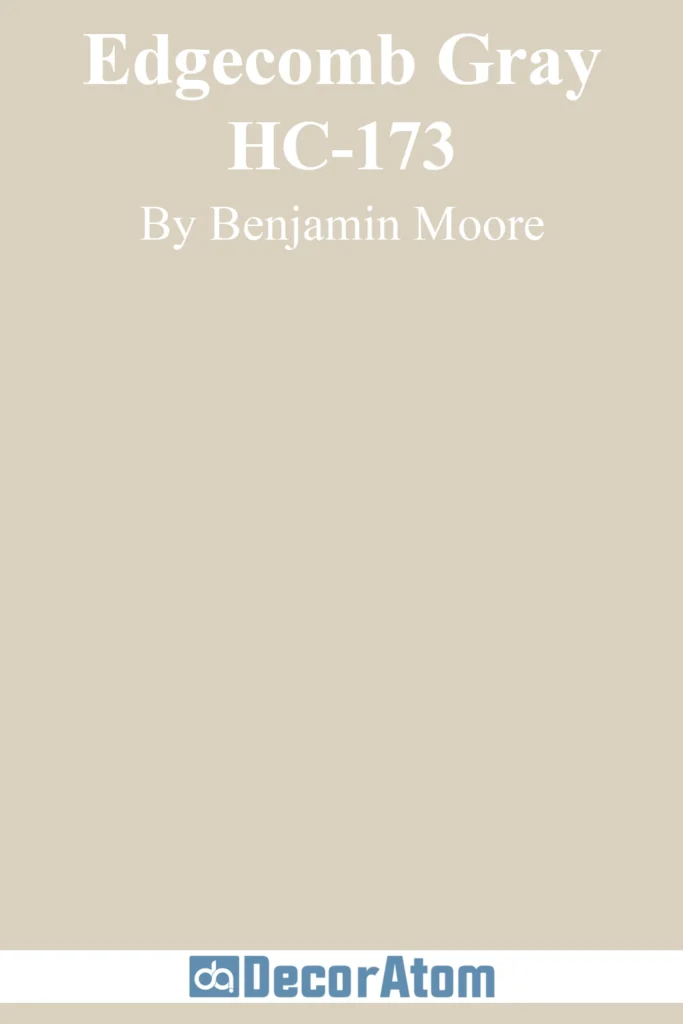
Edgecomb Gray is one of the most beloved greige shades because it adapts beautifully to different lighting conditions. It has soft beige undertones that prevent it from feeling too cold, yet it remains neutral enough to work with a wide range of styles. In bright rooms, it leans toward a warm, airy greige, while in darker spaces, the beige warmth is more prominent, giving the room a cozy feel. It pairs wonderfully with crisp whites, soft taupes, and muted blues for a refined, effortless look.
