
I’ve spent more time than I’d like to admit staring at paint swatches, wondering if that warm gray is too warm or if that muted green will actually look as soft as it does on Pinterest.
If you’re anything like me, you want your living room to feel like a space that’s both beautiful and completely livable, and choosing the right color combination plays a huge part in that.
Color isn’t just about looks; it sets the entire tone for how a room feels. Cozy and relaxed? Light and airy? Bold and dramatic? It all starts with the palette you build around your walls, trim, and accents.
In this post, I’m sharing my favorite tried-and-true living room color combinations, the ones that always work, feel timeless, and can be tailored to your own style.
I’ll also give you real paint color suggestions, styling tips, and ideas for tying everything together.
What Makes a Great Living Room Color Combination?
A great living room color combination is more than just picking a trendy wall shade. It’s about finding the right balance between your main wall color, trim, and accent hues so the entire space feels cohesive, inviting, and reflective of your style.
Here’s what I think makes a combination truly great:
It suits your lifestyle. Love to relax? Softer tones may work best. Hosting guests often? Bolder, stylish contrasts could feel more energizing.
There’s harmony between tones. The best color schemes combine warm or cool tones intentionally — not just randomly mixing them.
Contrast is used wisely. High contrast (like navy and white) brings drama, while low contrast (like beige and taupe) feels more calming.
It works with your existing furniture. Your sofa, floors, and wood finishes play a big role in how a color scheme looks in real life.
It evolves well over time. Timeless doesn’t mean boring. The best combinations still allow for personality — with pillows, rugs, or art that can shift with your taste.
Ultimately, a great palette doesn’t just look good in theory, it makes the room feel like a place you want to spend time in.
💥🎁 Christmas & Year-End Deals On Amazon !
Don't miss out on the best discounts and top-rated products available right now!
*As an Amazon Associate, I earn from qualifying purchases.
How to Choose the Right Living Room Color Combination for Your Home
Picking a color scheme can be overwhelming, especially with so many options out there. But I’ve learned a few simple steps that make the decision way easier — and more fun.
1. Start With the Feeling You Want to Create
Do you want your living room to feel cozy, open, sophisticated, calm, or bold? Your answer will guide your color direction (e.g., warm neutrals for cozy, cool tones for airy).
2. Consider Your Room’s Natural Light
North-facing rooms often benefit from warm tones to counterbalance cooler light, while south-facing rooms can handle cooler or bolder shades with ease.
3. Look At What You Already Have
If you’re keeping your sofa, floors, or large furniture, make sure your color choices work with those tones. You don’t need to match exactly, but the undertones should harmonize.
4. Choose Your Wall Color First
This will be the largest visual element. Once you have that, it’s easier to choose complementary trim and accent shades.
5. Test Before You Commit
I always sample colors on large swatches or directly on the wall in at least two spots (one near a window, one in a corner). Lighting changes everything.
Think of your living room like a story — your color combination is the setting. Make sure it supports the kind of atmosphere you want to live in every day.
12 Best Living Room Color Combinations You’ll Love
Below, I’ve rounded up 12 of the best living room color combinations — from timeless neutrals to bold, moody favorites. For each one, I’ve included real paint suggestions and tips to help you pull it all together in your space.
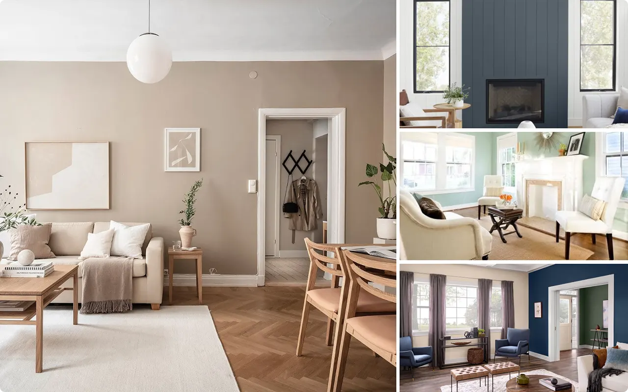
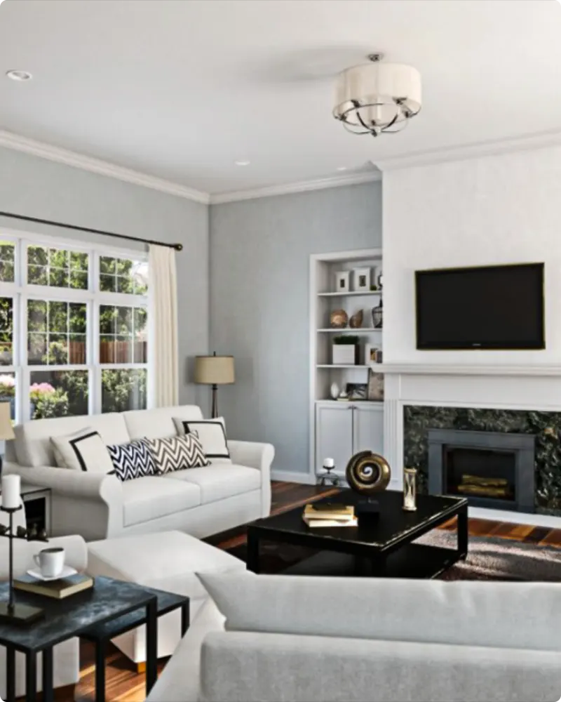
1. Neutral & Cozy
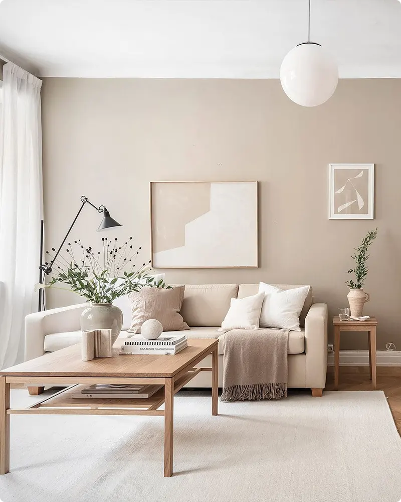
I always come back to this palette when I want a space that feels instantly welcoming. It’s the kind of living room you want to curl up in with a good book or a warm cup of coffee.
✔️ Wall Color: Warm greige or soft beige
For inspiration:
- Sherwin Williams Accessible Beige
- Benjamin Moore Edgecomb Gray
- Behr Natural Gray
✔️ Trim Color: Crisp white or creamy ivory
✔️ Accent Colors: Taupe, warm caramel, muted sage green
Why it works:
This palette blends softness and warmth effortlessly. Greige walls create a calming base, while warm undertones in accents like caramel and sage bring in coziness. Layer in natural textures like linen, wood, and jute to complete the look.
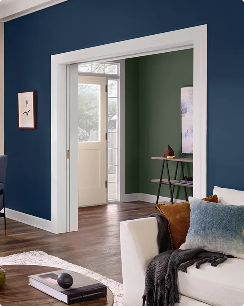
2. Classic & Timeless
💥🎁 Christmas & Year-End Deals On Amazon !
Don't miss out on the best discounts and top-rated products available right now!
*As an Amazon Associate, I earn from qualifying purchases.
If you’re aiming for a space that will always feel elegant, this one’s a winner. I love how effortlessly it works with traditional or transitional design styles.
✔️ Wall Color: Warm white or light greige
For inspiration:
- Sherwin Williams Alabaster
- Benjamin Moore Swiss Coffee
- Behr Palais White
✔️ Trim Color: Bright white or a slightly deeper greige
✔️ Accent Colors: Navy blue, forest green, brass, matte black
Why it works:
The beauty of this palette is in its balance. It starts with a neutral backdrop, allowing accent pieces like navy armchairs, brass lighting, or black-framed artwork to stand out. It feels curated but never trendy, making it a safe bet for long-term style.
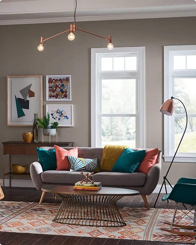
3. Bold & Dramatic
If you’re not afraid to go bold, this combo delivers impact. I love using this in larger living rooms or spaces with plenty of natural light.
✔️ Wall Color: Deep navy or charcoal gray
For inspiration:
- Sherwin Williams Naval
- Benjamin Moore Kendall Charcoal
- Behr Cracked Pepper
✔️ Trim Color: Crisp white or deep black
✔️ Accent Colors: Mustard yellow, burnt orange, emerald green
Why it works:
Dark walls instantly add depth and richness. What keeps this combo balanced is the injection of warm and vibrant accents. Think velvet pillows, brass hardware, and rich wood tones to elevate the look without overwhelming the room.
4. Fresh & Airy
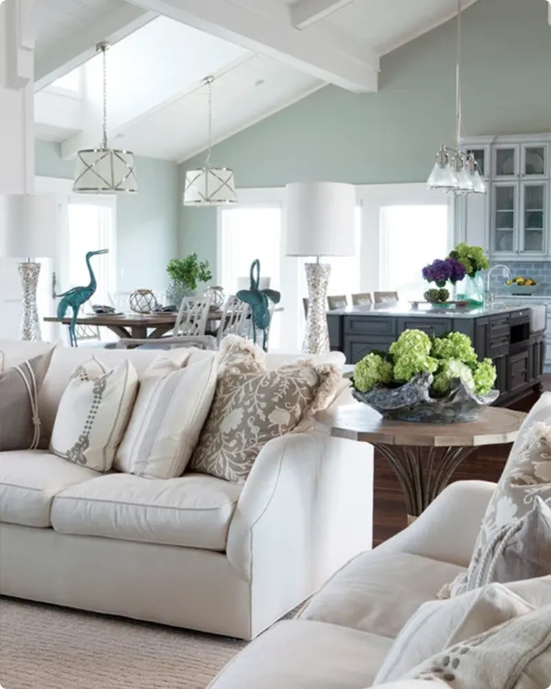
This one is a favorite for making small or low-light living rooms feel open and bright. It’s soft, relaxing, and works especially well in modern or cottage-style homes.
✔️ Wall Color: Soft gray-blue or pale green
For inspiration:
- Sherwin Williams Sea Salt
- Benjamin Moore Palladian Blue
- Behr Light Drizzle
✔️ Trim Color: Bright white
✔️ Accent Colors: Sky blue, whitewashed wood, pale beige
Why it works:
Cool, breezy tones keep the room from feeling stuffy. White trim helps define the space, while light wood tones in furniture or flooring add a natural softness. It’s a calm palette that still feels lively.
5. Beachy & Coastal
💥🎁 Christmas & Year-End Deals On Amazon !
Don't miss out on the best discounts and top-rated products available right now!
*As an Amazon Associate, I earn from qualifying purchases.
Even if you don’t live near the ocean, this palette brings that breezy coastal charm indoors. It’s light, relaxed, and perfect for casual living.
✔️ Wall Color: Soft blue or muted aqua
For inspiration:
- Sherwin Williams Rainwashed
- Benjamin Moore Wythe Blue
- Behr Breezeway
✔️ Trim Color: Warm off-white or soft ivory
✔️ Accent Colors: Sandy beige, driftwood gray, seafoam green
Why it works:
These tones mimic the colors of sand, sea, and sky. Add in materials like rattan, sisal rugs, and slipcovered furniture for that beach house vibe. This combo is great for open-concept homes or rooms with lots of natural light.
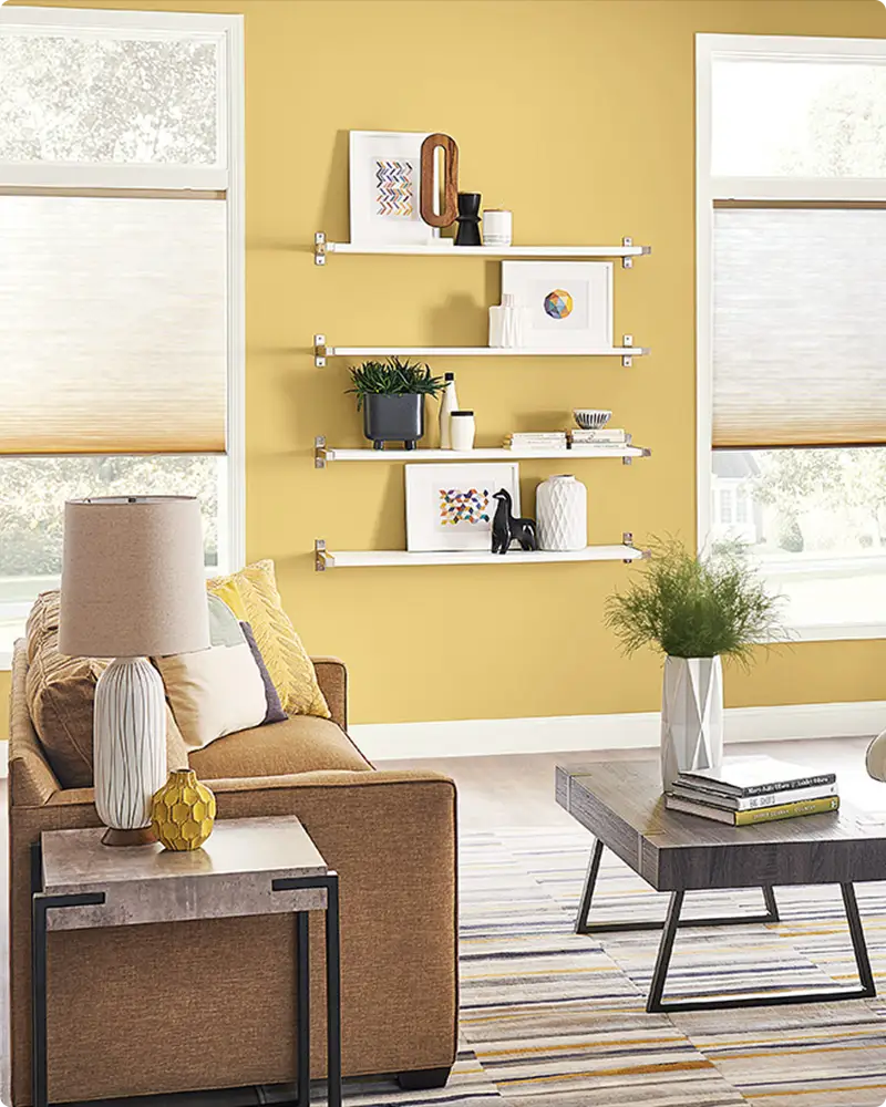
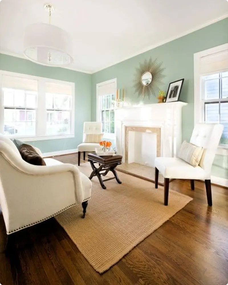
6. Earthy & Natural
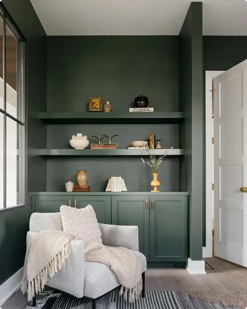
I love how grounding this palette feels. It’s great if you want a calm, nature-inspired space that still feels rich and layered.
✔️ Wall Color: Deep olive or sage green
For inspiration:
- Sherwin Williams Pewter Green
- Benjamin Moore Vintage Vogue
- Behr Vine Leaf
✔️ Trim Color: Soft off-white or greige
✔️ Accent Colors: Terracotta, beige, walnut brown
Why it works:
Green brings a connection to nature, and when paired with earthy tones like terracotta or brown, it feels grounded and serene. Finish with pottery, woven accents, and warm lighting for a cozy, lived-in feel.
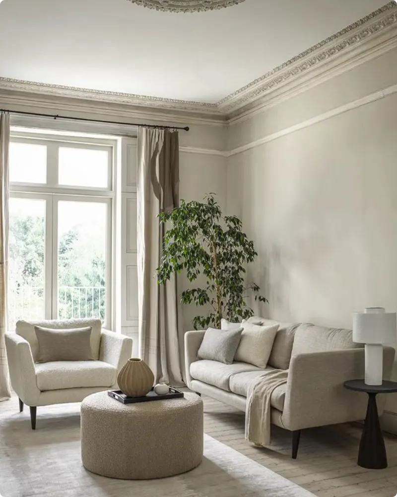
7. Soft & Sophisticated
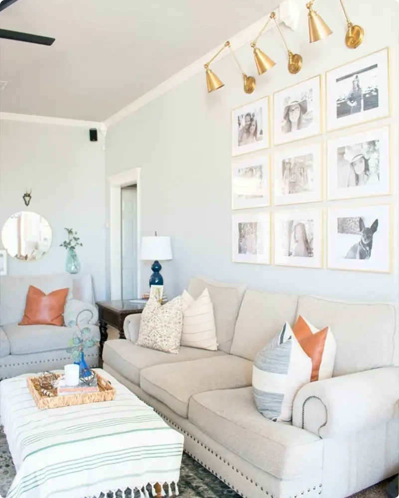
This palette is understated and elegant — perfect for a grown-up space that still feels approachable.
✔️ Wall Color: Greige or warm taupe
For inspiration:
- Sherwin Williams Repose Gray
- Benjamin Moore Thunder
- Behr Graceful Gray
✔️ Trim Color: Crisp white or soft cream
✔️ Accent Colors: Brass, dusty lavender, olive green
Why it works:
It’s a gentle balance of cool and warm. Neutral walls offer sophistication, while the subtle accents add just enough interest. This is ideal for layering in textures like velvet or brushed metals without feeling over-the-top.
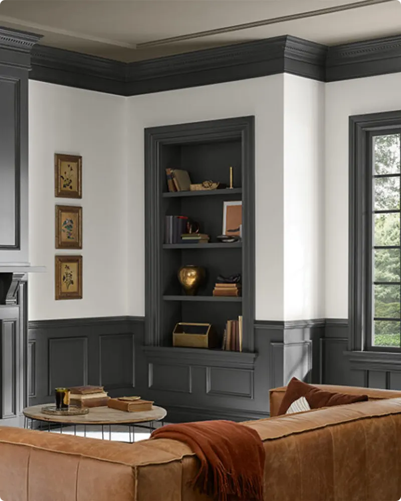
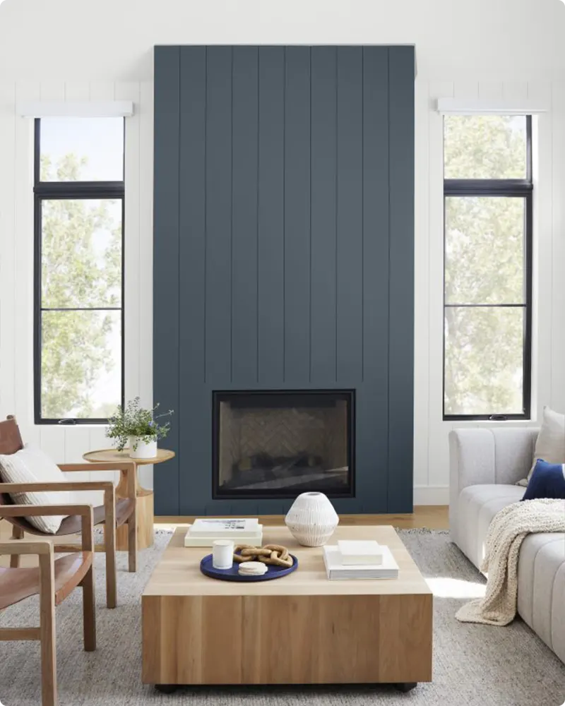
8. Dark & Moody with a Pop
💥🎁 Christmas & Year-End Deals On Amazon !
Don't miss out on the best discounts and top-rated products available right now!
*As an Amazon Associate, I earn from qualifying purchases.
Looking to create a bold and intimate space? This combo brings drama in the best way.
✔️ Wall Color: Deep navy, charcoal, or black-green
For inspiration:
- Sherwin Williams Iron Ore
- Benjamin Moore Hale Navy
- Behr Black Evergreen
✔️ Trim Color: Black, dark green, or matching moody hue
✔️ Accent Colors: Mustard, emerald, burnt orange
Why it works:
Dark walls envelop the space and make it feel cozy and luxe. What brings it to life are the pops of color — through art, pillows, or a statement chair. This combo works well with metallics like gold or bronze too.
9. Stone Gray & Blush Pink
This palette is soft and modern — a little romantic without being overly sweet.
✔️ Wall Color: Light stone gray
For inspiration:
- Sherwin Williams Agreeable Gray
- Benjamin Moore Classic Gray
- Behr Silver Drop
✔️ Trim Color: White or off-white
✔️ Accent Colors: Blush, soft gold, dusty rose
Why it works:
Stone gray gives you a neutral foundation, and blush pink adds a gentle contrast. Together, they feel elegant and warm. Ideal for modern spaces with touches of glam, like velvet curtains or brass lighting.
10. Beige & Blue-Green
This one reminds me of sun-bleached driftwood paired with ocean tones — timeless and soothing.
✔️ Wall Color: Warm beige or soft tan
For inspiration:
- Sherwin Williams Wool Skein
- Benjamin Moore Maritime White
- Behr Sandstone Cove
✔️ Trim Color: White or sand
✔️ Accent Colors: Teal, sea glass, sky blue
Why it works:
Beige keeps the room feeling grounded and timeless, while blue-green tones introduce freshness. It’s coastal without being beach-themed, and it pairs beautifully with wicker, woven baskets, and light woods.
11. Navy & Warm Brass
💥🎁 Christmas & Year-End Deals On Amazon !
Don't miss out on the best discounts and top-rated products available right now!
*As an Amazon Associate, I earn from qualifying purchases.
This one is bold, tailored, and effortlessly elegant. I like using it in rooms where you want a bit of drama without overwhelming the space.
✔️ Wall Color: Rich navy or indigo
For inspiration:
- Sherwin Williams Anchors Aweigh
- Benjamin Moore Newburyport Blue
- Behr Midnight Blue
✔️ Trim Color: White or soft ivory
✔️ Accent Colors: Brass, cream, camel leather
Why it works:
Navy provides a strong backdrop, and brass warms everything up. Add in leather, dark woods, or marble accents to round out a handsome, high-end feel.
12. Soft Blue & Crisp White
If you want your space to feel calm, clean, and airy — this combo is perfect.
✔️ Wall Color: Pale blue or light gray-blue
For inspiration:
- Sherwin Williams Misty
- Benjamin Moore Breath of Fresh Air
- Behr Light French Gray
✔️ Trim Color: Bright white
✔️ Accent Colors: Navy, driftwood, linen beige
Why it works:
It’s soothing without feeling cold. Soft blues give off a peaceful vibe, and the crisp white trim keeps everything looking clean and bright. Great for traditional, coastal, or modern farmhouse styles.
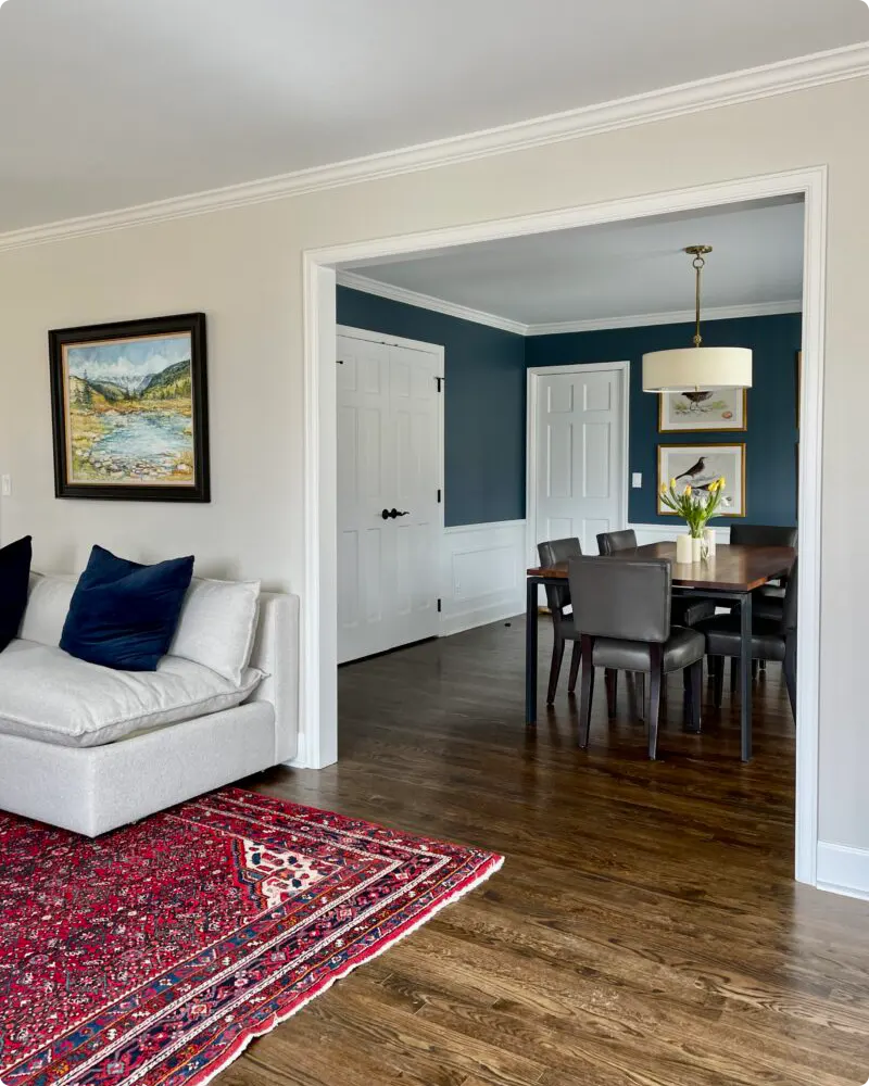
Tips for Coordinating Living Room Colors with Other Rooms
Creating a cohesive look throughout your home doesn’t mean every room needs to be the same color — but they should feel like they belong to the same family.
Here’s how I like to make colors flow from the living room to the rest of the house:
1. Stick to a Common Undertone
Whether it’s warm (creamy whites, beiges) or cool (soft grays, blues), keep the same undertone running through your wall colors.
2. Use a Consistent Trim Color Throughout
Bright white or a soft neutral for all baseboards and doors ties everything together visually, even if the walls are different shades.
3. Repeat One or Two Accent Colors
If your living room features navy pillows or brass hardware, carry those touches into nearby spaces like the dining room or hallway with rugs, artwork, or small decor pieces.
4. Create Smooth Transitions
In open-concept spaces, avoid harsh jumps in wall color. Choose complementary hues (e.g., greige to soft sage) that feel connected but still distinct.
5. Use the 60-30-10 Rule Across Rooms
If beige is your dominant (60%) color in the living room, it can become an accent (10%) in another room. This creates variety without losing harmony.
Coordinating doesn’t mean copy-paste, it’s more about creating rhythm and flow between your spaces so your home feels thoughtfully designed.
Final Thoughts
At the end of the day, your living room should feel like you. Whether you’re drawn to calm, earthy tones or bold, dramatic contrasts, the right color combination will help you express your personality while making your space feel pulled together.
Don’t be afraid to try something new, but also trust your gut. If you keep coming back to a certain shade or palette, there’s probably a reason. Start with one element you love (a paint color, a piece of art, a throw pillow) and build from there.
And remember: paint isn’t permanent. That’s the beauty of it. You can always evolve your palette over time as your style changes. So go ahead, get inspired, sample some swatches, and create a living room you truly love.