
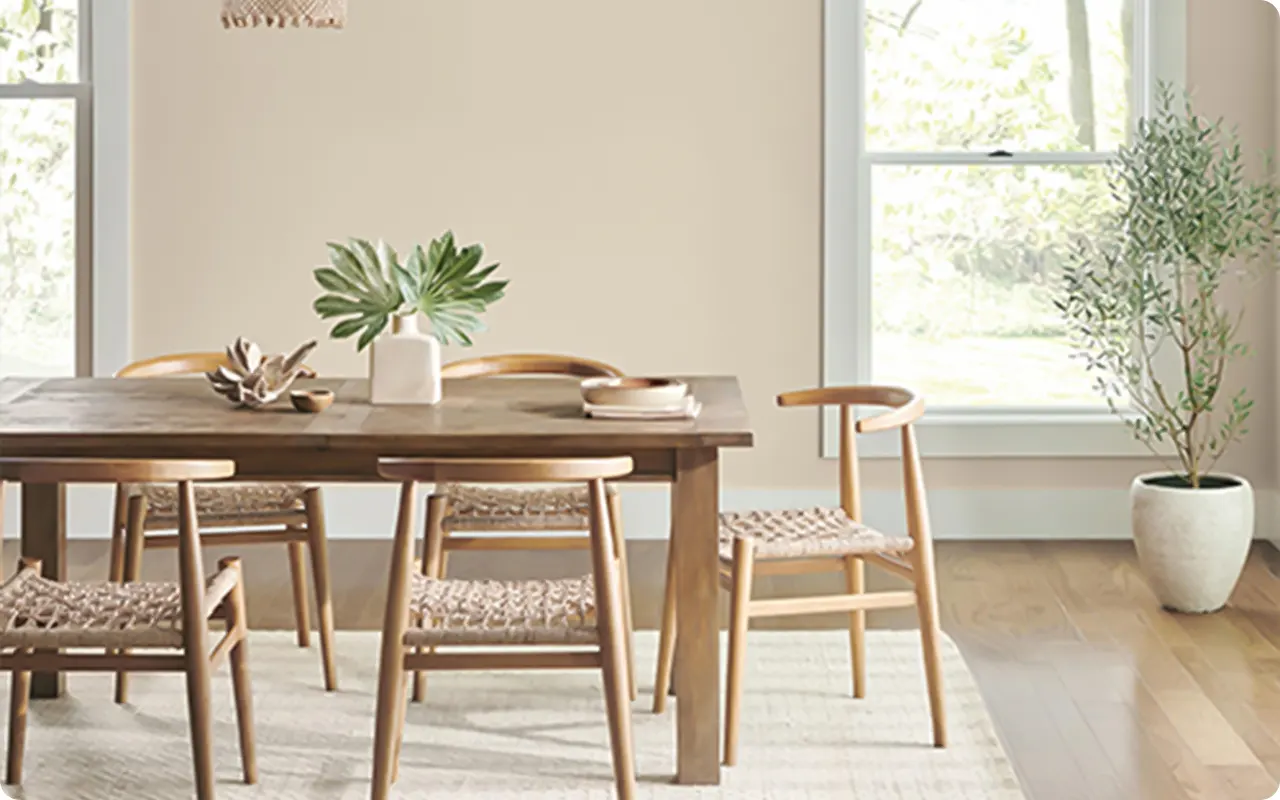
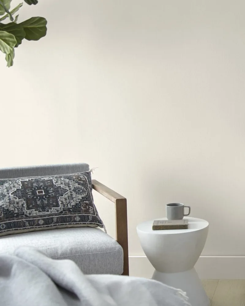
When it comes to choosing a paint color that feels timeless, welcoming, and incredibly versatile, light beige has quietly made its way back to the top of the list.
Unlike the flat builder-grade beige of the early 2000s, today’s light beiges are full of nuance.
Some lean warm and creamy, others carry a whisper of gray or a touch of earthy taupe. But what they all have in common is that effortless ability to warm up a room without taking over.
If you’re looking for a paint color that plays well with just about anything—wood tones, black accents, soft whites, even bold hues—light beige is one of the most reliable options out there.
It works beautifully in any space, from cozy bedrooms to open-concept living areas, and it brings that calming, pulled-together feel that never really goes out of style.
In this post, I’m rounding up 15 of my favorite light beige paint colors from brands like Sherwin Williams, Benjamin Moore, Behr, Farrow & Ball, and PPG.
Each one has its own personality, and I’ll walk you through what makes them special, where they shine, and why they’ve earned a spot on this list.
What are Light Beige Paint Colors?
Light beige paint colors are soft, neutral tones that sit between off-white and mid-tone taupe on the color spectrum.
They typically have warm undertones—sometimes leaning toward yellow, pink, or peach—but the best ones are beautifully balanced, subtle, and muted.
What sets light beige apart is its ability to warm up a space without overwhelming it. It offers a sense of calm and comfort, often feeling more inviting than a stark white or a cool gray.
You’ll often hear terms like “greige,” “warm white,” or “taupe-beige” used interchangeably, but not all of these are created equal.
True light beiges maintain a soft warmth that complements a wide range of other colors and materials. They’re especially popular for walls, cabinetry, and trim because they add warmth while still feeling light and airy.
Where to Use Light Beige Paint Colors
One of the reasons light beige is such a go-to is that it works in just about every room. Here’s where it really shines:
- Living rooms: Light beige creates a warm, grounded backdrop that makes furniture and art pop—especially when paired with white trim or natural textures.
- Bedrooms: Its calming nature makes it perfect for sleep spaces, where you want a soft, restful vibe.
- Kitchens: Used on cabinets or walls, light beige can bring in warmth without competing with countertops, backsplashes, or flooring.
- Hallways and entryways: These transition spaces benefit from a cohesive, neutral color that flows effortlessly from room to room.
- Bathrooms: A light beige with creamy undertones can warm up tile and fixtures, making the space feel cozy and polished.
Because it’s so adaptable, you can confidently use light beige throughout an entire home to create a cohesive and calming color story.
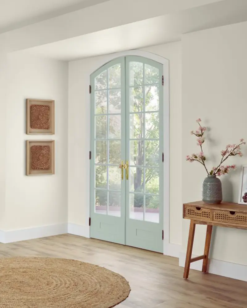
Colors to Pair with Light Beige
Light beige is a true team player when it comes to pairing with other colors. Depending on the undertone of your beige, you can create a palette that feels warm and cozy, fresh and airy, or even bold and dramatic.
- Whites and creams: Crisp or creamy whites make light beige feel clean and elevated. Use these for trim, ceilings, or adjacent cabinetry.
- Soft grays and taupes: These add a bit of contrast without breaking the calm, especially if your beige leans more neutral or gray-beige.
- Earth tones: Sage green, terracotta, and muted ochres bring in a grounded, organic feel that pairs beautifully with warm beiges.
- Deep blues and charcoals: For contrast, navy and charcoal gray provide striking balance—especially in accents like furniture, throw pillows, or built-ins.
- Blushes and muted pinks: These can feel sophisticated and unexpected when layered with the right beige, especially in bedrooms or living rooms.
The beauty of beige is its flexibility—you can take it warm, cool, soft, or bold depending on your pairing choices.
Tips for Choosing The Best Light Beige Paint Colors
Light beige may seem simple on the surface, but choosing the right one takes a little nuance. Here are some tips to help you land on the perfect shade for your space:
- Test it in different lighting: Light beige changes dramatically depending on your room’s exposure. What looks warm and creamy in the morning light might pull gray or peach in the afternoon. Always sample your paint on more than one wall and check it throughout the day.
- Pay attention to undertones: Some light beiges have yellow, pink, or gray undertones—these will affect how the color plays with your floors, furniture, and lighting. Be sure to hold the sample next to permanent elements like your countertops or flooring.
- Think about the mood: If you want a serene, spa-like feel, go for a beige with soft gray or taupe undertones. For a cozy, welcoming vibe, look for a beige that leans a little warmer.
- Use white trim for contrast: Pairing a light beige with crisp white trim can really help define the space and add a clean, modern edge.
- Don’t skip the sample pot: Paint a large swatch—at least 2′ x 2’—right on your wall. It’s the best way to see how the color will behave in your specific space.
Top 15 Light Beige Paint Colors
Here are my favorite Light Beige paint colors to decorate with.
1. Sherwin Williams Accessible Beige

Despite the name, Accessible Beige isn’t your average builder-grade beige.
It’s softer, more refined, and carries just enough gray to give it that versatile, modern edge.
I’ve seen this color work beautifully in open-concept spaces because it quietly complements both warm wood tones and cooler accents like brushed nickel or soft grays.
It has that chameleon-like quality where it shifts slightly depending on the light—sometimes leaning more into its warm beige core, and other times pulling forward its taupe-gray undertone.
If you’re looking for a light beige that doesn’t scream “beige,” this is a fantastic go-to.
2. Benjamin Moore Edgecomb Gray
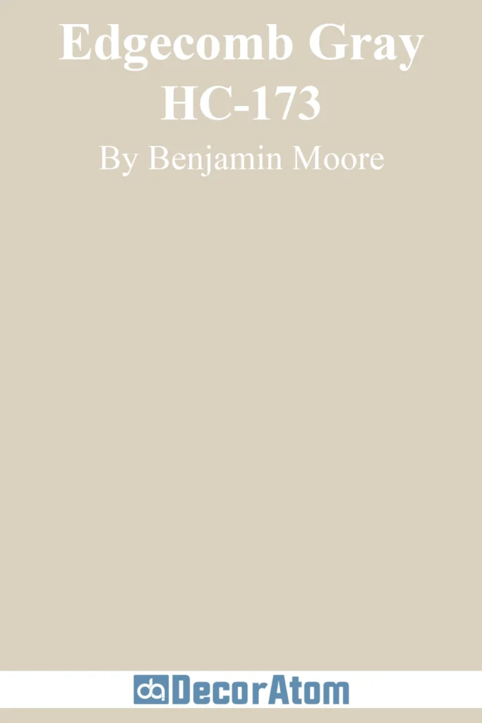
Edgecomb Gray is one of those rare shades that lives right on the line between beige and gray—in the best way possible.
I like to think of it as the introvert of the paint world: it doesn’t demand attention, but once you notice it, you appreciate how subtly beautiful it is.
It has soft, earthy undertones that make it feel grounded without being too warm or too cool. In bright rooms, it feels airy and light, but it never washes out.
This one’s a staple for good reason—it plays well with just about every style, from coastal to contemporary farmhouse.
3. Behr Almond Wisp

Almond Wisp is one of those soft, almost creamy beiges that creates instant coziness.
It has a gentle almond-milk warmth to it that never turns yellow or peachy.
What I love about this shade is how peaceful it feels—it’s the kind of color you’d expect in a spa or a sun-drenched bedroom.
It pairs really well with natural textures like jute, rattan, and raw wood, and looks lovely against crisp white trim.
If you’re after that calm, uncluttered look, Almond Wisp is a beautiful starting point.
4. Farrow & Ball Skimming Stone

Skimming Stone feels effortlessly elegant. It’s a light beige with subtle mushroom undertones that lean slightly toward gray, which gives it this calm, understated sophistication.
What makes it stand out is the way it shifts throughout the day—morning light brings out its soft warmth, while cooler afternoon light draws out a hushed, stony quality.
It’s perfect for creating a serene backdrop in living spaces, especially if you’re leaning into an old-world or European-inspired aesthetic. This shade has depth without drama.
5. PPG Wright Oyster Shell
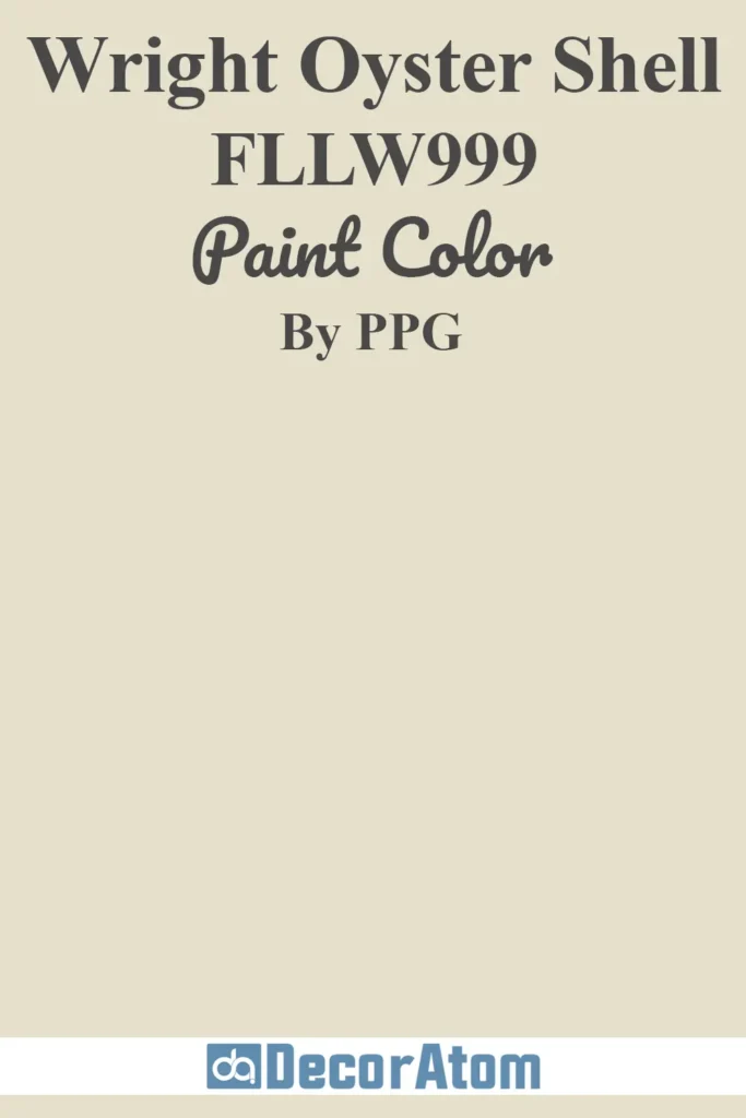
Wright Oyster Shell doesn’t always show up on mainstream lists, but it’s a hidden gem in the world of light beiges. There’s something gentle and grounding about it.
It has a subtle whisper of taupe that adds complexity, but it still reads light and airy on the wall.
This shade works particularly well in transitional spaces—think hallways, stairwells, or entryways—where you want something neutral but not boring.
Pair it with soft whites and bronze accents, and it totally shines.
6. Farrow & Ball Dimity
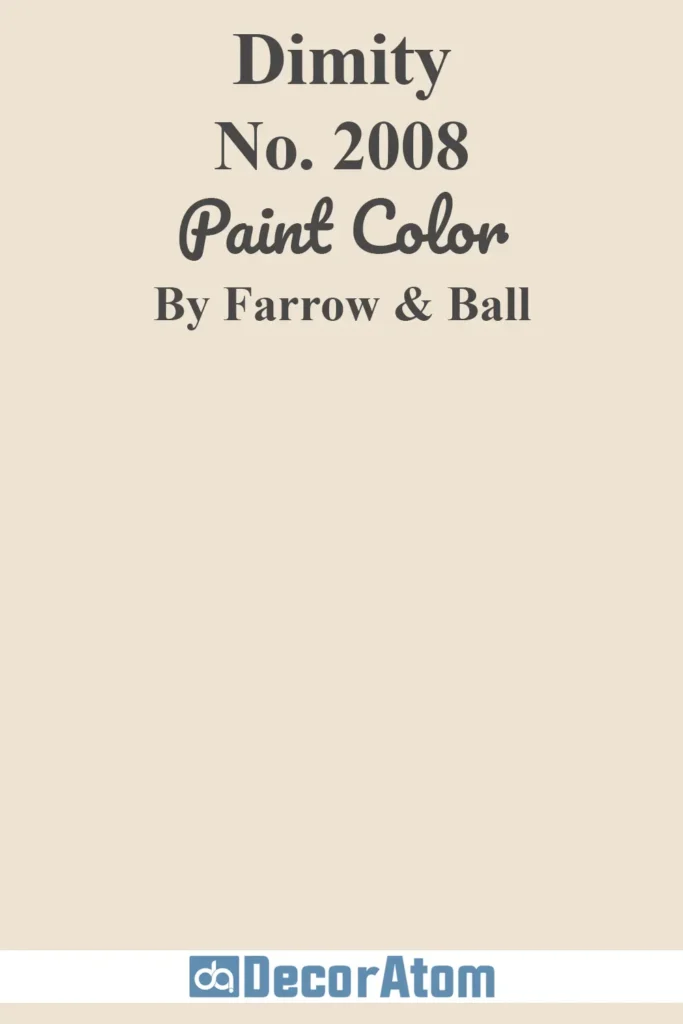
Dimity is the kind of beige that feels like a warm linen throw—inviting, clean, and quietly beautiful. It’s a pale, rosy beige with just the faintest hint of warmth that keeps it from feeling stark.
I love how it softens a room without overwhelming it. It’s especially charming in older homes with crown molding and character details—it makes those features stand out while adding a whisper of warmth to the room.
This is one of those shades that works just as well in a bedroom as it does in a sitting room or powder bath.
7. Benjamin Moore Manchester Tan

Manchester Tan is a classic for a reason. It walks the line between traditional and modern so well—it’s beige, yes, but not in a dated or flat way.
It leans just warm enough to feel cozy, with a slight green undertone that gives it a grounded, natural feel.
This color work beautifully in rooms with lots of wood tones—it complements walnut and oak like a dream.
It’s understated but timeless, making it a safe and stylish choice for larger spaces or whole-home color continuity.
8. Sherwin Williams Shoji White

Shoji White is one of those shades that defies easy categorization. It’s often called a soft white, but to me, it leans firmly into warm beige territory—just incredibly light and creamy.
What sets it apart is its subtle softness; it doesn’t glare the way some whites can, and yet it still feels clean and fresh. It has the kind of warmth that flatters every room, from sunlit kitchens to moody bedrooms.
If you’re torn between a true beige and an off-white, Shoji White might be your sweet spot.
9. Benjamin Moore Swiss Coffee

Swiss Coffee is one of Benjamin Moore’s cult favorites, and for good reason—it’s warm, approachable, and endlessly flexible.
While technically an off-white, it has a creamy beige undertone that brings softness without going yellow. In rooms with natural light, it glows; in darker spaces, it wraps the walls in a cozy, warm light.
What I love most about Swiss Coffee is how forgiving it is—it works with cool or warm tones, wood or metal finishes, and doesn’t fight for attention. It just enhances everything around it.
10. Sherwin Williams Creamy

Creamy is exactly what it sounds like—a soft, warm beige that leans toward ivory without tipping into yellow.
It has just enough depth to give a room some warmth, but it still reads light and airy. This shade shines in bedrooms and family rooms, where you want a little more comfort and softness on the walls.
It’s a wonderful alternative to a stark white or builder-grade beige—it brings that cozy lived-in feeling, especially when paired with warm woods, brass accents, or soft textiles.
11. Benjamin Moore Wind’s Breath

Wind’s Breath is one of those soft, whispery beiges that feels like a deep exhale.
There’s a gentle, grayish undertone that keeps it from feeling too warm or too traditional, but it still carries that light beige soul.
I love this one in rooms with lots of windows—it plays beautifully with changing light and adds just enough softness to make the space feel pulled together, even when the rest of the palette is minimal.
12. Sherwin Williams Aged White
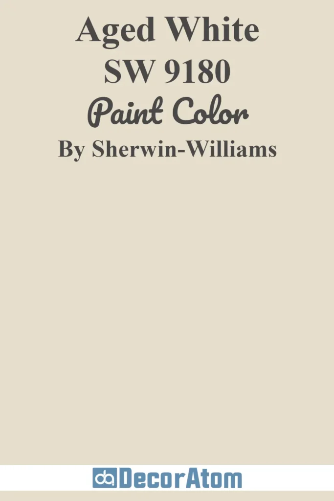
Aged White has a quiet richness to it, like antique linen or vintage parchment.
It’s more nuanced than a basic cream or beige—there’s a slightly buttery warmth running through it, but it never veers into yellow.
It’s the kind of shade that makes a room feel instantly lived-in, in the best way possible.
I’ve seen it used in historic homes and modern spaces alike, and it manages to feel appropriate in both. It really shines next to soft grays, deep charcoals, and natural wood finishes.
13. Sherwin Williams Muslin
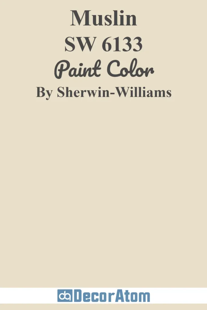
Muslin is a classic beige that leans warm, but there’s an airy quality to it that keeps it from feeling heavy.
There’s no gray, no pink, no peach—just a clean, creamy softness that works with just about anything. It’s a beautiful choice if you want a light neutral that brings in warmth without trying too hard.
I think of it as the perfect wall color when you want your furniture and artwork to take center stage, but you still want your backdrop to feel curated and considered.
14. Benjamin Moore Bleeker Beige
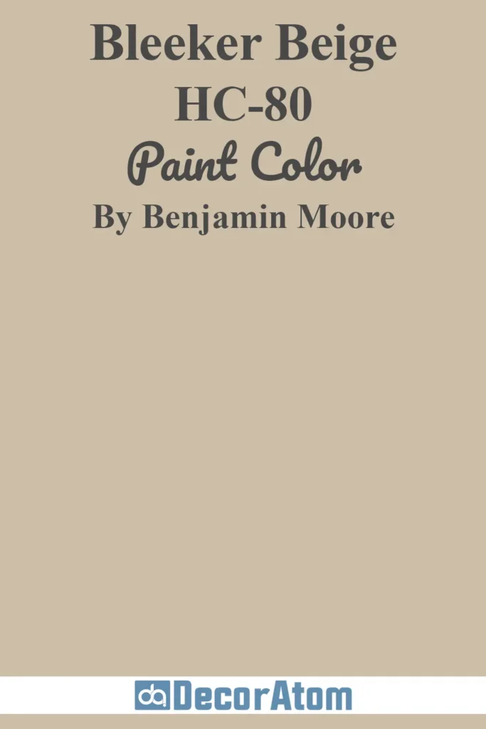
Bleeker Beige brings a little more depth and complexity to the beige world. It’s not too dark, but it’s definitely a mid-tone compared to some of the others on this list.
What makes it special is its subtle green-gray undertone, which adds a grounded, earthy vibe without taking away its cozy appeal.
It’s particularly striking in rooms with white trim and lots of texture—think linen curtains, rustic wood furniture, or woven rugs.
If you’re looking for a beige that feels timeless but not too light, Bleeker is a standout.
15. Benjamin Moore Grant Beige
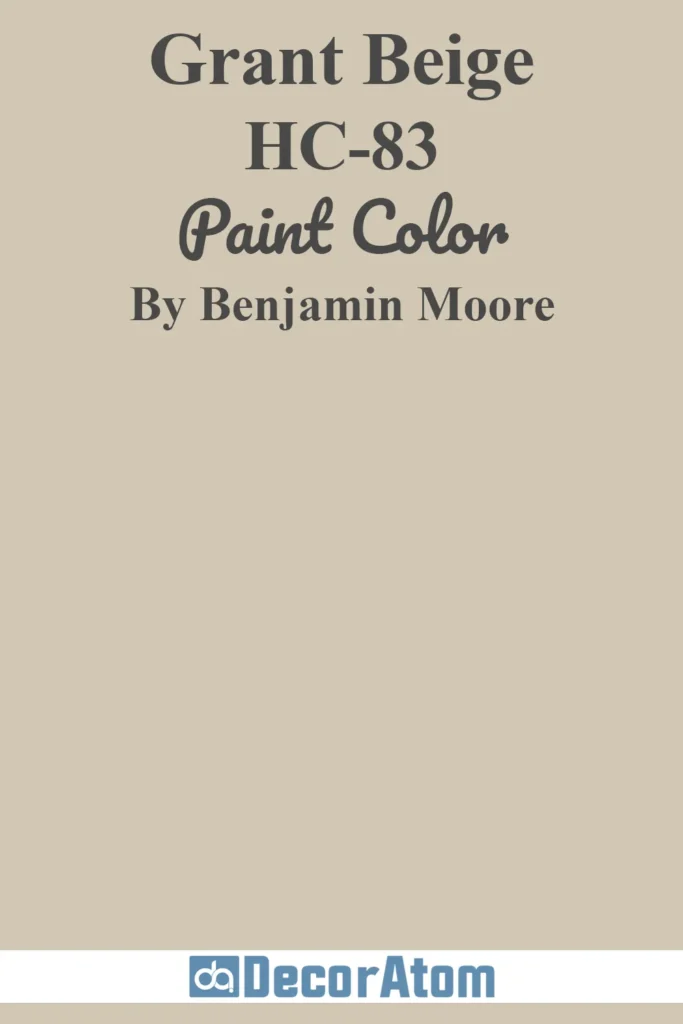
Grant Beige is one of those dependable, go-with-anything neutrals that designers always keep in their back pocket.
It’s beige with a whisper of gray—enough to feel modern, but not so much that it loses its warmth.
It’s great in north-facing rooms that need a little help brightening up, but it also holds its own in sunny spaces without going too golden.
There’s a maturity to this color—it doesn’t chase trends, and it never feels fussy.
Just an all-around solid choice for anyone who wants that effortless, polished look.