
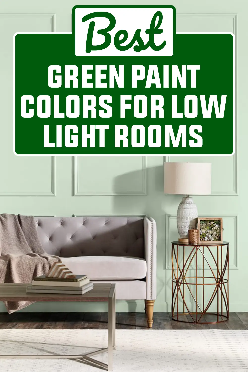
Finding the right paint color for a low-light room can feel like a bit of a guessing game.
I’ve been there—staring at paint chips under the wrong lighting, wondering why that beautiful green turned muddy once it hit my wall.
The truth is, not every green works well in a room without much natural light. But the right one? It can completely change how the space feels.
That’s why I put together this list of the 17 best green paint colors for low-light rooms.
These shades aren’t just beautiful—they’ve got the right balance of tone, warmth, and softness to thrive even in the darkest corners of your home.
How to Pick the Best Green Paint Colors for Low Light Rooms
Choosing green paint for a low-light room isn’t just about finding a pretty shade—it’s about understanding how light (or lack of it) interacts with color.
In darker rooms, greens with a bit of warmth or a gray undertone tend to perform better. They won’t go murky or overly saturated when the light dips, and they help keep the space feeling balanced and cozy.
Stick to softer or mid-tone greens if you want a calming effect, and avoid anything too bright or acidic—they can feel harsh in dim lighting.
Don’t be afraid of slightly deeper hues like Pewter Green or Evergreen Fog, either. Paired with warm lighting and soft textures, these colors can turn a shadowy space into one that feels rich and inviting.
Always sample your paint on the wall and check it throughout the day—you’ll be surprised how much it changes based on the light you do have.
Popular Behr Green Paint Colors:
Behr has a great reputation for soft, livable greens that don’t overwhelm darker rooms. These shades tend to be mellow, slightly muted, and incredibly versatile, exactly what I reach for when I want a gentle lift in dim spaces.
1. Cabbage Leaf M370-2
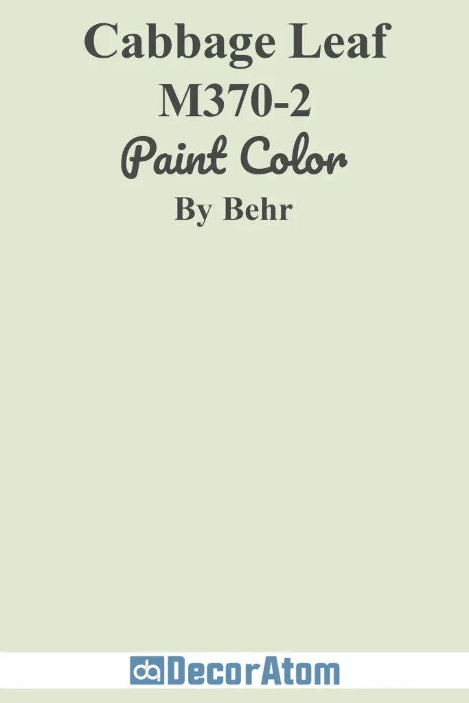
Cabbage Leaf is a soft, spring-like green that brings a cheerful but gentle presence into a room. It has a slightly warm undertone, which helps counterbalance the coolness of a dim or shadowy space.
This shade works beautifully in bedrooms or offices where you want a touch of nature without anything too intense or overpowering.
2. Morning Zen S380-2
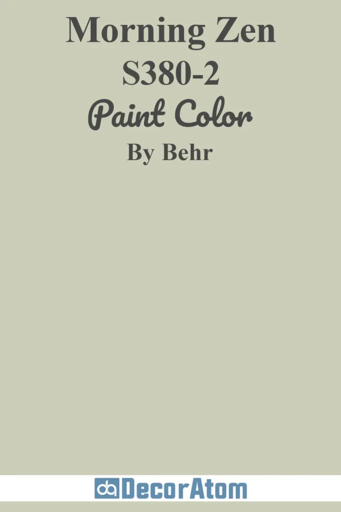
Morning Zen lives up to its name—it’s peaceful, calming, and has just enough pigment to feel intentional.
It leans toward a sage green but with a whisper of gray that softens it. If you’re trying to make a low-light room feel like a sanctuary, this color wraps the space in a quiet, meditative mood.
3. Jade Mist M410-1
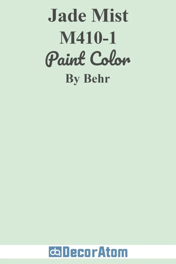
Jade Mist is a barely-there green that flirts with mint without becoming too pastel or cold. It’s ideal for tiny rooms or hallways where you want to keep things airy but not stark.
The subtle undertones allow it to shift beautifully with the light, adding gentle movement throughout the day—even when sunlight is scarce.
4. Relaxing Green 440E-1
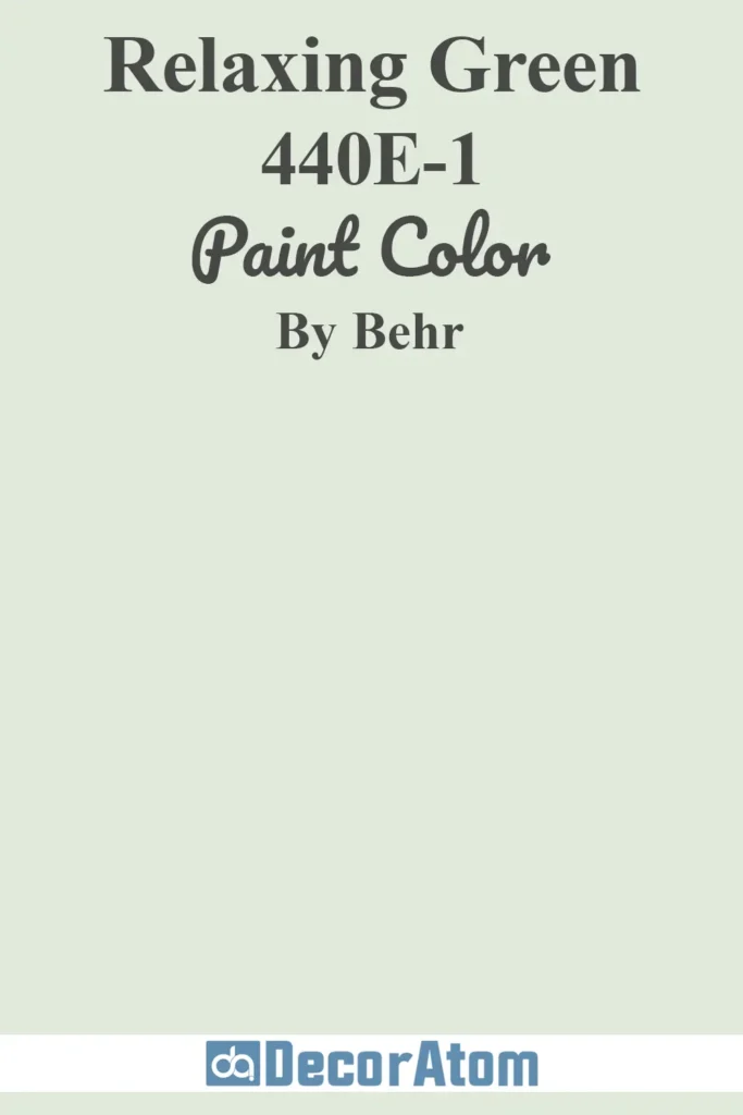
There’s a softness to Relaxing Green that makes it feel like a cozy hug. It has more of a creamy undertone than some of the other Behr greens, which gives it a slightly warmer cast under artificial lighting.
I like how it holds its own on larger walls while still feeling laid-back and approachable.
5. Comforting Green S400-2
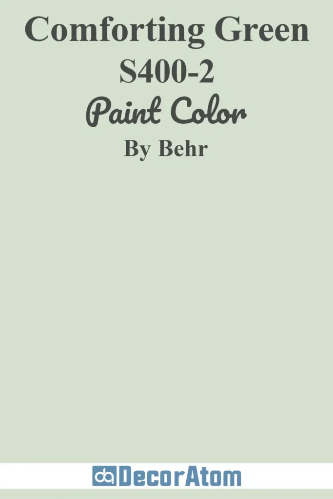
Comforting Green has a slightly deeper tone, leaning closer to olive without going full earth-tone. In a room that lacks natural light, this color still feels rich without darkening the space.
It pairs really well with wood accents and soft white trim, giving off a grounded, lived-in feel that’s especially inviting.
Popular Benjamin Moore Green Paint Colors:
Benjamin Moore is known for its nuanced, complex hues—and their green paint options are no exception. These shades bring a balanced, elegant feel to rooms that could use a bit of visual lift without relying on bright light.
Also Read: 15 Best Benjamin Moore Sage Green Paint Colors
6. Pale Avocado 2146-40
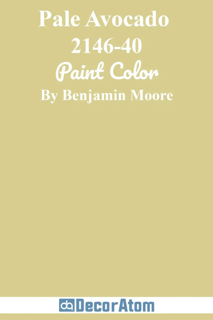
Pale Avocado is playful without being loud. It has a yellow-green base that gives it warmth and energy, which is exactly what you want in a space that tends to feel cool or shadowed.
It’s great for kitchens, bathrooms, or anywhere you want to inject a little zest while still keeping things sophisticated.
7. Paris Rain 1501

Paris Rain is one of those shades that shifts between green and gray, depending on the lighting.
That makes it a fantastic choice for low-light rooms because it adapts to the space rather than competing with it. It feels refined and a bit moody, perfect for a bedroom or a reading nook.
8. October Mist 1495

October Mist is the kind of color that seems to breathe on the wall. It was Benjamin Moore’s Color of the Year for a reason—it’s soft, organic, and incredibly easy to live with.
In low-light rooms, it brings a sense of quietness and calm, making it a great backdrop for both modern and vintage furnishings.
9. Hollingsworth Green HC-141

Hollingsworth Green is a pale green with just enough blue in it to feel crisp. It has a historic quality, but it doesn’t feel dated at all.
I’ve seen it used in windowless bathrooms and interior hallways, where it reflects ambient light beautifully and adds just the right amount of personality.
10. Fernwood Green 2145-40

Fernwood Green is one of those colors that instantly makes a space feel more connected to nature.
It’s earthy but not heavy, with soft yellow undertones that keep it feeling light and cozy. It’s especially lovely in dining rooms or dens where you want a hint of vintage charm.
11. Gray Cashmere 2138-60

Gray Cashmere is like a chameleon—it’s part green, part blue, part gray, and all elegance. It reads as a soft green in low light, which gives a room a tranquil, misty effect.
If you’re looking for a cooler green that still feels welcoming, this one’s worth a test swatch.
Popular Sherwin-Williams Green Paint Colors
Sherwin-Williams greens are some of the most dependable when it comes to low-light rooms. Many of their shades are designed with subtle undertones that help balance shadows and bring just enough color without making a space feel too dark or heavy. These 6 are my top picks for low-light areas.
12. Sea Salt SW 6204

Sea Salt is probably one of the most talked-about colors in the Sherwin-Williams palette, and for good reason.
It’s a light green with soft blue undertones, and in low-light rooms, it shifts beautifully depending on the light source.
Sometimes it looks minty, other times like a pale aqua—it’s endlessly soothing, making it a top pick for bathrooms, bedrooms, or even laundry rooms.
Also Read: Sea Salt SW 6204 Paint Color Review
13. Evergreen Fog SW 9130
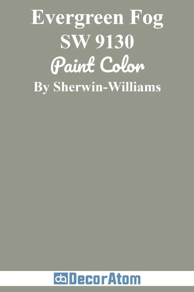
Evergreen Fog made a name for itself as Sherwin-Williams’ Color of the Year, and it’s easy to see why. It’s a moody, gray-green with just the right amount of depth to feel modern but still livable.
In rooms with low light, it adds character without making the walls feel heavy. Pair it with warm woods or soft whites and you’ve got a space that feels intentional and comforting.
Also Read: Evergreen Fog SW 9130 Paint Color Review
14. Liveable Green SW 6176

Liveable Green is one of those fail-safe shades—it’s soft, subtle, and incredibly versatile.
It has a creamy undertone that helps brighten dim spaces, and it reads like a gentle, barely-there green that still adds interest.
I’ve seen this used beautifully in small bedrooms and cozy living rooms where natural light is scarce, and it really helps open up the feel of the room.
15. Aloof Gray SW 6197
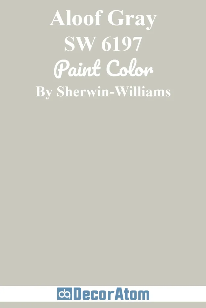
Don’t let the name fool you—Aloof Gray has a noticeable green undertone that reveals itself especially in shadowed rooms.
It’s cooler and more modern than many traditional greens, making it a great pick for minimalist or transitional spaces.
This one works well if you’re after a subtle, atmospheric wall color that doesn’t feel flat or overly gray in dim lighting.
16. Softened Green SW 6177
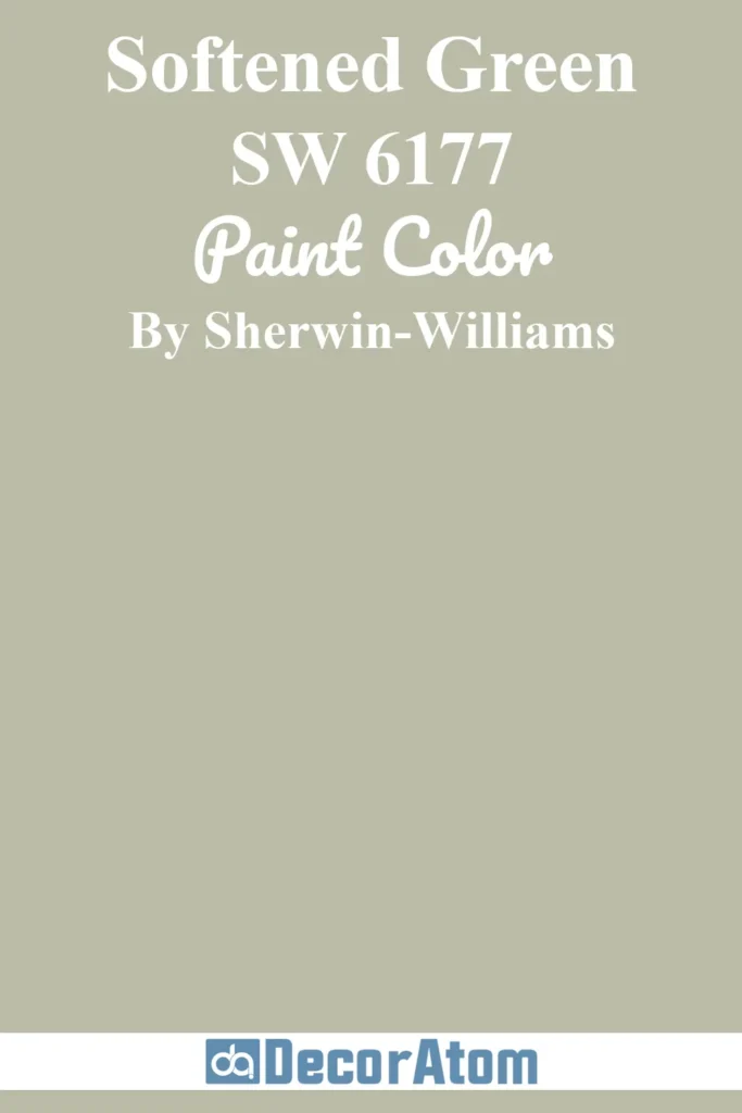
Softened Green is a gentle, earthy shade that leans toward sage without being too muted. It brings a natural feel to any room, which is especially helpful when there’s not a lot of light coming in.
What I like about this color is how grounded it feels—it doesn’t try too hard, yet it instantly warms up the space and gives it a calm, cohesive vibe.
17. Pewter Green SW 6208

If you’re craving a bit more drama without sacrificing warmth, Pewter Green might be the one. It’s a deep, muted green with gray undertones that keeps it from feeling too bold.
Even in rooms that don’t get a lot of sun, this shade holds its richness without turning too dark or muddy. It’s stunning on accent walls, cabinetry, or cozy dens where you want to create an enveloping, grounded feel.
Final Thoughts
Whether you’re working with a north-facing bedroom, a windowless hallway, or just a space that never seems to catch the sun, the right green paint can add life and warmth without overwhelming the room.
I’ve personally seen how a well-chosen shade—like Softened Green or Gray Cashmere—can completely shift the mood of a space.
I always recommend testing a few samples before making your final decision. Even the best paint color looks different depending on your lighting, flooring, and trim.
But once you find the one that clicks, your low-light room won’t feel like a design challenge anymore—it’ll feel like a cozy retreat.
Also Read: 13 Best Paint Colors for Low Light Rooms