

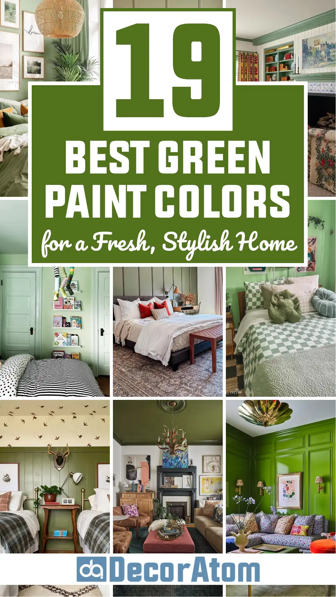
I’ve gone down the rabbit hole of green paints more times than I can count, testing swatches (on way too many walls), watching how they shift in different lighting, and pairing them with everything from warm woods to crisp whites.
And after all that, I’ve narrowed it down to my favorite 21 green paint colors—ones I keep coming back to again and again.
In this post, I’m walking you through each of these green gems, from soft and subtle sages to dramatic forest tones and moody emeralds.
These are the greens that have stood out for their beauty, versatility, and how incredibly livable they are in real homes.
If you’ve been dreaming of bringing some green into your space, you’re in the right place.
Where to Use Green Paint Colors
Green is one of those rare colors that feels equally grounded and refreshing, making it a smart choice for almost every room in the house.
It works beautifully in spaces where you want to introduce a sense of calm, but also in rooms where you want to inject personality and depth.
Living rooms are a great place to experiment with soft, earthy greens—think sage, olive, or muted eucalyptus tones. These colors can feel cozy and sophisticated, especially when paired with warm wood accents or neutral textiles. For a bolder approach, deep forest greens or smoky emeralds can create a moody, elegant backdrop for art, bookshelves, or fireplaces.
Bedrooms benefit from soft, cool-toned greens like Healing Aloe or Sea Salt. These whispery hues feel peaceful and spa-like, helping set the tone for relaxation.
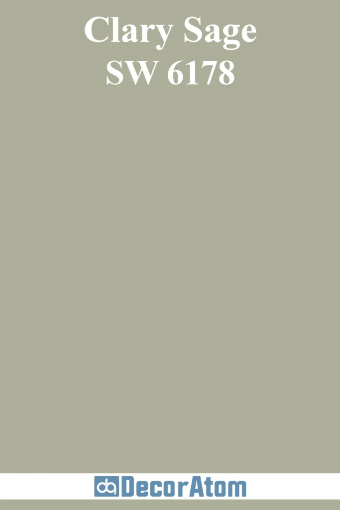
Kitchens and dining rooms are perfect spots for mid-tone greens. Greens like Clary Sage or Avocado Whip feel inviting and fresh, while still being rooted in nature—a nice touch for spaces centered around food and gathering.
If you want to make a statement, bathrooms, entryways, and offices are all great places to go deeper with rich greens like Salamander or Essex Green. These darker shades create a sense of drama and intimacy, while still feeling timeless.
Cabinetry and built-ins also come alive in green, especially in hues like Tate Olive, Garden Sage, or Evergreen Fog. Green cabinetry strikes a perfect balance between trend-forward and classic.

Colors to Pair with Green
Green is surprisingly versatile when it comes to pairing with other colors—it all depends on the undertone of your green and the mood you’re going for.
If your green has gray or blue undertones (like Sea Salt or Healing Aloe), it pairs effortlessly with crisp whites, soft grays, muted blues, and pale beiges. These combinations create a breezy, coastal or cottage-inspired palette.
Earthier greens like Clary Sage, Backwoods, or Camouflage lean into warm undertones, and they work well with creamy whites, warm taupes, terracotta, and even muted blushes. These combos feel grounded, organic, and warm.
For darker greens—think Salamander, Essex Green, or Lafayette Green—you can go bold by pairing with gold accents, black fixtures, or deep wood tones. You could also soften the look with lighter neutral walls or fabrics.
And don’t overlook natural textures—greens shine when paired with rattan, linen, wood, stone, and leather. Whether you’re after something soft and inviting or bold and dramatic, there’s a green pairing to get you there.

💥🎁 Christmas & Year-End Deals On Amazon !
Don't miss out on the best discounts and top-rated products available right now!
*As an Amazon Associate, I earn from qualifying purchases.
What Is The Most Popular Green Paint Color For 2025?
For 2025, Sherwin Williams Evergreen Fog is still holding strong as one of the most popular green paint colors.
It’s a soft, sophisticated green with gray undertones and a subtle hint of blue, making it a perfect chameleon color.
It reads differently depending on the light—sometimes it leans more sage, sometimes more silvery—but always feels modern and serene.
Evergreen Fog was Sherwin Williams’ Color of the Year for 2022, but it continues to trend because it’s so easy to live with.
It’s not too bold or too cool—it lives in that sweet spot between cozy and clean.
Whether it’s used on walls, cabinets, or exteriors, Evergreen Fog feels calm, grounded, and refreshingly current.
Other greens gaining popularity this year include Farrow & Ball Green Smoke for its dramatic depth and Benjamin Moore Healing Aloe for its barely-there softness.
But if you’re after a crowd-pleaser that fits into almost any design style, Evergreen Fog is the one that keeps showing up everywhere—from kitchens to bathrooms to bedrooms.

Tips for Choosing The Best Green Paint Colors
Choosing the right green can be tricky because greens are incredibly sensitive to light, undertones, and surrounding colors. Here are a few tips that can help make the process easier:
- Pay attention to undertones: Some greens have blue undertones and feel cooler, while others have yellow or brown undertones and feel warmer. Knowing the undertone will help you choose a green that complements the rest of your space. For example, Sea Salt leans cooler, while Clary Sage feels warm and earthy.
- Test in your lighting: Greens can shift dramatically depending on natural and artificial light. Always sample your top contenders in the room you’re painting. A color that looks soft and serene in one space might go minty or muddy in another.
- Think about mood: Soft greens (like Healing Aloe or Garden Sage) create a light, peaceful feeling, while darker greens (like Salamander or Tarrytown Green) offer drama and depth. Decide if you want your green to be a subtle backdrop or a bold statement.
- Balance with neutrals: If you’re going bold with your green, balance it out with neutrals like creamy whites, taupes, or light wood tones to keep the room feeling cohesive.
The Best Green Paint Colors
Here are my favorite Green paint colors to decorate with.
1. Benjamin Moore Healing Aloe

Healing Aloe is one of those whisper-soft greens that just makes a room feel instantly more peaceful.
It’s technically a green, but it leans so gently into gray and even a touch of blue that it often reads more like a soft, silvery mist.
What I love most about Healing Aloe is how fresh and airy it feels without ever being stark or chilly.
It’s the kind of color that works beautifully in a bedroom or bathroom where you want to create a spa-like retreat. It feels like a deep breath in paint form.
If your home has a lot of natural light, this color really shines—it takes on a slightly cool, coastal vibe. But even in lower light, it doesn’t go flat.
It holds just enough pigment to maintain that tranquil, watery hue.
Healing Aloe made my top list because it’s one of those rare colors that doesn’t try too hard, yet completely transforms a space.
2. Sherwin Williams Sea Salt

💥🎁 Christmas & Year-End Deals On Amazon !
Don't miss out on the best discounts and top-rated products available right now!
*As an Amazon Associate, I earn from qualifying purchases.
Sea Salt has been a cult favorite for years, and honestly, it deserves every bit of the attention it gets.
It’s a pale green with soft blue-gray undertones, and depending on your lighting, it can swing more green or more blue.
That chameleon-like quality is part of what makes it so appealing—it always feels fresh, never boring.
In north-facing rooms, Sea Salt leans more into its gray-green personality, while in bright, sun-filled spaces, it can look almost beachy with a hint of aqua.
It’s a go-to for bathrooms, bedrooms, and even open-concept living spaces where you want a hint of color without overwhelming the room.
It feels timeless, not trendy, and it brings a gentle, coastal calm wherever it goes.
Sea Salt earned its spot because it’s one of the most versatile greens you can put on your walls.
3. Benjamin Moore Hollingsworth Green

If you’re drawn to soft, vintage-inspired colors, Hollingsworth Green is such a gem.
It’s a delicate green with a healthy dose of gray that gives it a slightly antique quality—like something you’d find in an old English cottage or a historic farmhouse.
There’s something incredibly refined about this color. It doesn’t scream for attention, but it has a quiet elegance that just draws you in.
Its undertones are more neutral than yellow or blue, which helps it play well with a variety of other colors—especially creams, soft browns, and warm whites.
This one is perfect for dining rooms, libraries, or any space where you want a sense of tradition with a fresh twist.
4. Sherwin Williams Liveable Green

Liveable Green is exactly what the name suggests—a comfortable, easygoing, livable shade of green.
It’s a soft, muted green with warm undertones that give it a cozy, inviting feel.
If you’re nervous about going green but want to try something other than gray or beige, this is a wonderful stepping stone.
It doesn’t have the icy undertones that some pale greens do, which makes it an especially great fit for traditional or farmhouse-style homes.
It looks amazing with white trim, light wood floors, and woven textures.
I love it in hallways, living rooms, or even kitchens where you want a backdrop that has more character than a neutral, but still feels grounded.
5. Sherwin Williams Clary Sage
💥🎁 Christmas & Year-End Deals On Amazon !
Don't miss out on the best discounts and top-rated products available right now!
*As an Amazon Associate, I earn from qualifying purchases.
Clary Sage is the color equivalent of an herbal tea—warm, earthy, and comforting.
It’s a mid-tone green with strong yellow undertones, giving it that sun-warmed, natural vibe that works beautifully with organic materials like wood, linen, and leather.
It has more weight to it than a sage like Sea Salt, but it’s still soft enough to use in large doses.
This is a great color for kitchens and cabinetry—it pairs so well with brass hardware, butcher block counters, and creamy white walls.
I also love it for mudrooms or breakfast nooks where you want something that feels casual but curated.
Clary Sage is on my list because it offers that warm, rustic charm without feeling dated or too traditional.
6. Behr Avocado Whip
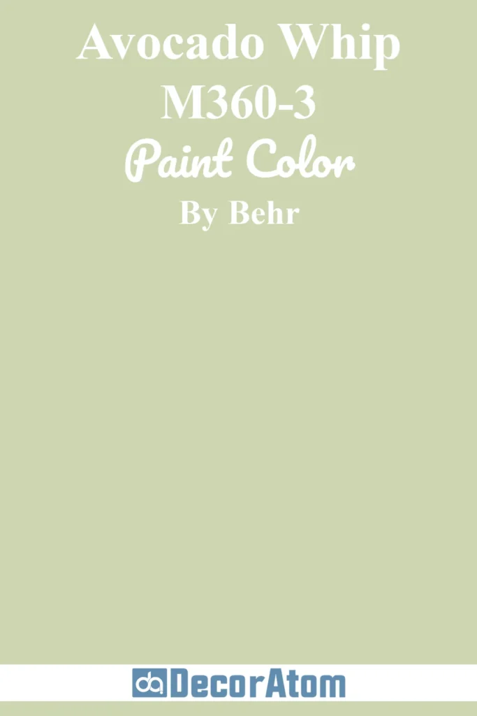
Now here’s a green that feels like a fresh burst of joy—Avocado Whip by Behr is a cheerful, retro-inspired green that manages to be both playful and stylish.
It’s not quite neon, but it has a definite vibrancy that sets it apart from your typical sage or olive tones.
It’s a mid-to-light green with a hint of yellow, which makes it feel sunlit and upbeat.
If you want to make a bold statement in a powder room, a laundry room, or even on a piece of furniture or cabinetry, Avocado Whip delivers.
It has a quirky, confident energy that’s hard not to love.
7. Sherwin Williams Evergreen Fog

Evergreen Fog was Sherwin Williams’ Color of the Year in 2022, and it’s still a major favorite in 2025.
It’s that perfect mix of green, gray, and a whisper of blue, giving it a smoky, soft depth that works in both modern and classic spaces.
What makes it special is its subtlety—Evergreen Fog isn’t showy, but it has an incredibly calming, sophisticated presence.
It’s a fantastic choice for walls, cabinetry, or even exteriors.
It looks amazing with matte black, brushed brass, and warm wood tones.
The undertones shift gently with the light, so in bright rooms, it feels airy and grounded, while in moodier spaces, it leans into that earthy elegance.
It’s on this list because it’s versatile, refined, and a total crowd-pleaser.
8. Farrow & Ball Green Smoke

💥🎁 Christmas & Year-End Deals On Amazon !
Don't miss out on the best discounts and top-rated products available right now!
*As an Amazon Associate, I earn from qualifying purchases.
Green Smoke is one of the most luxurious, dramatic greens on this list.
It’s deep, smoky, and richly saturated with a mix of green, blue, and gray undertones.
This color oozes sophistication and moody charm. It’s not one to fade into the background—it commands attention, but in the most tasteful way.
I love Green Smoke for accent walls, office spaces, libraries, or cabinetry.
It looks particularly stunning in rooms with warm lighting or vintage-inspired decor.
There’s something about this color that feels both historic and bold—like it’s been around forever, but still feels current.
9. Benjamin Moore Palace Green
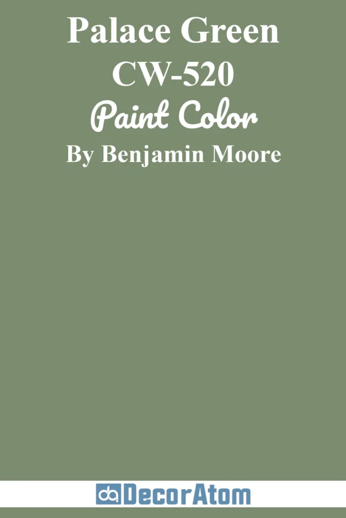
Palace Green is a rich, elegant jewel tone that feels timeless and regal.
It’s a true green—not too yellow, not too blue—with a depth that gives it serious drama.
If you love traditional interiors or want to create a formal dining room or home office with a bit of grandeur, this is the green to try.
It looks incredible paired with crisp white trim, gold accents, or deep wood tones.
Palace Green brings a sense of history and richness that instantly elevates a space.
It’s not a background color—it’s a centerpiece.
It’s ideal for homeowners who want to embrace color in a confident, classic way.
10. Benjamin Moore Tate Olive

Tate Olive is a warm, earthy olive green that brings a grounded, almost military-inspired tone to a space—but with a softness that keeps it from feeling harsh.
It has noticeable brown undertones that make it feel cozy and connected to nature, which is why it works so well in rustic, farmhouse, or mid-century modern spaces.
I love this color in kitchens, especially on cabinetry or accent walls.
It also looks fantastic in entryways, paired with natural materials like leather, stone, and unfinished wood.
It’s a great alternative to gray or beige when you want something neutral but more soulful.
11. Benjamin Moore Backwoods

💥🎁 Christmas & Year-End Deals On Amazon !
Don't miss out on the best discounts and top-rated products available right now!
*As an Amazon Associate, I earn from qualifying purchases.
Backwoods is the kind of green that feels like you’ve just stepped into a dense forest.
It’s rich, earthy, and quietly dramatic, with a slightly smoky undertone that gives it depth without being too dark.
This is not a vibrant or flashy green—this is a deep, grounding shade that makes you feel like you’re surrounded by nature in the best way.
It’s stunning in a study or dining room, and if you’re brave enough, it can create a moody cocoon in a bedroom.
Paired with warm wood tones or natural textures like leather and wool, Backwoods really comes to life.
It made my list because it captures that wilderness-inspired calm so perfectly—it’s bold, but not overbearing. A classic deep green that still feels very current.
12. Benjamin Moore Lafayette Green

Lafayette Green is one of those greens that instantly reads “luxury.”
It has a dramatic, jewel-toned depth—somewhere between emerald and forest green—but with an elegant clarity that keeps it feeling polished and sophisticated.
There’s almost a vintage velvet quality to it.
This shade is a showstopper for cabinetry, dining rooms, or any accent wall you want to make unforgettable.
What makes Lafayette Green stand out is its balance: it’s bold but not too dark, vibrant but not loud.
It looks especially striking with gold hardware, marble, or deep wood accents.
13. Sherwin Williams Evergreens

Evergreens is such a handsome, grounded green—it’s deep, cool-toned, and quietly powerful.
This isn’t a green that shouts; it has more of a subtle, confident presence.
With noticeable blue and gray undertones, it gives off a calm, slightly shadowy vibe that’s perfect for creating a cozy, tucked-in space.
I love Evergreens in dens, offices, or any room where you want a little drama without going too dark.
It pairs well with soft whites, charcoal grays, and natural stone. It also works beautifully on exteriors, especially when you want a color that blends into the landscape but still has presence.
14. Sherwin Williams Pewter Green

Pewter Green walks that fine line between earthy and sophisticated.
It’s a medium-dark green with gray undertones, giving it a slightly industrial, modern feel while still being rooted in nature.
This is a great green for people who love a more understated color palette but still want something richer than a neutral.
What I really love about Pewter Green is its balance—it’s deep enough for contrast but doesn’t overpower a room.
I’ve seen it used beautifully on kitchen cabinets, mudroom walls, and even front doors.
It works well with warm wood, matte black, and natural fibers.
15. Sherwin Williams Shade-Grown

Shade-Grown is the deepest, most dramatic green on this list—and I absolutely love it for that reason.
It’s bold, shadowy, and incredibly rich, almost reading as black in low light.
But in natural daylight, you see all the beautiful forest green tones emerge. It’s mysterious and moody in the best way.
This color is ideal for those brave enough to go dark—think cozy bedrooms, statement powder rooms, or kitchen islands that demand attention.
It looks absolutely stunning with brass, creamy whites, or even blush tones for contrast.
16. Benjamin Moore Tarrytown Green
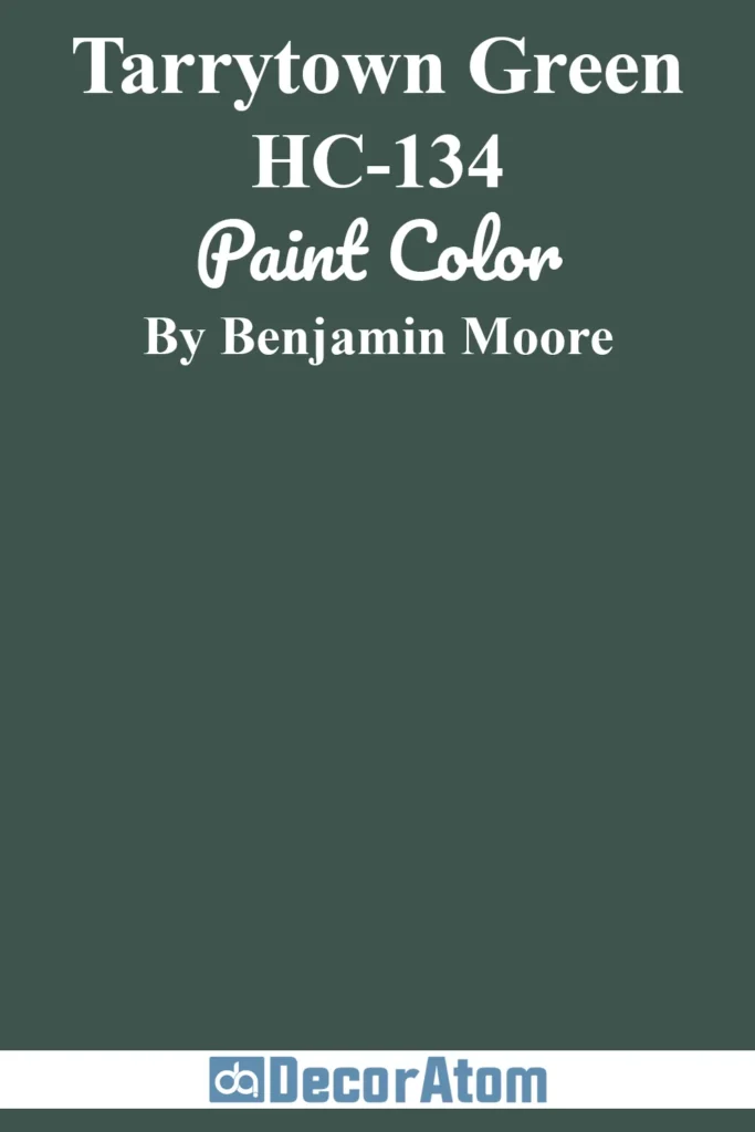
Tarrytown Green is a stately, historic-looking green with a rich, deep body and slightly blue-leaning undertones.
It feels very classic, very architectural.
This color reminds me of the grand old libraries and townhouses you see in the Northeast—timeless and always elegant.
It’s perfect for doors, trim, or accent walls where you want to make a strong but tasteful statement.
It plays beautifully with brass, navy, off-white, or wood tones.
17. Benjamin Moore Salamander
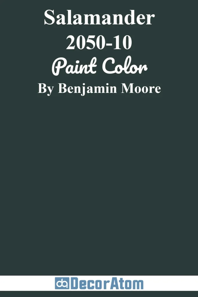
Salamander is a total wildcard—and I mean that in the best possible way.
It’s so deep and dark that in some lights it looks almost black. But then, the green and teal undertones come through, adding depth and intrigue. It’s bold, moody, and definitely dramatic.
This is a color for someone who isn’t afraid to go all in.
It looks stunning on built-ins, kitchen cabinets, or in a small powder room with gold accents and moody lighting.
It’s glamorous in a kind of mysterious, brooding way.
18. Benjamin Moore Essex Green

Essex Green is a deep, blackened green that feels very grounded and earthy.
It has a slightly warmer tone than some of the cooler forest greens, which makes it feel rich and enveloping rather than stark.
It’s the kind of green that would be right at home on a country estate or a classic Colonial exterior.
This color is bold but not flashy—it’s subtle and strong at the same time.
It looks incredible paired with cream or ivory trim and natural wood textures.
19. Sherwin Williams Garden Sage

Garden Sage is a soft, approachable green that’s equal parts herbal and elegant.
It has warm undertones and just a touch of gray, which keeps it from feeling too minty or cool.
It’s one of those greens that feels clean and calm—like fresh air in paint form.
It’s especially lovely in kitchens, bathrooms, and laundry rooms—spaces where you want a little lift without going overboard.
Garden Sage pairs beautifully with warm neutrals, matte black, or natural woven textures.
20. Benjamin Moore Camouflage
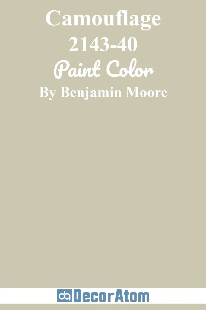
Camouflage is such a warm, grounded green—it lives somewhere between sage and khaki.
It’s earthy and soft, with tan and olive undertones that make it feel like part of the landscape.
It has that aged, natural beauty that feels both rustic and refined.
I love Camouflage in living rooms, hallways, or open-concept spaces where you want warmth with just a hint of color.
It doesn’t scream “green,” but it has enough depth to bring personality to a room.
21. Sherwin Williams Saguaro

Saguaro is such a fresh and unexpected green—it’s lively, a little funky, and full of desert-inspired personality.
It leans a bit into olive, but with a brighter, sunnier twist that makes it feel modern and full of life.
This isn’t a muted or shadowy green—it’s warm, natural, and totally charming.
I love Saguaro for creative spaces, laundry rooms, or as an accent in a more eclectic home.
It plays well with terracotta, warm whites, and rattan or wood elements.