

Green is one of those magical paint colors that brings balance, beauty, and a sense of calm to just about any room.
I’ve always had a soft spot for green paint. It’s the kind of color that can completely change the feel of a room—sometimes without you even realizing why it works so well.
Some greens feel crisp and clean, others feel cozy and grounded. And once you find the right one, everything else in the room just seems to fall into place.
I’ve tested a lot of green paints over the years—some hits, some definite misses. What I’ve learned is that the undertone matters more than you think, and lighting can make or break a green.
In this post, I’m sharing 25 of the best green interior paint colors I’ve come across—from soft and subtle to bold and dramatic.
Whether you’re updating your kitchen, trying to warm up a bedroom, or just need a fresh new wall color, one of these might be exactly what you’re looking for.

What Is the Most Popular Green Interior Paint Color?
One of the most consistently popular green interior paint colors is Sea Salt by Sherwin-Williams (SW 6204). It’s a soft, muted green with subtle blue-gray undertones that shift beautifully with the light throughout the day.
Sea Salt has become a go-to for bedrooms, bathrooms, and even living spaces because of its calming presence and spa-like feel.
Another top contender in recent years is Evergreen Fog (SW 9130)—Sherwin-Williams’ 2022 Color of the Year. It’s a slightly deeper, more grounded green that still feels fresh and modern.
For those who prefer Benjamin Moore, October Mist (1495) has gained popularity for its soft, silvery green tone that works like a neutral.
These shades are popular for good reason—they’re easy to live with, flexible across different decor styles, and have enough personality to make a room feel intentional without being overwhelming.

Which Paint Finish Is Best for Interior Walls?
Choosing the right paint finish can make a big difference in both the appearance and durability of your walls. Here’s a quick breakdown to help you decide:
- Matte or Flat: Ideal for low-traffic areas like bedrooms or formal living rooms. It hides imperfections well but isn’t very washable.
- Eggshell: A popular choice for most interior walls. It has a soft, velvety finish with a bit of sheen and is more durable than flat paint—perfect for living rooms, dining rooms, and even hallways.
- Satin: Slightly more lustrous than eggshell and very easy to clean. I recommend satin for kitchens, bathrooms, and high-traffic areas like kids’ rooms or entryways.
- Semi-Gloss: More reflective and moisture-resistant, so it’s great for trim, doors, and bathrooms—but not typically used for full walls unless you’re going for a very specific look.
- Gloss or High-Gloss: Best for accent details or cabinetry. It adds drama and shine but shows every imperfection on the surface.
My go-to? Eggshell for general walls and satin for any space that needs frequent wiping or added durability. If you’re using green paint, eggshell gives just enough softness to let the color breathe without becoming too shiny.

How Do You Choose the Right Green Paint Color for Your Interior?
Picking the right green can feel a bit overwhelming—there are so many variations, and lighting plays a huge role in how the color will actually look in your space. Here are a few tips I’ve found helpful:
1. Consider the Undertones
Some greens have blue undertones (like Rainwashed or Crystalline), which feel cooler and more serene. Others have yellow or gray undertones (like Clary Sage or Saybrook Sage), which tend to feel warmer or more earthy. Figure out whether your space calls for a cool, warm, or neutral green.
2. Test It With Your Lighting
Greens can change a lot based on natural and artificial light. Always test large swatches on your wall and check them at different times of day. North-facing rooms tend to cool colors down, while south-facing rooms warm them up.
3. Think About the Room’s Mood
Soft greens like Sea Salt or Soft Fern are great for relaxing spaces like bedrooms and bathrooms. Deeper tones like Pewter Green or Vintage Vogue add drama and coziness to dining rooms or studies.
4. Pair It With the Right Accents
Green is surprisingly flexible. It works beautifully with warm woods, whites, beiges, and even black accents. Consider the overall palette of your home to make sure the green fits in naturally.
5. Don’t Ignore the Flooring
If you have gray floors, warm wood, or tile, that will impact how the green appears. Try to view your swatches alongside your flooring and major furniture pieces.
Choosing the right green is less about following trends and more about how the color makes you feel in your space. Take your time with samples, and trust your gut—it’s usually right.

Top 25 Green Paint Colors For Interior
Here’s a carefully curated list of 25 green paint colors that work beautifully inside homes. These picks cover a range of tones—from light and fresh to deep and moody—so you can find the perfect shade for any room or style.
Green Interior Paint Colors From Sherwin-Williams
1. Sea Salt SW 6204
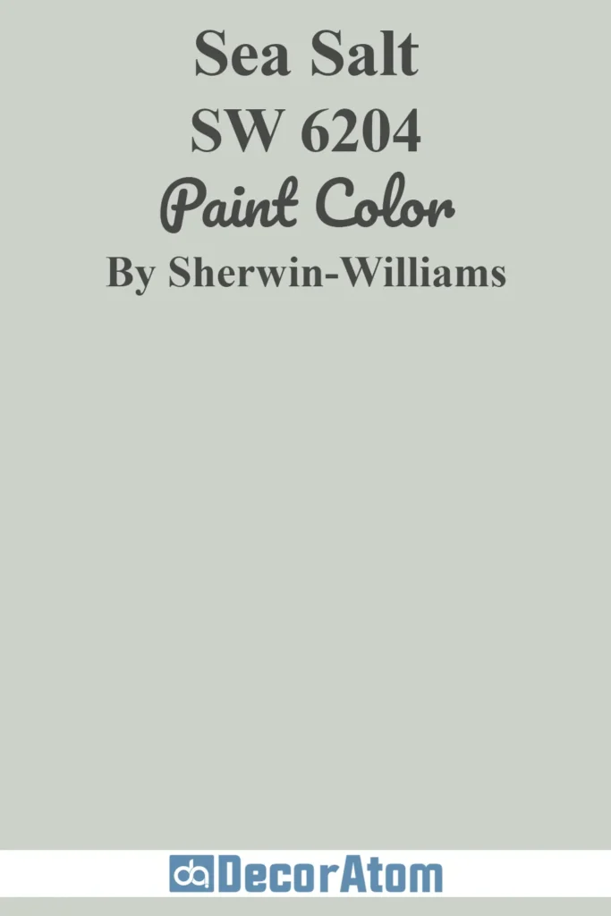
Sea Salt is one of those colors that seems to shift depending on the light—and that’s exactly why it’s so loved. It’s a soft green with just enough blue and gray to keep it from feeling too sweet.
In the morning light, it can look almost silvery green, and by evening, it leans toward a muted blue-gray. It’s calming without being cold.
Where to use it: This one shines in bathrooms and bedrooms, but I’ve also seen it work beautifully in living rooms paired with white trim and light oak floors. If you’re going for a coastal or spa-like vibe, this is a top pick.
2. Evergreen Fog SW 9130
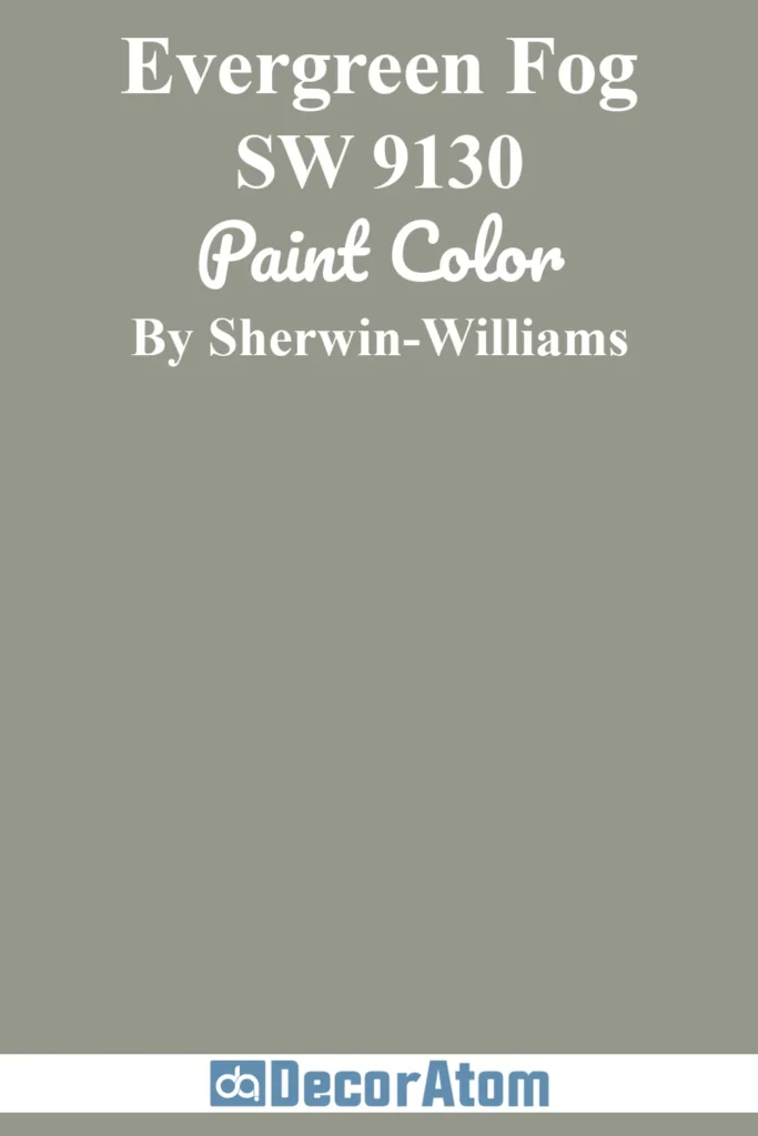
Evergreen Fog was Sherwin-Williams’ 2022 Color of the Year, and it’s easy to see why. It’s earthy, grounded, and reads like a gentle gray-green with just a hint of warmth. It’s a “grown-up” green—sophisticated and modern without feeling trendy.
Where to use it: I love this one for entryways, living rooms, or even on kitchen cabinets. It pairs beautifully with light neutrals and natural textures like rattan or raw wood.
3. Rainwashed SW 6211

Rainwashed is one of those colors that instantly feels like fresh air. It’s more green than blue, but with just enough aqua to keep it feeling light and breezy. It’s soft and welcoming but not flat or dull.
Where to use it: It works incredibly well in bedrooms and guest rooms—especially those that don’t get a ton of natural light. It also plays well in coastal-themed spaces or anywhere you want a gentle pop of soft color.
4. Comfort Gray SW 6205

Don’t let the name fool you—Comfort Gray is definitely more green than gray, but it has that cool undertone that makes it versatile. It’s slightly deeper than Rainwashed and feels a bit moodier, in a good way.
Where to use it: Perfect for dining rooms or living rooms where you want to make a quiet, confident statement. I’ve even seen it used in home offices for a calm, productive atmosphere.
5. Pewter Green SW 6208

This is a bold and saturated green with a strong gray base. It’s not a subtle wall color—but it’s a stunning one. Pewter Green has a rich depth to it that feels timeless and grounding.
Where to use it: Amazing on cabinetry or as an accent wall. I especially love it in kitchens paired with brass hardware and creamy white walls. It’s also beautiful on built-ins or even a moody bedroom wall.
6. Quietude SW 6212

Quietude is like a cousin to Sea Salt and Comfort Gray—peaceful, soft, and just a touch blue-green. It’s the kind of shade that instantly makes a space feel serene.
Where to use it: I’d recommend it for bedrooms, reading nooks, or any spot you want to turn into a cozy hideaway. It’s also lovely in nurseries or meditation spaces where calm energy is the goal.
7. Retreat SW 6207

Retreat is a deeper, more contemplative green. It’s earthy, a little moody, and has an almost velvety look to it when painted on a wall. It’s not dark in a dramatic way—it’s dark in a grounding way.
Where to use it: This one’s gorgeous in a study, library, or as a backdrop for a gallery wall. It’s also striking in powder rooms or as a cabinet color in a two-tone kitchen.
8. Clary Sage SW 6178

Clary Sage is warm, mellow, and has that soft herbal tone that feels comforting. It’s distinctly green, but it doesn’t scream for attention. There’s a quiet elegance to it.
Where to use it: Try it in kitchens or breakfast nooks where you want a natural, welcoming vibe. It also works really well with warm whites, creamy beiges, and natural wood tones.
9. Rosemary SW 6187

This is one of my go-to recommendations for anyone wanting a deep, sophisticated green that still feels organic. Rosemary has a slightly olive undertone, but it doesn’t feel too yellow. It’s bold but refined.
Where to use it: Perfect for accent walls, cabinetry, or even front doors if you want to bring it outside. It looks particularly stunning against matte black fixtures and warm brass accents.
10. Coastal Plain SW 6192

Coastal Plain is a soft mid-tone green with a fresh, clean energy. It leans more toward the yellow side of green without becoming limey or harsh. It’s cheerful but grounded.
Where to use it: I love it in sunrooms, laundry rooms, or even bathrooms where you want something colorful but not overwhelming. It pairs well with white tile, wicker baskets, and natural light.
11. Hunt Club SW 6468

If you’re looking for a true forest green, Hunt Club delivers. It’s deep, luxurious, and dramatic—in the best way. This color adds instant richness to a space.
Where to use it: Think formal dining rooms, statement walls, or painted cabinetry. I’ve seen it used in moody living rooms with leather furniture and antique wood tones—absolutely stunning.
12. Succulent SW 9650

Succulent is one of those greens that feels trendy and timeless all at once. It’s soft but modern, with a balanced mix of blue and gray undertones that give it versatility.
Where to use it: I’d use this in a kitchen, laundry room, or even a home office. It feels clean and fresh, especially when paired with crisp white or soft beige. It also holds its own next to metal finishes like brushed gold or black.
13. Taiga SW 9654

Taiga is one of those greens that feels like it came straight from the forest floor. It’s rich and muted, with a deep olive-gray base that makes it feel grounded and elegant. It’s not flashy—it’s thoughtful.
There’s something incredibly cozy about Taiga, like curling up under a wool blanket with a book on a rainy day.
Where to use it: I picture this in a dining room with dim lighting and heavy drapes, or on lower kitchen cabinets paired with butcher block counters. It also works wonderfully in entryways if you want to make a bold, earthy first impression.
Green Interior Paint Colors From Benjamin Moore
14. Soft Fern 2144-40

Soft Fern is gentle and effortless, like that first breath of spring after a long winter. It’s a light green with a whisper of yellow and gray, making it versatile enough to use in nearly any space without it feeling too sweet or saccharine. It brings a freshness that feels clean but not sterile.
Where to use it: This one is stunning in hallways, family rooms, or anywhere that needs a subtle lift. It pairs beautifully with creamy whites and soft, sandy neutrals—especially in farmhouse or cottage-inspired interiors.
15. Saybrook Sage HC-114

Saybrook Sage is that perfect garden green that feels rooted in tradition. It has warm undertones, a soft richness, and just enough gray to keep it calm and collected. It gives off a historic vibe—like a paint color you’d see on a centuries-old door in New England.
Where to use it: I love this for kitchens with classic white cabinets or traditional dining rooms with antique wood. It also makes a lovely wall color for bedrooms where you want a cozy, grounded feel.
16. October Mist 1495

There’s something poetic about October Mist—it’s soft, muted, and carries a hint of mystery. This was Benjamin Moore’s 2022 Color of the Year, and it’s easy to understand why. It’s a silvery green with a touch of sage and a cloudlike quality that makes it dreamy but modern.
Where to use it: I’d use this anywhere you want an airy but thoughtful backdrop—living rooms, offices, even laundry rooms. It’s subtle but never boring, and works like a neutral with a little extra personality.
17. Georgian Green HC-115

Georgian Green has a certain old-world charm. It’s a medium olive-toned green that feels warm, sophisticated, and grounded in history. There’s a richness here, a sense of depth, like velvet or aged linen.
Where to use it: This one’s a natural fit for studies, reading rooms, or formal dining spaces. I also adore it on cabinetry paired with brass hardware—it gives off a timeless, bespoke feel.
18. Vintage Vogue 462

Vintage Vogue is bold, moody, and undeniably chic. It’s a deep olive green with blackened undertones that make it feel incredibly high-end.
This is not a color for the faint of heart—it’s for the confident decorator who wants to create a dramatic and luxurious space.
Where to use it: Ideal for a moody office, powder room, or even as a statement-making wall in a minimalist living room. Pair it with matte black fixtures and warm wood for a modern yet timeless contrast.
19. Hunter Green 2041-10

Hunter Green is a deep, dark evergreen that feels rich and stately. It’s bold, commanding, and looks absolutely stunning in traditional or historic homes. This shade instantly adds character and depth to any space.
Where to use it: I love it in formal dining rooms with classic wainscoting, or on built-ins and bookcases in a home office. It also looks breathtaking in a moody bedroom with soft textiles and layered lighting.
20. Essex Green HC-188

Essex Green is even darker than Hunter Green—almost black in low light—but with an unmistakable green depth in brighter spaces. It’s luxurious, dramatic, and surprisingly versatile when styled well.
Where to use it: If you want to go bold in a powder room, accent wall, or cabinetry, Essex Green is a showstopper. It pairs perfectly with high-contrast whites and antique brass or bronze fixtures.
21. Crystalline AF-485

Crystalline is a delicate and calming green with just a kiss of blue and gray. It feels like sea glass—cool, clear, and peaceful. There’s a clarity to it that makes rooms feel open and serene.
Where to use it: This is ideal for bedrooms, bathrooms, or even kitchens if you’re leaning toward a soft, spa-like palette. I’d pair it with soft ivory, polished nickel, and pale wood accents.
22. Cushing Green HC-125

Cushing Green is the perfect middle ground between bold and soft. It’s not too dark, not too light—just a beautifully balanced green with subtle gray undertones that give it sophistication without making it feel heavy.
Where to use it: I’d use this in a kitchen or mudroom for a natural, grounded vibe. It’s also wonderful for built-ins, and looks beautiful against a crisp white or creamy backdrop.
23. Webster Green HC-130

Webster Green is a deep forest green that leans slightly cool, with blue undertones that add depth and elegance. It’s rich, confident, and full of character.
Where to use it: This would be amazing in a library or den, or even as an exterior door color. Indoors, it brings a touch of heritage charm to entryways or accent walls.
24. Louisburg Green HC-113

Louisburg Green is soft, almost chalky, and reminds me of sun-faded plants in a centuries-old greenhouse. It’s dusty and delicate, with warm undertones that give it an aged, historical appeal.
Where to use it: This one belongs in spaces with charm—farmhouse kitchens, vintage-style bedrooms, or even as a soft backdrop in a cozy living room. It’s understated but full of story.
25. Van Alen Green HC-120

Van Alen Green is another refined shade from the Historical Collection. It has a classic sage quality to it, with just enough depth to feel grounded but still light enough to be used on large surfaces.
Where to use it: I love it in formal dining spaces, entryways, or hallways that need color but still want to stay elegant. It looks gorgeous paired with classic trim and dark wood furniture.