
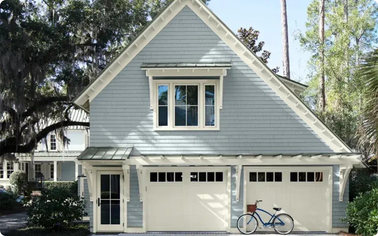
Gray has become one of the most popular choices for exteriors, and it’s not hard to see why.
The versatility, elegance, and timeless appeal of gray can transform a home’s curb appeal, giving it a contemporary feel or a classic charm, depending on how you use it.
Whether you’re working with a cozy cottage, a sprawling modern estate, or a traditional farmhouse, gray paints can be the perfect fit for every style.
The right shade can enhance the architectural features of your home, complement its surroundings, and adapt beautifully to changing seasons and lighting conditions.
In this post, I’ve rounded up the 25 best gray paint colors for exterior use, so you can find the perfect hue to refresh your home’s exterior and make a lasting impression on visitors.
Also Read: 15 Best Front Door Colors for Gray Houses
What Paint Finish Should I Use on the Outside of My House?
Choosing the right finish for your exterior paint is just as important as selecting the color itself.
The finish determines the sheen of the paint, how it holds up over time, and how easy it is to maintain.
Here’s a breakdown of the most common exterior paint finishes and how they affect the appearance and durability of your home:
1. Flat/Matte:
Flat finishes are non-reflective and give a smooth, velvety appearance. While this finish can be great for hiding imperfections on older homes, it’s less durable and harder to clean than other finishes. It’s often used for areas that are less exposed to the elements or for an elegant, understated look on siding. However, it may not be the best choice for areas with high moisture or dirt buildup.
2. Eggshell:
Eggshell offers a soft, low sheen that is more durable and easier to clean than flat finishes. This makes it a popular choice for exterior walls, especially for homes that may experience moderate weathering. It’s a great balance between appearance and functionality, providing a subtle shine without being too glossy.
3. Satin:
Satin finishes are slightly glossier than eggshell, offering a bit more shine. They are ideal for surfaces that require more durability, such as trim, shutters, and doors. Satin finishes are easy to clean and can withstand the elements while still maintaining a beautiful sheen.
4. Semi-Gloss:
Semi-gloss finishes are highly durable and reflect more light, making them excellent for high-traffic areas and surfaces that endure moisture, like doors, windows, and trim. This finish is easy to clean and resists mildew, but it can show imperfections more easily than satin or eggshell.
5. High Gloss:
The most reflective and shiny of all finishes, high gloss is often used for trim, doors, and accents. While it’s highly durable and easy to clean, it does tend to highlight imperfections on surfaces, so it’s important to have a smooth, well-prepared surface before applying this finish.
For most exteriors, a combination of finishes works well: matte or eggshell for walls and satin or semi-gloss for trim, shutters, and doors. Choosing the right finish will depend on your home’s style, the amount of foot traffic, and how much weather exposure your surfaces get.
How Many Colors Should Be in an Exterior Color Palette?
When it comes to an exterior color palette, less is often more. A well-curated exterior palette typically consists of three to four colors, with each color serving a specific purpose. Here’s a basic guide to help you decide how many colors to include:
1. Primary Color:
This will be the dominant color, typically applied to the main body of the house. It’s the first color that people will notice, and it sets the tone for the overall exterior.
For example, if you’ve chosen a warm gray like Sherwin-Williams’ Agreeable Gray, that will be your main hue.
2. Trim Color:
The trim color adds contrast and highlights architectural details like window frames, doors, and moldings. This color should either complement or contrast the primary color.
A light, neutral trim (like white or cream) often works well with darker or medium tones of gray, offering a clean, fresh look.
3. Accent Color:
Accent colors are used sparingly to create focal points or highlight special architectural elements. These colors are typically applied to front doors, shutters, or outdoor furniture.
Bold accents, such as a deep navy, dark green, or rich burgundy, can add personality and interest to your exterior palette.
4. Optional Fourth Color:
If you have additional architectural elements like stonework, a porch, or a fence, you may consider adding a fourth color to balance the design.
This could be a complementary color or a different shade of your primary color. For example, you might introduce a warm taupe or deep charcoal to blend with your gray tones.
💥🎁 Christmas & Year-End Deals On Amazon !
Don't miss out on the best discounts and top-rated products available right now!
*As an Amazon Associate, I earn from qualifying purchases.
How to Choose the Best Gray Exterior Paint Colors?
Choosing the right gray paint for your home’s exterior can be a daunting task, especially with so many shades available.
Gray is a complex color that can take on different personalities depending on its undertones and how it interacts with natural light.
Here’s a step-by-step guide to help you select the best gray for your home:
1. Consider Your Home’s Architecture:
The architecture of your home should influence your color choice. Traditional and colonial-style homes often look best with grays that have subtle, warm undertones, like Benjamin Moore’s Boothbay Gray.
Modern homes, on the other hand, may benefit from cooler grays, such as Sherwin-Williams’ Repose Gray, for a sleek, contemporary look.
2. Look at Undertones:
Every gray has its own undertones—some lean cool with blue or green undertones, while others are warmer with hints of brown or beige. Think about the overall mood you want to create.
Cool grays (like Behr’s Anonymous) tend to create a calm, serene atmosphere, while warmer grays (like Valspar’s Oatlands Subtle Taupe) can create a cozy, inviting feel.
3. Examine Your Home’s Surroundings:
Your home’s exterior will be influenced by its surroundings, including the landscape, neighborhood, and weather. If you live in a sunny, bright area, you may want to choose a gray that reflects the light well, like Behr’s Gateway Gray, to avoid the color looking too dull.
For homes in cooler, cloudier climates, a deeper gray like Sherwin-Williams’ Dorian Gray might add the warmth needed to keep things from feeling too bleak.
4. Test the Color in Different Lighting:
Gray can look drastically different depending on the time of day and the direction your house faces. Test your chosen gray in various lighting conditions, from direct sunlight to cloudy or shaded areas, to see how it looks throughout the day.
Colors like Benjamin Moore’s Stonington Gray can change significantly depending on natural light, so it’s essential to observe it in different conditions.
5. Think About the Trim and Accents:
Your gray choice will look different with various trim and accent colors. White or light gray trim pairs well with almost any shade of gray, while black trim creates a bold, striking contrast.
Natural wood accents can bring out the warmth in a cooler gray, or you can opt for metallic accents for a modern flair.
Top 25 Gray Paint Colors for Exterior
Here are my 25 favorite Gray paint colors for exterior. From light, airy grays to rich, deep hues, these shades will help you achieve a beautiful and harmonious exterior that stands out for all the right reasons.
Behr Grays
Behr is a trusted paint brand known for its high-quality formulations that deliver long-lasting color and protection.
Whether you’re tackling an interior or exterior project, Behr offers a wide range of hues and finishes that suit every style, from modern to traditional.
With a focus on durability and ease of application, Behr’s paints are ideal for homeowners seeking value without compromising on quality.
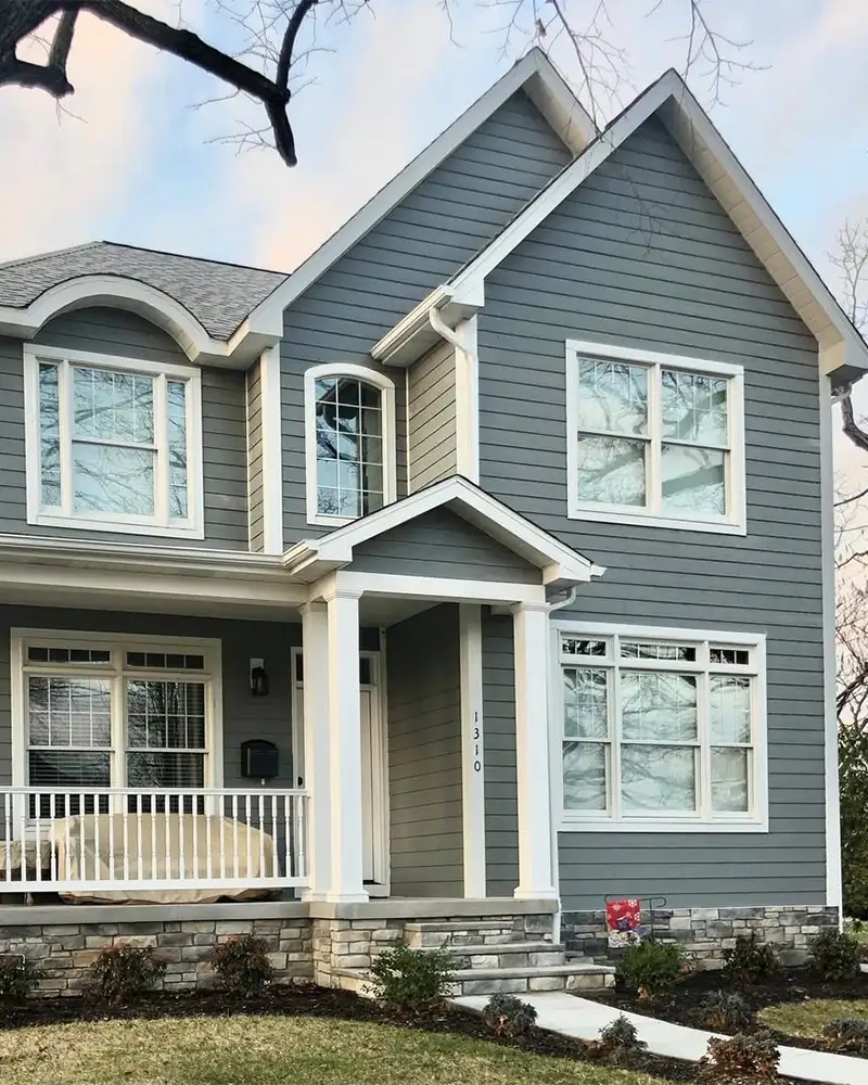
1. Gateway Gray MQ6-22
Gateway Gray is one of those chameleon grays that always seems to get it right. Sitting in the mid-tone range, it leans just warm enough to feel welcoming without slipping into beige territory.
This makes it a fantastic choice for homeowners looking to freshen up a traditional exterior—think Craftsman, Colonial, or even a rustic farmhouse.
Gateway Gray performs particularly well in full sun, where its warmth softens against stone or brick accents.
It can sometimes read a touch taupe in low light, so it’s ideal for homes that get steady daylight exposure. Pair it with creamy trim and deep charcoal shutters for timeless curb appeal.
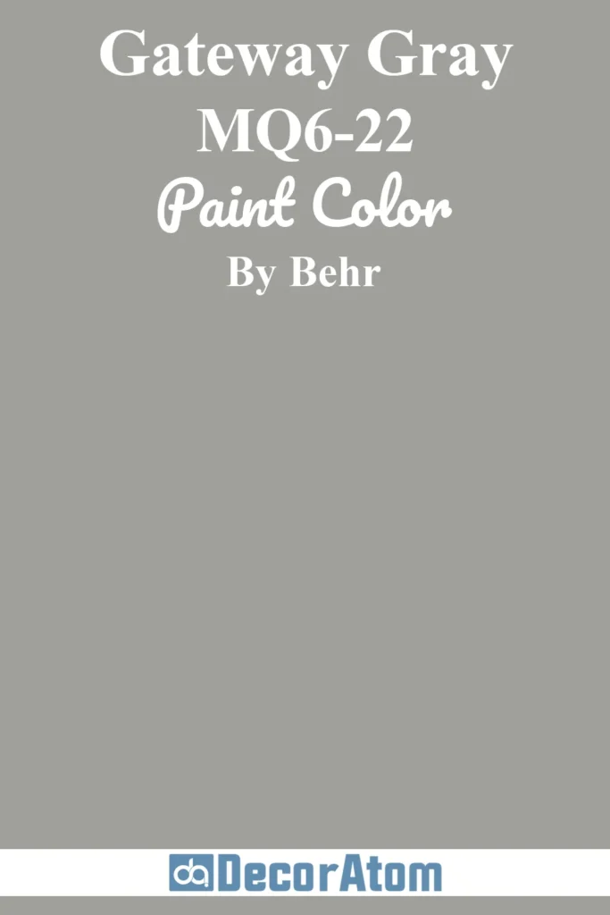
2. Anonymous 780F-5
💥🎁 Christmas & Year-End Deals On Amazon !
Don't miss out on the best discounts and top-rated products available right now!
*As an Amazon Associate, I earn from qualifying purchases.
Anonymous lives up to its name—it’s subtle, understated, and quietly bold. This deep, earthy gray has taupe and brown undertones that create a cozy yet modern look on exteriors.
It shines on bungalows, mid-century ranch homes, or even contemporary cabins surrounded by greenery. Because it’s a darker gray, Anonymous holds its color beautifully in strong sunlight and doesn’t wash out easily.
It also hides dust and weather wear well, making it a practical and stylish option. Use it as a main body color with crisp white trim or go tone-on-tone with wood and natural elements.
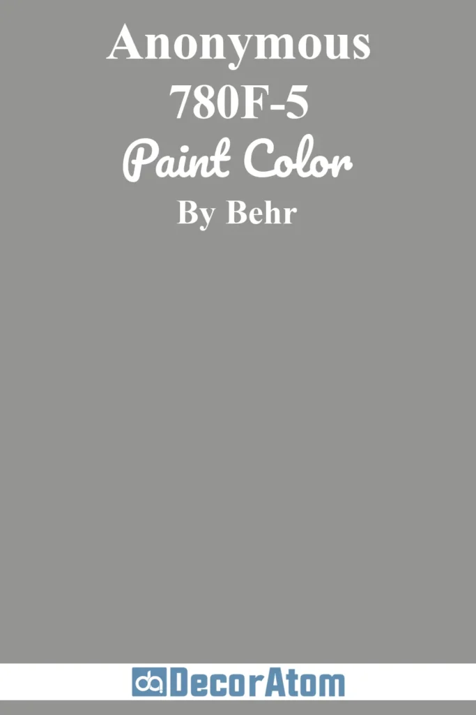
3. Porpoise 790E-3
Porpoise is the kind of gray that feels like a cozy sweater on a cool day—there’s comfort in its depth. With subtle brown and even violet undertones, it leans warm but doesn’t feel muddy.
This makes it a great fit for transitional-style homes or stucco exteriors that need a grounded neutral to anchor their design.
In bright sun, Porpoise tends to soften, allowing its warmer tones to peek through, while on cloudy days it takes on a moodier cast.
It pairs well with soft whites, muted blues, or even deep navy shutters for a more coastal look.
4. Mined Coal PPU18-18

If you want a dramatic exterior that still reads neutral, Mined Coal is your color. This deep charcoal has cool, steely undertones, giving it a crisp edge that suits contemporary and urban farmhouse styles.
It plays beautifully off crisp white trim, black windows, and industrial accents. In full sunlight, Mined Coal can pick up hints of slate blue, which adds to its dimensionality.
It holds its richness even in shaded areas, making it a reliable choice for exteriors with a mix of light conditions. Think dramatic without being harsh—this color is all about impact.
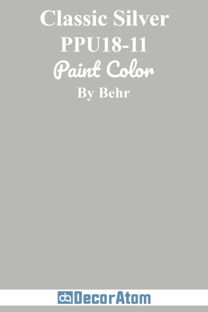
5. Classic Silver PPU18-11
💥🎁 Christmas & Year-End Deals On Amazon !
Don't miss out on the best discounts and top-rated products available right now!
*As an Amazon Associate, I earn from qualifying purchases.
Classic Silver has that sleek, cool vibe that works well on minimalist or contemporary homes. It’s a light gray with blue undertones, which gives it a subtle icy edge.
This color excels in full sun where it feels bright and reflective, adding a crispness to facades without appearing sterile.
Classic Silver can occasionally look almost white depending on the time of day, making it a great option for homes in hotter climates that benefit from lighter exteriors.
It pairs well with black, navy, or deep charcoal accents to balance its lightness.
Benjamin Moore Grays
Benjamin Moore is renowned for its premium paints that provide superior coverage, richness, and depth of color.
Known for their durability and exceptional finish, Benjamin Moore’s products are often favored by both professionals and DIY enthusiasts.
The brand’s extensive color palette, including classic grays and sophisticated neutrals, makes it a top choice for those seeking a refined, long-lasting exterior.
6. Silver Gray 2131-60
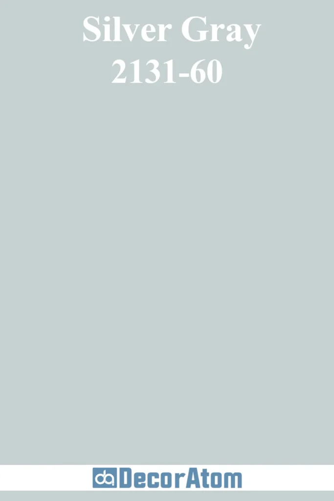
Silver Gray is fresh, soft, and effortlessly elegant. Its noticeable blue undertones make it a go-to for coastal or Cape Cod–style homes, but it also looks lovely on traditional siding or stucco.
Because it’s a light gray, Silver Gray benefits from ample sunlight, where it appears crisp and clean. In shaded areas, its blue undertones become more apparent, offering a calming effect.
For a classic pairing, use it with white trim and navy shutters—or add wood elements for a nautical-meets-natural twist.
7. Boothbay Gray HC-165
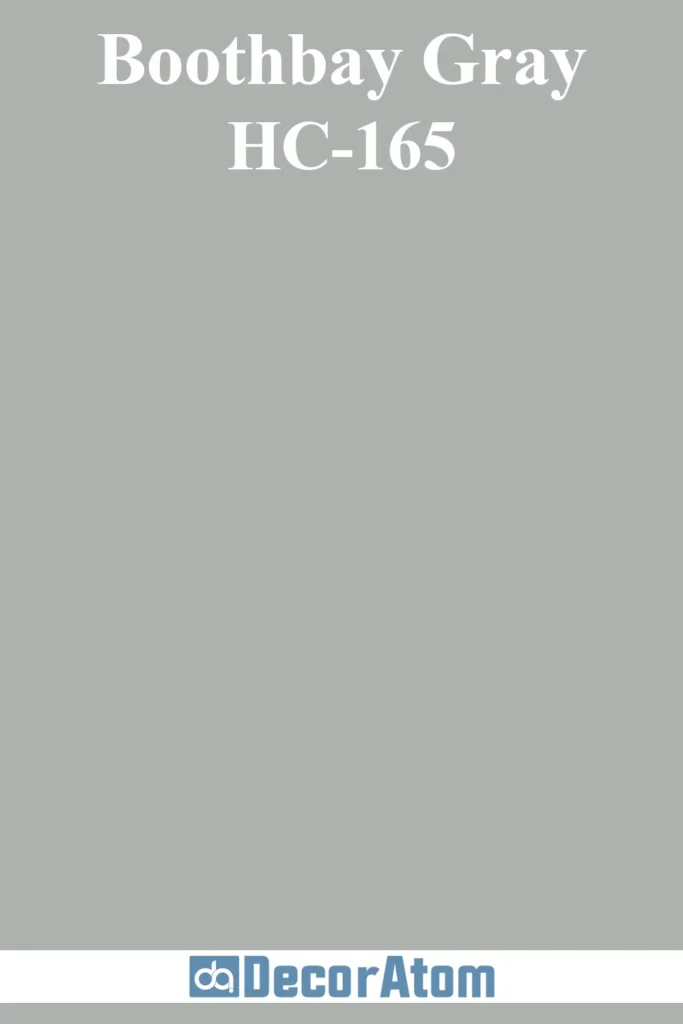
Boothbay Gray is one of those universally appealing colors that works just as well on a Maine cottage as it does on a suburban Colonial.
With its distinct blue-gray blend, it reads cool but never cold, offering a serene presence on any exterior. It looks stunning in both sunny and shaded environments, though in strong sunlight it leans slightly bluer.
It’s ideal for homes with natural stone features or wood porches, and it pairs effortlessly with crisp whites or rich navy accents. A timeless choice for those who want subtle character without being flashy.
8. Stonington Gray HC-170

💥🎁 Christmas & Year-End Deals On Amazon !
Don't miss out on the best discounts and top-rated products available right now!
*As an Amazon Associate, I earn from qualifying purchases.
Stonington Gray is one of Benjamin Moore’s most popular grays for good reason—it nails that neutral sweet spot.
It’s light enough to brighten an exterior but grounded enough to feel sophisticated. The faint blue undertones give it a slight coolness, but not so much that it feels icy.
On traditional homes like Colonials, Georgian-style houses, or even modern farmhouses, Stonington Gray offers understated elegance.
It looks especially polished when paired with white trim and black accents, offering contrast without clashing.
9. Rockport Gray HC-105
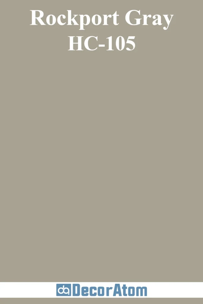
Rockport Gray is the color equivalent of stonewashed linen—classic, textured, and full of subtle variation. It has warm undertones that flirt with taupe, making it a welcoming option for exteriors.
This gray feels natural and grounded, particularly on homes surrounded by trees or landscaping. It works beautifully on Craftsman bungalows, historic homes, or ranch styles.
In sunlight, the warmth rises to the surface, while in shade it takes on a richer, deeper tone. Pair it with off-white trim and muted greens or blues for a sophisticated palette.
10. Kendall Charcoal HC-166
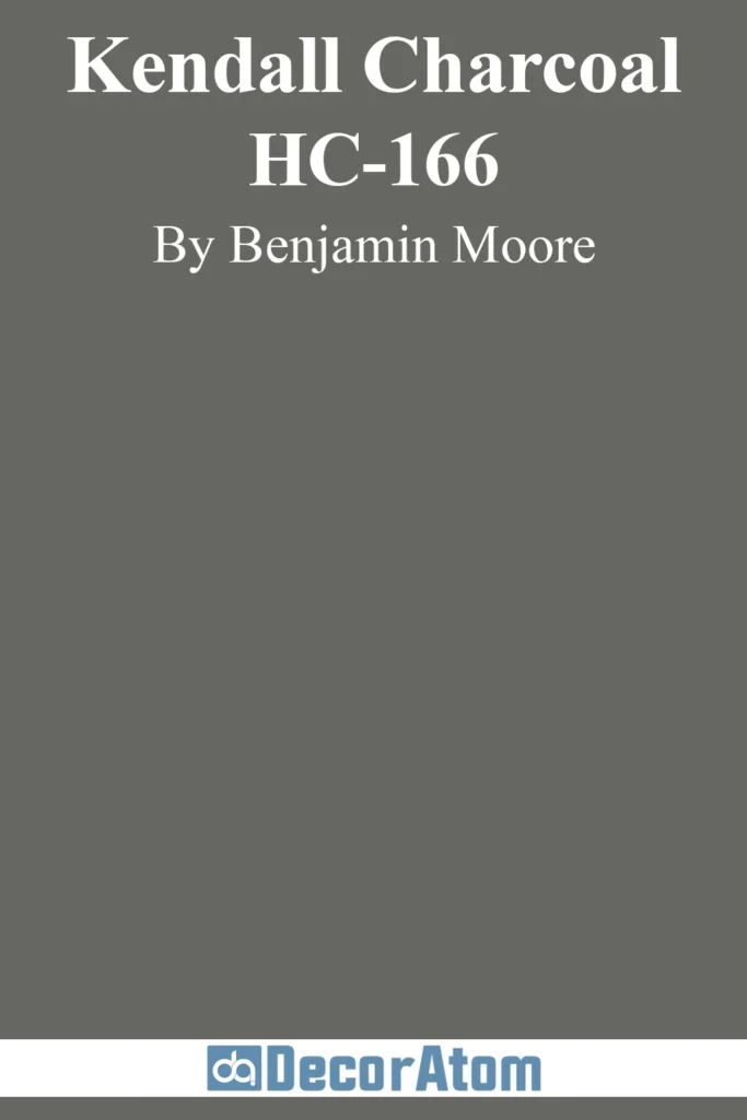
Kendall Charcoal is a powerhouse gray. It’s rich, saturated, and just dark enough to feel dramatic without veering into black.
What makes it stand out is its slightly earthy undertone—a subtle green that gives it depth and connection to nature. It’s a favorite for traditional homes, especially when paired with stonework or wood detailing.
In strong light, it holds its bold character beautifully, and in the shade, it becomes even more stately. This is a great choice for homeowners looking to make a bold, elegant statement.
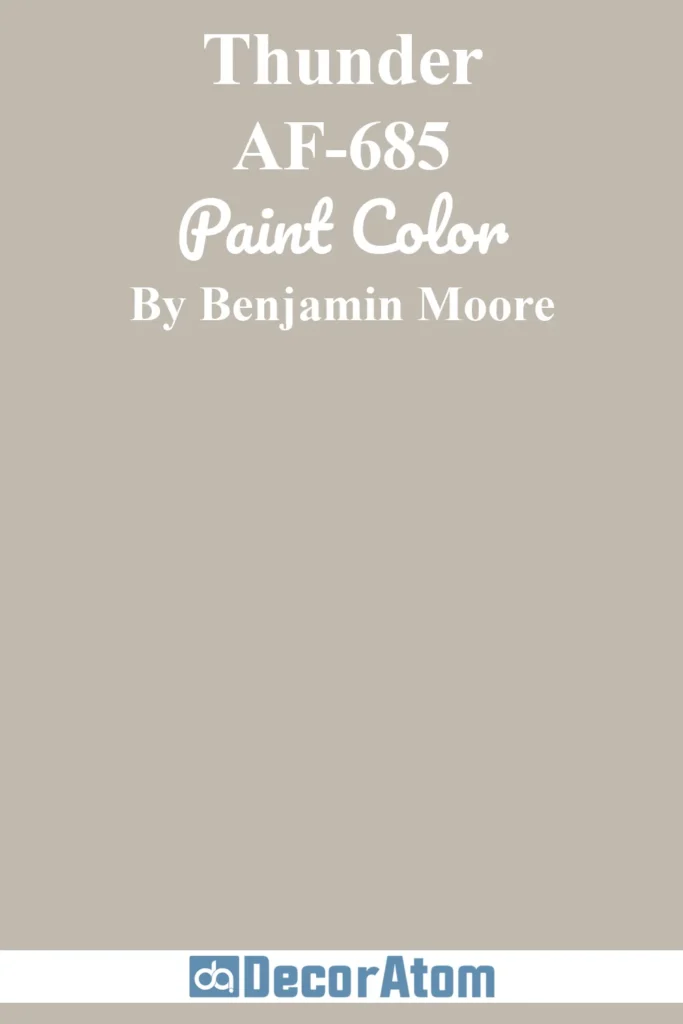
11. Thunder AF-685
💥🎁 Christmas & Year-End Deals On Amazon !
Don't miss out on the best discounts and top-rated products available right now!
*As an Amazon Associate, I earn from qualifying purchases.
Thunder walks the line between gray and greige with finesse. It has just enough taupe to warm it up, which makes it feel approachable and modern.
On exteriors, Thunder reads as a soft, lived-in gray that doesn’t scream for attention—but it always looks polished. In sunlight, it takes on a warm, almost creamy tone, while shaded areas bring out more of its gray base.
It’s a smart pick for transitional homes or modern craftsman styles, especially when paired with off-white or charcoal trim for contrast.
12. Storm AF-700
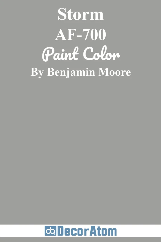
Storm is aptly named—it feels like a summer thunderstorm rolling in on the horizon. This darker gray has cool blue undertones that give it a sleek, dramatic edge.
Perfect for contemporary homes, urban townhouses, or statement-making renovations, Storm stands up well to sunlight without fading or flattening.
Its blue tones become more pronounced in cloudy or low-light conditions, adding to its atmospheric effect.
Pair it with bright white trim or soft wood tones for a look that’s both bold and balanced.
Sherwin-Williams Grays
Sherwin-Williams is a leading name in the paint industry, offering a vast selection of colors and superior coatings for both residential and commercial use.
With its reputation for producing high-performance, fade-resistant finishes, Sherwin-Williams paints are perfect for homes exposed to harsh outdoor elements.
The brand’s wide variety of shades and formulations ensures a perfect match for any exterior style, from modern to classic.
13. Repose Gray SW 7015

Repose Gray is one of Sherwin-Williams’ most beloved neutrals, and it absolutely earns its reputation on exteriors.
It sits in that magical space between warm and cool—technically a greige, but light enough to read gray in most lighting.
Its mild warmth comes from soft beige undertones, which help it feel inviting without ever appearing muddy. On exteriors, it’s a brilliant choice for modern farmhouses, colonials, and even craftsman homes.
In bright sunlight, Repose Gray stays light and fresh without looking stark, while in shade it takes on a slightly cozier tone. It pairs beautifully with white trim, black accents, and even soft blues or greens for a layered, timeless look.
14. Agreeable Gray SW 7029
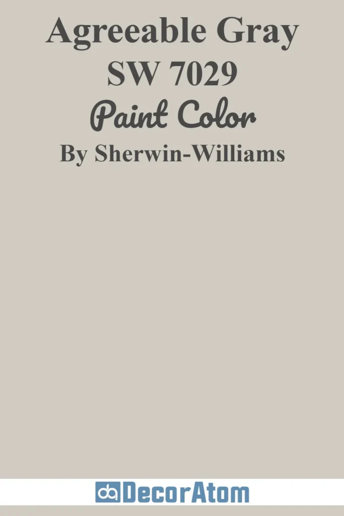
Agreeable Gray is the color equivalent of good taste—it’s dependable, flexible, and never too much. It has subtle beige undertones that place it firmly in the warm gray (or greige) family, which helps it feel cozy and approachable.
On exteriors, it’s perfect for those who want a neutral look with warmth and softness. It’s particularly stunning on stucco homes, transitional styles, or brick houses where a gentle contrast is needed.
Agreeable Gray doesn’t change dramatically in different lighting, which is part of its appeal—it’s consistent and calming from sunrise to sundown.
White trim adds a clean frame, but you can also pair it with wood tones or deeper earth tones for extra depth.
15. Mindful Gray SW 7016

Mindful Gray is like a slightly deeper, more confident sibling to Repose Gray. It’s a warm gray with faint taupe and green undertones that keep it grounded and earthy.
This makes it a fantastic choice for exteriors in wooded settings, or homes with stone, brick, or other organic materials.
Because it’s a touch darker than many standard grays, it offers more contrast against bright white trim or darker accents like black shutters.
In full sun, Mindful Gray lightens up and looks clean and neutral.
In shaded spots or on cloudy days, the warmth comes forward, giving it a cozy, classic feel. Ideal for ranches, cottages, and even modern designs looking for subtle warmth.
16. Anew Gray SW 7030
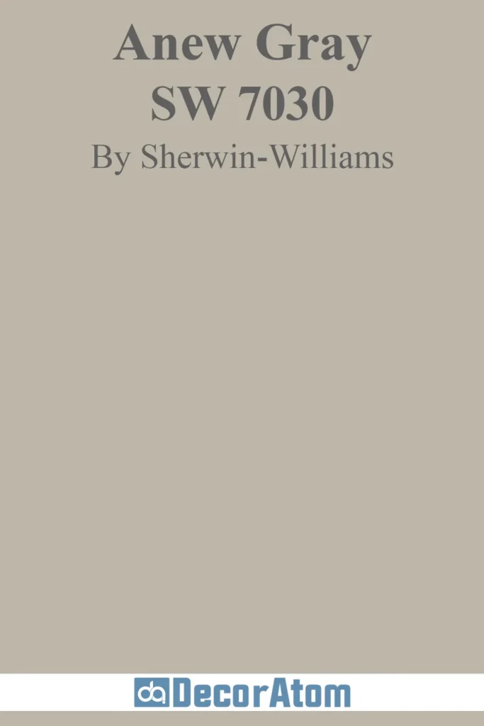
Anew Gray brings a hint of traditional elegance to exteriors thanks to its pronounced beige undertone.
It’s warmer than Repose or Mindful Gray, which makes it an excellent fit for homes in cooler climates where a little extra warmth on the exterior goes a long way.
This color is perfect for brick homes, transitional builds, or older homes undergoing an update. It holds up well in full sun, staying soft without washing out, and it looks especially harmonious with landscaping that leans green or earthy.
Pair it with off-white trim and bronze or deep charcoal accents for a curated, upscale look.
17. Amazing Gray SW 7044
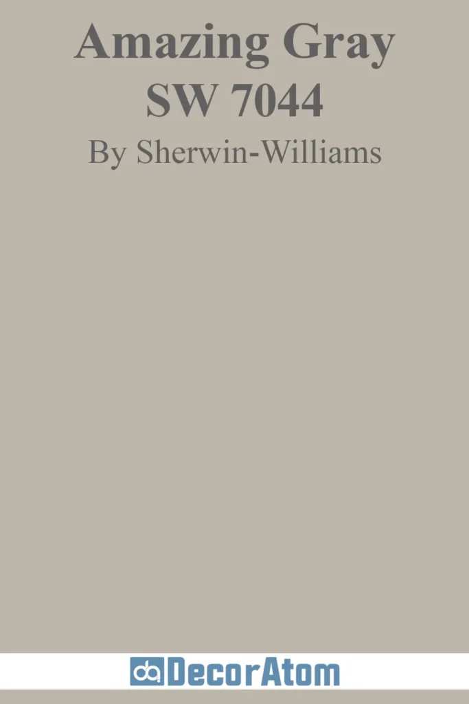
Amazing Gray lives up to its name when used on exteriors—it’s understated but strong, and has an earthy depth that gives a home substance without feeling too dark.
It has warm green-beige undertones that make it ideal for pairing with natural materials like wood siding, cedar shakes, or stone.
It tends to read warmer in bright sun and more neutral in shade, but it never gets too yellow or too cool. This makes it a reliable option for homeowners who want a slightly deeper neutral with timeless appeal.
It works well on craftsman bungalows, mountain homes, or even mid-century ranches with natural landscaping.
18. Worldly Gray SW 7043

Worldly Gray is one of those colors that effortlessly blends into just about any setting—it’s neither too cool nor too warm, making it a reliable middle-ground neutral.
On exteriors, this translates to a color that looks polished without screaming for attention.
It has subtle green-beige undertones that shift gently depending on the light: sunnier exposures draw out more of its beige warmth, while shaded areas reveal a softer grayness.
It’s especially flattering on stucco homes, two-story traditionals, or any house looking for a calm, collected backdrop. Pair with soft white trim, warm stone, or weathered wood for maximum charm.
19. Dorian Gray SW 7017

Dorian Gray offers a slightly darker take on warm gray—rich without being overwhelming, grounded without being muddy.
It has brown undertones that give it a sense of stability and structure, making it an ideal choice for homes that need a bit more visual weight on the exterior.
It’s a favorite for Tudor-style homes, modern colonials, or even bold contemporary facades. In full sunlight, Dorian Gray can take on a light warmth, while in shadow, it turns more charcoal and moody.
It pairs well with light stone, off-white trim, or even brick accents, depending on how much contrast you’re after.
20. Mega Greige SW 7031
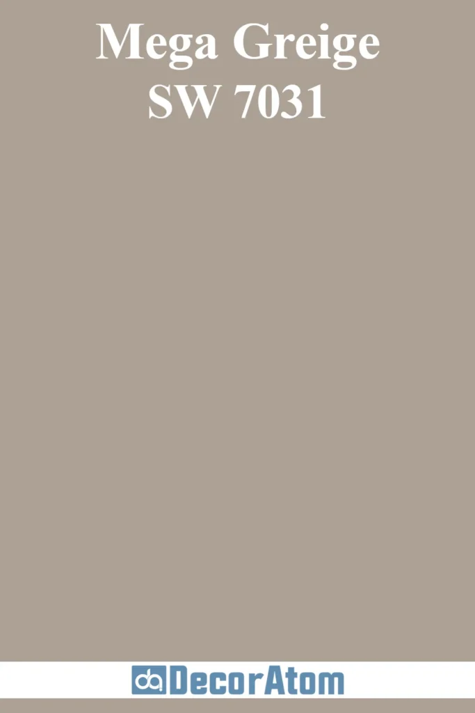
Mega Greige is not shy—it’s bold, cozy, and brings major depth to a home’s exterior.
With its rich taupe-brown undertones, it works beautifully on homes where warmth is key: think Mediterranean, Southwestern, or even updated ranches with earthy materials.
Mega Greige looks especially good in morning and afternoon light, where its undertones create an almost velvet-like softness.
In shade, it becomes more grounded and neutral, which adds to its versatility. It pairs beautifully with cream, black, or even olive-green accents for a nature-inspired look that still feels modern.
Valspar Grays
Valspar is known for its high-quality, affordable paints that deliver beautiful, durable results.
Offering an impressive range of colors and finishes, Valspar’s products are designed to provide excellent coverage and long-lasting protection.
Whether you’re updating a traditional home or refreshing a contemporary exterior, Valspar offers options that are both easy to apply and built to withstand the test of time.
21. Polished Silver 4008-1B
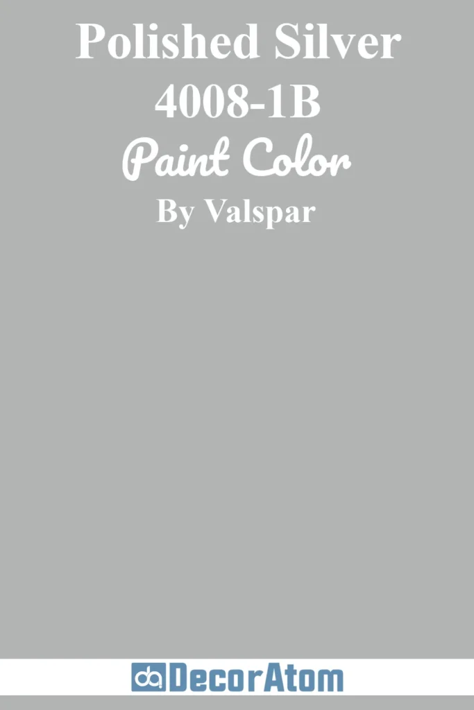
Polished Silver is a pale, silvery gray with a soft blue undertone that makes it feel almost ethereal in bright outdoor light.
On exteriors, this shade brings a crisp, clean appearance without feeling sterile. It’s ideal for cottages, coastal homes, or any house that could use a bright lift.
What makes it work so well outside is its reflective quality—this color bounces light in a way that helps smaller homes appear larger or gives shaded areas a gentle glow.
It pairs wonderfully with bright white trim, soft navy shutters, or even pale wood tones for a breezy, coastal-inspired look.
22. Voyage 4006-1B
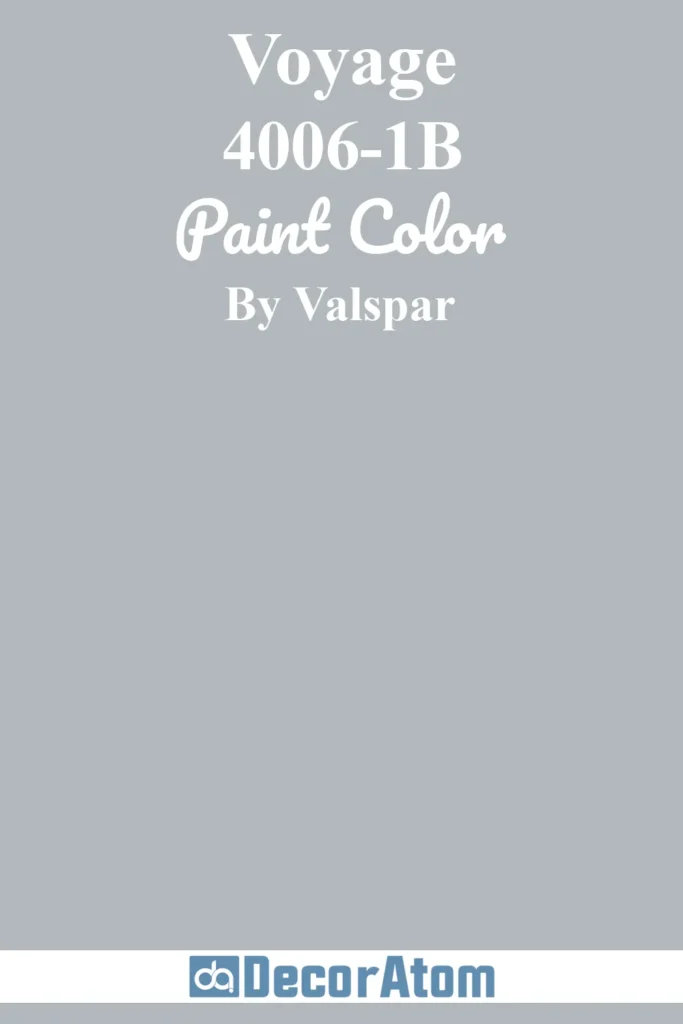
Voyage leans into the blue side of gray, which gives it a tranquil, almost foggy character.
It has enough saturation to stand out against white trim but isn’t so bold that it feels out of place on a traditional home.
This makes it a fantastic option for colonial revivals, beach houses, or even cabins where a sense of calm is part of the appeal.
In sunlight, Voyage shows more of its silvery-blue hue; in the shade, it reads slightly cooler, like a soft storm cloud.
It pairs well with both crisp white and darker grays or navy accents for a layered, harmonious look.
23. Urban Sunrise 4004-1B
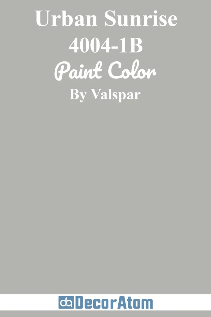
Urban Sunrise is a great “middle of the road” gray that doesn’t veer too cool or too warm. Its neutral-to-warm undertones make it incredibly adaptable for a range of exterior styles, especially modern and transitional homes.
In bright sunlight, it stays soft and grounded, without shifting too much in tone. In overcast conditions or shadow, it reveals a slightly taupe base that keeps it from feeling flat.
Urban Sunrise is especially handsome with black or bronze windows, natural wood accents, or warm white trim. It’s polished and modern, but still approachable—perfect for curb appeal that feels current without trying too hard.
24. Woodlawn Colonial Gray 6004-1B
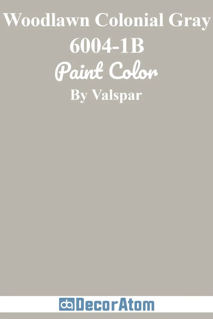
Woodlawn Colonial Gray has a timeless quality to it, rooted in historical palettes but still relevant today.
Its soft green undertone adds just enough warmth and complexity to make it feel interesting without overwhelming.
On exteriors, it’s a lovely match for colonial, craftsman, or farmhouse architecture—especially when paired with crisp white trim or black shutters.
This color works beautifully in natural settings and against stone or brick, offering a muted, natural elegance.
In bright sun, the green undertone gently surfaces, adding subtle charm. In shade, it leans slightly cooler but never goes icy or stark.
25. Oatlands Subtle Taupe 6005-1B
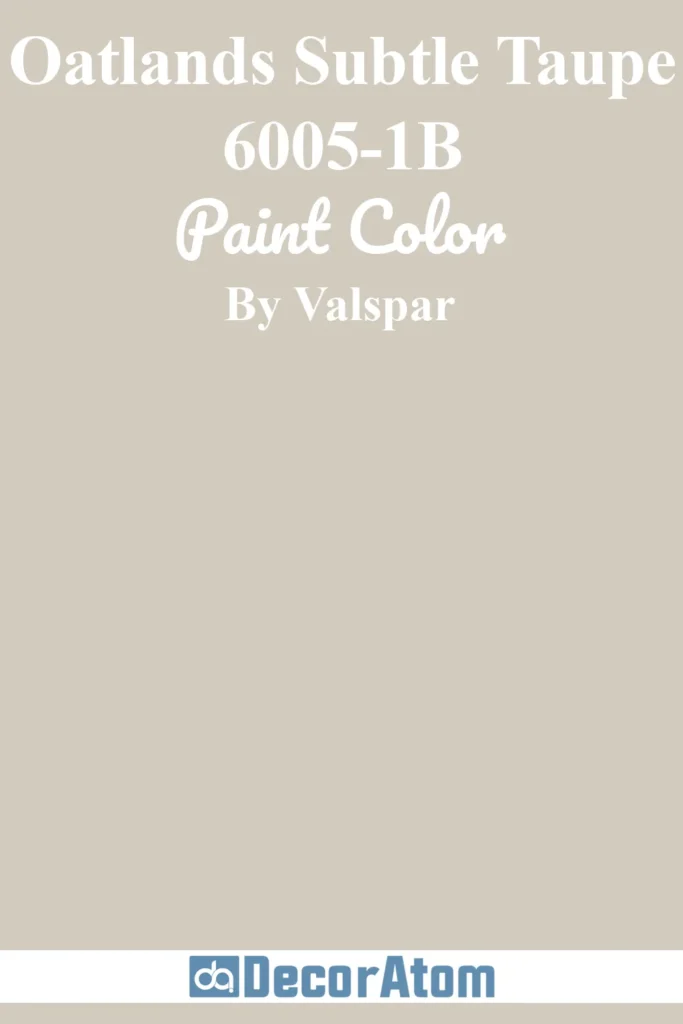
Despite the name “taupe,” Oatlands Subtle Taupe reads very much like a warm gray on exteriors.
It has beige-brown undertones that make it an ideal choice for homeowners who want the look of gray with a little more body and coziness.
This shade shines on traditional and transitional homes, especially those with warm stone, brick, or wood detailing.
In bright light, it softens beautifully without washing out; in shaded areas, it leans more toward a moody taupe, which adds depth and character.
It works well with creamy whites, warm charcoals, and muted green or bronze accents for a rich, layered look.