
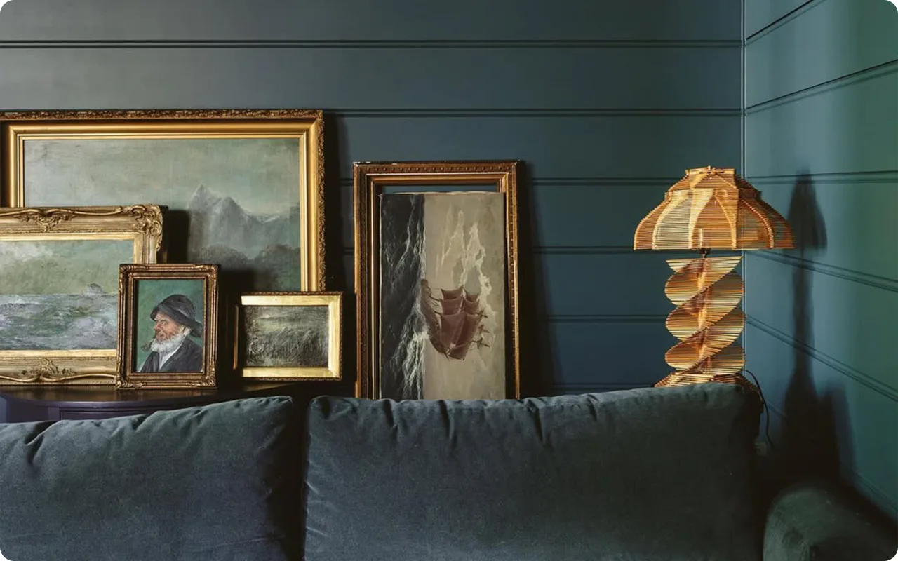
Dark green paint colors have a way of pulling you in.
They’re bold without being loud, dramatic without feeling cold, and they bring this rich, earthy depth that’s hard to resist.
I’ve been noticing more people gravitating toward dark greens lately—not just for accent walls, but for kitchen cabinets, exteriors, dining rooms, and even entire bedrooms.
What I love most about dark green is its range.
Some shades lean forest green, others have a bit of olive or a moody teal undertone.
You can find dark greens that feel almost black in low light, or others that soften beautifully in the sun.
They’re incredibly versatile—just as fitting in a modern home as they are in a classic farmhouse or a cozy cottage.
In this post, I’m sharing 21 of my favorite dark green paint colors.
These are the shades that I’ve seen work beautifully in real spaces—colors that add depth, character, and a sense of calm.
Some are bold and dramatic, others a bit more subtle, but every single one earned its spot on this list.

What are Dark Green Paint Colors?
Dark green paint colors are rich, deep shades of green that often pull inspiration from nature—think dense forests, mossy stones, pine trees, or deep jungle leaves.
These tones can range from smoky olive and muted sage to moody hunter green and dramatic teal-leaning shades.
Some dark greens carry blue or gray undertones, while others veer more toward earthy brown or even blackened hues.
What sets dark green apart is its ability to feel grounded and bold at the same time.
It brings depth and character to a room, often acting as a sophisticated alternative to black, navy, or charcoal.
In smaller doses, it can add a cozy, cocoon-like vibe. In larger spaces, it makes a confident, elegant statement.

Where to Use Dark Green Paint Colors
Dark green is incredibly flexible when it comes to where you can use it. If you’re craving drama or coziness, this color knows how to show up. Here are a few of my favorite places where dark green really shines:
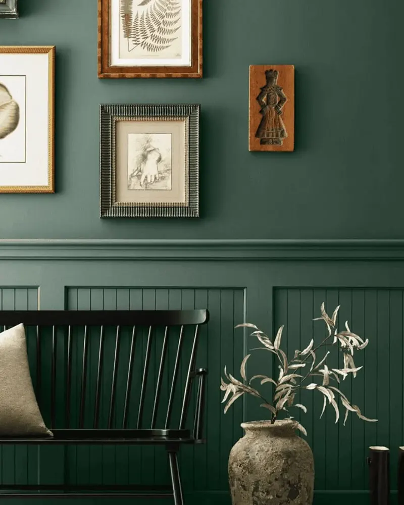
- Living Rooms & Dens: Perfect for creating a moody, relaxing atmosphere. Dark green on the walls can make a space feel grounded and serene, especially when paired with soft neutrals or warm wood tones.
- Kitchens: Green kitchen cabinets—especially in darker shades—are having a serious moment. They feel rich, elegant, and organic. Paired with brass hardware or marble countertops? Dreamy.
- Bedrooms: Want a restful, intimate feel? A dark green bedroom can feel like a cozy retreat, especially with layered textures like linen or velvet.
- Dining Rooms: Dark green brings a sense of formality and warmth to a dining space, especially under dim lighting or candlelight.
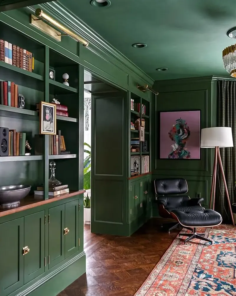
- Offices or Libraries: There’s something about dark green that feels intellectual and focused. It’s a great choice for creating a refined, distraction-free workspace.
You can also use dark green in smaller doses—like an accent wall, on built-in shelves, a powder room, or even on trim or interior doors for a bold but refined twist.
💥🎁 Christmas & Year-End Deals On Amazon !
Don't miss out on the best discounts and top-rated products available right now!
*As an Amazon Associate, I earn from qualifying purchases.
Colors to Pair with Dark Green
Dark green is more versatile than many people expect—it pairs beautifully with a wide variety of colors. Here are some of the most compelling combinations:
- Warm Whites & Creams: Soft, warm whites help balance the richness of dark green and make it feel fresh rather than heavy.
- Earthy Neutrals: Think taupe, terracotta, or greige. These tones keep things grounded and cozy.
- Brass & Gold: When it comes to fixtures and hardware, nothing pairs with dark green quite like warm metallics. They add just the right touch of glam.
- Wood Tones: From rustic oak to dark walnut, natural wood brings out the organic quality in green paint.
- Black & Charcoal: These high-contrast pairings can feel dramatic and modern—especially in contemporary or urban interiors.
- Soft Pinks or Muted Mauves: For a more unexpected combo, muted blush tones or dusty rose can add a romantic, vintage-inspired twist to deep green walls or cabinets.
- Navy or Teal: Dark green plays surprisingly well with other deep colors, especially those in the blue family. Together, they feel rich, layered, and collected.
Tips for Choosing The Best Dark Green Paint Colors
Choosing the perfect dark green can be trickier than it looks—undertones, lighting, and finish all play a big role. Here are a few tried-and-true tips to help narrow things down:
- Pay Attention to Undertones
Some dark greens lean cool with blue or gray undertones, while others lean warm with hints of olive or brown. Look at the other fixed elements in your space—like flooring, countertops, or furniture—to figure out which undertone will complement the rest of the room. - Test in Natural & Artificial Light
Always sample your paint color on the wall (and not just on the swatch). Watch how it looks at different times of day. A green that looks moody and luxe in the afternoon might read too gray or even almost black at night. - Consider the Finish
For walls, a matte or eggshell finish can keep the look soft and cozy, while satin or semi-gloss is great for cabinets or trim where durability matters. A higher sheen can slightly deepen the color and make it appear richer. - Think About the Room’s Mood
Want a bold, modern look? Try a dramatic green with cool undertones like teal or forest green. Going for a cozy, heritage-inspired feel? Reach for an olive or blackened green.
The Best Dark Green Paint Colors
Here are my favorite Dark Green paint colors to decorate with.
1. Farrow & Ball Monkey Puzzle

Monkey Puzzle by Farrow & Ball is one of those rich, inky greens that instantly elevates a space.
It’s deep and intense, bordering on black in dim light, but with enough green presence to give it warmth and personality.
The hue itself leans toward a cool forest green, but with a slightly velvety depth that’s distinctly Farrow & Ball—it doesn’t just sit on the wall, it envelops it.
What makes Monkey Puzzle so special is that it walks a fine line between sophisticated and dramatic.
It’s perfect for someone who wants a bold, confident color without going full-on black or navy.
I especially love it in formal dining rooms, powder rooms, or moody libraries—anywhere you want to add a bit of old-world charm or dramatic impact.
And like most Farrow & Ball paints, the finish has a beautiful softness to it that enhances the overall richness.
2. Behr Trailing Vine

💥🎁 Christmas & Year-End Deals On Amazon !
Don't miss out on the best discounts and top-rated products available right now!
*As an Amazon Associate, I earn from qualifying purchases.
Trailing Vine by Behr is a deep, lush green that leans warm with olive undertones—almost like the color of ivy climbing up a sun-soaked wall.
It’s not quite as moody as some darker greens, but it still gives off that grounded, cozy energy that works so well in living spaces or even kitchens.
What I love about Trailing Vine is how versatile it is.
It plays nicely with wood tones, brass fixtures, or creamy whites, but it can also stand alone and create a rich, enveloping backdrop.
This one feels especially inviting because of its earthy, organic undertone.
It has enough saturation to feel bold, but not so much that it overwhelms a room.
It would be a beautiful choice for cabinetry, built-ins, or even a bedroom feature wall if you’re craving that sense of calm and comfort.
3. Behr North Woods
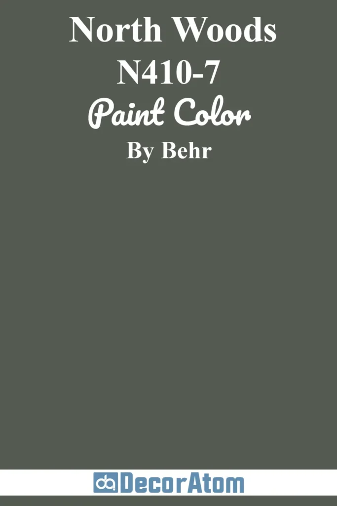
North Woods is Behr’s take on a timeless deep green, and it lives up to the name—it really does feel like stepping into a shadowy forest.
This color is dark and cool-toned, with subtle blue-gray undertones that give it that rich, almost evergreen quality.
If you’re looking for something that feels grounded but also has an air of mystery, this one hits the mark.
It works beautifully in spaces where you want a sense of tranquility and sophistication.
Picture it in a cozy den, a moody guest room, or even as an exterior color against crisp white trim.
North Woods also pairs well with cooler neutrals like soft grays and silvers, but it can take on a totally different personality when paired with warm wood or leather.
4. Sherwin Williams Rookwood Sash Green
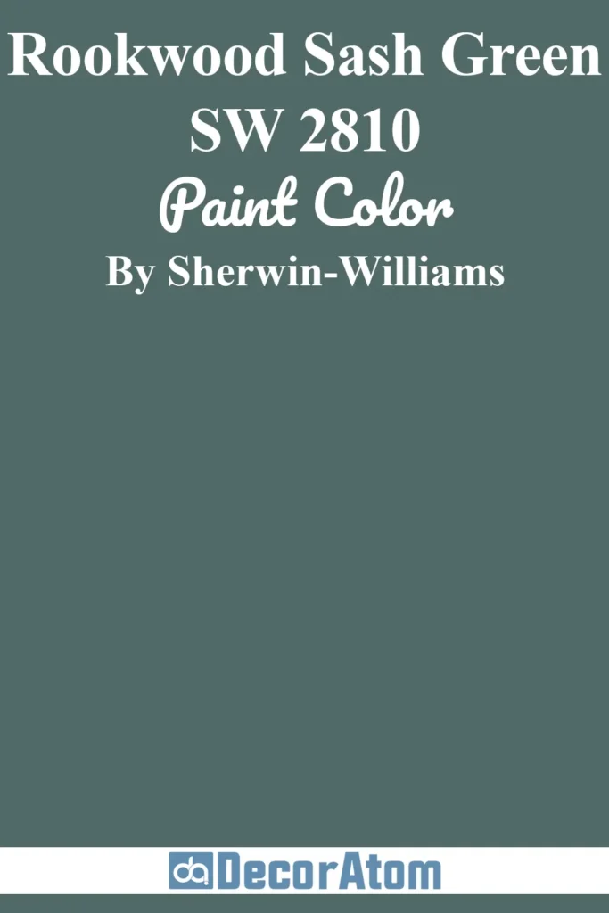
Rookwood Sash Green by Sherwin Williams is one of those historic colors that still feels incredibly relevant today.
It’s a deep olive green with strong brown undertones, giving it that warm, aged patina that feels right at home in vintage-inspired spaces.
What I love most about this shade is its sense of depth—it’s rich without being too dark, and earthy without feeling dull.
It’s a perfect pick for anyone who’s drawn to heritage-style interiors, arts and crafts details, or antique furnishings.
Rookwood Sash Green has a cozy, grounded appeal that makes it feel welcoming and timeless.
It works beautifully on wainscoting, cabinetry, or as a full-wall treatment in an office or dining room.
5. Benjamin Moore Waller Green

💥🎁 Christmas & Year-End Deals On Amazon !
Don't miss out on the best discounts and top-rated products available right now!
*As an Amazon Associate, I earn from qualifying purchases.
Waller Green by Benjamin Moore is one of those hidden gems that deserves more attention.
It’s a deep, slightly muted green with a soft gray undertone that gives it a refined, almost smoky vibe.
It doesn’t scream for attention, but it has this elegant depth that adds so much dimension to a space.
Think of it as a slightly vintage, slightly modern take on traditional hunter green.
This color is perfect if you want something rich but not too saturated—something that feels tailored and subtle.
It looks especially stunning with creamy trim, leather accents, or unlacquered brass hardware.
6. Sherwin Williams Pewter Green

Pewter Green has become one of Sherwin Williams’ standout dark greens for a reason.
It’s moody, stylish, and versatile—with a unique slate-like quality that gives it more depth than a standard forest green.
The undertones here are cool and muted, almost veering into gray-green territory, but there’s still enough green present to feel earthy and grounded.
What I especially love about Pewter Green is how well it works in modern spaces.
It’s a popular pick for kitchen cabinets because it feels both bold and neutral at the same time.
It’s also incredibly soothing in a bedroom, especially when paired with soft linen textures or wood floors.
7. Behr Meteorological

Behr’s Meteorological is one of the most unique dark greens on this list.
It leans into the teal family, with a strong blue undertone that gives it a fresh, slightly stormy edge.
It feels moody and dramatic, but also a little vibrant—like standing on a cliffside during a misty day.
If you’re drawn to jewel tones or want a dark green with a twist, this one’s a standout.
This shade is especially striking in contemporary or eclectic spaces.
Pair it with white oak, warm brass, or even matte black for a dramatic, curated vibe.
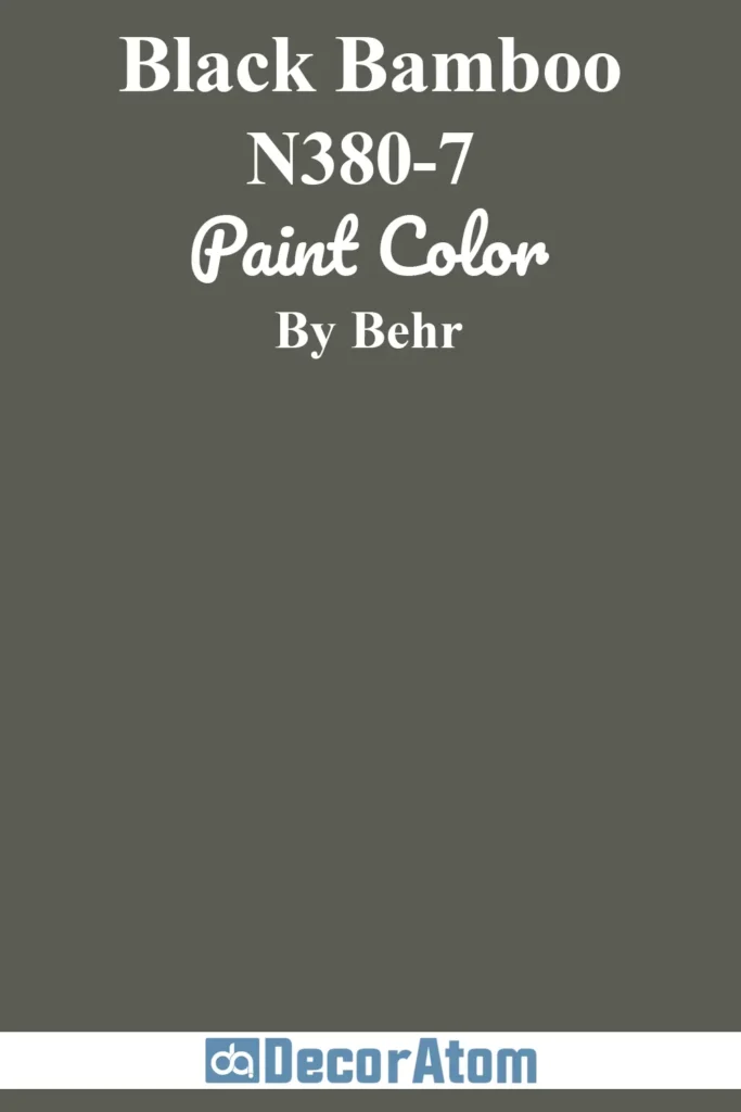
8. Behr Black Bamboo
💥🎁 Christmas & Year-End Deals On Amazon !
Don't miss out on the best discounts and top-rated products available right now!
*As an Amazon Associate, I earn from qualifying purchases.
Black Bamboo is a rich, dark green with a seriously sultry vibe.
It has an almost blackened base, which gives it major depth and drama, but it still reads green in natural light.
This is one of those colors that feels sophisticated and grounded, with just a hint of exotic flair—like the name suggests.
There’s a quiet elegance to Black Bamboo that makes it work beautifully in refined interiors.
Think moody powder rooms, dramatic accent walls, or high-style cabinetry.
It pairs well with muted golds, natural linens, and soft whites.
If you want a bold statement without veering too far into black, this is a gorgeous middle ground.
9. Sherwin Williams Shade Grown

Shade Grown is an earthy, botanical dark green with a strong presence and a touch of mystery.
It feels rooted in nature—almost like the color of thick ivy leaves in the deep shade.
There’s a subtle brown undertone here that keeps it feeling warm and grounded, making it a great choice for cozy, cocoon-like interiors.
This is a color that thrives in spaces where you want to disconnect and unwind.
It’s stunning in a bedroom or reading nook, and it adds a ton of character to cabinetry or built-ins.
What I appreciate most about Shade Grown is its organic, unfussy quality—it’s bold, but it still feels approachable.
10. Benjamin Moore Caribbean Teal
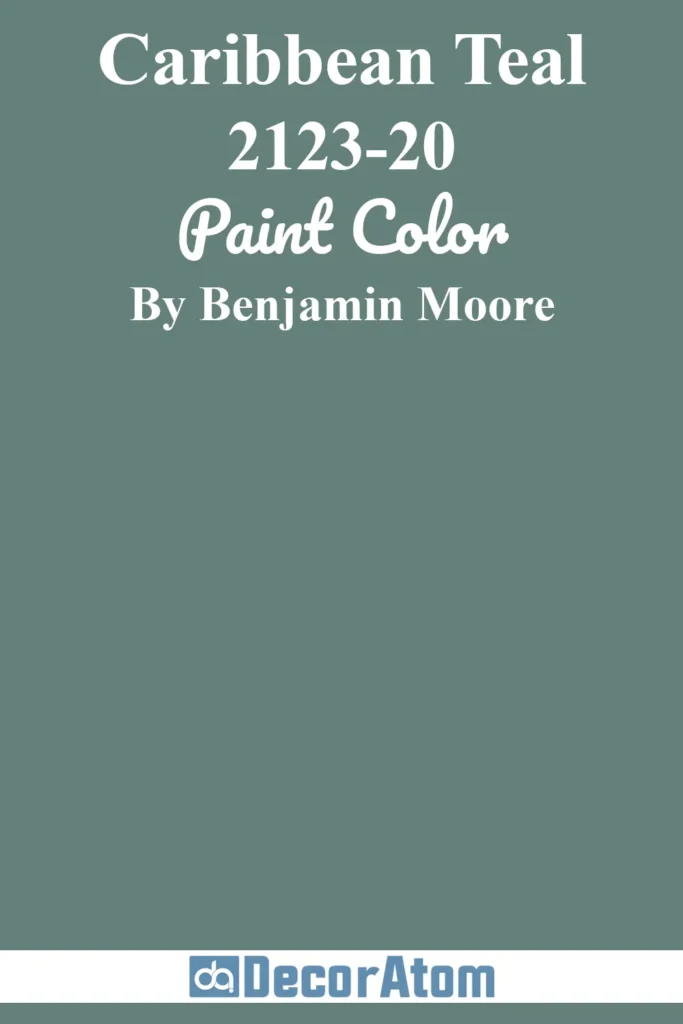
Caribbean Teal is a lush, saturated color that sits right on the line between deep green and peacock blue.
It has a rich teal base with a tropical undertone, making it one of the most vibrant and energetic dark greens on this list.
It’s not subtle—but that’s exactly what makes it so appealing.
This color is for someone who wants to make a statement. It’s bold, luxurious, and full of personality.
It works beautifully in eclectic spaces, maximalist interiors, or anywhere you want to inject a bit of color drama.
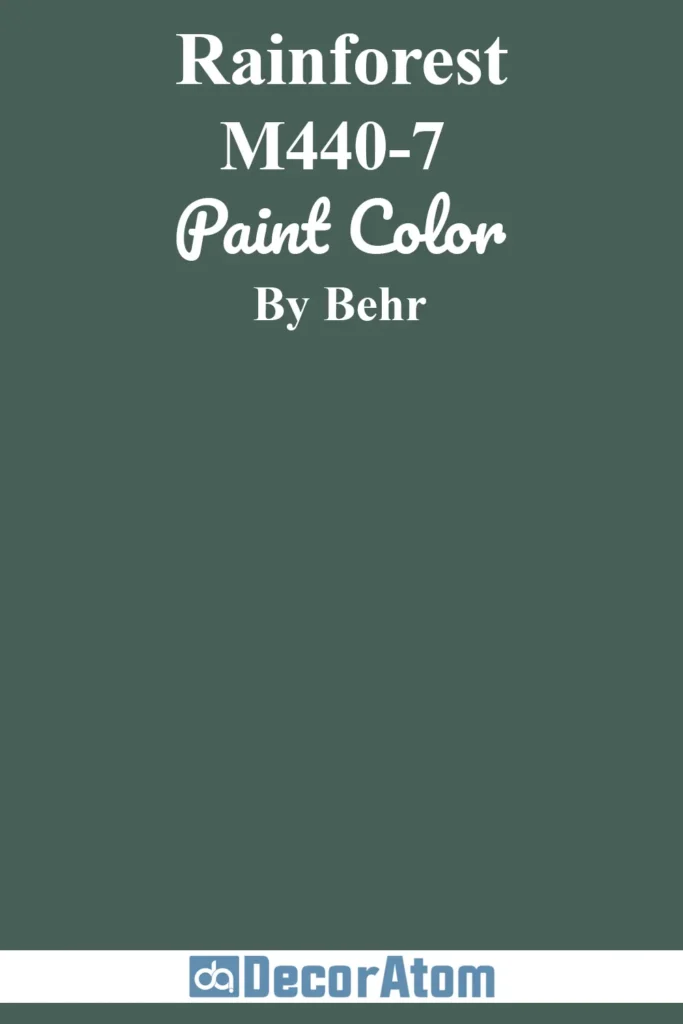
11. Behr Rainforest
💥🎁 Christmas & Year-End Deals On Amazon !
Don't miss out on the best discounts and top-rated products available right now!
*As an Amazon Associate, I earn from qualifying purchases.
Behr’s Rainforest is one of those greens that feels lush, dense, and unapologetically bold.
It has a true rainforest vibe—deep and saturated, with a mix of earthy green and slight teal undertones that keep it vibrant and full of life.
This isn’t a muted or subtle green—it’s dramatic, energetic, and absolutely captivating in the right space.
I think Rainforest really shines when used to create an immersive atmosphere.
Imagine it in a dining room paired with gold fixtures and rich wood tones, or in a bathroom with marble and vintage brass for a luxurious, almost spa-like feel.
It’s perfect for anyone who’s drawn to statement colors but still wants something rooted in nature.
12. Fusion Mineral Bayberry

Bayberry by Fusion Mineral Paint is a deep, vintage-inspired olive green with just the right amount of warmth.
It has muted yellow and brown undertones that give it a rustic, earthy feel, almost like dried herbs or antique botanical prints.
The matte finish typical of Fusion Mineral Paint only enhances its old-world charm.
This shade is especially popular for furniture makeovers, cabinets, or small spaces that need character without being too dark or heavy.
It’s great if you’re into farmhouse, cottage, or heritage aesthetics—Bayberry really leans into that timeless, cozy vibe.
13. Sherwin Williams Rock Garden
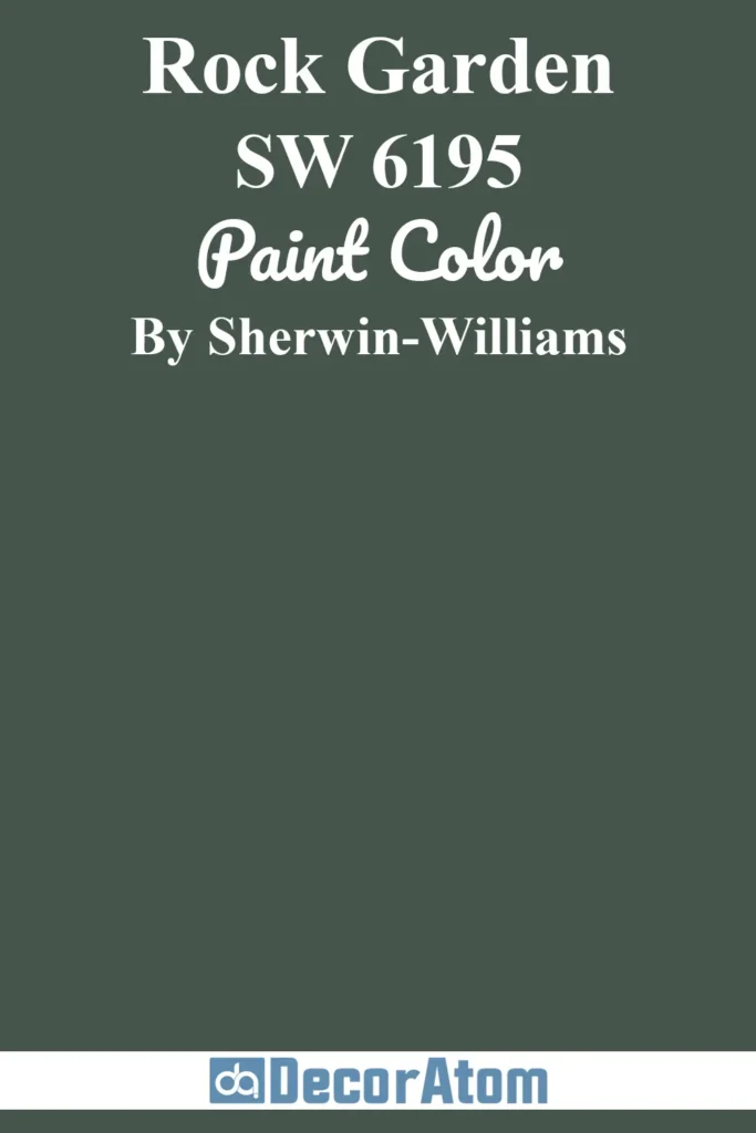
Rock Garden by Sherwin Williams is a moody, dramatic dark green with noticeable blue undertones.
It’s like a blend of evergreen and deep teal, and it has this almost mineral quality that makes it feel solid, serene, and mysterious all at once.
There’s a coolness to it, but it doesn’t feel cold—it’s more like standing in the shade of tall pines near a mountain stream.
This color works incredibly well in modern, luxe interiors that lean into rich, saturated color palettes.
I’ve seen it used on kitchen islands, statement walls, and even entire rooms for a cocooning effect.
Rock Garden made this list because it’s a color with presence.
It feels grounded, confident, and sophisticated without being flashy.
14. Benjamin Moore Dakota Shadow
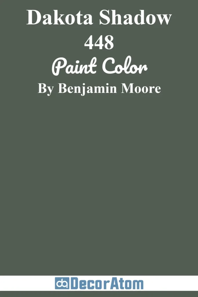
Dakota Shadow is one of those dark greens that brings a real sense of heritage and refinement.
It’s deep and earthy, but there’s a slight smokiness to it—almost like the faintest gray undertone hiding behind the green.
It reminds me of something you’d find in a classic study or old countryside manor.
It’s an excellent option for anyone wanting a more traditional or subdued take on dark green.
Dakota Shadow looks incredible with rich walnut woods, vintage rugs, and soft lighting.
It adds depth without overwhelming a room and works beautifully in both large and small spaces.
It made the list because of its timeless quality—it doesn’t follow trends, it quietly commands respect.
15. Benjamin Moore Backwoods

Backwoods by Benjamin Moore is about as true of a forest green as you can get—deep, shadowy, and beautifully rich.
It leans ever so slightly cool, with a hint of blue-green undertone that keeps it from feeling too heavy or muddy.
This color is an instant classic.
There’s something deeply calming about Backwoods—it evokes tall trees, pine needles, and fresh air.
It’s especially stunning in a cozy bedroom, home office, or library, and it pairs beautifully with creamy whites, leathers, and warm metals.
If you want a dark green that feels elegant and outdoorsy at the same time, this is the one.
16. Benjamin Moore Essex Green

Essex Green is one of the boldest, most intense greens Benjamin Moore offers—and that’s what makes it so incredible.
It’s nearly black in low light but reveals a lush, velvety green when the light hits it just right.
This is a color that wraps around a room and creates instant drama.
It leans cool, with no yellow or olive tones to soften it, so it feels polished and refined.
I’ve seen Essex Green used in everything from historic restorations to sleek modern spaces—it’s that versatile.
It works beautifully with crisp whites, natural wood, or even dusty pinks for contrast.
17. Benjamin Moore Mediterranean Teal

Mediterranean Teal walks that fine line between green and blue, and it does it with style.
It’s a deep, moody teal that feels like ocean waves meeting dense foliage.
There’s definitely a coastal energy to this shade, but it’s also grounded enough to work in more classic interiors too.
It’s an excellent choice for anyone who loves the idea of dark green but wants something a little more vibrant or unexpected.
It brings energy to a space while still offering depth and coziness.
It’s especially striking in rooms with lots of natural light where the teal tones can really shine.
18. Sherwin Williams Ripe Olive

Ripe Olive is exactly what the name suggests—a deep, savory olive green with warm brown undertones.
It has a slightly muted quality, like it’s been softened by sunlight and time.
This is a perfect pick for someone who wants dark green but doesn’t want anything too cool or stark.
Ripe Olive is fantastic for kitchens, living rooms, and built-ins because it pairs so well with brass, clay, and wood.
It has a bit of an old-world feel, almost Tuscan in spirit.
It feels like a color you could settle into and live with for years.
19. Benjamin Moore Amazon Green

Amazon Green is bold, jungle-inspired, and rich with life.
It’s a saturated, almost velvety green that leans warm with just a touch of blue peeking through.
There’s a vibrancy to it that makes it feel a bit more tropical than traditional, but it still has enough depth to belong in the “dark green” family.
This is a great choice if you want something dramatic but also full of energy.
It’s gorgeous in a powder room, a hallway, or even as a pop of color on cabinetry or trim. It’s bold, but still refined.
20. Benjamin Moore Black Forest Green

Black Forest Green is one of those colors that feels like it was made for moody interiors.
It’s almost black, with just enough green in it to keep it from feeling too stark.
Depending on the light, it can look like a deep spruce, a blackened teal, or a rich pine.
This one’s perfect for creating contrast—think kitchen islands, doors, or even exteriors.
It also works beautifully in rooms where you want to cocoon yourself in color.
If you’re into the almost-black trend but want something with more depth, Black Forest Green delivers.
21. Sherwin Williams Country Squire

Country Squire is a deep, earthy green with warm undertones and a classic, old-school charm.
There’s something stately and confident about it—it’s not flashy, but it definitely makes an impression.
It feels like the color you’d find in a historic home’s library or a gentleman’s study.
It leans slightly toward hunter green but with more warmth, making it a great fit in traditional interiors.
It looks beautiful alongside rich wood, leather, and neutral stone, and it holds up well on both walls and cabinetry.