
If you’re looking to add a touch of warmth and sunshine to your home, butter yellow is the way to go.
It’s that perfect balance between a soft, inviting yellow and a creamy warmth that makes a space feel cozy and alive.
Whether it’s the soft glow of a yellow-toned kitchen, a welcoming entryway, or even a cheerful bedroom, butter yellow can work its magic just about anywhere.
But with so many beautiful shades to choose from, how do you know which one will bring the perfect vibe to your home?
That’s why I’m here to help! In this post, you’ll discover 15 of the best butter yellow paint colors, each chosen for its ability to transform your space into something truly special.
What are Butter Yellow Paint Colors?
Butter yellow paint colors are soft, warm shades of yellow with a creamy, slightly muted quality.
Unlike bright, citrusy yellows, butter yellows have a gentler, more subdued look, often leaning toward pastel or golden tones.
They are reminiscent of freshly churned butter or the delicate glow of morning sunlight.
These colors exude warmth and coziness, making them perfect for creating an inviting, cheerful atmosphere in any space.
Butter yellow sits between pale yellow and warm beige, offering a touch of vibrancy without feeling overwhelming.
Depending on the shade, it can range from a very light buttery cream to a richer, golden hue. This versatility makes it a timeless choice for both traditional and modern interiors.
Why You Will Love These Butter Yellow Paint Colors
Butter yellow is a feel-good color that instantly brightens up a space while maintaining a sense of warmth and softness.
Unlike bold, neon yellows, butter yellow has a soothing quality that makes it a welcoming choice for walls, cabinetry, and accents.
Here’s why you’ll love these shades:
- Cheerful Yet Subtle – Butter yellow adds a sense of happiness and light without being overpowering.
- Warm and Inviting – The creamy undertones create a cozy ambiance that works beautifully in any room.
- Timeless Appeal – Unlike trendy colors that may go out of style, butter yellow has a classic, enduring charm.
- Versatile – It pairs well with a variety of colors, from soft neutrals to deeper, dramatic shades.
- Enhances Natural Light – Butter yellow reflects light beautifully, making spaces feel brighter and more open.
What Is The Most Popular Butter Yellow Paint Color For 2025?
One of the most sought-after butter yellow shades for 2025 is Benjamin Moore Hawthorne Yellow (HC-4). This color strikes the perfect balance between a soft, creamy yellow and a rich, golden hue. It has just enough warmth to feel cozy without leaning too dark or too bright.
Another top contender is Sherwin Williams Butter Up (SW 6681), a classic buttery shade with a welcoming glow. As homeowners and designers embrace warmer, nostalgic hues, these buttery yellows stand out as go-to choices for kitchens, living rooms, and accent walls.

Tips for Choosing The Best Butter Yellow Paint Colors
When selecting a butter yellow paint color, consider the following factors to find the perfect shade for your space:
- Undertones Matter – Some butter yellows have more golden, beige, or even peach undertones. If you want a more neutral, creamy look, opt for a color with a soft, muted base.
- Test in Different Lighting – Butter yellow can appear warmer in artificial light and cooler in natural daylight. Always sample the color in different lighting conditions before committing.
- Pair With The Right Trim Color – Crisp white trim (like Sherwin Williams Pure White) enhances the brightness of butter yellow, while warmer whites (like Benjamin Moore White Dove) create a softer, cozier effect.
- Consider the Room’s Purpose – For bedrooms and relaxing spaces, a softer butter yellow works best. In kitchens or dining areas, a richer, slightly deeper shade can add warmth and charm.
- Look at Existing Décor – Butter yellow complements wood tones, vintage-inspired pieces, and classic or country-style interiors. Make sure your chosen shade enhances your existing furnishings.
Top 15 Butter Yellow Paint Colors
1. Sherwin Williams Butter Up
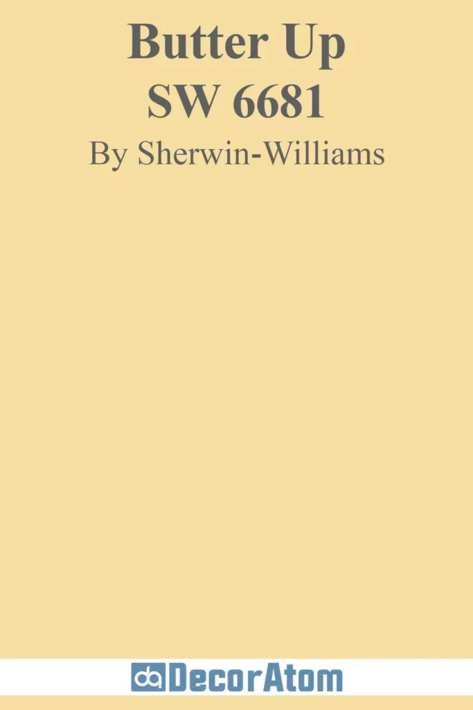
Sherwin Williams Butter Up is the epitome of a warm and inviting yellow. This shade is rich without being overwhelming, capturing the essence of melted butter with just a touch of golden depth.
It sits right in that perfect sweet spot—not too pale and not too bold—making it an incredibly versatile choice. With its warm undertones, Butter Up brings a sense of cheerfulness to any room, making it a favorite for kitchens, dining rooms, and cozy breakfast nooks.
One of its greatest strengths is its adaptability in different lighting. In natural daylight, Butter Up leans into its sunny warmth, creating a bright and welcoming feel. Under artificial lighting, especially warm-toned bulbs, it deepens slightly into a more golden hue, maintaining its cozy appeal.
If you want a color that can make a space feel both elegant and relaxed, this is a fantastic choice. Pair it with crisp white trim for a fresh look, or go for warm wood tones to enhance its richness.
2. Sherwin Williams Friendly Yellow

If you’re looking for a shade of yellow that embodies happiness, Friendly Yellow delivers exactly that. This is a color that instantly brightens up a space, creating a soft but lively atmosphere. It has a slightly warmer base than Butter Up, leaning just a little into a golden honey tone.
One of the reasons this color is so appealing is its ability to feel playful without being overpowering. It’s fantastic in spaces where you want an uplifting energy, like a child’s playroom, an entryway, or a home office.
Unlike neon or citrusy yellows that can be too sharp, Friendly Yellow maintains a balance that keeps it soft and cozy. If you’re looking for a way to inject a dose of warmth into your home while still keeping things sophisticated, this color is an excellent option.
3. Benjamin Moore Hawthorne Yellow
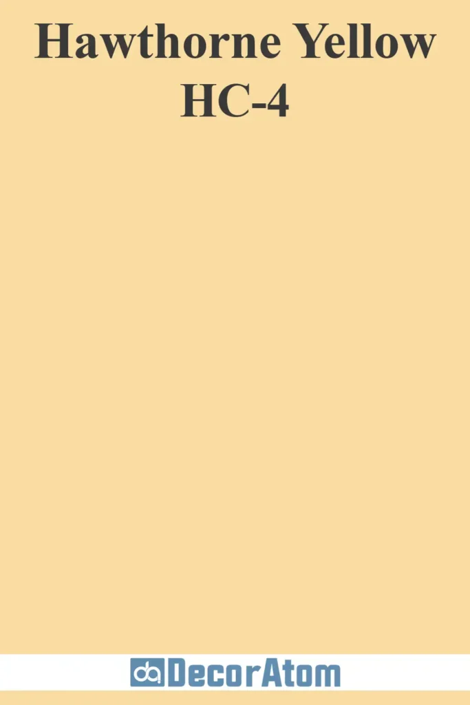
Hawthorne Yellow is a classic for a reason. This timeless shade has a historical charm, making it perfect for both traditional and modern spaces.
It has a depth that some lighter yellows lack, giving it a richness that feels both sophisticated and inviting. The slight golden undertone keeps it from looking too pastel, while its warmth ensures it never feels cold or stark.
One of the best things about Hawthorne Yellow is its versatility with different architectural styles. Whether you have a charming cottage, a colonial-style home, or a sleek modern space, this yellow adapts beautifully.
It pairs exceptionally well with crisp white trim, black shutters, and even deep navy accents for a high-contrast, elegant look. If you’re searching for a yellow that feels refined yet cozy, this one checks all the boxes.
4. Behr Melted Butter
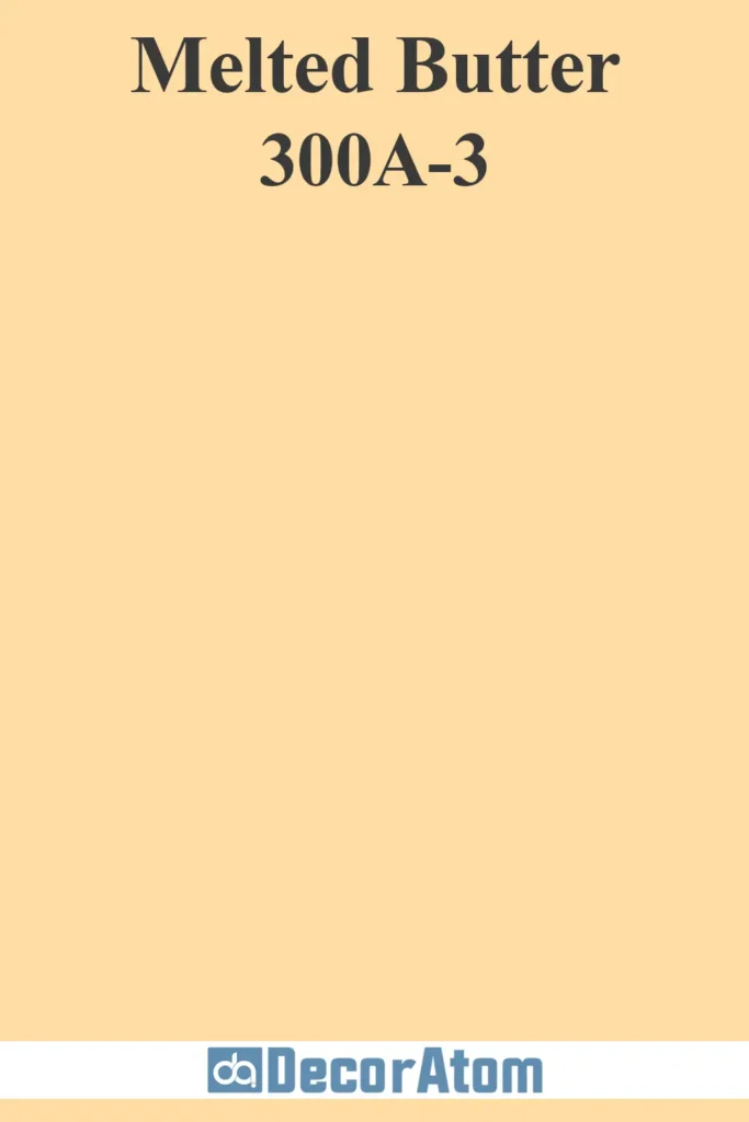
Behr’s Melted Butter is exactly what it sounds like—a luscious, warm, and creamy yellow that feels like a comforting embrace. This color has a softness that makes it ideal for spaces where you want a gentle glow without too much intensity.
Unlike some yellows that can appear too sharp or artificial, Melted Butter has an almost vintage quality. It looks stunning in farmhouse-style homes, paired with rustic wood elements and classic white cabinetry.
It’s also an excellent choice for bedrooms where you want a subtle warmth that doesn’t overwhelm the senses. If you’re looking for a color that radiates charm without being too bold, Melted Butter is a fantastic pick.
5. Behr Morning Sunlight
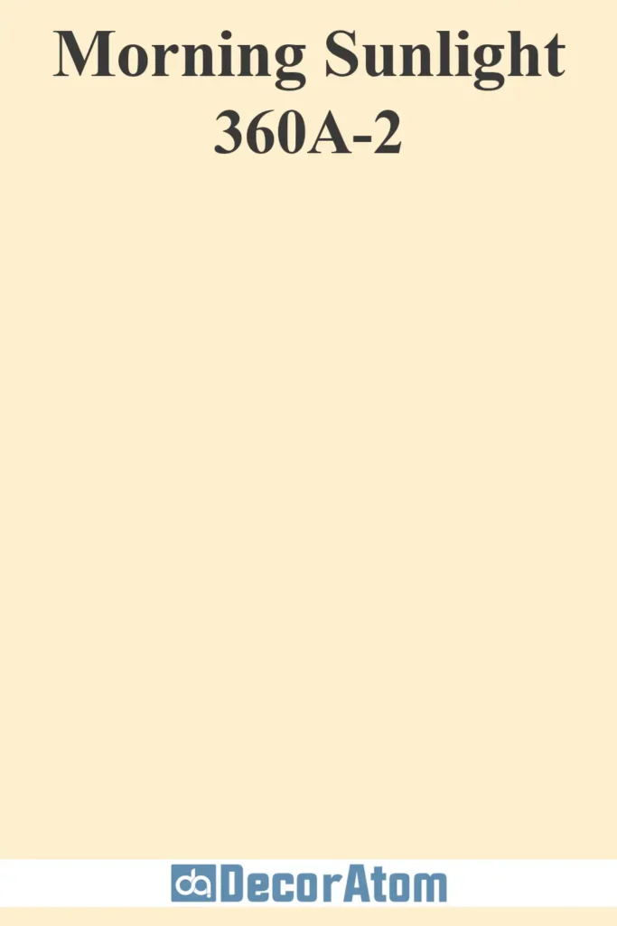
For those who want a light, airy take on butter yellow, Behr’s Morning Sunlight is a dream. This color is one of the softer yellows on the list, making it ideal for spaces that need a touch of warmth without feeling too saturated.
It’s particularly beautiful in rooms with limited natural light, as it helps reflect light and makes spaces feel more open and inviting.
Morning Sunlight works beautifully in living rooms, especially when paired with soft neutral furnishings. It also complements natural textures like linen, jute, and rattan, creating a breezy, coastal-inspired aesthetic.
If you want a yellow that leans more delicate and subtle, this is a perfect choice.
6. Sherwin Williams Banana Cream
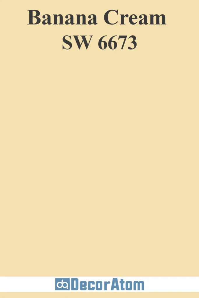
Banana Cream is a warm, soft yellow with a slight creaminess that keeps it from being too bright. This color has a nostalgic, almost old-world charm to it, making it perfect for traditional interiors or farmhouse-style spaces.
What makes Banana Cream so appealing is its ability to add warmth without feeling too intense. It’s an excellent alternative to stark whites in bedrooms, adding a cozy glow that feels welcoming and restful.
It also works beautifully in kitchens, especially when paired with warm wood cabinetry or classic subway tile.
7. Farrow and Ball Butterweed
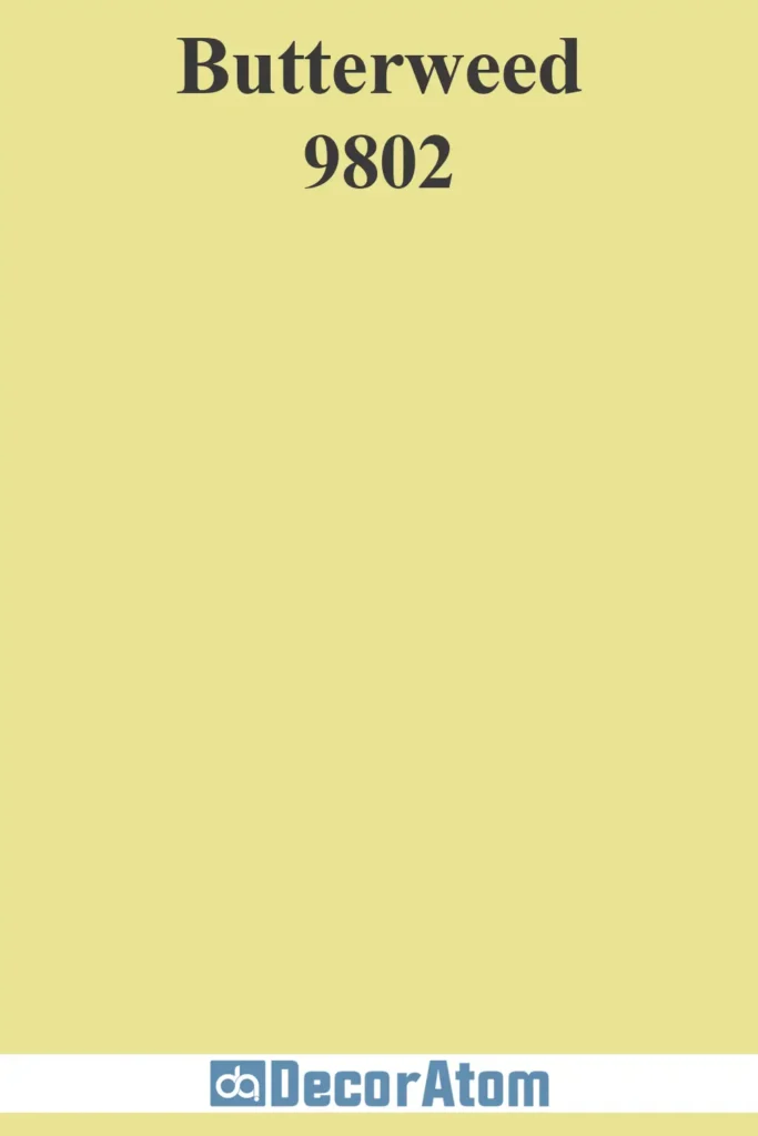
Butterweed is a sophisticated take on butter yellow, leaning slightly into a muted, earthy tone. Farrow and Ball’s signature high-pigment formula gives this shade incredible depth, making it appear beautifully rich in different lighting conditions.
This color is particularly well-suited for more elegant spaces, such as formal dining rooms, studies, or even exteriors.
It pairs beautifully with dark wood tones, deep green accents, and classic white trim. If you’re looking for a butter yellow with a refined, almost antique-inspired feel, Butterweed is a stunning choice.
8. Sherwin Williams Lemon Chiffon

Lemon Chiffon is a light, creamy yellow with a soft pastel quality. It’s one of the most delicate yellows on this list, making it ideal for bedrooms, nurseries, and cozy reading nooks.
What makes Lemon Chiffon so special is its ability to add just a hint of warmth without feeling too colorful.
It’s the kind of yellow that works beautifully as a neutral, allowing you to pair it with a wide range of colors and textures. If you want a buttery yellow that leans into softness rather than vibrancy, this is a beautiful option.
9. Farrow and Ball Dayroom Yellow
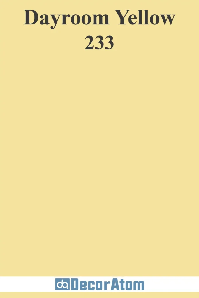
Dayroom Yellow has a bright yet refined character that makes it feel both cheerful and sophisticated. It’s a little cooler than some of the other butter yellows on this list, giving it a slightly more modern edge.
This color works wonderfully in sunrooms, kitchens, and bathrooms, where its fresh, uplifting quality can shine.
Paired with crisp white trim and natural wood accents, it creates a light and airy atmosphere that feels effortlessly elegant.
10. Benjamin Moore Windham Cream

Windham Cream is one of the most sophisticated butter yellows on this list. It has a warm, creamy base with a subtle hint of beige, making it perfect for those who want a more neutral yellow.
This color looks stunning in traditional interiors, especially when paired with rich wood tones and vintage-inspired decor.
It’s a fantastic choice for living rooms, bedrooms, and dining areas where you want a soft, inviting ambiance.
11. Benjamin Moore Butter Cream
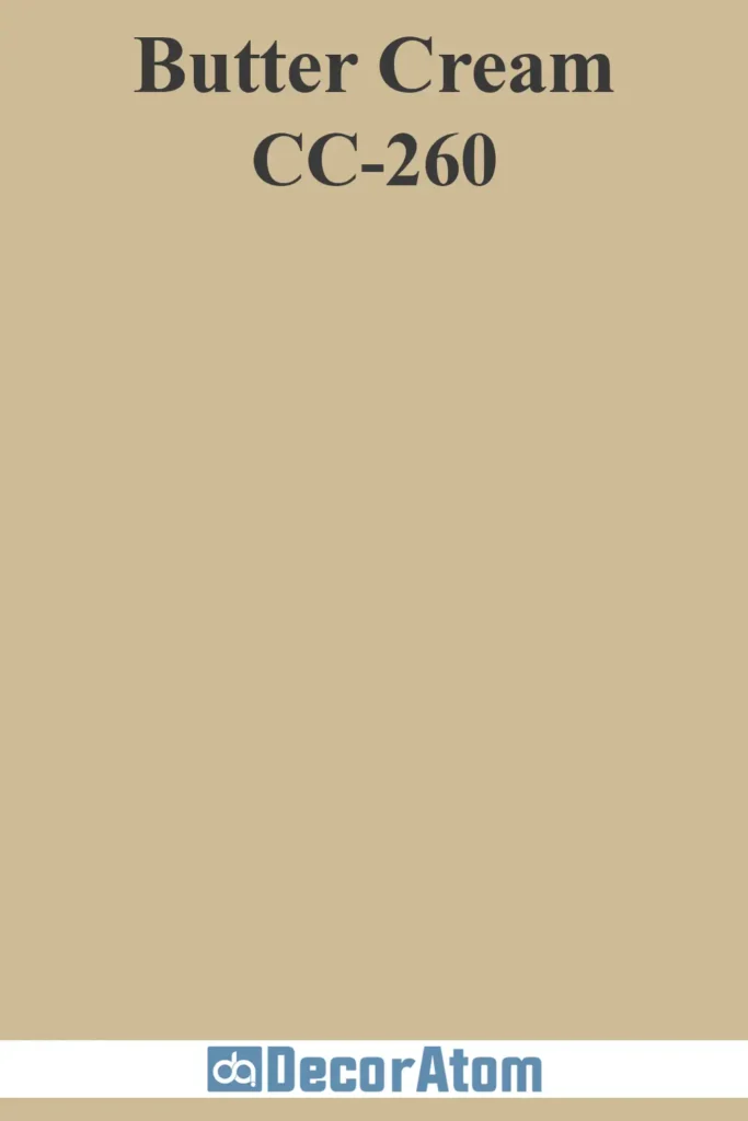
Benjamin Moore’s Butter Cream is a smooth, soft yellow with a hint of warmth. It’s a delightful, inviting color that evokes the feeling of warm sunlight streaming through your window on a perfect afternoon.
This shade has enough golden undertones to bring depth and warmth to a room without overwhelming the senses.
Butter Cream works wonderfully in kitchens, where its bright but subtle hue can lighten up the space without making it feel too intense.
It’s also great for living rooms or even entryways, adding a welcoming vibe that’s both fresh and soothing. When paired with soft neutrals like beige or light gray, Butter Cream creates a perfect balance of warmth and tranquility.
12. Behr Cottage White
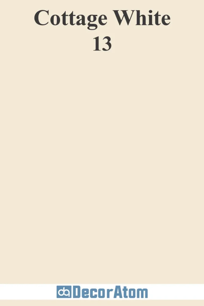
Behr Cottage White is a butter yellow with a very soft, almost creamy undertone that gives it a classic, timeless feel.
It’s the kind of yellow that whispers warmth without shouting, making it ideal for spaces where you want a gentle glow rather than a bold statement.
This color is perfect for rooms that need a touch of brightness but don’t require too much intensity. Think of it for bathrooms, bedrooms, or even sunrooms.
Its neutrality allows it to work beautifully with a variety of furniture styles and colors. It pairs wonderfully with light wood tones, soft linens, and natural textures, giving your space a relaxed, coastal cottage vibe.
13. Farrow and Ball Citron
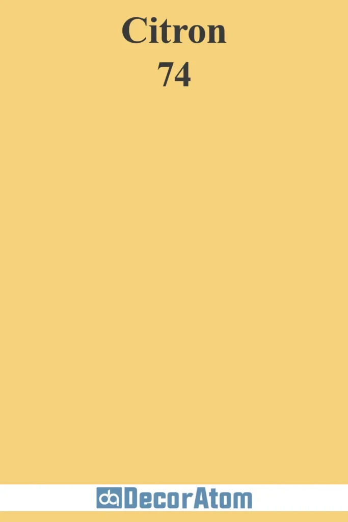
Citron is a sophisticated butter yellow with a more vibrant, citrusy twist. This color brings an energizing touch of yellow without leaning too far into bold, electric tones.
Its slightly green undertones give it a fresh and lively vibe that’s perfect for more dynamic spaces.
Citron is a fantastic choice for kitchens or entryways where you want a lively burst of color. Its energetic quality also makes it perfect for accent walls or even statement ceilings, bringing a sense of joy and vitality to the room.
Pair it with contrasting colors like deep blue, charcoal, or soft whites to create a balanced yet visually interesting space.
14. Benjamin Moore Weston Flax
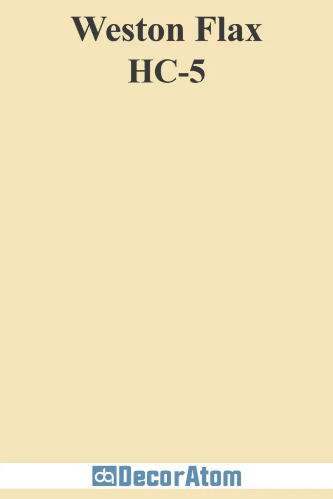
Weston Flax is a beautiful golden butter yellow with a subtle, sophisticated depth. It has a slight beige undertone that gives it a grounded, warm quality, making it perfect for traditional or vintage-inspired spaces.
This color brings richness without being overpowering, making it an ideal choice for large spaces or rooms that need a touch of elegance.
Weston Flax looks especially stunning in dining rooms, living rooms, or hallways, where it can create an inviting atmosphere.
It pairs beautifully with dark wood furniture, gold accents, and muted greens or blues. If you want a buttery yellow that has a regal feel but still feels cozy, Weston Flax is a great option.
15. Sherwin Williams Full Moon
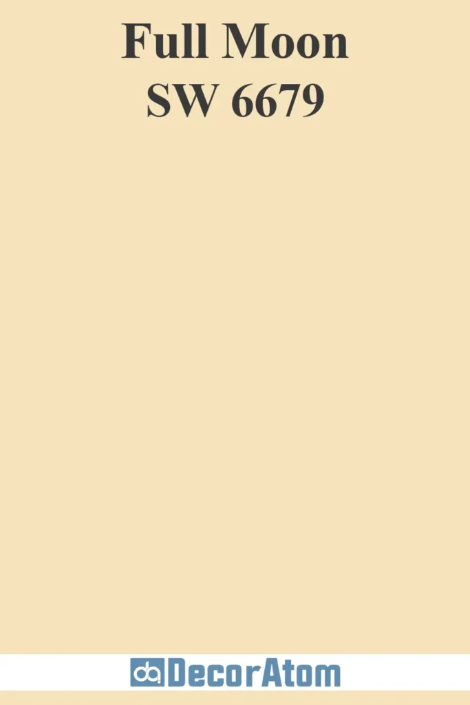
Sherwin Williams Full Moon is a soft, creamy yellow that feels light and airy. This yellow has a delicate quality, making it perfect for spaces where you want subtle warmth without a bold statement.
It’s a calm, soothing hue that reflects light beautifully, which is why it works so well in smaller or darker rooms.
Full Moon’s versatility makes it a perfect backdrop for a variety of decor styles. It pairs effortlessly with soft blues, whites, and even muted greens, creating a serene and harmonious space.
Whether used in bedrooms, bathrooms, or living areas, Full Moon adds a gentle brightness to the room that feels welcoming and peaceful.
What Color Complements Butter Yellow Paint Colors?
Butter yellow pairs beautifully with a variety of colors, depending on the desired mood:
- Soft Neutrals – White, cream, and beige create a light and airy feel.
- Warm Browns & Tans – Earthy wood tones or caramel hues enhance the warmth of butter yellow.
- Muted Blues & Grays – Soft blue-grays, like Benjamin Moore Palladian Blue, offer a fresh contrast without overpowering the warmth of yellow.
- Olive & Sage Greens – Earthy greens (such as Sherwin Williams Evergreen Fog) complement butter yellow beautifully, giving a nature-inspired look.
- Deep Charcoal or Navy – For a bold contrast, deep blues or grays create a sophisticated balance with butter yellow.
Places to Use Butter Yellow Paint Colors
Butter yellow is a highly versatile color that works well in many spaces:
- Kitchens – A warm and inviting choice for cabinets, walls, or even an accent island.
- Dining Rooms – Creates a cozy and cheerful atmosphere for meals and gatherings.
- Bedrooms – Soft buttery tones promote relaxation and warmth without feeling overwhelming.
- Living Rooms – A timeless shade that makes spaces feel bright and inviting.
- Nurseries & Kids’ Rooms – A perfect gender-neutral option that feels playful yet soothing.
- Entryways & Hallways – Instantly adds warmth and a welcoming touch.
- Bathrooms – Works beautifully with white fixtures and vintage-inspired decor.
Decor To Go With Butter Yellow Paint Colors
Choosing the right décor helps enhance the beauty of butter yellow walls or accents. Here are some great styling ideas:
- Natural Wood Furniture – Warm oak, walnut, or pine pairs effortlessly with buttery hues.
- Crisp White Accents – White trim, wainscoting, or linen fabrics keep the look fresh and timeless.
- Brass or Gold Hardware – Metallic gold and brass add a touch of elegance and warmth.
- Soft Blue or Green Textiles – Throw pillows, rugs, or curtains in muted blue-green tones balance out the warmth of butter yellow.
- Vintage-Inspired Pieces – Butter yellow has a nostalgic feel that works well with antique or farmhouse-style furniture.
- Floral or Botanical Prints – Soft floral patterns in pastel tones complement the cheerful nature of butter yellow.
- Woven Baskets & Textures – Natural textures like rattan, jute, or wicker bring an organic, cozy feel.