Choosing the right paint color for your nursery can be one of the most exciting parts of preparing for your little one’s arrival.
Among the many options available, blue remains a classic favorite for nursery spaces.
It’s more than just a color—it’s a mood-setter, a tranquilizer, and a versatile backdrop that suits a variety of themes.
Whether you’re aiming for a serene, calming environment for naps or a playful vibe that grows with your child, blue is a color that offers endless possibilities.
In this blog post, we’ll explore why blue is a top pick for nurseries and offer tips on how to choose the best blue paint colors that will work beautifully with your room’s size, lighting, and overall vibe.
If you’re ready to create a serene space for your little one, keep reading to discover how to choose the perfect blue to complement your nursery design.
Why Choose Blue Paint Colors for a Nursery?
Blue has long been a popular choice for nurseries, and for good reason. It’s a color that embodies calmness, tranquility, and comfort—ideal qualities for a space dedicated to rest and relaxation.
Choosing blue for your nursery creates an atmosphere that is soothing and serene, which is important for both the baby and parents.
One of the standout qualities of blue is its ability to promote relaxation. Scientific studies suggest that the color blue has a calming effect on the mind and body, making it a great choice for a space where your little one will spend a lot of time sleeping and playing.
Whether it’s a soft pastel blue or a deeper navy, the color has the power to create a peaceful environment conducive to rest.
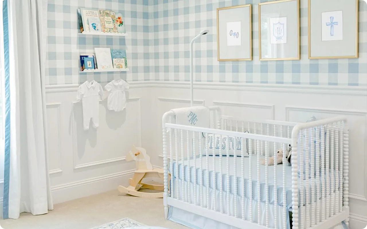
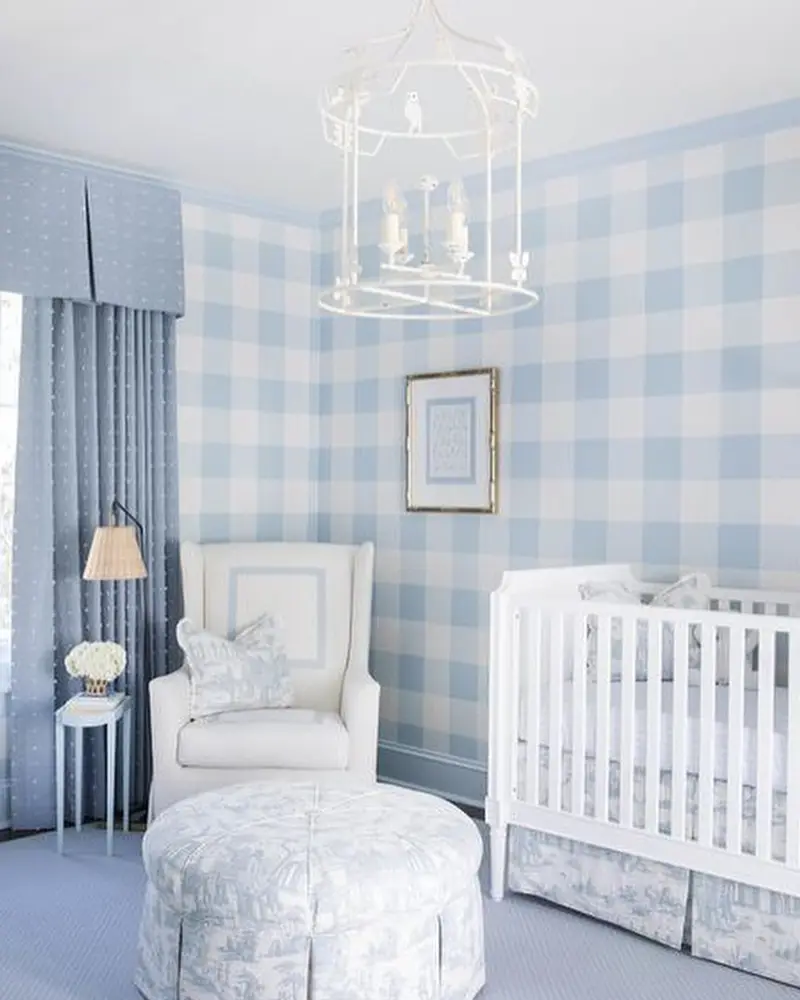
Blue is also incredibly versatile. It can work in a variety of nursery styles, from coastal-inspired spaces with light, airy blues to more sophisticated nurseries with deeper tones.
Additionally, blue pairs beautifully with many other colors, giving you endless options for creating the perfect nursery palette. Whether you want to combine it with soft whites, warm neutrals, or even a splash of bright accent colors, blue works in harmony with many hues. It also complements a wide range of furniture styles, from modern minimalist to rustic or vintage-inspired decor.
Finally, blue is a color that can grow with your child. As your little one transitions from a baby to a toddler and beyond, blue continues to be a solid and adaptable backdrop for evolving nursery themes and styles.
Tips for Choosing the Best Blue Paint Colors for Nursery
When selecting the perfect blue paint color for your nursery, there are a few important things to consider to ensure you create a calm, inviting, and functional space. Here are some helpful tips to guide you:
1. Consider Lighting
The type of lighting in the nursery can dramatically influence how a paint color looks. Natural light can make colors appear cooler or warmer depending on the room’s orientation, while artificial lighting can affect the color’s overall tone.
- South-facing rooms tend to get warm sunlight throughout the day, which can bring out the warmth in blue tones. If you’re using a blue with cooler undertones (like a light aqua or blue-gray), the warmth of the sunlight can balance it out, creating a welcoming atmosphere.
- North-facing rooms tend to have cooler, less direct light, which can bring out the cool, grayish undertones in certain blue shades. If you’re going for a soft, tranquil feel, look for a blue with warmer undertones to prevent the room from feeling too cold.
- Artificial lighting can also have an impact, especially in rooms with limited natural light. In dim lighting, some blues may appear darker or more muted, so be sure to test the paint in various lighting conditions to see how it looks throughout the day.
2. Determine the Mood You Want to Create
Blue comes in a wide range of shades, each offering a unique feel. For example, if you want the nursery to feel calm and airy, opt for lighter blues like Misty Blue or Sleepy Blue, which create a soft, serene environment. These colors are perfect for promoting restfulness, especially in a baby’s sleep space.
On the other hand, if you’re looking for a bolder, more sophisticated look, deeper blues like Hale Navy or Blue Dusk can add richness and depth to the room. These hues provide a cozy and grounded atmosphere, perfect for creating a nursery that feels like a peaceful retreat.
For a more playful vibe, consider vibrant blues such as Upward or Windy Sky, which give a sense of energy and joy without overwhelming the space. These shades are great if you’re designing a nursery that will also be a fun, engaging environment for the child as they grow.
3. Choose the Right Undertones
Blue paint colors can have varying undertones—some leaning towards green, gray, or even purple. It’s important to understand these undertones to ensure the color complements the rest of the room’s decor and feels balanced.
- Blue with green undertones (like Palladian Blue) can add a fresh, nature-inspired vibe to the nursery, ideal for those seeking a more organic, botanical feel.
- Blue with gray undertones (such as Sleepy Blue or Aleutian) provides a soft, muted look that pairs beautifully with neutral furniture and a minimalist aesthetic. These shades are also versatile and work well with a variety of other colors.
- Blue with purple undertones (like Tranquil Blue) can add a calming, slightly playful element to the space, perfect for creating a more whimsical atmosphere.
Pay attention to how the undertones of a blue paint color will interact with the other colors in the room, such as furniture, textiles, and decor. This will help create a cohesive and harmonious look.
4. Test the Paint on the Walls
No matter how much research you do, the best way to truly determine how a blue paint color will look in your nursery is to test it on the walls. Paint large swatches in different areas of the room, particularly near windows where natural light can have the most impact. Take time to observe how the color shifts throughout the day, especially if you’re working with a variety of light sources.
Testing the paint allows you to ensure that the color you’ve chosen complements the room’s existing features and that you’re happy with how it looks in real-world conditions.
5. Consider the Nursery’s Size
Lighter blues tend to make a space feel larger and more open, which is a great advantage if you’re working with a smaller nursery. If you have a more compact space, lighter shades like Misty Blue or Breath of Fresh Air can create the illusion of more space and give the room an airy feel.
For larger nurseries, you can play with deeper blues, such as Blue Dusk or Hale Navy, without overwhelming the space. These deeper tones can actually help anchor a larger room, making it feel more intimate and cozy, while still maintaining an open and welcoming atmosphere.
Top 13 Blue Paint Colors for Nursery
These 13 blue paint colors offer a range of moods—from soft and airy to rich and cozy—ensuring you can find the perfect shade for your nursery.
1. Benjamin Moore Misty Blue

Misty Blue is a delicate, airy blue with soft gray undertones, making it one of the most tranquil and soothing nursery colors.
Unlike baby blues that can sometimes feel too bright or overly playful, Misty Blue leans toward a more mature and timeless softness. It creates a serene, cloud-like atmosphere that feels effortlessly cozy—perfect for a nursery where calmness is key.
This shade works beautifully in both natural and artificial light, maintaining its softness throughout the day without shifting too much in tone.
In north-facing rooms, where light is cooler, Misty Blue’s gray undertones will be more prominent, giving it a soft, misty quality.
In south-facing nurseries, the warmth of the sunlight will bring out a slightly brighter blue, but it will never feel overwhelming.
Best Pairings:
- Crisp white trim (like Benjamin Moore Chantilly Lace) for a fresh contrast
- Soft pastel accents (blush pink, sage green, or warm cream) for a gentle, dreamy palette
- Natural wood furniture to keep the nursery feeling warm and grounded.
2. Sherwin-Williams Sleepy Blue

True to its name, Sleepy Blue is a peaceful, muted blue that instantly makes a space feel more relaxed. It has a hint of gray, which keeps it from feeling too bright or overpowering—exactly what you want in a nursery where rest and relaxation are essential.
One of the best things about Sleepy Blue is its ability to work in any lighting condition. In darker rooms, it remains soft and cozy rather than turning dull or cold.
In brighter nurseries, it retains its soothing quality, never looking too sharp or overly saturated. If you’re looking for a classic, gender-neutral blue that feels timeless, Sleepy Blue is a fantastic choice.
Best Pairings:
- Warm white tones (like Sherwin-Williams Alabaster) for a balanced, inviting look
- Soft grays or beiges for a neutral, modern nursery
- Delicate patterns (like gingham, florals, or stars) for a whimsical feel.
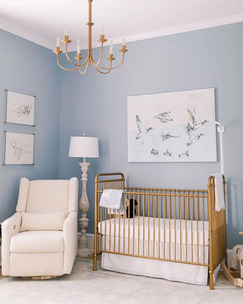
3. Benjamin Moore Blue Dusk

Blue Dusk is deeper, moodier, and more sophisticated than traditional nursery blues. It has a rich, grounded feel that makes a nursery feel warm, elegant, and timeless. If you love the idea of using blue but don’t want something too light or pastel, Blue Dusk offers a perfect middle ground.
Its undertones lean slightly toward gray, which gives it a soft, velvety look in dim lighting, making it a great choice for a cozy nursery. In well-lit rooms, Blue Dusk brightens up a bit but never feels too bold.
This is an ideal color if you want a nursery that can grow with your child—Blue Dusk works just as well in a baby’s room as it does in a toddler’s or even a teenager’s space.
Best Pairings:
- Warm whites and off-whites (like Benjamin Moore White Dove) for contrast
- Brass or gold accents to enhance the elegance of the color
- Soft creams and beiges for a more traditional nursery aesthetic.
4. Sherwin-Williams Bathe Blue
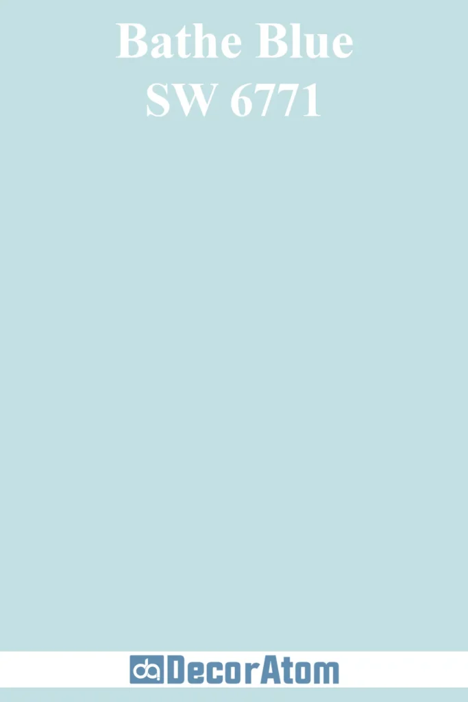
Bathe Blue is a light, airy blue with a hint of coolness, reminiscent of a clear sky or soft ocean waves. It has subtle aquatic undertones, which give it a fresh, crisp feel without making it feel too cold.
If you want a nursery that feels clean, uplifting, and peaceful, Bathe Blue is an excellent choice.
This shade works especially well in south-facing nurseries, where natural sunlight enhances its fresh, breezy quality. In north-facing rooms, it may appear slightly cooler, making it a great choice for warmer climates where you want to introduce a light, refreshing feel.
Best Pairings:
- White and soft gray tones for a cool, airy look
- Light wood furniture to add warmth and balance
- Subtle nautical or ocean-themed decor for a playful touch.
5. Benjamin Moore Hale Navy

Hale Navy is a bold, deep navy blue that adds richness and coziness to a nursery. While many people think of navy as a strong, statement color, Hale Navy is unique in that it has just the right balance of depth and warmth, making it feel inviting rather than overwhelming.
This color is perfect for parents who want to create a modern, gender-neutral nursery with a touch of sophistication.
It works beautifully in both small and large nurseries—in smaller spaces, it creates a cozy, cocoon-like feel, while in larger rooms, it adds depth without making the space feel too dark.
Best Pairings:
- Crisp white walls or trim (like Benjamin Moore Simply White) to balance the depth of navy
- Warm wood tones for a nautical or classic nursery look
- Soft blush pink or muted mustard accents to add warmth and contrast.
6. Benjamin Moore Palladian Blue

Palladian Blue is a soft blue-green with a vintage charm, making it one of the most unique nursery colors on this list. Unlike traditional baby blues, Palladian Blue leans slightly toward aqua, giving it a fresh yet classic feel.
It’s a perfect choice if you want a blue nursery that feels a little different, yet still timeless.
Its green undertones give it a natural, organic quality, making it a great choice for nurseries with botanical themes, soft florals, or woodland-inspired decor. This color thrives in bright, sunlit spaces, where its soft vibrancy shines.
Best Pairings:
- Soft whites and creams for a dreamy, vintage nursery
- Natural textures like linen and rattan for a relaxed look
- Light wood cribs and rocking chairs to enhance the organic feel.
7. Sherwin-Williams Upward

Upward is a cheerful, clear sky blue that brings an uplifting, happy feel to a nursery. It’s a classic, playful blue that remains soft enough for a baby’s room while still feeling fresh and bright.
This color works well in any size nursery—in smaller rooms, it helps create an open, airy feel, while in larger spaces, it provides a soft, welcoming energy.
It’s versatile and pairs well with both modern and traditional nursery decor.
Best Pairings:
- Bright whites and light grays for a crisp, modern nursery
- Pale yellows or soft coral accents for a cheerful touch
- Cloud or star-themed decor for a dreamy effect.
8. Benjamin Moore Windy Sky

Windy Sky is a light, airy blue with a cheerful and refreshing feel. It leans slightly cool but has a softness that keeps it from feeling stark. This makes it a wonderful choice for a nursery where you want a bright yet calming atmosphere.
In natural daylight, Windy Sky reads as a gentle sky blue, making a nursery feel open and expansive. In artificial lighting, it maintains its clarity without turning too muted or grayish.
It’s a fantastic pick if you want a classic baby blue that still feels modern and fresh.
Best Pairings:
- Soft whites for a clean, light-filled nursery
- Pastel yellows or soft greens for a cheerful, gender-neutral palette
- Whitewashed or light oak furniture to maintain a breezy, airy feel.
9. Sherwin-Williams Lakeshore

Lakeshore is a rich yet balanced blue that sits comfortably between medium and deep tones. Unlike navy, which can sometimes feel heavy in a nursery, Lakeshore has a touch of softness that keeps it from overpowering the space.
It’s calm and grounding, making it an ideal choice if you want a nursery with a slightly moody, sophisticated feel.
This color works especially well in rooms with warm lighting, as it will bring out its slightly muted, cozy undertones. In cooler lighting, it reads as a true, slightly deep blue with a serene presence.
Best Pairings:
- Warm white trim (like Sherwin-Williams Pure White) for contrast
- Soft blush or muted mustard accents to warm up the space
- Dark wood cribs and dressers for a refined, classic look.
10. Benjamin Moore Brittany Blue

Brittany Blue is a muted, gray-blue with a sophisticated edge. It has a slight dusty undertone, which gives it a vintage, timeless feel.
If you want a nursery that’s blue but not too bright, Brittany Blue offers a soft, refined take on traditional blue hues.
This color is perfect for both modern and traditional nurseries. In bright spaces, it looks more like a classic soft blue, while in dimmer rooms, its gray undertones create a cozy, den-like atmosphere.
Best Pairings:
- Antique brass or gold accents to enhance its classic feel
- Creamy off-whites for a soft, layered look
- Vintage or handmade decor (like crocheted blankets and woven baskets).
11. Sherwin-Williams Aleutian
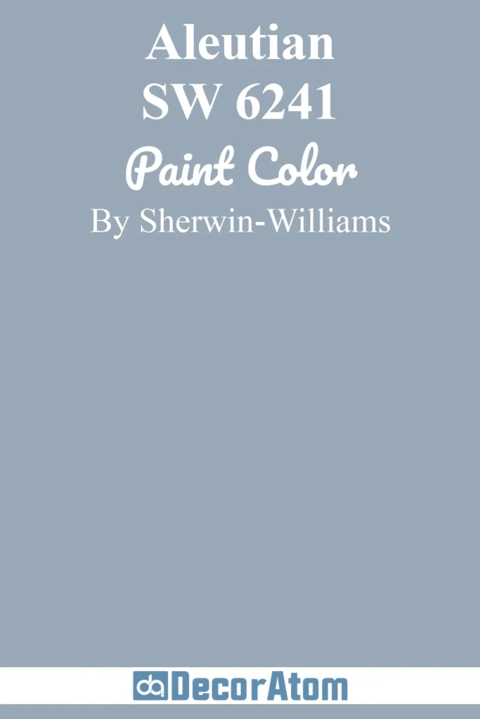
Aleutian is a dusty, muted blue with strong gray undertones, making it a fantastic choice for a nursery that leans toward modern and neutral aesthetics.
Unlike brighter blues, Aleutian offers a subdued, relaxed feel that works beautifully with both traditional and contemporary nursery decor.
In rooms with lots of natural light, Aleutian can appear slightly cooler and crisp, while in artificial light, it takes on a cozy, grayish-blue tone.
If you want a blue nursery without the space feeling overly themed or youthful, Aleutian is a great pick.
Best Pairings:
- Soft taupes and greiges for a modern, neutral nursery
- Matte black or iron accents for an industrial or rustic vibe
- Warm wood furniture to balance its cool undertones.
12. Benjamin Moore Breath of Fresh Air

As the name suggests, Breath of Fresh Air is a light, crisp, and refreshing blue that feels open and airy. It has just a hint of warmth, keeping it from feeling too icy.
This color is ideal for smaller nurseries, as it helps create the illusion of more space and a bright, cheerful atmosphere.
In morning light, Breath of Fresh Air reads as a true pastel blue, while in warmer lighting, it takes on an almost whispery, creamy quality.
This is a fantastic choice for parents who want a bright and uplifting blue that isn’t too bold or overwhelming.
Best Pairings:
- Crisp white trim and light neutrals for a fresh, clean look
- Soft lavender or sage green accents for a playful, dreamy touch
- Simple, Scandinavian-inspired furniture for a modern nursery aesthetic.
13. Benjamin Moore Tranquil Blue

Tranquil Blue is a soft, ocean-inspired blue with a slightly greenish undertone, giving it a unique, calming effect. This is an excellent color for parents who want a relaxed, nature-inspired nursery.
Unlike traditional baby blues, Tranquil Blue has a hint of aqua, which adds a touch of playfulness without feeling too bright or tropical.
This color pairs beautifully with natural textures like linen, rattan, and unfinished wood. It also works exceptionally well in coastal, beachy, or botanical-themed nurseries.
Best Pairings:
- Soft whites and sandy beige tones for a coastal-inspired nursery
- Natural fibers like wicker and rattan to enhance its organic feel
- Seafoam green or muted teal accents for a soft, layered color scheme.