
Blue-green paint colors have a special way of transforming a space into something truly captivating, balancing the tranquility of blue with the fresh, earthy vibe of green.
These shades have an innate ability to evoke calmness while adding depth and character to any room.
Whether you’re after something light and breezy or bold and dramatic, blue-green tones are versatile enough to create a vibe that suits your style.
In this post, I’ve put together 17 of the best blue-green paint colors that I’m sure will inspire you to reimagine your space.
From soft, coastal hues that bring a breath of fresh air to deep, rich tones that feel elegant and moody, each of these colors brings something special to the table.
Let’s explore why these blue-green shades are the perfect way to refresh your home and make a lasting impression.

What are Blue Green Paint Colors?
Blue-green paint colors are hues that blend blue and green tones, offering a beautiful balance between the calm, peaceful vibes of blue and the refreshing, natural elements of green.
These colors can range from soft, muted pastels to deep, rich tones.
In their lightest forms, blue-greens often evoke the feeling of serene skies or clear waters, while darker versions can feel more grounded, sophisticated, and calming.
The unique combination of blue and green makes these shades versatile, lending themselves to a variety of interiors, from coastal to contemporary to traditional.
The undertones of blue and green can vary, leaning more toward one color or blending equally for a truly harmonious look.

Where to Use Blue Green Paint Colors
Blue-green paint colors are incredibly versatile, fitting into almost any room of the house. Here are some of the best places to use them:
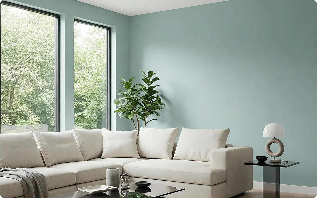
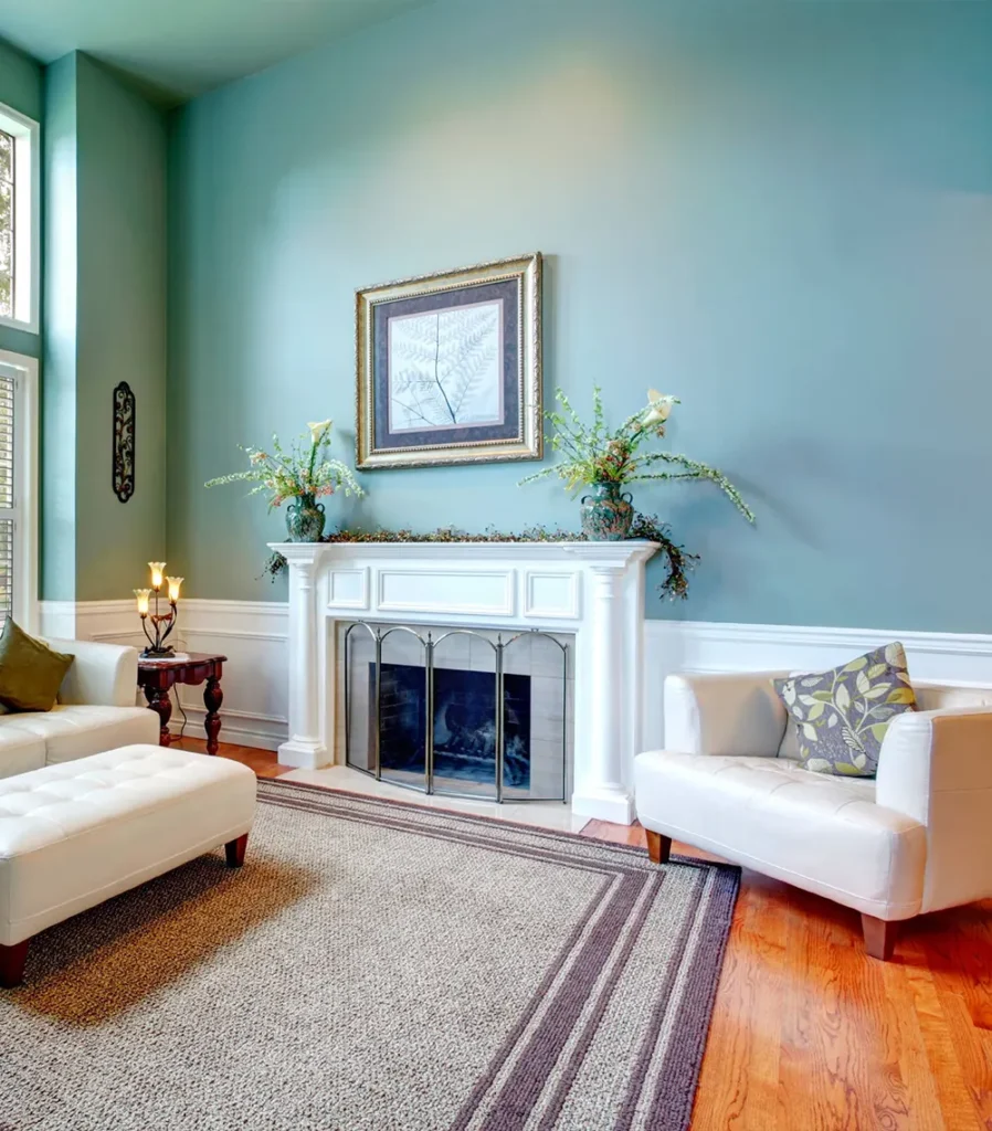
- Living Rooms & Family Rooms: Light to medium blue-greens can create a serene, inviting atmosphere in living spaces, making them perfect for spaces where you want to relax and unwind. Darker blue-greens, like Sherwin-Williams Riverway, can be used to add drama and sophistication, especially on feature walls or built-ins.
- Bedrooms & Bathrooms: Blue-green colors, especially softer shades like Benjamin Moore Palladian Blue or Sherwin-Williams Rainwashed, work wonderfully in bedrooms and bathrooms where you want to evoke a sense of calm and tranquility. These colors are ideal for creating a spa-like atmosphere in bathrooms.
- Kitchens: Whether you’re painting cabinets, islands, or walls, blue-green paint colors bring freshness and warmth. Medium shades like Aegean Teal by Benjamin Moore or Farrow & Ball Ballroom Blue are excellent choices for kitchens, offering both elegance and a touch of coastal charm.
- Hallways & Entryways: Darker blue-greens like Benjamin Moore Slate Teal or Sherwin-Williams Deep Sea Dive make striking choices for hallways and entryways. They create a welcoming, dramatic first impression while still feeling grounded and cozy.
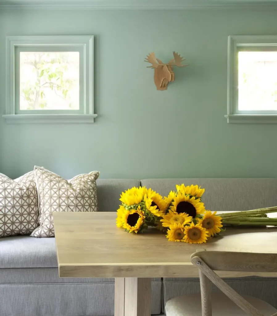
- Exteriors: Blue-green colors can also be a beautiful choice for exterior paint, particularly in coastal or lakeside homes. Shades like Sherwin-Williams Waterscape or Behr Breezeway pair well with natural surroundings and make homes feel integrated with the environment.

💥🎁 Christmas & Year-End Deals On Amazon !
Don't miss out on the best discounts and top-rated products available right now!
*As an Amazon Associate, I earn from qualifying purchases.
What Is The Most Popular Blue Green Paint Color For 2025?
While it’s hard to predict trends with complete certainty, Behr Breezeway (MQ3-21) is shaping up to be a top contender for the most popular blue-green paint color of 2025.
As a soft, tranquil shade with a refreshing vibe, Breezeway was named Behr’s 2022 Color of the Year, and it continues to have a lasting appeal.
This color captures the feeling of open skies and clear waters, making it a perfect choice for creating a peaceful, calm atmosphere in homes.
Its versatility allows it to work in any room, from living areas to bathrooms, and it pairs well with a variety of accent colors and natural materials.
The continued popularity of blue-green hues and their ability to bring nature indoors ensures that Breezeway will remain a favorite in 2025.
Tips for Choosing The Best Blue Green Paint Colors
Choosing the right blue-green paint color for your space can be tricky, but with the following tips, you’ll be sure to find the perfect shade:
- Consider the Room’s Lighting: Lighting plays a huge role in how colors appear. Natural light tends to bring out the blue in blue-green colors, while artificial lighting may emphasize the green. Test samples in different lighting conditions to see how the color shifts throughout the day.
- Think About Room Size and Purpose: Lighter blue-greens can make small spaces feel larger and airier, while darker shades like Deep Sea Dive or Riverway create a cozy, intimate feeling. Choose a shade that suits the room’s size and purpose. For example, softer blues are great for bedrooms, while deeper, moodier tones are ideal for living rooms or accent walls.
- Check the Undertones: Different blue-green colors can lean more toward blue, green, or gray. Consider what undertones will work best with your room’s furnishings and decor. If your furniture or flooring has warm tones, you might want to choose a blue-green with more green to balance the warmth. Conversely, if your space has cool tones, opt for a blue-green that leans toward blue or gray.
- Pair with Neutrals: Blue-green colors often pair beautifully with neutrals. Use whites, soft grays, or beige to balance the boldness of these shades. For more contrast, consider using deeper neutrals like charcoal or rich wood tones.
- Test Samples in the Space: Always test paint samples on your walls before committing. Colors can look different depending on the room’s light, size, and surrounding elements. Paint large swatches and observe how the color feels at different times of the day.
- Think About the Mood You Want to Create: Lighter blue-greens evoke a calming, refreshing mood, while darker blue-greens tend to feel more sophisticated and cozy. Consider the atmosphere you want to create in the room—whether you want to evoke peace, elegance, or energy—and choose your shade accordingly.
The Best Blue Green Paint Colors
Here are my favorite Blue Green paint colors to decorate with. You can’t go wrong with any of these colors—they bring out the best in interiors, offering a perfect balance between calmness and style.
The Best Light Blue Green Paint Colors
1. Benjamin Moore Sea Foam

💥🎁 Christmas & Year-End Deals On Amazon !
Don't miss out on the best discounts and top-rated products available right now!
*As an Amazon Associate, I earn from qualifying purchases.
Benjamin Moore Seafoam is the kind of color that instantly brings a sense of calm and tranquility to any room. With its soft, misty blue-green hues, it feels like a breath of fresh air.
The color has a subtle hint of green that keeps it from being too cool or harsh, which makes it a versatile choice for various spaces. It’s light enough to feel airy and refreshing but still rich enough to give a sense of coziness.
Perfect for bedrooms, bathrooms, or even a light-filled living room, Seafoam’s ability to blend both blue and green in an almost imperceptible way makes it a top choice for a soothing, serene atmosphere. The undertones are primarily green with just a touch of blue, giving it a natural, almost seaside vibe that evokes peacefulness.
If you want a soft, muted color that feels like a coastal breeze, Seafoam will work wonders. It’s perfect for creating a tranquil sanctuary where you can relax and unwind.
2. Behr Breezeway
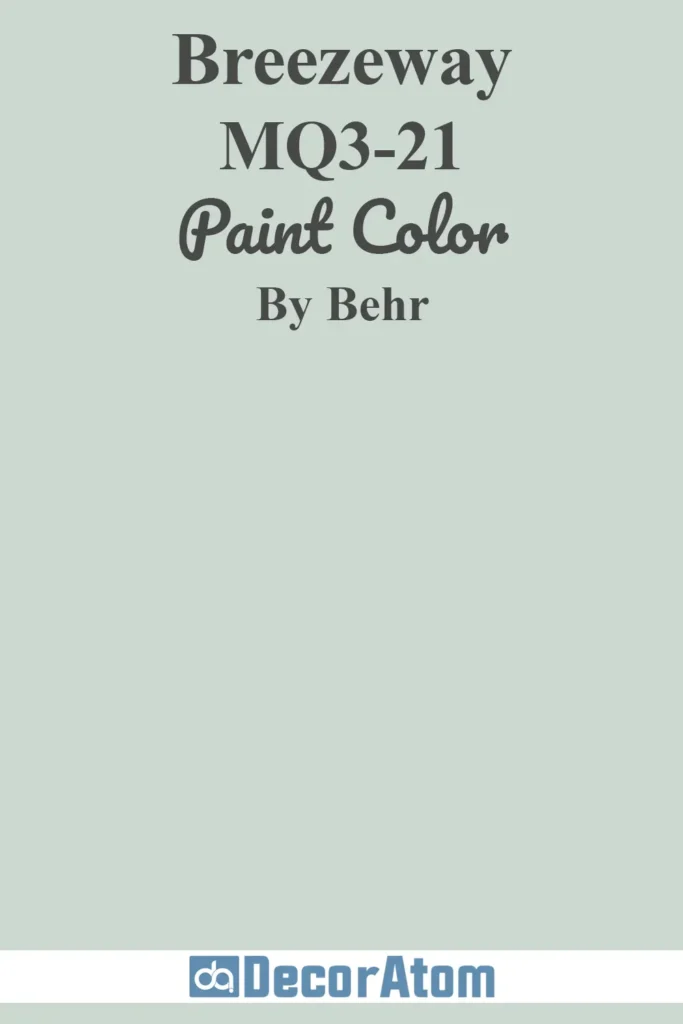
Behr Breezeway has earned its place as a popular and versatile choice, especially after being named Behr’s 2022 Color of the Year.
Its cool, silvery mint green hue is reflective of the natural world—think of a gentle sea breeze or soft, open skies. Breezeway leans heavily on its green undertones, making it ideal for spaces where you want a refreshing and nature-inspired feel.
It’s soft, calming, and still feels modern, without being too stark or bold. Its ability to adapt to various lighting conditions only enhances its appeal, with its cool tone changing with the time of day. Breezeway can beautifully work as an accent color or a primary wall color in spaces that need a fresh, clean vibe.
If you’re seeking a color that feels both fresh and sophisticated, Breezeway is your go-to. It’s elegant and timeless yet undeniably modern, making it ideal for a wide range of interior design styles.
3. Sherwin-Williams Waterscape
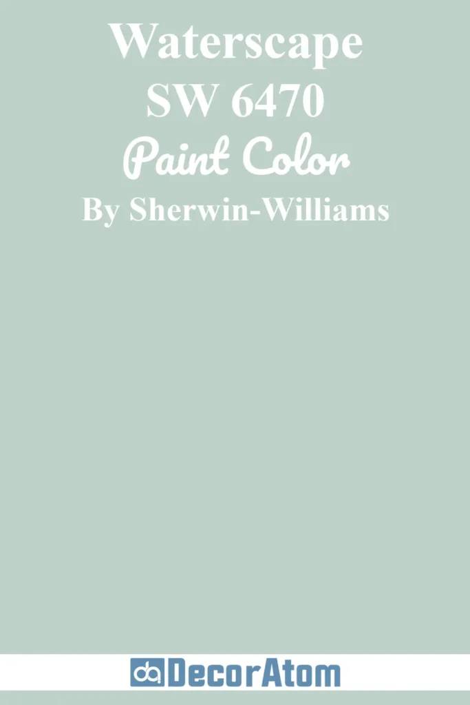
Sherwin-Williams Waterscape is a rich yet subtle blue-green that’s both vibrant and calming. With its medium depth, it captures the essence of ocean waters, offering a touch of luxury without feeling overpowering.
The color is deeply relaxing, evoking a serene atmosphere reminiscent of calm, tropical waters. It’s not as bright or intense as some blues or greens, but it still brings a sense of openness to a room.
The subtle blue undertone grounds the green, creating a balanced, harmonious feel. Waterscape is perfect for creating a tranquil living room or bedroom, or even in a coastal-inspired bathroom.
If you’re looking for something that combines elegance with tranquility, Waterscape delivers. Its depth and balance make it the perfect middle ground between a soft, muted tone and a vibrant, bold color.
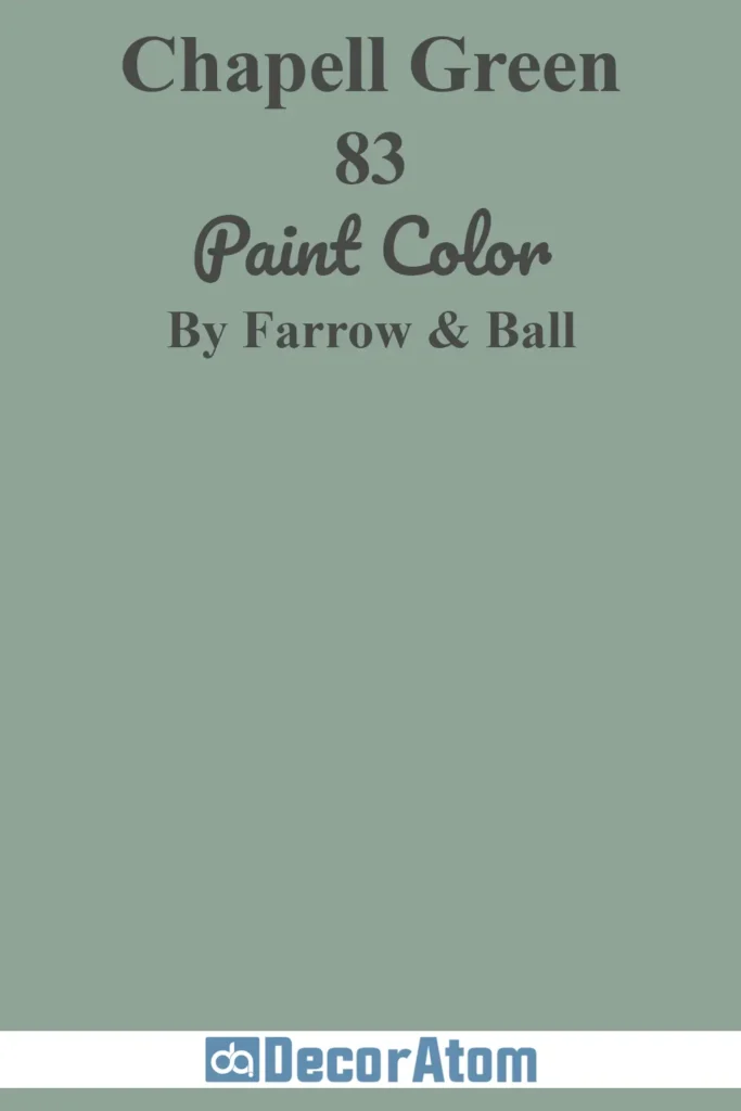
4. Farrow & Ball Chapell Green
💥🎁 Christmas & Year-End Deals On Amazon !
Don't miss out on the best discounts and top-rated products available right now!
*As an Amazon Associate, I earn from qualifying purchases.
Farrow & Ball’s Chapell Green is a sophisticated and enchanting choice. Unlike some of the lighter options, Chapell Green is a deeper, more intense shade of blue-green that provides a sense of depth and richness to any space.
It feels warm and inviting, but with just the right amount of coolness to balance it. The undertones lean more toward blue, giving it a slightly more subdued, antique quality.
This color works beautifully in spaces where you want to make a statement—think feature walls, cabinetry, or even an elegant dining room. It has a timeless quality that adds character and charm, while still feeling fresh.
Chapell Green is perfect for those who want a rich, moody color that isn’t too dark. It offers sophistication and a sense of history while still maintaining a lightness that keeps it from feeling heavy.
5. Benjamin Moore Palladian Blue

Benjamin Moore Palladian Blue is one of the most beloved blue-green shades in the design world, and for good reason. This soft, airy hue brings a sense of peace and calm wherever it’s used.
It’s known for its perfect balance between blue and green, leaning slightly toward blue without feeling too cool. The color evokes the feeling of a serene ocean or a quiet, misty morning.
Palladian Blue works wonderfully in almost any room—living rooms, bedrooms, kitchens, or even bathrooms. It’s the kind of color that never feels overwhelming but always adds just the right amount of warmth and freshness.
Palladian Blue feels timeless and peaceful, offering versatility for any room. If you’re after a hue that feels effortless yet polished, this is the color for you.
6. Sherwin-Williams Rainwashed

Sherwin-Williams Rainwashed is a soft, gentle color that evokes a sense of tranquility and freshness. With its faint greenish-blue undertones, it captures the feel of misty mornings and rain-kissed leaves.
Rainwashed isn’t as bright or stark as some other blue-greens, making it incredibly versatile for various interior styles. Whether you’re looking to add a bit of freshness to a bedroom or create a soothing vibe in a living room, this color works beautifully in any space where you want to evoke a sense of calm.
Its ability to change subtly with the light only adds to its appeal, making it a favorite for those who want a color that feels fresh and natural, no matter the time of day.
If you love calm, serene spaces with just a touch of color, Rainwashed is a dream. It’s perfect for creating an airy, light atmosphere, while still offering enough depth to keep it from feeling bland.
The Best Medium Blue Green Paint Colors
7. Farrow & Ball Ballroom Blue

💥🎁 Christmas & Year-End Deals On Amazon !
Don't miss out on the best discounts and top-rated products available right now!
*As an Amazon Associate, I earn from qualifying purchases.
Farrow & Ball’s Ballroom Blue is a striking, yet sophisticated blue-green with a touch of depth. It carries the vibrancy of a summer evening sky, combining both calmness and energy in the same stroke.
It’s a medium-to-deep shade that works wonderfully in larger rooms, offering elegance without feeling too intense. The blue undertones bring out a sense of coolness, while the green adds warmth and liveliness, making it a great choice for living rooms or dining rooms where you want to entertain but also maintain a relaxed ambiance.
If you want a color that exudes both calm and energy, Ballroom Blue is perfect. It’s bold without being overwhelming, adding character and richness to your space.
8. Benjamin Moore Surf City

Benjamin Moore Surf City is a fun, invigorating medium blue-green that calls to mind ocean waves and coastal breezes. This color has a balance of blue and green that creates an uplifting atmosphere.
It’s bright but not overwhelming, with just enough of both hues to keep it vibrant yet grounded. Surf City works great in spaces where you want to inject some energy and fun—like a kitchen, living room, or even a kid’s room.
Its versatility makes it a fantastic choice for both contemporary and traditional spaces.
Surf City is perfect if you want a cheerful, energizing color that still feels soothing. It’s ideal for spaces where you want a pop of color but still need a relaxed vibe.
9. Benjamin Moore Stratton Blue
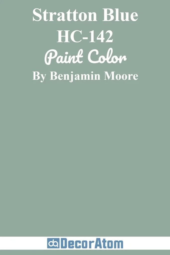
Benjamin Moore Stratton Blue is a classic, medium blue-green that feels elegant and timeless. It has the richness of blue with a touch of green that softens the tone, making it sophisticated without being too cool.
Stratton Blue works well in both contemporary and traditional settings, creating a calming yet elevated atmosphere. Whether in a dining room or living room, it brings depth and warmth to the space.
Its versatility is unmatched—it pairs well with both warm and cool neutrals, allowing it to be used in a variety of design schemes.
Stratton Blue is the perfect middle ground—it’s neither too bold nor too subtle, making it a go-to for creating a timeless, classic look.
10. Benjamin Moore Aegean Teal

💥🎁 Christmas & Year-End Deals On Amazon !
Don't miss out on the best discounts and top-rated products available right now!
*As an Amazon Associate, I earn from qualifying purchases.
Aegean Teal by Benjamin Moore is a captivating blue-green with depth and complexity. Its soothing quality comes from its mix of rich blue and green tones, with just a touch of gray to soften it.
Aegean Teal brings a sense of calm while still feeling sophisticated and refined, making it perfect for bedrooms, living rooms, or home offices. It’s a versatile medium tone that pairs beautifully with neutral tones like whites, grays, or even warm wood accents.
This color works wonderfully in spaces where you want a touch of color without going overboard.
If you want a color that feels both serene and bold, Aegean Teal offers the perfect balance. It’s ideal for creating a relaxing, inviting space that still feels modern and fresh.
11. Sherwin-Williams Still Water

Sherwin-Williams Still Water is a calming and serene blue-green that feels like a retreat into nature. Its soft, misty quality evokes the peacefulness of still waters on a quiet lake.
The color combines a subtle green base with a cool blue overlay, creating a balanced and harmonious effect. It’s perfect for creating peaceful, spa-like spaces like bathrooms, bedrooms, or meditation areas.
The muted tones ensure it never feels too bold or overwhelming, providing a serene backdrop for any room.
Still Water is perfect if you want to create a restful, peaceful environment. Its gentle hue will bring tranquility to your space, making it feel like a quiet sanctuary.
The Best Dark Blue Green Paint Colors
12. Benjamin Moore Garden Cucumber
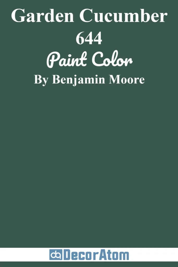
Benjamin Moore Garden Cucumber is a deep, captivating shade that brings a sense of luxury and depth to any space. This color combines the richness of green with a touch of blue, creating a bold yet balanced hue that feels fresh and grounded at the same time.
The green undertones give it a natural, almost earthy feel, while the blue adds a cool, calming touch. Garden Cucumber is ideal for spaces where you want a more dramatic effect without it being too dark or heavy. It’s perfect for an accent wall in a living room, a feature wall in a bedroom, or even as an elegant color for cabinetry or trim.
If you’re after a dark, sophisticated color that feels both luxurious and natural, Garden Cucumber is your perfect match. Its depth and versatility allow it to anchor any room without feeling overwhelming, adding richness without overpowering the space.
13. Benjamin Moore Slate Teal

Benjamin Moore Slate Teal is a deep, smoky blue-green that strikes the perfect balance between calm and drama. The cool blue undertones paired with a deep, almost grayish green give it an air of mystery and sophistication.
Slate Teal feels grounded yet elegant, making it perfect for creating a cozy yet refined atmosphere in larger spaces like dining rooms, living rooms, or even home offices. The depth of this color can transform a room, adding a sense of luxury and refinement while still feeling inviting.
Slate Teal brings a cool, calming ambiance while offering a dramatic touch. It’s ideal for those who want a dark, moody color that isn’t too harsh but still feels impactful and elegant. This color will elevate your space with its complexity and depth.
14. Sherwin-Williams Deep Sea Dive

Sherwin-Williams Deep Sea Dive is a strikingly bold dark blue-green that is perfect for those who want to make a statement. The color evokes the feeling of exploring the depths of the ocean, with its deep, mysterious qualities bringing a sense of adventure and tranquility at the same time.
With a solid base of green and blue, this rich shade brings both depth and vibrancy to a room. Deep Sea Dive works beautifully in spaces where you want a more dramatic, serene environment, like a reading nook or a luxurious bathroom.
It also pairs wonderfully with natural wood tones, brass, or gold accents for a truly refined look.
If you crave bold colors that pack a punch but still feel calm and serene, Deep Sea Dive will deliver. Its dark, captivating nature makes it a perfect choice for creating a striking yet soothing atmosphere that commands attention without feeling too overpowering.
15. Farrow & Ball Coppice Blue
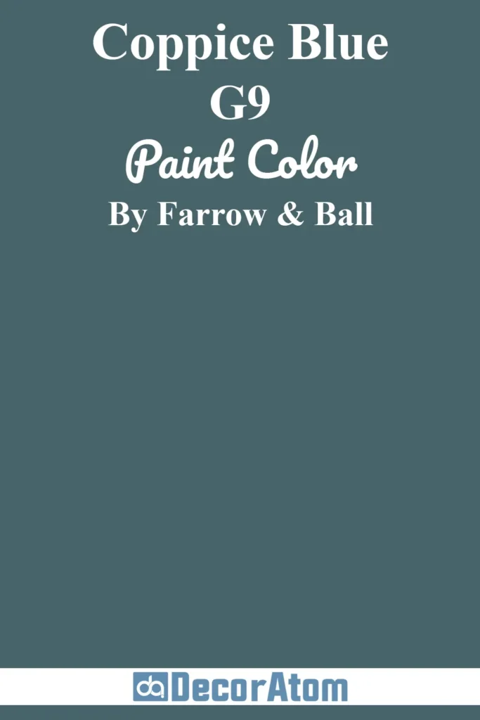
Farrow & Ball Coppice Blue is a sophisticated, dark blue-green that feels elegant and timeless. It’s a color that exudes a sense of deep tranquility with its mix of rich blue and muted green tones, giving it a natural, almost woodland vibe.
Coppice Blue brings a refined, grounded feel to any room, and it’s especially ideal in spaces where you want to evoke a cozy yet luxurious atmosphere. Think of using it in an intimate dining room, a luxurious bedroom, or even a home study.
Its depth is balanced by a soft touch of gray, giving it a richness that’s never too heavy.
Coppice Blue offers the perfect balance between warmth and depth. If you love rich, earthy tones but still want something sophisticated, this is an ideal choice. It adds character and a sense of elegance to any space while still feeling grounded and calming.
16. Benjamin Moore Dark Teal
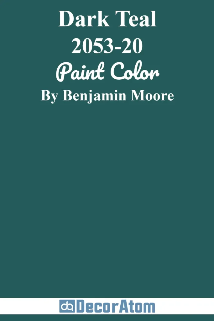
Benjamin Moore Dark Teal is a bold, moody shade that combines the intensity of teal with the richness of green and blue. This deep, jewel-toned color is perfect for those who want a dramatic effect without opting for something too stark or dark.
It’s perfect for creating a focal point in a room, whether it’s used as an accent wall or throughout a larger space. Dark Teal feels both modern and timeless, with its rich, complex undertones giving it an air of sophistication.
It works well in spaces that need a little extra depth and drama, like a dining room or library, but it can also be used to create a cozy, intimate vibe in a bedroom or living room.
If you’re drawn to deeper, more intense shades but want something that still feels warm and inviting, Dark Teal delivers. Its boldness adds drama to your space, while the rich tones keep it from feeling too overpowering or cold.
17. Sherwin-Williams Riverway

Sherwin-Williams Riverway is a deep, elegant blue-green with a touch of muted gray that gives it a soft, sophisticated vibe. It’s perfect for creating a serene, grounded atmosphere without feeling too dark or heavy.
Riverway’s beautiful blend of blue and green makes it adaptable to a variety of spaces, from bedrooms to bathrooms to living rooms. The subtle gray undertones ensure that the color doesn’t overpower a room, while still providing enough depth to make an impact.
Riverway pairs wonderfully with neutrals, warm wood tones, and metallic accents, allowing it to fit seamlessly into both contemporary and traditional settings.
If you want a deep color that feels rich and serene without being overwhelming, Riverway is the perfect choice. It’s ideal for creating a calm, sophisticated environment that adds a touch of elegance without feeling too bold.