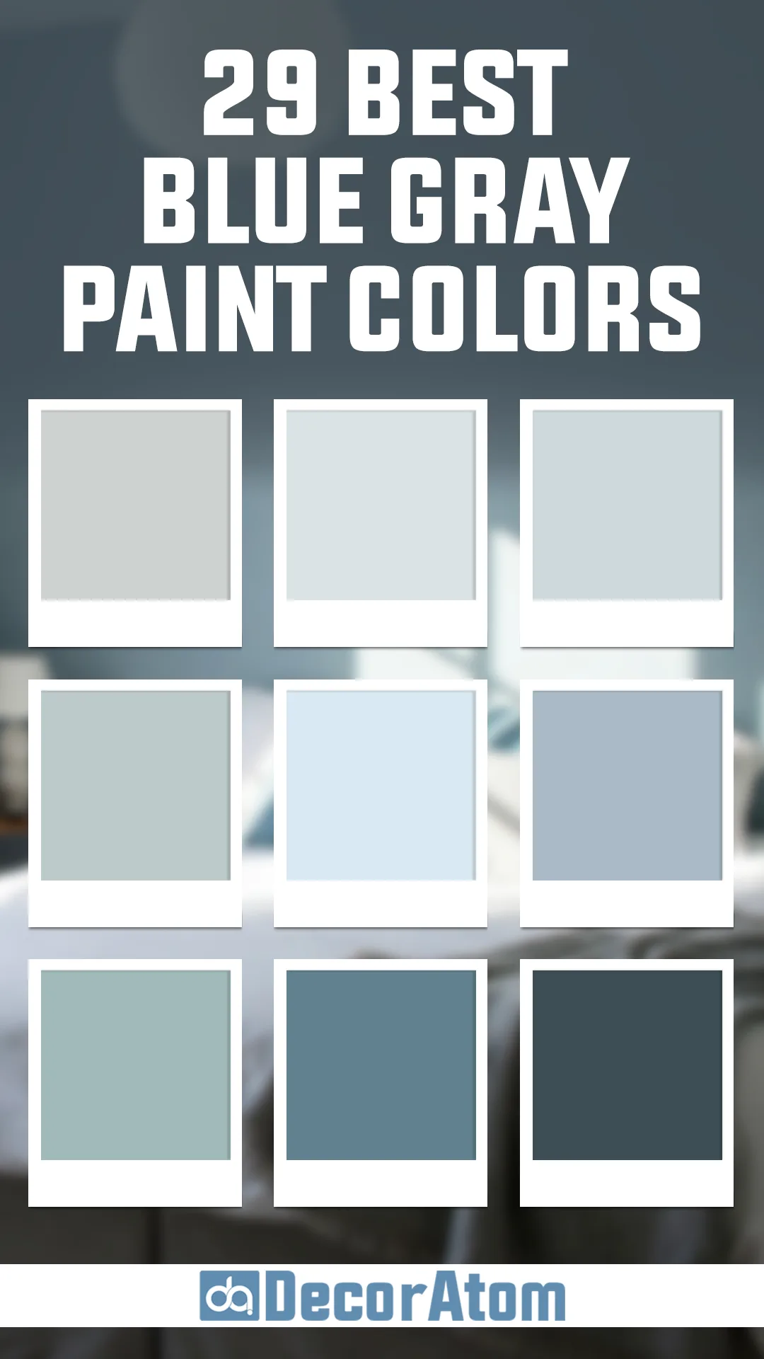
Blue-gray paint colors have become the secret weapon of interior designers everywhere – and for good reason.
As someone who’s spent countless hours helping clients create their dream spaces, I’ve seen firsthand how these sophisticated hues can transform a hectic room into a peaceful sanctuary.
They’re like that perfect pair of jeans – versatile enough to work with any style, yet distinctive enough to make a statement.
But with so many shades out there, finding the perfect blue-gray can feel overwhelming. That’s why I’ve done the legwork for you!
In this post, I’m sharing 29 of the absolute best blue-gray paint colors, from the palest whispers of gray with a blue undertone to deeper, more dramatic hues.
Whether you’re dreaming of a tranquil bedroom retreat or a sophisticated living room that makes your guests say “wow,” you’ll find your perfect shade here.
Let’s dive into these carefully selected colors that bring the calming essence of a cloudy beach day right into your home.
Light Blue-Gray Paint Colors
These light blue-gray shades all bring a sense of peace and sophistication, each with its own unique twist. Some lean more blue, some more gray, and others have subtle green or silver undertones that give them added depth. But one thing they all have in common? They create a calm and inviting home—exactly what you want from a blue-gray paint color.
Repose Gray by Sherwin Williams

Repose Gray is one of those shades that feels like a perfect balance between warmth and coolness. It’s technically a greige, but in certain lighting, a soft blue undertone emerges, giving it an airy, calming effect. If you want a barely-there blue-gray that still reads neutral, this is an ideal pick.
It works exceptionally well in spaces with lots of natural light, where its undertones subtly shift throughout the day. In dimmer rooms, it leans slightly warmer, making it a flexible option for those who don’t want anything too stark. This color has long been a go-to for modern, sophisticated interiors that need a hint of coolness without feeling cold.
Gray Owl by Benjamin Moore

Gray Owl is a crowd-pleaser for a reason. It’s a classic light gray with just enough blue and green undertones to keep it feeling fresh rather than flat. Depending on the lighting, it can lean slightly cooler, but it never feels icy. This is one of those colors that can make a room feel open and serene, which is why it’s so popular in bedrooms and living rooms.
It also pairs beautifully with crisp white trim, making it a fantastic choice for anyone who loves that timeless, clean aesthetic. If you want a true blue-gray that stays light and airy but still adds character, Gray Owl is a solid bet.
Sea Salt by Sherwin Williams
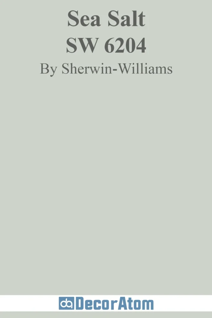
Sea Salt is a fascinating color because it’s a mix of blue, green, and gray all wrapped into one. It has a soft, misty quality that makes it feel almost coastal, yet it works just as well in modern and traditional spaces. In bright, natural light, the blue-green tones are more pronounced, giving the room a soothing, spa-like feel.
In lower light, it leans more muted and gray, making it a fantastic choice for those who want a dynamic color that shifts throughout the day. Sea Salt has a gentle way of making a space feel relaxed without being overwhelming—a true calming shade.
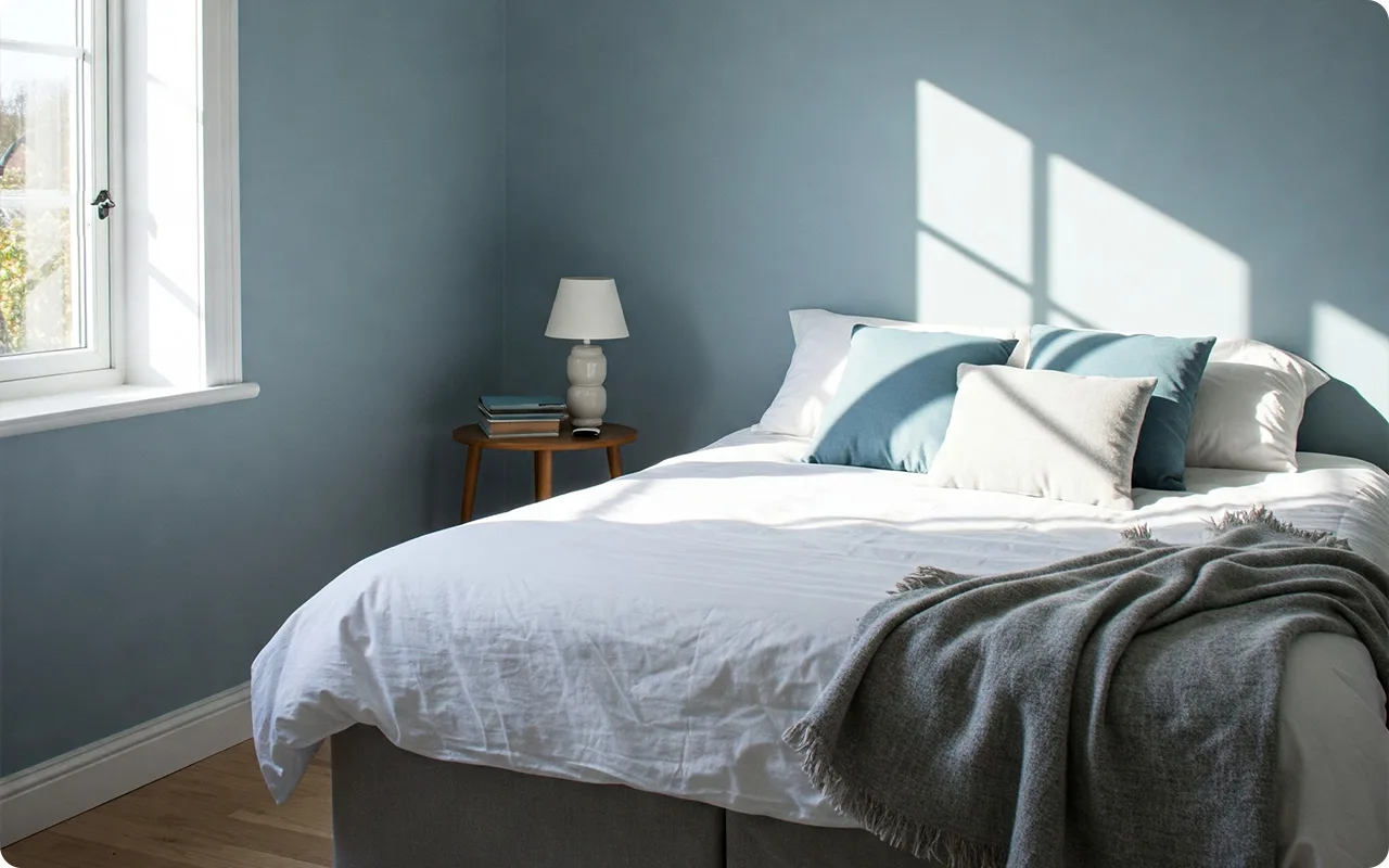
Reflecting Pool by Behr
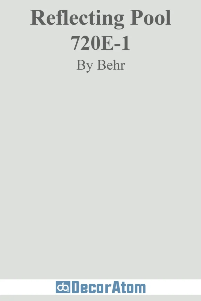
Reflecting Pool is one of those colors that instantly makes a room feel fresh. It has a bit more blue than some of the other blue-grays on this list, but the gray base keeps it from feeling overly bright or too baby blue. It’s a fantastic choice for anyone who wants a cool-toned color that still feels inviting.
This shade works especially well in bathrooms and bedrooms, where its tranquil undertones can create a peaceful retreat. If you’ve been searching for a light blue-gray that feels crisp and modern but not too cold, Reflecting Pool is a winner.
Arctic Gray by Benjamin Moore
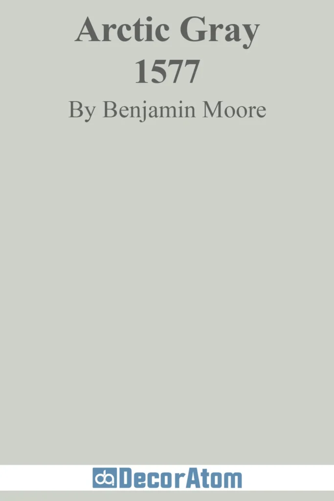
Arctic Gray is an elegant and airy shade that leans slightly more toward the blue side of blue-gray. It’s soft, refined, and has a lightness that makes it perfect for creating a calm atmosphere. This color works particularly well in rooms with lots of natural light, where its blue-gray hues stay crisp and fresh.
However, in dimmer rooms, it takes on a slightly grayer appearance, making it a versatile option for anyone who wants a cool-toned neutral that doesn’t feel overpowering. Arctic Gray is a fantastic choice for those looking for a refined yet relaxed aesthetic.
Borrowed Light by Farrow & Ball
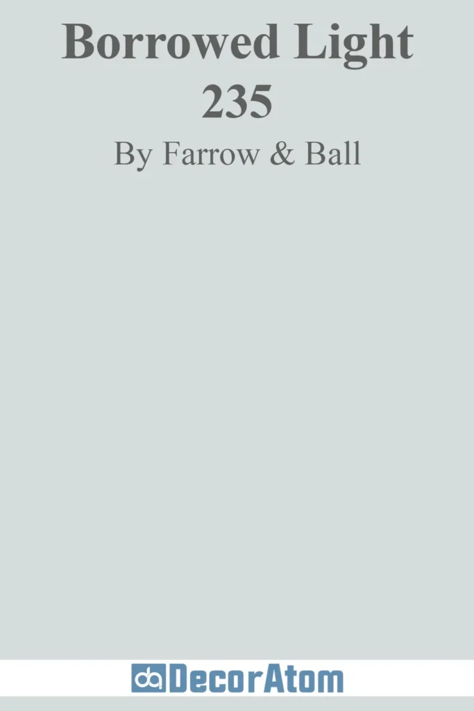
Borrowed Light has a delicate, almost ethereal quality. It’s a very pale blue-gray with a whisper of softness that makes it feel like a gentle morning sky. This is one of those colors that truly earns its name—it seems to borrow light from the room, making spaces feel open and airy.
Because of its barely-there gray undertones, it avoids feeling too pastel, keeping it sophisticated. If you want a color that feels fresh and uplifting while still maintaining a sense of calm, Borrowed Light is an excellent choice.
Beacon Gray by Benjamin Moore
Beacon Gray is a soft, muted blue-gray that brings a sense of serenity to any space. It has a gentle presence, never demanding attention but always adding an air of sophistication. The balance between blue and gray here is just right—it’s cool and fresh without feeling sterile.
This shade is particularly beautiful in spaces with plenty of natural light, where its soft blue undertones can shine. It’s also a great choice for pairing with warm wood tones, as it provides a subtle contrast that feels organic and inviting.
Misty by Sherwin Williams
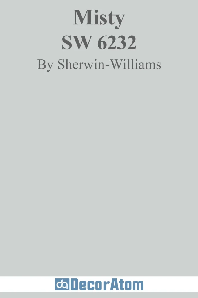
Misty is a dreamy, almost foggy shade of blue-gray. It has a tranquil, weightless quality that makes it a favorite for bedrooms, bathrooms, and any space where relaxation is key. What makes Misty stand out is its ability to lean more blue in certain lights while still feeling neutral enough to blend seamlessly with other colors.
It’s perfect for coastal-inspired spaces, but it also works beautifully in modern homes that need a soft touch of color without going full-on blue.
First Snowfall by Benjamin Moore

First Snowfall is an elegant, delicate blue-gray with an icy freshness. It has a crisp quality that makes spaces feel bright and open, but the gray undertones prevent it from feeling too stark.
This color works beautifully in minimalist interiors, where it adds just enough coolness to keep things feeling serene. If you love a light, clean look but want a hint of blue without it feeling overwhelming, First Snowfall is a fantastic choice.
North Star by Sherwin Williams

North Star is one of those colors that truly embodies calmness. It’s a soft blue-gray with a slight touch of silver, making it feel light and airy. Unlike some blue-grays that can feel heavy or moody, North Star maintains a fresh, balanced look in almost any lighting.
It’s an excellent option for anyone who wants a peaceful, breezy vibe in their home, whether it’s in a bedroom, bathroom, or even a well-lit kitchen.
White Satin by Benjamin Moore
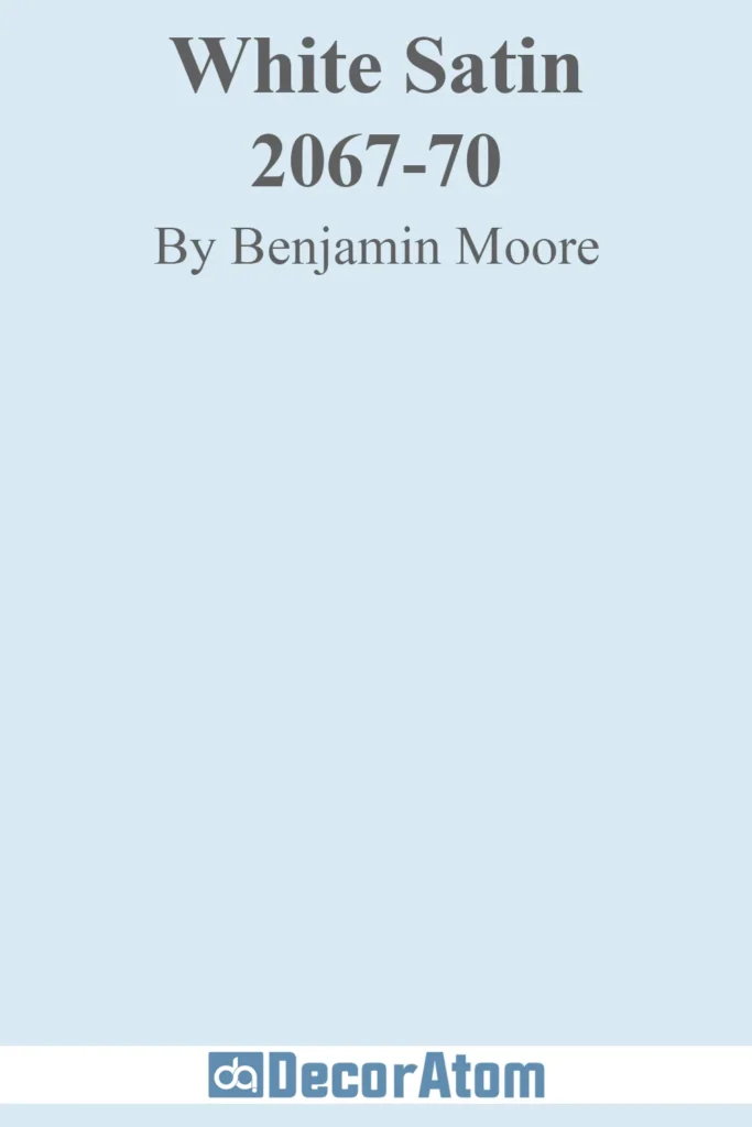
White Satin is a whisper-soft blue-gray with a nearly translucent quality. It’s one of those colors that adds just a hint of coolness to a space, making it feel effortlessly sophisticated. The gray undertones keep it grounded, ensuring that it never feels too pastel or overly bright.
This is an ideal choice for someone who wants a neutral that leans cool without fully committing to blue. White Satin works beautifully in spaces that need a breath of fresh air—perfect for small rooms that need an extra boost of light and openness.
Rich and Deep Blue-Gray Paint Colors
Now, let’s dive into these rich and deep blue-gray paint colors and explore what makes each one a standout choice for a calm yet bold home.
Buxton Blue by Benjamin Moore

Buxton Blue is a refined, mid-tone blue-gray with just enough depth to feel cozy without overwhelming a space. It has an almost velvety richness, thanks to its balanced mix of blue and gray, with a slightly muted quality that keeps it from feeling too bright.
The best part? It pairs beautifully with crisp whites and soft neutrals, making it a versatile option for everything from accent walls to entire rooms. If you love a classic blue but want something a bit more grounded and sophisticated, Buxton Blue is an excellent choice.
Blueprint by Behr
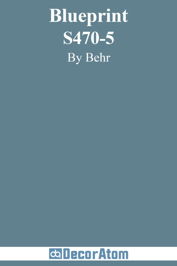
Blueprint is bold but balanced. It’s a deeper blue-gray with a strong presence, yet it doesn’t feel overpowering. The gray undertones keep it from leaning too vibrant, while the blue gives it enough warmth to feel inviting. This shade is fantastic for statement walls, cabinetry, or even exterior spaces.
If you want a color that makes an impact while still keeping a sense of calm, Blueprint is a solid contender. It has a modern, slightly moody vibe that works well in contemporary and transitional homes alike.
Slate Tile by Sherwin Williams
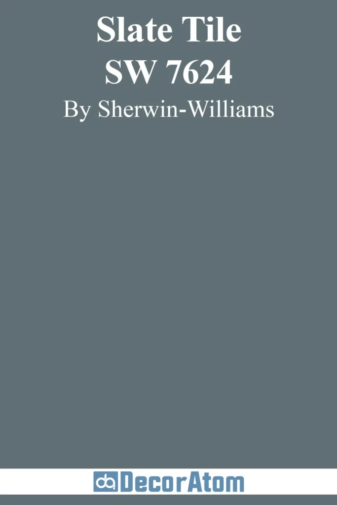
Slate Tile is one of those colors that feels both dramatic and serene at the same time. It’s a deep blue-gray that leans slightly cool, with a slate-like richness that makes it feel sophisticated. The beauty of this color is its versatility—it works equally well in traditional and modern spaces, adding depth without feeling too dark.
In bright natural light, it reveals more of its blue undertones, while in dimmer spaces, it takes on a moody, cozy feel. If you want a deep blue-gray that’s striking yet timeless, Slate Tile is a fantastic option.
Evening Dove by Benjamin Moore
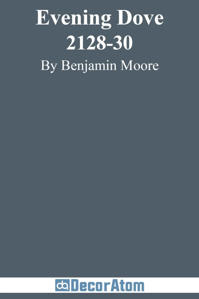
Evening Dove is a smoky, sophisticated blue-gray with a slightly stormy feel. It’s a deep, rich color that doesn’t quite hit navy territory but still has enough depth to create drama. There’s a softness to it that makes it feel more livable than a true navy, while the gray keeps it balanced and moody.
This color is perfect for those who love dark, cozy interiors but want a hint of blue rather than a straight charcoal or black. It’s stunning in bedrooms, offices, and dining rooms—anywhere you want to create a calming yet bold atmosphere.
Naval by Sherwin Williams
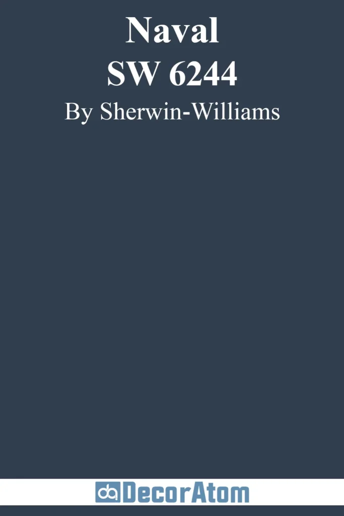
Naval is the epitome of classic deep blue-gray. It’s rich, dramatic, and bold, yet thanks to its strong gray base, it never feels too intense. This color works beautifully in spaces that need a sense of depth and sophistication, whether it’s on kitchen cabinets, a statement wall, or an entire room.
Naval pairs particularly well with warm wood tones, brass fixtures, and crisp white trim, creating a timeless and elegant contrast. If you’re looking for a deep blue-gray that feels regal yet inviting, Naval is a top-tier choice.
Hale Navy by Benjamin Moore

Hale Navy is a fan-favorite for good reason. It’s a deep, moody navy with a strong gray influence, making it more grounded than a traditional navy blue. This color has an effortlessly classic feel, working well in everything from coastal homes to modern interiors.
The gray undertones keep it from feeling too bold, giving it a more sophisticated edge. If you want a rich, deep blue-gray that won’t ever go out of style, Hale Navy is a no-brainer.
Krypton by Sherwin Williams
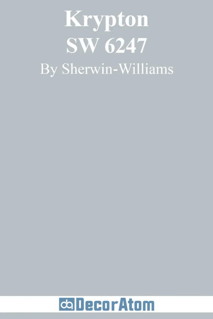
Krypton is a fascinating shade—it’s a deep blue-gray with an almost misty quality, sitting right between medium and dark on the color spectrum. It has cool undertones that make it feel crisp and serene, yet there’s enough depth to keep it from feeling washed out.
This shade works beautifully in rooms with lots of natural light, where its blue tones come through in a soft, airy way. In lower light, the gray takes center stage, giving it a more moody, sophisticated feel. Krypton is an excellent choice for anyone who wants a balanced deep blue-gray that isn’t too heavy.
Hague Blue by Farrow & Ball
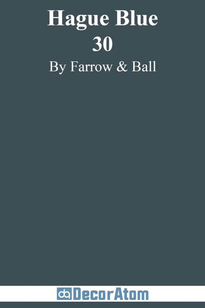
Hague Blue is an iconic deep blue-gray with a dramatic, almost inky quality. It’s a rich, saturated shade with green-gray undertones that add extra depth, making it feel even more luxurious. This is a color that brings instant sophistication to a space, whether it’s on walls, cabinetry, or even trim.
The way Hague Blue plays with lighting is what makes it so special—it can look almost black in low light but reveals its blue and gray depth in brighter conditions. If you want a deep blue-gray that feels moody, elegant, and timeless, this is a perfect pick.
Abyss by Benjamin Moore

Abyss is a bold, dark blue-gray that leans into its depth, creating a striking yet sophisticated look. It has an almost charcoal-like quality, but the blue undertones keep it from feeling too heavy. This is a great choice for anyone looking for a modern, moody color that still has warmth and personality.
Abyss works beautifully in intimate spaces like bedrooms or libraries, but it can also be used on cabinetry or doors for a stunning contrast against lighter walls.
Storm Cloud by Sherwin Williams

Storm Cloud is exactly what it sounds like—a deep, moody blue-gray that has the atmospheric feel of an overcast sky. It’s bold without being too dark, and the gray influence makes it incredibly versatile. In bright light, it shows off more of its blue tones, creating a striking but peaceful effect.
In dim lighting, it leans more gray, adding a sense of coziness and depth. Storm Cloud is a fantastic option for those who want a dramatic color that still feels calming and sophisticated.
Neutral Blue-Gray Paint Colors
Let’s wrap up the list with these neutral blue-gray colors, which blend the best of both worlds—versatility and a touch of calming coolness. Here’s why these colors make the cut:
Windy Blue by Sherwin Williams
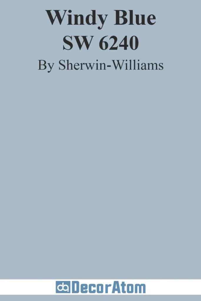
Windy Blue is a subtle, airy blue-gray that embodies the feeling of a soft breeze on a cloudy day. It’s not too bold, yet it has a refreshing vibrancy that lifts a space without being overpowering. The color feels effortlessly serene, offering a gentle touch of color that works well with both modern and traditional furnishings.
It’s an ideal choice for living rooms, kitchens, or even as a soft accent color in bedrooms. If you love blue but want a neutral shade that feels light and peaceful, Windy Blue is the perfect match.
Stonington Gray by Benjamin Moore

Stonington Gray is a light, neutral blue-gray that has a timeless, classic feel. It’s soft but not too pale, with enough depth to add interest without making a room feel heavy. The gray undertones in Stonington Gray keep it grounded, while the subtle blue quality adds just a hint of coolness.
This color pairs beautifully with virtually any color palette, making it perfect for those who want a serene backdrop that still has depth and character. It’s a top choice for open spaces or hallways, where it can create a seamless flow between rooms.
Pavilion Gray by Farrow & Ball
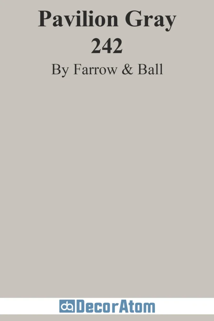
Pavilion Gray is a sophisticated, warm blue-gray with a soft, dusty appearance. It feels welcoming and elegant, offering a grounded neutrality that works in a variety of settings. What sets Pavilion Gray apart is its muted, almost antique quality that gives it a timeless charm.
It’s not as cold or clinical as some blue-grays, making it a great choice for anyone who wants a calm, understated hue with a bit of character. This shade pairs wonderfully with other muted tones, making it ideal for cozy, layered interiors.
Passive by Sherwin Williams

Passive is a soft, serene blue-gray that leans toward the cooler side without feeling too frigid. It’s one of those colors that can fill a room with calm and tranquility, perfect for spaces like bedrooms, bathrooms, or any area where you want to create a peaceful, relaxing atmosphere.
Its lightness and simplicity make it incredibly versatile—whether paired with whites for a crisp look or deeper hues for contrast, Passive is a great go-to for a neutral blue-gray.
Wickham Gray by Benjamin Moore
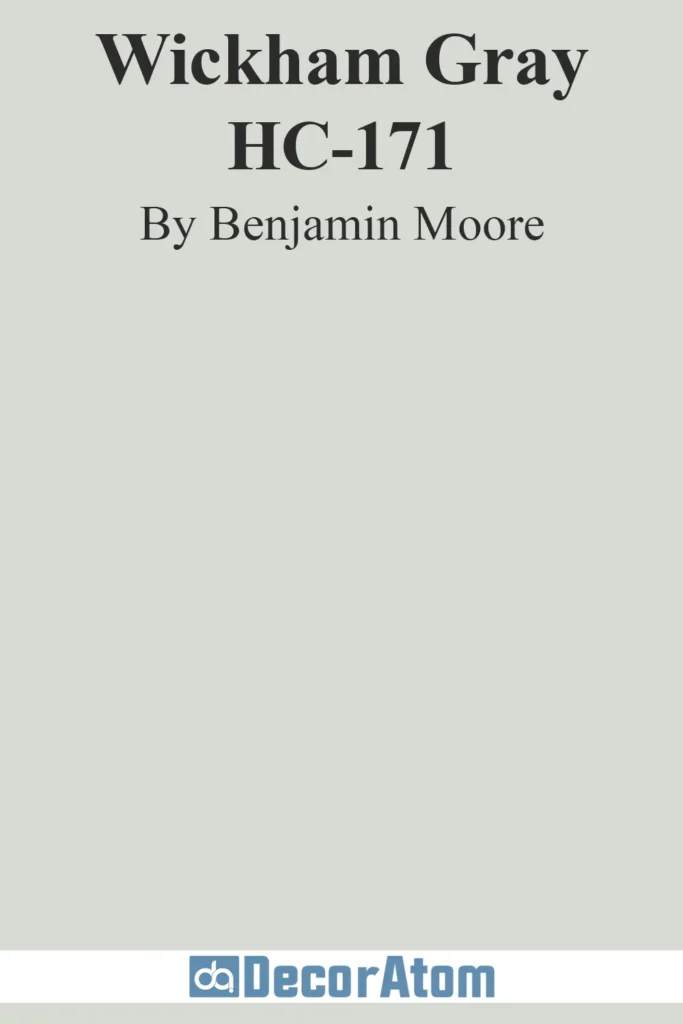
Wickham Gray is a light, crisp blue-gray with just a touch of green that gives it an almost seafoam quality. It’s soothing and soft, making it perfect for bedrooms, bathrooms, and living spaces where relaxation is key. The color has a natural, grounded feel, which makes it perfect for creating a serene and welcoming atmosphere.
If you’re looking for a blue-gray that’s not too heavy and not too cool, Wickham Gray strikes that perfect balance, offering just the right amount of freshness without overwhelming the space.
Evening Shadow by Sherwin Williams
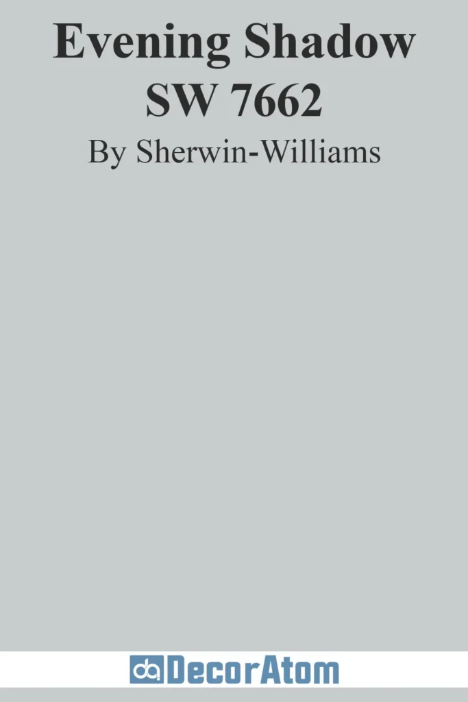
Evening Shadow is a mid-tone blue-gray that has a serene, almost velvety feel. It’s a little deeper than some of the other neutrals on this list but still maintains that soft, calming quality. This color has a coolness to it that’s grounded by its gray undertones, making it a great option for spaces that need a more substantial color without feeling too dark.
Evening Shadow works beautifully in rooms with softer lighting, where its cool tones can create a calm, peaceful ambiance.
Silver Mist by Benjamin Moore
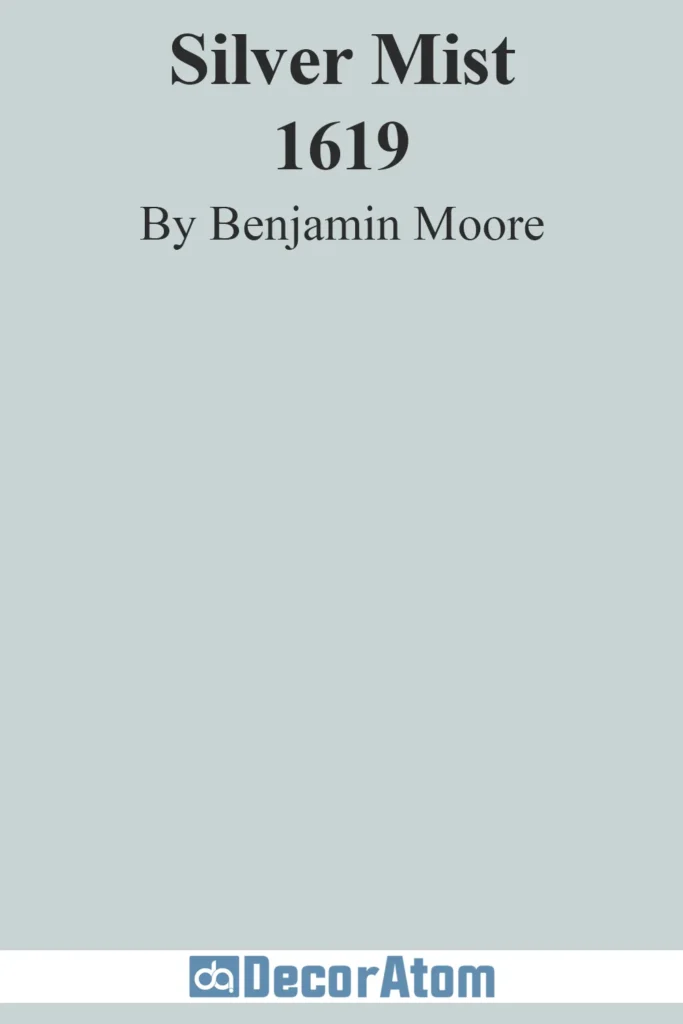
Silver Mist is a light, ethereal blue-gray with a whisper of silver, giving it a reflective, almost metallic quality. It’s a cool-toned color that brings a sense of lightness and airiness to any room. This is an excellent choice for smaller spaces or areas that need to feel open and expansive, like entryways or bathrooms.
Silver Mist also pairs well with both cool and warm tones, making it a versatile addition to any interior design scheme. If you’re after a blue-gray with a bit of a shimmer that feels fresh and clean, Silver Mist will do the trick.
Smoke by Benjamin Moore
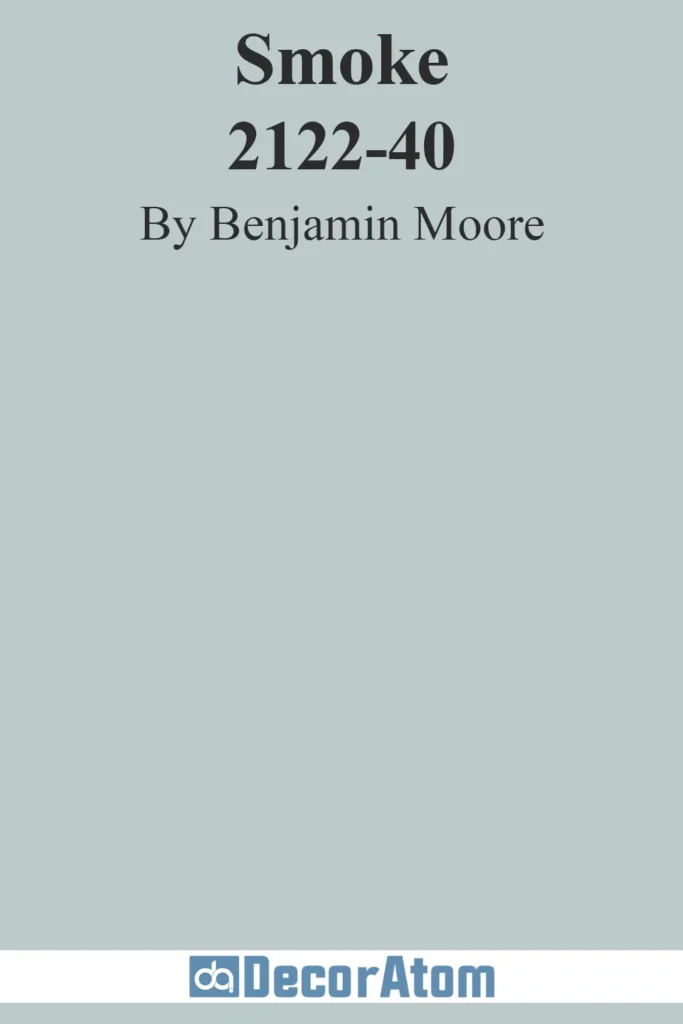
Smoke is a beautiful, soft blue-gray that feels like a gentle exhale. It’s subtle yet sophisticated, with enough color to make a statement without overwhelming a room. The lightness of Smoke makes it ideal for spaces that need a soft, neutral backdrop, like living rooms or kitchens.
What I love about Smoke is its ability to pair well with a wide range of styles—from traditional to modern—adding a cool, tranquil vibe to any space. It’s perfect for anyone who wants a blue-gray that’s soothing, understated, and effortlessly chic.
Final Thoughts
So, whether you’re after a light and airy feel, a deeper and more dramatic tone, or something in-between, these 29 blue-gray colors offer something for every space.
They’re the perfect blend of peaceful and sophisticated, making them an ideal choice for anyone looking to create a calm home with a touch of style.