
If there’s one category of paint colors I find myself reaching for again and again, it’s neutrals. They’re the quiet backbone of almost every room I design—versatile, calming, and easy to build on.
But with so many shades out there, choosing the right one can get overwhelming fast.
Benjamin Moore has a stunning selection, and over time, I’ve discovered a handful of tried-and-true favorites that work beautifully in real homes—not just on a paint chip.
Some are warm and earthy, others are crisp and modern, but they all share one thing in common: they create a timeless backdrop that makes everything else in the room shine.
In this post, I’m sharing 17 of the best Benjamin Moore neutral paint colors I’ve used and loved.
Whether you’re into soft whites, cozy beiges, greige perfection, or even a bold navy that acts like a neutral, this list covers it all.
What are Neutral Paint Colors?
Neutral paint colors are the quiet champions of interior design. They don’t shout for attention, but they create balance, calm, and flexibility in a space.
Typically, these colors include shades of white, beige, gray, taupe, cream, and sometimes even muted blues or greens—anything that acts as a subtle backdrop rather than a statement.
What makes a color “neutral” isn’t just its softness—it’s the ability to work with a wide range of styles, moods, and accent colors.
A true neutral won’t overpower a room; instead, it lets your furniture, artwork, or textiles take center stage. And that’s the beauty of it—neutral doesn’t mean boring. It means versatile, timeless, and soothing.
Where to Use Neutral Paint Colors?
Neutral paint colors can be used just about anywhere in the home. That’s one of the reasons they’re so popular.
In living rooms, they help create a calm, inviting atmosphere.
In bedrooms, they feel restful and clean. In kitchens or bathrooms, they provide a crisp, modern look or a warm, farmhouse feel—depending on the neutral you choose.
They’re also ideal for open-concept homes because they flow easily from one room to another without abrupt changes.
And if you’re staging a home or thinking about resale value, neutrals are the safest and smartest choice—they appeal to almost everyone.
Even accent pieces like doors, trim, cabinetry, or built-ins can be painted in deeper neutrals like navy or charcoal for a subtle contrast.
Colors to Pair with Neutral Paint Colors
One of the biggest perks of using neutral paint colors is how easy they are to pair with other shades. I
f you’re decorating with warmer neutrals like taupe, beige, or cream, try pairing them with earthy tones—rust, olive, terracotta, or muted golds. These combinations create a grounded, cozy feel.
Cooler neutrals like soft grays, greiges, or off-whites look beautiful with blues, greens, charcoals, and even dusty pinks.
Want something a little bolder? Try adding accents of black or deep navy for contrast, or go softer with pale pastels for a layered, airy look.
And don’t forget texture. Neutrals love natural materials—wood, rattan, linen, marble. These elements can bring depth and richness even when the color palette stays subtle.
Tips for Choosing The Best Neutral Paint Colors for Your Home
Choosing the right neutral paint color is trickier than it seems because undertones can shift dramatically depending on light, flooring, and even decor.
Here are a few things I always keep in mind:
1. Pay attention to lighting: North-facing rooms tend to bring out cooler tones, while south-facing rooms warm everything up. Test your neutral in different lighting throughout the day.
2. Understand the undertone: A gray might lean blue, purple, green, or even beige. Always sample the paint in your actual space to see how it behaves next to your furniture and finishes.
3. Don’t rely on the paint chip: Neutrals look very different on a wall compared to a swatch. Try large sample swatches or paint directly on poster board you can move around.
4. Use contrast intentionally: If your trim is white, choose a neutral that contrasts just enough to define the space but still feels cohesive.
5. Think about mood: Warm neutrals tend to feel cozier and more traditional. Cool neutrals often look more modern and crisp. What’s the vibe you’re going for?
Top 17 Benjamin Moore Neutral Paint Colors
Here are my favorite neutral paint colors from Benjamin Moore to decorate with. Each of these has been tested, loved, and used in real homes—mine included.
1. Chantilly Lace OC-65

Chantilly Lace is one of those rare whites that feels crisp without being cold. It has a clean, almost gallery-white quality that makes it a go-to if you want a modern, bright space that still feels welcoming.
I love using it in rooms with lots of natural light—it bounces light beautifully and helps the space feel expansive.
There’s no strong undertone here, which makes it incredibly versatile whether you’re pairing it with bold accent colors or soft, earthy tones.
2. White Dove OC-17

White Dove is soft and creamy without going yellow, which is harder to find than you’d think.
It’s a white that feels gentle, and I’ve found it especially forgiving in north-facing rooms that need a little warmth.
It works just as well on trim and cabinetry as it does on walls. If you’re after a white that doesn’t feel stark or overly bright, White Dove hits the mark—it’s elegant without trying too hard.
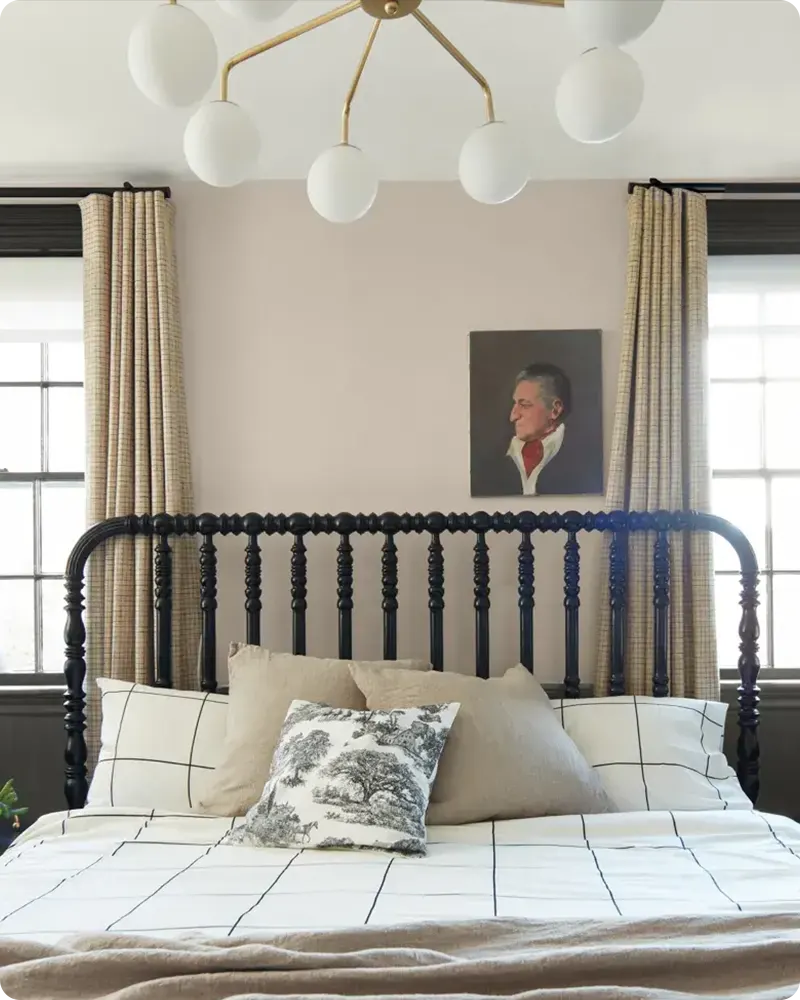
3. Pale Oak OC-20
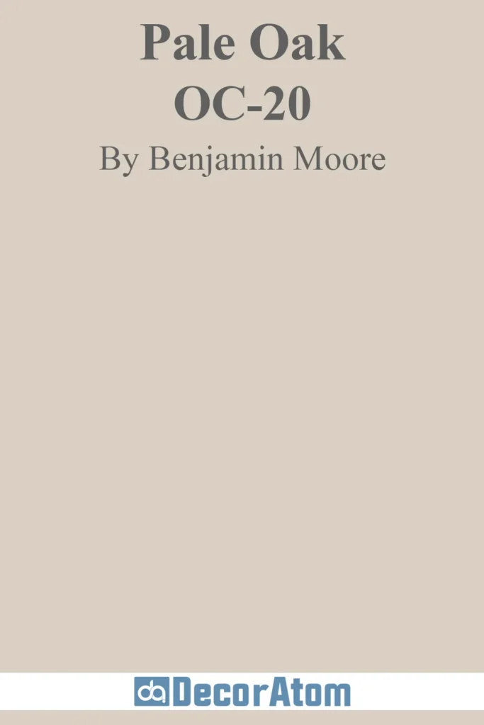
Pale Oak walks the line between greige and soft taupe, depending on the light. It’s subtle, which makes it ideal if you want a neutral that doesn’t fight for attention but still brings character.
It has a warm, lived-in quality that makes rooms feel cozy without being dark. I’ve seen this color shine in bedrooms and living rooms where you want that understated calm.
Pale Oak also pairs well with soft whites, muted greens, or dusty blues if you’re layering neutrals.
4. Gray Owl OC-52
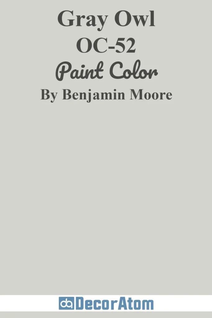
Gray Owl is one of those colors that really changes throughout the day. In bright daylight, it leans cool and clean—perfect if you want a modern gray that doesn’t feel too blue.
In lower light, it warms up just enough to feel comfortable. It’s great for open floor plans or spaces where you want a consistent, light neutral with a bit of personality.
I’ve used it in home offices and hallways, and it never looks flat or lifeless.
5. Balboa Mist 1549
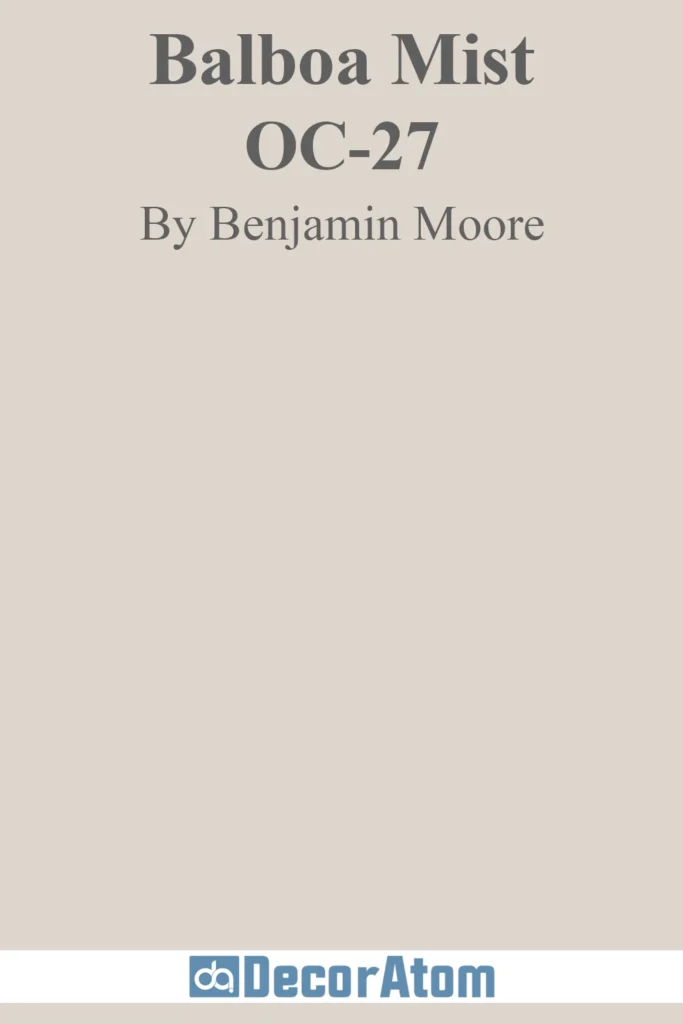
Balboa Mist has this lovely softness to it—it’s a light greige with subtle warm undertones that can sometimes pull violet or pink depending on the light. But it never feels overtly colored.
It’s the kind of neutral that adds polish to a room without dominating it.
I find it especially nice in transitional spaces or when you’re trying to tie together cool and warm elements in the same space. It’s graceful but modern.
6. Edgecomb Gray HC-173
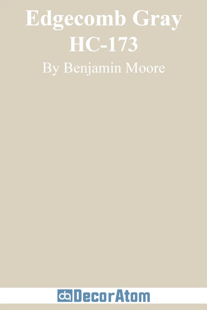
Edgecomb Gray leans more toward warm beige than cool gray, which makes it incredibly approachable. If you’re trying to find something that won’t clash with warm wood tones or antique furniture, this is a great option.
It has a calm, grounded vibe that works across all kinds of interiors, from traditional to farmhouse to minimalist. It’s one of those colors that just works without making a fuss about it.
7. Revere Pewter HC-172

Revere Pewter is practically a household name at this point, and for good reason. It’s a classic mid-tone greige that plays nicely with nearly everything.
What I like about it is that it has enough depth to ground a space but still feels neutral. In rooms with a lot of natural light, it can read lighter and a bit warmer.
In darker rooms, it holds its own without becoming muddy. It’s a great whole-house color if you want something consistent but not boring.
8. Manchester Tan HC-81

Manchester Tan is one of the warmer neutrals in this list—it’s a soft, earthy beige that doesn’t feel too yellow or dated. It reminds me of natural linen or sunlit stone.
This is a great option if you’re looking for a warm backdrop that doesn’t overpower the room. It’s subtle enough for walls but rich enough to make a space feel cozy.
I’ve used it in rooms with darker wood furniture, and it balances everything out beautifully.
9. Philadelphia Cream HC-30
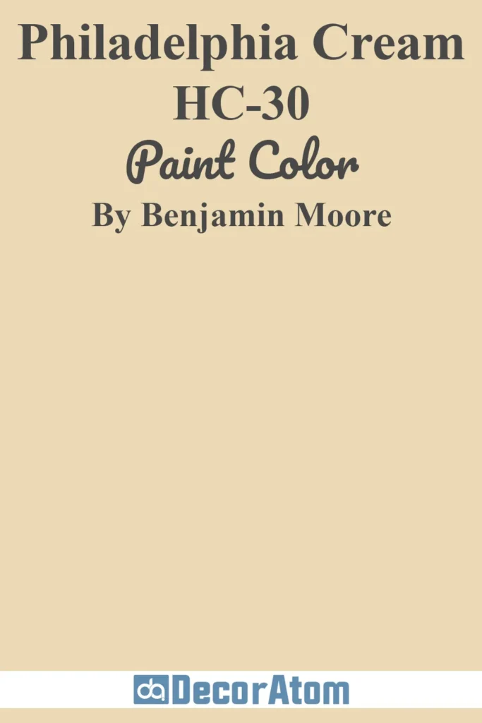
Philadelphia Cream brings a gentle warmth to a room that feels almost golden without being overly buttery.
It’s a traditional neutral that still holds up in modern spaces, especially when paired with crisp whites or muted blues.
It has a refined, almost historic feel to it—which makes sense given the name. I see this working well in dining rooms, formal living areas, or anywhere you want a warm but elegant vibe.
10. Smoke 2122-40
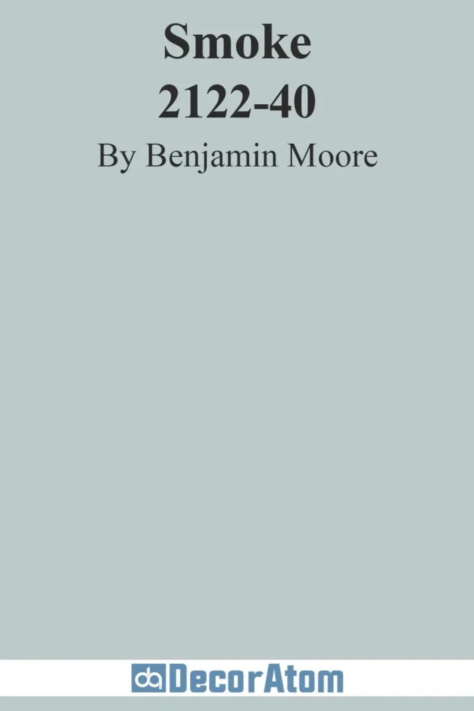
Smoke is such an interesting shade—it’s a soft gray-blue that reads more like a foggy morning than a stormy sky.
It’s definitely on the cooler side, but there’s a muted calmness to it that makes it feel incredibly serene. If you want a color that reads as neutral but still brings a whisper of color to the room, Smoke delivers.
I especially love it in bedrooms or bathrooms where you want a peaceful, spa-like feel.
11. Hale Navy HC-154

Hale Navy might not be a traditional neutral, but I consider it one—especially in modern interiors where deep colors act as backdrops. It’s a rich, saturated navy that adds instant depth and sophistication.
I’ve used this on accent walls, kitchen islands, and even full rooms when paired with white trim, and it never fails to make a statement. Despite its boldness, it doesn’t feel loud—it feels timeless.
If you want a darker neutral that still plays well with others, Hale Navy is a solid pick.
12. Antique Pewter 1560
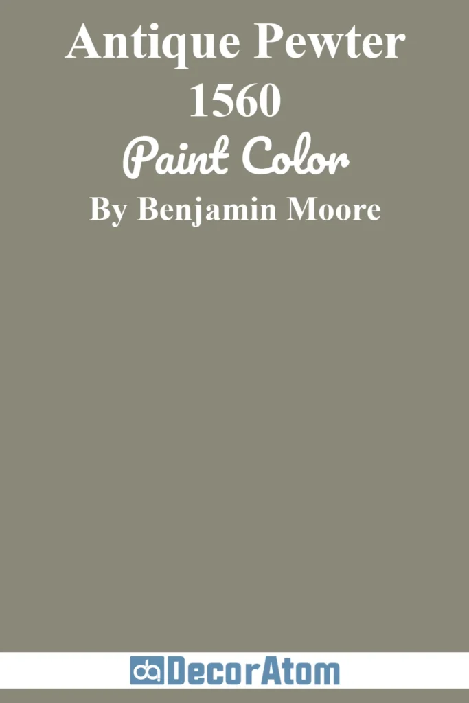
Antique Pewter is a warm, weathered gray with a greenish cast that gives it a grounded, almost nature-inspired feel.
It’s a beautiful choice if you’re tired of basic grays and want something a bit more layered. I’ve seen it work in both rustic and contemporary homes—it really depends on what you pair it with.
It looks especially rich against crisp whites and natural textures like wood or leather. It’s moody without being overly dark.
13. Pashmina AF-100
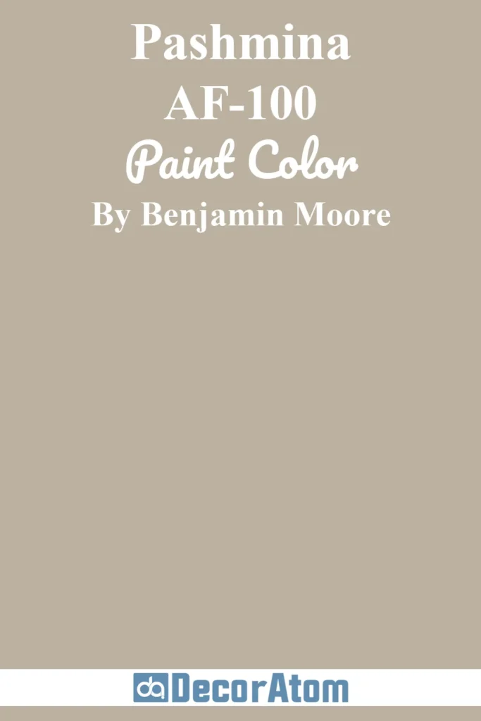
Pashmina is a warm greige that has more body than Pale Oak or Balboa Mist—it feels a touch deeper and more substantial.
I like using it in spaces that need warmth but still want to feel modern. It’s cozy, yes, but also refined. Depending on your lighting, it can lean more taupe or beige, but never feels overly brown.
It works beautifully in bedrooms and living rooms where you want softness without going too light.
14. Wind’s Breath 981
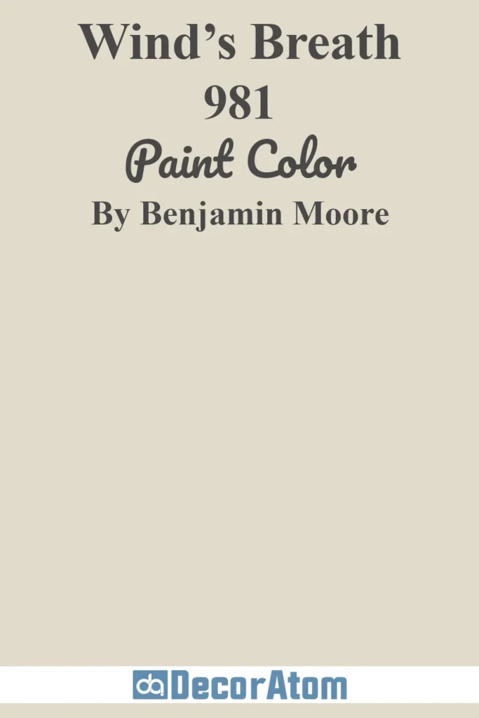
Wind’s Breath is one of those chameleon-like neutrals that shifts gently depending on its surroundings.
It has a creamy, beige-gray base that can read warm or cool, which makes it incredibly adaptable.
It doesn’t scream for attention but quietly supports whatever else is going on in the room.
I’ve used it in open-concept homes where you want a seamless transition between spaces, and it performs beautifully across different lighting conditions.
15. Sea Salt CSP-95
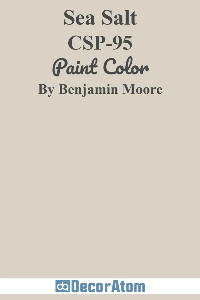
Sea Salt (not to be confused with Sherwin-Williams’ version) is a muted, silvery neutral with a whisper of green.
It’s calming, slightly coastal, and gives a room that easy, breezy vibe without going full-on beach house.
I’ve seen it in bathrooms and bedrooms where a sense of calm is the goal, and it delivers every time. It’s just colorful enough to stand out, yet soft enough to remain neutral.
16. Bleeker Beige HC-80
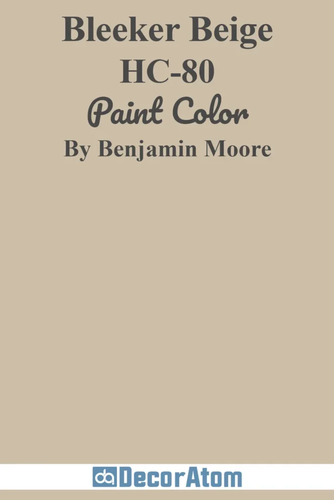
Bleeker Beige is one of those true, no-nonsense neutrals that has enough warmth to feel inviting but enough gray to feel sophisticated.
It’s not flashy, but it’s dependable—and that’s what makes it so versatile.
It plays well with traditional interiors, especially if you have a lot of warm wood tones or antique pieces.
I like using it in dining rooms or entryways where you want a classic, welcoming backdrop that doesn’t date quickly.
17. Boothbay Gray HC-165
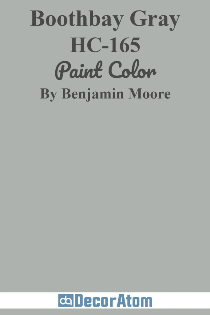
Boothbay Gray is technically a gray, but there’s a clear blue undertone that gives it personality. It’s soft, cool, and elegant—like a misty morning by the ocean.
I love using it in kitchens with white cabinets or as a subtle wall color in bedrooms. It’s light enough to keep a space feeling open but distinctive enough to create interest.
If you want a cool-toned neutral with just a hint of color, Boothbay Gray is a great pick.