
Moody paint colors have become a design favorite for homeowners and designers alike, thanks to their ability to add depth, drama, and sophistication to any room.
Unlike flat neutrals or bright shades, moody tones bring an atmospheric quality that can completely change the feeling of a space.
Benjamin Moore, known for its rich pigments and timeless palette, offers some of the most stunning moody shades across the spectrum, from deep browns and stormy grays to jewel-toned blues, greens, and purples.
In this post, we’ll explore 23 of the best Benjamin Moore moody paint colors and show you how these hues can transform your interiors into cozy, stylish retreats.
*This post contains affiliate links. For more details see my full disclosure.
What Makes A Color Moody?
Moody colors are defined by their depth, richness, and the way they interact with light. These aren’t just “dark” colors; they carry undertones that shift subtly depending on the time of day, lighting, and surrounding décor. Moody hues often feel atmospheric, like they’re setting the tone or emotion of a room.
A few qualities that make a color moody:
- Depth of tone: They often fall on the darker end of the spectrum, but can also include muted mid-tones.
- Complex undertones: A gray with blue undertones or a brown with hints of red will feel more layered and moody than a flat, straightforward shade.
- Atmospheric impact: Moody shades make a space feel cozy, dramatic, or sophisticated, depending on how they’re used.
- Versatility: While often bold, they can be surprisingly adaptable, working in both modern minimalist homes and traditional spaces.
In short, moody colors create an ambiance rather than simply covering a wall.
How to Pick The Best Moody Paint Colors?
Choosing the right moody shade depends on more than just picking a color you love from a swatch. Because these hues interact so strongly with their environment, it’s important to consider a few key factors:
1. Room Size & Natural Light
- In smaller rooms or those with limited light, dark moody shades will feel enveloping and cozy.
- In larger or brighter rooms, moody colors take on a grand, dramatic quality.
2. Undertones Matter
- A gray with blue undertones feels cool and calming.
- A brown with red undertones feels warm and inviting.
- Always test swatches on your wall before committing.
3. Function of the Space
- Bedrooms and dining rooms benefit from cocooning, intimate shades like deep blues, greens, and purples.
- Offices or libraries pair well with rich browns and grays for a grounded, sophisticated feel.
4. Pairing with Other Colors
- Moody colors shine when balanced with lighter neutrals, warm metallics, or natural textures like wood and stone.
- Accent walls, trim, or cabinetry are great ways to experiment without overwhelming a space.
By considering light, undertones, and overall vibe, you’ll find a moody shade that perfectly matches your design goals.
How to Know if a Paint Color Is Right for You?
The best way to see if a paint color works for your home is to test it on your wall. Look at it over a few days in different lighting; morning, afternoon, and evening, to see how it really feels.
You can do this by getting a sample from the paint store and using a brush put it up on the walls, but then you are left with a can that you can’t do anything with. Those samples are used with poor-quality paint and aren’t meant for use on your walls permanently.

Instead, I recommend going with Samplize. They are a company that will send you a 9”x14.75” peel and stick swatch of a paint color that you can stick to the wall. When you are done just peel it off and throw it away.
It’s easy and much less messy!
Top 23 Benjamin Moore Moody Paint Colors
Below, you’ll find 23 incredible moody shades, each with rich undertones and unique moods to inspire your next design project:
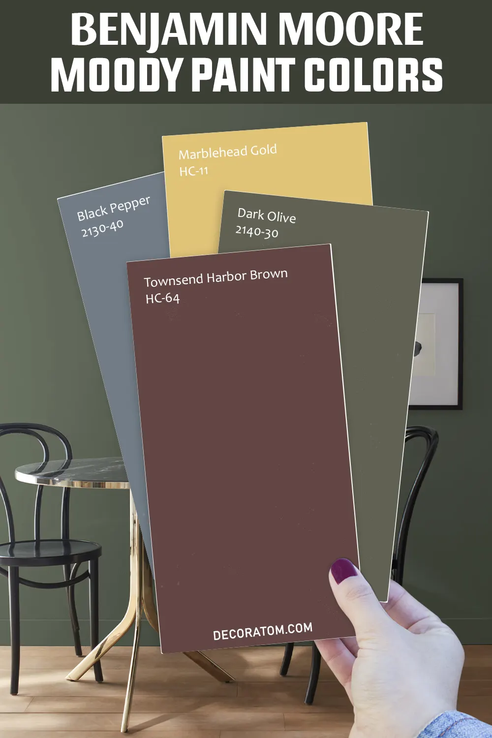
1. Townsend Harbor Brown HC-64
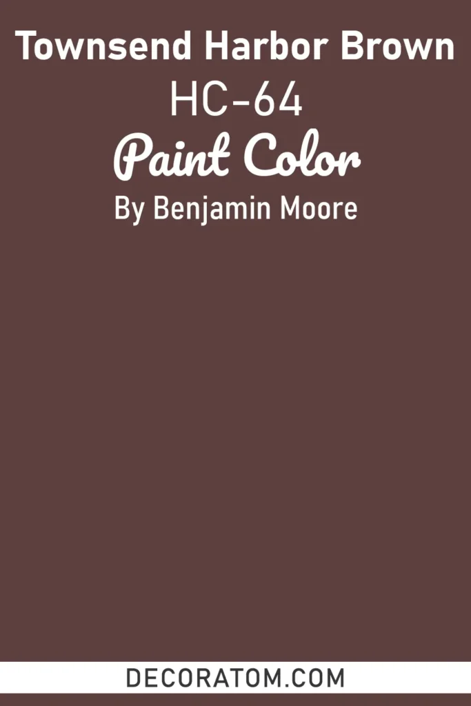
Townsend Harbor Brown is a deep, historic brown that embodies warmth, tradition, and stability. Its earthy richness has a grounding effect, making any space feel rooted and timeless.
The color carries subtle warm undertones that prevent it from feeling flat, giving walls a sense of depth and character. Because of its heritage-inspired tone, it works beautifully in classic homes or spaces that need a sense of permanence.
Use it in a library, office, or dining room for a refined and elegant look. Pair it with creamy off-whites, warm metallics like antique brass, or muted greens to highlight its old-world charm.
In modern homes, it can add a moody edge to cabinetry or accent walls, especially when styled with rich textures like leather, velvet, or wood.
2. Barberry 1244
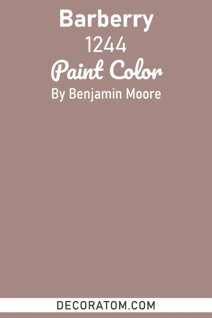
Barberry is a bold, berry-toned red that radiates drama and luxury. Unlike a true primary red, Barberry has undertones of wine and plum that give it depth and complexity, making it a striking choice for moody interiors.
This color feels both romantic and sophisticated, perfect for creating intimate dining spaces, statement entryways, or cozy reading nooks. When used in low light, it takes on a velvety richness, while in brighter spaces it reveals its jewel-like vibrancy.
Pair Barberry with deep greens for a classic complementary look, or with warm neutrals like taupe and beige for a softer balance. It also works beautifully with gold or bronze accents, enhancing its sense of richness and allure.
3. Weimaraner AF-155
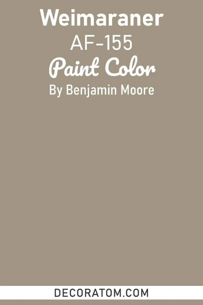
Weimaraner is a refined taupe-gray with soft brown undertones, inspired by the sleek coat of its namesake dog breed. It’s an elegant neutral that leans into the moody spectrum by offering depth without heaviness.
This shade creates a calm, understated atmosphere, perfect for bedrooms, living rooms, or transitional spaces where you want subtle sophistication.
Its chameleon-like quality allows it to pair with both warm and cool palettes, it looks serene with crisp whites and soft blues, yet cozy alongside deep browns and muted greens. Use it on walls for a sophisticated backdrop or on cabinetry to add quiet drama without overwhelming the room.
4. Antique Pewter 1560
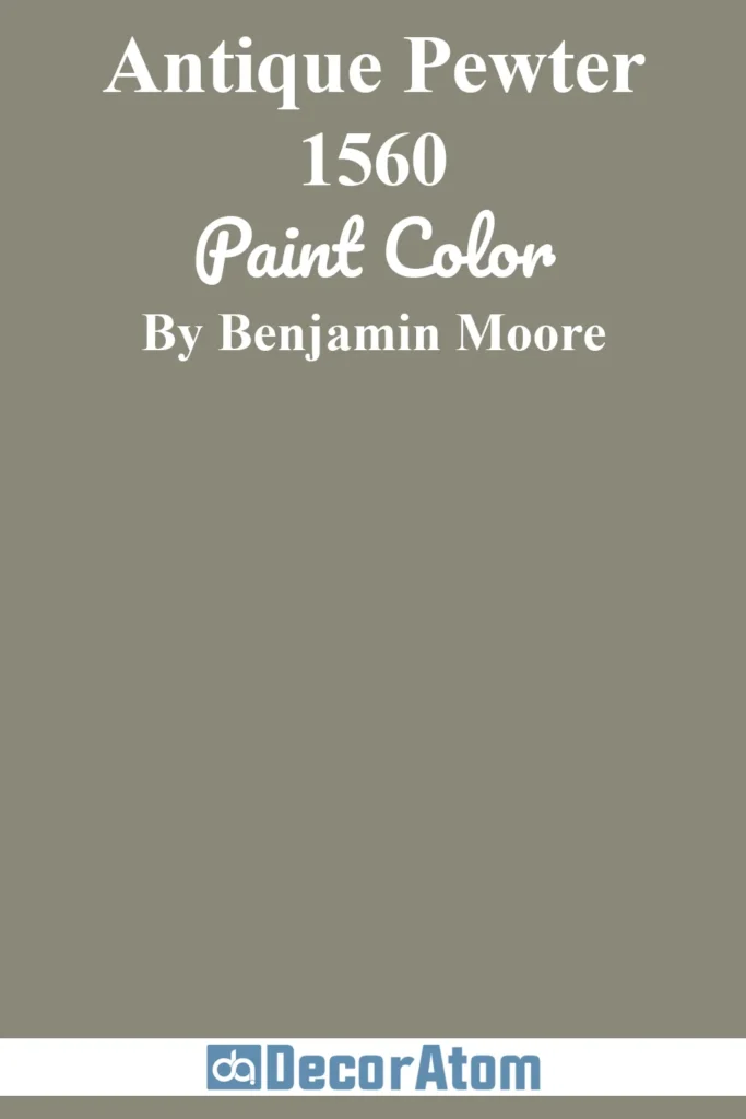
Antique Pewter is a timeless gray-green with muted, earthy undertones. It strikes the perfect balance between neutral and moody, offering depth without feeling too dark.
This shade has a grounded, organic feel, evoking the look of weathered metal or aged stone. In interiors, it’s an excellent choice for living rooms, offices, or kitchens, where it brings a sense of stability and calm.
Antique Pewter pairs well with creamy whites for contrast, but it truly shines when combined with other natural tones like beige, soft wood finishes, or brass accents. Its versatility also makes it a great transitional color, equally at home in traditional, farmhouse, or modern spaces.
5. Vintage Vogue 462

Vintage Vogue is a deep, sophisticated green with blackened undertones that give it a luxurious, moody edge. It’s a statement color that feels both timeless and dramatic, often described as a modern alternative to black.
This shade brings instant depth and richness to any room, making it perfect for accent walls, cabinetry, or even all-over applications in dining rooms or offices.
It has a strong, enveloping quality that pairs beautifully with warm neutrals, soft blush tones, or metallic finishes like brass and gold. Vintage Vogue also works exceptionally well in contemporary interiors, where it adds a bold contrast to lighter woods and minimalist décor.
6. Shadow 2117-30
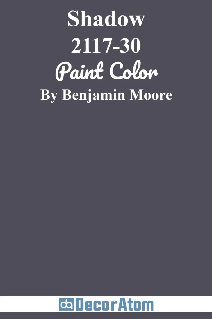
Shadow is one of Benjamin Moore’s most iconic moody shades, a dark, enigmatic purple with undertones of plum, charcoal, and eggplant. This color radiates mystery and sophistication, instantly transforming a space into something intimate and dramatic.
In daylight, Shadow reveals subtle purple richness, while in dim lighting it deepens into an almost-black tone. This makes it perfect for bedrooms, dining rooms, or creative spaces where atmosphere is key.
Pair Shadow with soft grays, muted pinks, or metallics like silver for a glamorous effect. For a bolder approach, combine it with other jewel tones to create a richly layered palette.
7. Van Deusen Blue HC-156

Van Deusen Blue is a rich navy that feels classic, confident, and endlessly versatile. It has just enough depth to be moody without appearing stark or overwhelming.
This blue works beautifully in traditional interiors, where it conveys a sense of refinement, but it can also feel fresh and modern when paired with crisp whites or lighter woods. Its balanced undertones make it ideal for cabinetry, accent walls, or even exterior applications.
Van Deusen Blue is particularly striking in bedrooms and living rooms, where it creates a calming yet sophisticated environment. Pair it with brass or gold accents for a luxurious touch, or with soft grays and whites for a timeless nautical-inspired palette.
8. Beau Green 2054-20
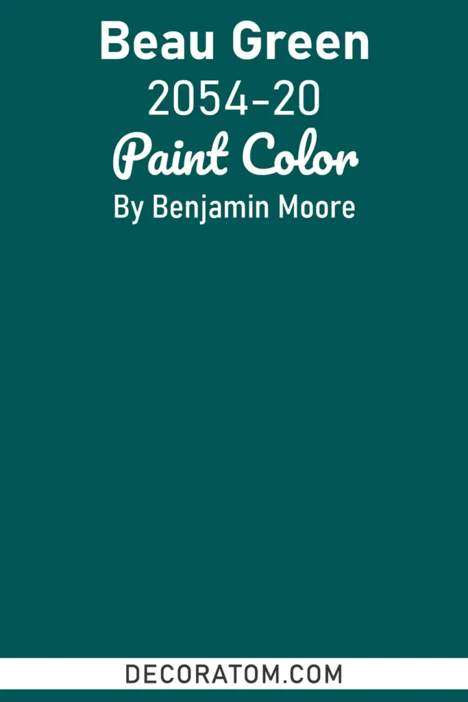
Beau Green is a lush, jewel-toned green with bold energy and undeniable depth. This shade is moody yet vibrant, bringing a sense of drama to any space without feeling overly heavy.
It has strong blue undertones that give it a modern edge, making it a fantastic choice for accent walls, dining rooms, or cabinetry.
Beau Green works particularly well in rooms that get natural light, where its richness truly comes alive, but it can also add depth and intimacy to dimly lit spaces.
Pair it with crisp whites or soft grays for balance, or embrace its boldness by combining it with other jewel tones like navy or plum.
9. Mozart Blue 1665
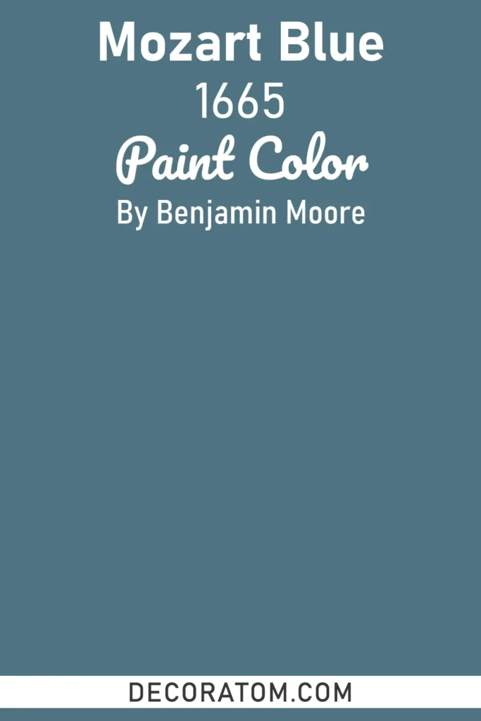
Mozart Blue is a striking, medium-dark blue with hints of teal and gray that make it both sophisticated and versatile. It exudes calm confidence and a moody elegance that works beautifully in both traditional and contemporary interiors.
Unlike darker navies, Mozart Blue has a fresher, more modern quality, making it a great option for bedrooms, home offices, or feature walls. It pairs well with clean whites for contrast, or with warm wood tones for a cozier vibe.
When accented with metallics like silver or chrome, Mozart Blue feels sleek and modern, while brass or gold accessories bring out its luxurious side.
10. Rocky Coast 1595
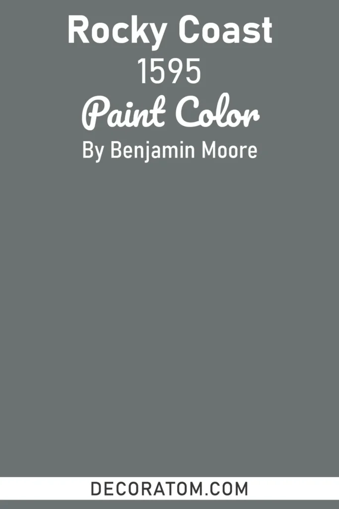
Rocky Coast is a dark, slate-like gray with strong blue undertones, reminiscent of stormy coastal skies. It’s a moody, dramatic color that adds a sense of depth and intensity to interiors.
This shade works well in modern spaces where you want to create a bold backdrop, such as living rooms, kitchens, or entryways. It also adds a grounding effect when used on cabinetry or trim.
Rocky Coast pairs beautifully with crisp whites for a sharp, modern look, or with muted greens and browns for a more natural, earthy palette. Its stormy quality makes it ideal for spaces that aim to feel both contemporary and atmospheric.
11. Middlebury Brown HC-68
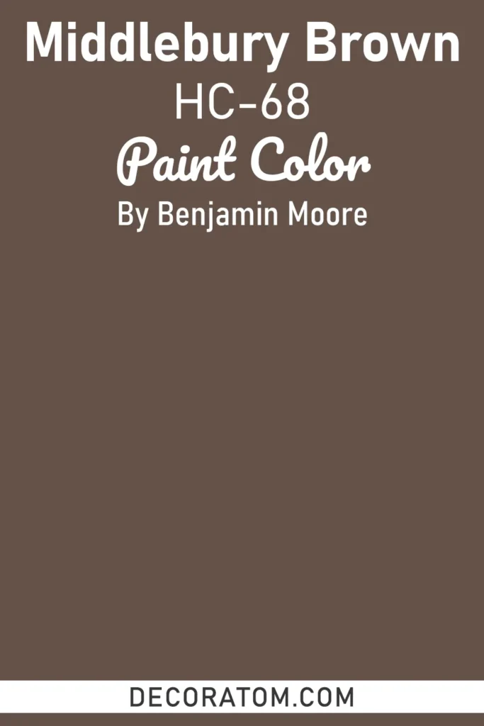
Middlebury Brown is a strong, earthy brown with warm undertones that lean slightly toward a chocolate richness. This color feels both solid and sophisticated, offering a sense of security and tradition. It’s ideal for spaces where you want to establish warmth and coziness, such as dens, dining rooms, or rustic kitchens.
In homes with traditional architecture, Middlebury Brown emphasizes historical character, while in modern spaces, it adds a bold contrast against lighter walls or wood finishes. Pair it with cream, beige, or muted greens for a natural palette, or highlight it with brass and leather textures for a rich, masculine feel.
12. Rock Gray 1615
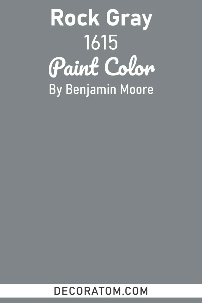
Rock Gray is a moody, mid-to-dark gray with understated blue undertones. This shade has a quiet strength, evoking the calming solidity of natural stone. It’s versatile enough to work in nearly any room, but particularly shines in bedrooms and living rooms where its softness creates a soothing backdrop.
Rock Gray balances beautifully with crisp whites for a modern contrast, or with warm neutrals to create a cozier look. It’s also a fantastic option for cabinetry or built-ins, where it lends a polished yet approachable feel. For a bolder palette, pair it with navy or forest green for added depth.
13. Puritan Gray HC-164
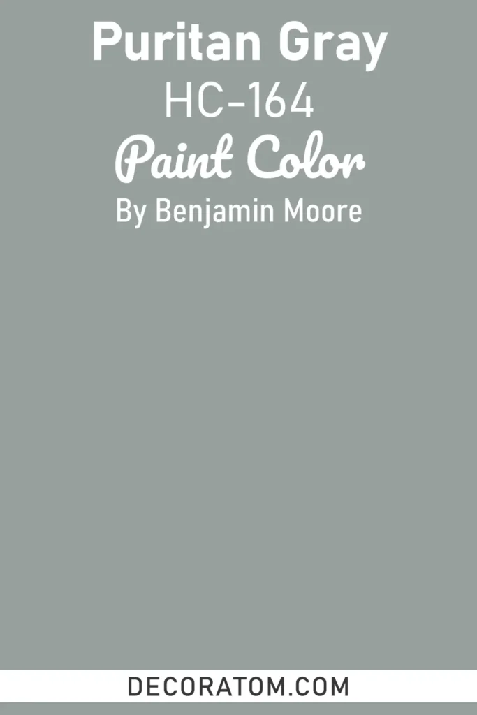
Puritan Gray is a historic gray-blue that leans cool and classic. Its muted undertones give it an aged, timeless feel, reminiscent of weathered seaside cottages or vintage painted furniture. This makes it a perfect choice for traditional or coastal-inspired interiors.
As a moody shade, it carries just enough darkness to feel dramatic without overwhelming a space. Puritan Gray is beautiful in bedrooms, bathrooms, or dining rooms, where it sets a calming yet sophisticated mood. Pair it with crisp white trim for a fresh, timeless look, or combine it with darker blues and grays for layered depth.
14. Narragansett Green HC-157
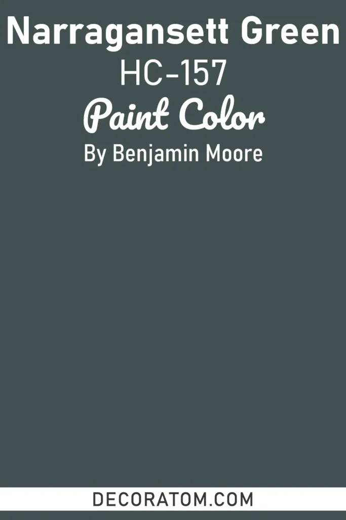
Narragansett Green is a deep, almost teal-like green with strong blue undertones. It’s bold, moody, and richly saturated, bringing dramatic flair to any space.
This color has a nautical edge, reminiscent of stormy seas, making it perfect for coastal homes or interiors where you want depth and character. Narragansett Green works beautifully in dining rooms, living rooms, or even on kitchen cabinets for a striking statement.
Pair it with crisp whites to highlight its richness, or with brass accents to enhance its luxe, jewel-toned quality. It’s a fantastic choice if you want to make a space feel both cozy and bold at once.
15. Backwoods 469

Backwoods is a dark, earthy green that feels organic, grounded, and moody in the most natural way. With its forest-inspired undertones, this shade instantly creates a cocooning atmosphere, ideal for bedrooms, studies, or rustic living rooms.
Backwoods pairs wonderfully with warm neutrals like beige and taupe, but it also looks striking with wood tones, leather, and stone textures.
In traditional spaces, it enhances architectural character, while in modern interiors, it offers a rich, dramatic contrast to light walls and minimalist décor. It’s also an excellent choice for exteriors, blending seamlessly with natural surroundings.
16. Bewitched CSP-450
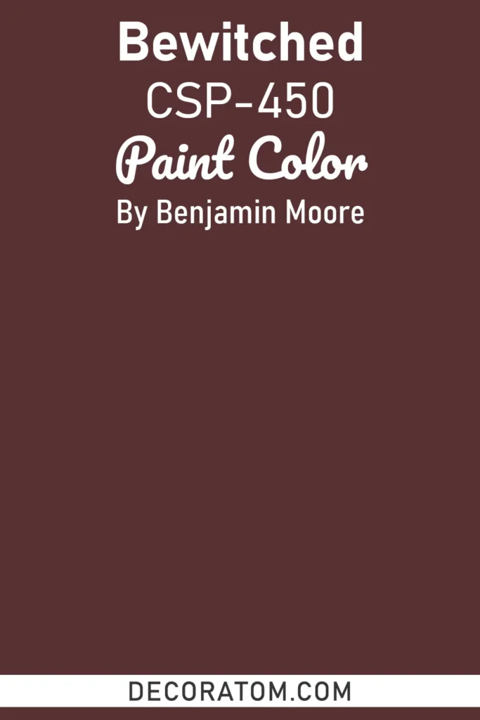
Bewitched is a mysterious, blackened purple with smoky undertones that give it incredible depth and sophistication. It’s moody, romantic, and slightly edgy, the kind of shade that transforms a room into something bold and unforgettable.
In low light, Bewitched can almost pass for a deep charcoal, while brighter light reveals its plum and violet richness. This makes it an excellent choice for intimate dining spaces, creative studios, or dramatic bedrooms.
Pair it with metallic accents like gold or silver to emphasize its glamour, or soften it with muted neutrals for a more balanced approach.
17. North Sea CC-932
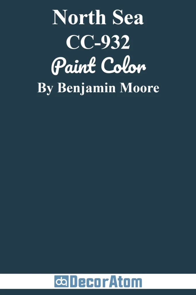
North Sea is a stormy, blue-gray that captures the look and mood of turbulent coastal skies. It’s dramatic yet calming, making it a versatile moody shade for interiors. With its balance of blue and gray undertones, North Sea works equally well in traditional or modern spaces.
Use it in bedrooms, offices, or living rooms to create a serene but sophisticated vibe. This shade pairs beautifully with crisp whites, soft creams, or darker charcoals for layered depth. For a bolder palette, pair it with deep greens or rich browns to emphasize its stormy character.
18. Mocha Brown 2107-20
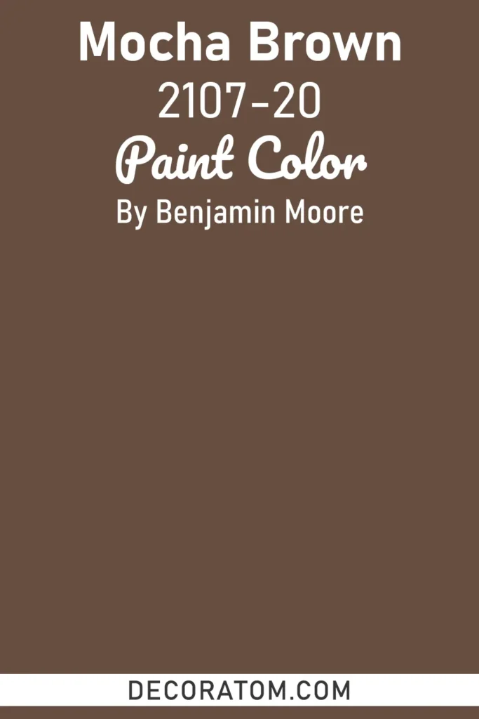
Mocha Brown is a warm, chocolate-inspired brown that feels rich, cozy, and inviting. Unlike cooler browns, this shade carries a softness that makes it versatile for both traditional and contemporary spaces.
It works especially well in living rooms, dens, or bedrooms where you want to create a welcoming atmosphere. Paired with cream or beige, it feels classic and understated, while combined with jewel tones like deep green or navy, it takes on a more luxurious, dramatic quality.
Mocha Brown also looks stunning on cabinetry or trim, adding instant depth to kitchens and built-ins.
19. Blue Note 2129-30
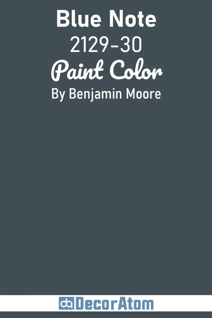
Blue Note is a deep, inky blue that borders on black, giving it a sleek, modern edge. It’s one of Benjamin Moore’s most dramatic blues, exuding sophistication and mystery.
This shade is perfect for creating moody, atmospheric spaces such as bedrooms, dining rooms, or media rooms. In daylight, Blue Note shows off its rich navy undertones, while in dim light it becomes almost black, offering an elegant backdrop for bold décor choices.
Pair it with crisp whites for a classic contrast, or with metallics and natural wood finishes for a more modern, luxurious effect. Blue Note is also a stunning choice for exteriors, adding instant curb appeal with a touch of drama.
20. Dark Olive 2140-30
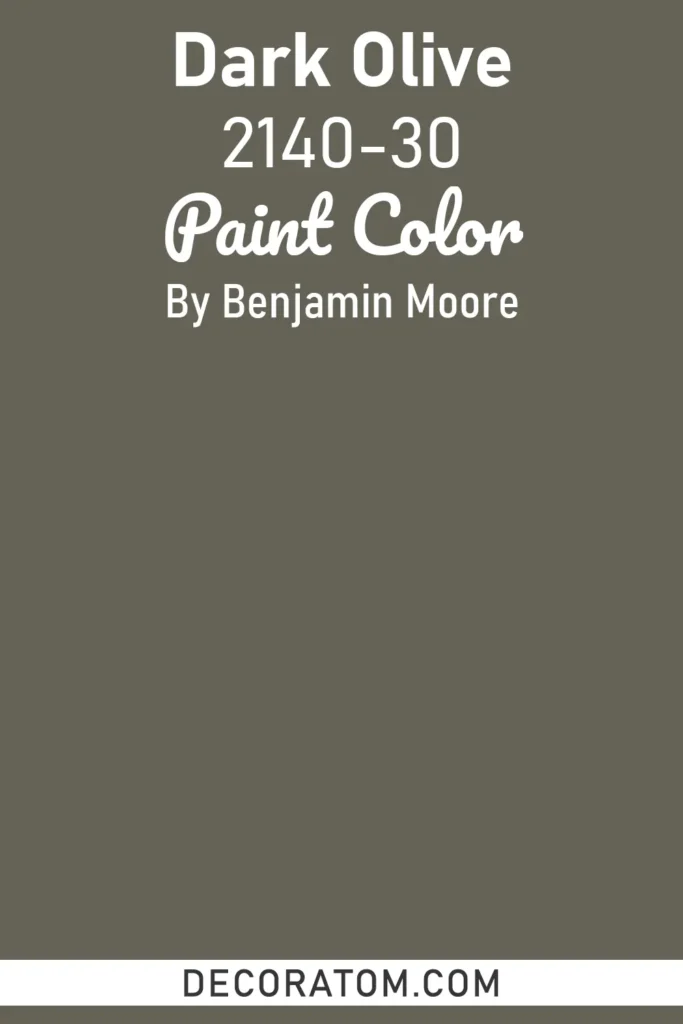
Dark Olive is a deep, earthy green with muted brown undertones, making it one of Benjamin Moore’s most versatile moody shades. It strikes the perfect balance between natural and dramatic, evoking the grounded feel of dense forests.
This color works beautifully in living rooms, libraries, and even kitchens, where it creates a sense of intimacy and warmth. In daylight, it feels organic and earthy, while in lower light it takes on a richer, more dramatic quality.
Dark Olive pairs wonderfully with creamy whites, beige, and warm woods for a rustic look, but it also shines in modern settings when combined with sleek blacks and metallic accents.
21. Black Pepper 2130-40
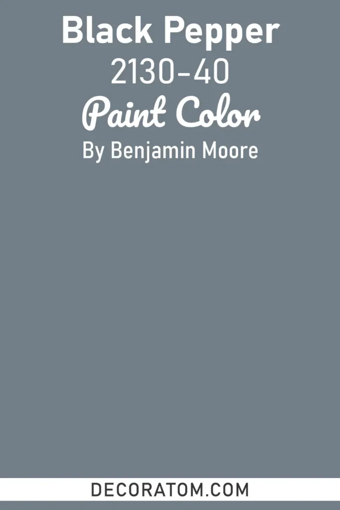
Black Pepper is a smoky, charcoal-gray with subtle blue undertones that give it a cool, refined edge. It’s moody without feeling stark, making it a sophisticated choice for interiors that need depth without overwhelming darkness.
This shade is especially effective in bedrooms, dining rooms, or offices, where it creates a cocooning, serene atmosphere. Black Pepper works seamlessly with crisp whites for a modern contrast, or with muted blues and greens for a more layered, tonal palette.
It’s also a great alternative to pure black, offering a softer, more livable version of dramatic dark walls.
22. Marblehead Gold HC-11
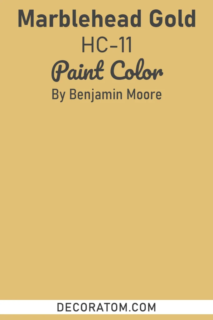
Marblehead Gold is a bold, golden ochre with rich, historic character. While not a traditional “dark” moody shade, its depth and warmth give it a dramatic presence that works beautifully in interiors aiming for atmosphere and personality.
It brings energy and richness to dining rooms, hallways, and accent walls, where its golden undertones reflect light in a cozy, enveloping way. Marblehead Gold pairs well with earthy greens, deep browns, and classic whites, and it can be accented with brass or bronze finishes for a timeless, old-world feel.
It’s also a fantastic choice for traditional homes, adding warmth and vibrancy while still keeping the moody elegance.
23. Smoked Oyster 2109-40
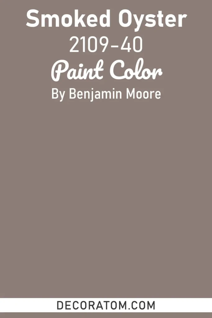
Smoked Oyster is a sophisticated, muted gray with subtle brown and lavender undertones, giving it a smoky, complex character. It’s a versatile moody shade that can feel both warm and cool depending on the lighting, making it ideal for a variety of interiors.
This color works beautifully in living rooms, bedrooms, or offices where you want depth and elegance without overwhelming darkness.
Smoked Oyster pairs exceptionally well with crisp whites and soft neutrals to brighten a space, or with rich browns, deep blues, and metallics for a layered, dramatic effect. Its understated sophistication also makes it a great choice for cabinetry, built-ins, or feature walls, adding quiet luxury to any room.
FAQs About Benjamin Moore Moody Paint Colors
1. Are moody paint colors only for large rooms?
Not at all. While moody shades can look dramatic and elegant in large, open spaces, they also work beautifully in small rooms. In fact, darker, moody colors in small spaces can create a cozy, intimate vibe that makes the room feel intentionally designed rather than cramped.
2. Do moody colors make a room look darker?
Moody paint colors do absorb more light than lighter shades, which can make a space feel darker. However, this isn’t a bad thing, it adds atmosphere and depth. You can balance moody walls with lighter furniture, white trim, mirrors, and metallic accents to reflect light back into the room.
3. What colors go well with moody paint shades?
Moody colors pair best with contrasting neutrals like crisp whites, soft beiges, or warm grays. They also look stunning with natural textures (wood, stone, leather) and metallic finishes like brass, gold, or silver. For a bold, layered palette, you can combine moody shades with jewel tones such as plum, emerald, or navy.
4. Can moody colors work in modern homes?
Yes — moody colors are incredibly versatile. In modern spaces, they add contrast and drama against clean lines, minimalist décor, and lighter finishes. For example, a moody navy or deep green accent wall can create a striking focal point in an otherwise simple room.
5. Where are the best places to use moody paint colors?
Moody shades are perfect for spaces where you want to create warmth, drama, or intimacy. Bedrooms, dining rooms, offices, and living rooms are all excellent choices. They’re also popular for cabinetry, feature walls, and even exteriors when you want a bold, sophisticated look.
6. Are Benjamin Moore’s moody colors good for exteriors?
Absolutely. Many of Benjamin Moore’s moody shades, like Blue Note, Backwoods, or Rocky Coast, look stunning on exterior siding, shutters, or doors. They stand out while still blending beautifully with natural surroundings.
7. How do I choose the right moody shade for my home?
Start by considering the room’s natural light, size, and overall function. Then test out a few samples on the wall, colors can shift dramatically in different lighting conditions. Look closely at undertones (warm vs. cool) to ensure the shade complements your existing décor.