

The right exterior paint color can completely transform your home, boosting its curb appeal and making it stand out in your neighborhood.
Benjamin Moore is known for offering a wide variety of high-quality, durable paint colors that stand the test of time.
If you’re looking for a fresh new look or trying to update your home’s exterior with a timeless shade, you’ll find the perfect match in their collection.
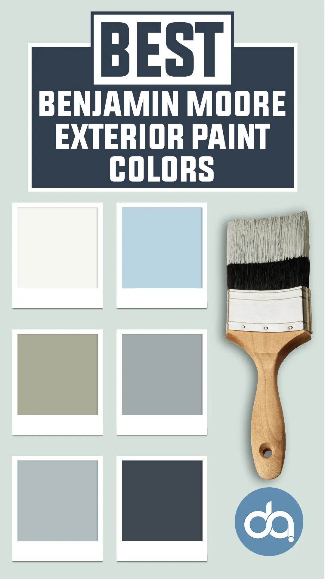
In this post, I’ve rounded up the 25 best Benjamin Moore exterior paint colors, each chosen for its beauty, versatility, and long-lasting finish.
From warm neutrals to bold blues, these colors will help you create a home you’ll love for years to come.
How Long Should Benjamin Moore Exterior Paint Last?
With proper surface preparation and application, Benjamin Moore exterior paint can last 8 to 15 years—sometimes even longer. Several factors influence longevity, including:
- Climate and weather exposure (sun, rain, snow, humidity)
- Surface type (wood, stucco, vinyl, etc.)
- Paint quality (Aura and Regal Select last longer than budget lines)
- Color choice (lighter colors tend to fade less than dark ones)
Routine maintenance—like cleaning your siding once a year or touching up problem spots—can also help extend the life of your exterior paint job significantly.
What Is the Most Popular Benjamin Moore Exterior Paint Color?
Hale Navy HC-154 continues to be one of the most popular and best-selling exterior colors from Benjamin Moore.
Its classic, deeply saturated navy blue tone works beautifully across a range of home styles—from coastal cottages to modern farmhouses to traditional colonials.
Hale Navy pairs well with crisp whites, natural wood tones, and even soft grays, making it an incredibly versatile and enduring choice for exterior palettes.
Other popular contenders include:
- White Dove OC-17 (for a soft, warm white)
- Kendall Charcoal HC-166 (a rich charcoal gray)
- Revere Pewter HC-172 (a timeless greige)
💥🎁 Christmas & Year-End Deals On Amazon !
Don't miss out on the best discounts and top-rated products available right now!
*As an Amazon Associate, I earn from qualifying purchases.
What Paint Finish Should I Use on the Outside of My House?
When it comes to exterior finishes, satin (or soft gloss) is the go-to for most siding applications. Here’s a quick breakdown of finish types and where they work best:
- Flat/Matte – Hides imperfections well, often used on older homes or stucco, but less durable and harder to clean.
- Low Lustre/Eggshell – Slightly more durable than flat; a great option for siding if you want a soft, natural finish.
- Satin/Soft Gloss – The most popular for siding. It offers a slight sheen that resists moisture and dirt, making it easier to wash.
- Semi-Gloss – Best for trim, shutters, and doors. Adds a nice contrast to siding and holds up well to frequent cleaning.
So for most homeowners, satin for siding and semi-gloss for trim and doors is the winning combo.
How Many Colors Should Be in an Exterior Color Palette?
Most well-balanced exterior palettes use three to four colors:
- Main color – This is the dominant shade used on siding or primary exterior walls.
- Trim color – Usually a contrasting or complementary neutral that frames windows, doors, and architectural details.
- Accent color – Used on shutters, doors, or decorative trim for visual interest.
- (Optional) Roof or natural material tones – Like brick, stone, or wood, which contribute to the overall palette even if not painted.
Too many colors can make a home feel disjointed, while too few might make it look flat. The key is balance—choose colors that complement each other and the architectural style of your home.
How Do You Choose the Right Paint Colors for Your Exterior?
Choosing the right exterior paint colors can feel overwhelming, but here are a few tried-and-true steps to simplify the process:
- Consider the architectural style of your home. A Victorian might handle bolder or more varied color schemes, while a modern home may benefit from a monochromatic or minimalist palette.
- Take note of fixed elements like the roof color, stone, brick, or landscaping. Your paint should coordinate with these.
- Pay attention to sunlight and orientation. North-facing homes often benefit from warmer tones to counteract cool light, while south-facing homes might need cooler shades to tone down intense sun.
- Think about the neighborhood. You want your home to stand out—but not clash—with nearby homes.
- Sample before committing. Paint large swatches on different sides of your house and observe how the color looks at different times of day.
Top 25 Benjamin Moore Exterior Paint Colors
Here are the best exteriors paint colors from Benjamin Moore.
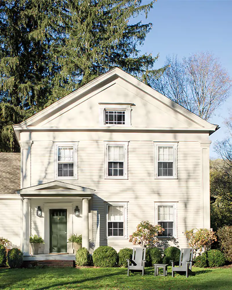
1. Simply White OC-117
💥🎁 Christmas & Year-End Deals On Amazon !
Don't miss out on the best discounts and top-rated products available right now!
*As an Amazon Associate, I earn from qualifying purchases.
A timeless favorite, Simply White is anything but plain. It offers a fresh, crisp look that brings brightness to exteriors without veering into sterile territory.
With soft yellow undertones, it feels warm and inviting in most lighting conditions.
On sunny days, it reflects a cheerful glow, while under cloud cover, it still maintains its clean profile without turning gray or blue.
This shade is especially popular on farmhouse-style homes, Cape Cods, and modern builds where you want a clean white that doesn’t feel too cold.
Pair it with black shutters or natural wood accents for a stunning, balanced contrast.
2. Atrium White OC-145
Atrium White has a touch of romance thanks to its subtle pink undertones, giving it a gentle warmth that sets it apart from cooler whites.
It’s an excellent choice for homeowners who want a soft, creamy white without veering into yellow.
In full sun, Atrium White glows with a peachy softness, while in shaded areas, the pink undertone gives it a subtly charming personality.
It’s especially beautiful on traditional homes, cottages, and Victorians.
Use it on clapboard siding with deeper accent colors for a dreamy, welcoming façade.
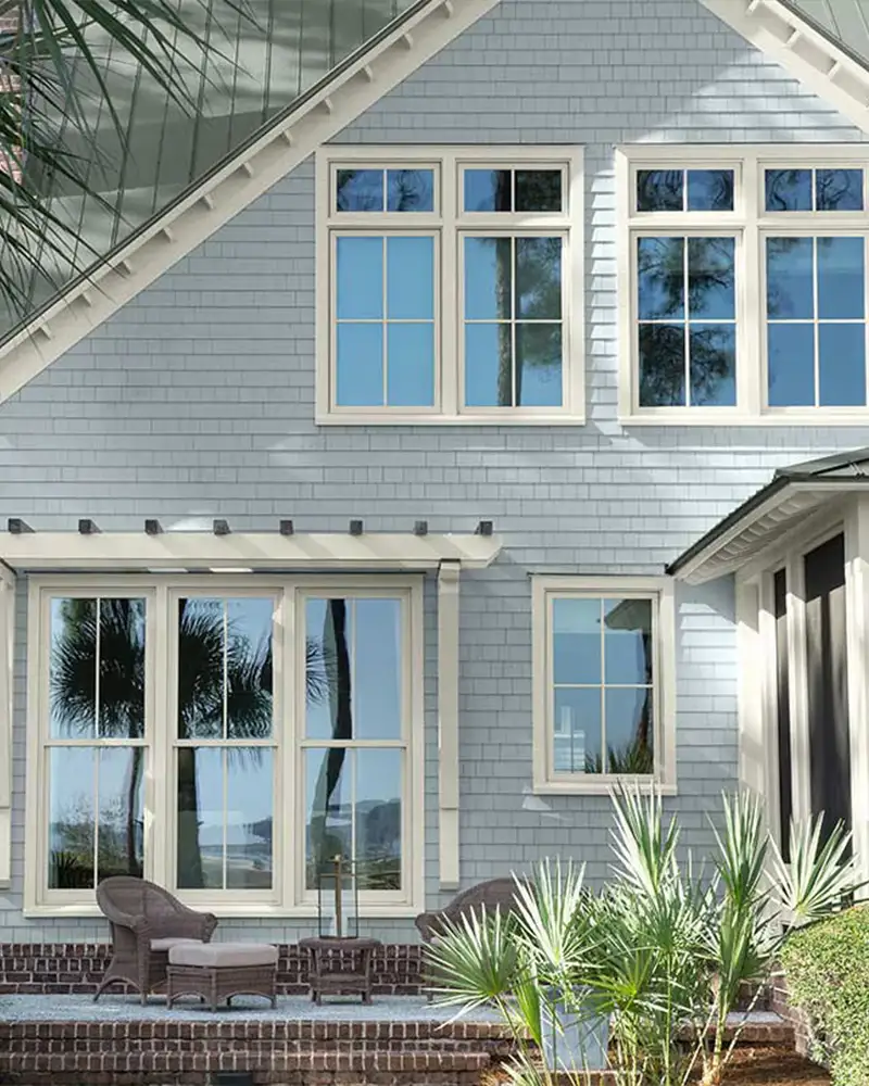
3. Horizon OC-53
Horizon is one of those elusive pale gray-blues that feels both serene and sophisticated.
With its cool blue and barely-there violet undertones, Horizon reads as a soft gray in shaded areas but leans more blue in bright sunlight.
It’s ideal for coastal homes or modern cottages where a breezy, foggy-morning look is desired.
Paired with white trim or charcoal accents, Horizon gives exteriors a whisper-soft elegance that’s not too cold, but perfectly airy.
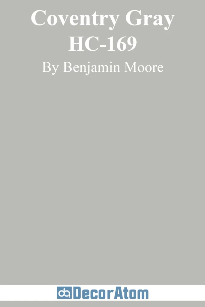
4. Coventry Gray HC-169
💥🎁 Christmas & Year-End Deals On Amazon !
Don't miss out on the best discounts and top-rated products available right now!
*As an Amazon Associate, I earn from qualifying purchases.
Coventry Gray strikes that perfect middle ground—it’s a true gray with subtle blue undertones that prevent it from feeling flat or lifeless.
It’s popular for exteriors because of its adaptability: in bright light, it holds its gray identity without washing out, while in shade, the cool undertones add a sophisticated depth.
Coventry Gray suits colonials, Craftsman homes, and modern farmhouses alike. It plays well with crisp whites, slate roofs, and even bold doors in black or navy.
5. Polo Blue 2062-10
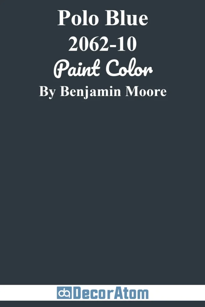
Moody, rich, and deeply saturated, Polo Blue is the kind of statement color that turns heads.
This deep navy carries just a whisper of green, giving it a tailored, almost preppy feel. On exteriors, it brings drama without going full black.
In full sun, Polo Blue reveals its richness; in shadow, it deepens into an elegant near-black.
It’s stunning on shingle-style homes, lakefront houses, or contemporary builds with wood or copper accents. For a bold yet timeless exterior, Polo Blue delivers.
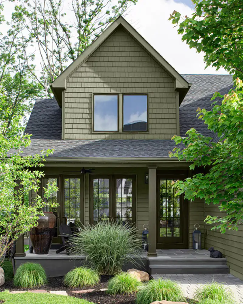
6. Louisburg Green HC-113
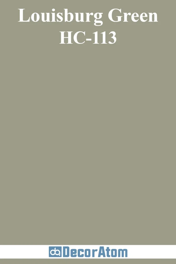
Rooted in nature, Louisburg Green is a classic historic color with muted gray-green undertones that ground a home with a soft, earthy elegance.
It reads as a mid-tone green that’s not too bright, making it ideal for exteriors in wooded or natural landscapes.
Its slightly aged appearance makes it perfect for Craftsman-style homes or traditional colonials.
In bright light, the gray keeps it from looking overly green, while in shadows, it deepens into a mossy tone that’s rich and grounding.
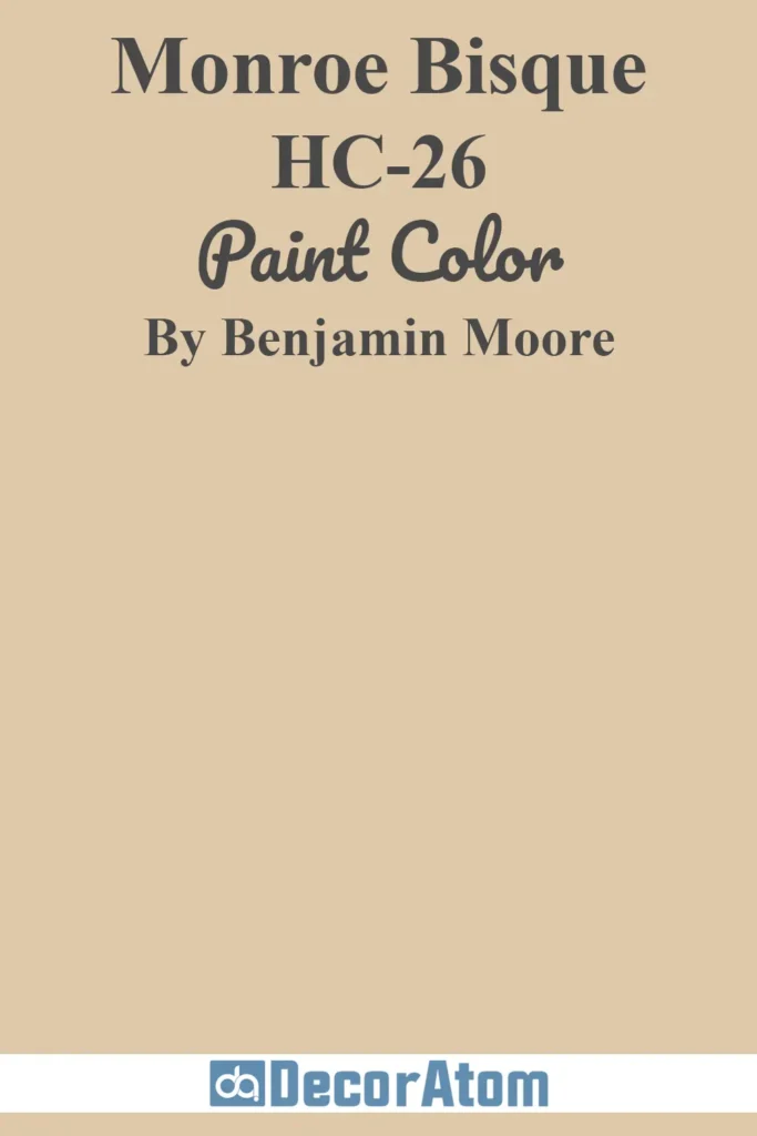
7. Monroe Bisque HC-26
💥🎁 Christmas & Year-End Deals On Amazon !
Don't miss out on the best discounts and top-rated products available right now!
*As an Amazon Associate, I earn from qualifying purchases.
Monroe Bisque offers a creamy, buff-toned neutral with yellow-beige undertones.
This warm hue is a staple for homeowners who want a light, sun-kissed exterior without going white.
It has a subtle elegance that flatters stucco and brick homes alike.
In full sun, Monroe Bisque glows with buttery warmth, while in shade, it becomes more understated and classic.
It’s especially beautiful on Mediterranean, Spanish, or Southern-style homes where warmth and softness are key.
8. Copley Gray HC-104
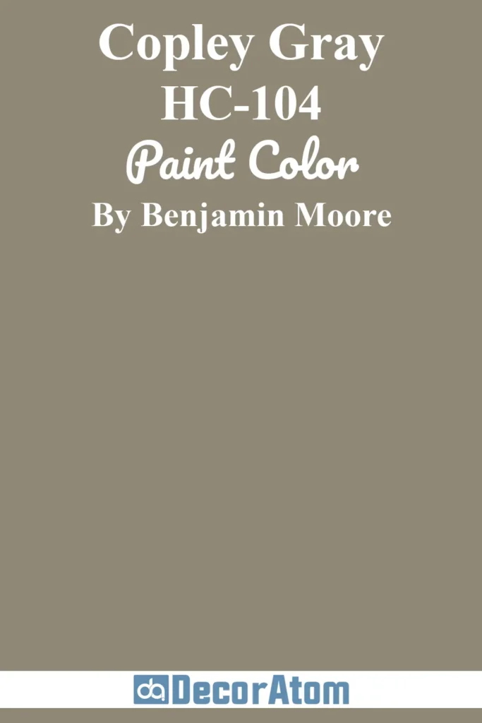
Copley Gray is one of those go-to exterior neutrals that walks the line between gray and taupe.
With green undertones tucked beneath its surface, this earthy hue offers just enough depth to anchor a home while still feeling fresh.
In bright light, it lightens slightly but never feels washed out; in shade, the green undertone steps forward, giving it a grounded, mossy feel.
It’s especially popular on traditional homes, ranches, and cottages. Pair it with crisp white trim and deep green or charcoal doors for a timeless look.
9. Sweet Rosy Brown 1302
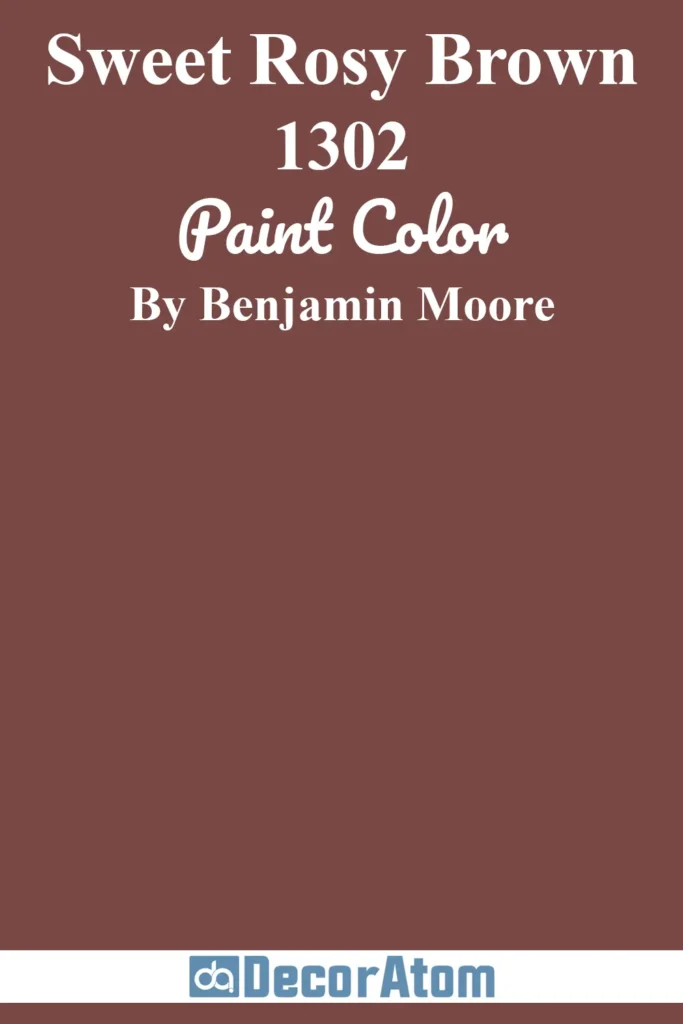
Don’t let the name fool you—Sweet Rosy Brown is a beautifully complex earthy neutral with soft red and mauve undertones.
It’s an unexpected yet charming choice for exteriors, bringing warmth and individuality without being overpowering.
It works well in evening light, where its rose undertone picks up a gentle glow, while during the day, it reads as a muted, cozy brown with character.
This color feels especially at home on vintage bungalows, Southwest adobe-style houses, or rustic cabins looking for a bit of soft color.
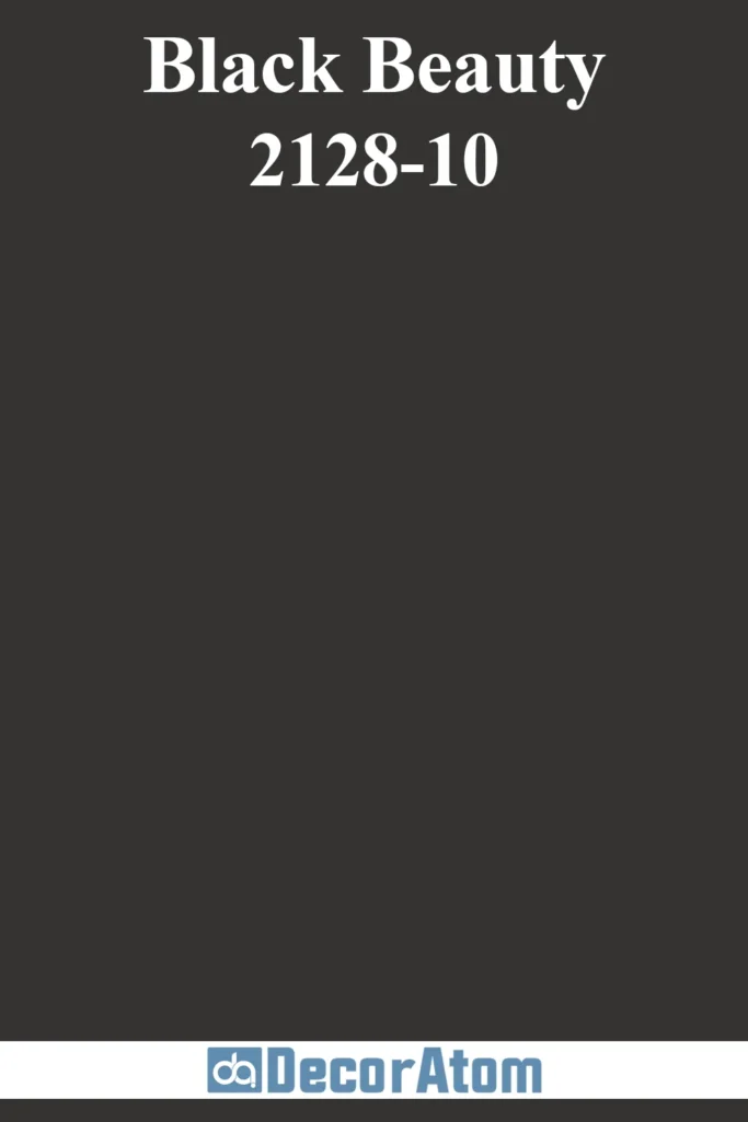
10. Black Beauty 2128-10
💥🎁 Christmas & Year-End Deals On Amazon !
Don't miss out on the best discounts and top-rated products available right now!
*As an Amazon Associate, I earn from qualifying purchases.
Black Beauty lives up to its name—it’s a lush, inky black with a touch of softness that keeps it from feeling too stark.
Unlike cooler, bluish blacks, this one has subtle brown undertones that add depth and warmth.
It’s a favorite for modern and traditional exteriors alike, making a bold statement on siding or as a dramatic trim and shutter color.
In direct sunlight, it picks up rich undertones; in shadow, it deepens into a velvety cloak.
Perfect for contemporary architecture, black-and-white farmhouse schemes, or even historic brownstones looking for high contrast and sophistication.
11. Cloud White OC-130

Cloud White is one of Benjamin Moore’s most beloved warm whites.
With creamy undertones and a soft, milky quality, it offers a classic yet inviting look that flatters a wide range of home styles.
Unlike stark whites, Cloud White has a touch of warmth, making it a standout on traditional or transitional exteriors.
It reflects light beautifully—bright but never glaring.
It’s especially lovely on brick homes, Tudors, and clapboard siding where a soft, elegant white is desired.
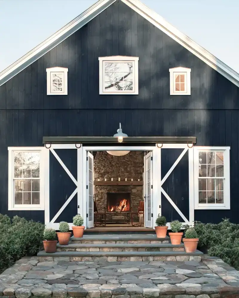
12. Hale Navy HC-154

A true design-world darling, Hale Navy is a classic navy blue with just the right mix of depth and richness.
It’s bold enough to stand on its own, but still versatile and grounding.
On exteriors, it reads as a stately blue in daylight, but deepens to a velvety navy in evening light.
The slight gray undertone keeps it from looking too vibrant or nautical.
It works wonderfully on colonial homes, modern coastal builds, or as a striking front door color. Paired with white trim or warm wood, it’s a showstopper.
13. Morrel AF-125
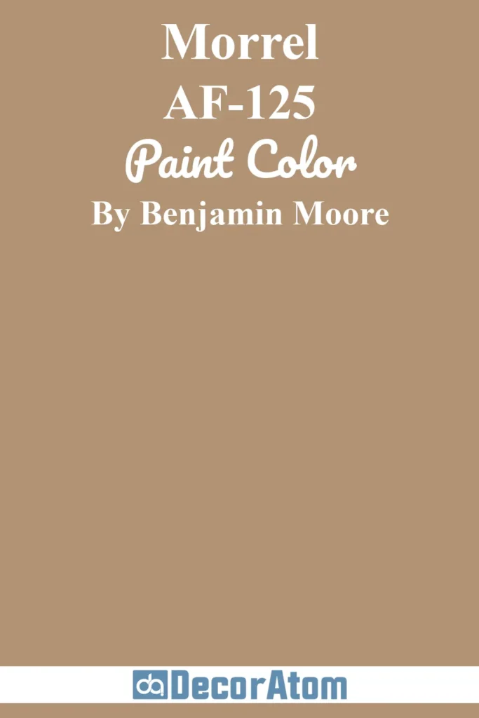
Morrel is an understated and deeply rooted brown with cool gray undertones, evoking the richness of tree bark or fertile soil.
It’s a color that doesn’t shout—but instead, whispers elegance. This earthy tone works beautifully on exteriors in wooded or rural settings, blending naturally into the landscape.
It holds its own in full sunlight without appearing too red or orange, and in shadow, it deepens into a rich espresso-like hue.
Morrel suits Craftsman homes, cabins, and mountain-style architecture, especially when paired with stone, cedar, or natural trim.
14. Jet Stream 814
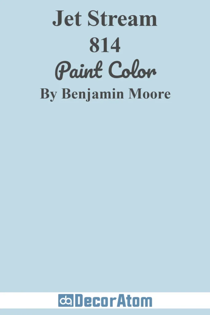
Jet Stream is a soft, whispery blue that feels light as air.
With a touch of gray to tone it down, this pale blue exterior color gives homes a tranquil, beachy look without going full coastal cliché.
In direct sunlight, it reads brighter and more cheerful; in the shade, its cooler undertone becomes more noticeable, adding a slightly moody, sky-on-a-cloudy-day vibe.
Jet Stream is a natural pick for Cape Cod-style homes, coastal cottages, or anyone wanting a gentle nod to the sea.
It pairs beautifully with crisp whites, soft grays, or navy accents.
15. Kendall Charcoal HC-166
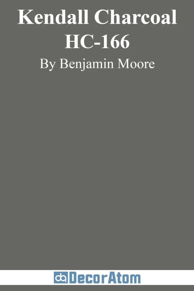
Kendall Charcoal is a bold, mid-to-dark gray with warm green undertones that give it an earthy balance.
It’s rich without being black, and it offers a sophisticated, grounded look to exteriors that need some gravitas.
In sunlight, Kendall Charcoal lightens slightly and shows off its green-gray heart, while in low light, it becomes more dramatic and saturated.
It’s often used on modern farmhouses, craftsman bungalows, or Tudor-style homes.
For contrast, white or pale stone trim works beautifully, and deep bronze or black accents elevate the look.
16. Cloud Cover 855
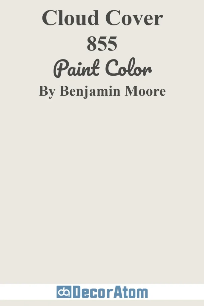
Cloud Cover is a soft, warm off-white with gentle gray undertones that give it a muted, serene finish.
It’s ideal for homeowners looking for a light color that isn’t stark white—especially for homes with plenty of direct sun.
Cloud Cover has a quiet elegance and is less prone to harsh glare than brighter whites.
It pairs beautifully with both dark shutters and warm wood tones, making it a favorite for colonial homes, traditional ranches, and transitional styles.
In overcast or shaded settings, its warm undertone keeps it from ever feeling cold.
17. Wenge AF-180
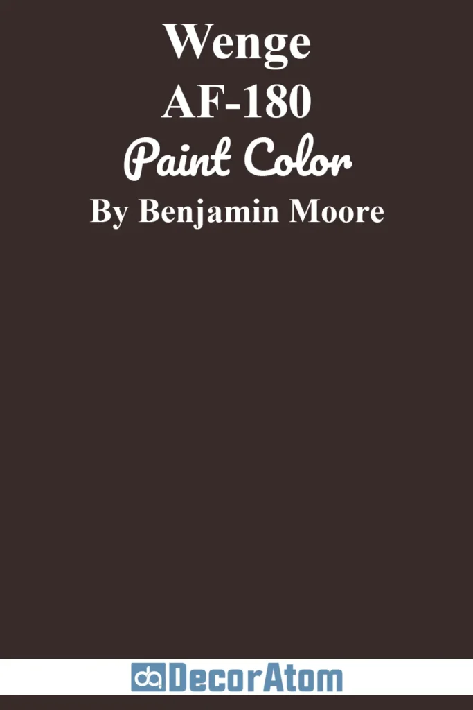
Wenge is deep, velvety, and full of character—a brown-black with reddish undertones that’s both modern and moody.
It’s a bold choice for exteriors, but one that oozes luxury and warmth.
In bright light, you’ll see subtle warmth come through; in the shade, it reads almost as black, but with more softness than a true jet black.
It’s particularly striking on contemporary homes, modern cabins, or mid-century designs where contrast and tone are key.
Use it with warm stone, copper gutters, or light natural wood for balance.
18. Concord Ivory HC-12
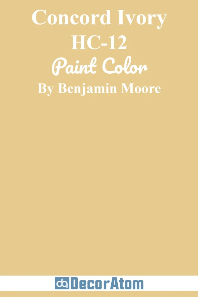
Cheerful and full of charm, Concord Ivory is a warm, golden yellow with hints of honey and a touch of orange.
It brings sunlight to exteriors, even on cloudy days. In direct sunlight, it glows without becoming brassy; in shade, it remains rich and welcoming.
Concord Ivory is especially suited for historic homes, Southern architecture, and country cottages.
It looks beautiful alongside white or cream trim and brick or terra cotta roofs. For a joyful, old-world feel, this shade is hard to beat.
19. Revere Pewter HC-172

This soft, earthy gray with warm undertones feels grounded, elegant, and endlessly adaptable.
On an exterior, Revere Pewter reads as a classic neutral that doesn’t look too cold or too beige—it lands right in that comforting middle ground.
Depending on your light exposure, it can lean more taupe or soft gray, making it a shapeshifter in the best way.
On a cloudy day or north-facing facade, it might pull a bit cooler and more gray, but in bright afternoon sun, its warm undertones gently emerge, offering a beautiful softness that plays well with white trim, black accents, or natural stone.
Revere Pewter suits everything from traditional colonials to transitional ranch-style homes, and it pairs just as well with rustic wood beams as it does with clean-lined shutters.
20. Violet Dusk 1409
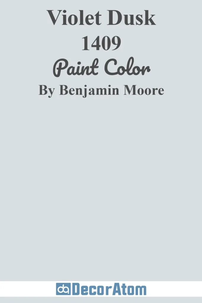
Violet Dusk is a dusty mauve-gray that offers a unique yet subtle pop of color for the right home.
It’s soft, moody, and a little romantic—perfect for those who want something out of the ordinary but still elegant.
In full sun, the violet tones become more apparent, giving exteriors a warm, ethereal quality. In shadow, it leans toward a gentle lavender-gray.
This shade is especially lovely on historic homes, Victorians, or charming cottages with white trim and lush garden settings.
21. Mallard Green 2053-10
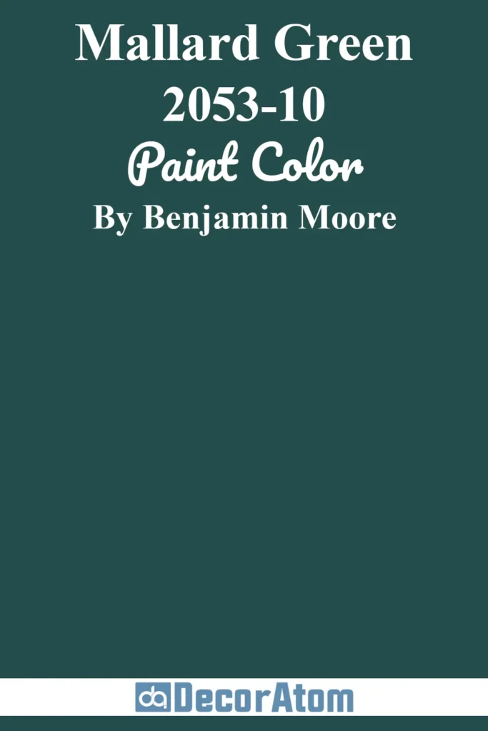
Mallard Green is a rich, jewel-toned deep green with blue undertones—a dramatic and timeless exterior color.
It echoes the look of classic hunter green but with more depth and coolness.
In bright sunlight, the green vibrancy shines through; in dim light or shade, it becomes a velvety deep teal-green.
This color feels regal and strong, perfect for traditional homes, Tudor-style exteriors, or rustic cabins tucked into forested lots.
It pairs beautifully with creamy whites, brass hardware, or natural stone.
22. Charcoal Slate HC-178
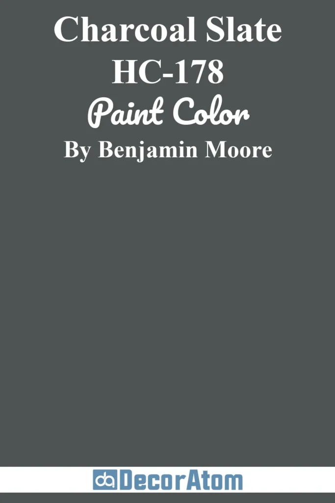
Charcoal Slate is a deep gray with blue undertones that gives a crisp, architectural look to any home.
It’s a refined, almost slate-blue color that’s more dimensional than flat charcoal.
In sunlight, the blue undertones become more pronounced, giving it a coastal or nautical feel. In shadow, it returns to a more classic charcoal.
This shade is ideal for homes in cooler climates, modern or transitional builds, and properties that use natural materials like slate, stone, or metal.
It looks fantastic with white, soft taupes, or deep navy accents.
23. Wedgewood Gray HC-146
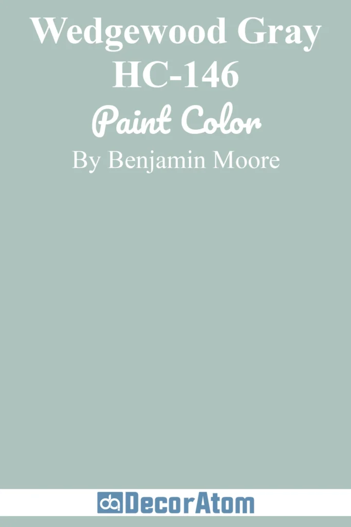
Wedgewood Gray is a soft, cool blue-gray that feels fresh, clean, and elegant.
It’s a favorite for exteriors because it adds color without overwhelming the design.
Its gray undertones soften the blue, making it look refined rather than juvenile.
In bright sunlight, it becomes more blue-forward; in the shade, the gray emerges for a more subdued effect.
It works beautifully on traditional homes, New England coastal architecture, and charming farmhouses.
White trim and dark blue or black shutters make this color truly pop.
24. Solitude AF-545
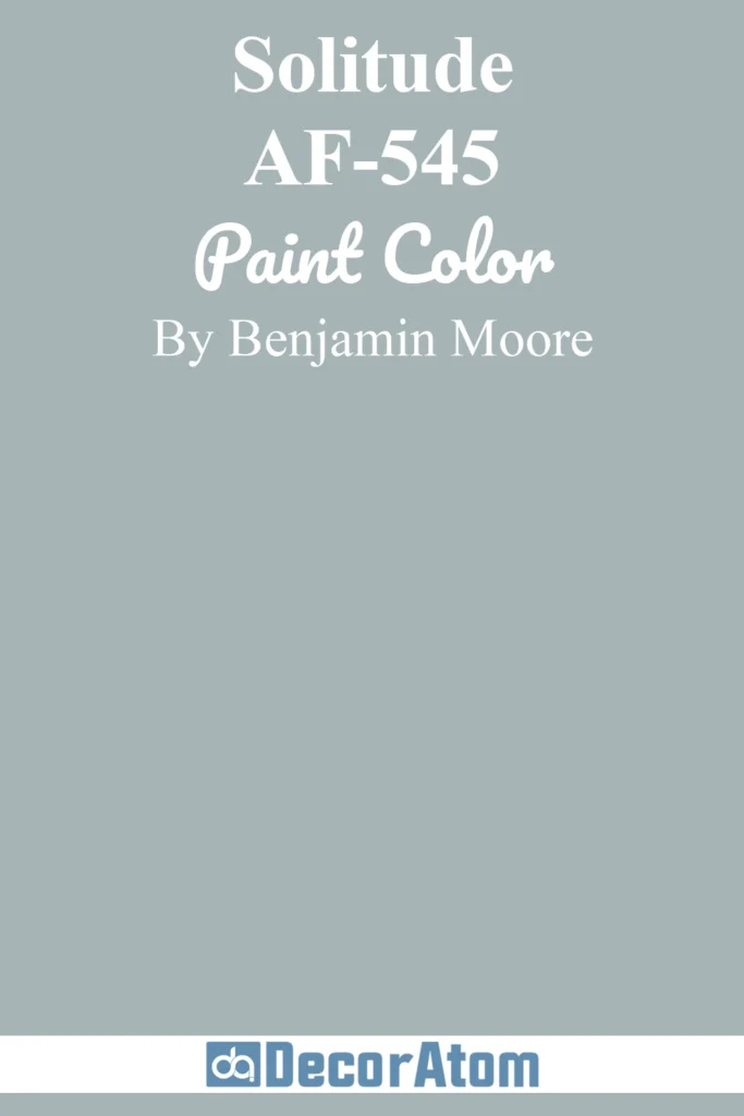
Solitude is a quiet, refined blue-gray with the calming feel of early morning mist.
It has soft violet undertones that make it feel elevated and a little mysterious.
In sunlight, it reads as a balanced blue with a soft glow; in shadows, it deepens into a moodier tone that adds intrigue.
This color is ideal for coastal cottages, serene retreats, or transitional homes looking for peaceful, refined curb appeal.
Pair it with soft white trim or warm gray accents for a beautifully layered look.
25. Chambourd AF-645
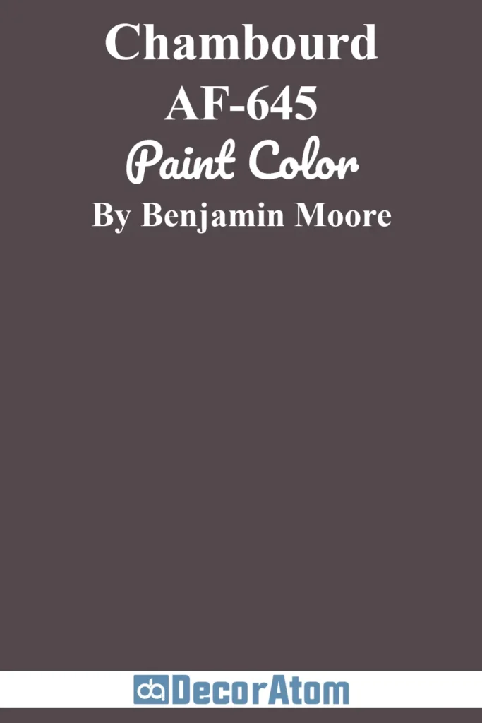
Chambourd is a bold, luxurious eggplant-inspired purple with deep brown undertones.
It’s moody, rich, and makes a high-end statement on exterior siding or as an accent color.
In sunlight, the red and purple notes emerge more vividly; in shade, it becomes a velvety dark neutral.
This is a color for homeowners who want something dramatic and different—but still elegant.
Chambourd works beautifully on historic homes, arts-and-crafts bungalows, or even ultra-modern architecture when paired with brass hardware, cream trim, or dark wood tones.