

I’ve always been drawn to that calm, breezy feel you get in homes near the coast—even if you’re nowhere near the ocean. And I’ve learned that a big part of capturing that vibe comes down to the paint colors you choose.
Not the cliché beachy ones, but those subtle, lived-in shades that actually feel coastal—like sea glass, driftwood, overcast skies, or even the warm light just before sunset.
I’ve gone down a rabbit hole (more than once) trying to find the perfect coastal colors from Benjamin Moore.
Some are soft and barely-there, others have a bit more personality—but they all share that relaxed, fresh, easygoing feel that I absolutely love in a home.
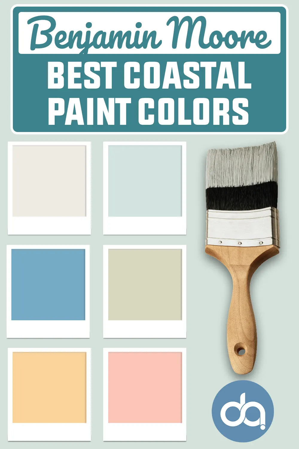
So I pulled together 21 of my favorite Benjamin Moore paint colors that work beautifully in coastal-inspired spaces.
If you’re after something that feels fresh but still grounded, I think you’ll find a few favorites here too.
What are Coastal Paint Colors?
Coastal paint colors are inspired by the natural beauty of beach landscapes—think soft sky blues, seafoam greens, sandy taupes, and crisp whites.
These hues are typically light, airy, and calming, reflecting the easygoing nature of coastal living.
You’ll often find colors that mimic the ocean, shells, driftwood, and sunrises over the water. They’re not just pretty—they’re designed to make your space feel relaxed and inviting.
What I love most about coastal colors is their versatility. They’re not just limited to traditional beach-themed homes.
Whether your style leans farmhouse, modern, or something in between, these colors can create a serene foundation that works with so many different design elements.

Where to Use Coastal Paint Colors
One of the best things about coastal paint colors is that they work just about anywhere. If you’re unsure where to begin, here are some of my favorite spots:
Living Rooms: Soft blues or pale neutrals make the perfect backdrop for casual, airy gathering spaces.
Bedrooms: Coastal greens and muted grays bring a restful, calming vibe—exactly what you want in a bedroom.
Bathrooms: Cool aquas and sea-glass tones give a fresh, spa-like feel to bathrooms, especially with white tile or chrome fixtures.
Kitchens: Light coastal tones brighten up kitchen cabinetry, walls, or even the ceiling for a subtle beachy pop.
Entryways & Hallways: A breezy coastal color can set the tone for the entire home from the moment you walk in.
The beauty of these shades is that they create a cohesive, tranquil flow from room to room—so your whole home feels connected, calm, and thoughtfully designed.
How to Pick the Best Coastal Paint Color?
Choosing the right coastal paint color is more than just grabbing a soft blue and hoping for the best. Here are a few tips I’ve learned from experience:
1. Consider the Lighting
Natural light plays a huge role in how a paint color reads. A soft gray-blue might feel cool and crisp in a bright room but could look dull or flat in a north-facing space. Always test samples in different lighting throughout the day.
2. Balance Warm and Cool Tones
Coastal palettes often include both warm (like sandy beiges or buttery creams) and cool (like ocean blues or seafoam greens) tones. Mixing both creates depth and keeps the space from feeling too cold or sterile.
3. Think About Your Style
Are you more traditional or leaning modern coastal? A rich navy might work great in a tailored, nautical look, while a faded green-gray feels right at home in a relaxed cottage vibe.
4. Use Neutrals to Ground the Palette
Whites, soft grays, and taupes keep coastal schemes from feeling too theme-y or overly colorful. They let those sea-inspired hues shine without overwhelming the room.
5. Don’t Skip the Undertone Check
Some blues have purple undertones, some greens lean yellow—it’s worth sampling a few options to see how the undertones play with your floors, trim, and furniture.
Top 21 Benjamin Moore Coastal Paint Colors
Now that you know what to look for, let’s dive into the fun part: the colors. These 21 Benjamin Moore shades are my personal picks for achieving that fresh, timeless coastal look.
I’ve grouped them into categories—neutrals, blues, greens, and sunset-inspired tones—so you can find the ones that fit your space and style best. Each of these colors brings something unique to the table, but they all share that breezy, effortless coastal charm.
Best Benjamin Moore Coastal Neutral Paint Colors
A coastal color palette doesn’t need to be all seafoam and blue skies—soft neutrals do just as much heavy lifting.
These shades bring calm, light, and versatility to coastal interiors, acting as the perfect backdrop for beachy textures like driftwood, rattan, and linen.
1. Frostine AF-5

Frostine is that rare cool white with a whisper of silvery-blue, giving it a subtle, frosted finish. It reminds me of a sea breeze drifting through gauzy curtains, cool and weightless.
I love using Frostine in bright coastal spaces where natural light can bring out its airy, almost ethereal nature.
It’s a great choice for walls, ceilings, or even cabinetry when you’re after a crisp, fresh look that still feels soft.
2. Ashwood OC-47

Ashwood is one of those quiet colors that feels like it belongs in a sun-bleached beach house.
It’s a sandy gray with a faded, weathered quality—almost like driftwood left to soften in the sun.
What I love about Ashwood is how easily it adapts to warmer accents like beiges and golden tones, yet still looks fantastic with cooler blues and whites.
It’s understated but never boring, which makes it incredibly easy to live with.
3. Pearl Gray 863
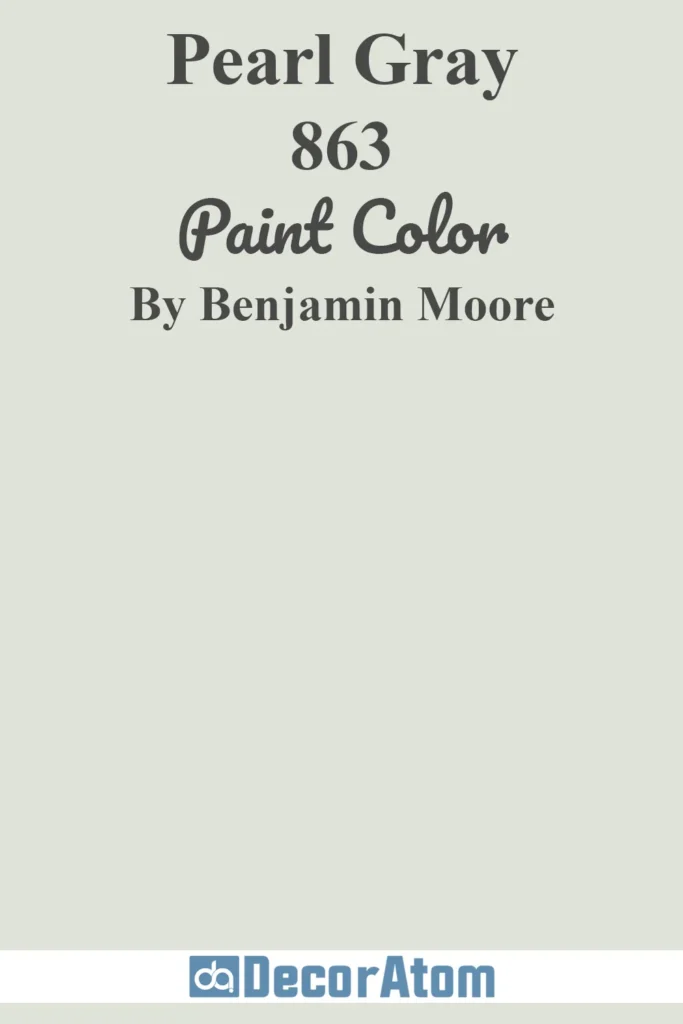
Pearl Gray has a luminous, almost reflective quality that feels right at home in coastal interiors. It shifts subtly depending on the light—sometimes cool and silvery, other times with a touch of warmth that gives it depth.
I picture this shade in a bathroom with chrome fixtures or a coastal kitchen with marble countertops. It plays beautifully with both soft ivories and bolder marine blues.
4. Gentle Gray 1626
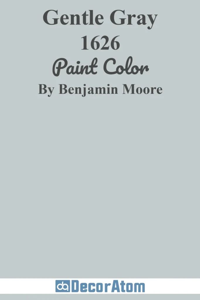
Gentle Gray lives up to its name—it’s calming, sophisticated, and quietly stylish. There’s a blue undertone that peeks through, especially in daylight, giving it a soft coastal charm without screaming “beach house.”
I like this shade for bedrooms or home offices where you want a touch of color that doesn’t overwhelm the space. It’s also gorgeous next to warm wood tones or paired with creamy whites.
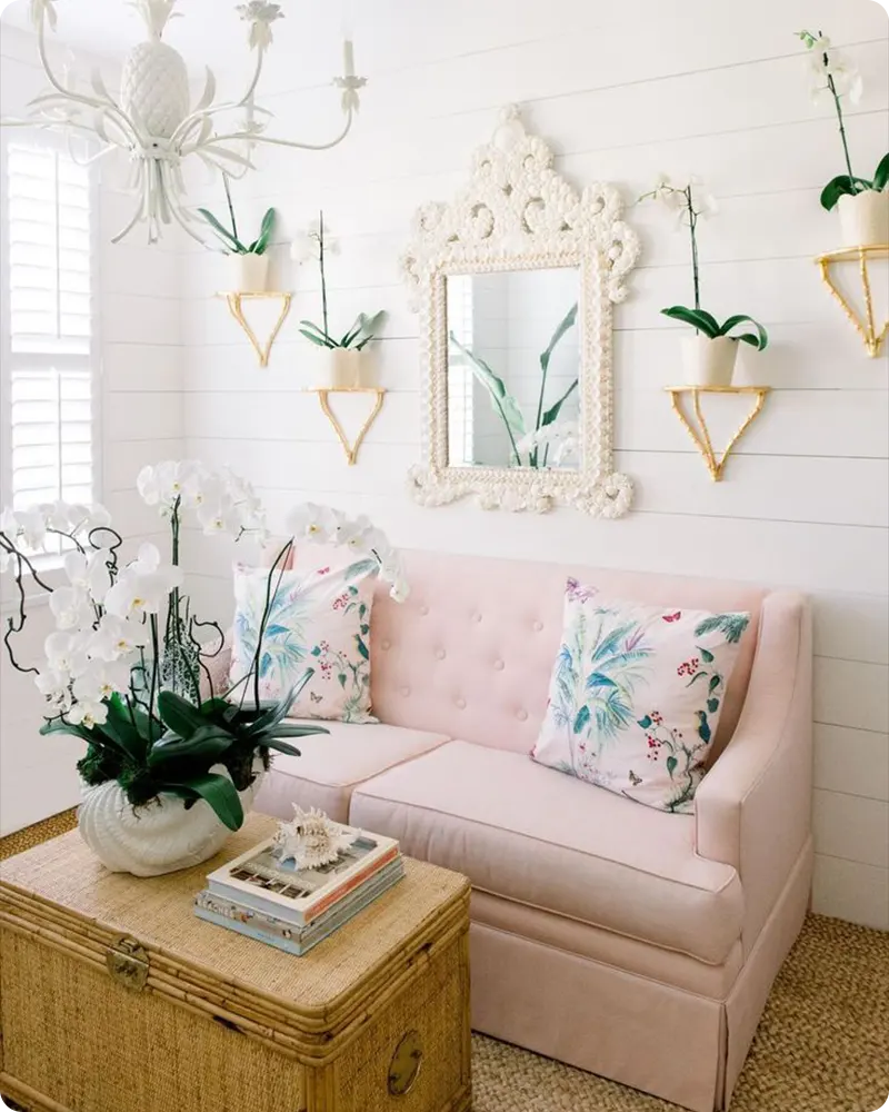
5. Atrium White OC-145
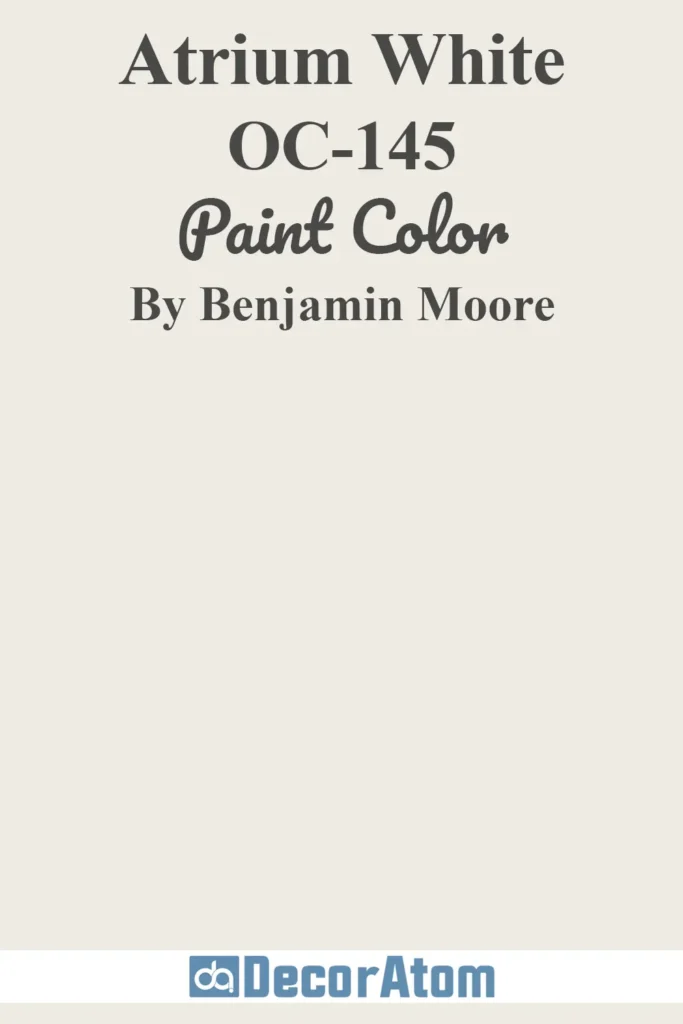
Atrium White is a warm white with just a hint of blush, making it feel cozy and inviting rather than stark or clinical. It’s a perfect choice if you want a coastal home that leans more cottage than contemporary.
The slight pink undertone gives it a sun-kissed glow, like the inside of a seashell. I find it especially pretty in bedrooms or on trim when paired with soft blues and sandy taupes.
Top Benjamin Moore Coastal Blues
Blue is the heart of any coastal color palette. From soft sky tones to rich nautical hues, the right shade of blue brings the ocean indoors.
These Benjamin Moore blues capture everything from serene beach mornings to dramatic sea-storm evenings.
6. Ocean Air 2123-50

Ocean Air is exactly what it sounds like—fresh, light, and quietly invigorating. It’s a breezy blue with a gentle green undertone, like the shallow water along a sunlit shoreline.
I love it in living rooms with lots of natural light, especially when paired with woven textures and crisp whites. It has enough personality to stand on its own but is soft enough to act like a neutral.
7. Sweet Dreams 847
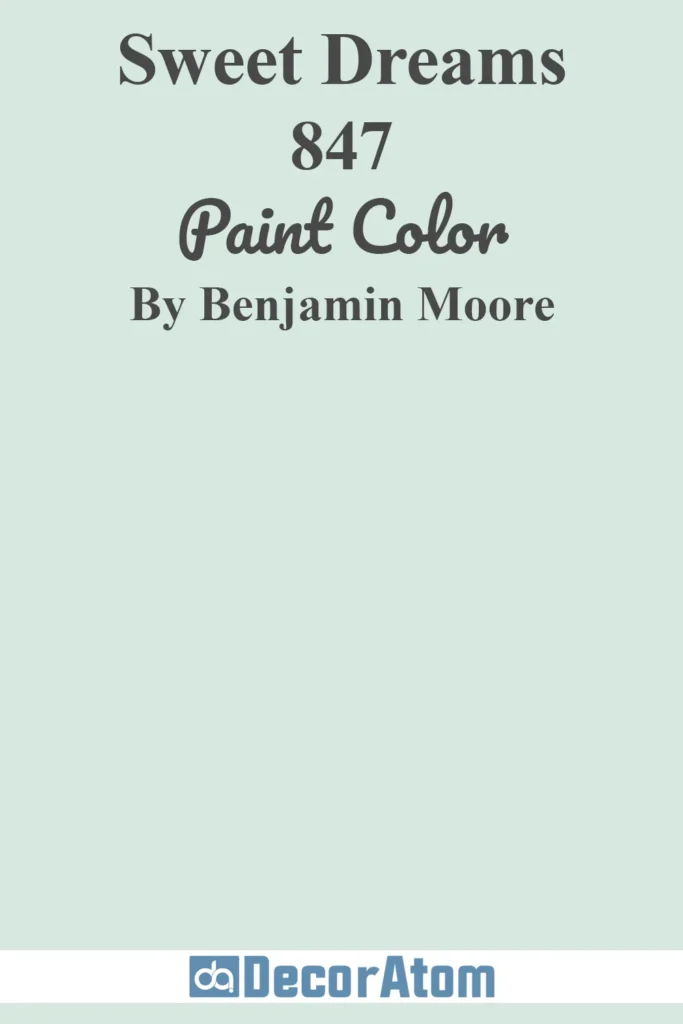
Sweet Dreams is a nostalgic baby blue that instantly puts you at ease. It’s delicate but not overly precious, especially when paired with warm neutrals, shiplap, or vintage-style furnishings.
I can picture this in a beach cottage bedroom, maybe with soft linen curtains and distressed wood floors. It’s the kind of color that makes a space feel relaxed and welcoming.
8. Summer Shower 2135-60

Summer Shower is one of those soft mid-tone blues that strikes the perfect balance between colorful and calming. It has just enough saturation to give a room personality, but not so much that it feels loud.
The name says it all—it feels like a soft sprinkle on a warm day, refreshing and peaceful. I think it’s a great option for bathrooms, hallways, or even an accent wall in an open living space.
9. Beach Glass 1564
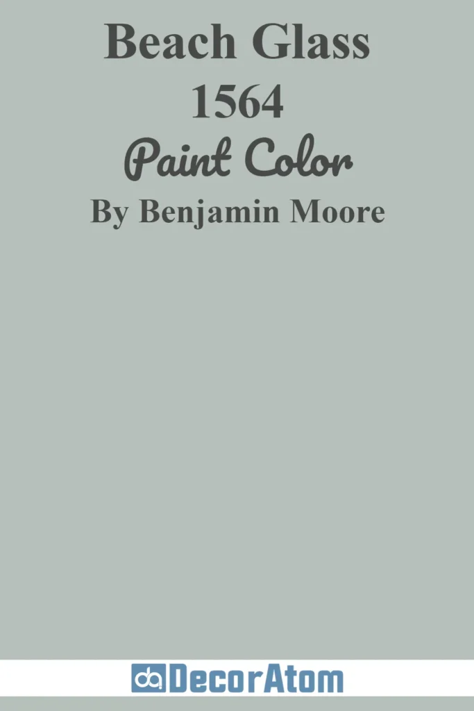
Beach Glass leans into that perfect gray-green-blue territory that’s impossible to define but easy to love. It reminds me of old sea glass washed smooth by the waves—muted, a bit misty, and full of character.
I like using this shade in small spaces like powder rooms or mudrooms where it brings a little color without overpowering. It’s also beautiful in kitchens with warm woods or brass hardware.
10. Mediterranean Sky 1662
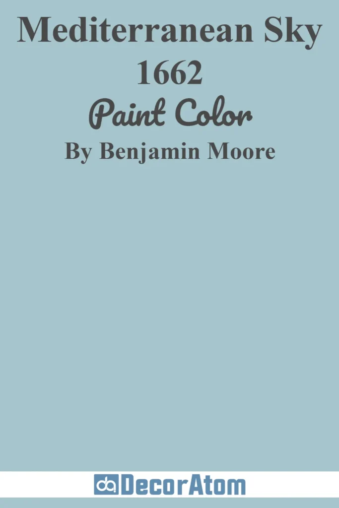
Mediterranean Sky is a mid-tone blue that brings energy and optimism into a room. It’s bolder than a pale sky blue but still feels light and airy—think sun-drenched doors and shutters in a coastal village.
It works well as a pop of color on trim, cabinetry, or even a front door. To me, it pairs beautifully with warm whites, natural fibers, and sun-kissed terracotta accents.
11. San Francisco Bay 802
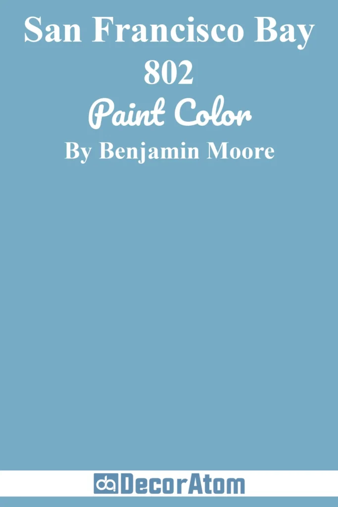
This rich blue captures the depth of water on a clear day—vibrant, clean, and full of life. San Francisco Bay is more saturated than most coastal blues, so I tend to use it for bold accents like built-in bookshelves or an entryway.
It holds its own against whites, sandy neutrals, and deep wood tones, giving your space that classic nautical vibe with a modern twist.
12. North Sea CC-932
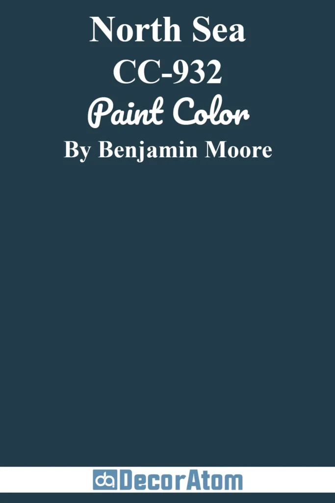
North Sea is a deep, inky blue that almost reads black in low light, but with just enough blue to feel coastal. It’s moody and grounding, like the ocean before a storm.
I love using this shade in smaller doses—think cabinetry, a powder room, or the back of a bookshelf. It brings drama without overwhelming the space and looks incredible when balanced with soft, natural textures like rattan and linen.
Best Benjamin Moore Coastal Greens
Green brings a grounded, organic element to coastal interiors. These shades echo dune grasses, seafoam, and the coastal pines you find just beyond the shore.
Whether you prefer soft and misty or deep and earthy, these greens add calm, character, and a natural feel to your beach-inspired home.
13. Par Four 470
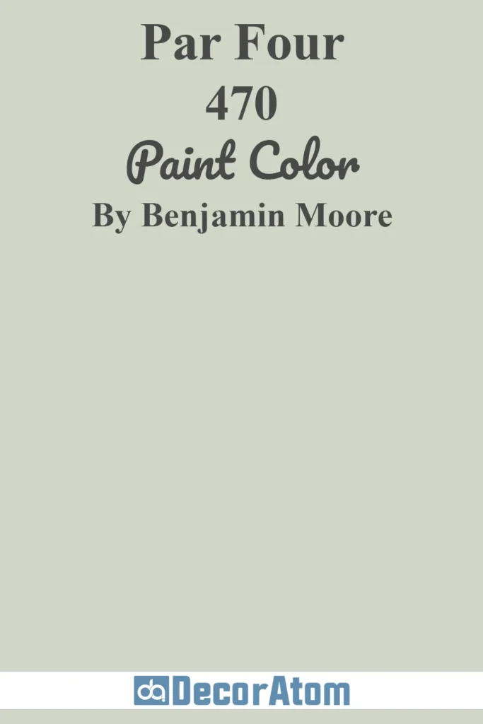
Par Four is a quiet green with a touch of blue and gray—almost like seafoam at dusk. What makes this shade special is how easily it shifts depending on the light.
In sunny rooms, it feels fresh and breezy, while in lower light it leans more muted and restful.
I love it for living rooms and bedrooms where you want color without a lot of contrast. It pairs beautifully with bleached woods, off-whites, and soft beige tones.
14. Quiet Moments 1563

Quiet Moments lives right between green, blue, and gray, and it’s every bit as soothing as it sounds.
There’s a spa-like serenity to this color, and I find it especially fitting for bathrooms, bedrooms, or even a coastal-inspired home office.
It doesn’t shout for attention, but it creates a peaceful atmosphere that feels instantly relaxing. Pair it with crisp white trim or warm brass finishes for a soft, elevated coastal look.
15. Hancock Green HC-117
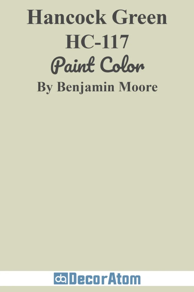
Hancock Green is a celery-toned green that brings a gentle, earthy freshness to coastal spaces. It has a historic feel to it—slightly vintage, slightly botanical—which makes it ideal for homes that mix traditional style with a coastal palette.
I like using it in kitchens or breakfast nooks, especially when surrounded by natural textures like jute rugs and woven blinds. It brings just enough color to keep things interesting without dominating the space.
16. Urban Nature AF-440
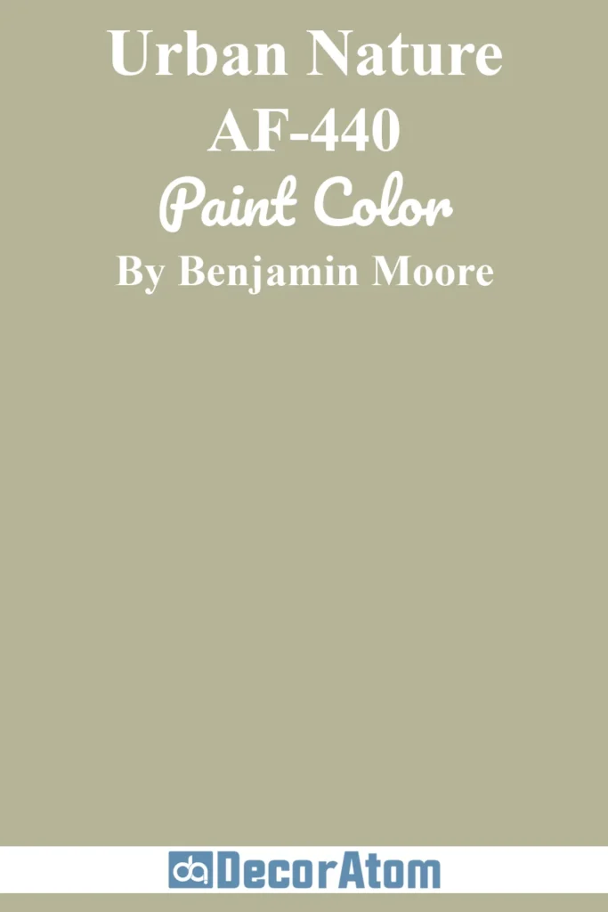
Urban Nature is a richer, moodier green than your typical beachy pastel. It has a mossy, olive undertone that feels grounded and contemporary. For coastal interiors that lean modern or minimalist, this color adds depth and contrast.
It’s stunning on built-ins, accent walls, or even cabinetry. Think driftwood, black iron accents, and creamy neutrals—Urban Nature ties it all together with quiet strength.
17. Verdigris 685
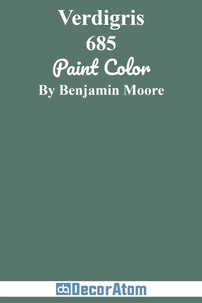
Verdigris is a deep, lush green with blue undertones—like the color of aged copper or a dense kelp forest. It’s bolder than your average coastal green, but when used strategically, it adds sophistication and richness to the palette.
I love this shade for statement-making trim, wainscoting, or moody coastal dining rooms. Pair it with lots of white and natural light, and it transforms the space into something elegant but still relaxed.
Popular Benjamin Moore Coastal Sunset Colors
Coastal living isn’t just about sea and sky—it’s also about the warm glow of golden hour, sandy paths at twilight, and the soft pinks of a fading sunset.
These colors bring warmth and playfulness to your beach-inspired palette, offering a perfect contrast to the cooler neutrals and blues.
18. Windham Cream HC-6

Windham Cream is a soft buttery yellow with a gentle glow, like the first light of morning on a quiet beach.
It’s cheerful without being too bold, making it perfect for kitchens, entryways, or any spot where you want to invite in a little sunshine.
I love how it pairs with natural textures like cane and rattan—it gives the whole space a golden, welcoming feel.
19. Chestertown Buff HC-9
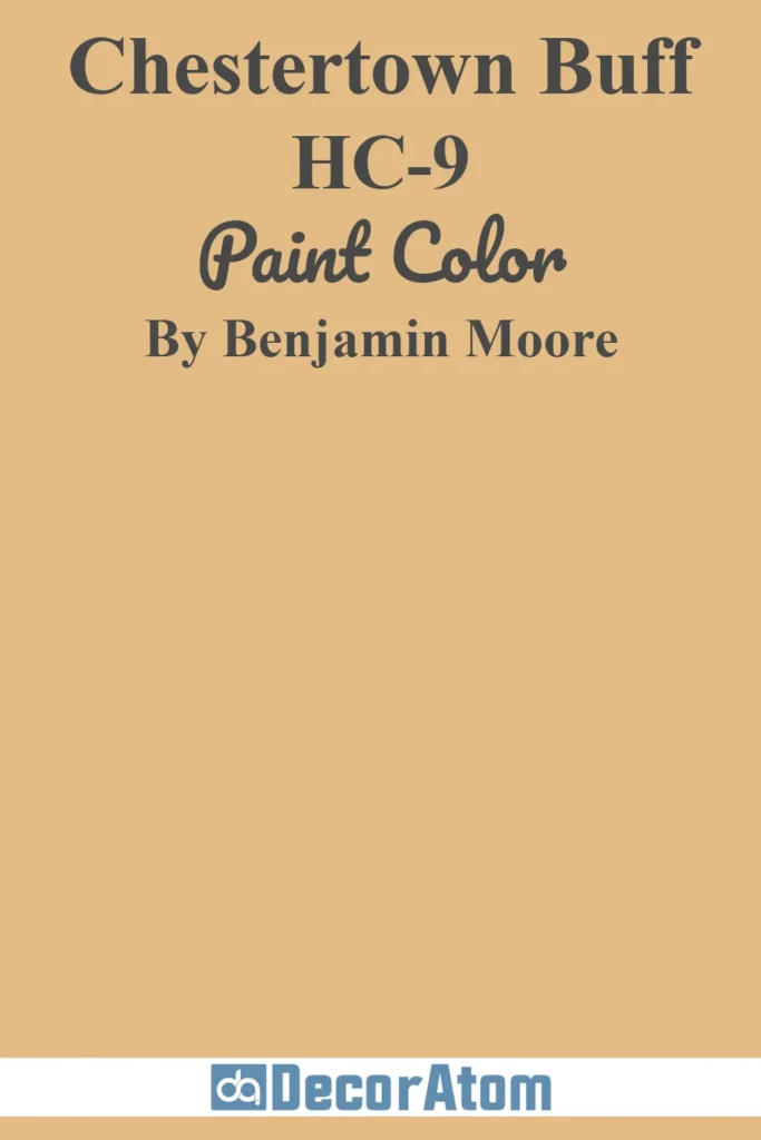
Chestertown Buff is a warm honey gold with an earthy, sunbaked quality. It feels like beach grass glowing in late afternoon light.
This shade is fantastic for coastal dining rooms or living areas where you want warmth and depth without going full-on orange or yellow. Try it with soft whites, terracotta accents, or pale wood furniture to create a rich, layered look.
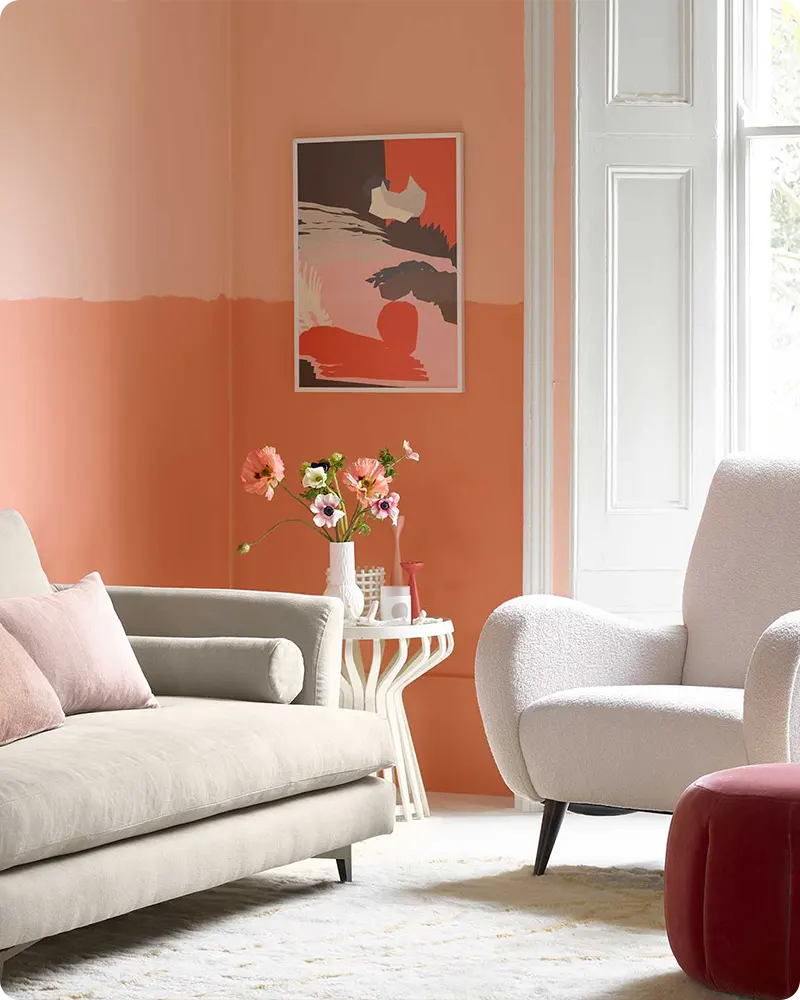
20. Salmon Peach 2013-50

Salmon Peach is a soft, muted coral that reads like a gentle blush on the horizon. There’s something nostalgic and comforting about this color—it’s warm without being overpowering, and it adds just the right touch of personality.
I’d use it in a guest bedroom or a cozy sitting area, paired with creamy whites and light wood tones. It has a lovely lived-in feel that’s effortlessly coastal.
21. Honeywheat 179

Honeywheat strikes a balance between gold and beige with a sun-drenched warmth that’s perfect for coastal interiors. It reminds me of sand dunes just before sunset—rich, soft, and golden.
This color is great for larger spaces like open-plan living rooms or entryways where you want a welcoming, golden glow. It works especially well with whitewashed woods and soft gray-blue accents.
Final Thoughts on Benjamin Moore Coastal Paint Colors
At the end of the day, coastal paint colors aren’t just about sticking to a theme—they’re about creating a space that feels calm, lived-in, and easy to be in.
Whether you’re leaning into soft neutrals, misty greens, or a few ocean-inspired blues, the right shade can shift the entire feel of a room.
These 21 Benjamin Moore colors are ones I keep coming back to because they’re versatile, timeless, and genuinely beautiful in real homes—not just on color cards.
If you’re working on a coastal-style space (or just want your home to feel a little more relaxed and refreshed), I hope this list helps you narrow things down and maybe even discover a new favorite.