
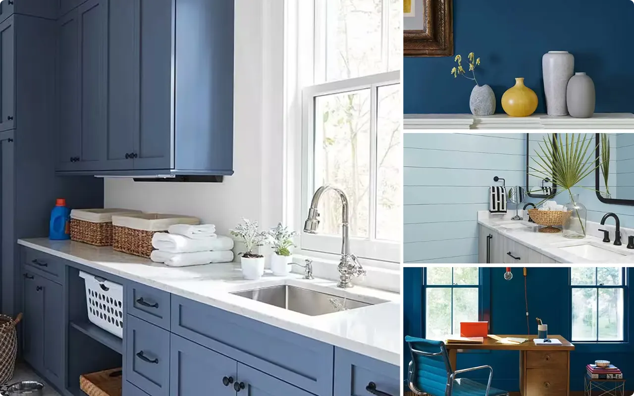
*This post contains affiliate links. For more details see my full disclosure.
You know how some colors just stick with you? Blue has been that for me for as long as I can remember. There’s something about it that can make a room feel calm and peaceful, or give it a spark of energy, depending on the shade you pick.
I’ve spent years experimenting with Benjamin Moore blues, painting walls, cabinets, and even ceilings, and I keep coming back to these favorites. They aren’t just colors on a chart to me, they each tell a story and create a vibe you can really feel.
So, whether you’re chasing that soft, barely-there blue or a deep, moody navy, I’ve put together a list of 17 Benjamin Moore blues that I think are worth trying.
These aren’t just pretty colors, they’re shades that have changed how my spaces feel, and I hope they’ll inspire you too.
What are Blue Paint Colors?
Blue paint colors are shades derived from the color blue, which ranges from light pastels like baby blue and powder blue to darker shades like navy and indigo. Blue often has undertones of green, gray, or purple, which can shift how the color feels in a room.
For example, a blue with green undertones can feel fresh and coastal, while a blue with gray undertones feels more muted and sophisticated. Blue is known for its calming and serene qualities, making it a popular choice for bedrooms, bathrooms, and living spaces.
Depending on the specific shade and undertones, blue can bring energy, coolness, or warmth to a room, making it one of the most versatile colors to work with in home décor.
Where to Use Blue Paint Colors?
Blue paint colors are incredibly versatile and can be used almost anywhere in your home, depending on the mood you want to create. In bedrooms, softer blues promote relaxation and restful sleep.
Bathrooms benefit from blues because the color naturally complements water and creates a spa-like feel. Living rooms and dining rooms can handle deeper, richer blues that add sophistication and coziness.
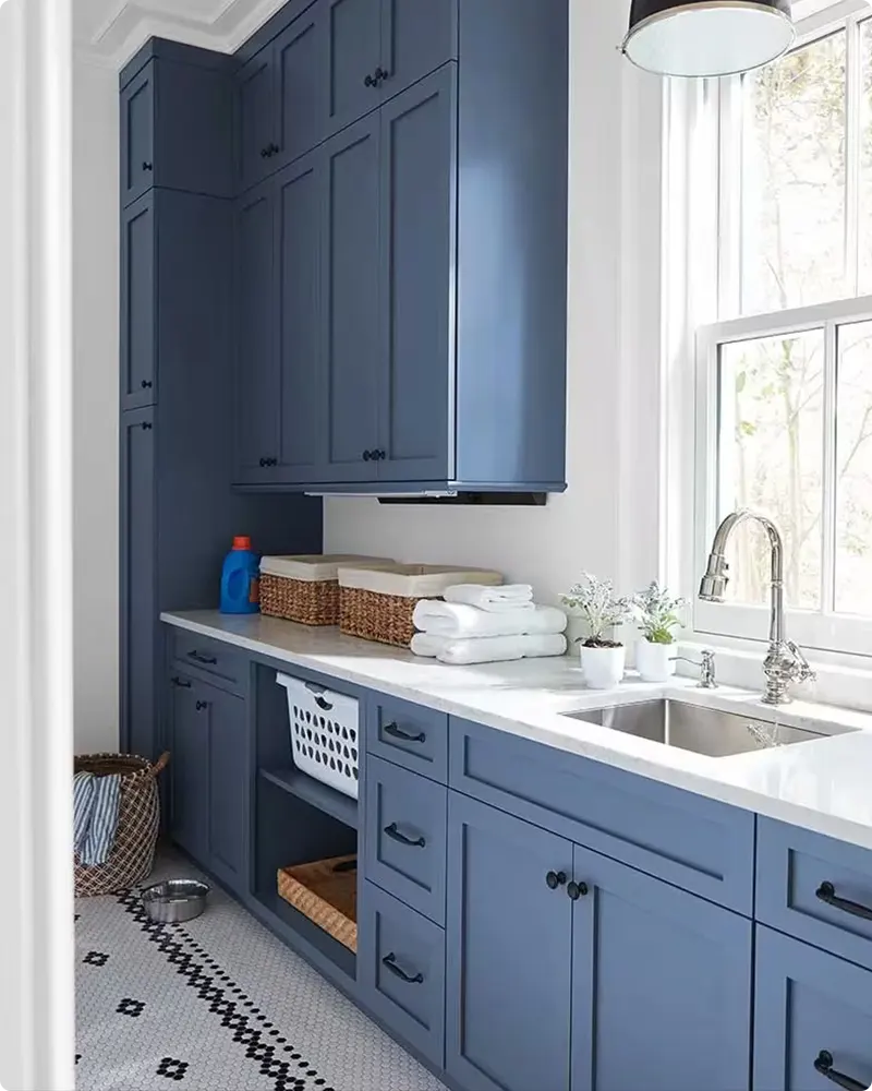
I’ve also seen blue used beautifully on kitchen cabinets or islands to add a pop of color without overwhelming the space.
Don’t overlook entryways and hallways, blue can make these transitional areas feel inviting and fresh. And for those who love a bold look, accent walls or ceilings painted in deeper blue tones bring drama and personality.
💥🎁 Christmas & Year-End Deals On Amazon !
Don't miss out on the best discounts and top-rated products available right now!
*As an Amazon Associate, I earn from qualifying purchases.
Colors to Pair with Blue Paint Colors
One of the things I enjoy most about blue is how well it pairs with a variety of colors. Whites and creams are classic companions that brighten and soften blue walls, creating a crisp, clean look.
Soft grays and beige tones can tone down blue’s intensity for a more subdued palette. For a modern twist, pairing blue with black or charcoal adds depth and sophistication.
Wood tones, whether warm oak or dark walnut, bring warmth and natural contrast to blue hues. Don’t forget metallics! Brass, gold, and copper accents pop beautifully against blue backgrounds, adding a touch of glamour and shine.
And for those who want a fresh, vibrant feel, blues paired with pops of coral, blush pink, or mustard yellow can bring energy and playfulness to any room.
Tips for Choosing The Best Blue Paint Colors
Choosing the right blue paint color can feel overwhelming because of how many shades exist, but here are some tips I’ve learned over the years:
1. Consider Your Lighting
Natural light and artificial light can dramatically change how a blue looks on your walls. Test your paint samples at different times of day to see how the undertones shift.
2. Think About the Room’s Purpose
Softer blues work better in spaces meant for relaxation, while brighter or deeper blues can energize social areas.
3. Test Large Samples
Small swatches don’t always tell the whole story. Paint larger patches on your walls before making a final decision.
4. Match Undertones
Pay attention to the undertones in your furniture, flooring, and décor to ensure your blue complements rather than clashes.
5. Don’t Be Afraid to Go Bold
Sometimes a dramatic navy or teal can make a space feel sophisticated and cozy.
How to Know if a Paint Color Is Right for You?
The best way to see if a paint color works for your home is to test it on your wall. Look at it over a few days in different lighting; morning, afternoon, and evening, to see how it really feels.
You can do this by getting a sample from the paint store and using a brush put it up on the walls, but then you are left with a can that you can’t do anything with. Those samples are used with poor-quality paint and aren’t meant for use on your walls permanently.

💥🎁 Christmas & Year-End Deals On Amazon !
Don't miss out on the best discounts and top-rated products available right now!
*As an Amazon Associate, I earn from qualifying purchases.
Instead, I recommend going with Samplize. They are a company that will send you a 9”x14.75” peel and stick swatch of a paint color that you can stick to the wall. When you are done just peel it off and throw it away.
It’s easy and much less messy!
Top 17 Benjamin Moore Blue Paint Colors
Here are my favorite Blue paint colors from Benjamin Moore to decorate with. I’ve tried and loved these shades in different settings and know they’re reliable choices for bringing beautiful blue vibes into your home.
1. Iceberg 2122-50
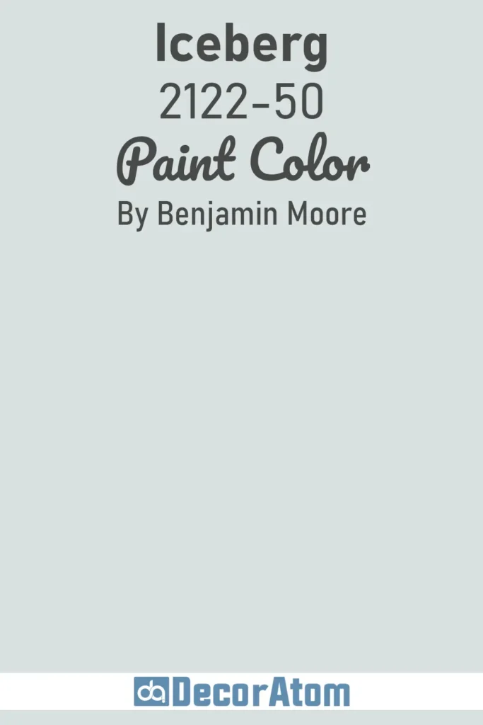
I always think of Iceberg as the softest whisper of blue you can paint on a wall without it feeling icy cold. It’s incredibly pale, almost a blue-tinted white, with subtle gray undertones.
That makes it a beautiful choice if you’re after a light, serene backdrop that won’t overwhelm a space. I’ve seen this used in nurseries, bathrooms, and even minimalist kitchens, and every time, it adds a clean and calming touch.
It’s also one of those chameleon colors, depending on your lighting, it might lean more gray or more blue, but it never feels too saturated or bold. If you want a barely-there blue with a soft modern elegance, Iceberg is a go-to.
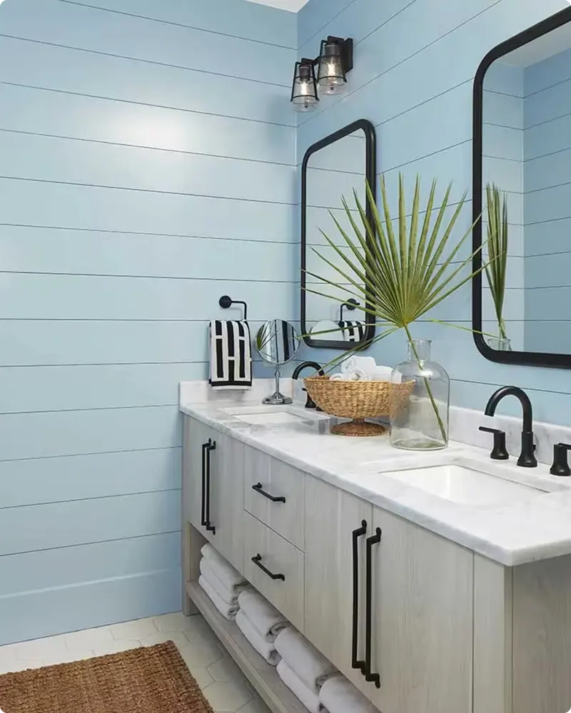
2. Ocean Air 2123-50

There’s something about Ocean Air that instantly makes a space feel lighter and fresher, like cracking open a window near the coast. It’s airy, soft, and has just the right balance of blue and green undertones.
This is one of those blues that works beautifully in bedrooms, especially when paired with white trim or sandy beige tones. It feels coastal without being too on-the-nose.
I’ve also seen Ocean Air in entryways, where it creates a welcoming, breezy first impression. It’s calm, casual, and always makes me feel like I’m stepping into a peaceful, well-balanced room.
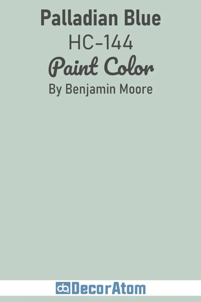
3. Palladian Blue HC-144
💥🎁 Christmas & Year-End Deals On Amazon !
Don't miss out on the best discounts and top-rated products available right now!
*As an Amazon Associate, I earn from qualifying purchases.
Palladian Blue has been a longtime favorite of mine, and honestly, I never get tired of recommending it. It’s a mix of blue, green, and a hint of gray, soft enough to feel sophisticated but still full of character.
What I love most is its versatility. It works in traditional spaces, beach houses, or even modern farmhouses. If you’re looking for a timeless blue-green that feels like a breath of fresh air, this one is it.
It plays beautifully with creams, brass finishes, and warm wood tones. It’s particularly stunning in bathrooms and dining rooms, but I’ve also seen it used on cabinetry and even ceilings for a subtle pop of color.
4. Polar Sky 1674
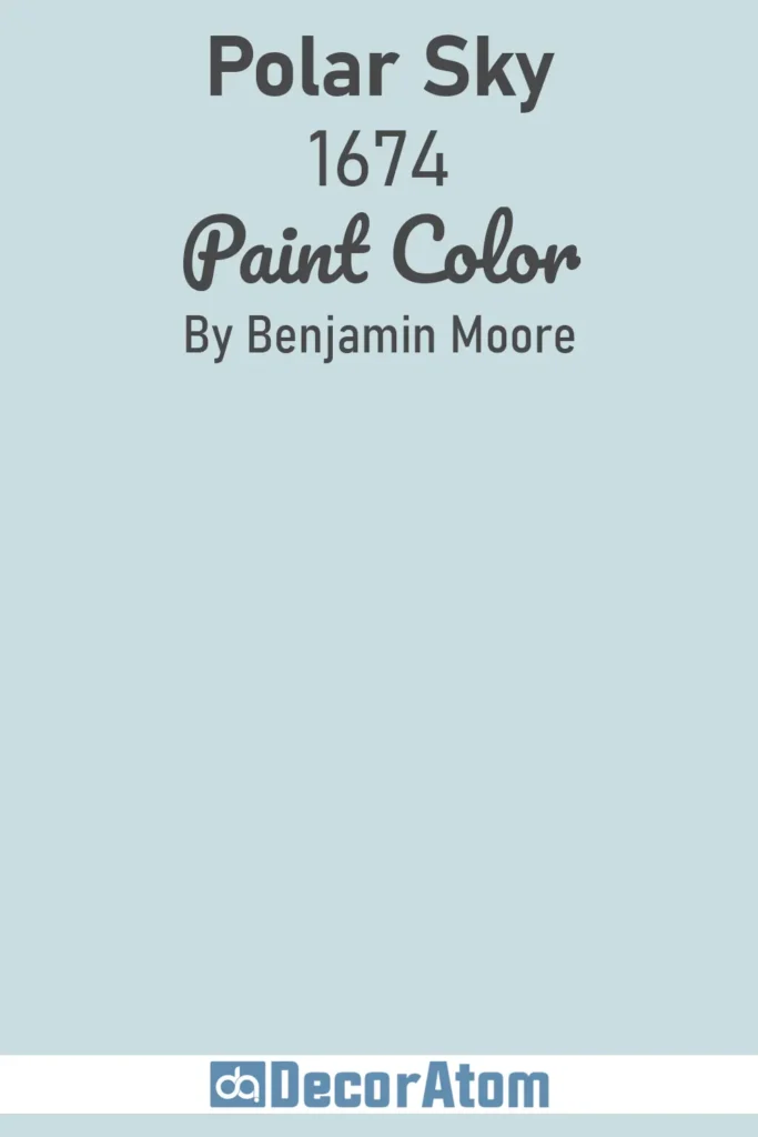
Polar Sky is a cool-toned mid-range blue that feels crisp and collected. It reminds me of a winter morning, clear, bright, and just a bit frosty.
This isn’t a muted blue, it has enough pigment to stand out without being overpowering. It looks gorgeous in north-facing rooms where you want to bring in some brightness.
I personally love how Polar Sky pairs with white wainscoting or light gray furniture. It brings a clean and peaceful mood to the space, which is ideal for home offices or guest bedrooms.
If you want a blue that has presence but still feels tranquil, Polar Sky is a solid choice.
5. Palace Pearl CW-650
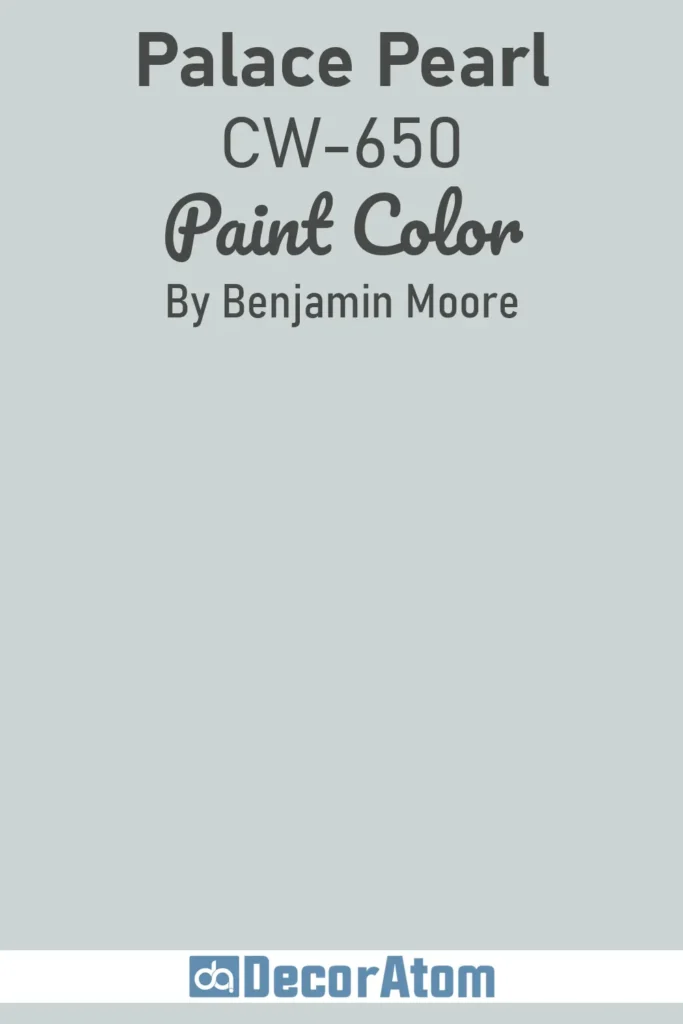
This one’s a little different, and a total hidden gem. Palace Pearl comes from Benjamin Moore’s Williamsburg Collection, and it has this historic elegance that feels both rich and refined.
It’s a pale blue with silvery undertones, almost like a pearl shimmer under the right lighting. I love using this in formal spaces like dining rooms or studies, especially if you’re going for a classic or vintage-inspired look.
It pairs beautifully with antique brass, deep wood tones, and soft whites. It’s not your average light blue, it has a subtle depth that gives it a lot of character without being loud.
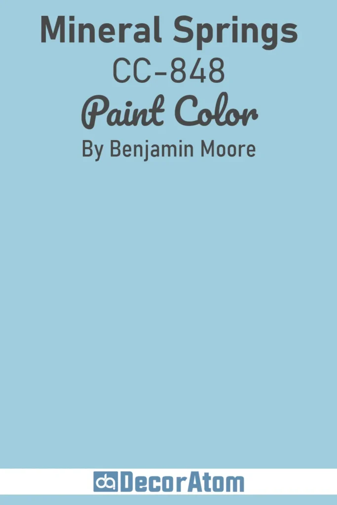
6. Mineral Springs CC-848
💥🎁 Christmas & Year-End Deals On Amazon !
Don't miss out on the best discounts and top-rated products available right now!
*As an Amazon Associate, I earn from qualifying purchases.
Mineral Springs is one of those colors that immediately makes me think of natural spas and peaceful retreats. It’s a light to mid-tone blue with green-gray undertones, which gives it an earthy, organic feel.
It doesn’t scream for attention, instead, it brings a grounded calmness to any room it touches. I especially love it for bathrooms, laundry rooms, and even entryways. It’s cool without feeling cold, and it transitions beautifully with both warm and cool tones in your décor.
If you’re designing a space that’s meant to recharge you, Mineral Springs is worth considering, it’s that perfect in-between shade that feels elegant and comforting at once.
7. Aegean Teal 2136-40
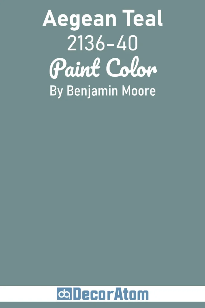
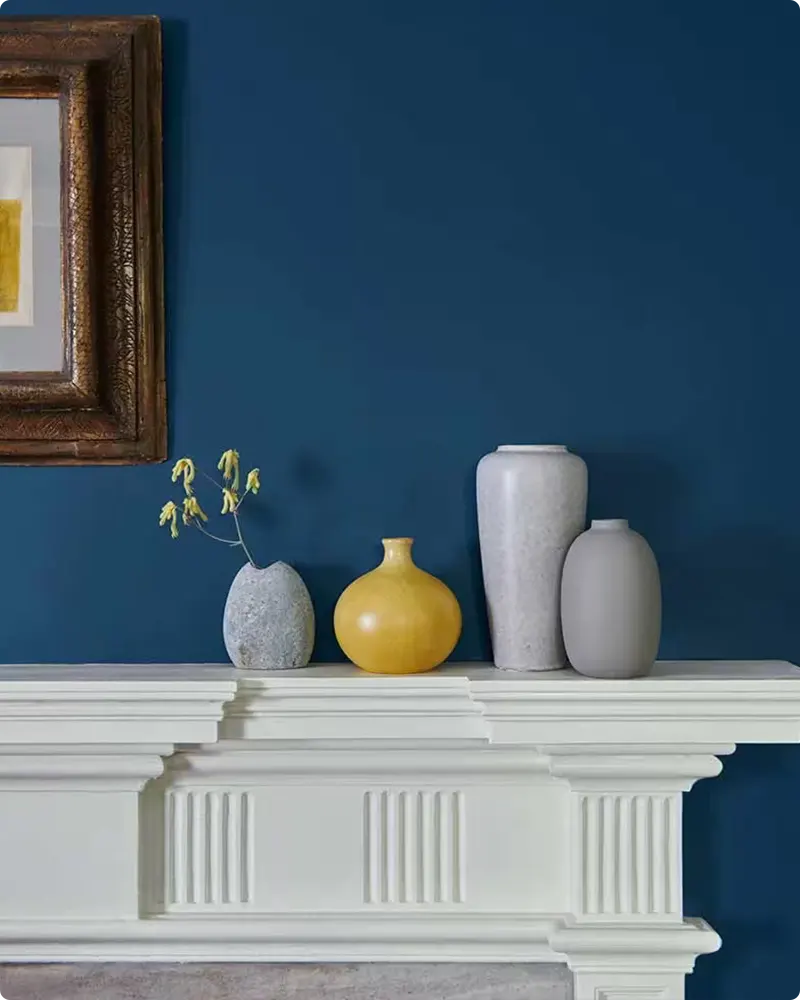
I still remember the first time I saw Aegean Teal on a cabinet, it was bold, moody, and absolutely stunning. There’s something so rich and layered about this color. It’s not just blue, and it’s not quite green.
It’s a deeply saturated teal with gray undertones that add sophistication. Benjamin Moore chose it as their Color of the Year in 2021 for a reason, it has personality, but it’s also deeply grounding.
I’ve seen it work beautifully in kitchens, accent walls, even bedroom paneling. It pairs well with warm whites, muted golds, and rustic wood tones. If you’re craving something more dramatic but still refined, Aegean Teal is the color to try.
8. Santorini Blue 1634
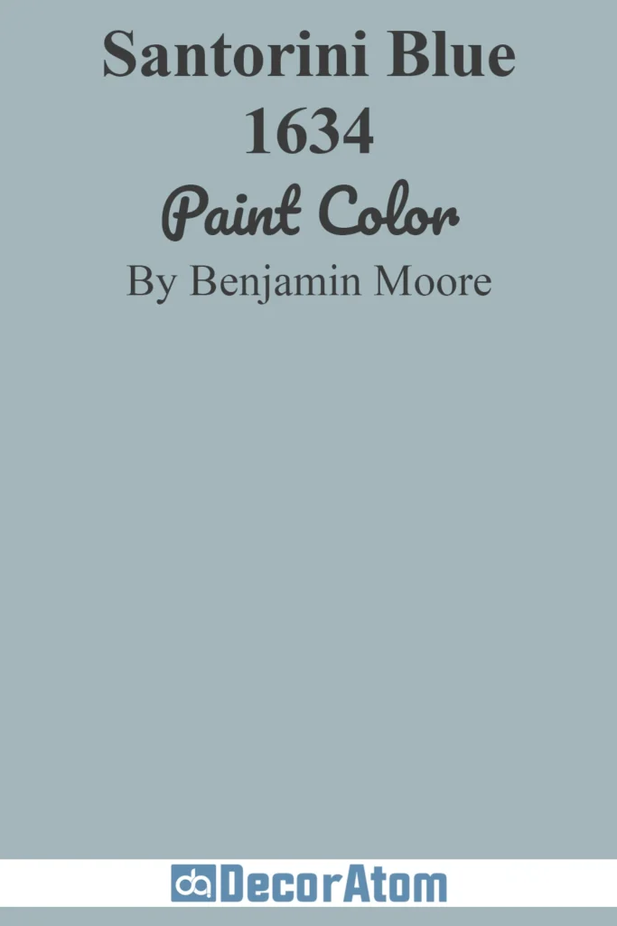
Santorini Blue captures that Mediterranean charm, bright, happy, and reminiscent of sun-washed coastal villages. It’s a classic medium blue that feels cheerful without tipping into juvenile territory.
I love using this in children’s rooms, sunrooms, or even on exterior doors. It brings energy and warmth, especially in spaces that get plenty of sunlight.
What’s great is that it doesn’t feel overly bold or brash, it still carries a sense of ease and charm. If you want a blue that feels optimistic and welcoming, Santorini Blue gives you that perfect touch of seaside spirit.
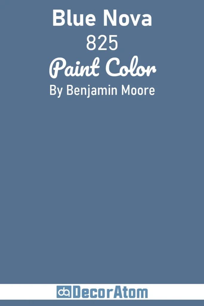
9. Blue Nova 825
💥🎁 Christmas & Year-End Deals On Amazon !
Don't miss out on the best discounts and top-rated products available right now!
*As an Amazon Associate, I earn from qualifying purchases.
Now this one, Blue Nova, is for those who want something rich, moody, and full of depth. It’s a deep periwinkle-blue with violet undertones that give it a unique, sophisticated twist.
I’m drawn to it for creative spaces or reading nooks where you want the walls to feel cozy and enveloping. It also looks incredible when used with warm metallics like brushed gold or bronze.
One thing I love about Blue Nova is that it isn’t a typical navy or cobalt, it’s got that unexpected edge. And if you’re not afraid of making a statement, it can look striking on kitchen cabinetry or even a powder room ceiling.
10. Van Deusen Blue HC-156
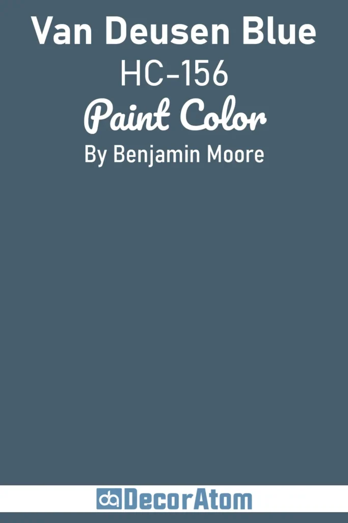
Van Deusen Blue is a tried-and-true classic in the Benjamin Moore Historical Collection. It’s a deep, rich navy with a dignified, timeless appeal. I often describe it as a navy with structure, it’s not too dark, not too bright, and doesn’t lean too purple or gray.
It holds its own in a variety of settings. I’ve seen it on front doors, bookcases, dining room walls, and even bathroom vanities, and it works every single time.
It also pairs beautifully with crisp whites, wood tones, and brass fixtures. If you’re looking for a blue that feels stately and dependable, Van Deusen Blue is one that never disappoints.
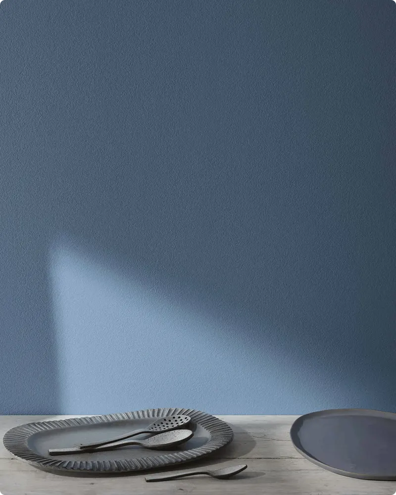
11. Blue Danube 2062-30
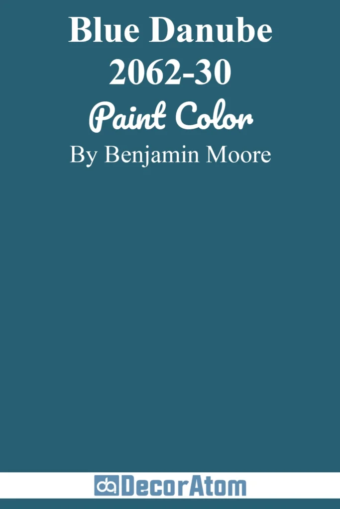
Blue Danube is a wonderfully soft, muted blue that instantly feels approachable and comforting. It strikes a beautiful balance, not too bright, not too dull, and leans slightly toward the gray side, which makes it incredibly versatile.
I’ve used this color in living rooms and bedrooms where a peaceful, cozy atmosphere is the goal. It pairs beautifully with light woods, soft creams, and even some warmer taupes.
What I love about Blue Danube is that it quietly supports your space without dominating it, perfect for anyone who wants a subtle touch of blue with a sophisticated edge.
12. Downpour Blue 2063-20
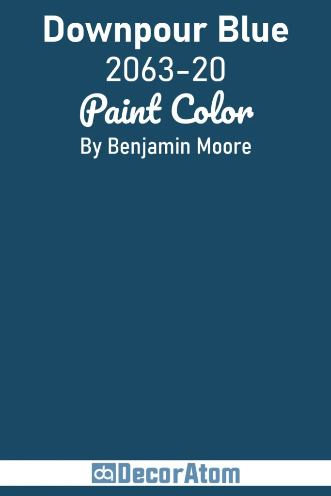
With Downpour Blue, you’re getting a deeper, moodier blue with strong gray undertones. This color reminds me of a gentle rainstorm, calm, reflective, and a little mysterious.
It’s fantastic for spaces where you want a bit of drama without going full-on dark. I’ve seen it work wonders on accent walls, dining rooms, and even exteriors.
Paired with crisp white trim and soft grays, it brings a refined and slightly moody vibe. It’s one of those colors that feels classic yet modern, perfect for adding character without overpowering.
13. Kensington Blue 840
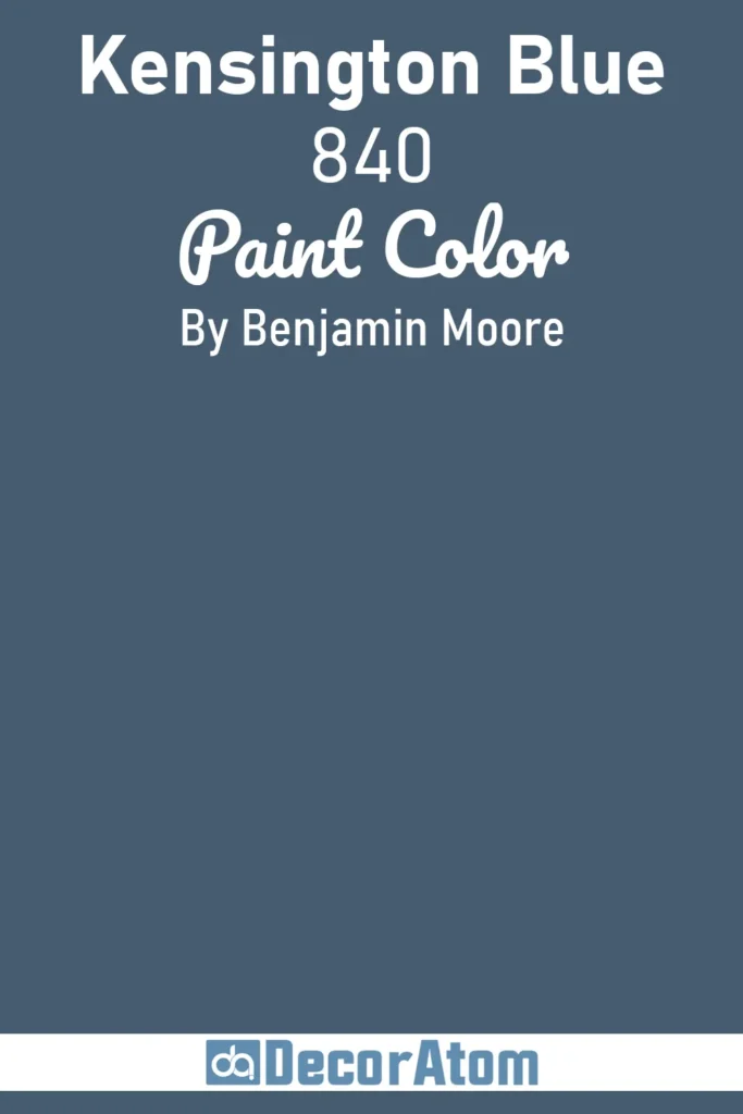
Kensington Blue is a rich, slightly traditional blue with enough warmth to feel inviting rather than cold. I like to think of it as a deep denim tone with a touch of softness.
This color works beautifully in family rooms and libraries, where it creates a cozy and grounded ambiance. It’s also lovely on cabinetry or built-ins, giving them a timeless, tailored look.
What’s great about Kensington Blue is that it pairs equally well with natural wood, brass accents, and creamy neutrals, making it a fantastic choice if you want classic style with a bit of personality.
14. Symphony Blue 2060-10
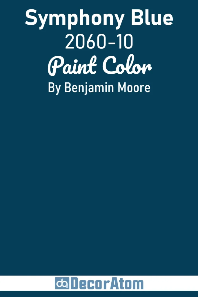
Symphony Blue is one of those captivating blues that feels vibrant but never overpowers. It’s a medium-to-deep blue with a crisp clarity that makes a statement without shouting.
I’ve found it to be perfect for dining rooms and kitchens, where you want a fresh, energized feel. It’s also fantastic for accent walls or even front doors.
The color feels modern and lively, yet approachable. It pairs wonderfully with whites, light grays, and natural woods, creating a balanced and inviting atmosphere.
15. Gentleman’s Gray 2062-20
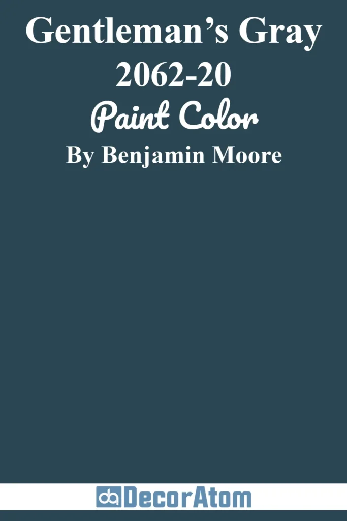
Despite the name, Gentleman’s Gray is actually a blue-gray hybrid with a soft, muted personality. It’s calm and sophisticated, like a well-tailored suit in paint form.
I love using this color in home offices, bedrooms, or living spaces where you want a bit of understated elegance.
The gray undertones help tone down the blue so it feels peaceful, while the blue hints keep it interesting and fresh. It pairs seamlessly with both warm and cool neutrals and looks especially striking with matte black accents or brushed nickel hardware.
16. Hale Navy HC-154
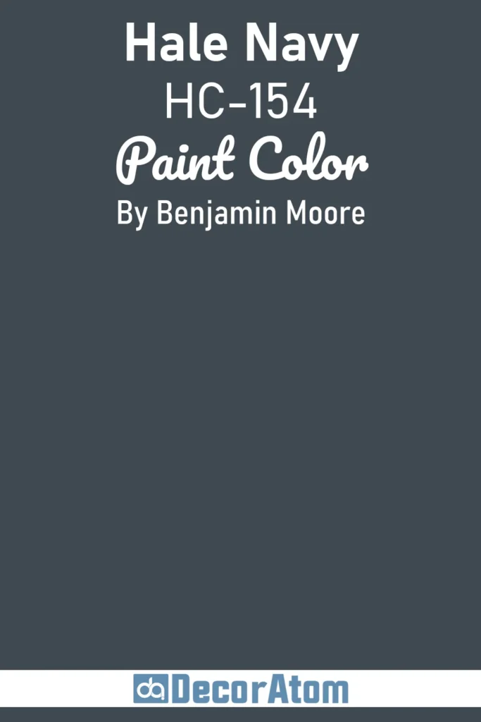
Hale Navy is a personal favorite and a true classic in the Benjamin Moore lineup. It’s a deep, rich navy that commands attention without feeling heavy or oppressive.
I’ve used Hale Navy on everything from exterior doors to entire dining rooms, and it always adds a sense of timeless elegance. What I appreciate most is how flexible it is, it can feel traditional and stately or modern and bold depending on how you style it.
I like pairing it with warm whites, brass fixtures, and natural wood for that perfect mix of classic and contemporary.
17. Hidden Sapphire CSP-690
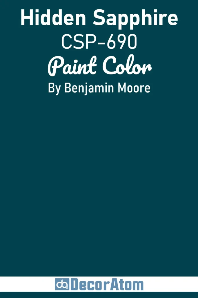
Hidden Sapphire feels like the perfect balance between jewel-tone richness and everyday practicality. It’s a medium-to-dark blue with subtle green undertones that give it an almost mysterious depth.
This color works beautifully in bedrooms or living rooms where you want to create a cozy, intimate vibe without going too dark. I’ve also seen it used as a statement cabinetry color in kitchens, where it adds a unique twist without feeling trendy or fleeting.
It pairs wonderfully with soft neutrals and warm metals, making it a great choice if you want blue that’s sophisticated but still inviting.
Related Paint Color Articles:
If you’re looking for even more paint color inspiration, be sure to check out these other posts by clicking on their titles below:
- 21 Best Sherwin Williams Blue Paint Colors
- 17 Best Blue Paint Colors for Living Room
- 17 Best Benjamin Moore Blue Gray Paint Colors
- 17 Best Coastal Blue Paint Colors
- 17 Best Blue Paint Colors for Kitchen Cabinets
- 13 Best French Blue Paint Colors
- 13 Best Blue Paint Colors For Nursery
Frequently Asked Questions
Q: Are blue paint colors suitable for small rooms?
Absolutely! Lighter blues can make small rooms feel bigger and airier, while darker blues can add depth and coziness. Just consider your lighting and balance with lighter accents.
Q: How do I know if a blue has warm or cool undertones?
Warm blues tend to have hints of green or teal, while cool blues lean toward gray or purple. Testing samples in your space helps reveal undertones clearly.
Q: Can I use blue paint colors in kitchens?
Definitely! Blue cabinets or accent walls can add freshness and personality to kitchens. Pair them with neutral counters and hardware for a balanced look.
Q: What colors go best with navy blue?
Navy pairs wonderfully with crisp white, soft gray, warm wood tones, and metallics like brass or gold.
Q: How do I prevent blue paint from feeling cold?
Balance blues with warm elements like wood, textured fabrics, or warm metals to create a cozy atmosphere.