
I have to admit, I never thought I’d be this obsessed with blue gray paint colors. But here we are.
There’s just something about that cool, muted mix of blue and gray that feels both fresh and cozy at the same time. It’s like the paint version of your favorite well-worn sweater — familiar, calming, and easy to live with.
Over time, I’ve tried a bunch of Benjamin Moore’s blue grays in my own home and for clients, and let me tell you, some of these colors really hit different.
Some feel like a soft whisper of color that just makes everything better, while others add this moody, grown-up vibe that totally transforms a room.
If you’re staring at paint swatches and feeling overwhelmed, you’re not alone. Blue gray is tricky because it can look completely different depending on the light or what it’s paired with.
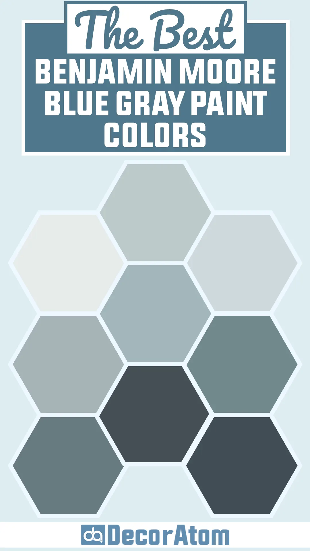
So I rounded up the 17 best Benjamin Moore blue gray paint colors that I think can work anywhere — from bedrooms to kitchens to your cozy reading nook.
No fuss, no frills — just the real deal on the colors I actually recommend.
What Are Blue Gray Paint Colors?
Blue gray paint colors are exactly what they sound like — a mix of blue and gray, blended to create a color that feels calm, balanced, and easy to live with.
But what makes these colors so interesting is how much they shift depending on the light, the room, and what else is around them.
Some blue grays lean heavily into their gray side, offering a soft, smoky look that works almost like a neutral. Others are bluer and bring a bit more color to the space without being too bold.
What I love most about blue gray is that it walks the line between cool and comforting. It’s not as stark as plain gray and not as playful as true blue — it gives you the best of both worlds.
That’s why you’ll see designers reaching for blue grays all the time: they’re incredibly versatile and easy to work into almost any room.
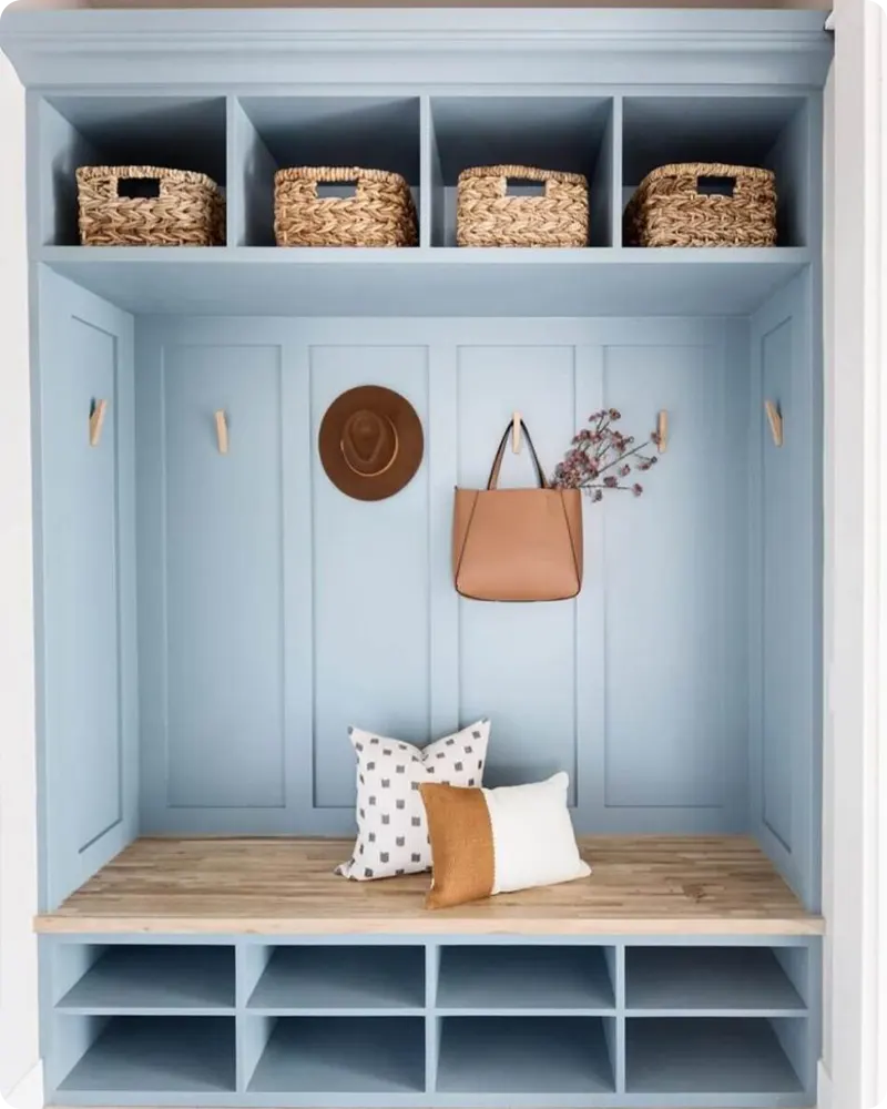
Where to Use Blue Gray Paint Colors
Honestly, there’s hardly a space in the house where a good blue gray won’t work.
I’ve seen these colors look amazing in bedrooms, especially when you’re going for a calm, restful atmosphere.
A soft blue gray on the walls can make the whole space feel a little more relaxed — like a Sunday morning kind of vibe.
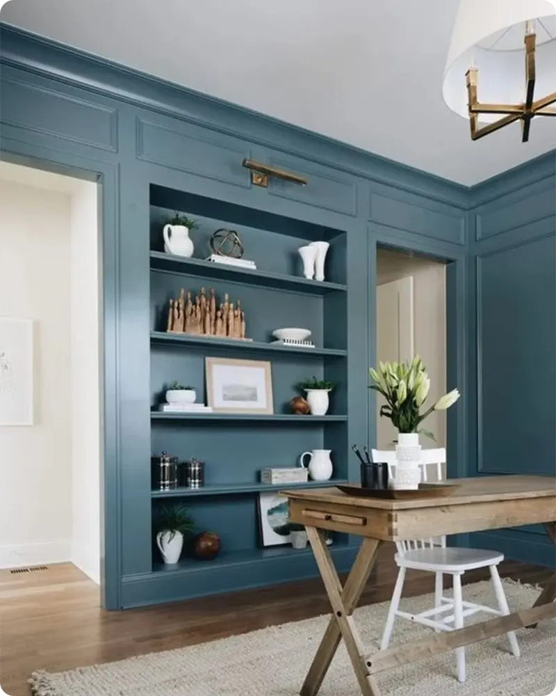
In living rooms, I like using slightly deeper blue grays to ground the space without making it too dark. They add just enough contrast against white trim or neutral furniture.
I’ve also used blue grays in bathrooms, where the cool tones feel clean and spa-like, especially next to white tile or marble.
And then there are kitchens — one of my favorite places to experiment with blue gray.
Whether it’s on walls, cabinetry, or even just the island, it brings a subtle hint of color that still feels timeless. If you want a fresh update that’s not too trendy, blue gray is a smart, safe choice.
Colors to Pair with Blue Gray Paint Colors
The great thing about blue gray is that it doesn’t box you in when it comes to color pairing. It’s flexible.
Depending on the undertone, you can go in a lot of different directions — warmer, cooler, bold, or soft.
For a classic and clean look, pairing blue gray with crisp white trim always works.
If you’re trying to warm things up a bit, soft taupes or warm beige tones add a cozy contrast.
Personally, I love pairing blue gray with natural wood textures and earthy accents — it keeps things grounded and gives the color room to breathe.
If you’re feeling a little more playful or creative, blush pinks, sage greens, or even brass and gold finishes look beautiful against blue gray.
These kinds of combinations give the color more personality and can help you steer the overall mood of the space.
Tips for Choosing the Best Blue Gray Paint Colors
I’ve learned the hard way that blue gray paint colors can be a bit tricky — not because they’re bad choices, but because they change so much depending on the space.
What looks like the perfect soft blue gray in a store or on a Pinterest board might suddenly read too cool or even purple once it’s on your own wall.
That’s why I always recommend sampling — not just a little swatch on the wall, but a larger section that you can watch throughout the day.
Morning light, afternoon shadows, and even the bulbs in your lamps can all shift the color more than you might expect.
Also, don’t forget about undertones. Some blue grays have a subtle greenish hue; others lean violet or slate.
It’s subtle, but once it’s on the wall, those undertones become much more noticeable, especially if you’re pairing the color with other strong elements like flooring, cabinetry, or textiles.
My best advice? Take your time, live with a few samples for a few days, and trust your instincts more than the paint chip.
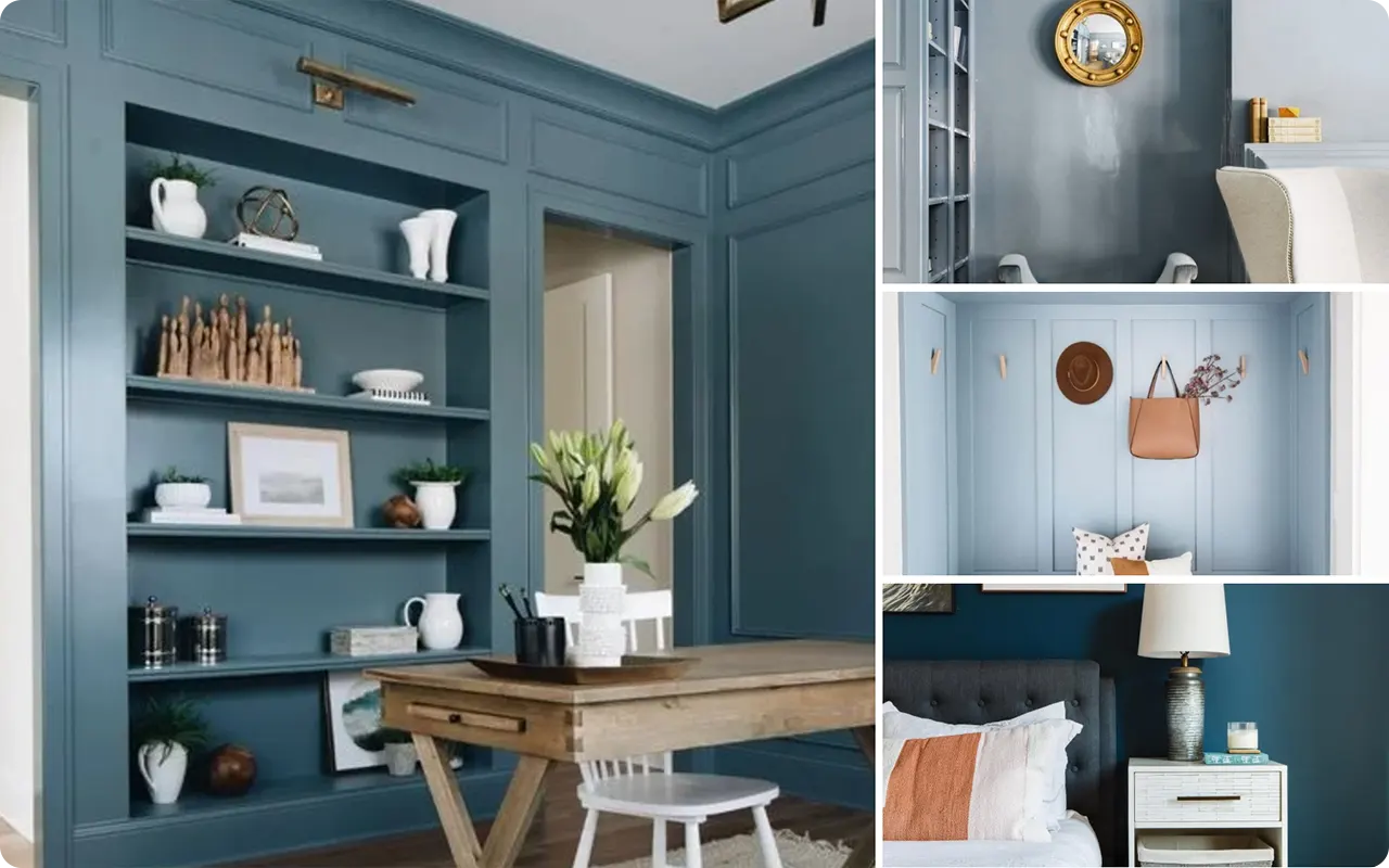
Top 17 Benjamin Moore Blue Gray Paint Colors
Here are my favorite Blue Gray paint colors from Benjamin Moore to decorate with.
1. Benjamin Moore Lily White 2128-70
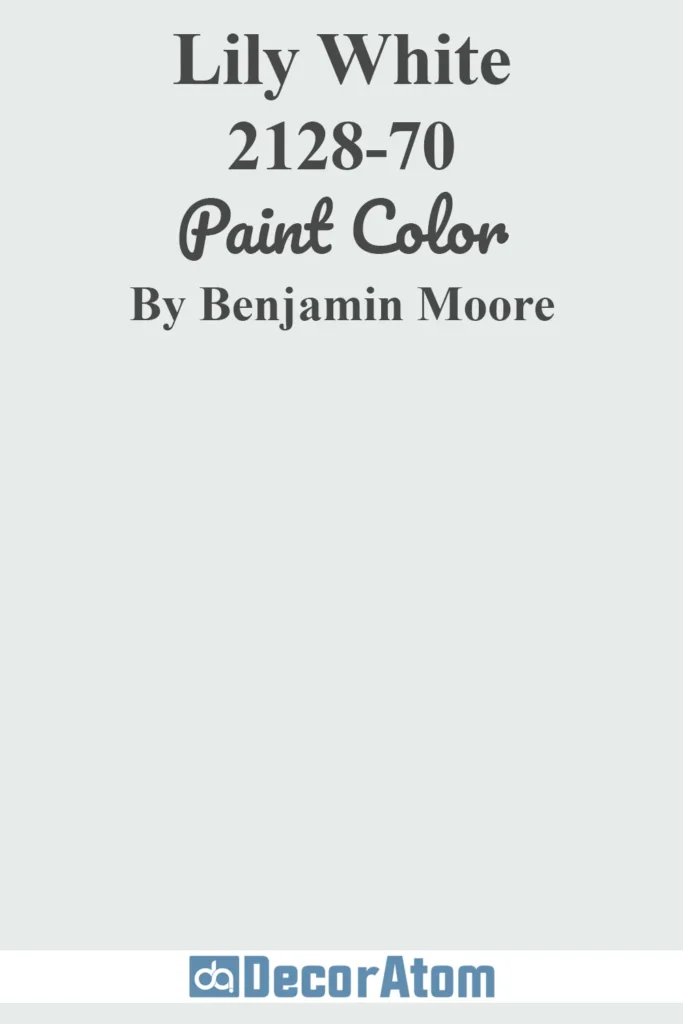
If you’re looking for a blue gray that’s light, airy, and incredibly versatile, Lily White might be your perfect match.
It’s the kind of shade that reads almost off-white but has just enough of that cool, misty blue undertone to feel fresh.
I personally love using it in open, sunlit spaces like living rooms or large hallways, where it reflects natural light beautifully.
It gives you that clean, crisp look without ever feeling sterile. And the best part? It plays so well with warm neutrals like beige and ivory, so it’s super easy to work into an existing palette.
2. Benjamin Moore Silver Cloud 2129-70
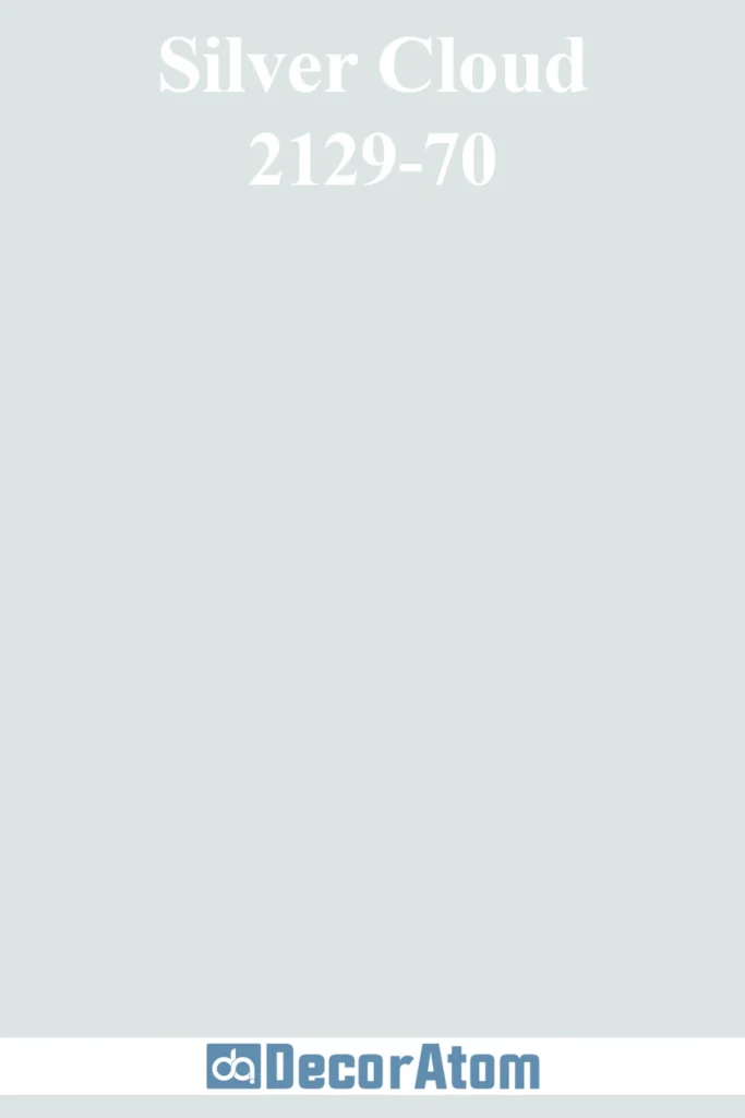
Silver Cloud feels like a whisper of blue caught in a soft gray fog. It’s subtle but not dull — a little moodier than Lily White, but still very much on the lighter end of the spectrum.
This is one of my go-to colors for bedrooms, especially if you want that serene, just-slept-in vibe all day long. It also works beautifully with cream, soft whites, and light woods.
Think minimal Scandinavian bedrooms or coastal-style bathrooms — that’s the kind of calm Silver Cloud brings into a space.
3. Benjamin Moore Solitude AF-545
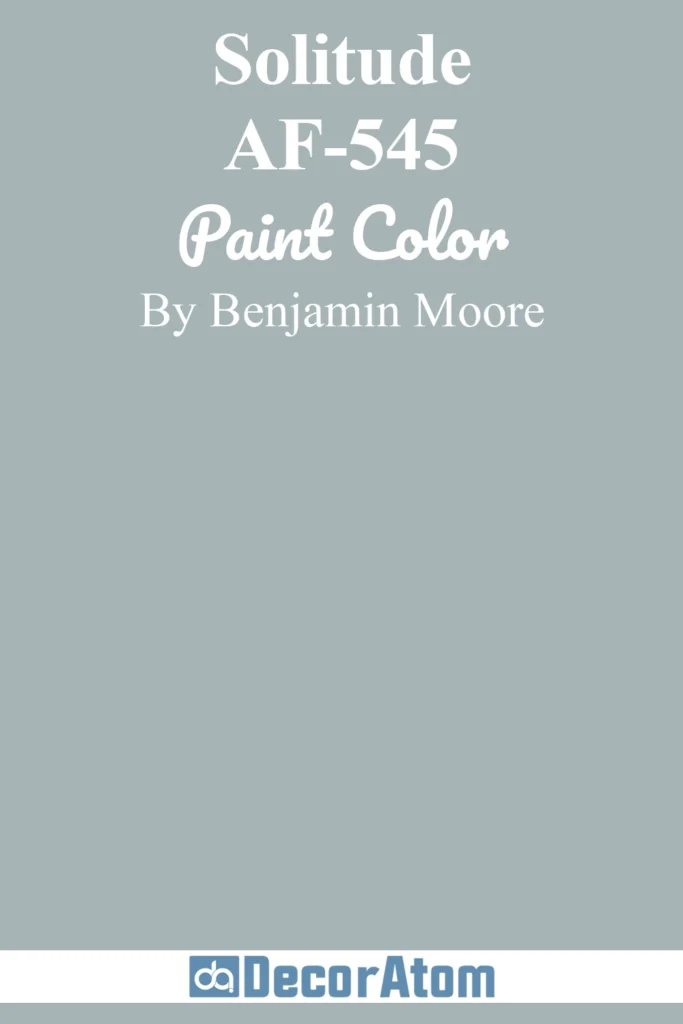
Solitude has a slightly deeper personality than the previous two, but it still holds onto that calming, blue-gray essence.
There’s a quiet richness to it that I find really appealing in spaces like home offices or reading nooks.
It brings a sense of focus and clarity, which makes it perfect for workspaces, but it’s not too heavy.
Solitude also has a chameleon quality — in cool light, it leans more blue; in warmer light, it feels a touch gray-lavender. I love pairing it with blush pink, soft greens, or even warm woods for balance.
4. Benjamin Moore Beacon Gray 2128-60
Beacon Gray gives me old-world charm meets fresh, modern sensibility. It’s a traditional blue gray, clean and balanced, with just enough depth to make a statement without overwhelming the room.
I think of it as a color that would look right at home in a historic house but would also work great in a modern coastal setting.
If you’re trying to bring a sense of elegance and lightness to your home, this is definitely a color worth sampling. It looks stunning against white trim and works surprisingly well in kitchens.
5. Benjamin Moore Smoke 2122-40
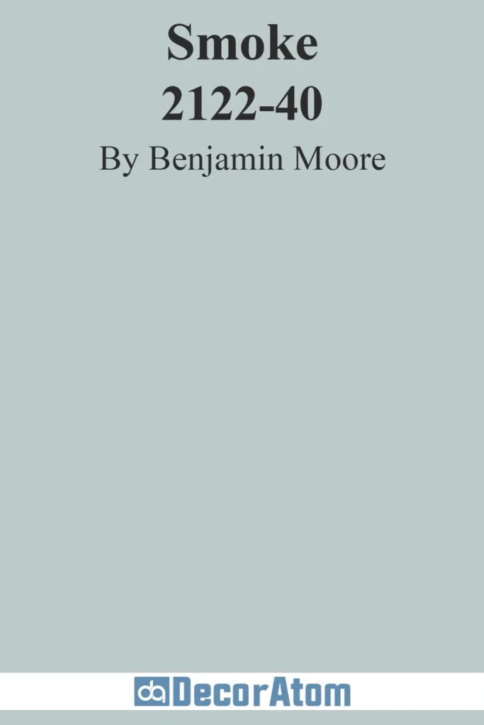
Smoke is a classic. If you’ve ever stood in a room painted in this color, you’ll know exactly why it’s such a designer favorite.
It’s one of those rare hues that manages to feel both cozy and open at the same time. There’s a quiet blue base, but it’s wrapped in enough gray to make it feel grounded.
I love it for bathrooms and dining rooms — it sets a soft, moody tone without turning the room too dark. If you’re going for a relaxed but elevated vibe, Smoke nails it.
6. Benjamin Moore Instinct AF-575
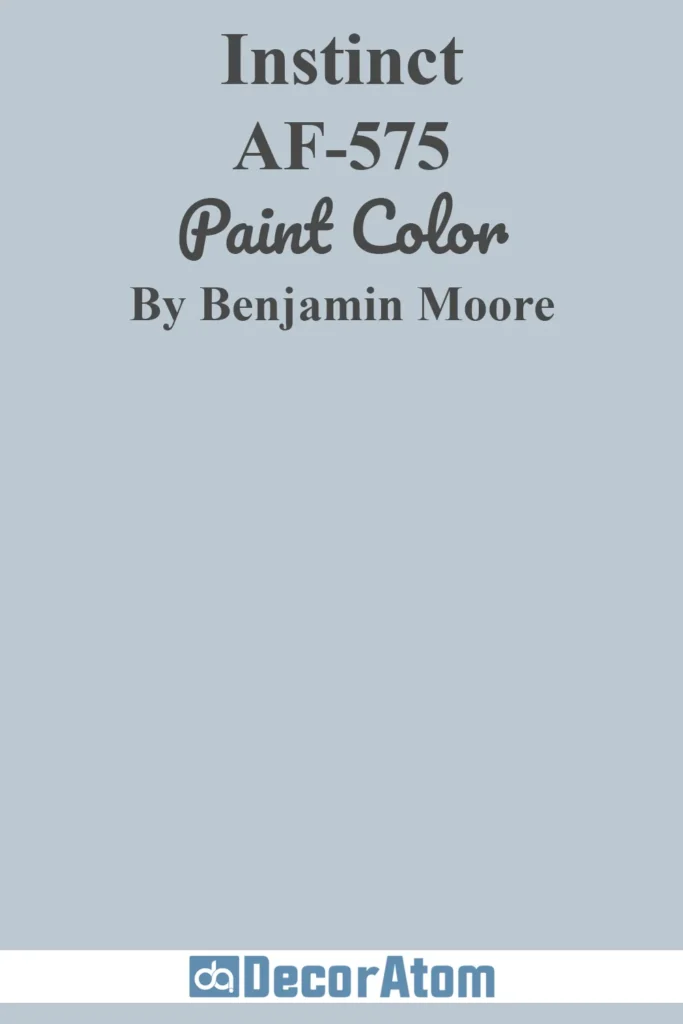
Instinct brings something a little more unexpected to the blue gray family — a faint lavender undertone that adds a dash of personality.
This color reads as sophisticated and elegant, almost like a custom-mixed shade you’d expect to see in a boutique hotel.
It’s perfect for sitting rooms, foyers, or anywhere you want a subtle hint of femininity without going full-on pastel.
I like to think of it as a soft-spoken statement color — it doesn’t scream for attention, but you notice it.
7. Benjamin Moore Mt. Rainier Gray 2129-60
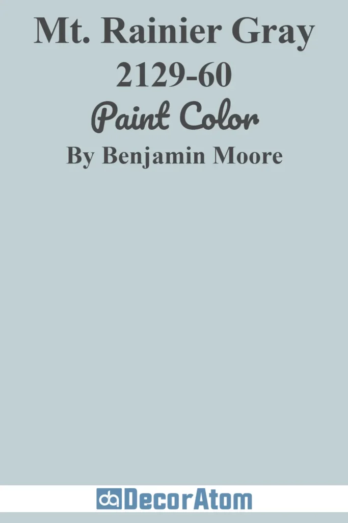
Mt Rainier Gray is the paint equivalent of a cool breeze through the trees. It’s light, soothing, and has that clean, slate-blue tone that feels both modern and classic.
I’ve used this one in guest bedrooms, and it never fails to make the space feel calm and polished.
It’s also a wonderful update if you’re trying to move away from old-school powder blue but still want that touch of color.
Bonus: it pairs beautifully with crisp whites, warm tans, and brushed nickel or chrome accents.
8. Benjamin Moore Santorini Blue 1634
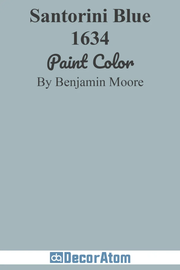
Santorini Blue brings the Mediterranean into your home — it’s more vibrant than the other shades on this list, with a clear blue presence, but still tempered by enough gray to keep it sophisticated.
I love this color for accent walls or even kitchen cabinets if you’re looking to inject some personality.
It has a liveliness that feels cheerful without being juvenile. Pair it with soft whites, marble, or aged brass, and you’ve got a space that feels timeless but fresh.
9. Benjamin Moore Little Falls 1621
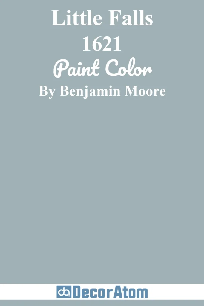
Little Falls reminds me of morning mist rolling over a quiet lake. It’s a mid-tone blue gray that feels organic and earthy, inspired by sky and sea.
It’s not too light, not too dark — a perfect in-between shade if you’re trying to avoid going too deep or too pale.
I love how it complements natural textures like rattan, linen, or wood.
It’s ideal for a coastal-themed space or even a relaxed, nature-inspired living room. It also layers beautifully with greens and warm neutrals.
10. Benjamin Moore Water’s Edge 1635
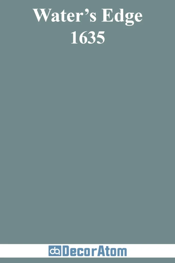
There’s something magical about Water’s Edge — it shifts ever so slightly depending on the light, sometimes looking teal, other times leaning gray-blue.
It has a depth that makes it feel luxurious, yet it’s not too bold to use in larger doses. I’ve seen it used on kitchen cabinets, and wow, it completely transforms the space.
It also works beautifully in bathrooms where the play of natural and artificial light brings out its shifting tones. It’s refined, dimensional, and never boring.
11. Benjamin Moore November Skies 2128-50

November Skies is like a deep breath on a chilly afternoon. It carries that soft, overcast quality — not too heavy, not too light — just the right amount of moodiness.
What I love about this shade is how balanced it feels. It doesn’t lean too blue or too gray, and because of that, it works almost anywhere.
I’ve used it in smaller living rooms where it adds atmosphere without darkening the space too much.
It’s also fantastic in transitional homes — those with both classic and modern touches. Add warm wood tones or soft white trim, and it really comes alive.
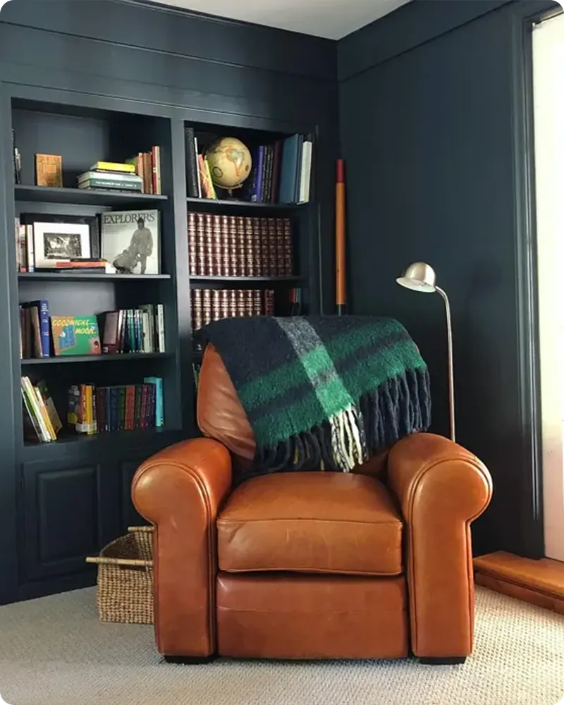
12. Benjamin Moore Oxford Gray 2128-40
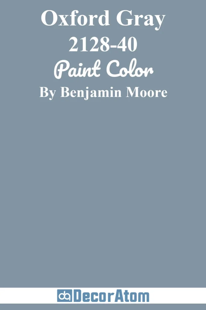
Oxford Gray is one of those colors that instantly elevates a space. It’s rich, tailored, and has a slight masculine edge — but don’t let that scare you off.
It works beautifully in both bold and subtle interiors. Picture it in a moody dining room with dim lighting or a cozy den filled with leather, books, and brass.
It’s deep enough to feel dramatic, but not so dark that it closes off a room. I think of it as the navy blue of the blue-gray world — classic, confident, and endlessly versatile.
13. Benjamin Moore Providence Blue 1636
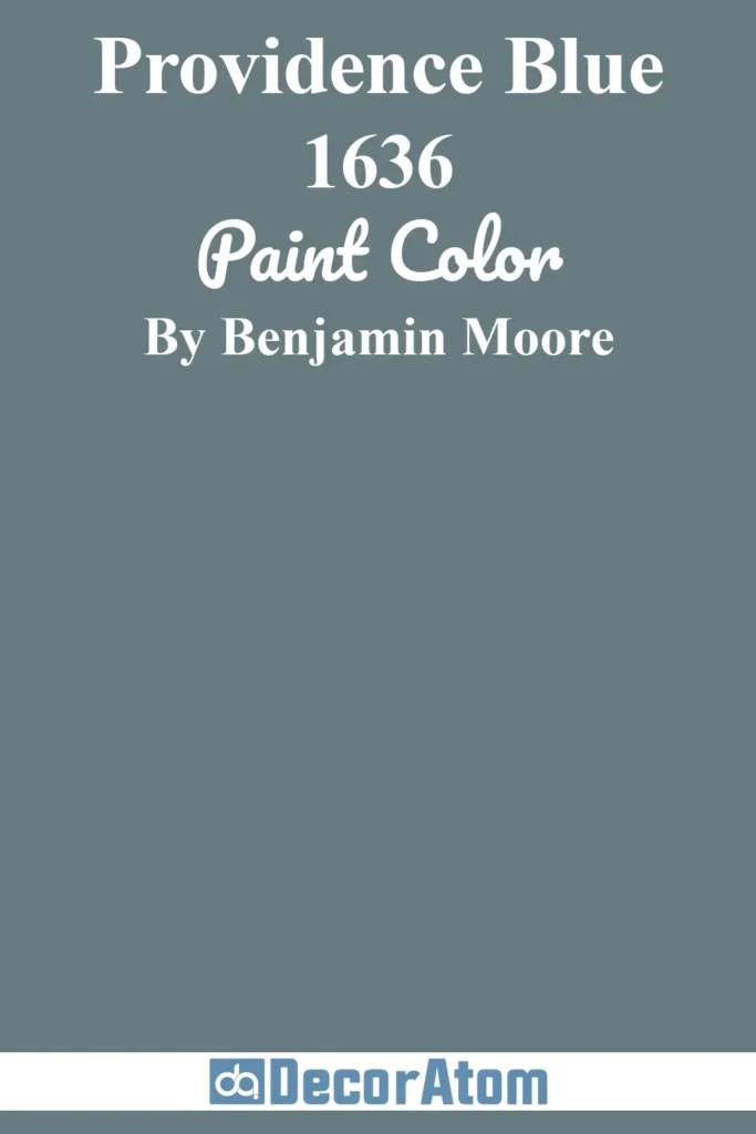
Providence Blue is a beautiful bridge between slate blue and peacock teal, depending on the lighting. It has a hint of green lurking beneath the surface, which gives it a very dynamic personality.
I’m drawn to this color for spaces where you want a touch of drama without going full jewel tone — like a powder room, a formal study, or even a striking kitchen island.
It pairs surprisingly well with traditional whites and creams but can also handle more adventurous partners like burnt orange or antique gold.
14. Benjamin Moore Evening Dove 2128-30

Evening Dove is one of my favorites when I want something darker and more saturated — a color that doesn’t just sit in the background but shapes the entire mood of a room.
This is where blue-gray takes a bolder turn, veering toward charcoal navy. It has a luxurious, inky vibe that feels perfect for small spaces you want to cocoon in, like a bathroom or reading corner.
If you love the idea of “color drenching,” where the walls, trim, and even ceiling are all the same color, Evening Dove is stunning for that.
15. Benjamin Moore Lead Gray 2131-30
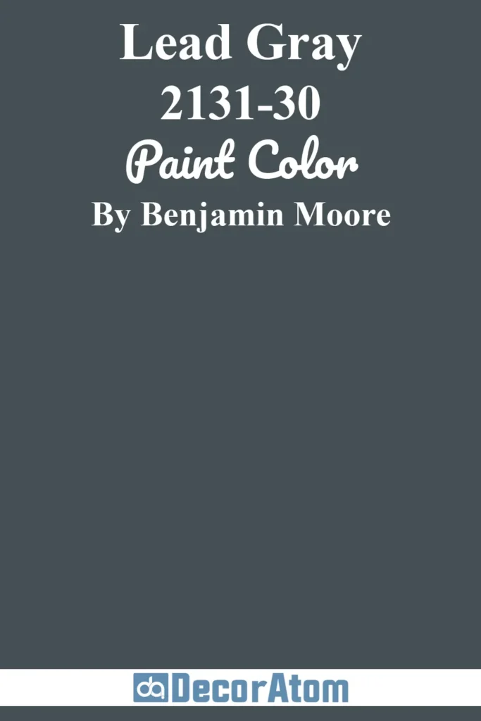
Lead Gray walks a fine line between blue-gray and deep, stormy teal. It has this moody, smoky tone that I find incredibly rich and grounding.
I’ve seen it work well on lower kitchen cabinets or built-ins in a living room. It’s bold without being harsh — more soulful than stark.
If you lean toward eclectic or vintage design, this color complements saturated tones like rust, mauve, or goldenrod really well.
There’s a slight earthiness to it that feels both classic and a little boho at the same time.
16. Benjamin Moore Gentleman’s Gray 2062-20
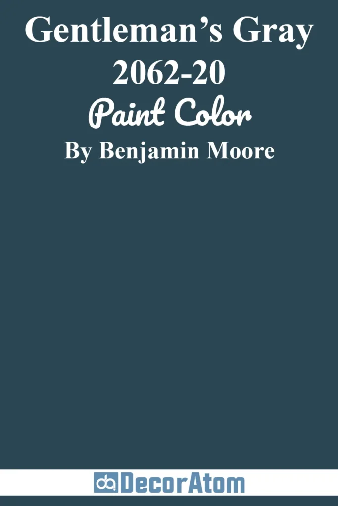
Despite the name, Gentleman’s Gray is more of a deep, blackened teal than a traditional gray. It’s intense, moody, and makes a bold statement wherever it goes.
I’ve seen it used in everything from traditional libraries to ultra-modern bathrooms, and it always delivers that wow factor.
It’s a fantastic option for color drenching or for creating high contrast with bright whites and metallic accents.
If you want something darker than navy but with more complexity, this one is absolutely worth a test swatch.
17. Benjamin Moore Blue Note 2129-30

Blue Note is the deepest, most dramatic shade on this list — like a symphony in blue gray form.
It’s luxurious, grounded, and leans more toward navy than gray, but the gray undertone keeps it from going too vibrant.
This is the kind of color that can carry an entire room by itself.
It’s perfect for a modern living room, an elegant bedroom, or a moody hallway.
I also love it for exteriors — it looks incredible against stone, wood, or crisp white trim. If you’re ready to embrace boldness, Blue Note is your finale.
Final Thoughts
Choosing a paint color can be overwhelming, but blue gray is one of those safe-yet-stylish options that never feels boring.
What I love most is how these colors don’t demand too much, they simply enhance a space. They work quietly in the background or take center stage if you let them.
I hope this list of my 17 favorite Benjamin Moore blue gray paint colors has helped you narrow down your options and gives you the confidence to try a blue gray of your own.
Trust your eye, test the colors in your space, and don’t be afraid to go a little bolder than you think, sometimes that’s where the magic happens.
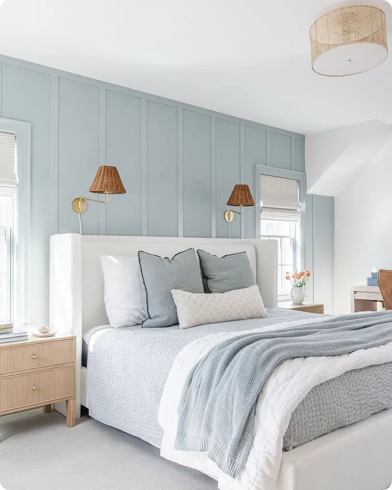
Could you tell me which blue is on the panelling behind the bed in the bedroom pictured.
Hii Julie, It’s Kentucky Haze AC-16 by Benjamin Moore. We truly appreciate your comment and support. Thank you!
Is it a % of Kentucky Haze in the photo?
Could you tell me what white color is paired with the Kentucky Haze and/or what other light white colors would pair well with it. Thank you.
Hi Christy! The white paired with Kentucky Haze AC-16 in this room is Chantilly Lace OC-65 by Benjamin Moore — a crisp, clean white that complements the soft blue-gray beautifully. Other great options include White Dove OC-17 and Simply White OC-117 if you prefer something a bit warmer.