
Picking a neutral paint color might sound simple, but if you’ve ever stared at a million paint chips and felt totally stuck, you know it’s not.
Neutrals can be tricky because they all look kinda similar—until you see them on your walls and suddenly realize how different they really are.
I’ve spent way too much time testing Behr’s neutrals (yes, really), and I’ve found a handful that just work every time.
They’re the kind of colors that make your space feel calm and put together, without being boring or cold.
So if you want neutrals that actually feel like home, these 15 Behr shades are the ones to check out.
What are Neutral Paint Colors?
Neutral paint colors are those understated tones that don’t strongly lean toward any one color on the color wheel. Think whites, beiges, grays, taupes, and even some muted browns or soft blacks.
What makes them “neutral” isn’t just the lack of bold pigment—it’s their flexibility. They act as a backdrop rather than a focal point, allowing other elements in a space to stand out.
That said, not all neutrals are created equal. Some are warm, with undertones of yellow, red, or orange, while others are cool, carrying hints of blue, green, or violet.
This means neutrals can feel cozy and inviting or crisp and modern, depending on the specific shade and how you use it.
The beauty of neutrals is that they’re timeless—you don’t need to worry about trends when your wall color quietly complements everything else in the room.
Where to Use Neutral Paint Colors?
Neutral paint colors can go anywhere. That’s the magic of them. If you’re working with an open-concept layout, a neutral shade can tie multiple areas together seamlessly.
In smaller spaces like hallways or bathrooms, a soft beige or warm white can make things feel brighter and more spacious.
I personally love neutrals in bedrooms and living rooms, where the goal is usually comfort and calm.
A warm gray or soft off-white can make the room feel restful without drawing too much attention to the walls.
In kitchens, neutral cabinets in greige or taupe add depth while still feeling fresh. Even home offices benefit from neutrals—they create a focused, distraction-free environment.
Neutral doesn’t mean boring—it means balanced. These shades allow you to get creative with furniture, textiles, and art because they don’t compete for attention.
Colors to Pair with Neutral Paint Colors
The great thing about neutrals is they’re incredibly easy to pair with both bold and muted tones.
If you’re working with warm neutrals like creamy beige or soft tan, try pairing them with earthy hues—rust, sage green, terracotta, or mustard.
These combinations create a warm, natural palette that feels grounded and welcoming.
Cool neutrals like light gray or soft white pair beautifully with blues, charcoals, or even soft blush tones.
You can go minimalist and stick with a monochrome palette using layered neutrals—think a warm white wall, light taupe sofa, and oatmeal-colored rug.
Or, if you want contrast, try pairing neutrals with black accents—trim, fixtures, or furniture—to add structure and style.
Honestly, there’s no wrong answer here. The key is to decide what kind of mood you want to create. Neutrals are the foundation—you get to choose how colorful or calm the final look will be.
Tips for Choosing The Best Neutral Paint Colors
Choosing the right neutral might seem easy, but there are definitely some tricks to getting it right. First, pay close attention to undertones.
That “gray” you love might look lavender in some light. Always test a few samples in your space before committing—they can shift drastically depending on your lighting.
Second, think about natural light. North-facing rooms tend to be cooler and can make colors look bluer, so you might want a warmer neutral there.
South-facing spaces usually handle both cool and warm tones beautifully. Artificial lighting also plays a role, so don’t forget to check how your sample looks in the evening.
Also, don’t overlook the existing finishes in your space. If you have warm-toned floors or countertops, pick a neutral that harmonizes rather than clashes.
And finally, consider the overall vibe you’re going for—cozy and inviting, crisp and modern, or soft and serene. The right neutral can help you tell that story without overwhelming the room.
Top 15 Behr Neutral Paint Colors
Here are my favorite neutral paint colors from Behr to decorate with.
1. Blank Canvas DC-003
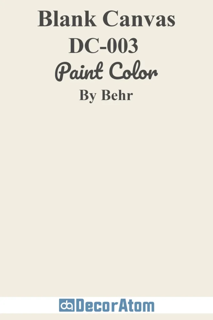
Blank Canvas lives up to its name—it’s the kind of warm, soft white that makes anything possible. I love it because it doesn’t feel cold or clinical like some whites do.
Instead, it reflects natural light in the loveliest way, giving your space that bright, airy feeling without going stark.
If you’re unsure where to start with a neutral, this one is as foolproof as it gets. It works with natural wood, black accents, soft colors—you name it.
2. Gratifying Gray DC-008
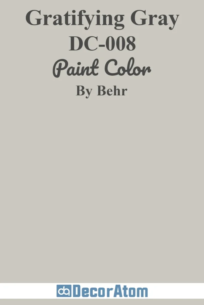
Gratifying Gray is that ideal middle-of-the-road neutral—neither too warm nor too cool, just a true balanced gray.
It doesn’t pull blue or purple like some grays tend to do, which makes it an easy choice for just about any room.
Whether you’re pairing it with crisp whites, navy blues, or earthy tones, Gratifying Gray brings a clean and calm feeling that’s timeless but never boring.
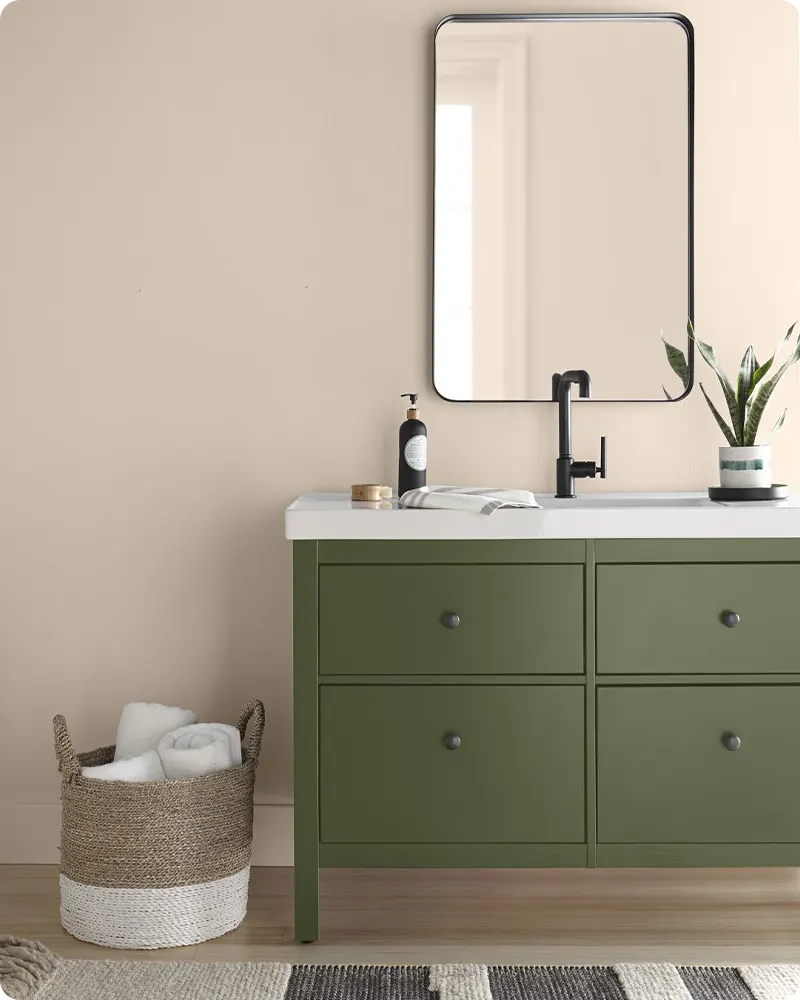
3. Even Better Beige DC-010
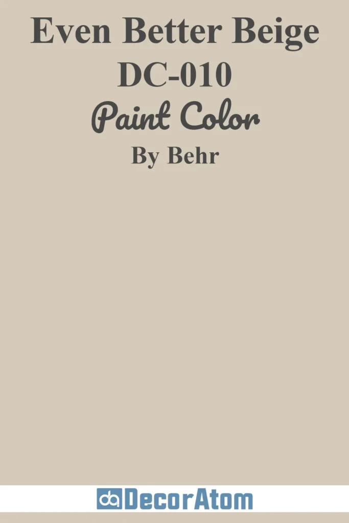
Even Better Beige feels like an elevated take on traditional beige. It’s creamy, soft, and welcoming—without leaning yellow or feeling dated.
It’s subtle, but it has enough depth to create warmth, especially in rooms with less natural light.
I think it’s a great choice for living rooms or hallways, where you want something cozy but not overpowering.
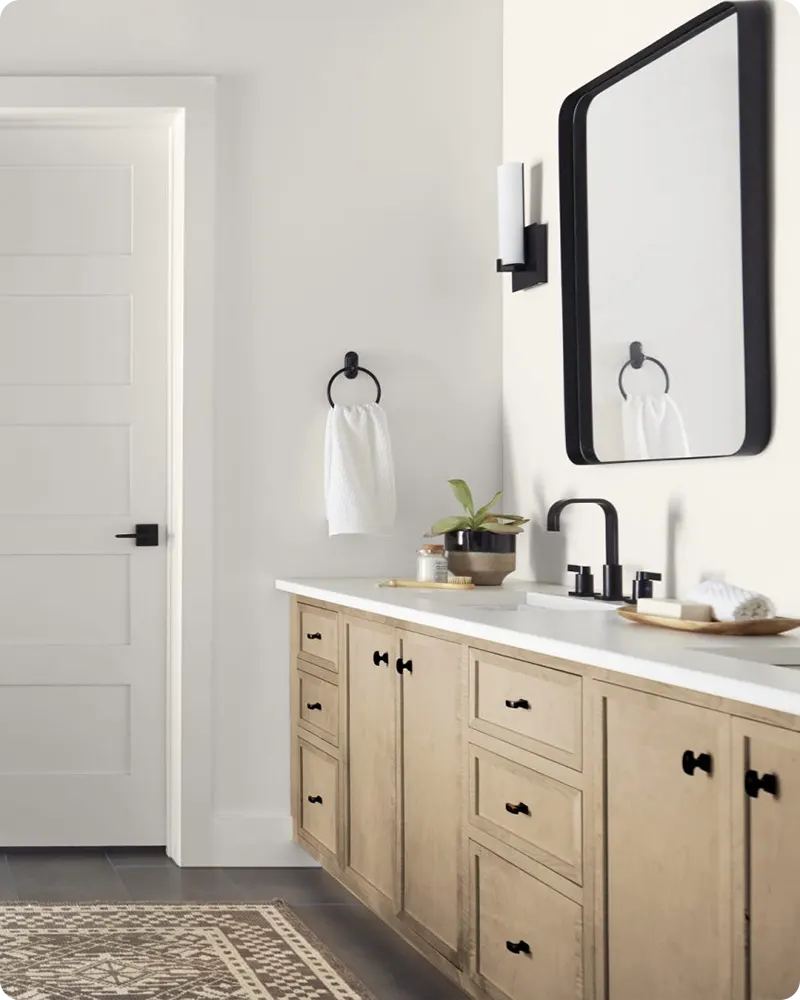
4. Harmonious White DC-013
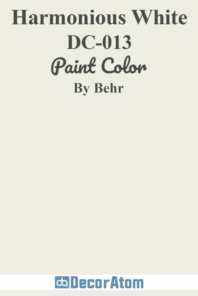
This one is all about subtlety. Harmonious White is a gentle off-white that brings just enough warmth to avoid that icy, sterile look.
It’s beautiful in spaces where you want to keep things bright but still feel grounded.
I’d use this in a kitchen or bathroom to balance out cooler tones like stainless steel or gray tile. It lives up to its name by playing well with everything.
5. Tranquil Gray DC-007
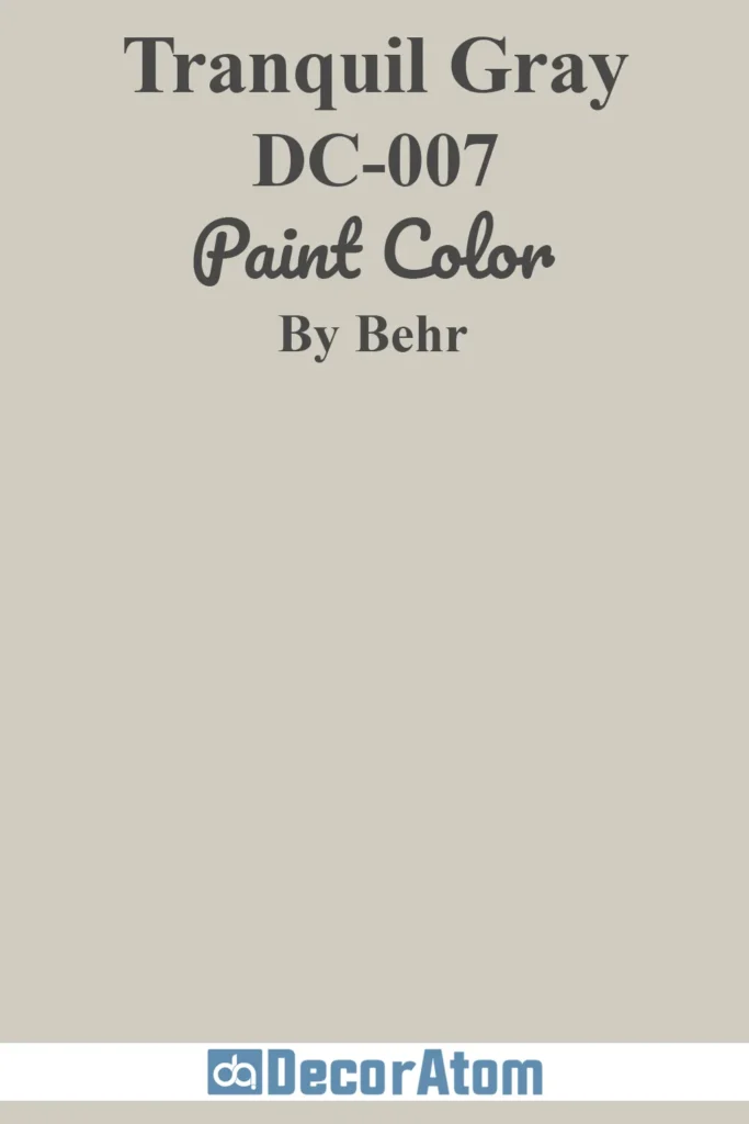
There’s something peaceful about Tranquil Gray—it has a soft, slightly warm undertone that makes it incredibly soothing.
It doesn’t scream for attention, but it quietly sets the tone for a relaxed atmosphere.
I think this one is perfect for bedrooms or reading nooks—anywhere you want a touch of calm without going full white or beige.
6. Dove HDC-MD-21
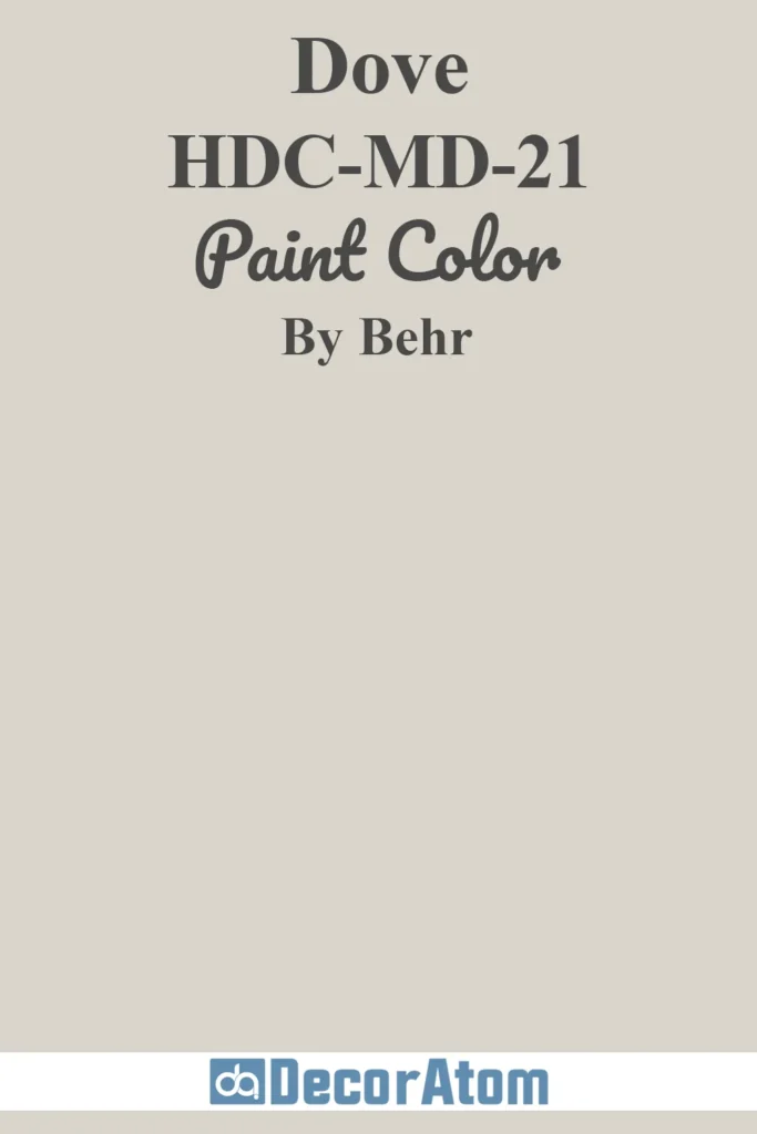
Dove is a beautiful chameleon of a color. It’s a soft white with just a hint of gray, which keeps it from feeling too stark.
What I like most about Dove is how versatile it is.
You can pair it with modern finishes like matte black hardware, or use it alongside traditional trim and molding. It always feels clean, fresh, and intentional.
7. Antique White 23
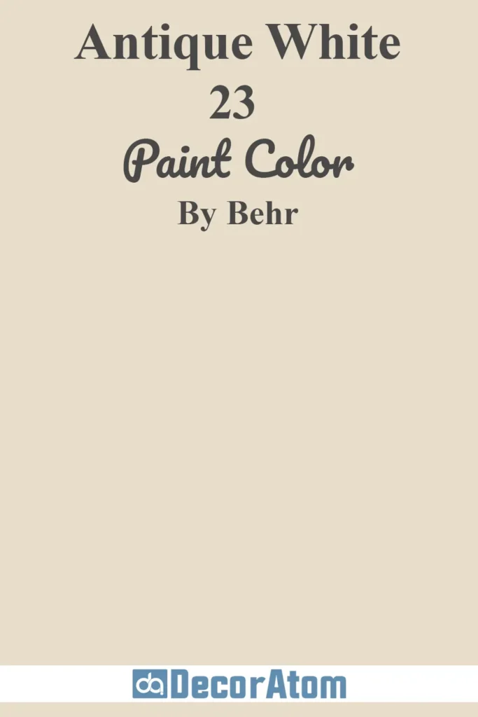
Antique White brings a sense of nostalgia and charm. It’s creamier and more saturated than your typical off-white, which makes it feel a little more historic and character-rich.
This one shines in older homes or rooms with a vintage aesthetic. Think cozy dining rooms, sun-drenched kitchens, or even painted furniture for a soft, timeworn feel.
8. Crisp Linen MQ3-13
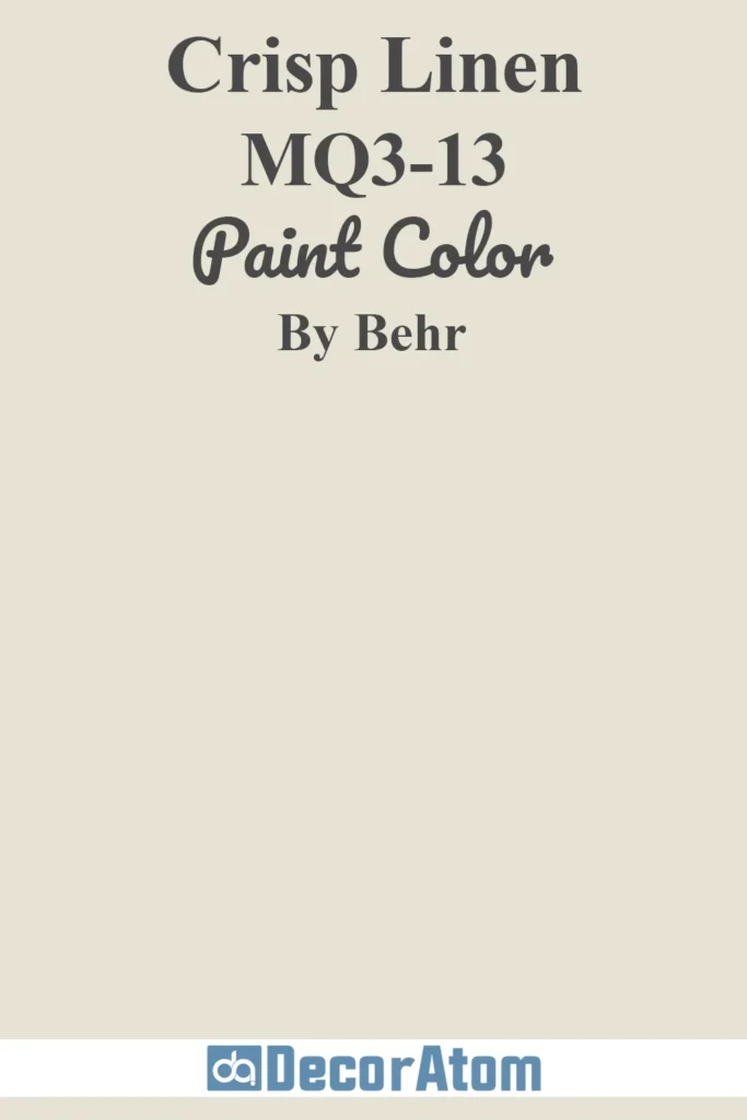
Crisp Linen has that raw, natural linen vibe—it’s soft and warm without feeling yellow or muddy.
It’s a neutral that’s grounded, which makes it ideal for layered, lived-in spaces.
I especially love it in homes that lean coastal, cottage, or farmhouse in style. It’s easygoing and forgiving, a real workhorse of a neutral.
9. Chic Gray PPU26-10
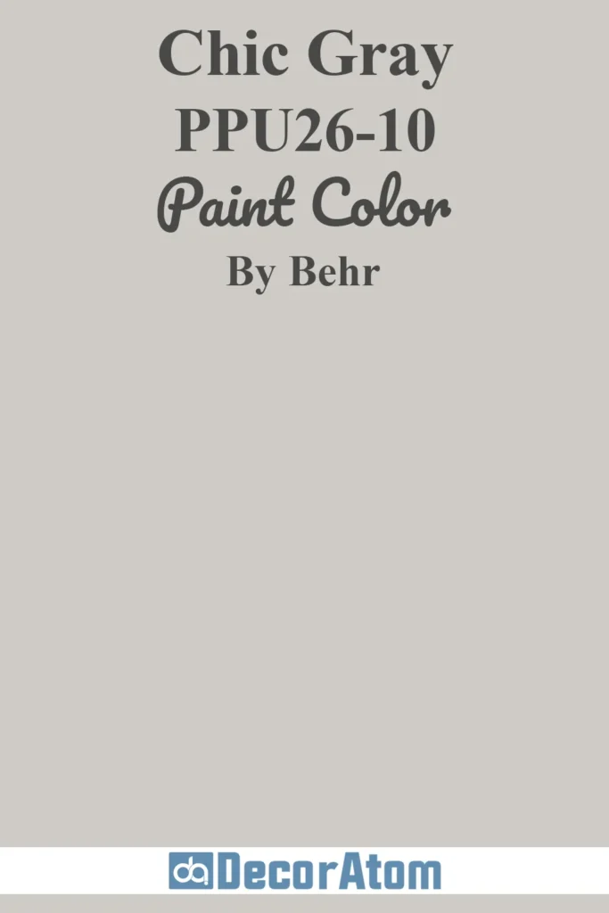
Chic Gray is one of those colors that instantly elevates a room.
It’s a cooler-toned gray with a silvery undertone, making it feel clean and modern. If you love Scandinavian or minimalist interiors, this one’s for you.
Pair it with blonde wood, black accents, and simple textures—it really lets your decor shine without fading into the background.
10. Platinum PPU26-11
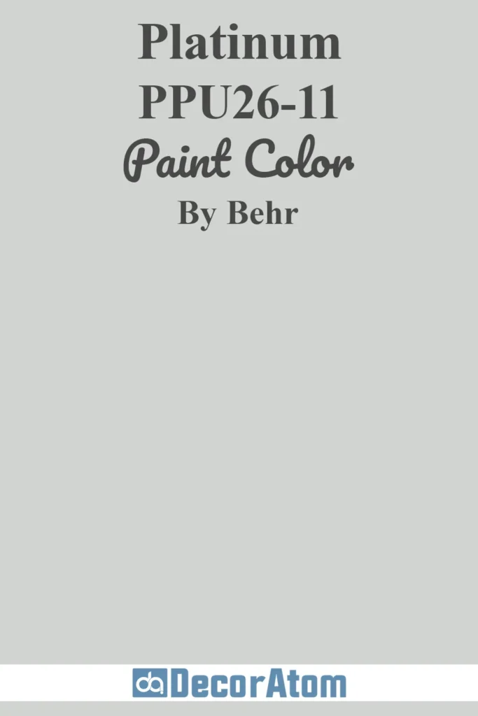
Platinum is a softer gray with subtle blue undertones. It’s a touch cooler than Chic Gray, but still easy to live with.
I think this one is especially lovely in bedrooms or home offices—it has a tranquil, cloudlike quality that feels restful and balanced.
It also works beautifully with navy, soft taupe, or crisp white trim for contrast.
11. Campfire Ash N320-1
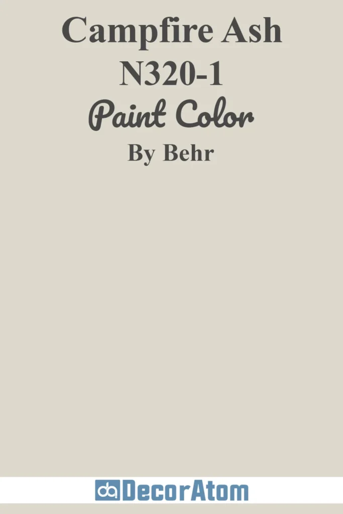
Campfire Ash is one of those soft grays that walks the line between warm and cool effortlessly.
It’s muted and gentle, with a bit of a weathered look that reminds me of driftwood or washed stone.
If you’re working with an open-concept space or want a neutral that flows seamlessly between rooms, this one’s a solid choice.
It’s subtle enough to act as a backdrop, but it still adds personality.
12. Jungle Camouflage N350-4
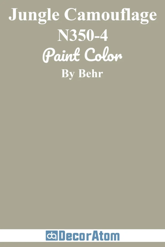
This is where things get interesting. Jungle Camouflage is technically a gray-green, but it behaves like a neutral in the best way.
It’s earthy, muted, and incredibly grounding—perfect if you want something a little unexpected but still easy to live with.
I’ve seen this used in living rooms with lots of natural texture—rattan, raw wood, clay—and it’s stunning.
It feels modern, but with a cozy, organic twist.
13. Spanish Sand OR-W7
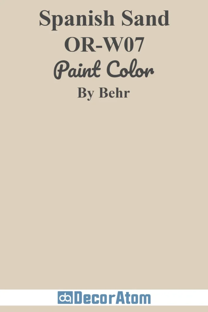
Spanish Sand has a soft, sunbaked quality to it—like a beige with a warm, slightly peachy undertone.
It’s ideal if you love desert-inspired palettes or are aiming for a boho, Southwestern vibe.
It pairs beautifully with terracotta, mustard, even dusty blue.
What I appreciate most about this shade is how warm and welcoming it feels without being overpowering.
14. Off The Grid T18-08
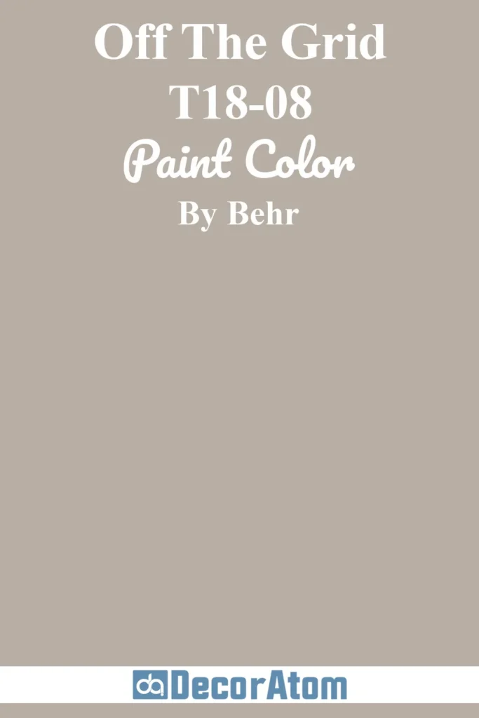
Off The Grid is a taupe that really leans into its earthy side. It has a reddish-brown undertone that gives it a grounded, organic feel—great for anyone leaning toward warm, enveloping spaces.
This is one of those colors that’s perfect for creating that “color-drenched” look where walls, trim, and even ceilings are painted the same tone. It feels bold but still very livable.
15. Cracked Pepper PPU18-1
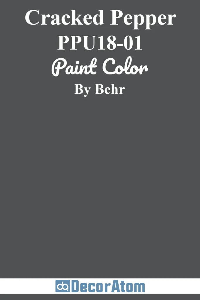
Cracked Pepper is Behr’s moody showstopper. It’s a soft black that feels dramatic but never harsh.
If you’re thinking of painting cabinetry, a statement wall, or even an entire powder room, this is a fantastic neutral to use when you want depth without going full jet black.
It’s rich, stylish, and surprisingly versatile—it can lean modern, industrial, or even classic depending on how you style it.
Final Thoughts
Neutral paint colors might seem simple on the surface, but the right one can completely transform how a space feels.
The best part about neutral paint colors is their flexibility.
They evolve with your style and provide a solid foundation you can build on again and again.
Take your time choosing, sample thoughtfully, and trust your gut—it’s your space, and the right neutral should feel like home.