
Let me take you back to a moment that changed how I saw color. A few years ago, I walked into a friend’s newly painted living room, and the walls were this soft, dreamy blue—like the sky just after dawn.
It wasn’t loud or overpowering, but it transformed the space into something calming, inviting, and alive. That was my first real encounter with the magic of blue paint, and I’ve been hooked ever since.
Blue is more than just a color; it’s a mood, a vibe, a way to make any room feel like home. Whether you’re drawn to the serene whisper of a pale aqua or the bold drama of a deep navy, blue has a way of speaking to everyone.
That’s why I’m thrilled to share my curated list of the 17 Best Behr Blue Paint Colors. As someone who’s spent hours poring over paint swatches and experimenting with hues in my own home, I’ve fallen in love with Behr’s range for its quality, depth, and versatility.
From coastal-inspired pastels to rich, moody jewel tones, these blues can transform a bedroom into a sanctuary, a kitchen into a gathering spot, or a front door into a statement.
In this post, I’ll walk you through why blue is such a timeless choice, where to use these shades, how to pair them, and tips for picking the perfect one for your space.
Also Read: 15 Best Behr Blue Gray Paint Colors
Also Read: 17 Best Benjamin Moore Blue Paint Colors
What are Blue Paint Colors?
Blue paint colors include any shades that fall within the blue family on the color spectrum—from pale, misty hues like baby blue to bolder choices like royal or navy blue.
What makes blue such a versatile paint color is its wide emotional range. Lighter blues often feel soft, airy, and calming, while darker blues can feel cozy, dramatic, or even stately.
In the world of paint, blues can also lean cool or warm, depending on their undertones. Some Behr blues have gray or green undertones for a muted, coastal vibe, while others are cleaner and more vibrant, perfect for a bold statement wall. Understanding these subtle differences is key when choosing the right shade for your home.
Also Read: 17 Best Blue Paint Colors for Living Room
Where to Use Blue Paint Colors?
Personally, I find blue to be one of the most adaptable colors in home design. I’ve used it successfully in:
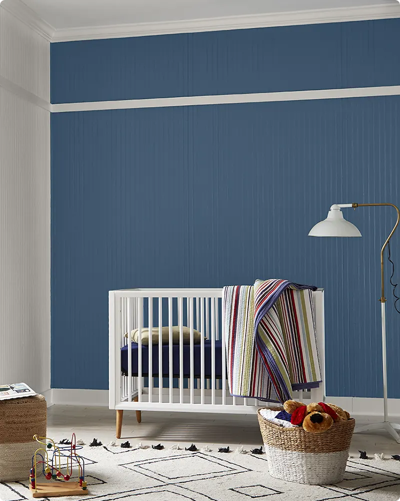
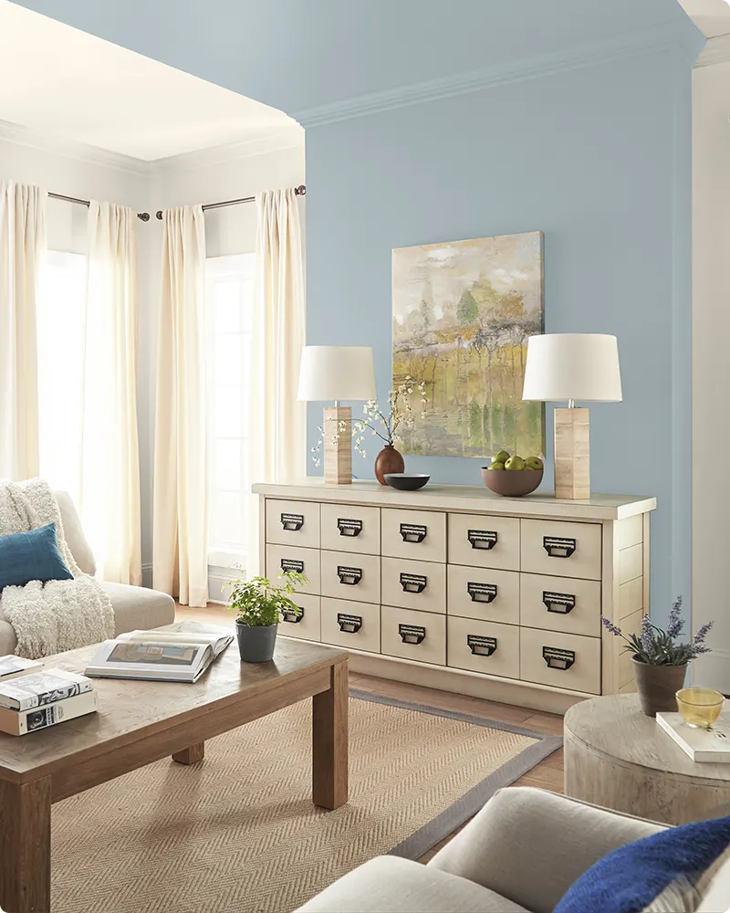
Bedrooms – Soft blues create a peaceful environment, ideal for sleep and relaxation.
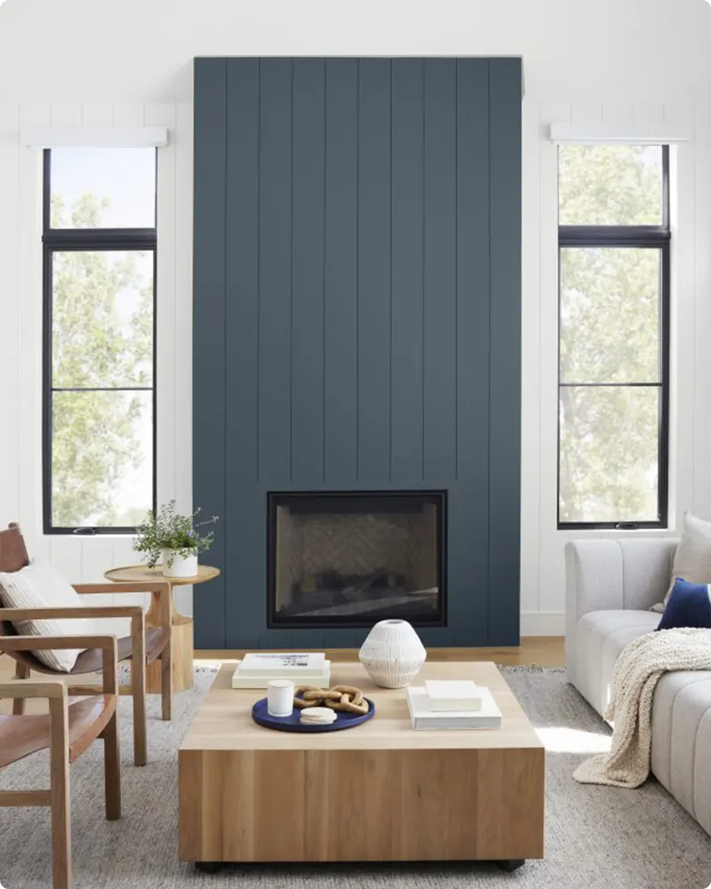
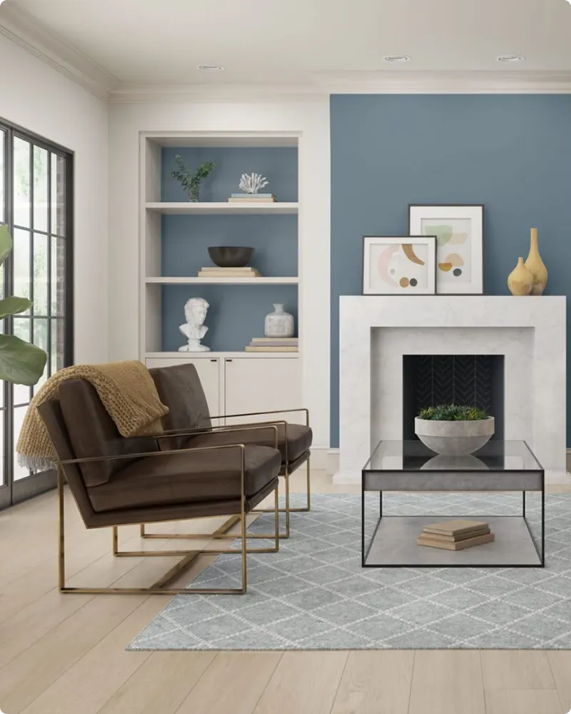
Living Rooms – A medium-toned blue adds personality without overwhelming the space.
Bathrooms – Light or coastal blues feel clean and spa-like.
Kitchens – Navy blue cabinets or islands offer a crisp, timeless look.
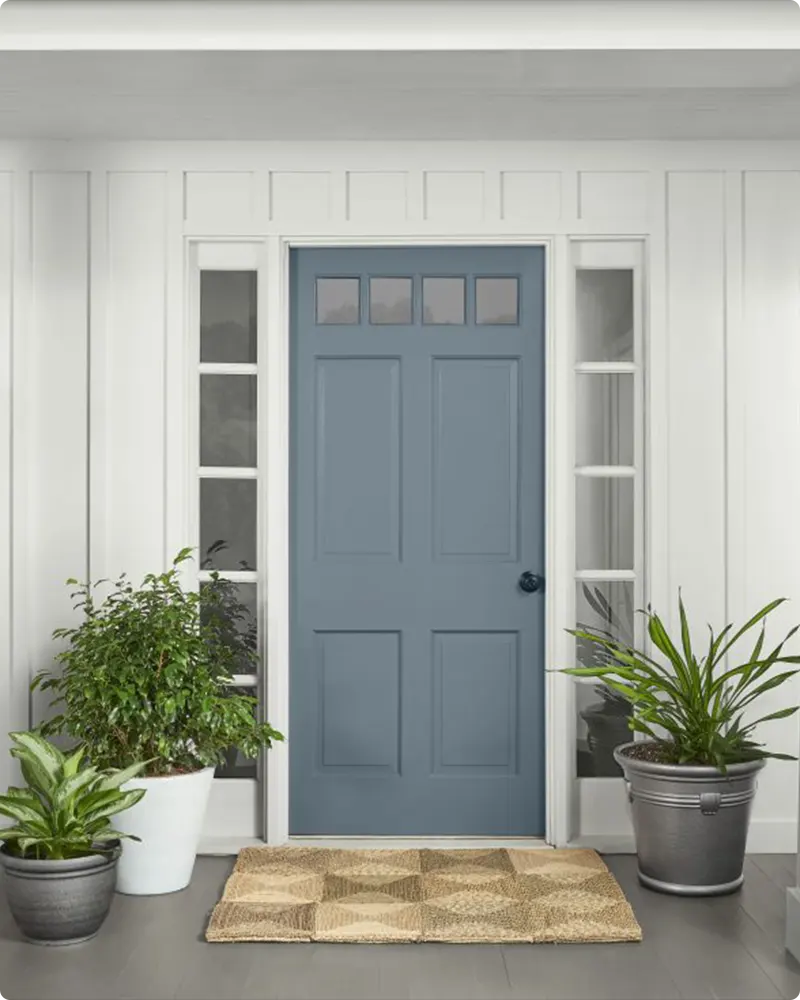
Exteriors – Deeper blues look sharp and elegant on front doors, shutters, or siding.
Blue works well in just about every room, as long as the lighting supports the tone you’re working with. South-facing rooms can handle cooler blues, while north-facing rooms often benefit from a slightly warmer or muted tone.
Also Read: 21 Best Sherwin Williams Blue Paint Colors
Colors to Pair with Blue Paint Colors
Blue’s versatility makes it a dream to pair with other colors, whether you’re going for contrast, harmony, or something in between. Here are some winning combinations for the Behr blues on your list, tailored to different aesthetics:
White – Crisp white trim or cabinetry against blue walls always looks clean and timeless.
Gray – A soft greige or warm gray pairs beautifully with muted blues.
Wood Tones – Natural wood adds warmth and texture, especially with cooler blues.
Brass or Gold Accents – These elevate navy or darker blues for a luxe vibe.
Soft Greens or Sage – These create a calming, nature-inspired palette that feels fresh and organic.
When in doubt, I always sample with white, wood, or neutral accents—they rarely fail with blue.
Tips for Choosing The Best Blue Paint Colors
Picking the perfect blue paint color can feel daunting with so many stunning options, but these tips will help you narrow down the right Behr blue for your space:
- Test in Different Light – Blue changes a lot depending on natural and artificial lighting. Always sample your top contenders on a few walls.
- Pay Attention to Undertones – Is the blue leaning gray, green, or purple? This subtle undertone will impact how it interacts with your furniture and decor.
- Balance with Surroundings – If your room has cooler lighting or a lot of gray furniture, a warmer or slightly muted blue often works better.
- Don’t Skip the Sample – Behr offers 8 oz paint samples for a reason—use them. I like to paint large swatches on poster board and move them around the room.
- Think About Mood – Go lighter for a relaxed, airy feel and darker for drama and intimacy.
Top 17 Behr Blue Paint Colors
Here are my favorite blue paint colors from Behr to decorate with. These 17 shades offer something for every style, from serene and subtle to bold and dramatic. Each comes with a unique personality to elevate your space.
1. Ocean Front P490-1
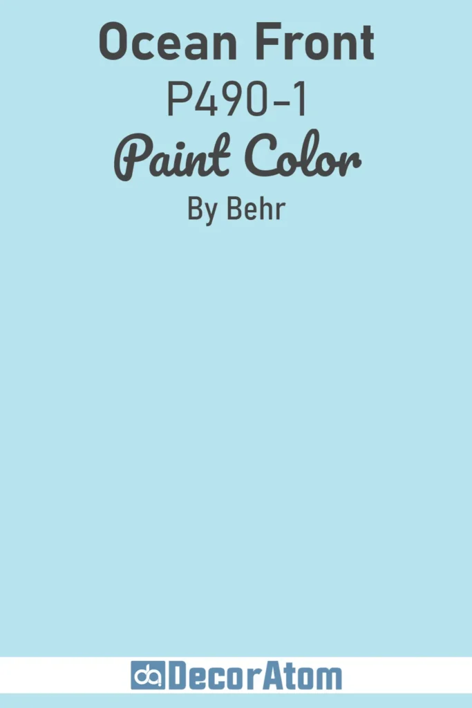
Imagine standing on a coastal cliff, the sea stretching endlessly before you, its surface a soft, pale blue kissed by morning light. That’s Ocean Front P490-1.
This color feels like a gentle wave lapping at the shore, light, airy, and serene without being stark. It’s the kind of blue that brings calm to a bedroom or bathroom, making small spaces feel open and tranquil.
Pair it with crisp whites or sandy beiges for a beachy vibe, or go bold with coral accents for a pop of warmth.
The subtle gray undertone keeps it versatile, working just as well in a modern minimalist living room as it does in a cozy nursery. It’s not demanding; it’s inviting, like a deep breath of salty air.
2. Sydney Harbour S480-3
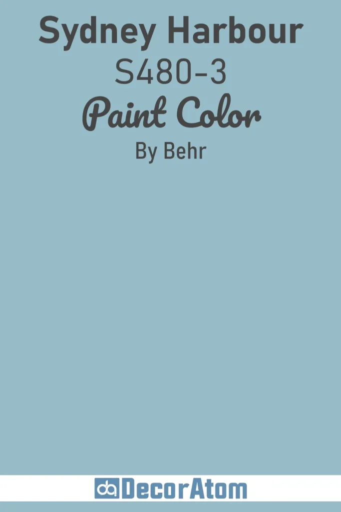
Sydney Harbour S480-3 is the blue of a perfect summer day Down Under, where the water sparkles with a vibrant, mid-tone energy. It’s not as pale as a whisper or as deep as a storm, this blue strikes a cheerful balance, lively but not overwhelming.
Picture it on a kitchen island or an accent wall in a dining room, where it brings a fresh, approachable energy. It plays beautifully with warm woods like oak or walnut, and it loves being paired with sunny yellows or soft creams for a coastal-chic look.
There’s a touch of green in its undertone, giving it a slightly teal-like personality that feels modern and dynamic without shouting for attention. It’s the kind of color that makes you smile when you walk into the room.
3. Absolute Zero N490-1
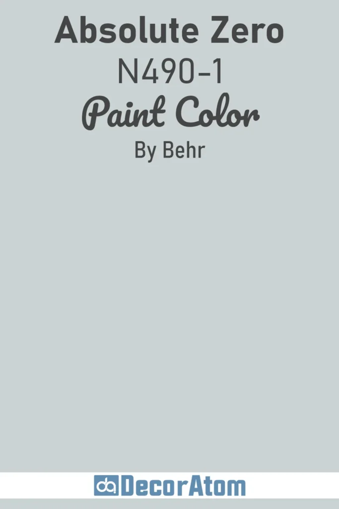
Absolute Zero N490-1 is the softest whisper of blue, so light it almost feels like a neutral. Think of the faintest hint of frost on a winter morning, where the blue is more a suggestion than a statement.
This color is perfect for those who want a hint of cool elegance without committing to a bold hue. It’s ideal for whole-room painting, walls, trim, even ceilings, because it creates a serene, cohesive backdrop.
Pair it with warm grays or ivories for a sophisticated look, or add metallic accents like gold or brass for a touch of glamour. In a home office or reading nook, it fosters focus without feeling cold. Absolute Zero is like a quiet friend, understated but always there to make everything feel just right.
4. Simply Blue PPU15-16
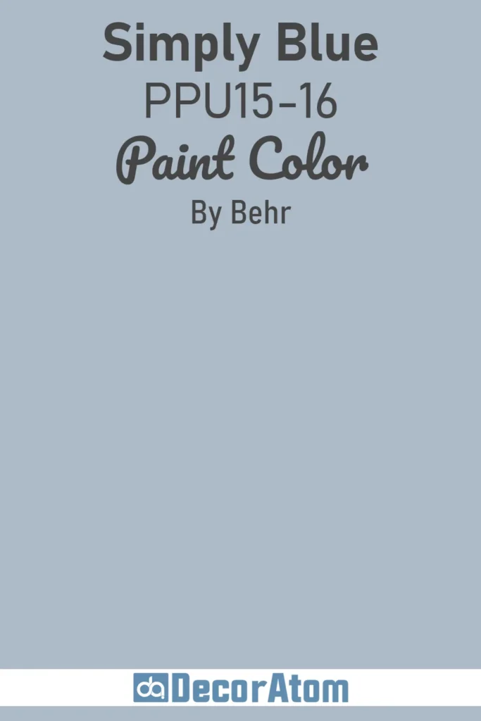
Simply Blue PPU15-16 lives up to its name: it’s blue in its purest, most approachable form. Not too bright, not too muted, it’s the Goldilocks of blues, just right.
This medium-toned shade feels like a clear sky on a spring day, with a clean, classic vibe that works in almost any space. Use it in a living room for a welcoming feel or in a kid’s room where it’s playful but not juvenile.
It pairs effortlessly with whites and grays for a timeless look, but it also loves bolder companions like mustard yellow or deep navy for contrast. The beauty of Simply Blue is its versatility, it’s confident without being pushy, making it a go-to for anyone dipping their toes into bolder color choices.
5. Beachside Drive M460-2
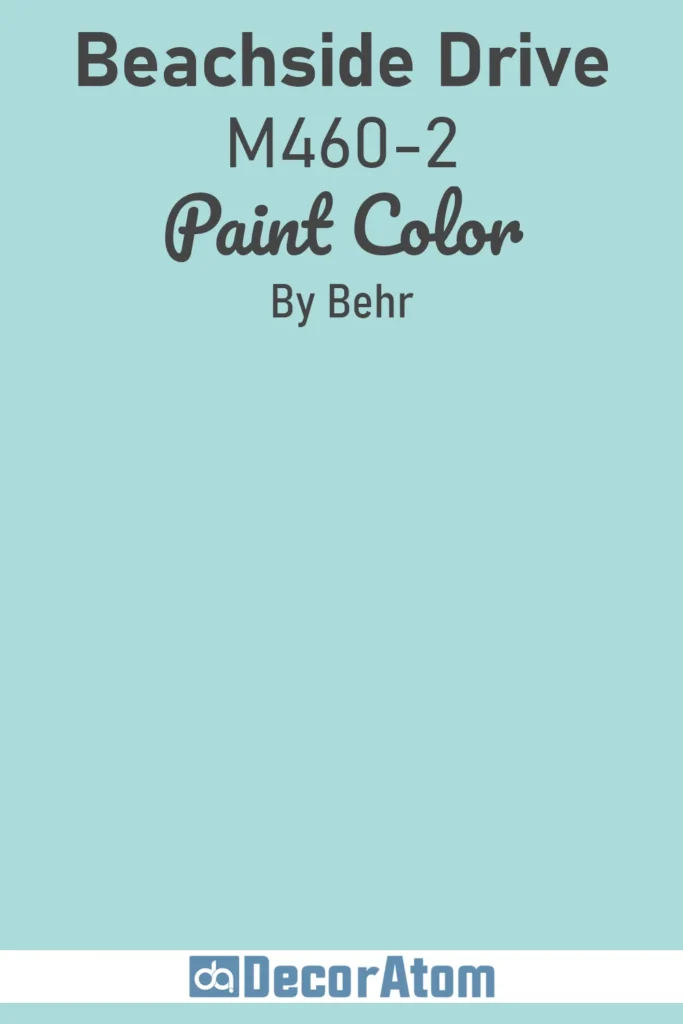
Beachside Drive M460-2 feels like a stroll along a quiet shore at dusk, where the ocean takes on a soft, dreamy blue with a hint of gray. This pale, muted shade has a soothing quality that’s perfect for creating a restful retreat in a bedroom or bathroom.
It’s not as icy as some light blues, thanks to a warm undertone that keeps it from feeling sterile. Try it with natural textures like linen or rattan for a relaxed coastal vibe, or pair it with charcoal accents for a more modern edge.
In a small space, it opens things up without overwhelming, and in a larger room, it sets a calm, contemplative mood. It’s the color of quiet moments and gentle waves.
6. Saga Blue S480-4
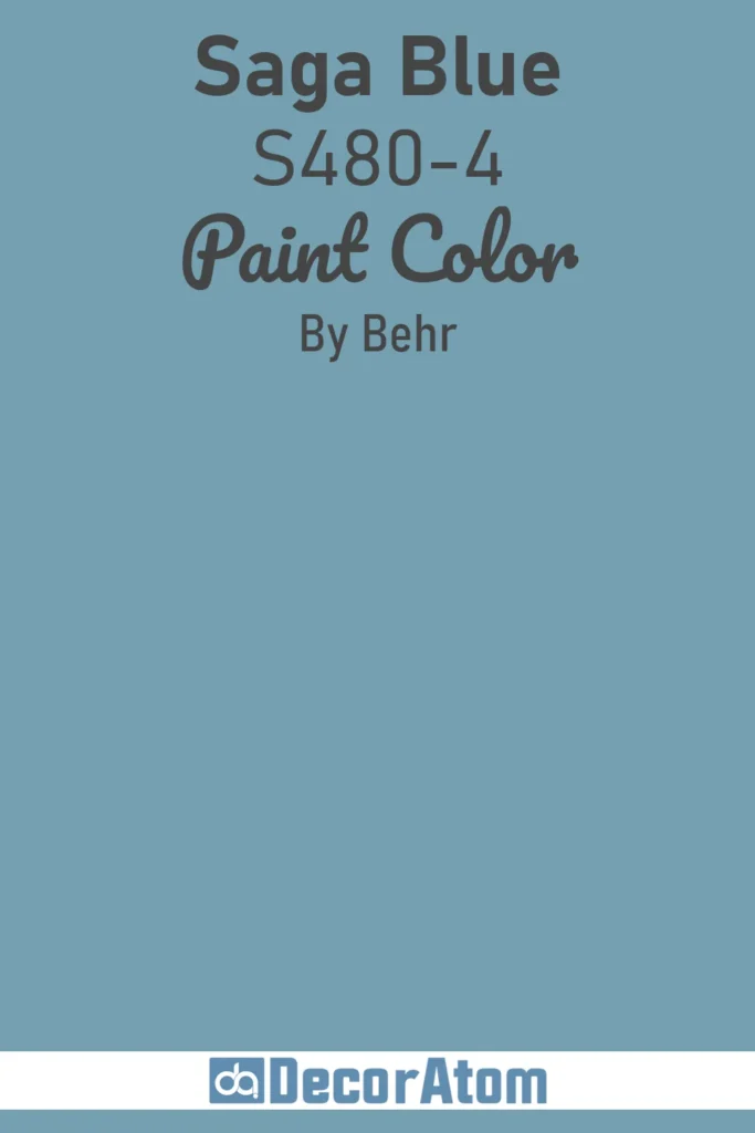
Saga Blue S480-4 is a storyteller’s blue, rich, medium-deep, and full of character. It’s the kind of color you’d find in a weathered seaside cottage, where the walls hold stories of storms and sunny days.
This blue has a touch of green, giving it a teal-like depth that feels both timeless and trendy. It’s bold enough for an accent wall in a dining room or study but soft enough to cover an entire bedroom without feeling heavy.
Pair it with warm neutrals like taupe or creamy white for balance, or go dramatic with brass fixtures and deep wood tones. Saga Blue has a quiet strength, like it’s ready to anchor any space with a sense of history and charm.
7. Peaceful Blue S470-3
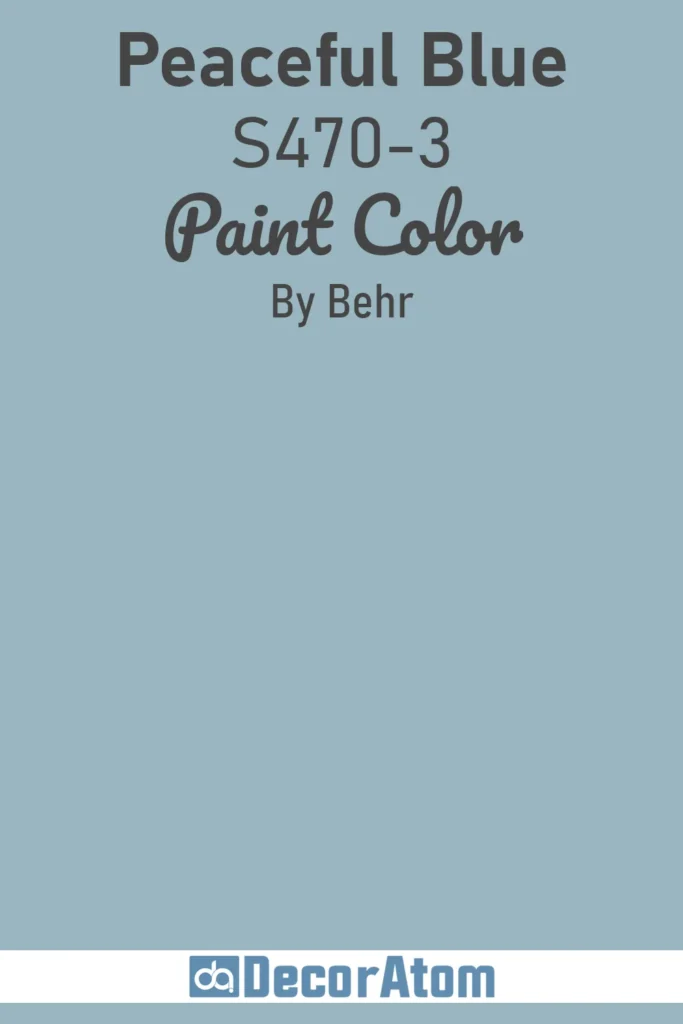
Peaceful Blue S470-3 is exactly what it sounds like, a color that wraps you in calm like a soft blanket. This muted, mid-tone blue has a dusty quality, with just enough gray to keep it from being too vibrant.
It’s the kind of blue you’d see in a misty morning sky, gentle and understated. Perfect for a bedroom or a cozy reading corner, it creates a space where you can unwind without distraction.
Pair it with plush textures like velvet or wool for extra warmth, or keep it crisp with white trim and silver accents. It’s also a great choice for a home office, where its soothing vibe helps you focus. Peaceful Blue is like a sigh of relief in paint form.
8. Deep Breath S460-7
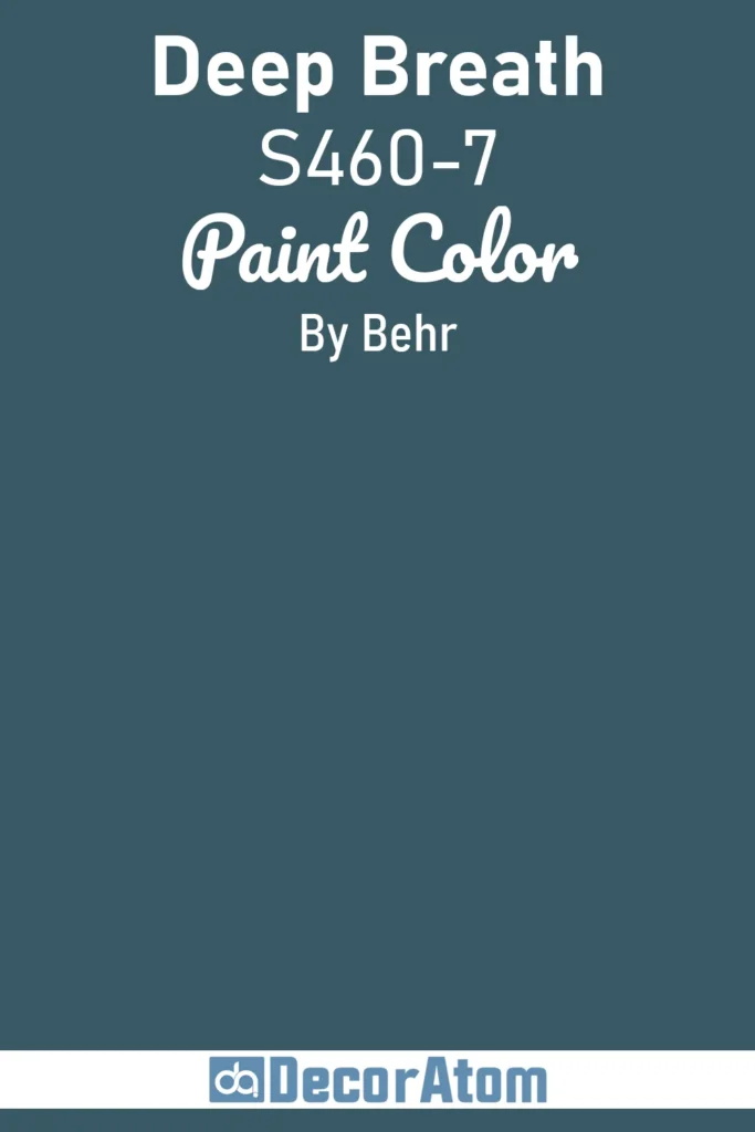
Deep Breath S460-7 is bold, soulful, and a little mysterious, like the ocean at twilight, when the water turns a rich, inky blue. This deep shade isn’t navy, but it’s got that same commanding presence, with a touch of green that gives it a unique, almost jewel-like quality.
It’s perfect for a dramatic accent wall in a living room or a moody library where you want to feel enveloped. Pair it with warm golds or soft creams to keep it from feeling too heavy, or lean into the drama with charcoal and black accents.
This color demands attention but rewards you with depth and sophistication. It’s the blue for those who aren’t afraid to go bold.
9. North Pole Blue M480-5A
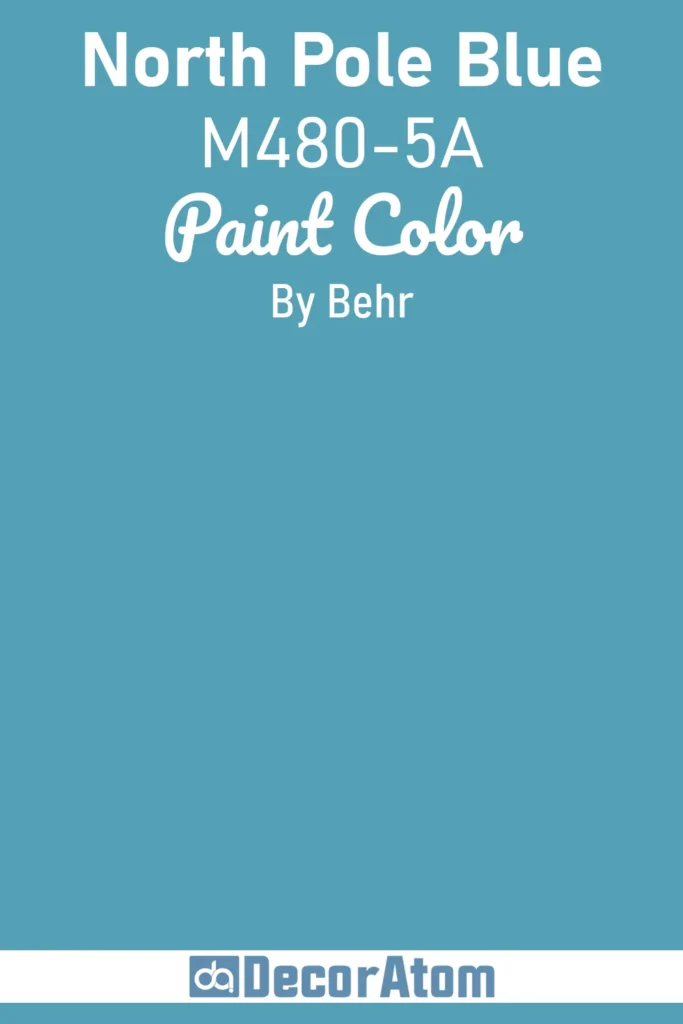
North Pole Blue M480-5A is like a crisp winter morning where the sky is clear and the air bites just a little. This medium-depth blue has a cool, clean edge, with a subtle gray undertone that gives it a frosty, almost icy feel.
It’s not as heavy as a navy, but it’s got enough presence to hold its own in a dining room or a cozy den. Picture it on built-in bookshelves or a statement wall, paired with warm wood tones or creamy whites to soften its chill.
For a bolder look, toss in some mustard yellow accents or brass hardware, it’s surprisingly versatile. North Pole Blue brings a refreshing, invigorating vibe, like a blast of cold air that wakes up a room without overwhelming it.
10. Charismatic Sky M520-3
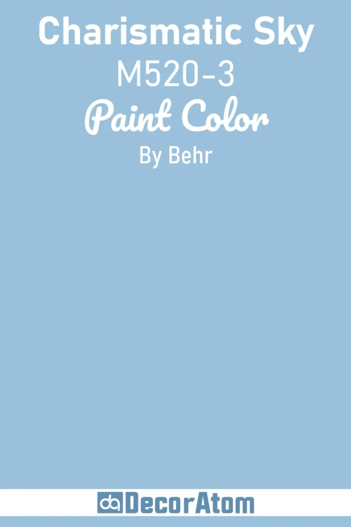
Charismatic Sky M520-3 is the blue of a perfect afternoon, where the sky is bright but not blinding, inviting you to kick back and dream. This lively, medium blue has a touch of vibrancy that feels playful yet sophisticated, making it a fantastic choice for a family room or a creative studio.
It’s got a hint of periwinkle in its DNA, which gives it a slightly whimsical edge without veering into purple territory. Try it with soft grays and natural linens for a relaxed look, or pair it with bold oranges or pinks for a fun, eclectic vibe.
Charismatic Sky is the kind of color that sparks conversation, it’s approachable, upbeat, and just a little bit flirty.
11. Glass Sapphire PPU14-02
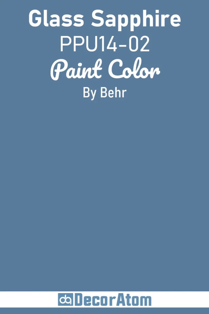
Glass Sapphire PPU14-02 feels like a polished gemstone, catching the light with a deep, translucent blue that’s both elegant and grounded. This rich shade leans toward the jewel-tone end of the spectrum, with a subtle warmth that keeps it from feeling too stark.
It’s perfect for creating a luxurious atmosphere in a formal dining room or a master bedroom, where it can envelop the space in sophistication. Pair it with metallics like silver or gold for a glamorous touch, or keep it earthy with warm beiges and wood textures.
In low light, it takes on a moody, intimate quality, while in bright spaces, it sparkles with quiet confidence. Glass Sapphire is for those who want a blue that feels like a treasure.
12. Adirondack Blue N480-5
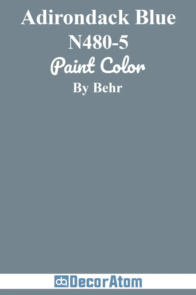
Adirondack Blue N480-5 transports you to a misty lake surrounded by pine trees, where the water reflects a deep, contemplative blue. This medium-dark shade has a natural, earthy quality, with a hint of green that ties it to the outdoors.
It’s ideal for a cozy cabin vibe, think accent walls in a living room or a fireplace surround that draws you in. Pair it with warm neutrals like taupe or soft ivory to keep things inviting, or go bold with copper accents for a rustic-modern twist.
Adirondack Blue has a grounded, timeless feel that works just as well in a traditional home as it does in a contemporary loft. It’s the blue of quiet retreats and soulful moments.
13. English Channel PPU14-19
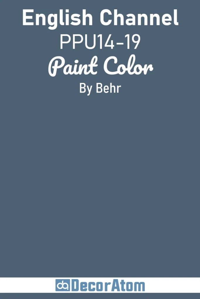
English Channel PPU14-19 is moody and mysterious, like the choppy waters of its namesake on a foggy day. This deep, grayish-blue has a sophisticated, almost nautical vibe that’s perfect for creating drama in a study or powder room.
It’s not quite navy, but it’s got that same commanding depth, with a muted quality that keeps it from feeling too intense. Pair it with crisp whites for a classic coastal look, or lean into its moodiness with charcoal accents and dark wood furniture.
In smaller doses, like on cabinetry or a front door, it adds a touch of elegance without overwhelming. English Channel is the blue for those who love a little intrigue in their spaces.
14. Bering Wave S490-6
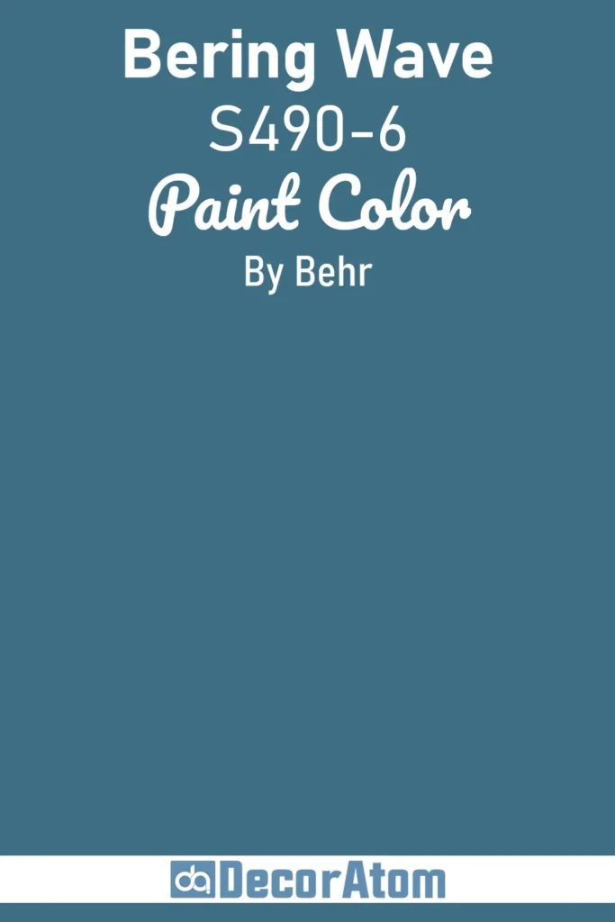
Bering Wave S490-6 is a bold, oceanic blue that feels like it’s surging with energy. This deep, slightly teal-tinged shade captures the power of a wave crashing against a rocky shore, vibrant yet controlled.
It’s a fantastic choice for a statement piece, like a kitchen island or a feature wall in a modern living room. The slight green undertone gives it a fresh, contemporary edge, making it a great match for sleek materials like glass or stainless steel.
Pair it with warm creams or sandy tones to soften its intensity, or go all-in with emerald green accents for a coastal-inspired palette. Bering Wave is for those who want a blue that makes a splash without losing its cool.
15. Laguna Blue PPU14-18
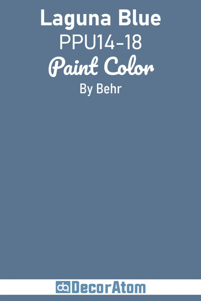
Laguna Blue PPU14-18 is the color of a tropical lagoon at midday, bright, clear, and irresistibly inviting. This vibrant, medium blue has a clean, pure quality that feels fresh and uplifting, perfect for a sunny breakfast nook or a lively entryway.
It’s got a touch of aqua in its heart, which gives it a playful, beachy vibe without being too pastel. Pair it with white shiplap for a coastal cottage look, or mix it with bold patterns in coral or yellow for a fun, eclectic space.
Laguna Blue shines in rooms where you want energy and optimism, it’s like a burst of sunshine reflected on water, bringing life to any corner of your home.
16. Midnight Blue N480-7
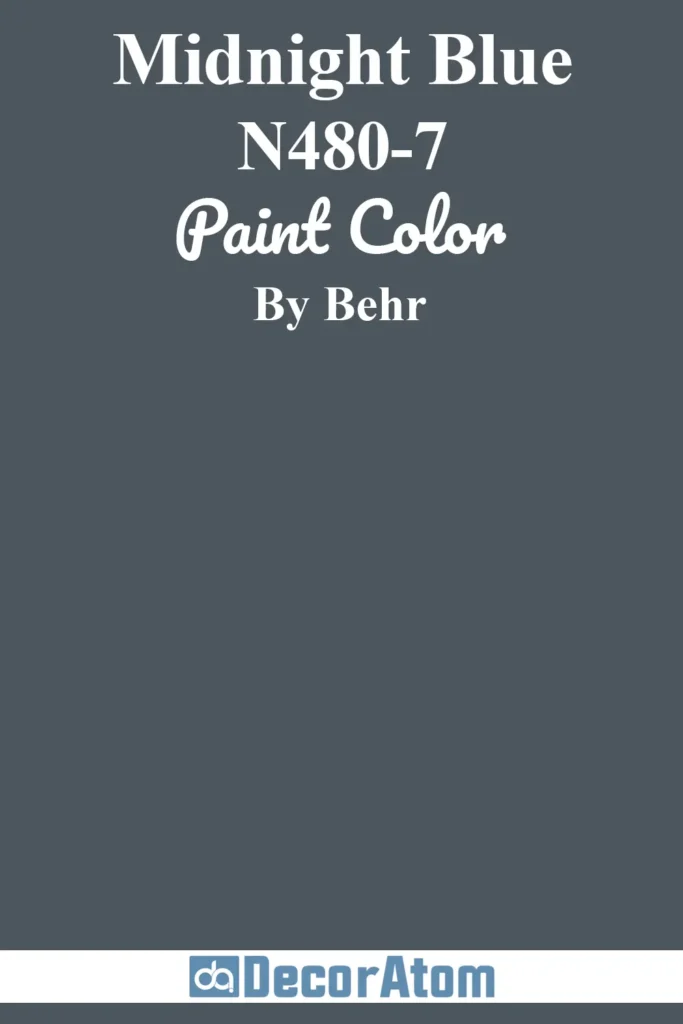
Midnight Blue N480-7 is the deepest, most soulful blue on the list, like the night sky just before the stars come out. This rich, near-navy shade is bold and enveloping, perfect for creating a cozy, dramatic atmosphere in a bedroom or home theater.
Its depth gives it a timeless elegance, but a subtle warmth keeps it from feeling cold or stark. Pair it with soft golds or creamy whites to add warmth, or go for a monochromatic look with lighter blues for a serene, layered effect.
On cabinetry or an accent wall, it feels luxurious and grounding. Midnight Blue is for those who want a color that feels like a warm embrace at the end of a long day.
17. Tibetan Turquoise MQ4-53
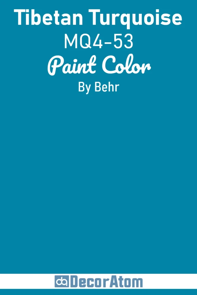
Tibetan Turquoise MQ4-53 is a showstopper, blending the best of blue and green into a vibrant, jewel-like hue that feels exotic and alive. This bold turquoise has a rich, cultural depth, like a handcrafted tile from a far-off bazaar.
It’s perfect for an accent wall in a bohemian living room or a bathroom where you want to channel spa-like luxury. Pair it with earthy tones like terracotta or warm wood for a grounded look, or let it pop against crisp whites and gold accents for a modern twist.
Tibetan Turquoise doesn’t fade into the background, it’s the color for those who want their space to tell a story of adventure and vibrancy.
FAQ’s
1. What is the most popular Behr blue paint color?
In my experience, Behr Blueprint (S470-5) is one of their most loved blues. It was Behr’s 2019 Color of the Year for a reason, versatile, modern, and a perfect blend of richness and softness.
2. Which Behr blue works best for a small room?
For smaller rooms, I usually recommend lighter tones like Behr Misty Coast or Light French Gray with a blue undertone. They help open up the space without making it feel cold.
3. Can I use Behr blue paint for kitchen cabinets?
Absolutely. I’ve painted lower kitchen cabinets in Behr Starless Night for a client and the result was stunning, bold but still classic.
4. What sheen should I use for blue walls?
For most walls, I go with eggshell or satin. They offer just the right amount of light reflection without highlighting imperfections.
5. How do I avoid a blue room looking too cold?
If your space has cool lighting or lots of gray elements, balance it with warm accents, wood tones, brass fixtures, or even warm white trim can help keep things cozy.
6. Are Behr blue paint colors durable for high-traffic areas?
Yes, Behr offers durable finishes like satin, semi-gloss, or their Marquee line, which are great for high-traffic areas like kitchens or hallways. Colors like Simply Blue PPU15-16 or Bering Wave S490-6 look stunning on cabinetry or trim with these finishes, resisting wear and tear while being easy to clean.