
If you’re anything like me, picking a paint color can quickly go from exciting to overwhelming.
There are so many shades out there—but few strike the perfect balance between calm and character the way blue gray paint colors do.
They’re soft yet rich, modern but timeless, and they bring a cozy, polished feel to just about any room.
I’ve spent a lot of time exploring Behr’s collection of blue grays—testing swatches, checking how they shift in different lighting, and pairing them with various décor styles.
And let me tell you, Behr has some real standouts.
In this post, I’m sharing 15 of the best Behr blue gray paint colors that I’ve come to love, whether you’re going for a fresh coastal look or something deeper and more dramatic.
What Are Blue Gray Paint Colors?
Blue gray paint colors are exactly what they sound like—a blend of blue and gray tones. But it’s not just about mixing the two.
The best blue grays are carefully balanced to feel tranquil and cool without becoming too icy or flat.
They often lean slightly more toward one side—some might have a stronger blue presence with a subtle smoky undertone, while others are essentially soft grays with just a hint of blue.
The result is a color that feels both serene and sophisticated. Blue grays are especially known for their versatility.
Depending on the shade and how you use it, they can look crisp and modern or soft and soothing.
They also tend to shift beautifully throughout the day as the lighting changes, which adds a dynamic layer to any space.
Where to Use Blue Gray Paint Colors?
Honestly? Just about anywhere. That’s the beauty of blue gray paint—it’s a true chameleon that works in nearly every room of the house.
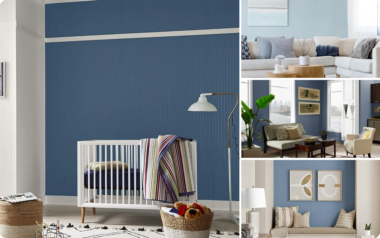
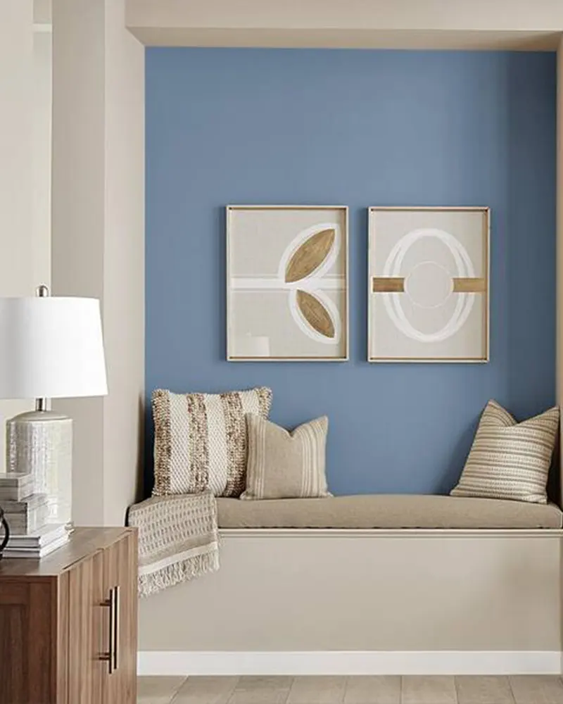
Bedrooms: Blue grays are a top choice for bedrooms because of their calming, restful feel. Lighter shades like Etched Glass or Absolute Zero can help create a spa-like retreat, especially when paired with soft whites and natural textures.
Living Rooms: If you want a cozy, grounded vibe in your living area, a mid-tone blue gray like Teton Blue or Cumberland Fog adds depth without feeling dark or heavy.
Kitchens & Cabinets: Colors like Adirondack Blue or Midnight Blue are perfect for cabinetry or kitchen islands if you want a bold, sophisticated look that still feels welcoming.
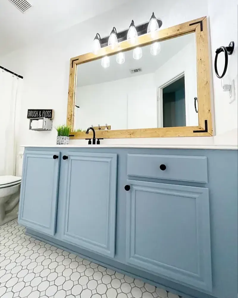
Bathrooms: Pale blue grays, such as Dayflower or Peaceful Blue, bring a clean and refreshing feel to bathrooms, especially when paired with white tile and chrome fixtures.
Offices or Dining Rooms: Richer hues like English Channel or December Eve help create a more intimate, focused environment, ideal for workspaces or formal areas.
Blue grays also make great accent walls or door colors, especially if you want to add interest without going too bold.
Colors to Pair with Blue Gray Paint Colors
One of the reasons I keep coming back to blue grays is how beautifully they play with other colors. Whether your style is traditional, coastal, modern, or something in between, there’s a palette that works.
Here are some of my favorite pairings:
- White & Cream: Crisp whites or warm creams help blue grays feel brighter and fresher. This combo is perfect for trim, ceilings, and furniture.
- Warm Woods: Natural wood tones (oak, walnut, or rattan) bring warmth and texture, especially when paired with deeper blue grays like Atlantic Blue or Thundercloud.
- Earth Tones: Terracotta, rust, sage, and taupe all look stunning alongside blue grays, adding contrast while keeping the palette grounded.
- Blush & Dusty Pinks: For a soft and romantic vibe, pairing blue grays with muted pinks creates a balanced and inviting look.
- Gold or Brass: Metallic finishes, especially brushed brass or gold, add elegance and shine—especially in light fixtures, hardware, or frames.
The key is balance. Since blue gray is a cool tone, adding warm or neutral elements helps keep the space from feeling too cold.
Tips for Choosing the Best Blue Gray Paint Colors
I’ve learned (sometimes the hard way) that choosing the right blue gray comes down to more than just picking a pretty swatch. Here are a few practical tips to help guide your decision:
1. Test It in Your Space
Blue gray shades can look completely different in various rooms or under different lighting. Always test a sample on your wall and observe it at different times of the day.
2. Pay Attention to Undertones
Some blue grays lean more violet or green, while others stay strictly in the blue-gray zone. Knowing the undertone will help you avoid surprises once the paint is on your walls.
3. Consider the Room’s Natural Light
North-facing rooms tend to bring out the cool tones, making some blue grays feel more gray or even icy. South-facing rooms, with warmer light, might soften the coolness.
4. Pair with Complementary Decor
Think about what flooring, furniture, and décor you’ll have in the room. If your space already has a lot of cool tones, you might want a warmer blue gray to balance it out.
5. Don’t Skip the Sample Jars
Even if you think you’ve found “the one,” testing a few sample jars side-by-side is worth the extra step. You might be surprised which color ends up being your favorite.
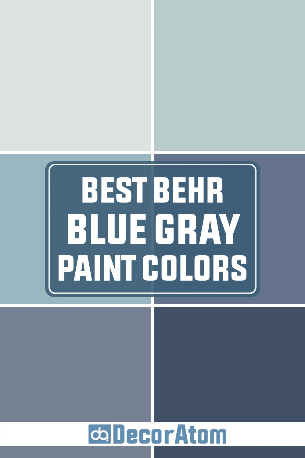
Top 15 Behr Blue Gray Paint Colors
Here are my favorite Blue Gray paint colors from Behr to decorate with.
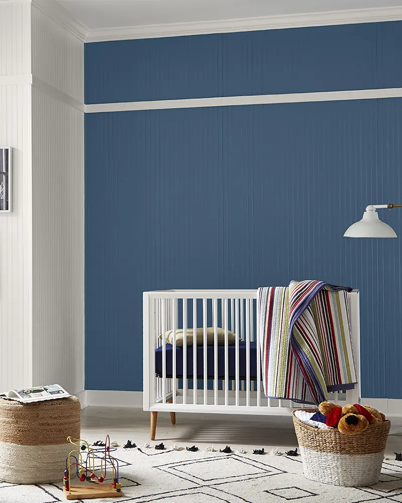
1. Etched Glass MQ3-27
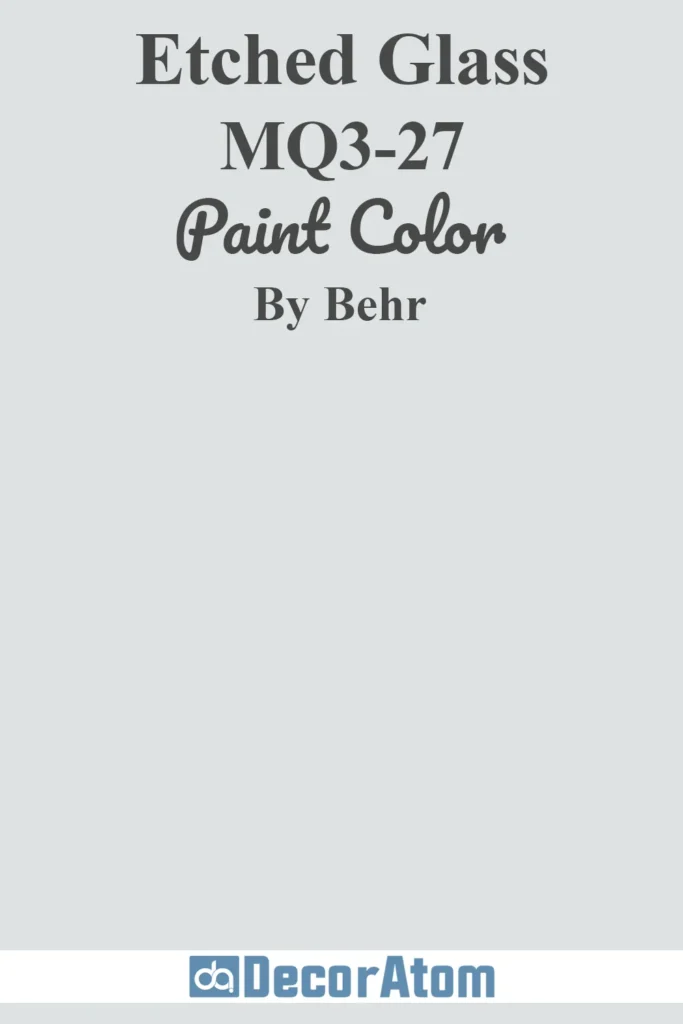
Etched Glass is one of those soft, dreamy shades that instantly makes a space feel calm and airy. It’s a pale blue gray with a slightly frosty undertone—like a whisper of winter sky on a clear morning.
What I love about this color is its subtlety. It doesn’t scream “blue,” but it’s far from being a boring neutral either.
If you’re someone who finds white too stark but wants that same fresh, clean vibe, Etched Glass is a fantastic alternative.
It pairs beautifully with sky blues, soft creams, or even muted pastels for a layered monochromatic look.
I’ve seen it used in nurseries, bathrooms, and even kitchens—and it somehow works in all of them without overwhelming the space.
2. Absolute Zero N490-1
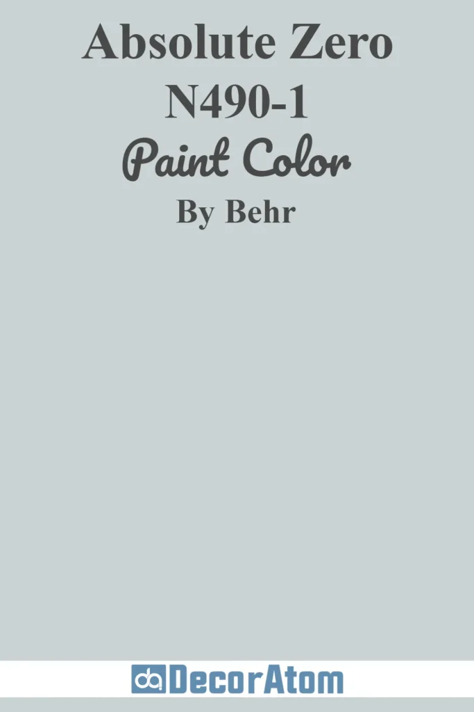
If you’re looking for a blue gray with a little more personality, Absolute Zero might be your match. It leans a bit cooler than Etched Glass, but it still feels incredibly gentle and light.
This color glows in natural light and really comes to life in small or shadowy rooms that need a bit of brightening.
What sets it apart for me is its versatility—it works equally well in a vintage-style dining room or a crisp, modern nursery.
I’ve also seen it paired with blush pink and soft white for a romantic, airy palette that feels cozy without being overly feminine.
It’s a color that can evolve with your home, whether you’re styling a guest room today or a reading nook tomorrow.
3. Dayflower MQ3-54
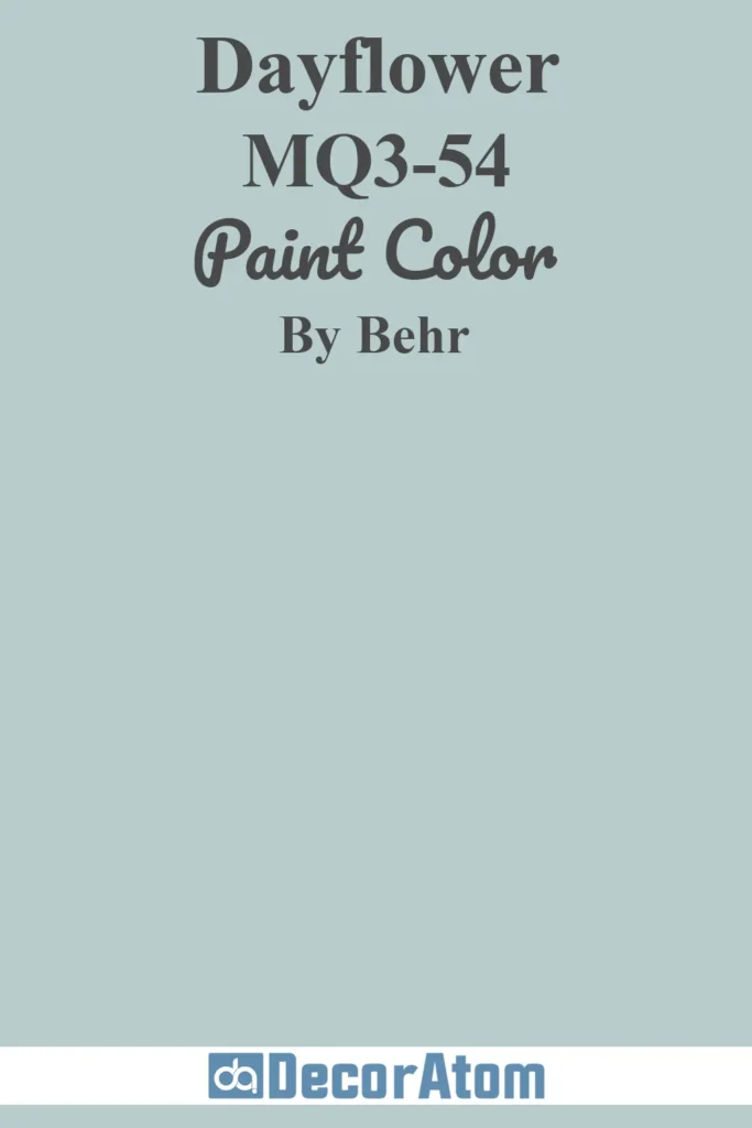
Dayflower is such a poetic name for this shade—it really does evoke the image of soft petals and dewy mornings. This blue gray has a delicate, pearlescent quality that makes it shimmer subtly in the light.
It’s not flashy or overly saturated, but there’s a richness to it that adds depth. I especially love using Dayflower in spaces where you want a relaxed, restorative feel.
Think reading corners, bedrooms, or even a cozy home office. I once saw a home with Dayflower walls, teal velvet cushions, and white shelves lined with books—it was such a warm, personal space.
The color brings charm and softness without demanding attention, which is a tough balance to strike.
4. Cumberland Fog 560E-2
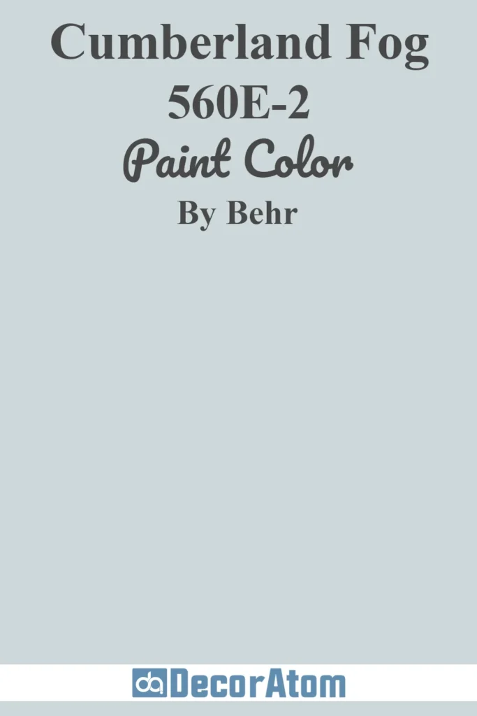
Cumberland Fog lives up to its name—it has this misty, muted tone that feels like standing in a cool, quiet forest just after dawn.
It sits right between gray and blue but doesn’t lean too far in either direction, which makes it one of the more balanced hues on this list.
This shade has a way of grounding a space without making it feel dark or heavy. I’d use it in a living room with white trim and natural wood furniture, or even in a bathroom where you want a spa-like feel.
What I appreciate most about Cumberland Fog is how well it plays with both cool and warm tones, so you’re not locked into one particular color scheme.
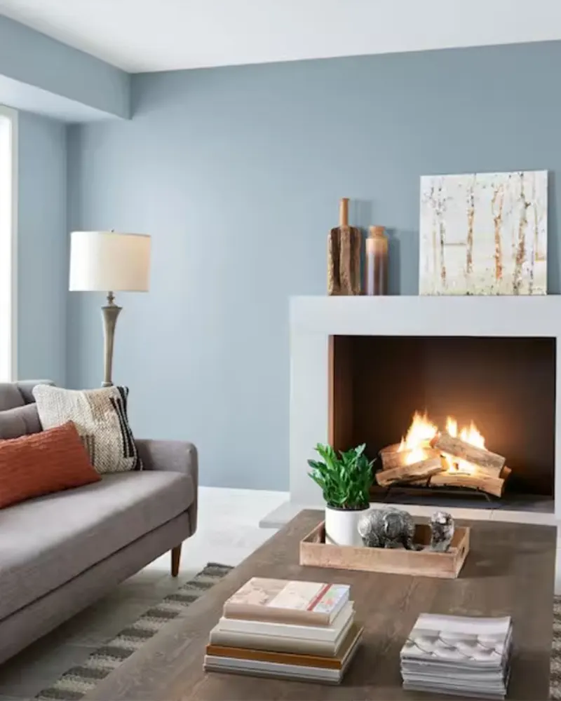
5. Peaceful Blue S470-3
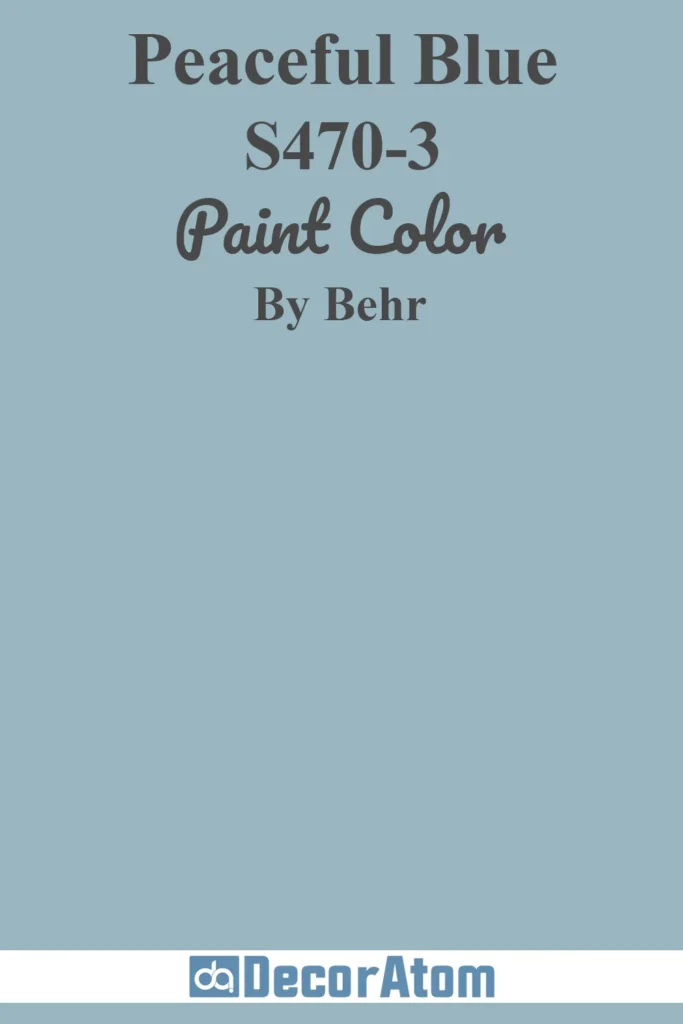
Peaceful Blue feels exactly like its name suggests—calm, quiet, and soothing. This shade reminds me of a clear autumn sky, that soft kind of blue that feels fresh but not cold.
It works beautifully as an accent in neutral palettes, especially those built around taupe, greige, or even soft brown.
If you’re trying to create a cozy, countryside feel in your home, this is the kind of color that can do a lot of heavy lifting without feeling overpowering.
I also love the idea of using Peaceful Blue in coastal-themed spaces—it brings that breezy, outdoorsy vibe inside without screaming “beach house.”
6. Blue Willow 570F-4
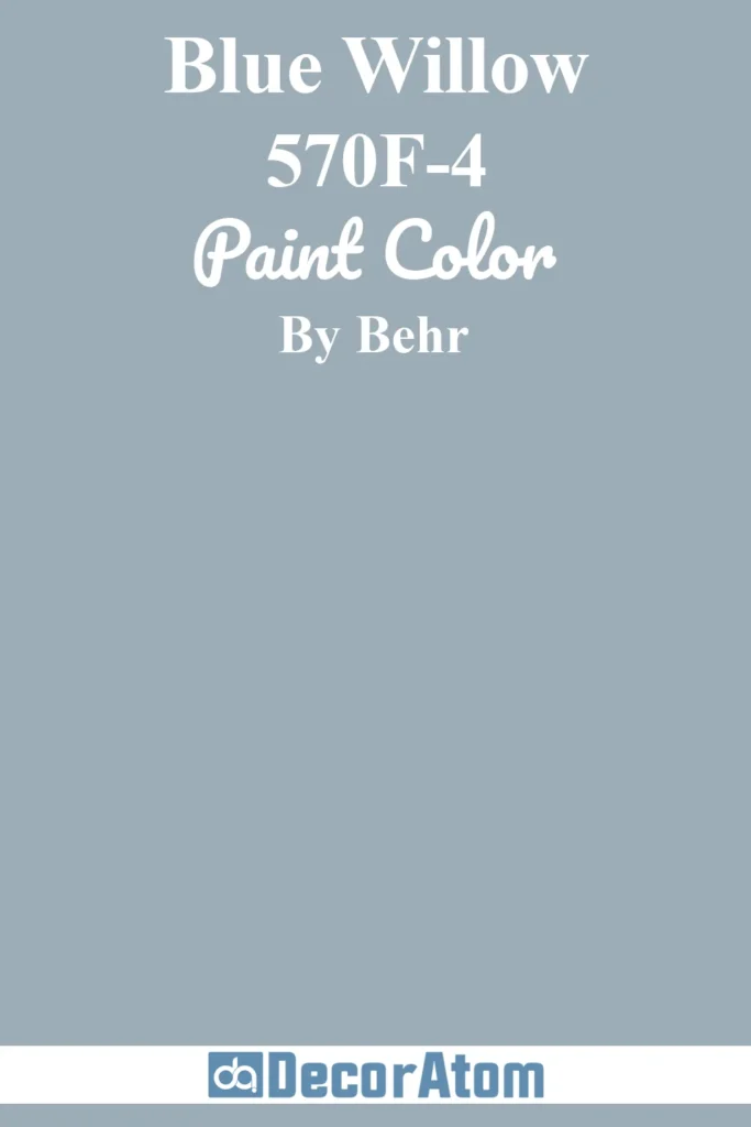
Blue Willow has a slightly vintage feel to it, like something you’d find in an heirloom china pattern.
It’s a mid-tone blue gray with just enough depth to make a statement but still soft enough to use in large doses.
This shade has a gentle, grounded presence that works well in traditional interiors but can also lean modern when styled right.
I love how Blue Willow pairs with crisp white trim or natural wood—together, they create a serene, classic atmosphere.
It’s also one of those colors that seems to shift slightly with the light, offering a bit of visual interest without being distracting.
7. Half Sea Fog N470-3
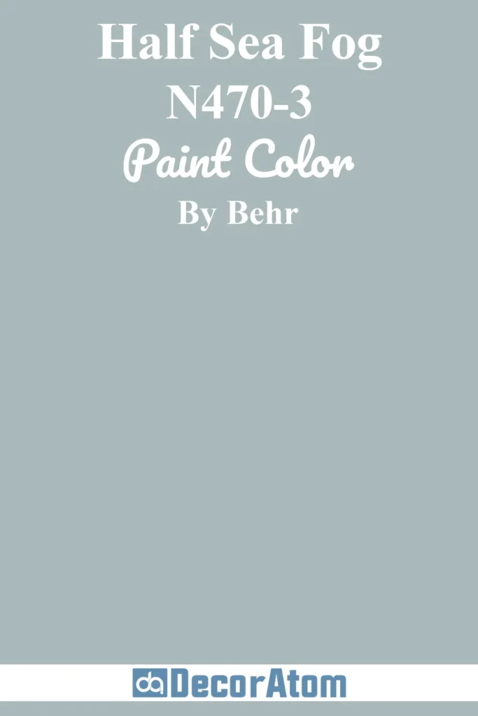
Half Sea Fog is one of those effortlessly elegant shades that looks good pretty much anywhere you use it.
Inspired by the gentle grays of morning mist over the ocean, it’s a blue gray with a calming softness that feels almost ethereal.
I think of this as the perfect backdrop for a minimalist living room or a serene master bedroom.
It pairs beautifully with blush pink, pale silver, or deeper charcoals, depending on the mood you want to set.
8. Adirondack Blue N480-5
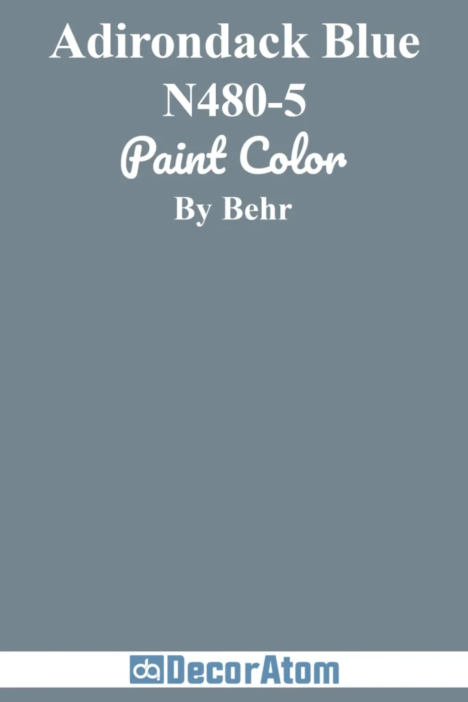
Now we’re getting into the deeper end of the spectrum. Adirondack Blue is rich and saturated, with a slate-like quality that makes it ideal for adding drama and contrast.
If you’ve been to the Adirondack Mountains, you’ll recognize the moody, shadowy inspiration behind this shade.
I love using this color on lower kitchen cabinets, built-ins, or a single feature wall in a bedroom.
It pairs beautifully with warm wood tones, brass accents, and lighter blues or whites for balance.
9. Atlantic Blue 600F-6
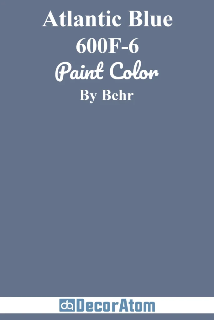
Atlantic Blue is a bit of a wildcard—it has a violet undertone that adds a surprising warmth and richness to what you might expect from a typical blue gray.
That subtle purple base makes it feel luxurious, almost velvety, and perfect for bold, creative interiors.
It’s not for the faint of heart, but if you want to add depth to a dull gray room or shake things up with a moody accent wall, Atlantic Blue delivers.
Try pairing it with mustard, rust, or forest green if you want to lean into a retro or eclectic vibe. This color really shines when styled with confidence.
10. Teton Blue N490-4
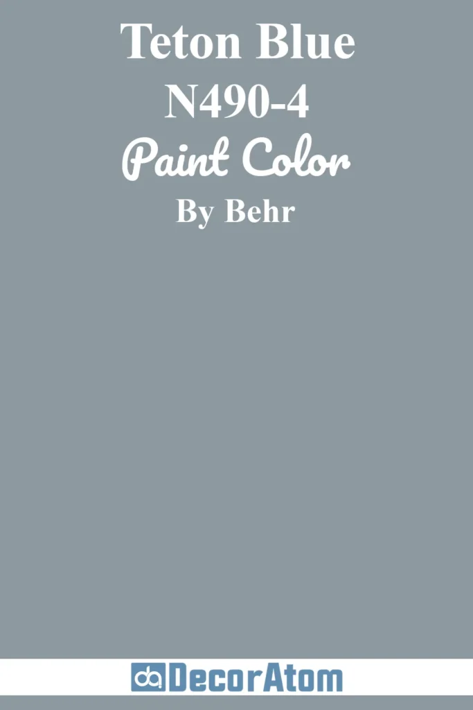
Teton Blue is beautifully balanced—somewhere between blue, gray, and slate—with just enough color to feel dynamic without overwhelming the room.
It’s one of those hues that looks different depending on the time of day and the light in the space. In the morning, it leans cooler and crisper. In the evening, it feels a little cozier and more grounded.
I’ve seen it used to great effect in Japandi-style interiors, where it anchors warm wood tones and crisp whites with quiet confidence.
It also holds its own in Scandinavian or even industrial palettes when paired with the right accents.
11. English Channel PPU14-19
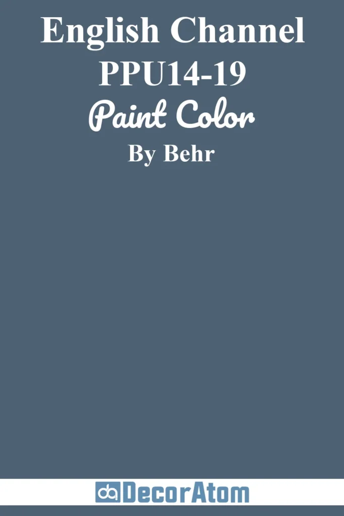
English Channel is a deep, moody blue gray that instantly brings drama and sophistication to any room. There’s a weight to it that feels grounding—like the still, vast water it’s named after.
I see this color working best in spaces where you want to create an intimate, cocoon-like atmosphere.
Think a cozy library, a dining room for candlelit dinners, or even a bold, enveloping bedroom.
Pair it with other saturated tones like charcoal, paprika, or deep plum if you’re going for a rich, layered look. But it can also stand on its own against white trim or soft neutrals to create contrast.
12. Tranquil Pond PPU15-7
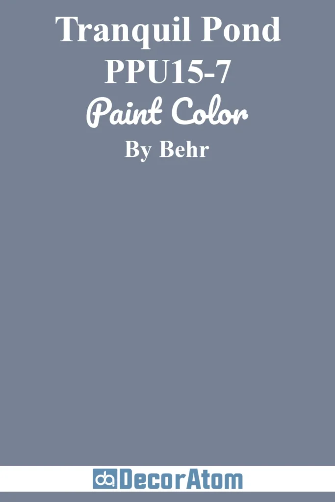
Tranquil Pond sits right in that sweet spot between serene and saturated. It’s a medium-dark blue gray with a slightly green undertone, giving it a natural, earthy vibe.
This color reminds me of those still, quiet lakes surrounded by pine trees—cool, peaceful, and undisturbed. It’s ideal for a space that needs calm without veering into cold territory.
I’ve seen it look incredible in bathrooms with brushed nickel hardware or in entryways that need a bit of personality.
Tranquil Pond also works really well with soft creams, taupe, or even warm terracotta if you’re aiming for a nature-inspired palette.
13. Midnight Blue N480-7
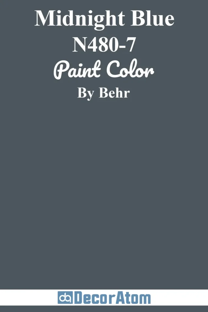
If you’re after something bold and atmospheric, Midnight Blue should be high on your list. This is a rich, saturated blue gray that leans just a touch toward charcoal.
It’s deep, inky, and undeniably elegant—perfect for those looking to add a little drama to their interiors. What I really love about Midnight Blue is how it plays with texture.
Against a matte wall, it feels velvety and cozy. But pair it with glossy tile or metallic fixtures, and suddenly it takes on this luxurious, almost glamorous edge.
It’s perfect for accent walls, cabinetry, or even moody powder rooms. Just make sure you balance it with lighter tones or reflective surfaces so it doesn’t feel too heavy.
14. Thundercloud S520-5
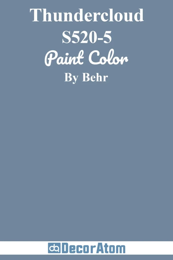
Thundercloud is a strong, stormy blue gray that commands attention in the best way. The name is spot-on—it really does look like the sky just before a summer rain, full of movement and energy.
This color brings a modern, slightly edgy vibe to a room, especially when paired with crisp whites, matte black accents, or warm woods.
I think it works particularly well in living rooms or offices where you want a color that feels grown-up but not stiff.
It also brings out the best in natural textures like rattan, wool, and raw linen. If you’re someone who’s drawn to moody neutrals but still wants a touch of color, Thundercloud delivers.
15. December Eve 580F-7
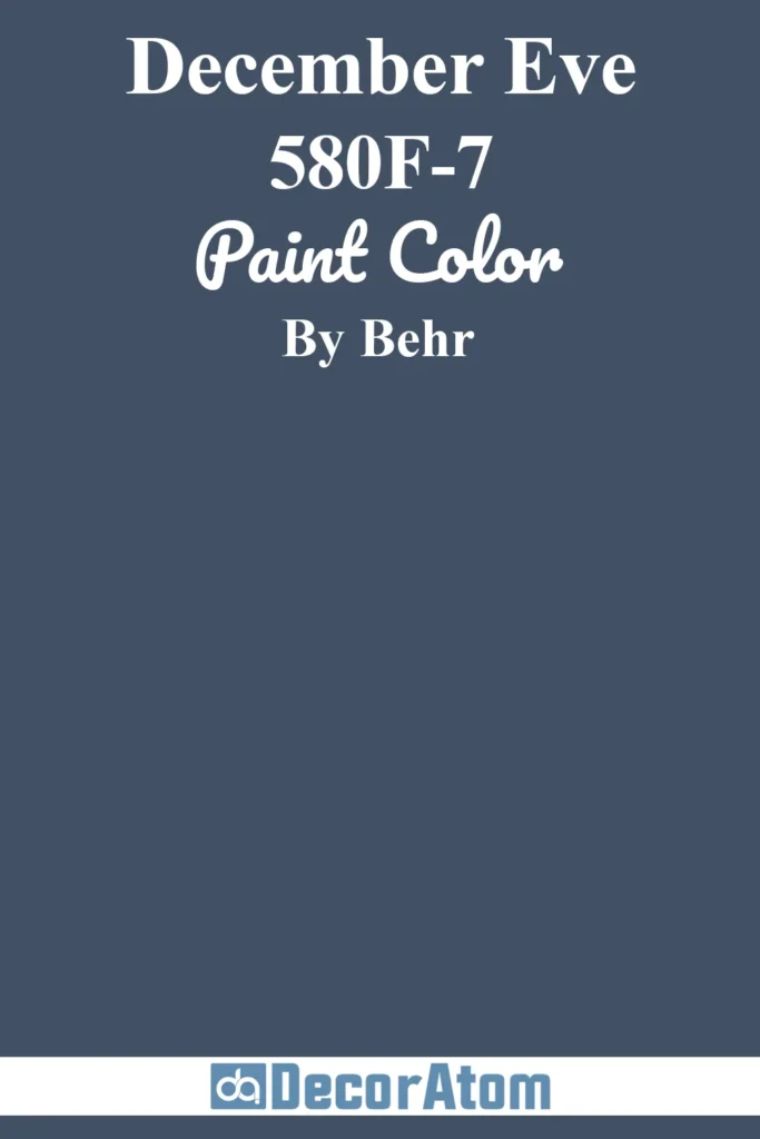
December Eve is deep, dusky, and just a little mysterious—kind of like the twilight hour in winter when the light starts to fade but the day hasn’t fully let go.
This is one of the darker blue grays on the list, bordering on navy but with enough gray to keep it soft and sophisticated.
It’s an excellent choice if you’re ready to embrace dark walls or dramatic cabinetry.
I’ve seen it used beautifully in dining rooms, paired with gold fixtures and creamy wainscoting for a luxe, holiday-ready feel. Or take it into a modern direction by pairing it with minimalist décor and a few bold art pieces.
It’s a color that adds instant depth and elegance without feeling too formal.
Final Thoughts
Blue gray paint colors are more than just trendy—they’re incredibly livable. They have a way of making spaces feel calm, collected, and elevated without being too stark or too dramatic.
I hope this list helps you narrow things down and feel more confident choosing the right shade.
If you’ve tried any of these colors or have a personal favorite, I’d love to hear about it in the comments!