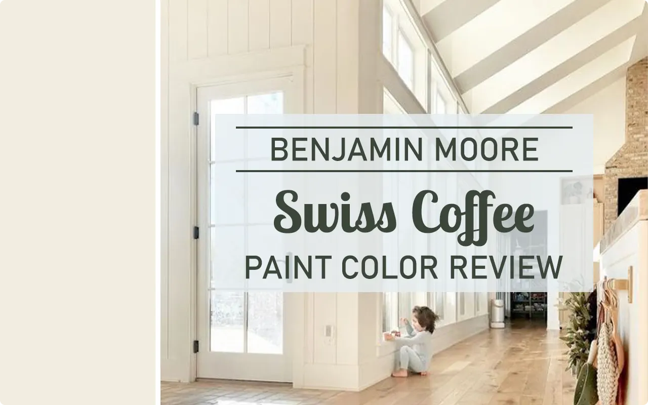
Let’s talk about the paint color that everyone seems to obsess over: Benjamin Moore Swiss Coffee OC-45.
Honestly, this color is like the little black dress of paint, never really out of fashion, always looking sharp, and somehow manages to make every room look like it belongs on a Pinterest board.
People keep coming back to it for a reason. I’m dead serious when I say you could slather this stuff on every wall in your house or just the trim, and it’ll always look like you put in way more effort than you actually did.
So, if you’re stuck in the paint aisle, sweating over 50 shades of white, here’s what you wanna know about Swiss Coffee before you commit.
*This post contains affiliate links. For more details see my full disclosure.
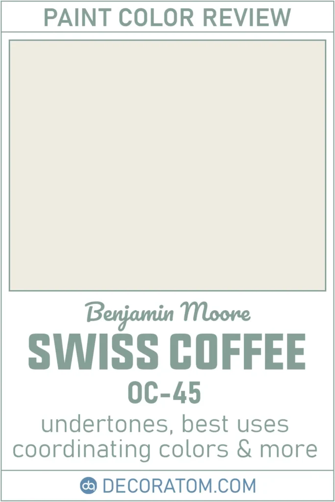
So, What Exactly IS Swiss Coffee?
Swiss Coffee is basically the Goldilocks of whites, it’s not too cold, not too stark, just right. Imagine a soft, creamy white that isn’t screaming “look at me!” but also isn’t so bland you forget it’s even on the wall. It’s got this cozy, velvety vibe.
If you ever walk into a friend’s house and think, “Dang, these walls just feel good,” odds are, it’s something like Swiss Coffee making that magic happen. It just works, whether you’re into modern minimalism or grandma-chic.
How to Know if a Paint Color Is Right for You?
Would you like to sample Swiss Coffee paint color? I recommend using Samplize. They offer 9”x14.75”” peel-and-stick paint swatches that make testing colors super simple. Just stick it on your wall, move it around if needed, and when you’re done, peel it off and toss it. No mess, no cleanup. It’s quick, easy, and way more convenient!

Advantages of using peel and stick paint samples:
- EASY TO USE: Simply move your SAMPLIZE paint sample around the room to test under a variety of lighting conditions.
- AFFORDABLE: Budget-friendly solution and no more buying inaccurate swatches, rollers, wasted paint.
- SUPER FAST DELIVERY: Depending on your location, 1 day delivery is possible.
- ORDER FROM HOME: Save a trip to the store looking for samples.
- NO MESS: SAMPLIZE uses real paint samples with zero-mess
- NO WASTE: No leftover cans or wasted paint.
Warm or Cool? (The Age-Old Question)
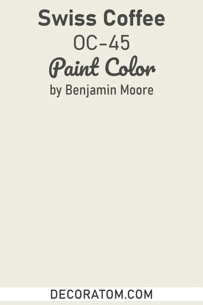
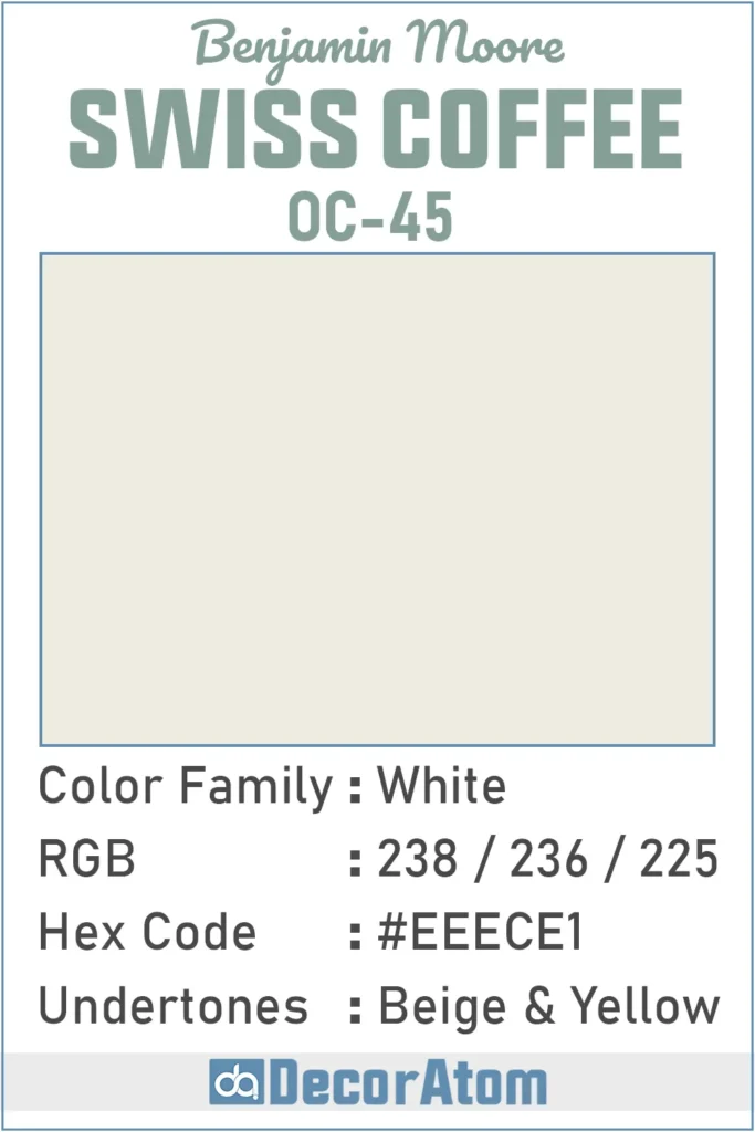
Let’s cut to the chase: Swiss Coffee is warm. Not like, “I’m melting,” but more of a subtle, creamy warmth. You know how some whites make a room feel like a hospital? Not here.
This one’s got that little extra something, a touch of butteriness, that keeps things friendly and inviting. If you want a space that feels like a hug instead of a freezer, you’re looking at the right color.
LRV—Wait, What’s That?
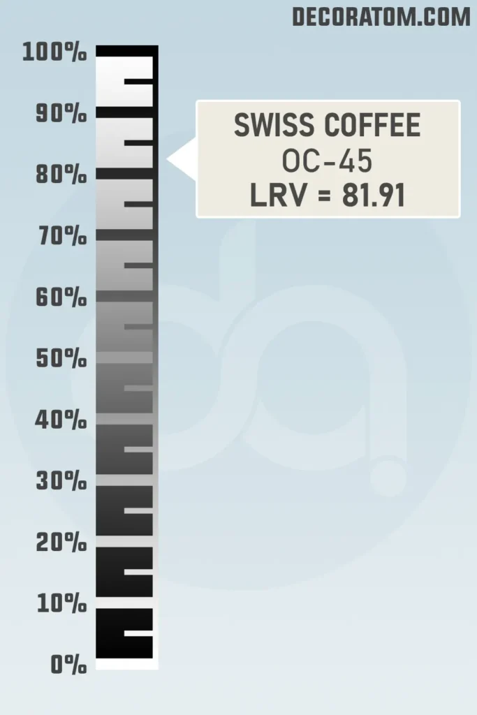
LRV stands for Light Reflectance Value, which sounds super technical, but it’s just paint-nerd speak for “how much light bounces off this color.” The scale runs 0 (pitch black) to 100 (blinding white).
Swiss Coffee clocks in at 81.91, so yeah, it’s up there with the space-bright colors. Basically, it’s gonna keep your room feeling light and open, but you won’t need sunglasses indoors.
Which Color Family Are We Talking Here?
Swiss Coffee hangs out with the white color family, but don’t get it twisted, not all whites are built the same. Some are ice-cold, some are blinding, and then you’ve got this one, creamy, soft, and just a tad warm.
It’s white, but it’s got personality. That’s why people keep coming back to it. It never goes out of style, and you’re never gonna look back and think, “What was I even thinking?” Totally timeless, but never boring.
RGB Colors
Alright, let’s geek out for a sec. If numbers are your thing, the RGB values for Benjamin Moore Swiss Coffee are 238 (red), 236 (green), and 225 (blue).
Hex Value
Hex value is just a digital code for a color, like a secret handshake for designers. Swiss Coffee’s is #EEECE1.
Undertones of Benjamin Moore Swiss Coffee
Here’s where things get a little sneaky. Swiss Coffee looks like a cozy, creamy white at first glance, but there’s more going on under the hood.
Peek closer and you’ll catch hints of beige and yellow doing their thing. Sometimes, in weird lighting, there’s even the tiniest whisper of green, don’t freak out, it’s barely there.
These undertones are what make Swiss Coffee feel warm and chill instead of blinding and cold. That soft, lived-in look? Yeah, that’s because of the undertones. No wonder everybody uses it for rooms where you actually want to relax.
How Different Types of Lighting Affect Benjamin Moore Swiss Coffee
Lighting is basically the puppet master here, Swiss Coffee will act totally different depending on what’s going on in the room.
- Natural light: Toss it in a room with tons of daylight and it’ll look fresh, light, a little less warm but still not cold.
- North-facing rooms: These always get that blue-ish, cooler light, so Swiss Coffee can dial down the creaminess and go a bit more gray. Not a bad thing, just a heads-up.
- South-facing rooms: This is Swiss Coffee’s moment to shine. All that warm sunlight? It brings out the cozy, golden undertones and makes the whole place feel soft and welcoming.
- Artificial lighting: Warm bulbs crank up the yellow and beige, so you get max coziness. But if you’re into LED’s cooler tones, Swiss Coffee will chill out and look more like a classic off-white.
Long story short, this color’s kind of a chameleon. Always test a sample in your own space, because what looks dreamy in your friend’s sunroom might look totally different in your basement.
Trim Colors to Pair With Benjamin Moore Swiss Coffee
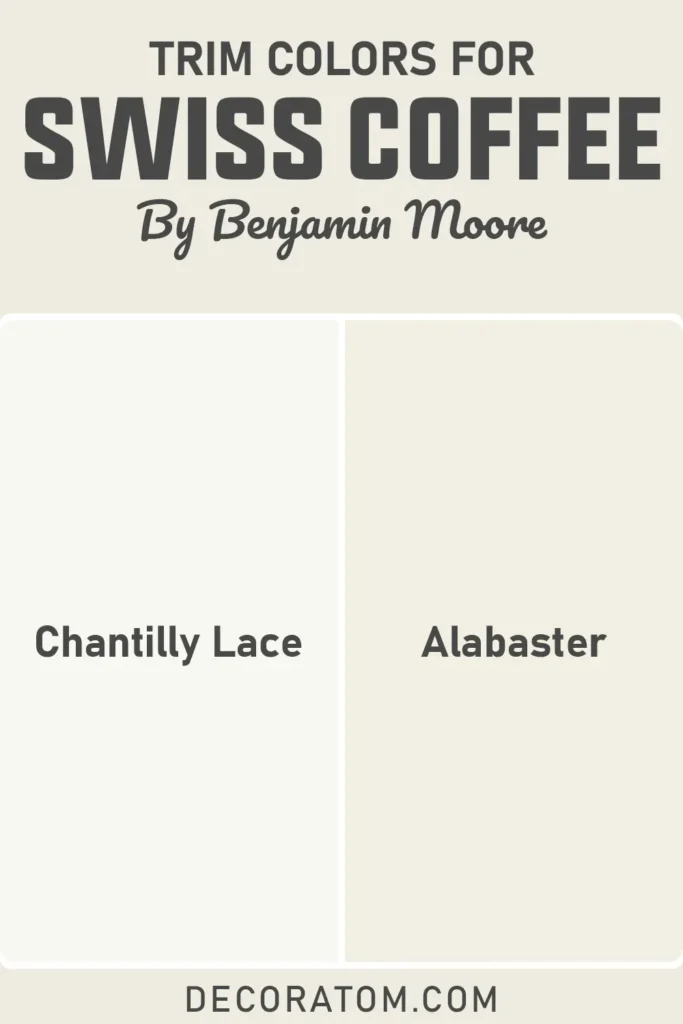
Alright, trims. If you want Swiss Coffee to look its best, pair it with a clean, bright white on the trim.
Chantilly Lace from Benjamin Moore? That’s the go-to, super crisp and makes the creamy walls stand out. Or, if you’re feeling extra chill, just use Swiss Coffee on both the walls and trim for that seamless, “I live in a cloud” vibe.
Another solid pick is White Dove, it’s got some warmth but is still bright enough to give a little pop. Basically, decide if you want a sharp contrast or a soft, blended look. Both totally work. Your house, your rules.
Colors Similar to Benjamin Moore Swiss Coffee
Okay, so you’re eyeing Swiss Coffee, but you want to scope out the competition before committing? Smart move. I always say, never trust a paint chip in isolation. You think you’re getting that dreamy creamy white, and then, boom, your living room looks like a butter factory because your windows face north. The struggle is real.
Swiss Coffee lives in that cozy, warm white club. Most of its “twins” have that soft, creamy thing going on, but don’t get it twisted, those undertones sneak up on you. Maybe one leans yellowish (hello, banana vibes), another feels a smidge more gray, or you find one that’s just brighter and crisper.
It’s wild how two “identical” whites can look totally different when you slap them up on the wall. Seriously, if you line them up, you’ll probably surprise yourself with what your eyeballs actually like.
And here’s a pro tip: sometimes you want the overall look to vibe together, but you don’t wanna use the exact same white in every single room. Swiss Coffee might be a winner for your sunny kitchen, but in that moody hallway? Nah, maybe you want something a bit less warm. Mix it up, keep things interesting.
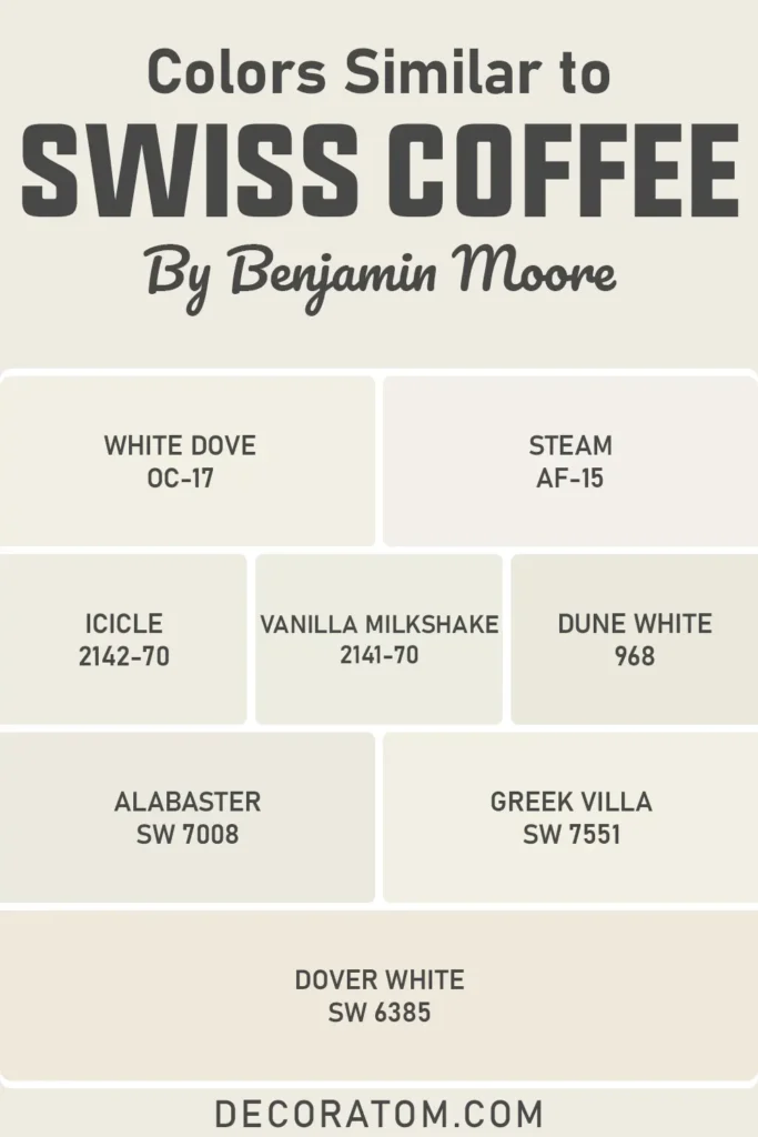
Wanna see what’s in the Swiss Coffee lookalike gang? Here’s the usual suspects:
- Benjamin Moore White Dove OC-17
- Benjamin Moore Steam AF-15
- Benjamin Moore Icicle 2142-70
- Benjamin Moore Vanilla Milkshake 2141-70
- Benjamin Moore Dune White 968
- Sherwin Williams Alabaster SW 7008
- Sherwin Williams Greek Villa SW 7551
- Sherwin Williams Dover White
Colors that Go With Benjamin Moore Swiss Coffee
Here’s why I love Swiss Coffee, it’s like the best supporting actor in a movie. You can throw it in almost any scene and it just makes everyone else look good. It’s warm but not yellow, creamy but not cloying. Basically, the Switzerland of wall colors. Neutral, friendly, kinda goes with everything.
When I’m matching stuff to Swiss Coffee, I break it down like this: You’ve got your other whites and off-whites (for that “I live in a magazine” layered look). Then you’ve got earthy neutrals—think taupe, greige, muted tan.
Those really play up the warmth and make your space feel super inviting. And if you wanna go bold? Deep navy, forest green, charcoal, all of those pop like crazy against that creamy backdrop. Keeps things from turning into a whiteout.
Bottom line: You want colors that either amp up Swiss Coffee’s coziness or totally contrast it for drama. It’s the kind of white you could build an entire house palette around and not get bored, which is saying something.
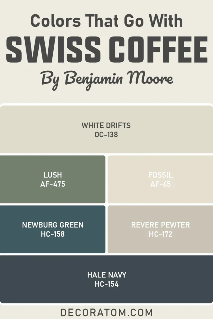
Wanna cheat sheet? Here are a bunch of colors that totally vibe with Swiss Coffee:
- Benjamin Moore White Drifts OC-138
- Benjamin Moore Lush AF-475
- Benjamin Moore Fossil AF-65
- Benjamin Moore Newburg Green HC-158
- Benjamin Moore Revere Pewter HC-172
- Benjamin Moore Hale Navy HC-154
Comparing Benjamin Moore Swiss Coffee With Other Colors
Picking a white paint? Yeah, in theory, it’s easy, until you’re standing in the store looking at about five million almost-identical swatches and losing your will to live. Not all whites are created equal, though.
Some have a weird yellow thing going on, others feel basically blue, and then there’s the sneaky undertones that only show up after you’ve painted the whole dang room. That’s why you gotta throw a few samples up on the wall and see what’s actually happening in your space.
Take Benjamin Moore Swiss Coffee OC-45, for example, people are always comparing it to other “classic” whites, like White Dove, Simply White, and even Sherwin Williams Alabaster. On the card, the differences are tiny. On your wall? Whole different story.
Here’s how Swiss Coffee stacks up against the usual suspects.
Benjamin Moore Swiss Coffee vs Benjamin Moore White Dove
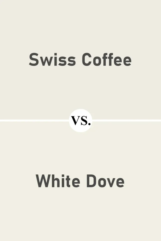
If you’re deep in the Benjamin Moore rabbit hole, you’ve definitely heard the endless Swiss Coffee vs. White Dove debate. They look the same at first, until you slap ‘em on the wall and suddenly, bam, not twins.
Swiss Coffee has that creamy thing happening, almost like someone snuck a little bit of beige into the can. White Dove is softer, leans a smidge gray, so it ends up feeling more neutral overall.
Want that homey, warm, “come in and stay awhile” vibe? Swiss Coffee’s your pal. If you need something more middle-of-the-road that can swing modern or classic, White Dove’s the safer bet.
Benjamin Moore Swiss Coffee vs Benjamin Moore Simply White
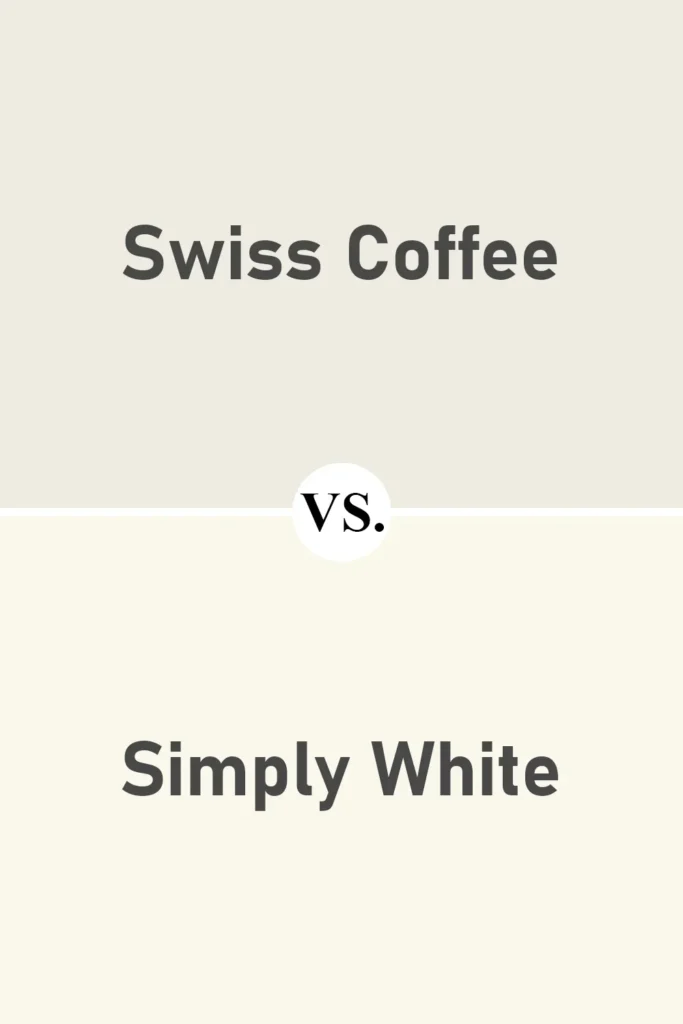
Simply White? That one’s like, “I’m here, I’m bright, deal with it.” It’s much cleaner than Swiss Coffee, way less creamy, with just enough warmth to keep it from going full sterile hospital.
Swiss Coffee is for people who want their white to feel lived-in, not blinding.
Honestly, these two are playing in totally different leagues, Simply White is that crisp, fresh white for when you want your space to basically glow, while Swiss Coffee is more like a soft filter over everything. Depends if you want “wow, that’s bright” or “mmm, that’s cozy.”
Benjamin Moore Swiss Coffee vs Benjamin Moore Cloud White
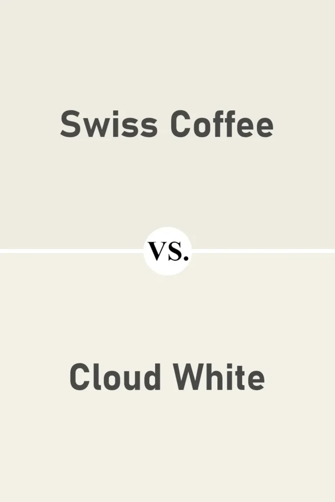
Cloud White’s another crowd-pleaser on the warm white front. It’s close to Swiss Coffee but a little airier, a little less “cream in your coffee” and more “milky daydream.”
The undertones in Swiss Coffee are stronger, it brings more beige to the party, so it’ll look richer and deeper, especially in low light. If you just want a gentle, subtle warmth, Cloud White’s a safe pick. If you want to crank up the cozy, Swiss Coffee’s got your back.
Benjamin Moore Swiss Coffee vs Sherwin Williams Alabaster
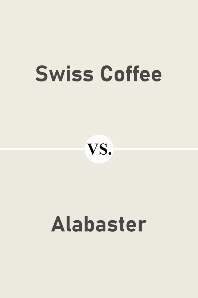
Alabaster and Swiss Coffee are basically cousins. Both are warm, inviting, and super popular for a reason. The nitty gritty? Alabaster leans a tad more greige, so you’ll see a little more taupe-y undertone, while Swiss Coffee goes heavier on the creamy yellow.
Both look fantastic in most spaces, honestly. Lighting is gonna make the biggest difference, Alabaster can look more muted and mellow, Swiss Coffee tends to look sunnier and brighter.
So, if your space is a cave, Swiss Coffee might perk it up. If you’ve already got a lot of natural light, Alabaster will feel chill and timeless.
Benjamin Moore Swiss Coffee vs Sherwin Williams Greek Villa
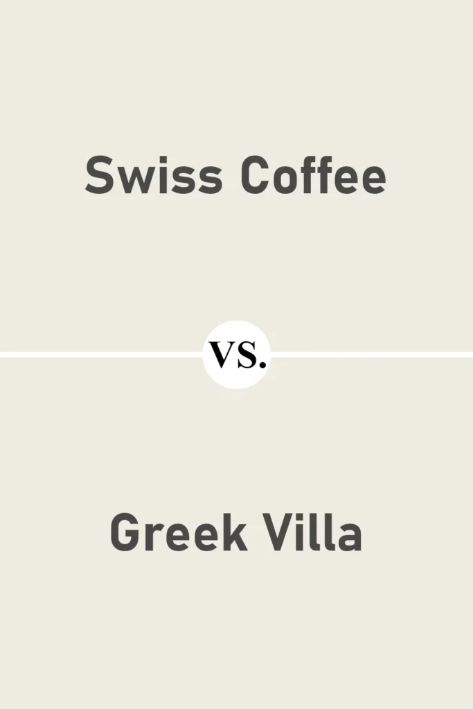
Greek Villa’s another “warm white” that people keep asking about. It’s a bit brighter than Swiss Coffee, and not as heavy on the beige. Almost feels like a halfway point between creamy and clean.
In a sun-drenched room, Greek Villa can almost pass for pure white, while Swiss Coffee will always hang onto that soft, toasty vibe. Can’t decide? Ask yourself: do you want that extra bit of warmth or something a little fresher? Creamy comfort = Swiss Coffee. Breezy freshness = Greek Villa.
Benjamin Moore Swiss Coffee vs Sherwin Williams Snowbound
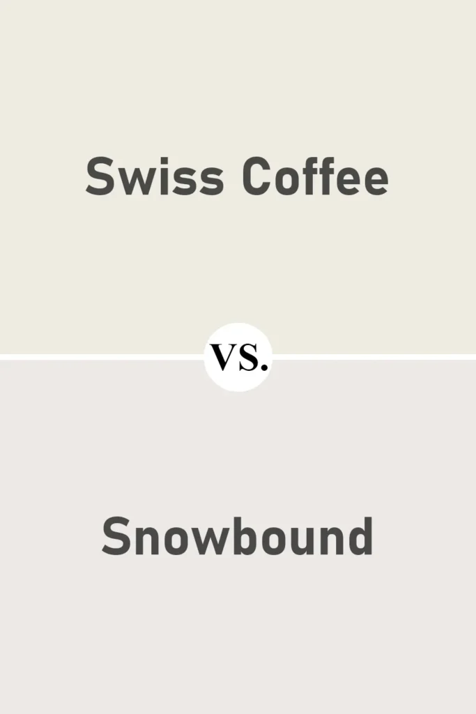
Alright, Snowbound is a whole other animal. Swiss Coffee brings the heat (well, warmth), but Snowbound cools things down with its sneaky gray undertones.
Put ‘em side by side and you’ll totally see the difference. Snowbound’s got that crisp, modern edge, pairs so well with black, gray, and all things sleek.
Swiss Coffee is more “let’s snuggle up with a cup of tea and a chunky throw blanket.” So: modern and sharp? Go Snowbound. Traditional and cozy? Swiss Coffee’s calling your name.
Where to Use Benjamin Moore Swiss Coffee?
Honestly, I always end up grabbing Swiss Coffee when I want a place to feel chill, bright, and, you know, like someone actually lives there, not like a rental with cold white walls.
This color’s surprisingly forgiving (bye, wall dents), easy on your eyeballs in the afternoon, and it vibes with just about anything: oak, marble, black metal, brass, you name it.
Pro tip: slap up some big swatches in different rooms before you commit, because this color is a total chameleon. In sunlight, it glows. In shade, it’s mellow.
At night with cool bulbs? Yeah, it shifts again. Here’s where I really love it, plus my hacks on sheen, trim, and finishes so it looks intentional and not like you ran out of paint.
Swiss Coffee in the Bedroom
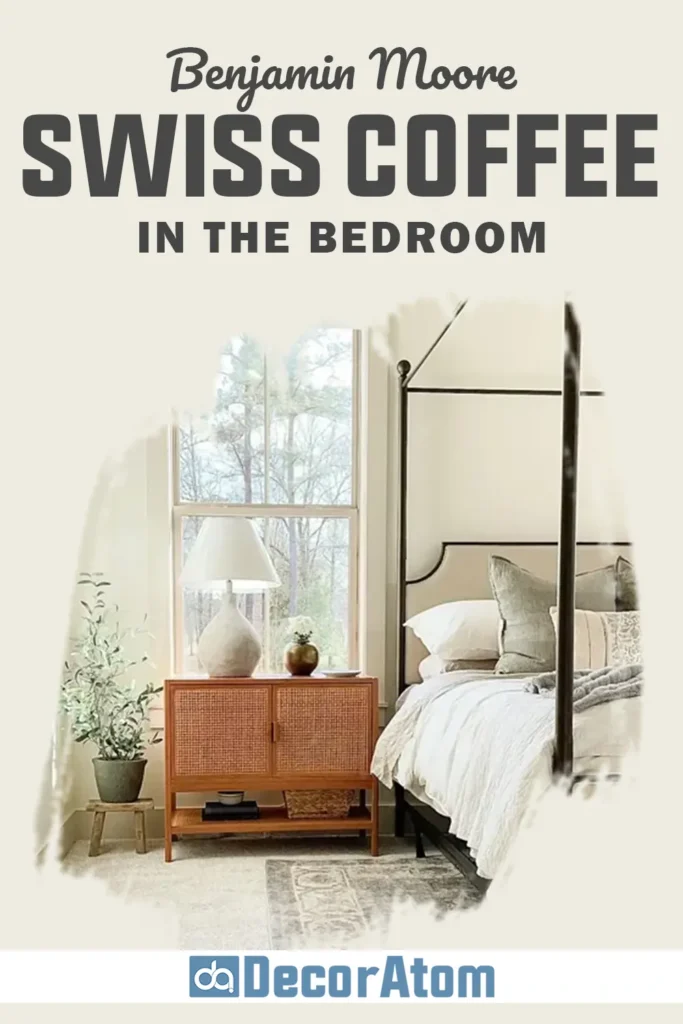
Bedrooms are for sleeping, obviously, and Swiss Coffee just gets that. The creamy undertone softens up morning sun so you don’t wake up feeling like you’re in a hospital. At night, pair it with warm bulbs and it feels cozy, not all chalky or weird.
Here’s how I usually roll:
- Walls: Go matte or eggshell. It hides all the weird little wall bumps and gives a velvety look.
- Trim and doors: If you want crisp, use Chantilly Lace. For a softer edge, White Dove’s solid. Or just do everything in Swiss Coffee if you’re into that cocoon thing.
- Floors/textiles: Honey oak, walnut, rattan, chunky linens, makes the room feel like a hug. If your bedding’s icy, toss in a Hale Navy or Newburg Green throw to chill out the warmth.
- Headboard/furniture: Upholstered neutrals, warm woods, or something painted in Fossil AF-65. Seriously, it all looks good.
North-facing and feeling a bit cold? Get some warm lamps, like 2700K bulbs, so it doesn’t go flat and sad.
Swiss Coffee in the Living Room
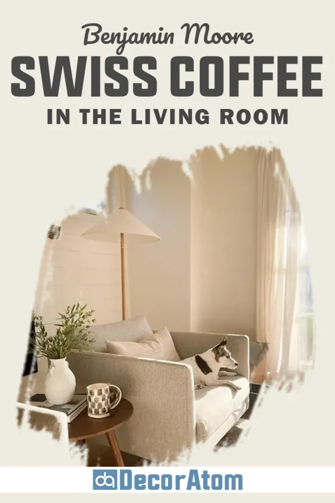
Living rooms are where Swiss Coffee really gets to show off. It’s bright in the morning, chill in the afternoon, and never looks out of place with all the random stuff (art, books, pillows) you collect.
My living room setup:
- Walls: Eggshelly shine for a bit of bounce, but no glare.
- Trim/built-ins: Want contrast? Chantilly Lace. Want modern? Go Swiss Coffee everywhere. Black window frames or dark hardware make the color pop.
- Fabrics: Oatmeal, caramel leather, denim blues, mossy green, all play nice here. Bonus points for a wild chair or cabinet in Lush AF-475.
- Stone/metal: Works with fireplaces, brass, black accents, nothing fights for attention.
Got one of those open concept spaces? This ties everything together. Just anchor it with a rug that’s got both warm and cool shades so the walls stay the relaxed backdrop.
Swiss Coffee in the Kitchen
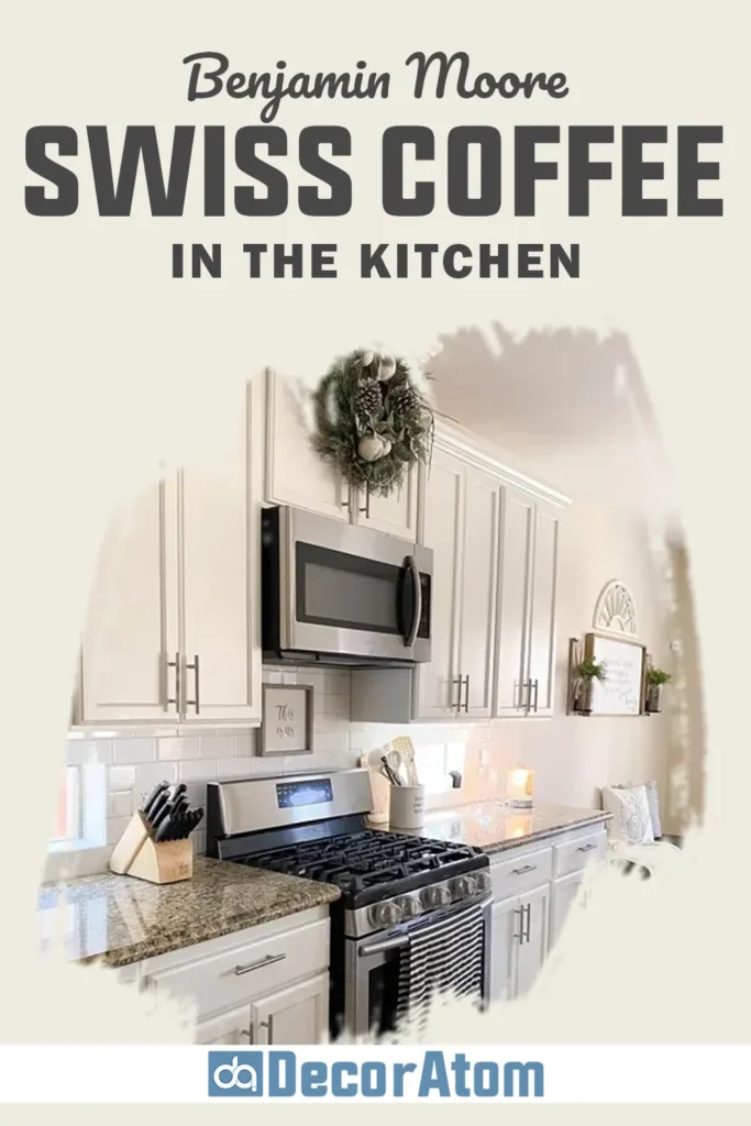
Kitchens gotta be bright, but also cleanable (hello, sticky hands). Swiss Coffee nails both. It’s warm, looks high-end, and won’t blind you like those blue-whites. Works on walls, cabinets, whatever, just pay attention to the other finishes.
My best combos:
- Walls: Matte or satin. You want to wipe ketchup off, don’t you?
- Cabinets: Swiss Coffee actually looks killer here, as long as you’re not mixing in a ton of weird undertones elsewhere. Pair with crisp white counters, quartz, marble, soapstone all work. For extra spice, paint your island Newburg Green or Hale Navy.
- Tile/counters: White subway with warm grout, ivory zellige, or soft taupe stone. Steer clear of icy gray counters unless you’re after a basement vibe.
- Metals: Unlacquered brass, brushed nickel, or even black hardware for some definition.
If you’ve got those harsh, cold LEDs, Swiss Coffee might look blah. I stick with 2700K or 3000K bulbs so it stays cozy, not cafeteria.
Swiss Coffee in the Bathroom
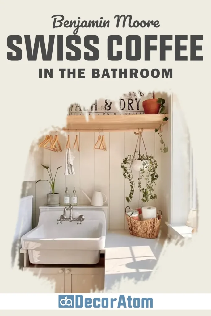
Bathrooms = shiny surfaces. Tile, mirrors, all that jazz. Swiss Coffee somehow keeps it from feeling like a dentist’s office. Bonus: everybody looks better in the mirror.
My go-to routine:
- Walls: Satin for baths you actually use (so you can scrub off toothpaste splatters). Matte or eggshell’s fine in a powder room.
- Vanities/trim: Chantilly Lace on the trim for a fresh edge, or keep it tonal with Swiss Coffee for that spa feel. Vanity in Fossil AF-65? Chef’s kiss.
- Tile: White, ivory, warm gray, makes the paint feel creamy. If your tile’s on the cold side, toss in a wood mirror or some baskets to warm it up.
- Mirrors/fixtures: Polished nickel is classic, matte black is modern. Both look right.
No window in your bathroom? Add some warm lights at face level. Swiss Coffee will feel calm, not sad and flat, even under the world’s worst overhead fixture.
Benjamin Moore Swiss Coffee For the Exterior
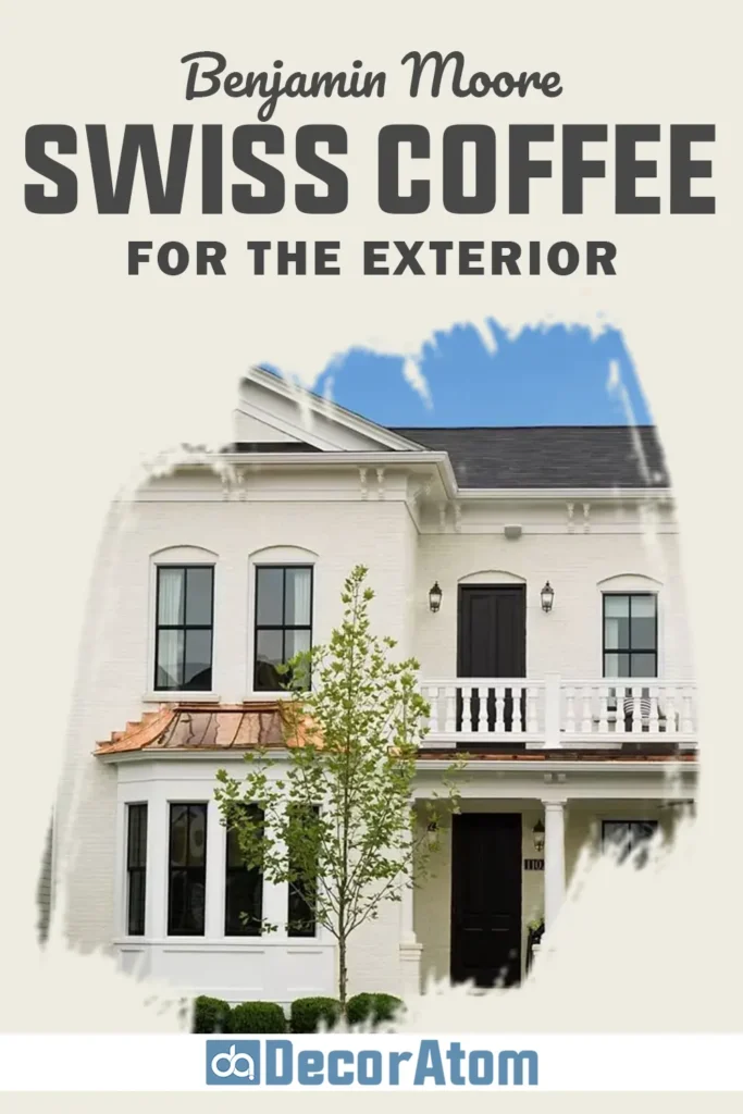
So, Benjamin Moore Swiss Coffee. On exteriors? Man, it’s a whole different beast than inside. Sun hits it and—bam, it’s way brighter. With an LRV up there around 82, you’re getting a really light look on your house, which is honestly gorgeous on those classic cottages or farmhouse styles. Makes stucco look dreamy, too, and somehow doesn’t erase all the texture.
Here’s how I roll with it:
- For the main part of the house, I’d grab a solid flat or low-sheen paint. Skip the shiny stuff unless you want your house looking like a disco ball every afternoon.
- Trim’s a tricky one. Chantilly Lace? Outside, that stuff is basically glowing. If you want it chill, keep trim in Swiss Coffee or maybe White Dove, softer, less in-your-face. Black or dark bronze windows? Chef’s kiss, you need that pop.
- Shutters or doors, I don’t mess around. I go deep. Newburg Green, Hale Navy, or Kendall Charcoal if you’re spicy. Otherwise, the whole house risks looking washed out as soon as the sun shows up.
- Roof and hardscape, yeah, don’t ignore ‘em. Match your roof first. If you’ve got warm shingles or stone, Swiss Coffee’s perfect. Cool gray roof? You need some darker accents or your walls will end up looking like melted vanilla ice cream.
Seriously, slap up some big paint samples outside. And not just one side, do all four. Morning sun, afternoon glare, cloudy day, whatever. This color does mood swings like you wouldn’t believe, especially on the south side. No one wants a surprise after painting half their house.
Why I Love Benjamin Moore Swiss Coffee
Listen, I’ve tried more white paints than I care to admit. Like, actual gallons have been sacrificed in the name of finding “the one.” And I just keep crawling back to Swiss Coffee.
There’s something about it, you know? It’s reliable as heck, but not in that dull, “I’m just here so I don’t get fined” kind of way. Some whites? Total hospital vibes, cold, clinical, straight-up soul-sucking.
Others go all jaundice on you and start looking like a banana in bad lighting. Swiss Coffee, though? Hits that Goldilocks zone, cozy and welcoming, but doesn’t make your eyeballs hurt. It’s clean, but not that icy, “don’t touch anything” clean.
You wanna talk versatility? This paint’s basically a chameleon. I’ve seen it holding its own in everything from cottagecore farmhouses to fancy modern lofts, even splashed across exteriors, and it never looks awkward. That’s rare, honestly.
Good color plays nice with everything, your ratty vintage couch, your overpriced art, the random collection of planters you keep meaning to organize. Swiss Coffee gets it.
It just hangs back and lets the other stuff shine, especially if you’ve got wood, stone, or metal going on. Bonus: the color shifts ever so slightly throughout the day, so it never gets boring. It’s like the supporting actor who low-key steals the show.
Click here to get a Peel & Stick paint sample of Swiss Coffee
My Two Cents
Picking the right white paint? Might as well be the 13th labor of Hercules. The options are endless and half of them look the same on the swatch. But Swiss Coffee actually makes life easier.
It’s creamy but not grimy, warm but not egg yolk, bright but doesn’t scream at you. Somehow it’s got enough personality to avoid being a wallflower, but it won’t hijack your whole vibe either. That’s probably why everyone’s obsessed with it.
If you want a paint that just works, like, literally everywhere, give Swiss Coffee a shot. Definitely slap a sample on your own walls first, because lighting is a sneaky little gremlin and can mess with any color.
But for me? This shade’s never let me down. It’s my MVP for making a place feel chill, timeless, and like you actually have your life together (even if you totally don’t).

