
If you’ve ever tried choosing the perfect beige paint color, you already know—it’s not as simple as it sounds.
Beige might seem like a safe, neutral choice at first glance, but dive into the Benjamin Moore collection and suddenly you’re swimming in a sea of undertones: some beiges lean warm and golden, others drift into gray, pink, or even a hint of green.
And that’s exactly what makes beige so endlessly versatile—and so easy to love.
Over the years, I’ve found myself turning to beige time and time again.
It’s the kind of color that quietly elevates a room without demanding attention.
It adds warmth, brings balance, and plays nicely with practically every design style, from modern minimalism to cozy traditional spaces.
Whether you’re refreshing your living room walls, rethinking a guest bedroom, or just craving a soft, timeless backdrop for your home, there’s a beige out there waiting for you.
In this post, I’m sharing my personal list of the 15 best Benjamin Moore beige paint colors.
So if you’re done with sterile whites or tired grays and ready for something with soul, this list is for you.
What Are Beige Paint Colors?
Beige paint colors are warm, neutral tones that typically fall somewhere between off-white and light brown.
But beige isn’t just one thing—it’s a whole world of soft, earthy hues that can include undertones of yellow, pink, gray, green, or even peach.
Some beiges lean creamy and light, others pull deeper into tan or taupe territory.
What makes a beige a “beige” is that it always carries warmth and softness, even when it’s on the cooler end of the spectrum.
It’s the kind of color that can go anywhere without overwhelming the space.
Beige might have once had a reputation for being safe or basic, but in today’s interiors, it’s become a go-to choice for designers aiming for comfort, warmth, and understated elegance.
Why Designers Love Beige Paint Colors?
Designers love beige paint colors because they offer both versatility and timelessness.
Beige acts as a neutral backdrop that allows other elements in a room—like textures, artwork, lighting, and furniture—to take the spotlight.
Unlike stark white, beige brings a touch of softness and warmth, helping rooms feel more welcoming and grounded.
Beige also plays well with a wide variety of styles, from modern minimalist to rustic farmhouse, and even traditional or coastal.
It can tone down bold design elements or warm up cooler materials like concrete, metal, or marble.
Plus, with so many undertone options—from rosy to gray to golden—it’s easy to find a beige that complements a space’s natural light and existing color palette.
Where to Use Beige Paint Colors?
Beige paint colors can go just about anywhere in your home. That’s part of their charm—they’re incredibly adaptable. Here are a few places where beige really shines:
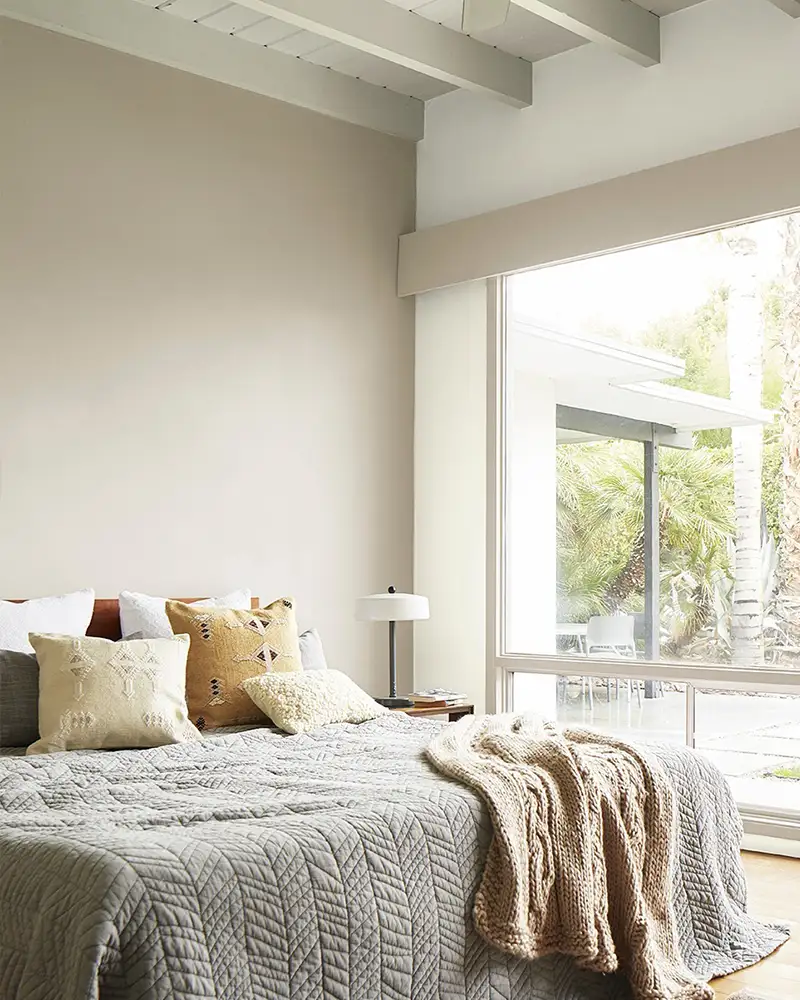
- Living Rooms: A beige wall creates a cozy, inviting feel while offering a neutral canvas for layered textiles and accent colors.
- Bedrooms: Beige adds softness and warmth, making it perfect for serene, restful spaces.
- Dining Rooms: It brings a classic, sophisticated tone that pairs well with wood furniture and warm lighting.
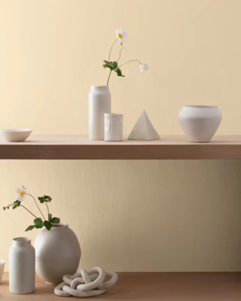
- Kitchens: Light beiges can brighten a kitchen while keeping things grounded and timeless.
- Hallways and Entryways: These transitional areas benefit from the calming, welcoming nature of beige.
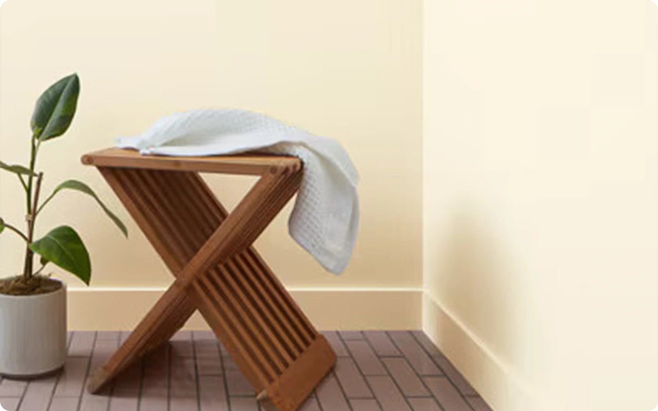
- Bathrooms: When paired with natural materials like stone or wood, beige adds a spa-like warmth that makes bathrooms feel more serene.
Colors to Pair with Beige
Beige might be neutral, but that doesn’t mean it’s boring—especially when you start layering it with other colors. Depending on the undertones of your chosen beige, here are some color pairings that work beautifully:
- Whites and Off-Whites: Crisp white trim or cabinetry gives beige a fresh, clean contrast.
- Soft Blues and Blue-Grays: These cool tones balance out beige’s warmth and add a calming, coastal feel.
- Greens (Sage, Olive, or Moss): Earthy greens bring out the natural undertones in beige, creating a cozy, grounded palette.
- Terracotta and Rust: Rich, clay-inspired tones complement warm beiges and add depth and warmth.
- Charcoal or Soft Black: These deeper accents offer drama and sophistication, especially when beige is used as a backdrop.
- Blush or Dusty Rose: Pink-toned accents enhance rosy or peachy beiges and add a romantic, soft touch.
When you pair beige thoughtfully, it transforms into something rich, layered, and unexpectedly beautiful.
What Is The Most Popular Benjamin Moore Beige Paint Color For 2025?
While trends shift every year, Benjamin Moore’s Shaker Beige HC-45 continues to lead the way into 2025.
This classic warm beige is loved for its balance—it isn’t too yellow, too gray, or too pink.
It feels timeless, elegant, and inviting, making it a favorite for both homeowners and designers who want a neutral with presence.
What sets Shaker Beige apart in 2025 is its adaptability to today’s layered, natural interiors.
Whether it’s paired with warm woods, natural stone, vintage rugs, or sleek modern accents, it brings a soft warmth that never feels heavy.
It’s the kind of beige that works in both traditional and transitional homes, and it holds its color beautifully under a range of lighting conditions.

How To Choose The Best Beige Paint Colors?
Choosing the best beige paint color isn’t just about picking one that looks good on a swatch—it’s about finding the right tone for your space. Here’s how to narrow it down:
1. Pay Attention to Undertones
Some beiges have yellow undertones, others lean pink, peach, or gray. Hold up swatches in your space and compare them—undertones become much more obvious in natural light.
2. Consider the Lighting in Your Room
Natural light changes everything. North-facing rooms tend to cool down beige, often highlighting gray or pink undertones. South-facing spaces bring out warmth and can make a beige feel more golden or creamy. Always test your samples on all four walls at different times of the day.
3. Think About Your Existing Finishes
If you have warm-toned flooring, beige with golden undertones might work better. Cooler countertops or tile might be better complemented by a more greige-based beige.
4. Decide How Bold or Soft You Want It to Feel
Lighter beiges like Muslin or Tapestry Beige feel soft and breezy. Deeper options like Lenox Tan or Dark Beige bring warmth and contrast. Choose one that fits the mood you’re trying to create.
5. Test Before You Commit
This step is essential. Paint large sample swatches or use peel-and-stick samples to see how the beige looks in real life, under your lighting, and with your furniture.
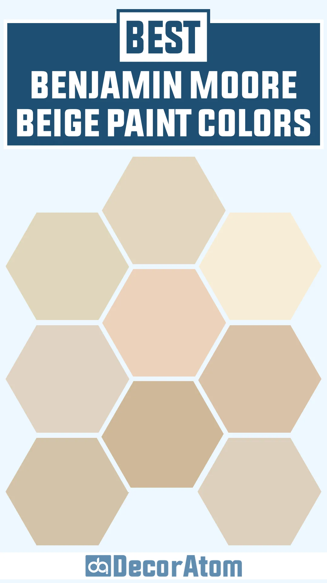
Top 15 Benjamin Moore Beige Paint Colors
Here are my favorite Beige paint colors from Benjamin Moore to decorate with.
1. Shaker Beige HC-45

Shaker Beige has been a staple in the Benjamin Moore world for good reason.
It’s a warm, balanced beige that leans slightly toward tan without veering too yellow or too gray.
I’ve always appreciated how versatile it is—it doesn’t scream for attention, yet it anchors a room in warmth and timeless charm.
With soft red and orange undertones, it works beautifully in traditional or transitional homes, especially paired with crisp white trim.
In north-facing rooms, it still holds its warmth without feeling flat.
2. Lenox Tan HC-44
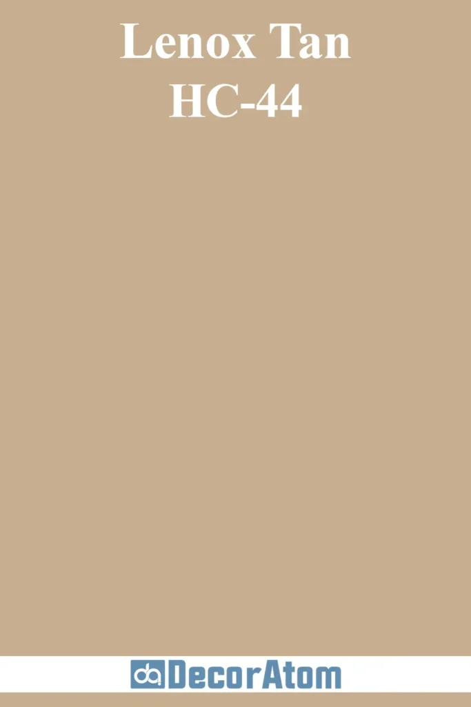
If you’re looking for a beige that leans into a richer, deeper feel, Lenox Tan brings that lived-in elegance.
This shade reads as a darker beige with golden-brown undertones that give it a classic, heritage vibe.
It looks especially stunning in formal spaces like dining rooms or home offices where you want to create depth without going full brown.
Under warm lighting, Lenox Tan glows beautifully; in cooler light, it deepens and feels grounded, not muddy.
3. Stone House 1039
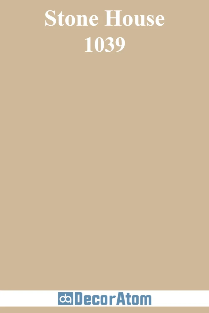
Stone House is one of those warm beige shades that somehow manages to feel soft and cozy without leaning too yellow.
It has a touch of pink and brown in its undertone that keeps it from feeling too cold or too golden.
It’s a favorite in bedrooms and open-concept spaces because it brings in a mellow comfort that feels timeless and welcoming.
I love how it pairs with natural materials—think oak floors, linen fabrics, and woven baskets.
4. Manchester Tan HC-81

Manchester Tan is a lighter, more muted beige that has a refined elegance to it.
It’s often thought of as a greige-beige hybrid because of its subtle green-gray undertones.
This is the beige to choose when you want something that feels fresh and clean but still warm.
It doesn’t overwhelm a space and looks especially beautiful in rooms with lots of natural light, where it takes on an almost creamy softness.
It’s perfect for whole-house use if you’re leaning into classic or coastal vibes.
5. Bennington Gray HC-82
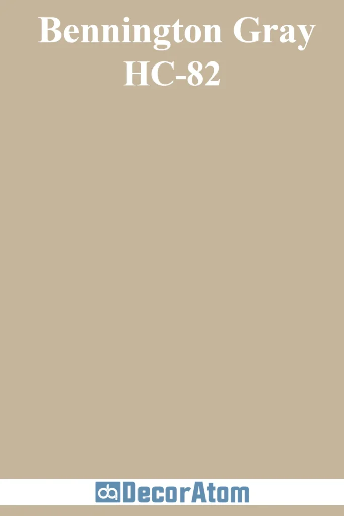
Don’t let the name fool you—Bennington Gray is very much a beige, just one with quiet sophistication.
It has that gentle crossover into taupe territory thanks to soft gray undertones, but it still carries enough warmth to be considered beige.
I like how it adds subtle contrast when used with bright white trim or paired with natural stone elements.
It feels grown-up and calm, great for living rooms, bedrooms, or any space where you want softness with a little structure.
6. Grant Beige HC-83
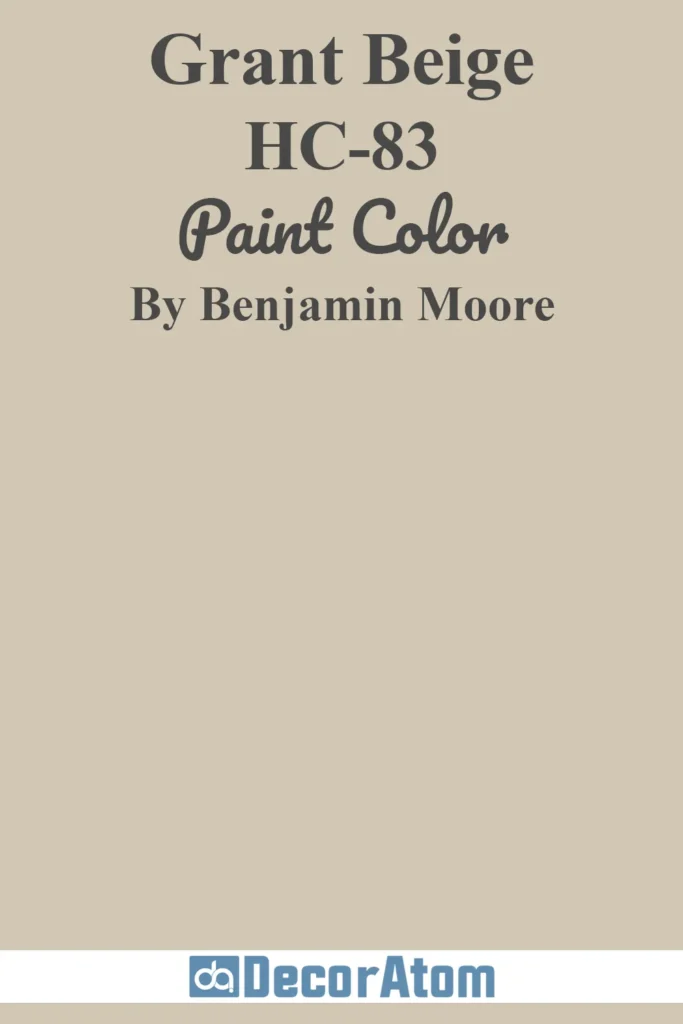
Grant Beige is one of those unicorn neutrals that manages to sit perfectly between warm and cool.
It leans warm but has just enough gray to keep it modern and not too creamy.
It doesn’t have the yellow or pink undertones that some beiges do, which makes it super flexible in nearly any lighting.
In south-facing rooms, it brightens up; in cooler light, it still holds steady without turning too dull.
It’s a go-to backdrop for layering textures and tones.
7. Tapestry Beige 975
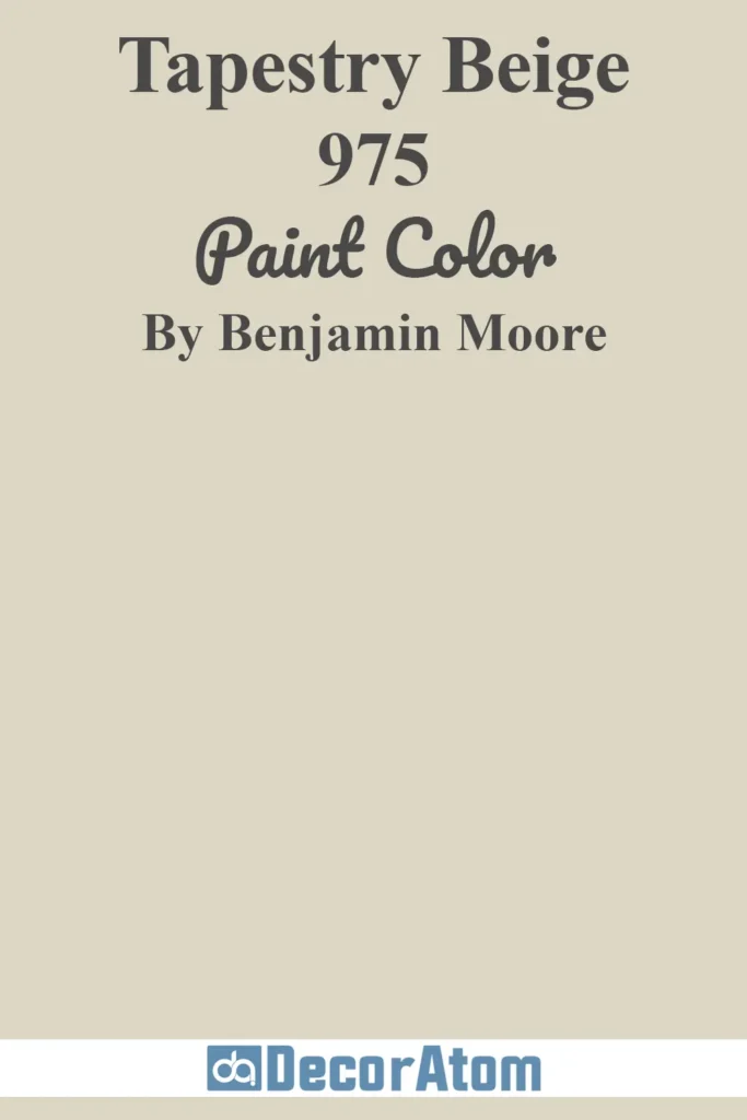
Tapestry Beige is light, airy, and quietly elegant. It has a gentle pink-beige undertone that adds warmth without overwhelming the space.
This one thrives in rooms with soft natural light—think bedrooms, reading nooks, or even a peaceful home office.
It plays nicely with soft whites, muted greens, and warm metallics like brushed brass or copper.
If you’re looking for a beige that adds a whisper of color and a lot of softness, this is it.
8. Dark Beige 2165-40
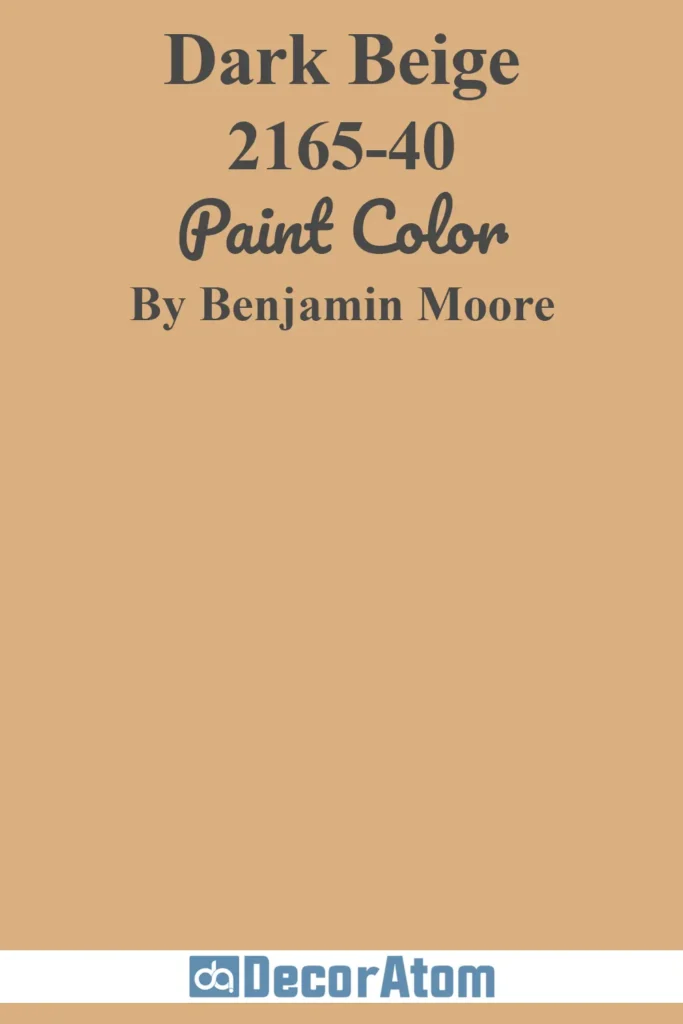
True to its name, Dark Beige is a deeper, richer version of the classic beige, with golden and brown undertones that feel grounded and earthy.
This shade brings a sense of coziness and depth, especially in larger rooms or open spaces where you want to create warmth without going full brown.
It pairs beautifully with natural textures like wood and leather.
It also makes a great accent wall if you’re playing with layers of neutral tones.
9. Adobe Beige 1128
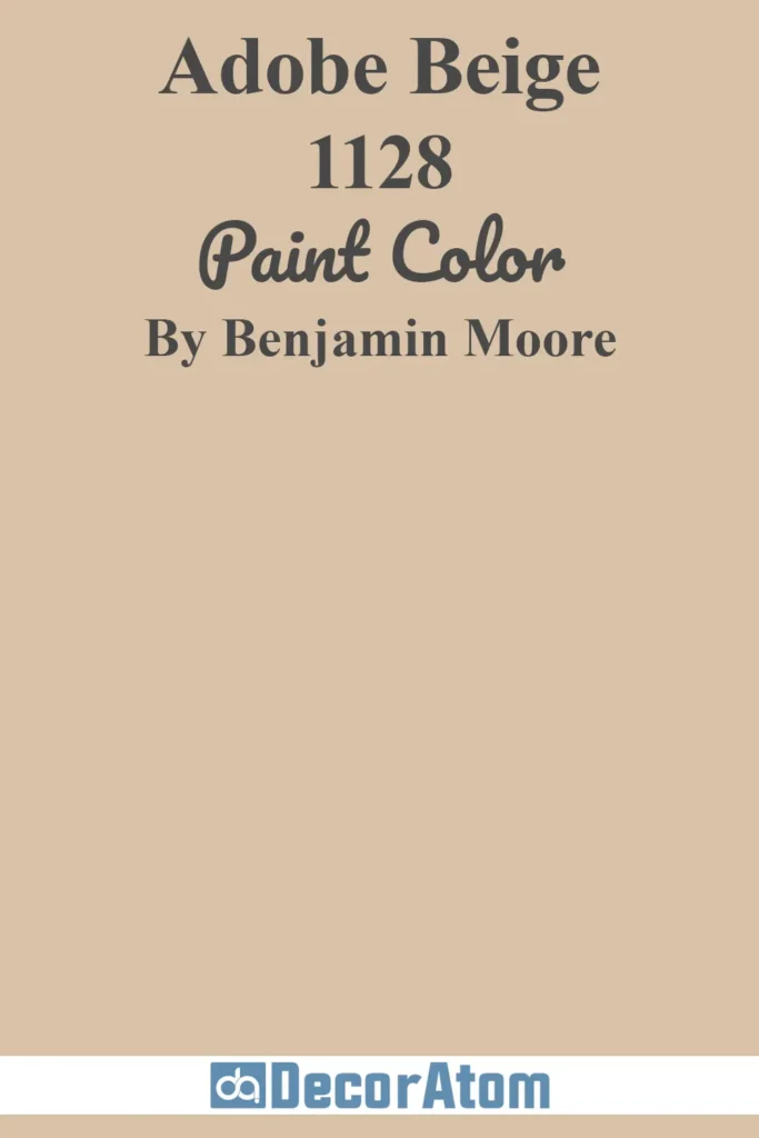
Adobe Beige has a sunbaked warmth that immediately makes me think of desert landscapes and cozy southwestern charm.
It leans into peachy-tan territory, but not in a dated way—it feels earthy and warm, with a natural softness that makes it stand out.
This color is especially beautiful in rooms with a lot of natural light, where its undertones get a chance to glow.
It’s a great pick for a warm, rustic kitchen or a cozy, boho-inspired living space.
10. Byrd Beige 1032

Byrd Beige is one of those underrated shades that deserves a lot more attention.
It’s a classic beige with subtle golden undertones, giving it a gentle warmth that doesn’t overpower.
It’s soft and inviting, perfect for open-concept homes or anywhere you want a seamless, neutral backdrop.
I love how it works with both modern and traditional furnishings—it adapts effortlessly and never feels stale.
11. Bar Harbor Beige 1036
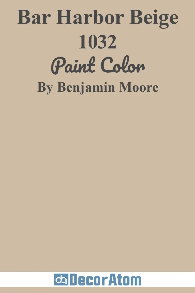
Bar Harbor Beige offers a mellow, creamy tan feel that lands somewhere between beige and khaki.
It has slightly green undertones, which give it an earthy, grounded vibe.
This makes it ideal for homes that use a lot of natural wood tones, especially oak, maple, or walnut.
In brighter spaces, it takes on a softer look, while in lower light, it deepens just enough to create a cozy feel without going too dark.
12. Sheraton Beige HC-57
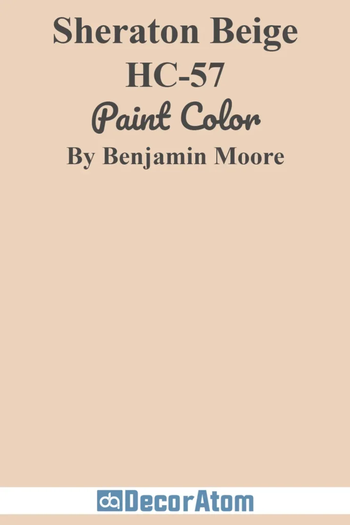
Sheraton Beige is another flexible neutral that walks the line between tan and taupe.
Its subtle red undertones give it just a touch of warmth, which adds a cozy dimension to living rooms or entryways.
It works beautifully with both warm and cool palettes, and I especially love how it pairs with deep blues or crisp whites.
It feels traditional, but not outdated—just timeless and well-grounded.
13. Muslin 1037

Muslin is a soft, breathable beige that almost reads as an off-white in brighter spaces.
It’s airy, barely-there, and perfect when you want a whisper of warmth without strong undertones.
There’s a faint pink-beige undertone here, which adds just enough depth to keep it from feeling flat.
It’s one of my go-to picks for minimal, cozy spaces like serene bedrooms or calm entryways. Light and breezy, but not cold.
14. Bleeker Beige HC-80
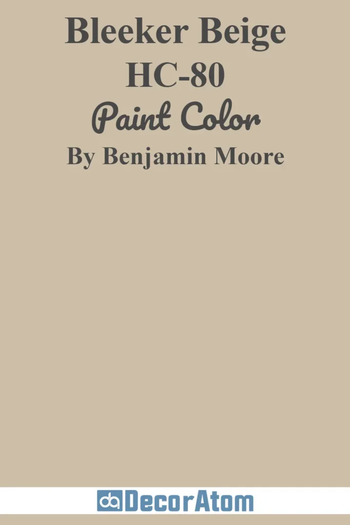
Bleeker Beige is warm and grounded, with a noticeable green-gray undertone that gives it a touch of sophistication.
It’s not your average beige—it has an old-world elegance that works particularly well in more traditional or historic homes.
I find it especially beautiful in dining rooms or offices where you want a bit of weight and structure without going too dark.
It also balances well with crisp white or off-white trim.
15. Antique White 909
Antique White is soft, creamy, and full of quiet charm. It’s one of those warm whites that leans enough into beige territory to count here.
With a gentle yellow-beige undertone, it brings a sunny glow to any space—especially those that need a little warming up.
It’s perfect for creating a cozy, cottage-inspired look, especially when paired with wood accents and natural textiles.
This shade feels like a hug from a vintage quilt—comforting, gentle, and oh-so-inviting.