
Beige is one of those colors that never really goes out of style.
It quietly anchors a space with its warmth, versatility, and subtle elegance.
Over the years, beige has shaken off its old reputation as “boring” or “builder-grade” and transformed into one of the most sought-after neutral palettes for modern homes.
From cozy cottages to sleek contemporary interiors, beige has found its way into just about every room.
In this post, I’m sharing 15 of the best Behr beige paint colors—from soft off-whites to richer, moodier tones.
Whether you’re painting a whole room or just looking for the perfect warm neutral accent, there’s something here that will work beautifully in your home.
What are Beige Paint Colors?
Beige paint colors are warm neutrals that fall somewhere between white and brown, often with undertones of yellow, gold, gray, or even pink.
What makes beige so unique is its ability to shift slightly depending on lighting and surrounding colors—sometimes it looks creamy and soft, other times more earthy and rich.
Beige isn’t just one color—it’s a spectrum. Some beiges are almost off-white, like Behr’s “Linen White,” while others lean deeper and toastier, like “Harvest Brown.”
The unifying factor is warmth. Beige brings comfort and subtle depth to a room without overpowering the space, making it ideal for walls, trim, cabinetry, and more.
Why Designers Love Beige Paint Colors?
Designers love beige for its flexibility. It works with nearly every design style—from traditional to modern farmhouse, coastal to contemporary.
Beige is a grounding color; it doesn’t compete with furniture, artwork, or textiles.
Instead, it enhances them. It makes a room feel welcoming and cohesive, especially when layered with natural materials like wood, linen, or leather.
Designers also appreciate the wide range of undertones beige offers—whether they’re going for something warm and golden, soft and creamy, or cool and taupe-like, there’s a beige that fits the vibe. Plus, beige has a timeless quality.
It’s not trendy in the way bold colors are—so when you paint a room beige, it tends to stay fresh and classic for years.
Where to Use Beige Paint Colors?
The short answer: just about anywhere. Beige is one of the most versatile paint colors, and it can work beautifully in living rooms, bedrooms, dining areas, bathrooms, and even kitchens.
For open-concept homes, beige is a great go-to for creating flow from one space to the next.
It also shines in spaces that get a lot of natural light, where its warm tones can truly come to life.
In darker rooms, beige adds coziness without making things feel too heavy.
Lighter beige tones are ideal for ceilings, trim, and cabinets, while deeper beiges can add contrast on feature walls or built-ins.
Whether you’re painting an entire space or just want to warm up a neutral palette, beige can do it all.
Colors to Pair with Beige
Beige plays incredibly well with a wide range of colors. If you’re going for a soft, serene look, pair beige with whites, creams, and pale grays for a layered neutral palette.
For something warmer and cozier, pair beige with terracotta, rust, mustard, or olive green.
If you’re leaning into a modern style, beige and black create striking contrast—especially when paired with brass or matte finishes.
Beige also complements natural textures beautifully: rattan, wood tones, woven textiles, and stone all look richer next to a warm beige backdrop.
And if you’re looking for a little pop? Dusty blue, sage green, or even blush can add just enough personality without overwhelming the beige foundation.
What Is The Most Popular Behr Beige Paint Color For 2025?
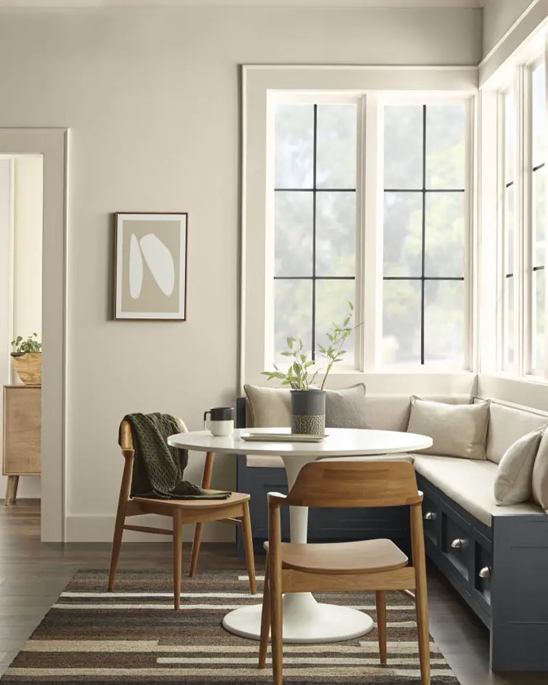
For 2025, Blank Canvas (DC-003) continues to lead the way as Behr’s most popular beige paint color—and for good reason.
It strikes that perfect balance between creamy warmth and clean elegance.
As a warm off-white with beige undertones, it’s ideal for anyone who wants a soft, versatile backdrop that still feels fresh.
It’s also incredibly adaptable across different styles, from boho to minimalist.
Designers love it because it reflects light beautifully, works well in both small and large spaces, and provides a neutral canvas for furniture, décor, and art.
How To Choose The Best Beige Paint Colors?
Choosing the best beige for your space comes down to three main things: lighting, undertone, and purpose.
Start by thinking about the natural light in your room.
North-facing rooms tend to make colors look cooler, so you might want a warmer beige with golden undertones.
South-facing rooms can handle both warm and cool beige tones, depending on the mood you’re going for.
Then, consider undertones—some beige paints lean yellow, pink, or gray. The best way to spot this is by sampling a few swatches side by side and seeing how they change throughout the day.
Finally, think about what kind of look you’re after. Lighter beiges like Swiss Coffee and Linen White are perfect for open, airy spaces.
Deeper tones like Harvest Brown or Baja add cozy depth and are great for accent walls or moody rooms.
Don’t forget to test your top picks in your space—paint a large sample on the wall and observe it over a couple of days before committing.
Top 15 Behr Beige Paint Colors
Here are my favorite Beige paint colors from Behr to decorate with.
1. Blank Canvas (DC-003)

Blank Canvas is Behr’s 2023 Color of the Year, and honestly, I can see why it keeps showing up in beautiful interiors.
This soft, creamy beige leans just warm enough to feel cozy, but it still reads clean and neutral.
It’s the kind of color that makes your space feel effortless and uncluttered—like a fresh start, just as the name suggests.
I love it for living rooms and bedrooms where you want calm, inviting vibes.
It also pairs beautifully with organic textures like rattan, linen, and unfinished wood.
If you’re after that warm minimalist look, Blank Canvas is your best friend.
2. Swiss Coffee (12)

Behr’s Swiss Coffee is one of those timeless colors that designers and homeowners return to again and again.
It’s not quite white, not quite beige—somewhere in between, with a soft golden warmth that gives it a lived-in, welcoming feel.
I’ve seen it used on everything from walls to trim to kitchen cabinets, and it works every time.
It’s especially pretty in north-facing rooms where cooler light might wash out brighter whites.
If you love a classic, warm interior with just a touch of vintage charm, Swiss Coffee belongs on your shortlist.
3. Antique White (23)
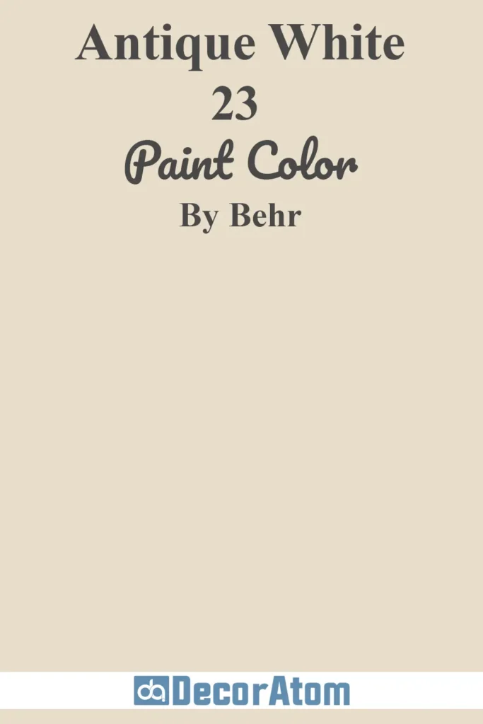
Antique White brings a touch of elegance without going overboard.
It has creamy undertones that lean slightly yellow, giving it a subtle glow—like candlelight in the late afternoon.
This is a great beige option for more traditional spaces or homes with rich wood tones and vintage furnishings.
It softens a room without making it feel too “vanilla.”
I also like it for trim and ceilings if you’re using deeper beige tones on the walls.
4. Off White (73)
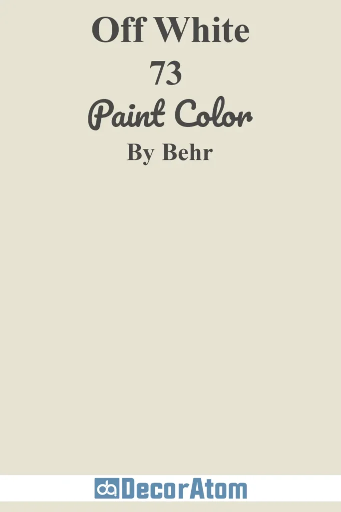
Off White is one of those quietly reliable neutrals. It’s warmer than a stark white but still reads light and airy.
There’s just enough beige in it to take the edge off, making it great for open-concept spaces or homes where you want everything to flow.
It doesn’t compete with other colors, so it works well if you have bold furniture or artwork.
Think of it as the backdrop that lets your personality shine.
5. Navajo White (22)
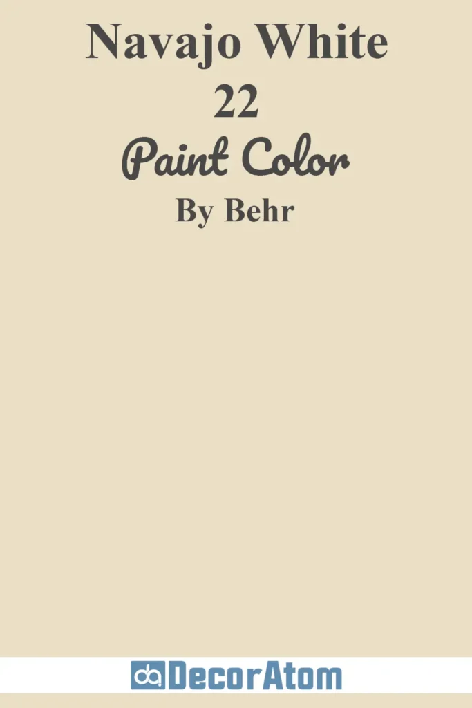
If you’re drawn to earthy, southwestern vibes, Navajo White might speak to you.
It has a distinctly creamy undertone with a subtle yellow-beige warmth that feels sunny and grounded.
It’s a beautiful choice for cozy family rooms or anywhere you want that warm desert-inspired palette.
I especially love pairing it with terracotta, olive green, or dusty blue—it brings out a whole new dimension in the color.
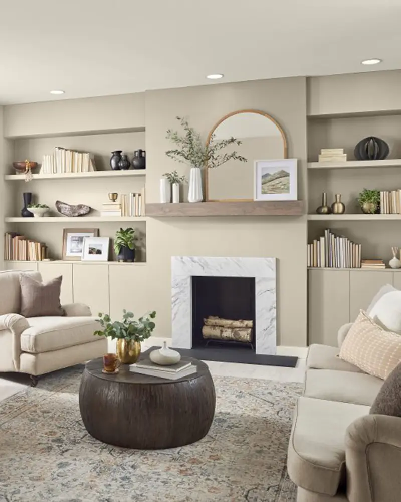
6. Baja (PPU7-08)
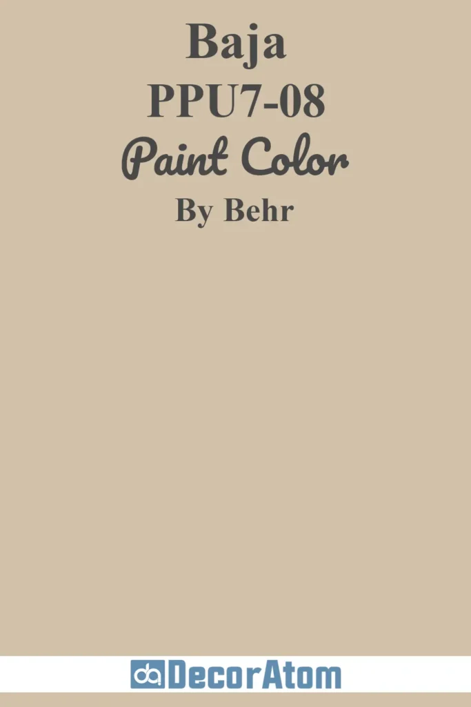
Baja is deeper and a bit more saturated than your average beige.
It has a sandy, sunbaked tone that gives a room depth and warmth without leaning too brown.
I think of this as a modern alternative to taupe—it’s neutral but has enough body to stand on its own.
It looks stunning in a dining room with black accents or in a bedroom paired with creamy whites and woven textures.
7. Plateau (PPU4-08)
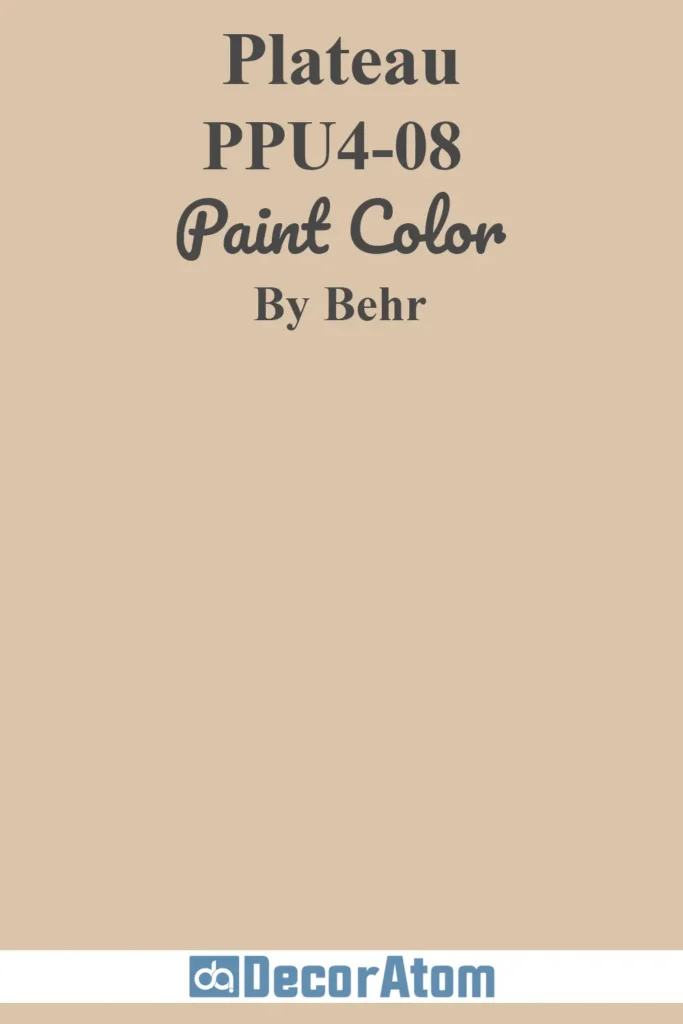
Plateau strikes that perfect balance between warm and grounded.
It has soft brown-beige undertones that feel a little more masculine and tailored than some of the lighter beiges.
It’s an excellent wall color if you want to anchor a space without making it feel dark.
In a home office or study, it brings a sense of focus and calm.
Add leather chairs, warm metals, and olive green for a moody, grounded palette.
8. Linen White (70)
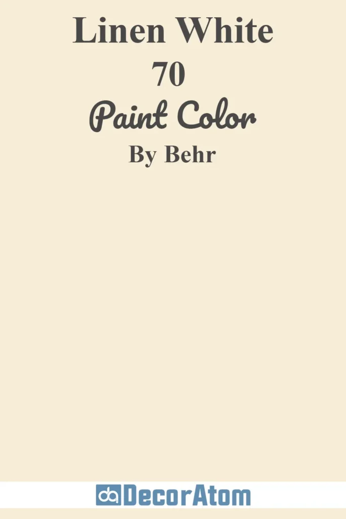
Linen White is airy, light, and gently warm—like a summer breeze through linen curtains.
It’s more off-white than beige, but that warm undertone gives it just enough depth to avoid feeling sterile.
This is a great whole-house color if you’re chasing that soft, organic look.
It pairs beautifully with light oak floors, soft sage accents, and woven materials like jute or seagrass.
9. Cottage White (13)
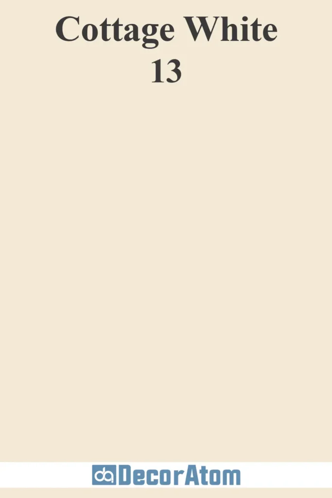
Cottage White leans into charm and nostalgia with its soft, creamy tone.
It feels like an old farmhouse wrapped in sunshine.
There’s a quiet coziness to this color that makes it ideal for kitchens, breakfast nooks, or anywhere you want to evoke warmth and comfort.
Pair it with beadboard, vintage hardware, or floral fabrics and you’ve got instant cottagecore magic.
10. Spanish Sand (OR-W07)
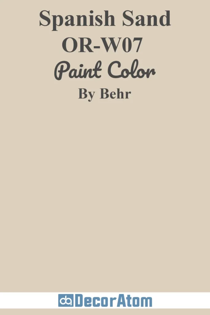
Spanish Sand brings a rich, golden warmth to the beige family.
It’s a little deeper and toastier than some of the others on this list, making it a standout for living rooms or hallways that need more depth.
The undertone is almost caramel-like, which adds elegance without feeling too dark.
I’ve seen this color work beautifully with warm grays and rich blues—it’s a grounding color that still feels sunny and uplifting.
11. Even Better Beige (DC-010)
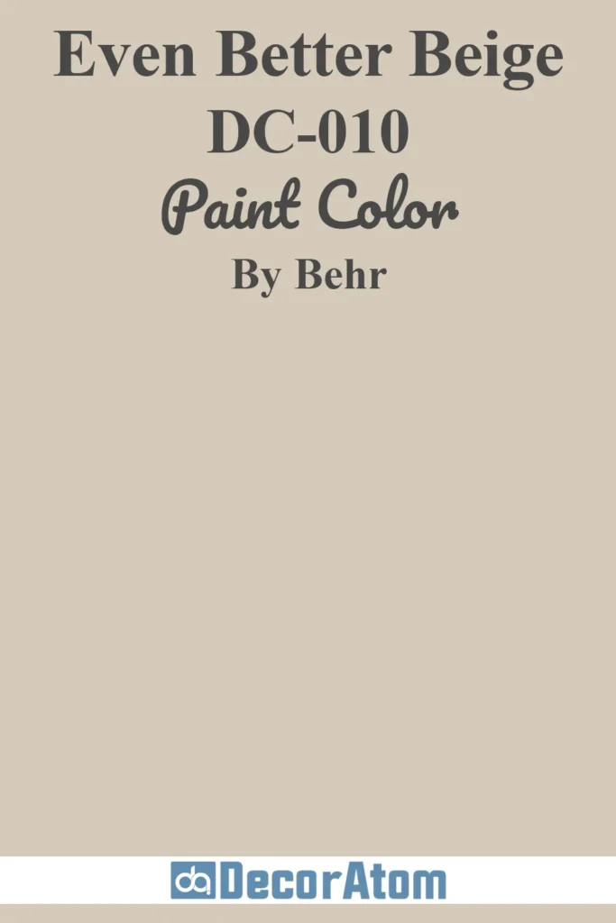
Even Better Beige lives up to its name—it’s that just-right beige that doesn’t lean too yellow, pink, or gray.
It’s truly neutral but still warm and comforting, which makes it incredibly versatile.
I’d recommend it for a nursery, guest room, or main living space if you want something serene and universally appealing.
It plays well with practically any accent color, which is part of its magic.
12. Aged Beige (PPU7-09)
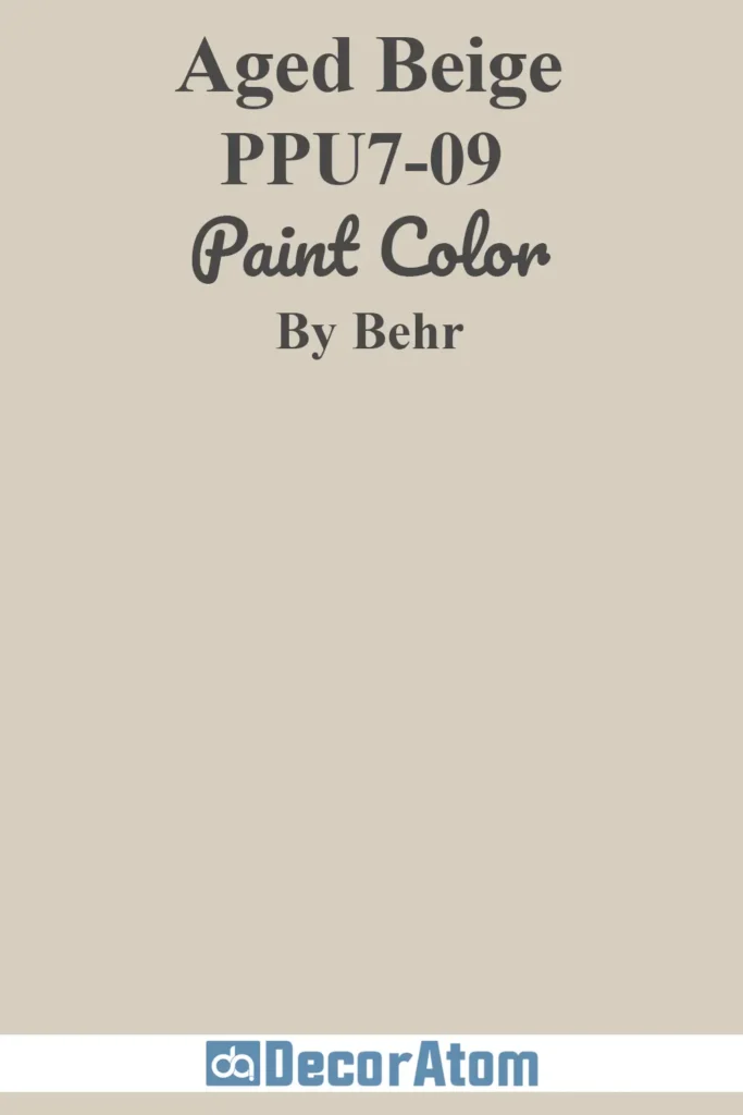
Aged Beige has a little more history in its tone—it feels mellow, slightly weathered, and incredibly homey.
There’s a muted elegance to it that works well in more traditional or transitional homes.
Think crown molding, antique furniture, and woven area rugs.
It brings a cozy familiarity that instantly makes a space feel lived in—in the best possible way.
13. Sentimental Beige (YL-W13)
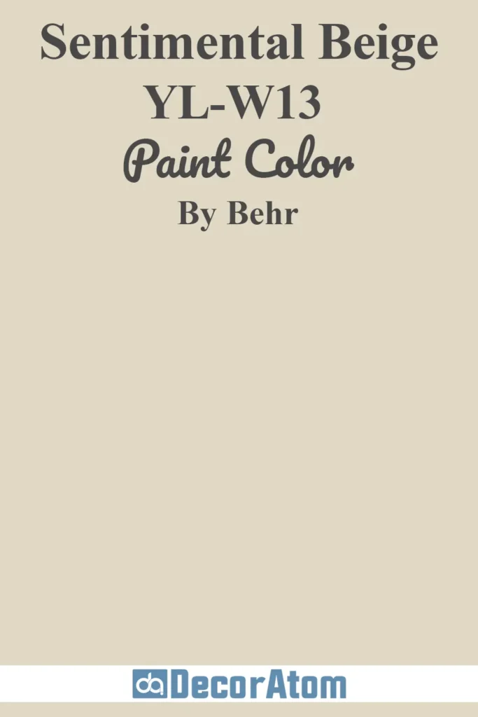
Sentimental Beige is soft, nostalgic, and comforting. It leans ever so slightly pink-beige, which gives it a subtle rosiness that feels inviting.
This color feels especially appropriate in bedrooms or quiet sitting areas where you want a tender, warm atmosphere.
Pair it with creamy whites, soft blush, or dusty lavender for a romantic color palette that still feels grown-up.
14. Harvest Brown (710D-4)
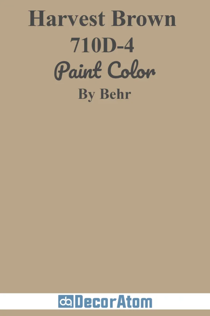
Harvest Brown sits at the darker end of the beige spectrum.
It has a toasty richness that feels like autumn in a paint color—warm, grounded, and deeply inviting.
I love it for accent walls, cabinetry, or even entire rooms if you’re going for a cocooning effect.
It’s a color that pairs incredibly well with brass, deep green, or crisp white trim to create contrast and depth.
15. Creamy Mushroom (PPU5-13)
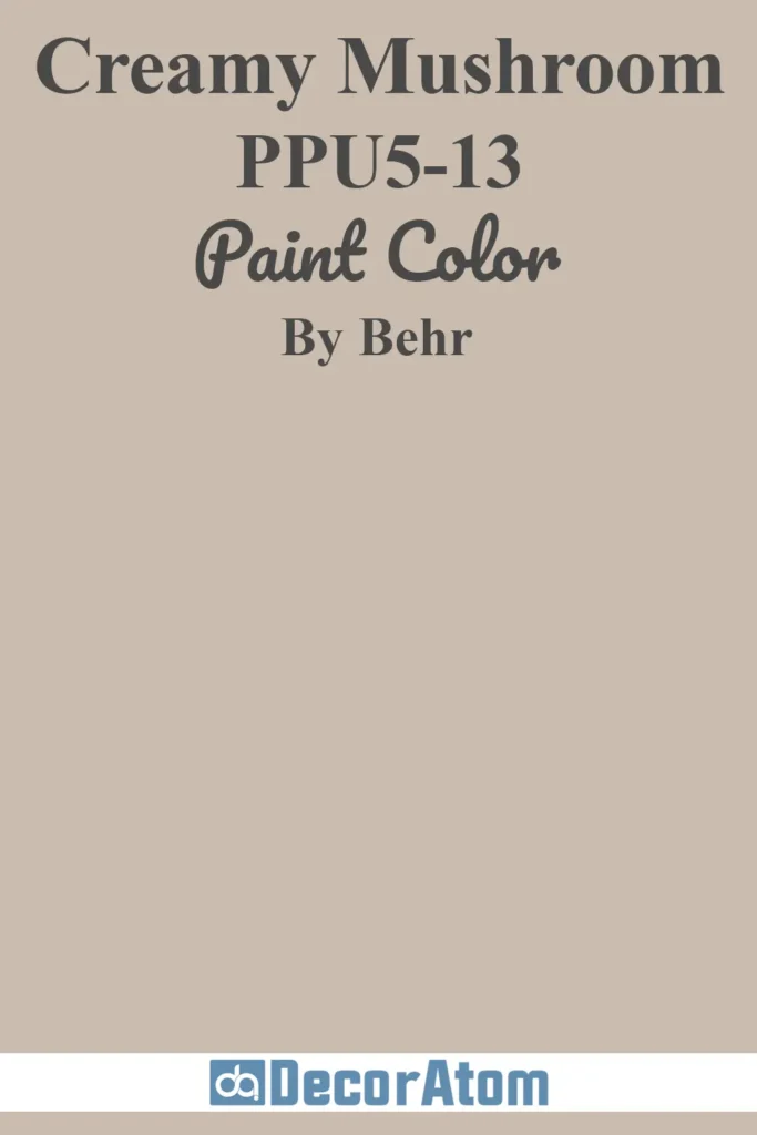
Creamy Mushroom is that earthy taupe-beige that’s having a serious moment.
It has just enough gray to feel modern, but enough warmth to stay cozy.
I especially love this shade in kitchens or bathrooms—it has that soft, organic quality that feels grounded but elevated.
Pair it with matte black fixtures, creamy countertops, or wood cabinetry for a timeless, on-trend palette.