
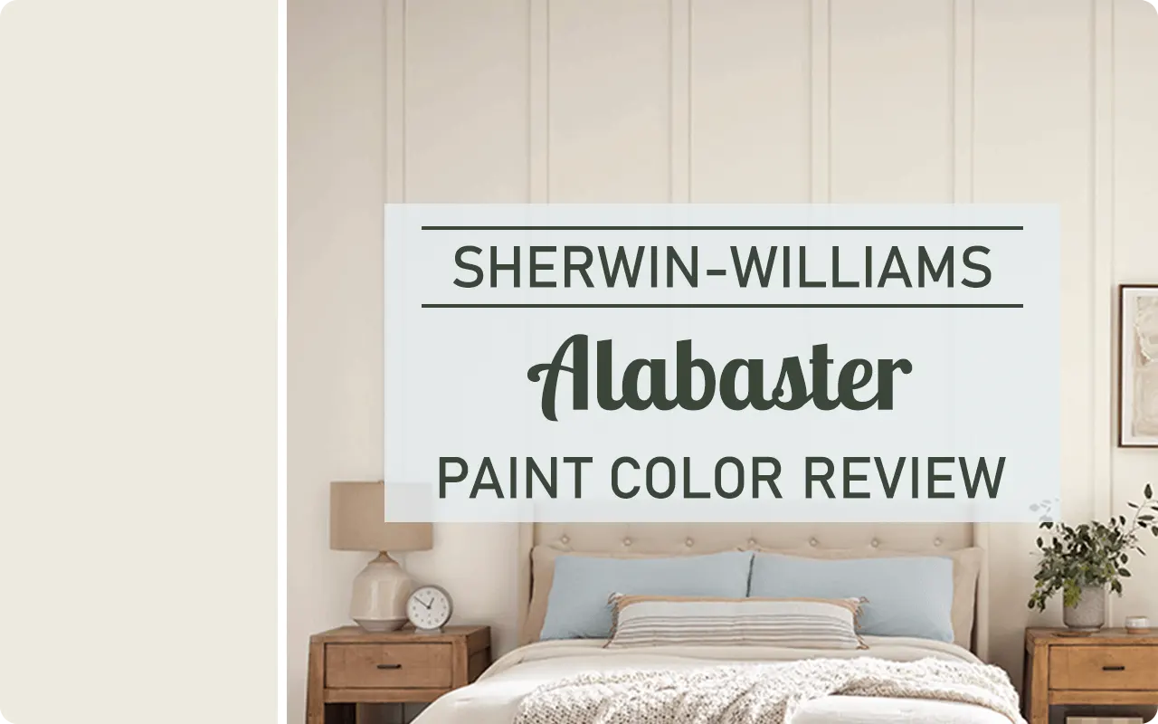
Alright, let’s get real about Sherwin-Williams Alabaster SW 7008. If you want a soft white that doesn’t scream “hospital hallway” or “I live inside a refrigerator,” this paint’s basically your soulmate. Seriously, it’s got that rare magic where a room feels homey and timeless, but not like you’re trapped in a sepia Instagram filter.
I’ve slapped this color on so many walls, trim, cabinets, even a bathroom once when I was feeling wild, and honestly, I keep coming back to it. There’s just something about the vibe. It never looks yellow, never goes dingy. It’s like the Goldilocks of white paint: not too cool, not too warm, just right.
*This post contains affiliate links. For more details see my full disclosure.
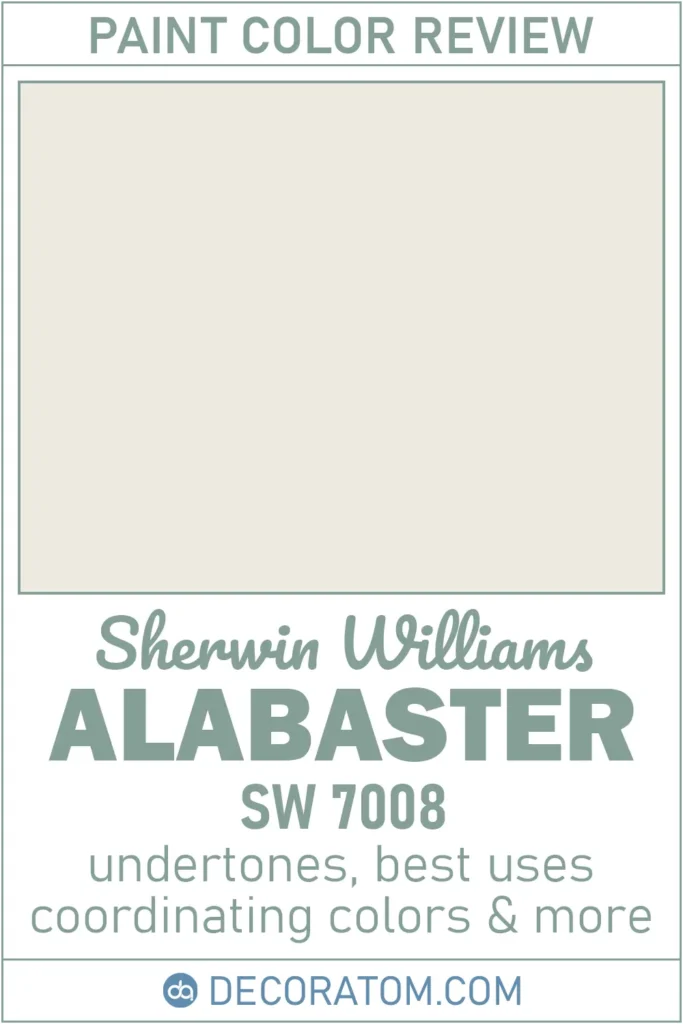
What Color is Sherwin Williams Alabaster SW 7008?
Picture actual alabaster stone, soft, a little creamy, kinda elegant, zero drama. That’s the inspiration. It’s not that harsh “blank page” white, but it won’t make you feel like you’re inside a butter churn, either. It’s got this chill, welcoming feel. Clean, but not so clean you’re afraid to touch anything.
Alabaster has a tiny bit of warmth to it. Not the kind that screams “banana pudding,” more like “fresh linen with a hint of sunshine.” It’s great if you want a space to look polished but still livable. Like, you can actually have pets and kids and not stress out.
How to Know if a Paint Color Is Right for You?
Would you like to sample Alabaster paint color? I recommend using Samplize. They offer 9”x14.75”” peel-and-stick paint swatches that make testing colors super simple. Just stick it on your wall, move it around if needed, and when you’re done, peel it off and toss it. No mess, no cleanup. It’s quick, easy, and way more convenient!

💥🎁 Christmas & Year-End Deals On Amazon !
Don't miss out on the best discounts and top-rated products available right now!
*As an Amazon Associate, I earn from qualifying purchases.
Advantages of using peel and stick paint samples:
- EASY TO USE: Simply move your SAMPLIZE paint sample around the room to test under a variety of lighting conditions.
- AFFORDABLE: Budget-friendly solution and no more buying inaccurate swatches, rollers, wasted paint.
- SUPER FAST DELIVERY: Depending on your location, 1 day delivery is possible.
- ORDER FROM HOME: Save a trip to the store looking for samples.
- NO MESS: SAMPLIZE uses real paint samples with zero-mess
- NO WASTE: No leftover cans or wasted paint.
Is It a Warm or Cool Color?
Alabaster is warm, no question. But don’t panic, your walls won’t turn yellow. It’s more of a soft, beige-y undertone, which keeps it feeling cozy. Cooler whites can look…well, cold. Like, “IKEA showroom in January” cold. Alabaster sidesteps all that. It just feels grounded, like your favorite sweater.
Bedrooms, living rooms, bathrooms, this shade’s a chameleon. Anywhere you want to chill out and not feel like you’re in a lab.
LRV of Sherwin Williams Alabaster SW 7008
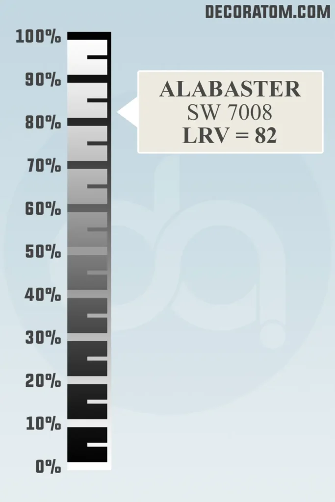
LRV means Light Reflectance Value, which is basically, “How much light does this color bounce around?” Scale goes 0 (black hole) to 100 (blinding white). Alabaster clocks in at 82, which is up there, but not so much that you need sunglasses inside. So, it’ll brighten up a room, but not in an “oops, I painted everything with liquid paper” way.
Color Family
Technically, it’s in the white family, but honestly, it’s like the cool cousin who actually brings something to the party. Some whites are icy, some look like sour cream, Alabaster chills right in the middle. It’s got warmth, but not too much. You can pair it with pretty much any color palette, warm, cool, whatever. That’s why, if you ask around, tons of people (myself included) swear by it.
RGB Colors
If you get all starry-eyed over hex codes and RGB values, here’s the scoop:
- R: 237
- G: 234
- B: 224
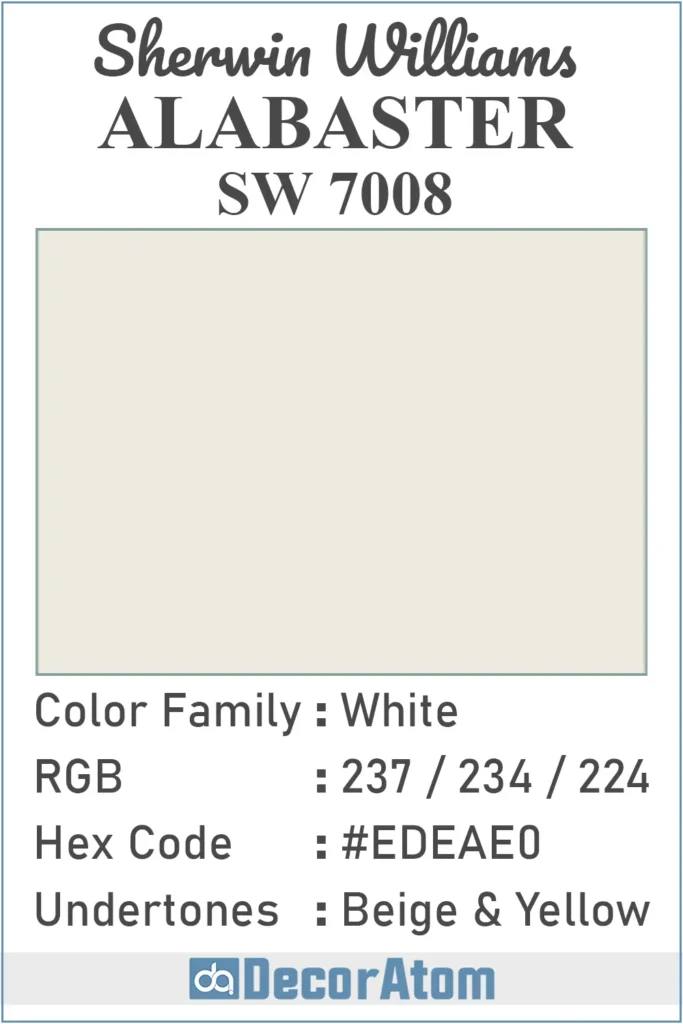
Hex Value
If you’re working on a digital mood board or using design software, you’ll want to know Alabaster’s hex value, which is #EDEAE0.
This six-digit code represents the color in web and graphic design, and it matches perfectly with what you see on your walls in real life, soft, creamy, and calming.
Undertones of Sherwin Williams Alabaster SW 7008
This is where a lot of whites mess up, but Alabaster nails it. The undertones are beige and a hint of yellow, but super chill, not “I spilled curry on the wall” yellow. That’s what makes it so adaptable. In daylight? It looks clean and fresh, never hospital-ish. In dimmer rooms, the cozy vibes turn up a notch, and it almost glows. It’s like your walls are giving you a soft hug.
Honestly, that’s why it works with so many styles, modern, traditional, farmhouse, you name it. Chameleon mode: activated.
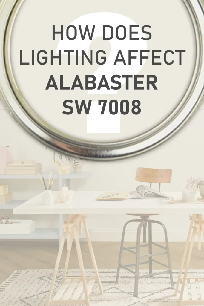
How Does Lighting Affect Sherwin Williams Alabaster?
💥🎁 Christmas & Year-End Deals On Amazon !
Don't miss out on the best discounts and top-rated products available right now!
*As an Amazon Associate, I earn from qualifying purchases.
Lighting totally changes the game. Tons of sunlight? Alabaster looks bright, but still soft. In darker rooms, those warm undertones start to shine, so things feel more snug and intimate. Artificial light? Cool bulbs might bring out a faint gray, but warm bulbs just amp up the inviting, creamy feel.
Bottom line: Alabaster’s the kind of paint that plays nice no matter what you throw at it. North-facing, south-facing, whatever, you can count on it not to betray you. Which, let’s be honest, is more than you can say for most “trendy” paint colors out there.
What Trim Colors Go with Sherwin Williams Alabaster?
Choosing the right trim color for Sherwin Williams Alabaster (SW 7008) can elevate the overall look of your space. Alabaster is versatile and pairs beautifully with a range of trim colors, depending on the style and mood you want to achieve. Here are some excellent options:
1. Bright White Trim: For That Fresh, Snappy Look
If you want to keep things looking crisp (like, toothpaste-ad crisp), go for a true white trim. Alabaster on the walls, Extra White (SW 7006) or the cult-fave Chantilly Lace (OC-65) on trim, chef’s kiss. The white trim makes Alabaster’s soft warmth pop, and it’s a go-to for anyone obsessed with modern, clean lines. Minimalists and Instagram home tour people, this one’s for you.
2. Matchy-Matchy: Alabaster on Everything
Okay, hear me out: just slap Alabaster on the trim too. Monochrome can be seriously chic. It’s seamless, it’s quiet, and it’s kind of classy in a “I definitely hired an interior designer” way. The trick here? Switch up the finish, do a satin or semi-gloss on the trim, and a matte or eggshell for the walls, so it’s not totally flat and boring. You get a little texture, a little light play, and no clashing undertones anywhere.
3. Creamy or Off-White Trim: Soft & Cozy Feels
Not feeling stark white? No problem. Try an off-white or creamy trim instead. Sherwin Williams Ivory Lace (SW 7013) or Westhighland White (SW 7566) are both solid picks. They’re still light, but bring a bit more softness and depth. It’s a look that works in those “curl up with a book and a cup of tea” kind of rooms, think farmhouse, cottagecore, or anything with shiplap.
4. Darker Trim: For Drama Queens (and Kings)
Alright, if you like a bit of drama (no judgement, I’m right there with you), dark trim is where it’s at. Imagine Alabaster walls with deep, moody Iron Ore (SW 7069) or Urbane Bronze (SW 7048) trim. Now we’re talking impact. Perfect for highlighting trim details or just making your space feel a bit more edgy and modern. Pro tip: this combo absolutely slaps in older homes with chunky moldings.
5. Natural Wood: Warm, Earthy, Unbothered
Got wood trim? Lucky you. Alabaster is basically made for pairing with wood, doesn’t matter if it’s a pale oak or something rich like walnut. The warmth in Alabaster pulls out the natural tones in the wood, giving your space that earthy, “I do yoga and eat granola” vibe. Rustic, boho, or just not into painting your trim? You’re golden.
Colors Similar to Sherwin Williams Alabaster
Let’s be real, Alabaster is a crowd-pleaser. But, maybe you want to see what else is out there, maybe your lighting is weird, or you just don’t want the same color as everyone on Pinterest. Fair enough.
Alabaster sits right in that sweet spot: it’s warm without looking yellow, soft but not dingy. If you want something similar, you’ve got options. Some are a touch warmer, some a little brighter. Mixing these up is handy if you want the rooms to flow but not look like you bought paint in bulk.
Here’s a quick hit list of shades that’ll give you those same easy, timeless vibes:
- Sherwin Williams Snowbound SW 7004
- Sherwin Williams Greek Villa SW 7551
- Sherwin Williams Westhighland White SW 7566
- Sherwin Williams Pure White SW 7005
- Benjamin Moore White Dove OC-17
- Benjamin Moore Simply White OC-117
- Benjamin Moore Cloud White OC-130
- Benjamin Moore Swiss Coffee OC-45
Honestly, you can’t go wrong with any of these. If you’re still unsure, just grab a few samples and slap ‘em on the wall, you’ll know what feels right when you see it in your own space. Trust your gut (and maybe your lighting).
Colors That Go With Sherwin Williams Alabaster SW 7008
Let me just say, Alabaster is like the Swiss Army knife of paint colors. Seriously, this shade is stupid versatile, it’s that soft, warm white everyone’s always hunting for but rarely finds. Whether you want your walls to vibe as a subtle backdrop or you’re going for an all-out statement, Alabaster’s got your back.
Now, picking colors to go with it? That’s all about the mood, right? Wanna crank up the cozy? Toss in some earthy neutrals, think wheat, tan, even those buttery warm grays. If you’re itching for a little more edge (but not “I live inside an aquarium” levels), muted blues or chill sage greens bring just enough contrast without punching you in the face.
In living rooms, Alabaster plus tan or a wheat-y beige? Timeless. Warm grays? Grown-up but not boring. If you’re more into that fresh, coastal thing, pair it with soft greens or faded blues and suddenly, you’re Martha Stewart. It just plays nice with everyone, darker tones for depth, mid-tones for that layered, curated look. Not too stark, not too yellow. Just right.
Bottom line: Pick the right sidekicks, and Alabaster’s gonna look even fancier. My faves? These are always a win:
6 Colors That Just Work:
- Sherwin Williams Townhall Tan SW 7690
- Sherwin Williams Dakota Wheat SW 9023
- Sherwin Williams Comfort Gray SW 6205
- Sherwin Williams Accessible Beige SW 7036
- Sherwin Williams Sea Salt SW 6204
- Sherwin Williams Intellectual Gray SW 7045
Where to Use Sherwin Williams Alabaster SW 7008?
Alright, confession: I’ve slathered Alabaster everywhere, bedrooms, bathrooms, the outside of a house, you name it. Every single time? Still obsessed.
Here’s how it shakes out in different spots around the house:
Sherwin Williams Alabaster in the Bedroom
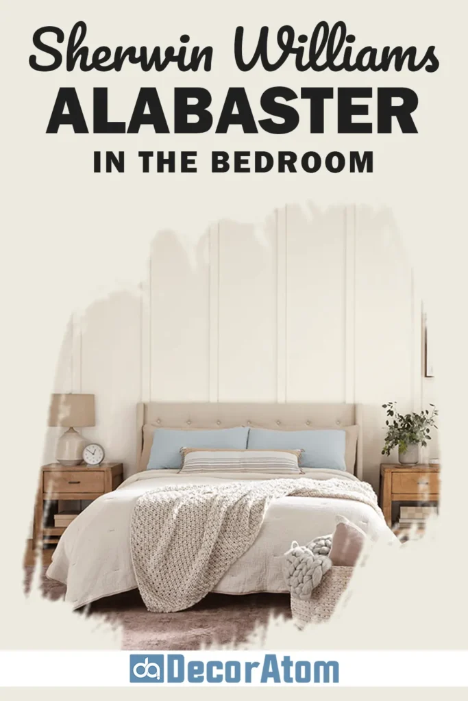
Waking up in a room painted Alabaster is like being inside one of those fancy hotel suites that makes you wanna stay in bed all day. It’s soft, glowy, never too cold or too yellow, basically, relaxing on tap.
If you’re a sucker for minimal or Scandi vibes (hello, IKEA devotees), this color is a dream with wood furniture and all those cozy textures. Even if you lean more boho or classic, Alabaster just rolls with it.
My favorite part? This color changes with the light. Mornings? It’s bright and crisp. Late afternoon? The warm undertones sneak out and wrap the place in a soft glow. It’s like two bedrooms in one. If you’re trying to turn your space into a chill retreat, this is your paint.
Sherwin Williams Alabaster in the Living Room

Let’s get real: Alabaster is basically the MVP for living rooms. Total chameleon. I’ve put it in rooms with everything from mid-century weirdness to farmhouse stuff, and it never throws a fit.
Loads of natural light? Alabaster bounces it around like a pro, your space instantly feels bigger and airier. Got a cave of a living room? It doesn’t go yellow or dingy like some so-called “warm whites.” It just…works.
Your art, your couch, your grandma’s weird throw pillows, everything pops against Alabaster. And next to crisp white trim, it’s warm but not muddy. No weird clashing. No regrets.
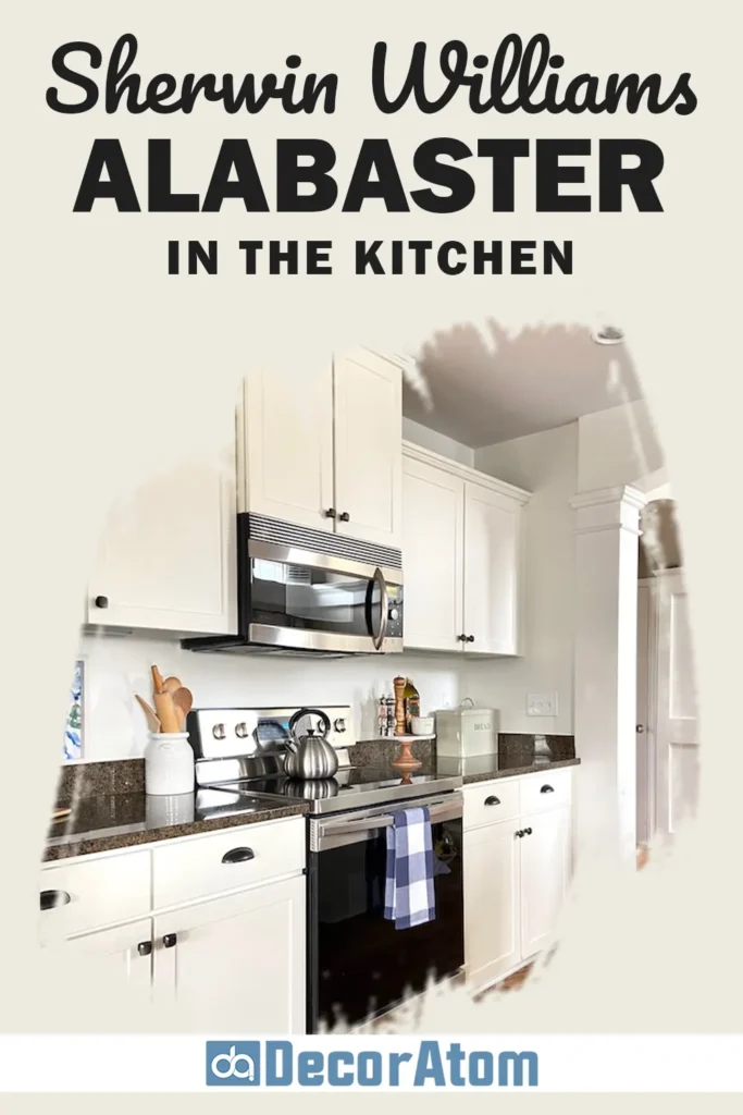
Sherwin Williams Alabaster in the Kitchen
💥🎁 Christmas & Year-End Deals On Amazon !
Don't miss out on the best discounts and top-rated products available right now!
*As an Amazon Associate, I earn from qualifying purchases.
I’m kind of obsessed with Alabaster in kitchens. You want a white kitchen that feels cozy, not like you’re prepping surgery? This is it.
On cabinets, it’s a killer alternative to those blinding, sterile whites. It vibes with marble, quartz, wood, whatever countertop you’ve got, and both gold and black hardware look sharp. I’ve even seen it on backsplashes (yeah, really), and it just works.
If you’ve got wood cabinets or open shelving, Alabaster as a wall color makes everything look lighter and brighter but not like you’re living inside a snow globe. Throw in some brass or wood accents and boom, instant Pinterest kitchen.
Sherwin Williams Alabaster in the Bathroom

Bathrooms and paint colors, man, it’s a minefield, especially with whites. If you go too cool, suddenly you’re scrubbing up in a hospital. Too warm, and it’s like someone left a yellow filter on your lens. Alabaster, though? It just gets it right.
It’s got enough brightness to keep things looking fresh and clean, but those subtle warm undertones make it feel chill, not icy. Especially when you flip on the lights and there’s not much sun coming in, Alabaster doesn’t go weird or shadowy like some other whites. It just glows, cozy but not dingy.
I’m a sucker for Alabaster in those tiny, windowless bathrooms. It doesn’t turn gloomy or sad. Instead, it bounces around enough light to trick your brain into thinking the space is bigger. Works with white subway tile, shiny nickel faucets, or even if you’ve gone wild with a bold vanity color. It’s like the little black dress of bathroom paint, always looks good, never tries too hard.
Sherwin Williams Alabaster for the Exterior
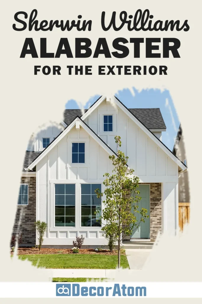
Thinking about slapping Alabaster on the outside of your house? Honestly, why not? It’s not just an indoor superstar.
Outside, Alabaster comes off as a creamy, soft white, not that blinding, sunglasses-required kind. Even when the sun’s blasting or on those gray, moody days, the color holds up. It doesn’t fade into blah or turn into a weird shade of yellow.
There’s one thing, though, outdoor light can make its warm side pop a bit more, especially at golden hour. But that’s what makes it feel homey, not like you live in an art gallery. Pair it with black shutters, rough stone, or wood accents, seriously, it’ll never look dated. It just works. You get that, “Hey, come on in!” vibe, not “Please admire my sterile, magazine-perfect house from the sidewalk.”
Comparing Sherwin Williams Alabaster with Other Colors
Picking paint is basically the adult version of “which ice cream flavor are you today?” You gotta compare a bunch of close shades to see which one feels right.
Alabaster (SW 7008) is a classic, soft white with a warm hug built-in, but people always stack it up against a few other big names before deciding. Every one of these whites has its own thing going on, undertones, brightness, the whole vibe. Some work better in certain rooms or styles than others.
Let’s break down how Alabaster stacks up next to six other crowd favorites, so you can find the one that actually fits your space (and your sanity).
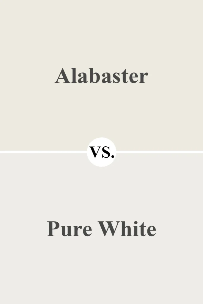
Sherwin Williams Alabaster vs Sherwin Williams Pure White (SW 7005)
💥🎁 Christmas & Year-End Deals On Amazon !
Don't miss out on the best discounts and top-rated products available right now!
*As an Amazon Associate, I earn from qualifying purchases.
If you’re after a super clean, crisp white, Pure White is usually on the mood board. Alabaster’s got those warm, beige-y undertones, while Pure White is more neutral, with just a dash of gray to keep it from going too stark.
- Brightness: Pure White’s LRV is 84, a smidge brighter than Alabaster’s 82. If you want max light bounce, go Pure White.
- Vibe: Alabaster feels cozy and welcoming; Pure White is all about that minimal, modern, almost futuristic look.
- Pairing: Pure White loves cool pals, think grays or blues. Alabaster is best friends with warm woods or earthy tones.
Sherwin Williams Alabaster vs Benjamin Moore White Dove (OC-17)
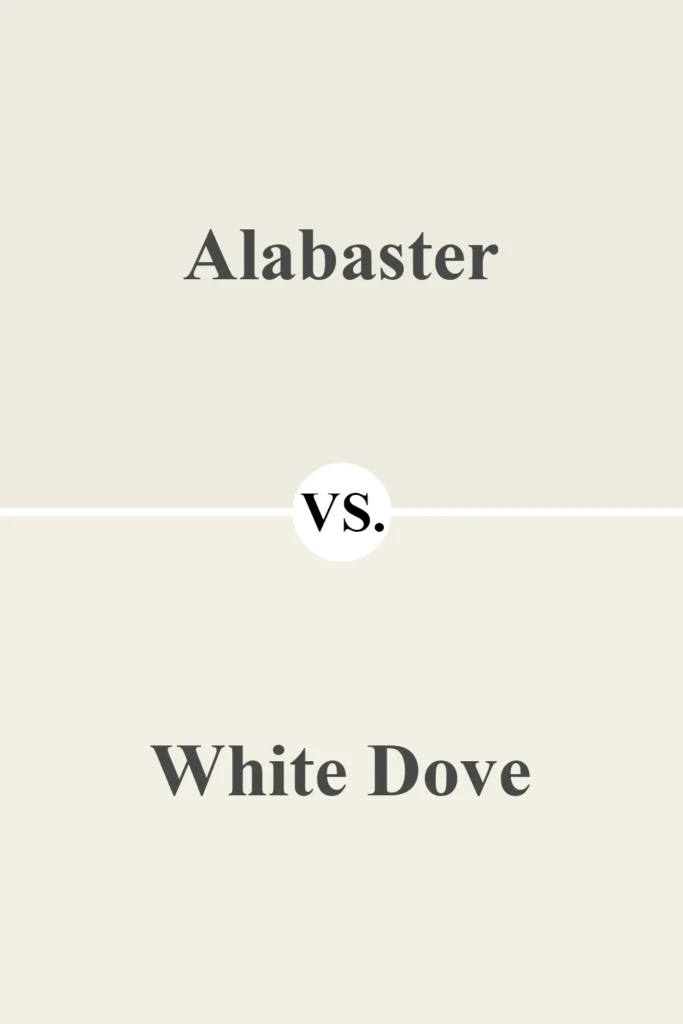
White Dove: basically the Taylor Swift of Benjamin Moore whites. Both it and Alabaster are warm, but they’re not twins.
- Undertones: Alabaster leans a bit creamier thanks to those beige vibes. White Dove slips in a hint of gray, making it feel ever-so-slightly cooler.
- LRV: White Dove wins on paper, its LRV is 85.38, so it’s technically brighter.
- Where to Use: Alabaster reads extra homey, perfect for traditional or farmhouse spaces. White Dove’s cooler side fits in with transitional or modern styles.
Sherwin Williams Alabaster vs Sherwin Williams Snowbound (SW 7004)

Snowbound is your go-to if you want that chill, modern, minimal scene.
- Undertones: Alabaster’s warm and beige. Snowbound? Cooler, with gray undertones, think more “crisp linen shirt” than “cozy sweater.”
- How It Looks: Got loads of natural light? Snowbound will look even sharper. Alabaster, meanwhile, stays soft and easy on the eyes.
- Best For: Love a cool, streamlined look? Snowbound. Want warmth and timeless charm? Alabaster’s your buddy.
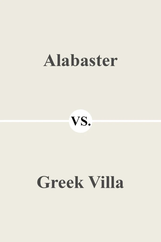
Sherwin Williams Alabaster vs Sherwin Williams Greek Villa (SW 7551)
💥🎁 Christmas & Year-End Deals On Amazon !
Don't miss out on the best discounts and top-rated products available right now!
*As an Amazon Associate, I earn from qualifying purchases.
Oh, Greek Villa, now there’s another white that always gets dragged into the “which shade of white is actually the best?” debate. And honestly, it’s pretty close to Alabaster, but there are some differences you’ll notice if you’re staring at swatches for more than five minutes (which… let’s be real, we all have).
- Warmth: Both are warm whites, but Greek Villa isn’t as beige-y as Alabaster. It’s got a little less of that creamy vibe. If Alabaster is like a vanilla latte, Greek Villa is more like plain milk, still cozy, just not as rich.
- Brightness: Greek Villa’s LRV is 84, so it bounces back more light than Alabaster. Basically, it’s a little brighter, great if you want your walls to feel like they’re glowing without going full hospital white.
- Pairing: Greek Villa is the social butterfly here, it hangs out with both warm and cool colors and somehow manages to look good with all of them. Alabaster? It’s more of a homebody, happiest surrounded by earthy, warm tones.
Sherwin Williams Alabaster vs Benjamin Moore Simply White (OC-117)

Let’s talk about Simply White for a second. People are obsessed with it for a reason. It’s like the Instagram influencer of whites, super clean, super bright, and always ready for a close-up.
- LRV: Simply White’s LRV is wild, 91.7! That’s practically glowing. If you want your room to look like it’s got its own built-in ring light, this is your paint.
- Undertones: Alabaster’s got that soft beige thing going on, so it’s warm and creamy, but Simply White skews a little yellow. Not in a “did someone spill lemonade?” way, more of a gentle, sunny warmth.
- Best Uses: Simply White kills it in modern or contemporary spaces. If you want your place to look like an Architectural Digest spread, this is your jam. But if you’re after that cozy, traditional, even rustic vibe? Alabaster’s got your back.
Sherwin Williams Alabaster vs Sherwin Williams Accessible Beige (SW 7036)

Accessible Beige kind of lives in a different zip code, but sometimes folks want to know how it stacks up against Alabaster.
- Color Family: Accessible Beige is basically greige’s cooler cousin. It’s a true beige with a hit of gray. Alabaster, on the other hand, is a soft white, so they’re not exactly twins.
- Tone: Accessible Beige is noticeably darker, think “I want my walls to feel grounded and grown-up.” Alabaster? Much lighter and airier, perfect if you like breathing room.
- Pairing: Honestly, these two are besties. Alabaster for the trim and ceilings, Accessible Beige for the walls, and suddenly your space looks like you hired an interior designer (for free).
Why I Love Sherwin Williams Alabaster
Listen, there are a million whites out there, and I’ve probably sampled half of them. Alabaster just… hits different. It’s bright, but it doesn’t blast your eyeballs. It’s warm, but not in a “did someone leave the butter out?” way. Not too yellow, not too boring.
I’ve slapped it on living room walls, bedroom trims, heck, even doors, and it never looks out of place. It’s that rare backdrop that lets your furniture and art actually pop, but it doesn’t demand attention for itself. Minimalist, maximalist, weird thrift shop chic, it all works.
And the best part? Alabaster is basically a chameleon. It plays nicely with navy, wood, sage green, or whatever other wild color you’re trying to make happen. It’s timeless, too, so you won’t wake up in three years thinking, “Ugh, what was I thinking?” This is not the avocado green of the 1970s. It’s going nowhere.
Final Thoughts
If you’re losing your mind trying to pick a soft white that’s not boring, not blinding, and actually works with your style, honestly, just go with Sherwin-Williams Alabaster SW 7008.
It’s welcoming, it vibes with everything from farmhouse to modern (yes, even coastal grandma). Those subtle undertones keep it from feeling flat, and it’s pretty much impossible to screw up. Designers are obsessed. I’m obsessed. You might be next.
Whole room, trim, cabinets, wherever you use it, Alabaster brings that chill, clean, pulled-together feel. It just works. Period.
Click here to get a Peel & Stick paint sample of Alabaster SW 7008
