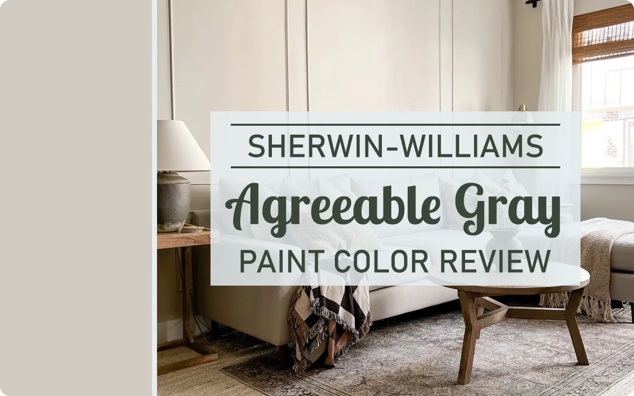
Let’s talk about one of Sherwin Williams’ most popular and talked-about paint colors: Agreeable Gray SW 7029.
If you’ve spent any time browsing Pinterest, flipping through home decor magazines, or walking through staged homes, chances are you’ve already seen this color in action—maybe without even realizing it.
It’s one of those chameleon colors that seems to work just about anywhere, and that’s exactly what has made it a go-to for designers, realtors, and homeowners alike.
For me, Agreeable Gray is that reliable, can’t-go-wrong paint color.
It’s subtle, yet sophisticated. It’s neutral, but never boring.
It brings just enough warmth to make a space feel cozy, while still staying light and airy.
I’ve seen it used in everything from newly built modern farmhouses to traditional living rooms, and it somehow feels just right in all of them.
If you’re looking for a color that can gracefully tie your whole house together or give you a clean slate for decorating, Agreeable Gray might just be what you’re looking for.
And in this post, I’m breaking down everything you need to know—from what this color actually looks like, to how it reacts in different lighting, and even why it’s such a crowd favorite.

What Color is Agreeable Gray SW 7029?
Despite the name, Agreeable Gray isn’t your typical gray. It’s actually a soft blend of gray and beige—what many call a “greige.” And it truly lives up to that description.
It sits right on the fence between gray and beige, which is part of what makes it so versatile.
In a home with cooler tones and clean whites, Agreeable Gray can lean a little more toward gray.
But if you pair it with warmer elements like wood floors or creamy trim, it reveals more of its warm, beige side.
So what does it actually look like on the wall? Think of it like a light to medium-toned neutral with a slight softness to it.
It doesn’t have the cold, sterile feeling that some grays can bring. Instead, it has this calm, welcoming vibe—like it wants to play nicely with the rest of your decor, no matter your style.
I’d say Agreeable Gray has a classic feel to it. It doesn’t scream for attention, but it definitely adds a polished, pulled-together look to a space.
Is It a Warm Or Cool Color?
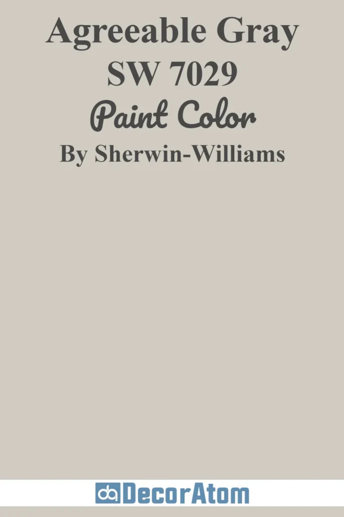
Here’s where it gets interesting. Agreeable Gray is technically considered a warm gray, but it has just enough balance that it never feels overly warm or yellowish.
It sits in that perfect sweet spot. If you’ve ever been frustrated trying to find a gray that doesn’t turn blue in daylight or beige that doesn’t go peachy—this is the kind of color that makes you breathe a sigh of relief.
Because it has a bit of beige in the mix, Agreeable Gray brings warmth to a room. But since it also has that gray backbone, it keeps things feeling grounded and modern.
It doesn’t go icy, and it doesn’t go muddy. It’s more like a subtle hug for your walls—warm enough to be inviting, but still neutral enough to stay sophisticated.
This warm undertone is part of what makes it so flexible. It works beautifully with both warm and cool decor elements.
So if you have wood floors with golden tones or brass hardware, it complements them without clashing.
And if you have stainless steel appliances or cool-toned marble, it still holds its own and doesn’t look out of place.
LRV of Agreeable Gray SW 7029
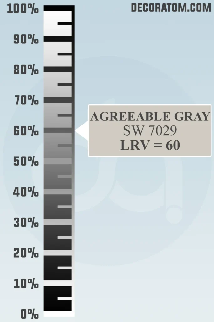
The LRV, or Light Reflectance Value, of Agreeable Gray is 60.
And if you’re not super familiar with LRV, here’s a quick breakdown in plain terms: it’s a number on a scale from 0 to 100 that tells you how much light a paint color reflects. Zero is absolute black, and 100 is pure white.
So a color with an LRV of 60 reflects a decent amount of light—enough to brighten a room, but not so much that it feels washed out.
This makes Agreeable Gray a great middle-ground choice. It has enough depth to give your walls character, but it won’t make a room feel dark or heavy.
In fact, in a room with natural light, it can actually help bounce some of that light around and make the space feel even more open.
Undertones of Agreeable Gray SW 7029
The magic of Agreeable Gray lies in its undertones.
It has warm beige undertones with just a tiny whisper of green and even a hint of purple in some lights—but don’t worry, it doesn’t actually look green or purple on the wall.
Those undertones are subtle and balanced, and they do a lot of behind-the-scenes work to keep the color from leaning too far in any direction.
These undertones are what keep Agreeable Gray feeling so, well… agreeable.
They help it stay grounded and prevent it from shifting too cool or too warm, even as lighting conditions change.
That little bit of green in the base helps neutralize overly warm tones, while the soft purple gives it that modern gray edge.
This is also what makes it play so nicely with other colors.
How Does Lighting Affect Agreeable Gray SW 7029?
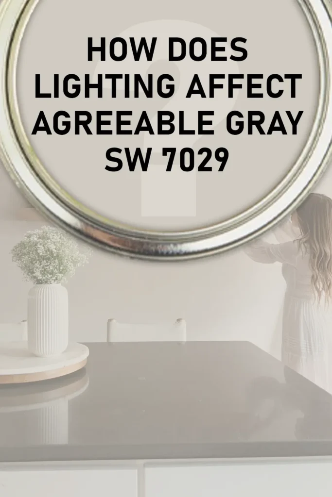
Lighting plays a huge role in how Agreeable Gray shows up in a room. In fact, this is one of those colors that shifts subtly depending on the light, but not so much that it becomes unpredictable.
It stays true to its balanced, neutral personality—but the temperature and amount of light can bring out different aspects of the color.
In south-facing rooms, where you get warm, bright natural light, Agreeable Gray tends to look its best. It leans a little warmer, showing off more of those soft greige tones. It feels cozy and inviting, but still light and airy.
In north-facing rooms, which have cooler, bluer light, Agreeable Gray can take on a slightly cooler appearance. It’ll show a bit more of its gray side, and the warmth in the beige may be more muted. It still looks great, just a bit more toned down.
In rooms with artificial lighting—like recessed lights or warm white bulbs—it holds its warmth well. Under yellow-toned bulbs, you’ll likely see more of the beige come forward. And in dimly lit spaces, Agreeable Gray can look a touch darker, but it doesn’t go dingy or muddy.
So, if you’re considering this color, I’d definitely recommend testing it out on your wall in different parts of the day. The lighting can make it feel like a slightly different color from morning to evening, but it always stays soft, grounded, and versatile.
Trim Colors to Pair With Agreeable Gray SW 7029?
When it comes to trim, Agreeable Gray plays really well with a variety of whites—but not just any white. Choosing the right trim color can make or break how Agreeable Gray looks on your walls.
Since this is a warm gray with subtle undertones, it tends to look best when paired with softer whites that have a touch of warmth, rather than stark, ultra-cool whites that can feel jarring next to it.
One of my favorite go-to trim colors to pair with Agreeable Gray is Sherwin Williams Alabaster (SW 7008). It has that creamy, soft white feel without leaning yellow.
It creates just enough contrast with Agreeable Gray to define your trim, doors, or ceilings—without being too sharp. The warmth in Alabaster complements the greige tone in Agreeable Gray beautifully.
If you prefer a brighter white that still plays nice, Sherwin Williams Pure White (SW 7005) is another solid option.
It’s a clean white with just a hint of warmth, so it keeps things feeling crisp and fresh but doesn’t clash with the warm undertones in Agreeable Gray.
For those who want a bit more contrast, something like Extra White (SW 7006) can work too, especially in modern spaces. It’s a cooler white, but still soft enough that it doesn’t feel clinical.
Colors Similar to Agreeable Gray SW 7029
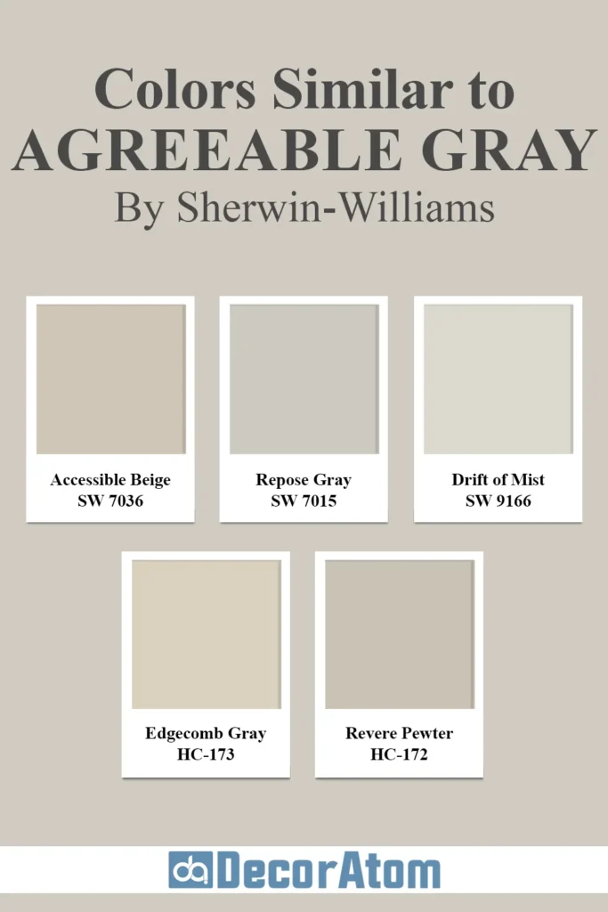
If you love Agreeable Gray but want to explore some other options—maybe to compare undertones, depth, or see if something else works better with your lighting, there are a handful of similar greige colors from both Sherwin Williams and Benjamin Moore that have that same cozy, versatile, neutral vibe.
Let’s look at five popular alternatives:
1. Sherwin Williams Accessible Beige
Accessible Beige is like the more beige cousin of Agreeable Gray. It leans warmer, with more noticeable tan undertones, especially in rooms with a lot of natural light.
If Agreeable Gray feels just a little too cool for your space, Accessible Beige might give you that extra bit of warmth without going too dark.
It’s still neutral enough to use as a whole-home color and works well in traditional or transitional interiors.
2. Sherwin Williams Repose Gray
Repose Gray is another super popular greige, but it leans slightly cooler and has more gray than Agreeable Gray. It also has a subtle violet undertone, which can peek through in certain lighting.
If you want something that’s still neutral but just a bit more modern or edgy, Repose Gray might be your winner. It pairs well with cooler accents and can give your space a more contemporary feel.
3. Sherwin Williams Drift of Mist
Drift of Mist is lighter and airier than Agreeable Gray. It’s a very soft greige with muted undertones, almost tiptoeing into off-white territory.
If you love the idea of Agreeable Gray but worry it might be too dark in your space, Drift of Mist can give you a similar look but with a little more lift and brightness.
4. Benjamin Moore Edgecomb Gray
Edgecomb Gray is Benjamin Moore’s version of a warm greige that lives in the same space as Agreeable Gray. It’s just a touch lighter and has a gentle, calming quality to it.
In certain light, it reads as a soft warm gray, and in others, it looks beige. It’s that same easy-going, do-it-all neutral, great for entire homes and open layouts.
5. Benjamin Moore Revere Pewter
Revere Pewter has been a longtime favorite in the greige world. It’s a bit darker than Agreeable Gray and has stronger green undertones.
If you want something with a little more depth and character but still want to stay in that warm gray family, Revere Pewter might be the one. It’s especially striking in rooms with white trim and wood tones.
Colors that Go With Agreeable Gray SW 7029
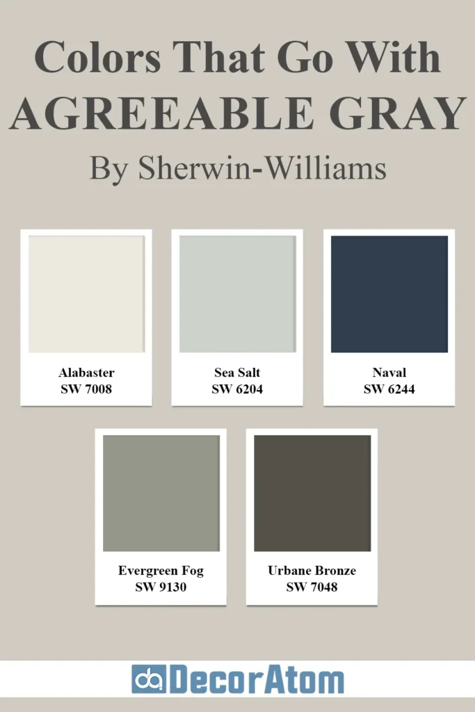
Agreeable Gray’s versatility is one of its biggest strengths—it’s like that reliable friend who gets along with everyone. Because it sits so perfectly in the middle of warm and cool tones, you can build a wide variety of color palettes around it, from soft and serene to bold and dramatic.
Here are five colors that pair beautifully with Agreeable Gray and can help you build a cohesive color story in your home:
1. Sherwin Williams Alabaster
Alabaster is a creamy, off-white that brings warmth and light to a space. It’s the perfect trim or ceiling color for Agreeable Gray, but it also works well on cabinets or accent walls if you want a subtle contrast that still feels seamless. Together, they create a soft, welcoming palette that feels calm and classic.
2. Sherwin Williams Sea Salt
Sea Salt is a muted green-blue that brings a spa-like serenity to any space. Paired with Agreeable Gray, it creates a breezy, coastal vibe without feeling overly beachy. This combo is beautiful in bathrooms, bedrooms, or any space where you want to feel relaxed and refreshed.
3. Sherwin Williams Naval
If you want to bring in some drama, Naval is a rich, deep navy that contrasts beautifully with the soft neutrality of Agreeable Gray. The two together can create a high-end, sophisticated look, especially when used with white trim and brass or gold accents. Great for dining rooms or offices where you want a bit more visual impact.
4. Sherwin Williams Evergreen Fog
Evergreen Fog is a soft green-gray with a bit of an earthy feel. It brings a natural, organic touch to a space and complements the understated warmth of Agreeable Gray beautifully. This combo works well in transitional or modern farmhouse styles and pairs nicely with wood tones.
5. Sherwin Williams Urbane Bronze
Urbane Bronze is a deep, moody bronze-gray that brings depth and contrast to lighter colors like Agreeable Gray. If you want to anchor a space with a bold accent wall, built-ins, or even kitchen cabinets, Urbane Bronze is a stunning companion. It adds that cozy, grounded feeling that makes a space feel designed and intentional.
Where to Use Agreeable Gray SW 7029?
One of the best things about Agreeable Gray is how versatile it is. I’ve seen this color work in just about every room you can think of, and it always brings a sense of calm, balance, and timelessness.
- Living Rooms – It creates a cozy, neutral backdrop that works with both traditional and modern furniture. You can layer in color through pillows, rugs, and artwork without worrying about clashing.
- Bedrooms – It gives off a soothing, relaxed vibe that helps make the room feel like a true retreat.
- Kitchens – Agreeable Gray is fantastic on walls or even kitchen cabinets. Pair it with white or off-white uppers, and you’ve got a chic, understated look.
- Hallways and Open Floor Plans – It flows effortlessly from one space to the next, which is why many people use it as their main whole-house color.
- Offices – Want something that feels professional but not cold? Agreeable Gray checks that box too. It keeps things neutral, but still warm and inviting.
- Bathrooms – Especially with whites and soft blues or greens, it helps create that clean and serene bathroom feel.
Comparing Agreeable Gray SW 7029 With Other Colors
Sometimes, you don’t realize which color is “the one” until you line it up next to something else. Comparing paint colors can help you see the subtle differences in undertones, depth, and overall mood.
Agreeable Gray gets compared a lot to other popular grays and greiges because it sits right in that neutral sweet spot—but those small differences can have a big impact on how your room feels.
Let’s break down how it stacks up against some other favorites:
Agreeable Gray vs Repose Gray
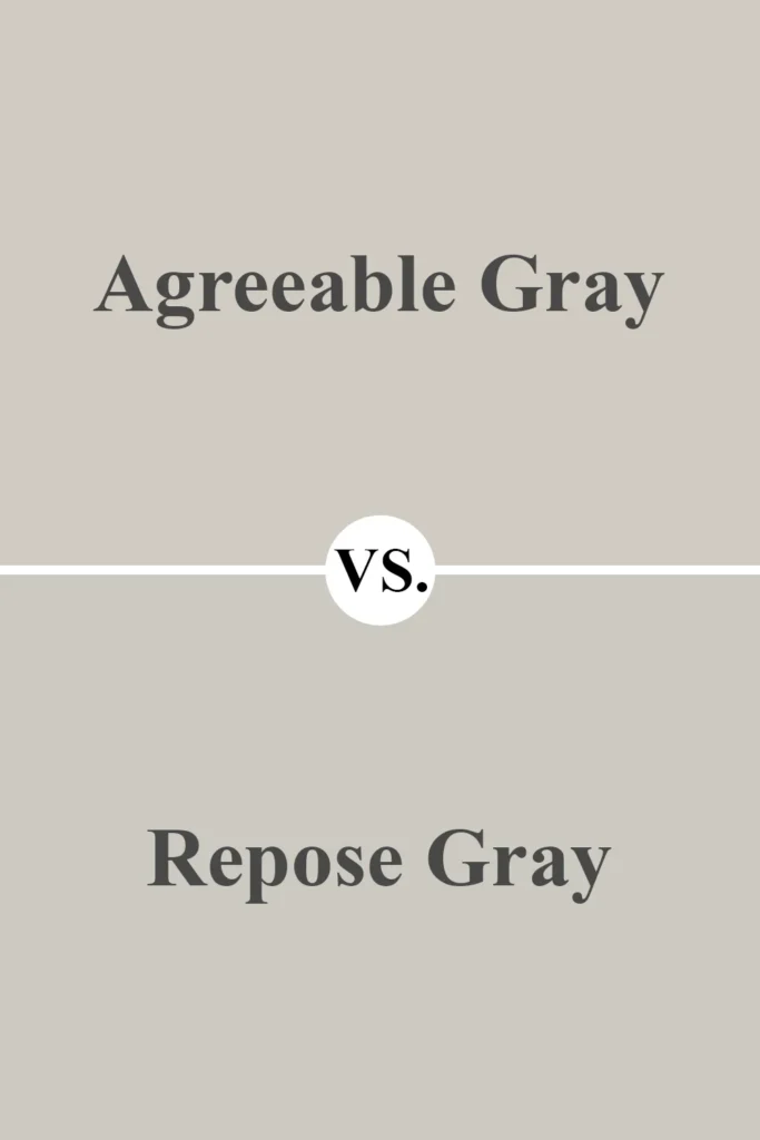
Repose Gray is slightly cooler than Agreeable Gray. It has subtle violet undertones that can pop through more clearly in certain lights, while Agreeable Gray stays more muted and balanced.
If your room has a lot of natural light and you’re looking for something just a bit more modern and cool-toned, Repose Gray might lean more your way. But for a softer, warmer vibe, Agreeable Gray wins.
Agreeable Gray vs Accessible Beige

Accessible Beige has more pronounced beige tones, making it feel warmer overall. In comparison, Agreeable Gray reads more neutral and a bit lighter.
Accessible Beige works beautifully in rooms with a lot of warm wood tones, while Agreeable Gray gives a bit more flexibility with mixed finishes and cooler accents.
Agreeable Gray vs Edgecomb Gray
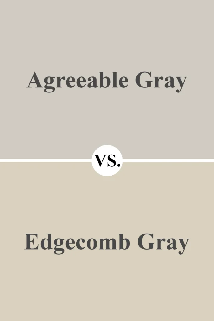
Edgecomb Gray and Agreeable Gray are quite close, but Edgecomb tends to lean just a smidge more beige. It has a lighter, softer feel and works really well in traditional spaces.
Agreeable Gray, on the other hand, has a bit more depth and leans more toward a balanced gray-beige blend, giving it a slightly more modern edge.
Agreeable Gray vs Revere Pewter

Revere Pewter is deeper and moodier than Agreeable Gray. It has stronger green undertones and can feel more earthy. Agreeable Gray feels lighter and a bit fresher, especially in smaller rooms or homes that need a brighter touch.
Revere Pewter is great for contrast and depth, while Agreeable Gray is perfect for openness and light.
Agreeable Gray vs Classic Gray
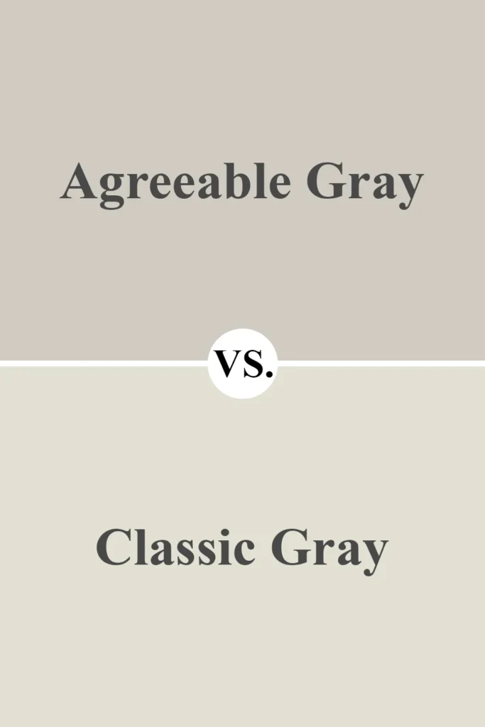
Classic Gray is much lighter and more ethereal than Agreeable Gray. It almost leans into off-white territory in bright rooms.
If you want something very soft and barely-there, Classic Gray might be it. But if you need a bit more contrast and structure to your walls, Agreeable Gray gives you that while still feeling light.
Agreeable Gray vs Drift of Mist
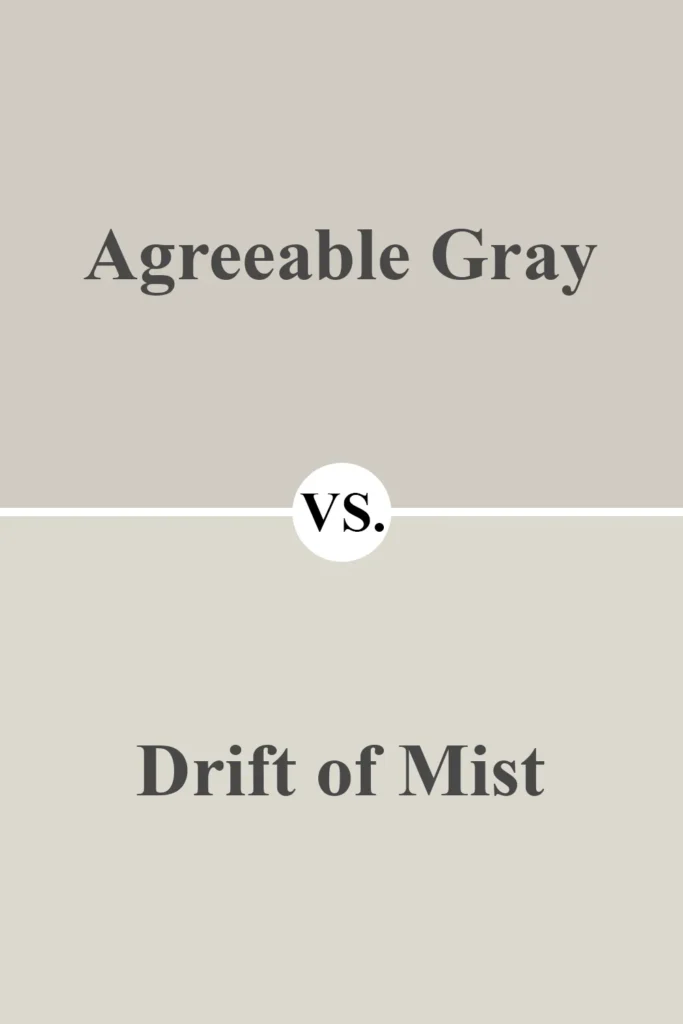
Drift of Mist is cooler, lighter, and more subdued than Agreeable Gray. It has more of a gray-white quality, while Agreeable Gray offers a bit more color and warmth.
Drift of Mist is great if you want an ultra-light, subtle look. Agreeable Gray stands out just enough to give rooms personality without overwhelming them.
Final Thoughts on Agreeable Gray SW 7029 Paint Color by Sherwin Williams
At the end of the day, it’s no surprise that Agreeable Gray has become such a household favorite.
It manages to walk that fine line between gray and beige, warm and cool, timeless and current.
Whether you’re refreshing a single room or painting an entire house, it’s one of those colors that just works.
It’s neutral without being boring, warm without being yellow, and modern without being cold.
And the fact that it plays so well with so many other colors makes it a decorator’s dream.
Honestly, if you’re stuck in the decision-making rabbit hole of paint colors, Agreeable Gray is a solid, safe choice that you’re unlikely to regret.

