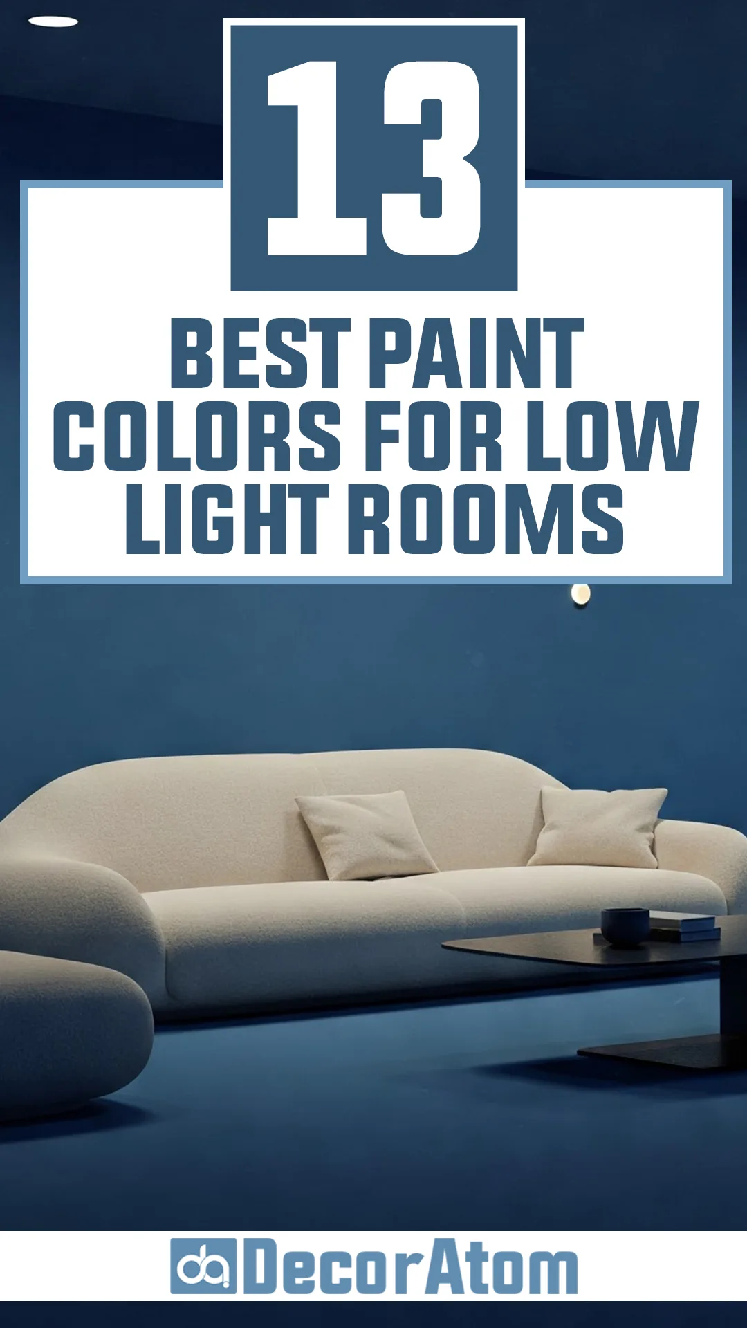
Finding the right paint color for a dimly lit room can be tricky. Without much natural light, colors can shift, looking darker or even duller than expected.
The goal is to bring out the best in the space—enhancing brightness, warmth, or depth without making it feel heavy or lifeless.
The following 13 colors aren’t just random picks; they’ve earned their place by transforming low-light rooms into inviting, well-balanced spaces.
1. White
It’s the most obvious choice, but not all whites work the same way in a low-light room. A bright, cool white can feel stark and shadowy without natural light to soften it.
That’s why I recommend a warm white, like Sherwin Williams Alabaster or Benjamin Moore White Dove. These have just enough warmth to keep them from looking too sterile but are still light enough to reflect every bit of available light.
The key here is reflection—white bounces light around, making a room feel more open and airy, even when there’s not much light to work with.
Best Paint Colors from Popular Brands:
- Sherwin Williams: Alabaster, Greek Villa
- Benjamin Moore: White Dove, Simply White
2. Beige
Beige is often overlooked as a “safe” color, but in a low-light room, it’s a game-changer.
It has enough pigment to add depth without darkening the space, and the warm undertones help counteract the cool shadows that often appear in dim rooms.
A soft, creamy beige like Sherwin Williams Accessible Beige or Benjamin Moore Muslin keeps things cozy and inviting.
Beige also pairs beautifully with artificial lighting, maintaining a consistent warmth throughout the day and night.
Best Paint Colors from Popular Brands:
- Sherwin Williams: Accessible Beige, Balanced Beige
- Benjamin Moore: Muslin, Manchester Tan
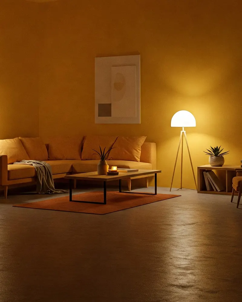
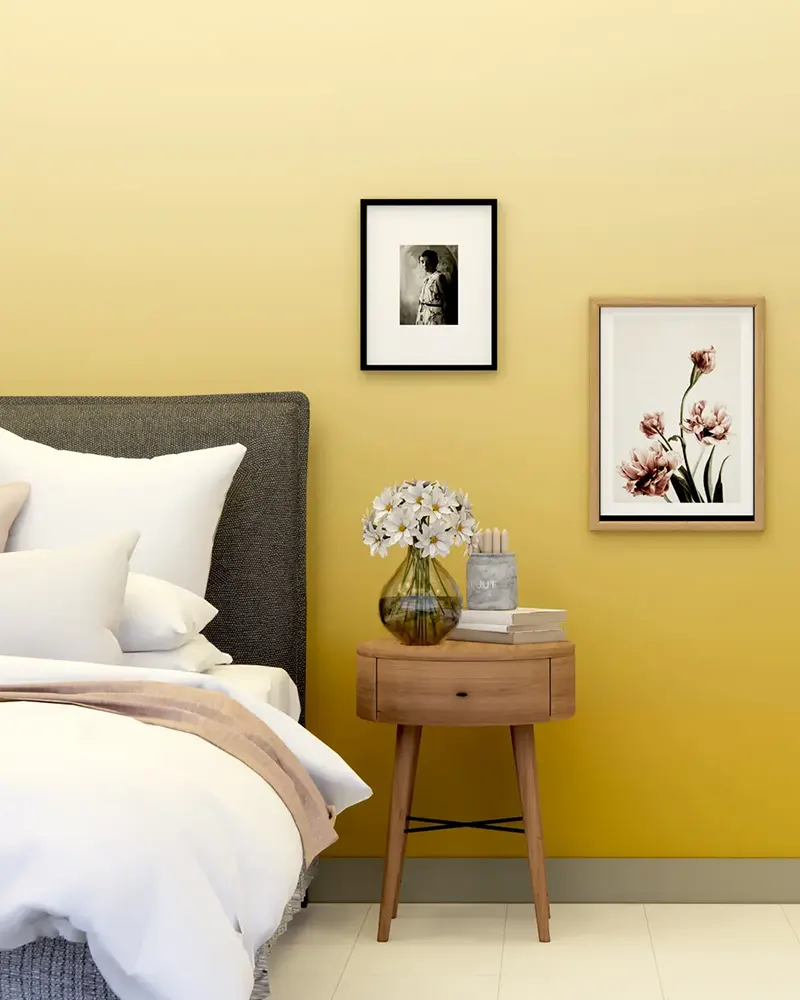
3. Yellow
💥🎁 Christmas & Year-End Deals On Amazon !
Don't miss out on the best discounts and top-rated products available right now!
*As an Amazon Associate, I earn from qualifying purchases.
A low-light room doesn’t have to feel dark and moody—it can feel cheerful and welcoming, and yellow is the color to make that happen. But the right yellow matters.
A deep mustard can feel too heavy in low light, but a soft buttercream shade, like Benjamin Moore Windham Cream, brings a delicate glow to the space.
Yellows with a subtle golden undertone work best because they reflect warmth without looking overly saturated. They also play well with warm LED lighting, enhancing the cozy feel.
Best Paint Colors from Popular Brands:
- Sherwin Williams: Jersey Cream, Cachet Cream
- Benjamin Moore: Windham Cream, Hawthorne Yellow
4. Blue
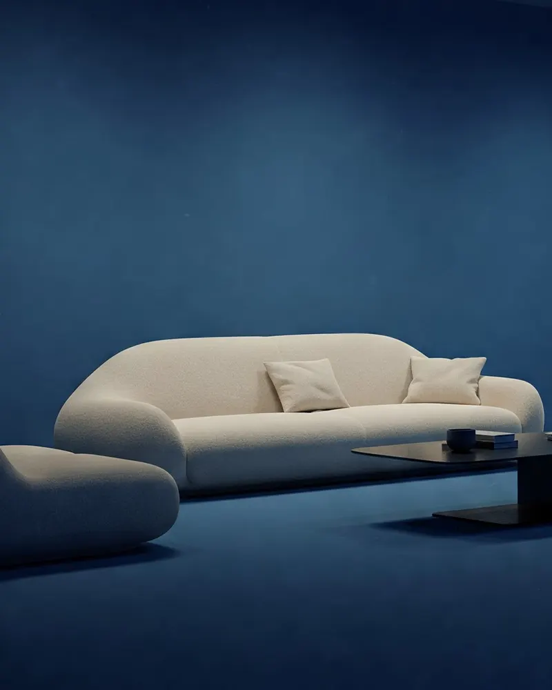
It might seem counterintuitive, but certain shades of blue can brighten up a dim space.
Instead of going with a deep navy or a muted gray-blue, opt for a soft, airy blue with a touch of warmth—something like Sherwin Williams Sea Salt or Benjamin Moore Palladian Blue.
These shades have just enough green in them to keep them from looking cold, and they create a fresh, open feel without overwhelming the room.
Best Paint Colors from Popular Brands:
- Sherwin Williams: Sea Salt, Rainwashed
- Benjamin Moore: Palladian Blue, Woodlawn Blue
5. Green
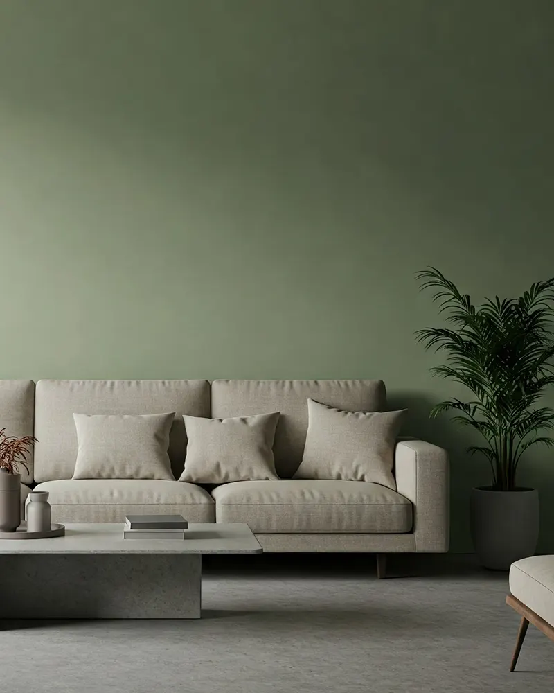
Green is one of those colors that can bring life to a space, even when natural light is scarce.
The trick is choosing a shade with enough warmth to keep it from looking too shadowy. Sage greens, like Sherwin Williams Clary Sage or Benjamin Moore Saybrook Sage, add an organic, grounding feel without making the room look dark.
If you want something even lighter, a soft pistachio or barely-there green can create a fresh, airy feel without washing out the space.
Best Paint Colors from Popular Brands:
- Sherwin Williams: Clary Sage, Softened Green
- Benjamin Moore: Saybrook Sage, Guilford Green
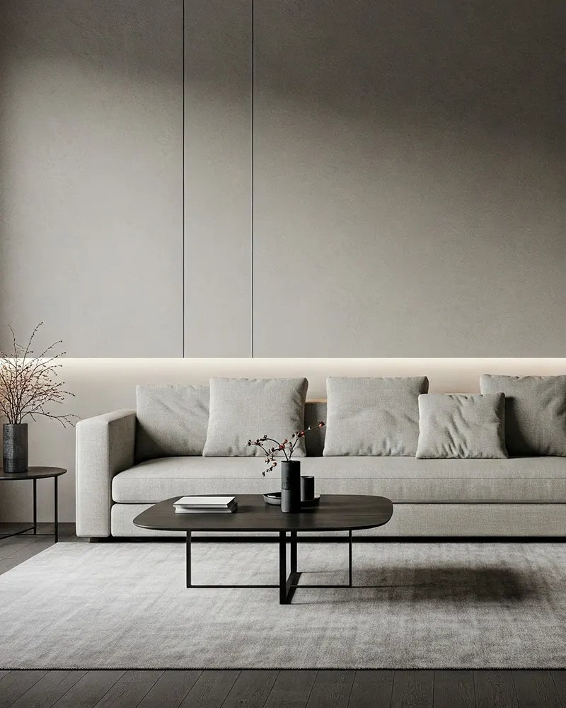
6. Greige
💥🎁 Christmas & Year-End Deals On Amazon !
Don't miss out on the best discounts and top-rated products available right now!
*As an Amazon Associate, I earn from qualifying purchases.
When you want the best of both beige and gray, greige is the answer.
It’s one of my favorite choices for low-light rooms because it adapts beautifully to changing lighting conditions.
Colors like Sherwin Williams Repose Gray or Benjamin Moore Edgecomb Gray have enough warmth to avoid looking dull but enough neutrality to work with any decor.
Greige is a safe bet for anyone wanting a modern, sophisticated look that won’t fall flat in a dim room.
Best Paint Colors from Popular Brands:
- Sherwin Williams: Repose Gray, Agreeable Gray
- Benjamin Moore: Edgecomb Gray, Revere Pewter
7. Pink

Soft pinks can do wonders in a low-light space, as long as they lean toward warm blush tones rather than cool, powdery pastels.
A peachy or rosy pink, like Farrow & Ball Pink Ground or Sherwin Williams Intimate White, adds a subtle warmth that counteracts the shadows in a dim room.
The best part? Pink has a natural ability to reflect light in a way that makes walls feel soft and inviting without looking overly feminine.
Best Paint Colors from Popular Brands:
- Sherwin Williams: Intimate White, Malted Milk
- Benjamin Moore: First Light, Venetian Rose
8. Lavender
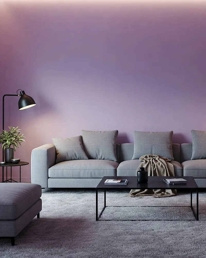
Lavender is one of those unexpected colors that can completely transform a dark room. It has enough brightness to feel uplifting but carries a gentle depth that keeps it from feeling washed out.
The key is choosing a shade with a warm undertone, like Benjamin Moore Violet Mist, so it doesn’t turn too cool or gray in dim lighting.
Paired with soft lighting, lavender creates a soothing, serene atmosphere that feels both airy and cozy.
Best Paint Colors from Popular Brands:
- Sherwin Williams: Lite Lavender, Ash Violet
- Benjamin Moore: Violet Mist, Winter Gray
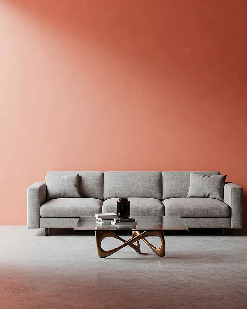
9. Coral
💥🎁 Christmas & Year-End Deals On Amazon !
Don't miss out on the best discounts and top-rated products available right now!
*As an Amazon Associate, I earn from qualifying purchases.
For anyone looking to add a little energy to a low-light room, coral is a fantastic choice.
It’s warm, inviting, and carries just enough orange and pink undertones to create a soft glow. Shades like Sherwin Williams Coral Reef or Benjamin Moore Peach Parfait bring a sun-kissed warmth to the space, making up for the lack of natural light.
Coral also pairs beautifully with wood tones and neutral furnishings, creating a balanced yet lively feel.
Best Paint Colors from Popular Brands:
- Sherwin Williams: Coral Reef, Dishy Coral
- Benjamin Moore: Peach Parfait, Coral Spice
10. Taupe
Taupe is a master at adding sophistication to dim rooms. With a mix of brown and gray, it provides enough pigment to add depth without darkening the space too much.
Warm taupes, like Sherwin Williams Perfect Greige or Benjamin Moore Shaker Beige, work best because they carry a natural coziness that prevents the room from feeling lifeless.
Taupe also adapts well to artificial lighting, shifting subtly throughout the day while maintaining a rich, inviting presence.
Best Paint Colors from Popular Brands:
- Sherwin Williams: Perfect Greige, Loggia
- Benjamin Moore: Shaker Beige, Stone Hearth
11. Teal
Teal might seem like a bold choice, but when done right, it can be transformative. A muted teal, like Sherwin Williams Riverway or Benjamin Moore Wythe Blue, adds depth without sucking the light out of a room.
Teal has enough richness to create interest, but its blue-green undertones keep it feeling balanced rather than heavy. In a dim space, teal can feel both moody and lively, making it a great option for a cozy but dynamic atmosphere.
Best Paint Colors from Popular Brands:
- Sherwin Williams: Riverway, Moody Blue
- Benjamin Moore: Wythe Blue, Stratton Blue
12. Gold
💥🎁 Christmas & Year-End Deals On Amazon !
Don't miss out on the best discounts and top-rated products available right now!
*As an Amazon Associate, I earn from qualifying purchases.
Gold tones, especially those in the softer wheat or honey range, add an effortless warmth to dark rooms. Instead of going too metallic or bold, opt for a rich golden beige like Benjamin Moore Hawthorne Yellow.
It catches whatever light is available, creating a sunlit effect that makes a room feel brighter even on the cloudiest days. Gold also works beautifully with warm lighting, amplifying its natural glow.
Best Paint Colors from Popular Brands:
- Sherwin Williams: Anjou Pear, Empire Gold
- Benjamin Moore: Hawthorne Yellow, Desert Tan
13. Plum
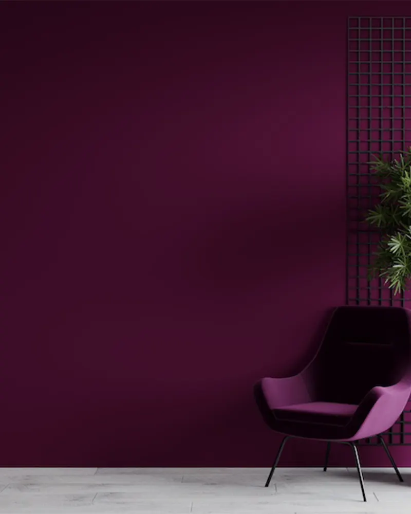
Plum is the perfect balance of drama and warmth for a low-light room.
Unlike deep purples that can feel heavy, a warm plum like Sherwin Williams Mature Grape or Benjamin Moore Kalamata creates a rich, cozy atmosphere without making the space feel closed in.
The secret is its red undertones, which add enough warmth to counteract any cool shadows.
Plum works beautifully in bedrooms, offices, or even living rooms when paired with warm lighting and soft furnishings.
Best Paint Colors from Popular Brands:
- Sherwin Williams: Mature Grape, Expressive Plum
- Benjamin Moore: Kalamata, Caponata
Final Thoughts
Choosing a paint color for a low-light room isn’t just about making it feel brighter—it’s about making it feel alive.
These 13 colors don’t just work well in dim spaces; they enhance them.
Whether you want something airy and fresh or rich and cozy, each of these shades has the ability to transform a low-light room into something truly special.
The key is warmth, balance, and reflection—finding the perfect shade that makes the most of the light you do have.