Here we compare two popular neutral paint colors from Sherwin Williams. Agreeable Gray and Repose Gray are both gentle grays that many people pick when they don’t want anything too bold. But even though they look similar at first glance, they bring a slightly different feel to a room.
If you’ve ever stared at a wall painted one of these and wondered “Does this feel cozy or cool?” then you’re in the right place.
We’ll walk through what makes each color special. No fluff. Just what you need to know so you can choose the right gray for your space.
Key Differences Between Agreeable Gray And Repose Gray

- Agreeable Gray leans more toward a soft beige gray. Repose Gray has subtle green-taupe hints.
- Agreeable Gray feels a tad warmer and lighter (with LRV 60) while Repose Gray is a bit deeper and slightly cooler (LRV 58).
- Agreeable Gray blends easily with warm tones. Repose Gray plays nicer with cooler, modern tones or muted palettes.
When to Use Agreeable Gray And Repose Gray
If you want a neutral wall that doesn’t steal the show, but still feels welcoming, these grays are great. They are both flexible. Which one you choose depends on the mood and style of the space.
Use Agreeable Gray if:
- You want a soft, warm neutral that pairs well with wood, warm whites, or cozy decor.
- The space gets a lot of light and you want the room to feel open and airy.
- You’re going for a classic, timeless vibe, maybe a traditional living room or a warm bedroom.
Use Repose Gray if:
- You want a neutral with a subtle modern edge, something a bit cooler or more sophisticated.
- You have minimal furniture or cooler-toned decor (like grays, charcoals, blacks, or metal finishes).
- You want a calm, slightly muted backdrop, perhaps for a contemporary space, a home office, or a quiet bedroom.
Emotional Effects: Agreeable Gray vs Repose Gray
Agreeable Gray tends to make a room feel calm, warm, and inviting. It wraps the room in a gentle hug. It feels familiar. Like home. It doesn’t shout. Instead, it whispers. You walk into a space painted Agreeable Gray and you might think, “Ah, this feels peaceful.”
Repose Gray gives a slightly different vibe. It can feel more controlled, modern, and maybe a bit moody (in a good way). It’s still soft. But it leans toward sophistication. It can quiet a room down. Make it feel refined or a little more grown-up. Kind of like wearing nice slippers instead of fuzzy socks.
If you want comfort and warmth, Agreeable Gray. If you want calm and subtle style, Repose Gray.
Detailed Comparing Agreeable Gray And Repose Gray

Here’s a breakdown of each color’s details.
Agreeable Gray
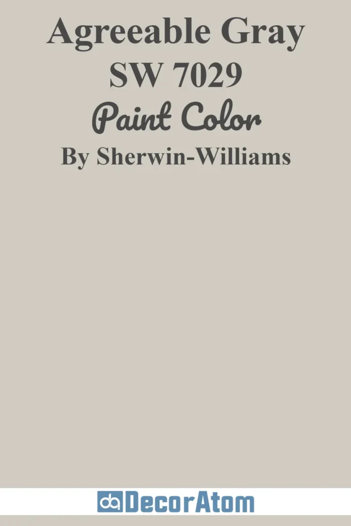
Agreeable Gray is a soft beige-tinged gray. It works well almost anywhere. It gives warmth without making a room feel dark or heavy. It pairs nicely with warm woods, creamy whites, and natural textiles, think cozy, liveable spaces.
Repose Gray
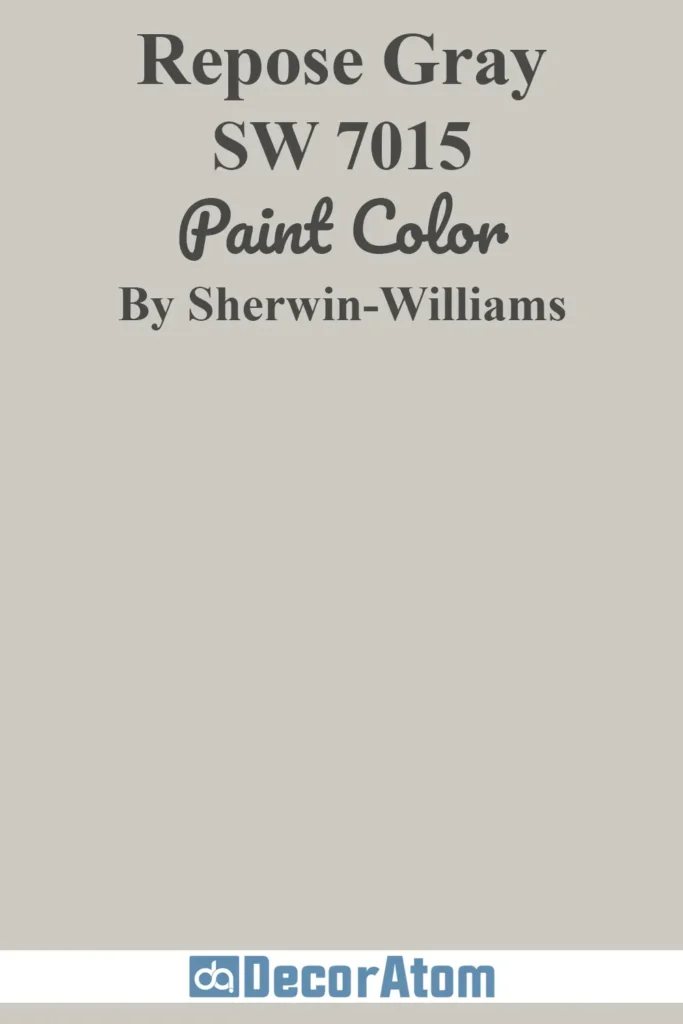
Repose Gray leans a tiny bit toward taupe with a whisper of green. It feels a little more modern. It works well when you want a neutral base that doesn’t compete with furniture or decor. It’s flexible enough for contemporary, minimalist, or even slightly industrial spaces.
| Features | Agreeable Gray | Repose Gray |
|---|---|---|
| Hex Value | #D1CBC1 | #CCC9C0 |
| LRV | 60 | 58 |
| Undertones | Beige | Slight green & taupe |
| Use | Living rooms, bedrooms, open spaces, warm décor | Modern rooms, offices, bedrooms, cool/neutral décor |
| Finishes | Matte, eggshell, satin | Matte, eggshell, satin |
| Style Fit | Cozy, classic, traditional, transitional | Modern, minimalist, contemporary, chic |
Real-Life Photos: Agreeable Gray vs Repose Gray
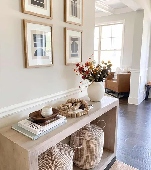
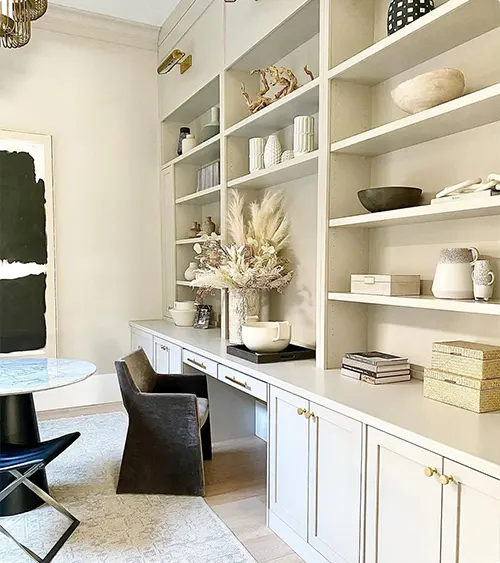
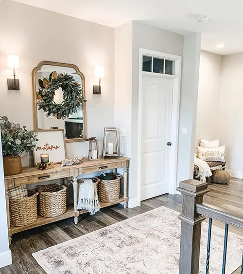
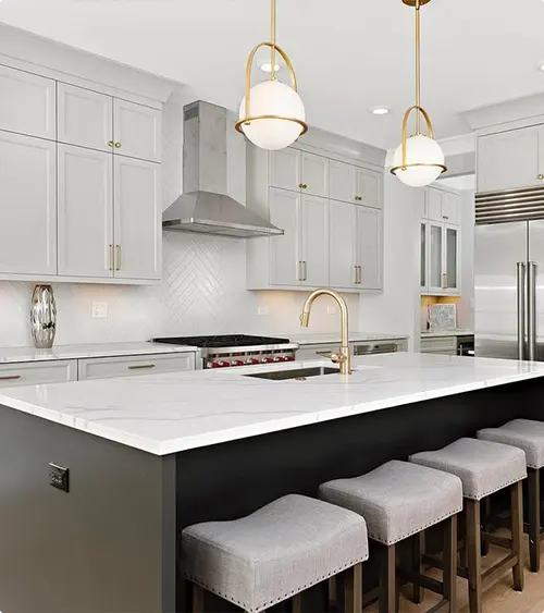
Here you’ll see how these colors actually look on walls in real homes. Sometimes paint chips lie, real rooms show how light, furniture, and trim transform color. Use these photos to get a feel for how Agreeable Gray and Repose Gray behave under different lights and settings.
Agreeable Gray:
Repose Gray:


Agreeable Gray vs Repose Gray: Are They Warm or Cool Paints?
Agreeable Gray sits on the warm side. It has that soft beige touch that makes a room feel cozy without turning yellow. It gently warms up a space, which is why so many people use it in living rooms and hallways.
Repose Gray leans a bit cooler. Not icy. Just slightly crisp because of its green-taupe undertones. It brings a calm, modern, steady feeling to a room. It works great when you want a space to feel clean and balanced.
Coordinating Colors
Coordinating colors are shades that work well with your main wall color to create a balanced and stylish room. They help bring harmony to furniture, decor, and accents without clashing or overwhelming the space. Choosing the right coordinating colors makes decorating easier and the room feel complete.
Agreeable Gray
- Sherwin Williams Alabaster
- Benjamin Moore White Dove
- Sherwin Williams Misty
Repose Gray
- Sherwin Williams Extra White
- Benjamin Moore Chantilly Lace
- Sherwin Williams Sea Salt
Trim Color with Agreeable Gray And Repose Gray
Trim color matters more than people think. A trim color can make a wall look brighter or deeper. It also ties the whole room together. You want a trim shade that’s clean and simple so the wall color stands out the right way.
For Agreeable Gray:
- Sherwin Williams Pure White
- Sherwin Williams Alabaster
- Benjamin Moore White Dove
- Benjamin Moore Chantilly Lace
These whites stay soft and smooth beside the warm beige-gray tone.
For Repose Gray:
- Sherwin Williams Extra White
- Sherwin Williams Pure White
- Benjamin Moore Chantilly Lace
- Benjamin Moore Decorator’s White
These are crisp, clear whites that keep Repose Gray looking modern and fresh.
What’s the Verdict? Should I Choose Agreeable Gray or Repose Gray
Both are great neutral colors. They just create different moods. Agreeable Gray feels warmer. It fits best when you want your home to feel open, soft, and cozy. Repose Gray is a little cooler. It’s nice when you want a clean and calm backdrop with a modern touch.
If your room has warm light or lots of wood tones, Agreeable Gray will blend right in. If your room has cooler light or you like modern furniture and clean lines, Repose Gray will look more fitting.
You can’t go wrong. It’s more about the feeling you want when you walk into the room.
👉 Order Agreeable Gray peel-and-stick sample from Samplize
👉 Order Repose Gray peel-and-stick sample from Samplize
FAQs
Is Agreeable Gray lighter than Repose Gray?
Yes. Just a little. Agreeable Gray has LRV 60, so it reflects more light. Repose Gray has LRV 58, so it’s slightly deeper.
Are they greige colors?
Agreeable Gray is more greige. Repose Gray leans more toward a soft gray with faint green-taupe hints.
Can I use both colors in the same house?
You can. Many people use Agreeable Gray in main areas and Repose Gray in offices or bedrooms for a slightly cooler look.
Do these colors change a lot with lighting?
They do shift. Agreeable Gray warms up in bright light. Repose Gray can show a hint more green in low or north-facing light.
Which one works best for resale?
Agreeable Gray is the safer pick because it feels warm and neutral in most homes. Repose Gray is great too but looks its best in balanced lighting.

