
Gray paint colors have become one of the most popular choices for modern and classic interiors alike, and for good reason. It’s versatile, timeless, and works with nearly any style, from modern minimalism to classic elegance.
The right gray can make a room feel calm and cozy, open and airy, or bold and dramatic, depending on the shade and undertones.
In this post, we’ll explore 21 of the best gray paint colors from top brands like Sherwin Williams and Benjamin Moore.
You’ll also find tips on choosing the right gray, where to use it, and what colors pair best, so you can confidently pick the perfect shade for your home.
What are Gray Paint Colors?
Gray paint colors are a spectrum of neutral tones that range from soft, light grays to deep, charcoal-like shades. They can lean warm with beige or taupe undertones, cool with blue or green undertones, or remain true, neutral grays.
This versatility makes gray a unique and adaptable color, capable of setting different moods in your home. Light grays can make small spaces feel open and airy, while darker grays add drama, depth, and a sense of sophistication.
Essentially, gray is a chameleon color, it changes depending on lighting, surrounding colors, and materials, making it perfect for a wide range of design applications.
Where to Use Gray Paint Colors
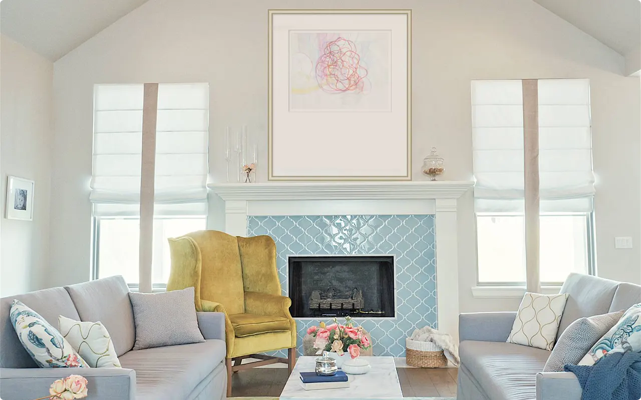
Gray paint colors are suitable for almost any space in your home. In living rooms, gray walls provide a calm, sophisticated backdrop that complements furniture, artwork, and décor accents.
In bedrooms, gray creates a serene, relaxing environment conducive to rest. Kitchens benefit from gray shades on walls or cabinets, adding a modern or transitional feel depending on the undertones.
Bathrooms with gray paint feel clean, spa-like, and timeless. Even home offices or hallways can benefit from gray tones, which offer a professional yet inviting atmosphere.
Darker grays work beautifully for accent walls, fireplaces, or cabinetry, while lighter grays can open up spaces and enhance natural light.
Colors to Pair with Gray
One of gray’s greatest strengths is its versatility in pairing with other colors.
Soft whites and creams complement gray for a classic, neutral palette, while bold colors like navy, emerald, or mustard add vibrancy and contrast.
Gray also pairs beautifully with wood tones, both light oak and rich walnut, to bring warmth and texture into a room.
For a more contemporary feel, metallic accents like gold, silver, or brushed nickel can enhance the sophistication of gray walls.
Also, gray works harmoniously with pastels such as blush, mint, or powder blue, offering a soft, airy look ideal for bedrooms or living areas.
How To Choose The Right Gray Paint Color?
Choosing the perfect gray can be surprisingly challenging due to the wide range of undertones and shades.
Start by considering the mood you want for your space, warm grays with beige or taupe undertones create cozy, inviting rooms, while cool grays with blue or green undertones convey calmness and elegance.
Always test paint samples in your actual room lighting, as grays can shift dramatically with natural and artificial light. Consider the colors of your furniture, flooring, and décor, ensuring that the gray complements rather than clashes.
Don’t be afraid to use darker grays for accent walls or cabinets to add depth and contrast, and remember that lighter grays can make small spaces feel larger and more open.
Ultimately, the best gray is one that feels balanced, harmonious, and timeless in your space.
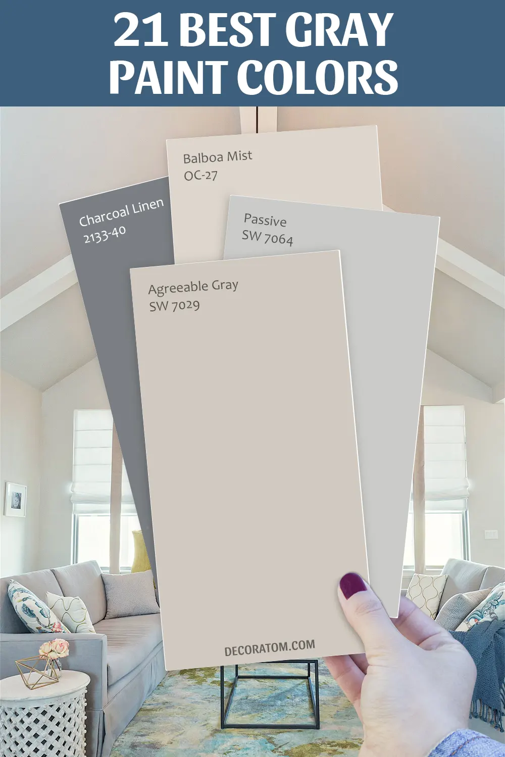
21 Best Gray Paint Colors
Here are my favorite gray paint colors to decorate with, carefully selected from Sherwin Williams and Benjamin Moore. Each color has its own character, undertone, and mood, allowing you to create spaces that feel perfectly tailored to your home’s personality.
Best Gray Paint Colors From Sherwin Williams
1. Agreeable Gray SW 7029
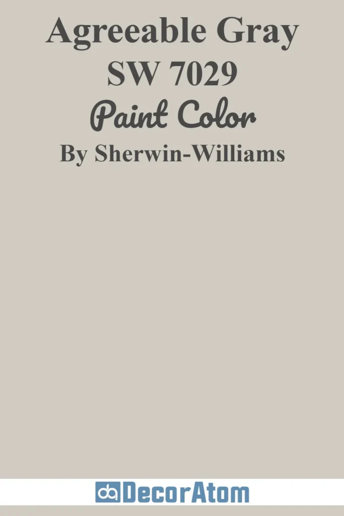
Agreeable Gray is a warm, soft greige that sits beautifully between beige and gray, making it one of the most versatile neutral shades. Its subtle warmth gives spaces a cozy, inviting feeling while still maintaining the crisp, modern edge of gray.
This color exudes a calming and balanced mood, perfect for creating a serene backdrop without feeling sterile or cold.
Its neutral undertones allow it to harmonize seamlessly with both warm wood tones and cooler furniture accents, making it ideal for living rooms, kitchens, and open-concept areas where you want a consistent, flattering base.
Agreeable Gray also works exceptionally well in spaces that receive a lot of natural light, as the soft undertones can shift slightly with sunlight, offering depth and interest throughout the day.
2. Repose Gray SW 7015
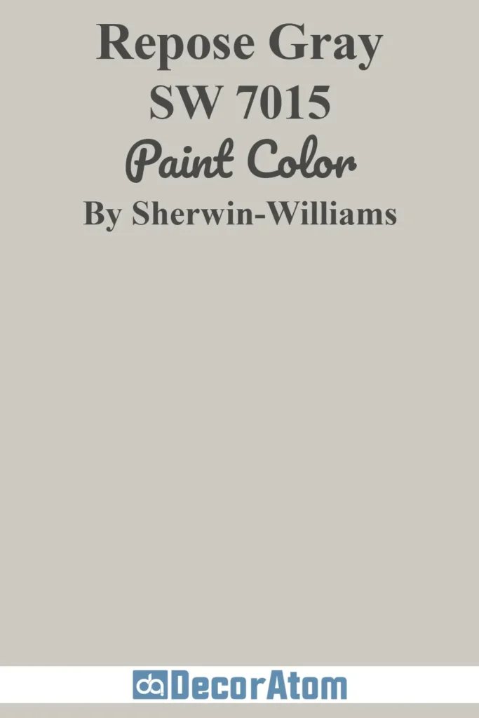
Repose Gray is a soft, cool greige that has delicate lavender undertones, giving it a subtle sophistication that feels modern yet approachable. This color creates a peaceful, restful mood, making rooms feel open, airy, and tranquil.
It’s versatile enough to function as a main wall color while also providing a perfect neutral backdrop for art, textiles, and statement furniture pieces.
Repose Gray performs beautifully in bedrooms and bathrooms, creating a soothing and peaceful environment.
It’s equally stunning in living areas, dining rooms, and hallways, shifting from a warm, inviting tone in natural light to a cooler, more refined hue under artificial light.
Pairing it with crisp whites, soft blues, or muted greens enhances its tranquil and contemporary feel.
3. Dorian Gray SW 7017
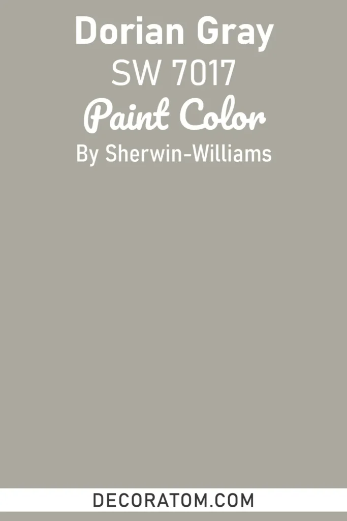
Dorian Gray is a medium-toned gray with soft purple undertones that lend a subtle richness and depth to any space. This color has a refined, sophisticated mood, bringing a sense of understated elegance without overwhelming the room.
Its muted undertones allow it to complement both light and dark furnishings, making it ideal for accent walls, cabinetry, or entire rooms where a classic yet contemporary feel is desired.
Dorian Gray is particularly effective in living rooms, dining rooms, and offices, where it adds warmth and dimension while still feeling neutral enough to allow other colors and textures to shine.
Its versatility also makes it a great choice for transitional spaces that bridge modern and traditional décor styles.
4. Mindful Gray SW 7016
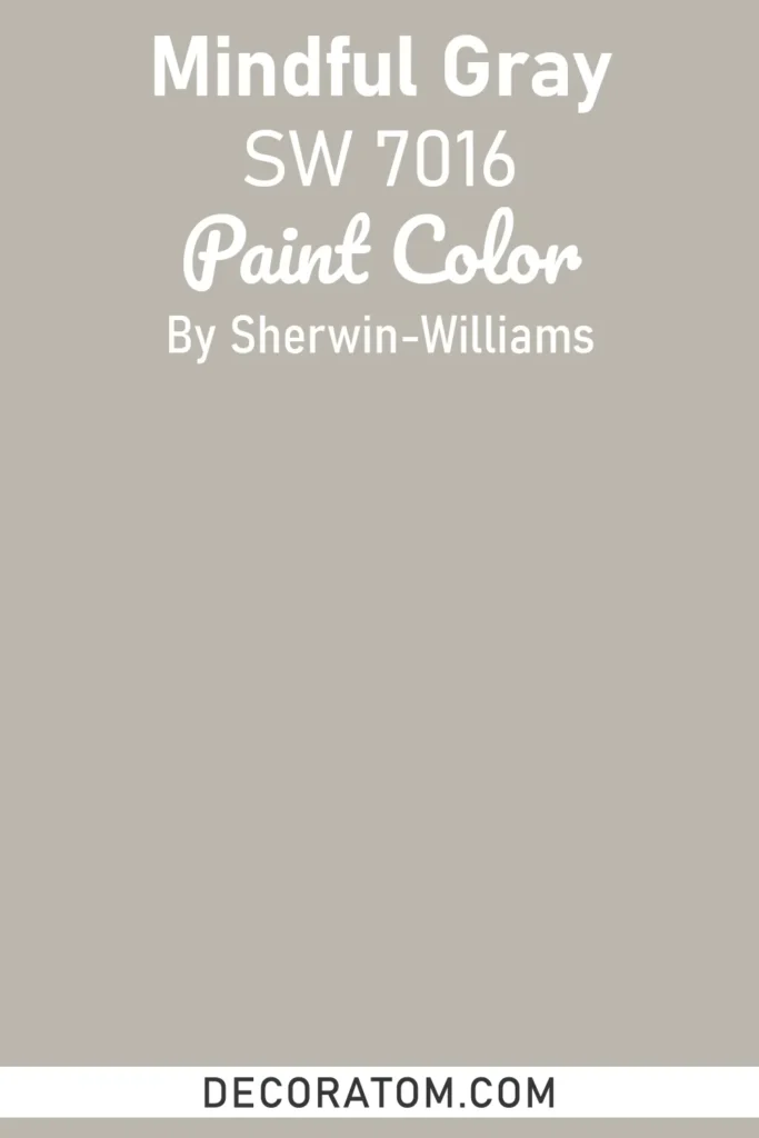
Mindful Gray is a balanced, soft gray with warm undertones that create a calming and composed atmosphere. It’s neither too dark nor too light, making it a perfect neutral choice for a wide range of interior spaces.
The color exudes a sophisticated, serene mood, giving rooms a polished and welcoming feel without feeling stark or cold. Mindful Gray works exceptionally well in bedrooms, living rooms, kitchens, and even home offices, providing a subtle backdrop that enhances both bold and muted accents.
Its warm undertones allow it to pair beautifully with natural wood finishes, creamy whites, and soft pastels, making it a highly adaptable option for traditional, modern, or transitional design schemes.
Mindful Gray’s understated elegance makes it suitable for spaces where you want a timeless, classic look that will remain stylish for years.
5. Worldly Gray SW 7043
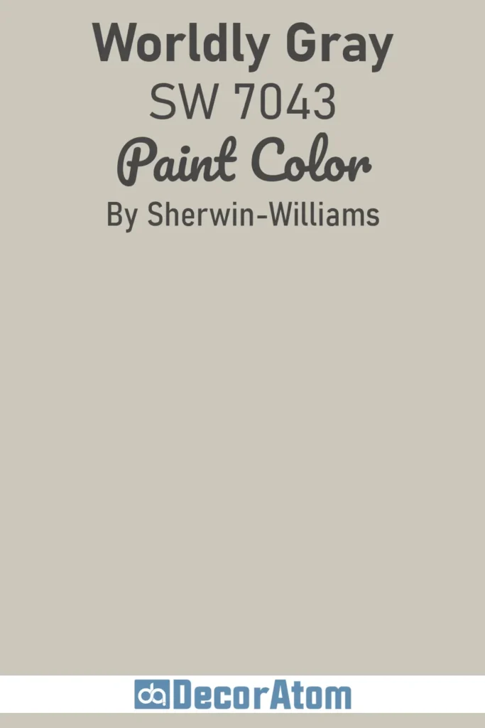
Worldly Gray is a warm, medium gray with soft beige undertones that give it a sophisticated, inviting character. It conveys a cozy yet refined mood, making it perfect for spaces where comfort meets elegance.
The color has excellent versatility, providing a neutral backdrop that allows furniture, artwork, and accent colors to pop without clashing.
Worldly Gray works beautifully in living rooms, bedrooms, and dining areas, creating a welcoming atmosphere while maintaining a sense of modern style.
Its warm undertones make it especially complementary to natural wood tones, brass fixtures, and rich textiles, helping to create a cohesive and polished interior that feels effortlessly timeless.
6. Big Chill SW 7648
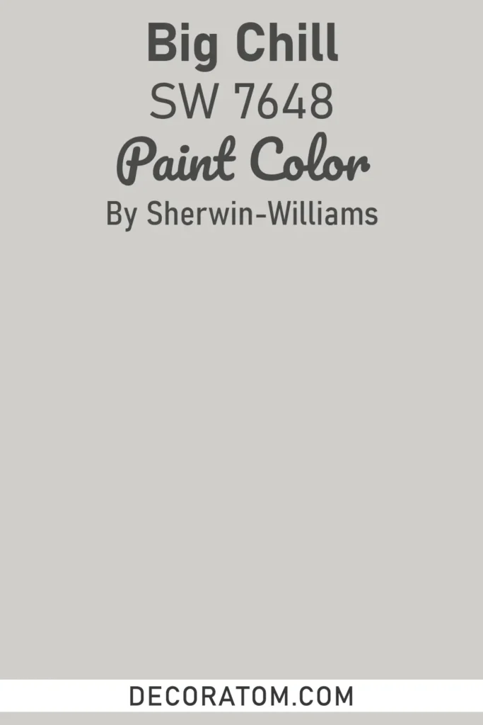
Big Chill is a cool, medium gray with blue undertones that lend a subtle, refreshing vibrancy to any space. It creates a calm and serene mood while adding a hint of modern sophistication, making rooms feel airy yet grounded.
This shade works well in kitchens, bathrooms, and bedrooms, particularly in spaces that receive a lot of natural light, as the blue undertones shift gently throughout the day to add dimension.
Big Chill pairs beautifully with crisp whites, soft neutrals, and even bold jewel tones, offering designers and homeowners a versatile canvas for both contemporary and transitional décor. Its slightly cooler edge also makes it an ideal choice for accent walls or cabinetry that need a modern, polished finish.
7. Gray Screen SW 7071

Gray Screen is a soft, cool gray with subtle green undertones that provide depth and sophistication without overwhelming a room. The color has a refined and composed mood, offering a neutral backdrop that feels elegant and contemporary.
Gray Screen works exceptionally well in living rooms, dining rooms, and home offices, where a balanced and soothing ambiance is desired. It pairs effortlessly with both cool and warm accents, ranging from crisp whites to deeper charcoals and soft greens, making it highly adaptable to a variety of décor styles.
Its understated charm allows it to be used as a main wall color or as a complementary shade for accent walls and trim, creating a cohesive, timeless look.
8. Silver Strand SW 7057
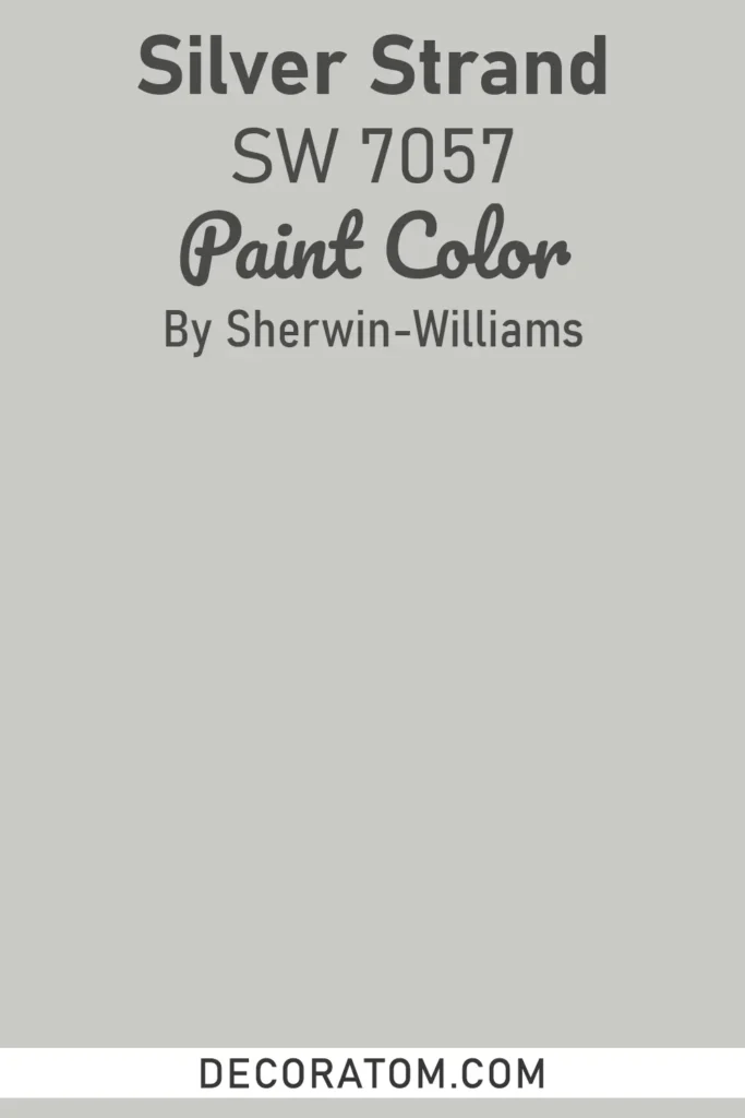
Silver Strand is a light, warm gray with a hint of greige that brings an airy, sophisticated feel to any space. It conveys a calm, tranquil mood that makes rooms feel open, welcoming, and subtly elegant.
This color is particularly well-suited for living rooms, kitchens, and bedrooms, as it reflects natural light beautifully, creating a soft, inviting glow.
Silver Strand pairs well with a wide range of finishes, from polished metals to natural wood tones, and works harmoniously with both neutral and colorful accents.
Its versatile warmth makes it an excellent choice for open-concept spaces, providing a consistent yet dynamic backdrop that enhances the overall design.
9. Passive SW 7064
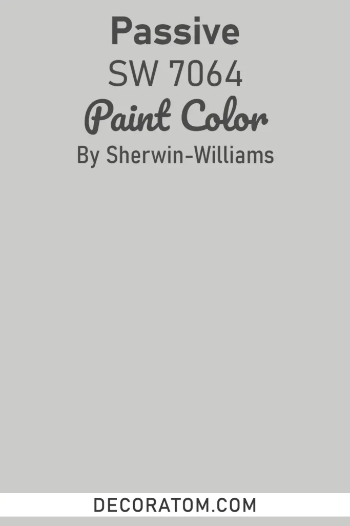
Passive is a soft, cool gray with subtle lavender undertones that evoke a serene, composed atmosphere. Its understated elegance makes it perfect for creating a modern, sophisticated look without appearing cold or stark.
Passive works wonderfully in bedrooms, bathrooms, and offices where a relaxing, focused environment is desired. Its gentle undertones allow it to complement both warm and cool color palettes, pairing seamlessly with crisp whites, muted blues, and soft greens.
Additionally, Passive’s versatility makes it suitable for open spaces, creating a cohesive neutral backdrop that highlights furnishings, artwork, and architectural details without overwhelming the room.
10. Serious Gray SW 6256
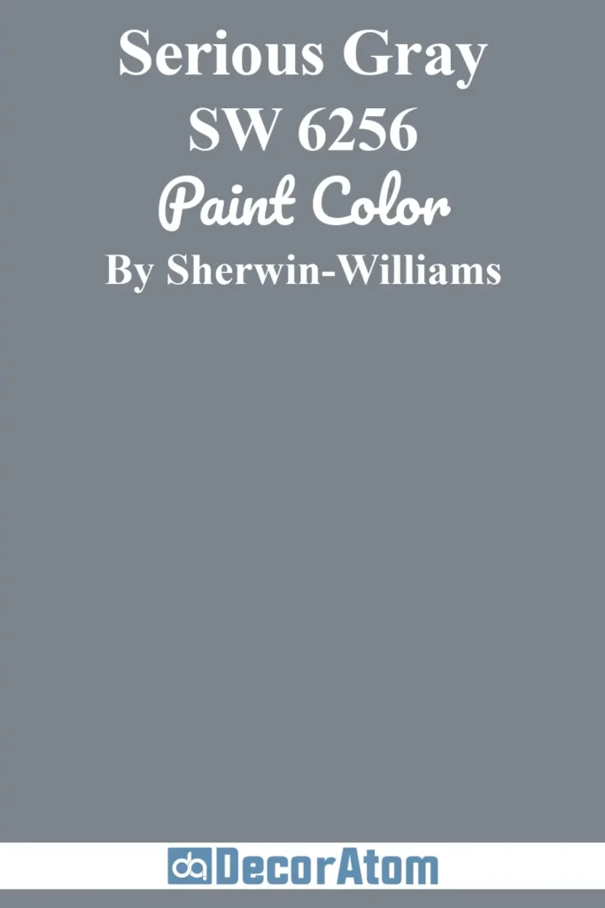
Serious Gray is a medium gray with strong, sophisticated undertones that exude confidence and depth. It creates a moody, elegant ambiance, making it ideal for spaces where a bold yet neutral statement is desired.
Serious Gray works beautifully in dining rooms, living rooms, and bedrooms, adding drama and structure while remaining versatile enough to pair with a wide variety of accent colors and materials.
Its richness allows it to complement natural wood tones, metallic finishes, and deep jewel-toned accents, providing a timeless and polished look. This shade is also excellent for accent walls or cabinetry, giving spaces a refined, high-end feel.
11. Gauntlet Gray SW 7019

Gauntlet Gray is a deep, warm gray with subtle brown undertones that give it a sophisticated, grounded quality. The color conveys a strong, elegant mood, adding depth and character to any room while remaining neutral enough to harmonize with various design styles.
Gauntlet Gray is ideal for feature walls, living rooms, kitchens, and home offices, creating a cozy yet polished atmosphere.
Its warm undertones pair beautifully with wood furnishings, creamy whites, and metallic accents, enhancing the room’s overall warmth and richness. This shade is perfect for homeowners seeking a bold, timeless gray that can anchor a space without feeling overpowering.
Best Gray Paint Colors From Benjamin Moore
12. Balboa Mist OC-27
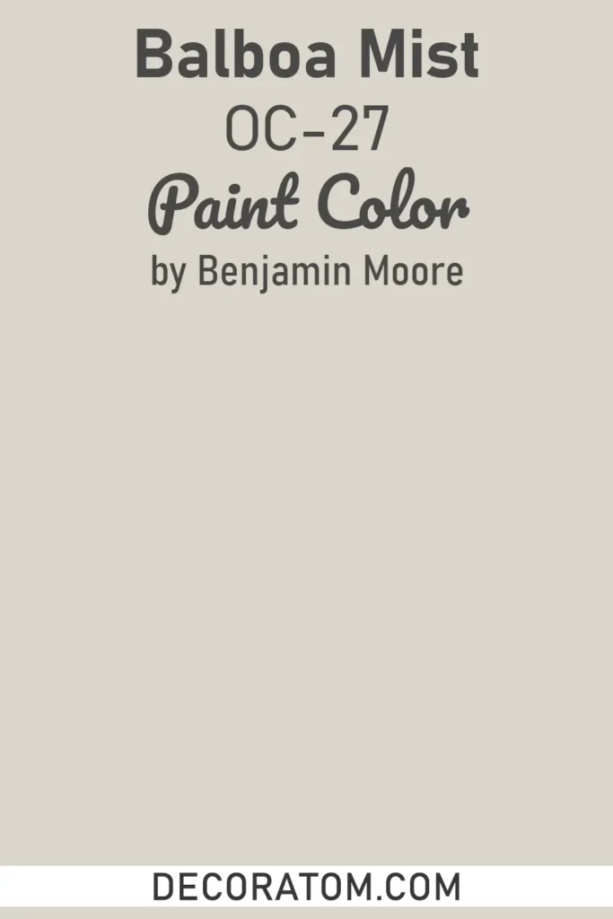
Balboa Mist is a soft, warm gray with subtle beige undertones that create a serene, soothing atmosphere. Its light and airy nature makes rooms feel spacious and inviting, while its warmth adds a comforting touch that prevents spaces from feeling cold or sterile.
Balboa Mist works beautifully in living rooms, bedrooms, and hallways, providing a versatile backdrop that complements both traditional and modern décor.
It pairs seamlessly with whites, soft pastels, and natural wood tones, making it ideal for open-concept layouts where a neutral, cohesive color is desired. The color’s gentle depth also allows it to adapt to different lighting conditions, shifting slightly to reveal warmer or cooler nuances throughout the day.
13. Classic Gray OC-23
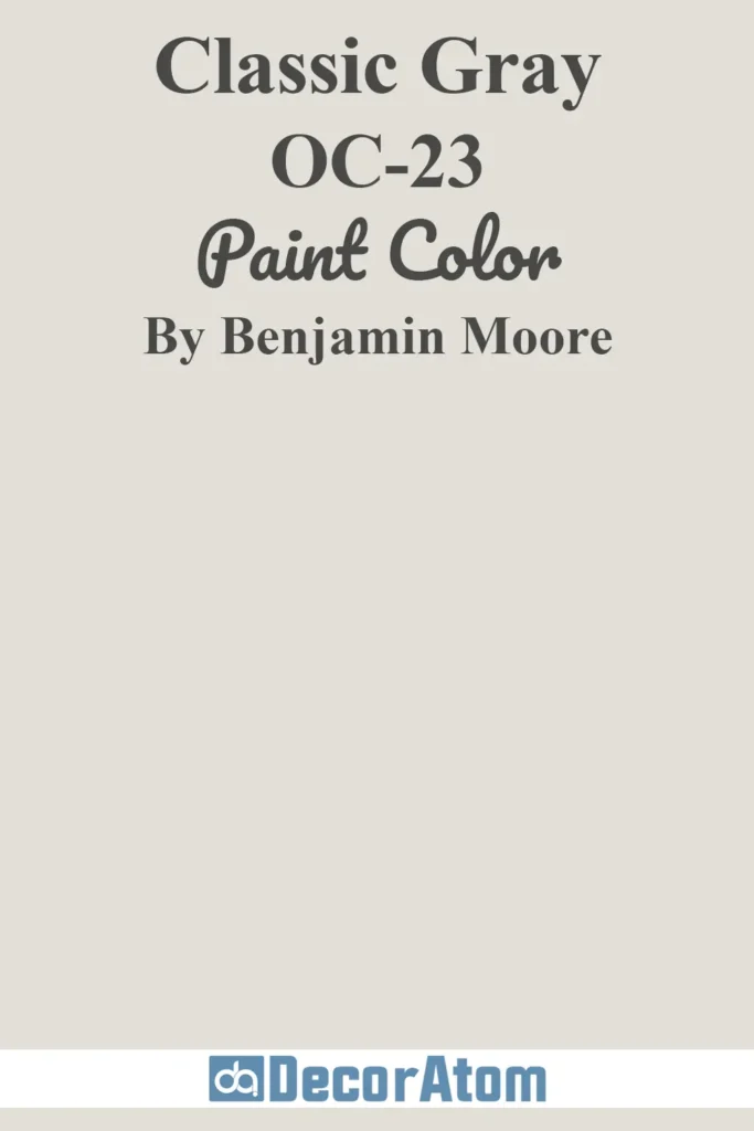
Classic Gray is a light, understated gray that leans slightly warm, offering a calm and timeless mood. It’s a sophisticated neutral that conveys elegance without drawing too much attention, making it perfect for walls, trim, or ceilings.
Classic Gray works exceptionally well in spaces like bedrooms, living areas, and kitchens, where a peaceful and balanced atmosphere is desired.
Its soft undertones harmonize beautifully with both muted and bold accent colors, including blues, greens, and soft metallics, creating a versatile palette suitable for modern, transitional, or traditional interiors.
14. Revere Pewter HC-172

Revere Pewter is one of Benjamin Moore’s most celebrated greige shades, offering a perfect balance between warm beige and soft gray. It creates a welcoming, cozy mood while maintaining modern sophistication.
Revere Pewter is incredibly versatile, ideal for living rooms, kitchens, bathrooms, and bedrooms, where it serves as a neutral yet dynamic backdrop.
Its warm undertones pair beautifully with natural wood, stone, and crisp white trims, making it a reliable choice for open floor plans. Depending on the lighting, it can appear slightly warmer or cooler, adding depth and dimension to any space.
15. Gray Owl OC-52
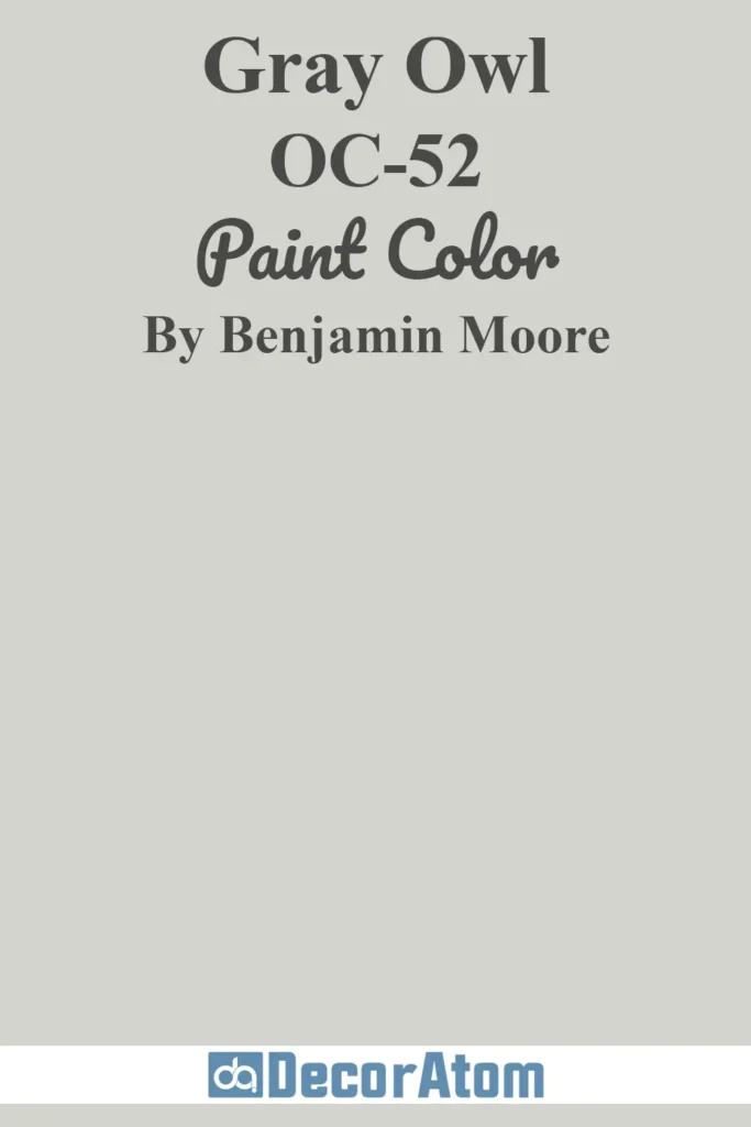
Gray Owl is a soft, light gray with subtle green undertones, giving it a fresh and airy feel. The color evokes a tranquil and serene mood, making spaces feel calm and open.
Gray Owl is perfect for living rooms, bedrooms, kitchens, and bathrooms, especially in areas with abundant natural light, where its undertones become more pronounced.
It pairs well with white trim, soft blues, and natural wood finishes, making it a versatile choice for modern and transitional interiors. Its understated elegance allows it to function as a main wall color or a complementary neutral to highlight furniture and décor accents.
16. Paper White OC-55
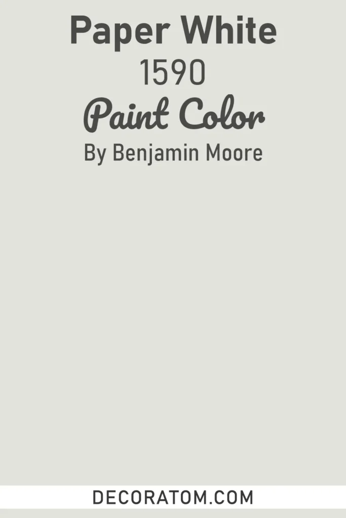
Paper White is a delicate, light gray with warm undertones that create a soft, inviting ambiance. It conveys a calm, peaceful mood, making it ideal for bedrooms, bathrooms, and smaller spaces where a soothing atmosphere is desired.
Paper White works beautifully as a backdrop for both warm and cool accent colors, including soft pastels, muted blues, and earthy tones.
Its subtle depth ensures that spaces feel spacious and airy while maintaining warmth and elegance, making it a timeless choice for modern and transitional interiors alike.
17. Stonington Gray HC-170
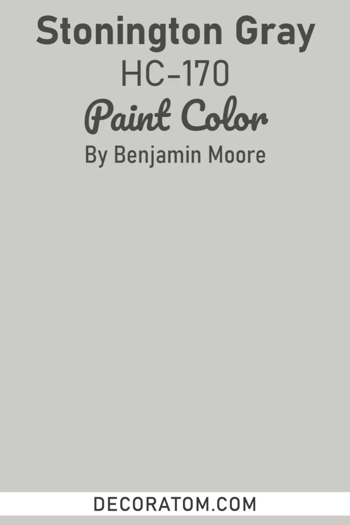
Stonington Gray is a versatile, medium-light gray with cool undertones that create a refined and sophisticated mood. The color offers a sense of calm and composure, making it ideal for living rooms, dining rooms, and home offices.
Stonington Gray pairs exceptionally well with crisp whites, soft blues, and charcoal accents, providing a polished and harmonious palette.
Its neutrality allows it to adapt to various lighting conditions, shifting slightly to reveal warmer or cooler undertones, making it a dependable choice for both traditional and contemporary design schemes.
18. Coventry Gray HC-169
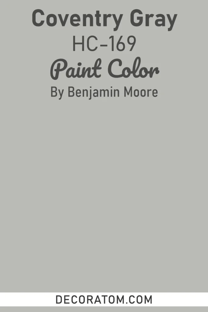
Coventry Gray is a medium gray with balanced warm and cool undertones, offering a sophisticated and elegant feel. It conveys a grounded and timeless mood, making it suitable for a wide range of spaces, including living rooms, kitchens, and bedrooms.
Coventry Gray pairs beautifully with natural wood tones, white trims, and muted accent colors, creating a cohesive and classic look.
Its balanced undertones allow it to adapt to different lighting conditions, providing depth and subtle variation, making it ideal for spaces where a neutral yet characterful gray is desired.
19. Stormy Sky 1616
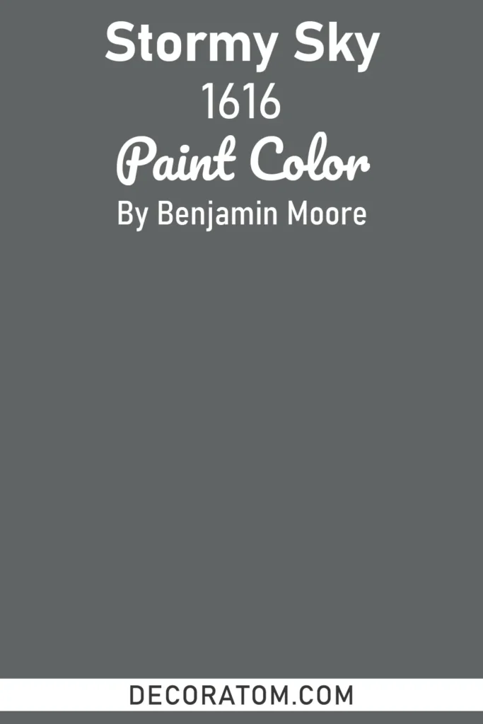
Stormy Sky is a dramatic, medium-to-dark gray with subtle blue undertones that create a moody, contemplative atmosphere. The color conveys depth and sophistication, making it perfect for accent walls, dining rooms, or home offices where a bold statement is desired.
Stormy Sky pairs beautifully with white trim, soft neutrals, and metallic accents, adding contrast and interest without feeling heavy.
Its deep, cool undertones evoke a serene and calming ambiance, making it ideal for modern or transitional interiors that aim for a refined, contemporary look.
20. Charcoal Linen 2133-40
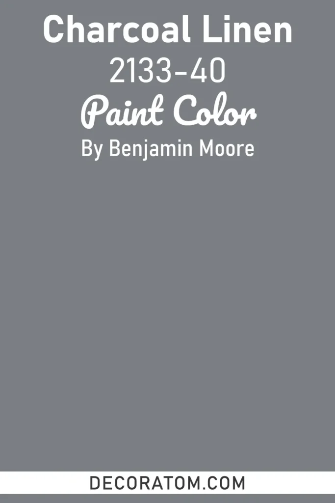
Charcoal Linen 2133-40 is a deep, sophisticated gray with rich charcoal undertones that lean slightly warm, creating a grounded and elegant feel. This shade has a luxurious depth that brings drama and refinement into any space, while still maintaining the versatility of a neutral.
It works beautifully in dining rooms, living areas, or bedrooms where you want to create a moody, intimate atmosphere. Charcoal Linen also makes an excellent choice for cabinetry, doors, or accent walls, adding contrast against crisp whites or lighter gray tones.
Pairing it with metallic finishes, natural wood, or soft fabrics enhances its richness, making it ideal for both modern and classic interiors.
21. Chelsea Gray HC-168
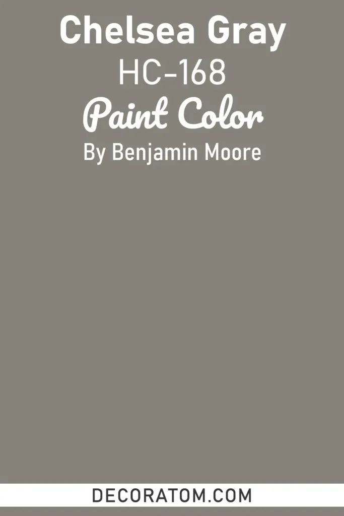
Chelsea Gray is a rich, medium-dark gray with warm undertones that create a dramatic yet inviting atmosphere. The color conveys sophistication, elegance, and depth, making it ideal for accent walls, cabinetry, or entire rooms where a bold statement is desired.
Chelsea Gray pairs beautifully with lighter neutrals, natural wood, and metallic accents, providing contrast and visual interest. Its warmth ensures that it feels welcoming rather than cold, making it perfect for living rooms, dining areas, and bedrooms where a luxurious, refined mood is desired.
FAQs About Gray Paint Colors
1. What is the most popular gray paint color?
Some of the most popular grays include Sherwin Williams Agreeable Gray and Benjamin Moore Revere Pewter. These shades are loved for their versatility and ability to work well in many different spaces.
2. How do I know if a gray paint color is warm or cool?
Look at the undertones. Warm grays have hints of beige, taupe, or brown, while cool grays often have undertones of blue, green, or violet. Always test a sample on your wall to see how it looks in your room’s lighting.
3. Do gray paint colors work in small rooms?
Yes, especially lighter grays. They can make a small room feel larger and more open. Darker grays can also work in small rooms if you want to create a dramatic, cozy atmosphere.
4. What colors go best with gray walls?
Gray pairs well with a wide range of colors. Crisp whites and creams create a clean look, while bold colors like navy, emerald, or mustard add contrast. Wood tones and metallic accents also enhance the warmth and depth of gray.
5. Should I use gray for my entire home?
Gray is versatile enough to be used throughout a home, especially lighter shades that create a consistent, airy flow. However, you can also mix in darker grays as accents or on feature walls to add dimension and character.
6. Do gray paint colors ever go out of style?
Gray is considered a timeless neutral. While certain shades may trend in and out, the overall use of gray in home design has remained popular for decades, and it continues to be a safe, stylish choice.
7. What finish is best for gray paint?
For walls, an eggshell or satin finish is most common, offering a balance between durability and a soft look. For trim or cabinets, semi-gloss or high-gloss finishes add a polished touch and are easier to clean.