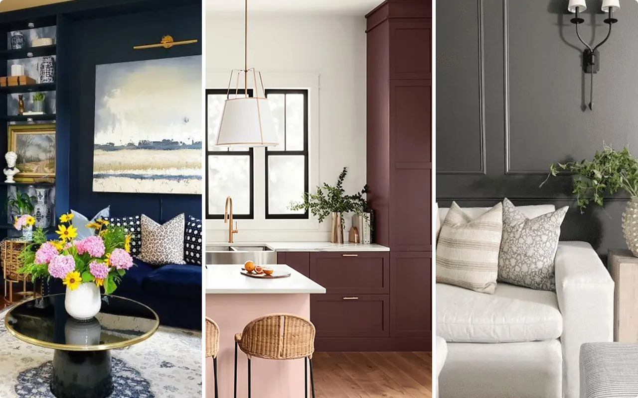
Moody paint colors have become a favorite among homeowners and designers who want to create spaces with personality, depth, and sophistication. Instead of sticking to bright whites or safe neutrals, more people are turning toward deeper, richer shades that evoke emotion and make a statement.
Sherwin-Williams, one of the most trusted names in paint, offers an incredible range of moody colors that span across blues, greens, grays, browns, and jewel tones.
These shades work beautifully for cozy interiors, striking exteriors, or as accents that bring drama to a room. Whether you’re drawn to inky blues, earthy greens, or warm, dramatic neutrals, this list of 19 best moody paint colors from Sherwin-Williams will inspire you to embrace boldness in your home.
*This post contains affiliate links. For more details see my full disclosure.
What Makes A Color Moody?
A moody paint color isn’t just “dark.” What sets it apart is its depth, richness, and emotional impact. Moody colors typically fall on the deeper end of the spectrum, often infused with complex undertones that create dimension and drama. These shades can feel cozy, dramatic, romantic, or even mysterious, depending on how they’re used.
For example:
- Moody blues often feel calm, grounded, and classic.
- Deep greens evoke a natural, earthy sophistication.
- Charcoals and blacks add drama and modern elegance.
- Rich warm tones like terracotta or plum feel bold and expressive.
Lighting also plays a big role in how moody colors behave. Natural sunlight can soften their richness, while artificial lighting often intensifies their depth. The result is a color that changes throughout the day, giving your space a dynamic, layered personality.
How to Pick The Best Moody Paint Colors?
Choosing the right moody paint color depends on your space, your lighting, and the atmosphere you want to create. Here are some key tips to guide your decision:
1. Consider Natural Light
Rooms with plenty of natural light can handle deeper, darker shades without feeling closed in. In smaller or dimly lit spaces, opt for moody colors with a softer undertone (like a smoky blue or muted green) to prevent the room from feeling heavy.
2. Think About Room Function
- Bedrooms benefit from calming, cocoon-like shades such as deep greens or muted blues.
- Dining rooms and living rooms can handle bold, dramatic colors like plum, charcoal, or navy.
- Kitchens and bathrooms look stunning with moody cabinetry, often in shades of dark green, gray, or navy.
3. Pair with Contrasts
Moody colors really shine when paired with the right accents. Crisp white trim, warm wood tones, or metallic finishes like brass or bronze help balance their richness and highlight their depth.
4. Test Before You Commit
Always sample a color on your wall and observe it in different lighting conditions. A color that looks dramatic and cozy in the evening might appear brighter or softer in natural daylight.
How to Know if a Paint Color Is Right for You?
The best way to see if a paint color works for your home is to test it on your wall. Look at it over a few days in different lighting; morning, afternoon, and evening, to see how it really feels.
You can do this by getting a sample from the paint store and using a brush put it up on the walls, but then you are left with a can that you can’t do anything with. Those samples are used with poor-quality paint and aren’t meant for use on your walls permanently.

Instead, I recommend going with Samplize. They are a company that will send you a 9”x14.75” peel and stick swatch of a paint color that you can stick to the wall. When you are done just peel it off and throw it away.
It’s easy and much less messy!
Top 19 Sherwin Williams Moody Paint Colors
Here’s the curated list of the 19 best moody paint colors by Sherwin-Williams:
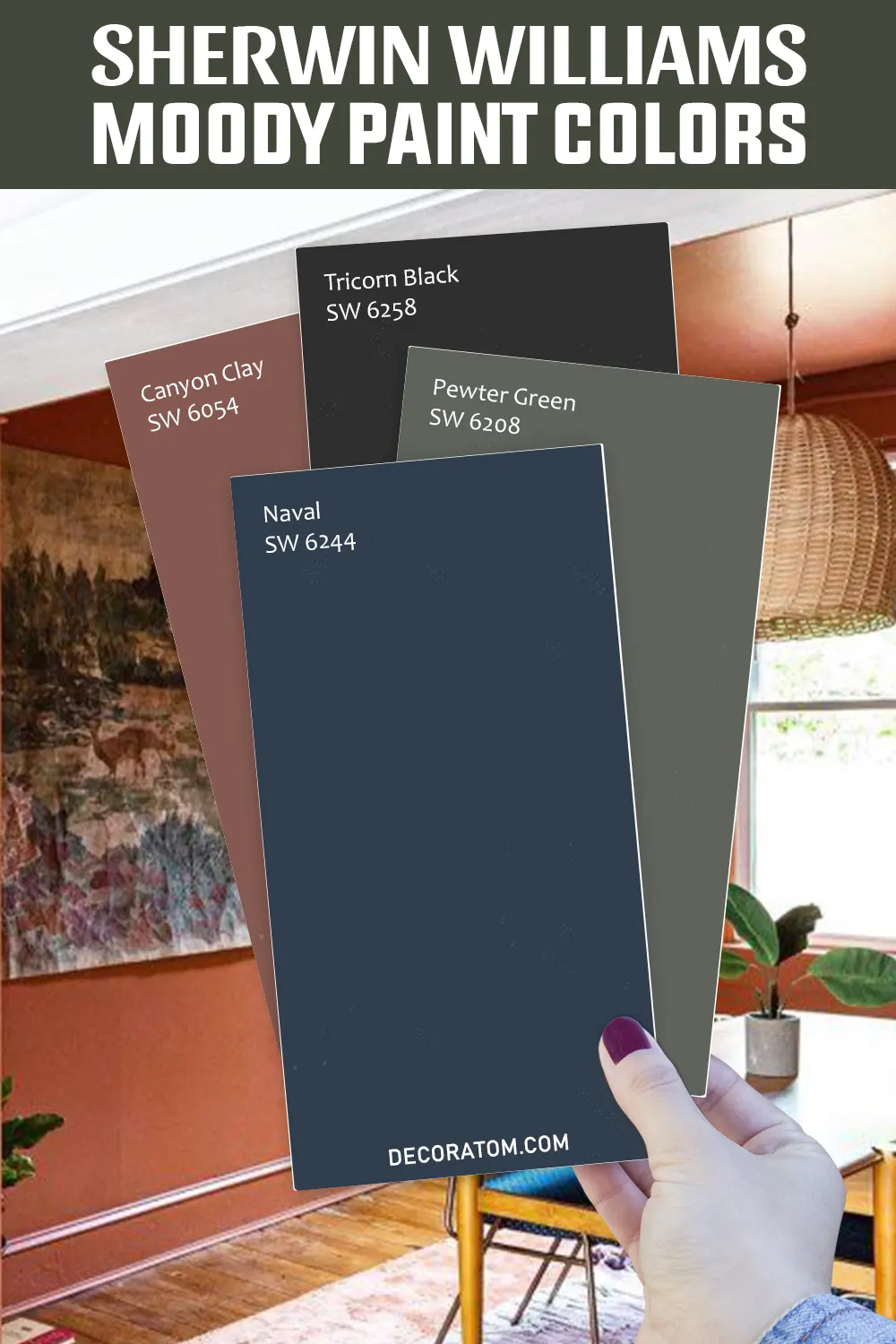
1. Naval SW 6244

💥🎁 Christmas & Year-End Deals On Amazon !
Don't miss out on the best discounts and top-rated products available right now!
*As an Amazon Associate, I earn from qualifying purchases.
Naval is a rich, deep navy blue that manages to be both classic and contemporary at the same time. Its depth creates an anchor-like presence in any room, instantly adding drama and refinement.
Unlike lighter blues, Naval carries a strong sense of sophistication that feels timeless rather than trendy. In living rooms, it pairs beautifully with crisp white trim and warm metallic accents like brass or gold, creating a luxurious atmosphere.
In bedrooms, it sets a moody, cocoon-like backdrop that feels serene and grounding, especially when layered with soft linens and warm wood tones. Naval also shines on kitchen cabinetry or bathroom vanities, where its bold tone adds modern flair without overwhelming the space.
2. Smoky Blue SW 7604
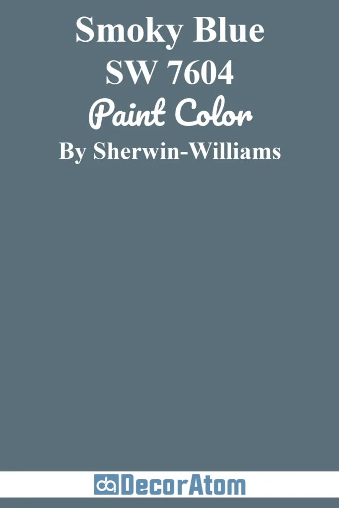
Smoky Blue captures the quiet elegance of a misty morning. Its slightly gray undertones soften the intensity of the blue, making it versatile enough for both traditional and modern interiors.
This shade has a calming, relaxed mood, perfect for spaces where you want to encourage focus and peace, such as home offices, libraries, or study nooks. On walls, Smoky Blue works wonderfully with creamy whites and warm wood finishes, balancing coziness with sophistication.
Outdoors, it lends homes a timeless coastal charm, pairing beautifully with white trim or stone details. Its muted richness ensures it doesn’t overpower, even when used across an entire room.
3. Retreat SW 6207

Retreat is a muted green-gray that instantly evokes feelings of calm, balance, and connection to nature. With its earthy undertones, it delivers a grounded atmosphere that feels equally at home in a rustic cabin or a contemporary farmhouse.
Retreat is a go-to choice for bedrooms or bathrooms where relaxation is the goal, creating a spa-like retreat that lives up to its name.
Pair it with warm woods, wicker textures, and natural fabrics for a soothing organic aesthetic, or contrast it with crisp whites for a more modern edge. Retreat also works well on cabinetry, where it feels fresh yet timeless.
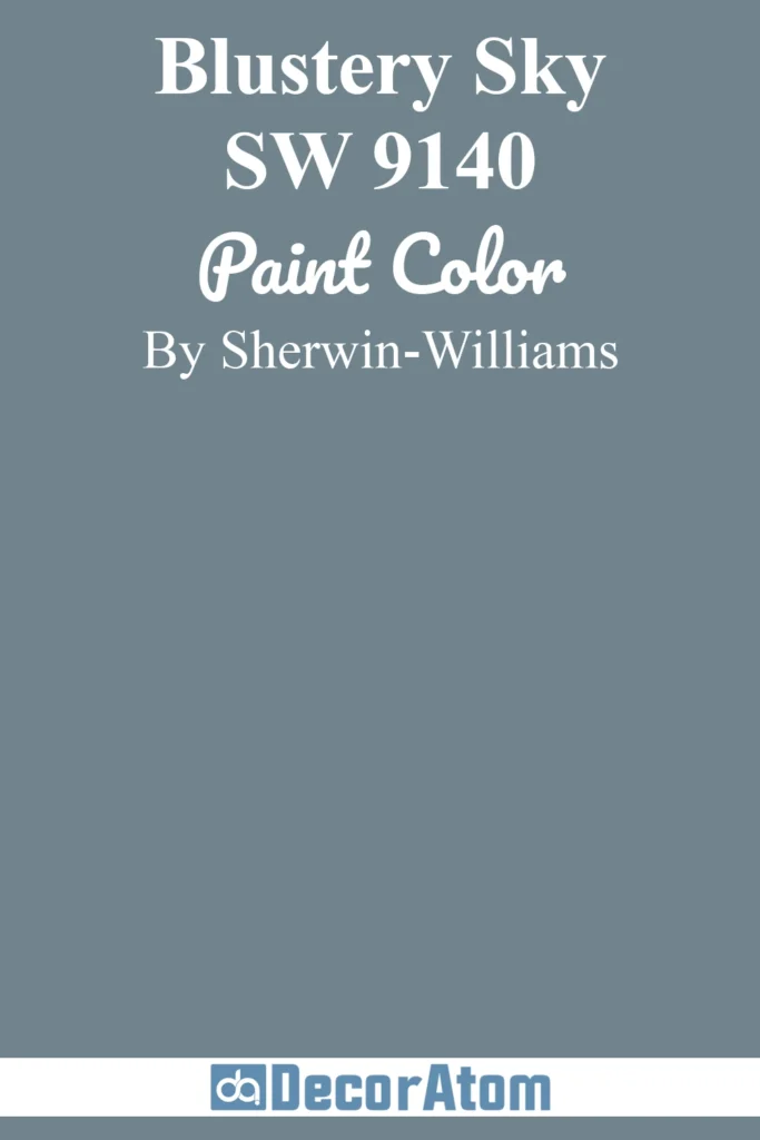
4. Blustery Sky SW 9140
💥🎁 Christmas & Year-End Deals On Amazon !
Don't miss out on the best discounts and top-rated products available right now!
*As an Amazon Associate, I earn from qualifying purchases.
Blustery Sky is a medium-deep stormy blue that captures the drama of overcast skies and rolling seas. Its gray undertones soften the blue, giving it a versatile quality that works beautifully in both coastal and urban settings.
This color has a moody yet approachable personality—perfect for entryways where you want to make a statement, or for dining rooms that call for an elevated yet cozy mood.
When paired with pale gray furnishings, linen fabrics, and black accents, Blustery Sky creates a sophisticated, layered look. It’s equally effective on an exterior, offering just the right balance of drama and classic appeal.
5. Pewter Green SW 6208
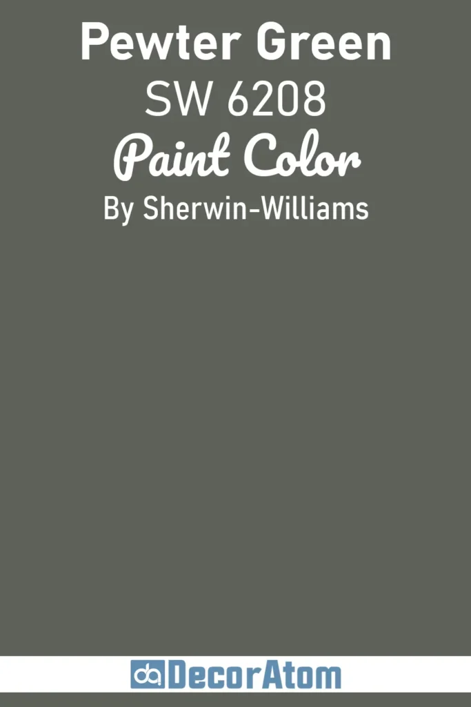
Pewter Green is a dark, elegant green that leans into gray for a beautifully muted finish. This sophisticated shade feels grounded in nature, evoking a sense of stability and depth.
It’s the perfect moody hue for anyone who loves the richness of green but wants something more versatile and subdued than emerald or forest green. Pewter Green excels in kitchens and dining rooms, especially when used on cabinetry or built-ins, giving spaces a refined yet organic feel.
For bedrooms, it creates a cozy, cocooning vibe that pairs beautifully with warm brass, soft whites, and rich wood tones. Outdoors, it adds character to exteriors, offering a modern twist on classic green.
6. Iron Ore SW 7069
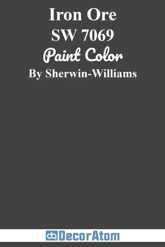
Iron Ore is a luxurious, soft black with rich charcoal undertones that make it more approachable than a pure, stark black. Its velvety depth brings instant drama and sophistication to any space.
As an interior wall color, it creates the ultimate backdrop for bold artwork, modern furnishings, or layered neutrals. On cabinetry or doors, Iron Ore feels sleek and timeless, while on exteriors it delivers striking curb appeal that stands out without feeling harsh.
Despite its depth, this color reads warm and inviting in natural light, making it surprisingly versatile. It’s ideal for homeowners who want boldness with a touch of softness.
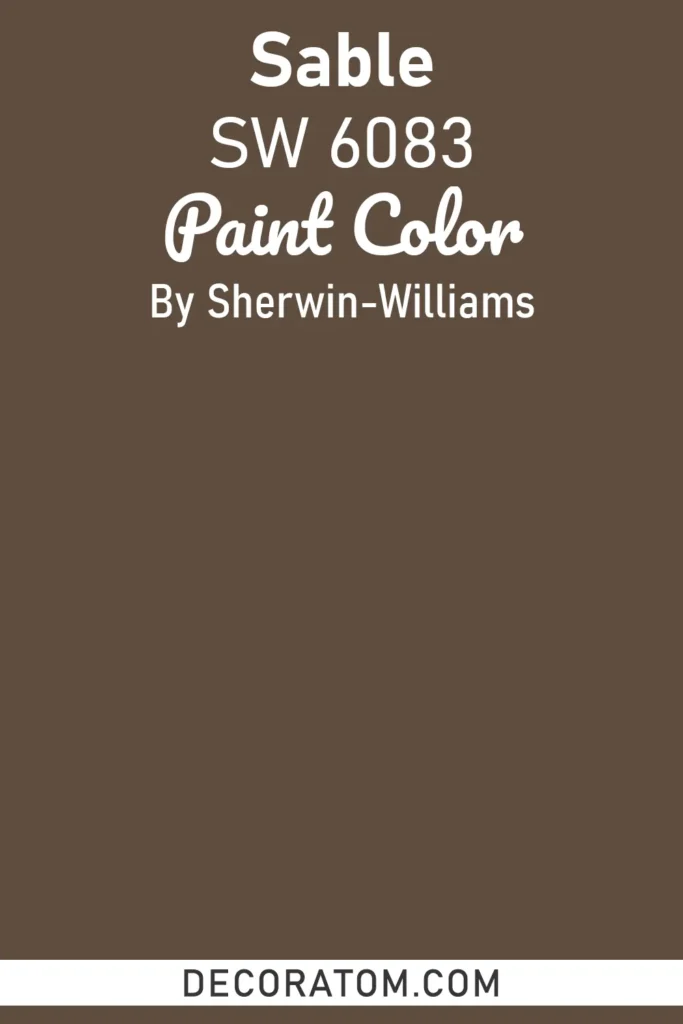
7. Sable SW 6083
💥🎁 Christmas & Year-End Deals On Amazon !
Don't miss out on the best discounts and top-rated products available right now!
*As an Amazon Associate, I earn from qualifying purchases.
Sable is a dark, chocolatey brown with a richness that feels both earthy and elegant. It carries a natural warmth that instantly creates a cozy and enveloping atmosphere, making it a perfect choice for living rooms, dens, or bedrooms where comfort is key.
Unlike lighter tans or beiges, Sable leans into drama, yet its undertones prevent it from feeling heavy or oppressive. Paired with natural stone, warm woods, and soft lighting, it evokes a sense of rustic sophistication.
On exteriors, Sable adds a timeless quality, complementing both brick and natural siding materials beautifully.
8. Raisin SW 7630
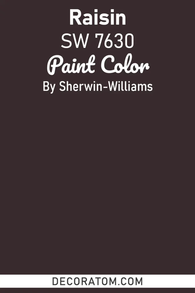
Raisin is a deep, rich purple-brown that adds unexpected drama and depth to interiors. Its undertones give it a wine-inspired elegance that feels both bold and cozy.
This color creates a sense of intimacy, making it a striking choice for dining rooms, libraries, or powder rooms where you want to wow guests with a touch of moody sophistication.
Paired with soft neutrals like ivory or gray, Raisin feels refined, while bolder pairings with metallic accents or jewel tones can push it toward glamorous and dramatic. It’s an excellent way to bring color into a space without resorting to traditional blues or greens.
9. Tricorn Black SW 6258

Tricorn Black is Sherwin-Williams’ most classic, true black. Free from noticeable undertones, this color delivers crisp, clean drama that works across all styles, from modern minimalism to historic charm.
On interiors, it’s a showstopper for accent walls, trim, or even full rooms when balanced with plenty of light and contrasting furnishings. On exteriors, Tricorn Black provides instant curb appeal, lending a sophisticated, architectural quality to siding, doors, or shutters.
Its versatility is unmatched: pair it with warm woods for an earthy, organic feel, or with whites and grays for a bold, modern contrast.
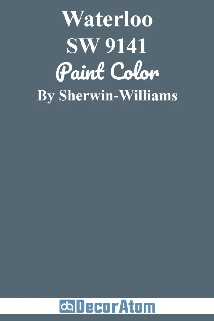
10. Waterloo SW 9141
💥🎁 Christmas & Year-End Deals On Amazon !
Don't miss out on the best discounts and top-rated products available right now!
*As an Amazon Associate, I earn from qualifying purchases.
Waterloo is a moody blue-gray with a subtle softness that keeps it from feeling too heavy. Its smoky undertones bring sophistication and versatility, making it ideal for spaces where you want depth without overwhelming the senses.
Waterloo works beautifully in bedrooms, creating a cozy and restful retreat, and it also elevates dining rooms or offices with a dramatic yet calming atmosphere. When paired with lighter grays, crisp whites, or warm metallics, Waterloo shines as both a bold accent and a whole-room color.
It’s equally stunning on cabinetry or as an exterior paint, where its richness stands out against natural landscapes.
11. Dovetail SW 7018
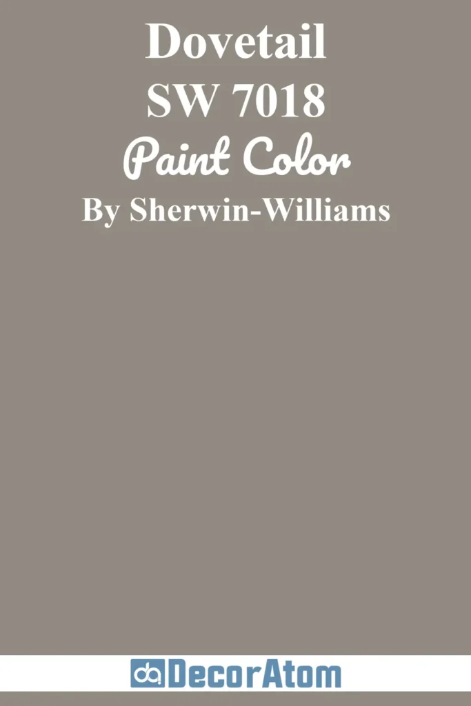
Dovetail is a warm, medium-to-dark gray with subtle brown undertones, giving it a soft, inviting mood rather than a cold, industrial one. It’s the kind of gray that feels balanced, neutral enough to pair with almost anything, yet moody enough to create depth.
In interiors, Dovetail works beautifully as a whole-room color, especially in living rooms or bedrooms where coziness is the goal. It also shines on cabinetry or built-ins, grounding a space without overwhelming it.
Outdoors, Dovetail provides a sophisticated neutral backdrop that pairs well with stone, brick, or contrasting trim colors.
12. Tony Taupe SW 7038
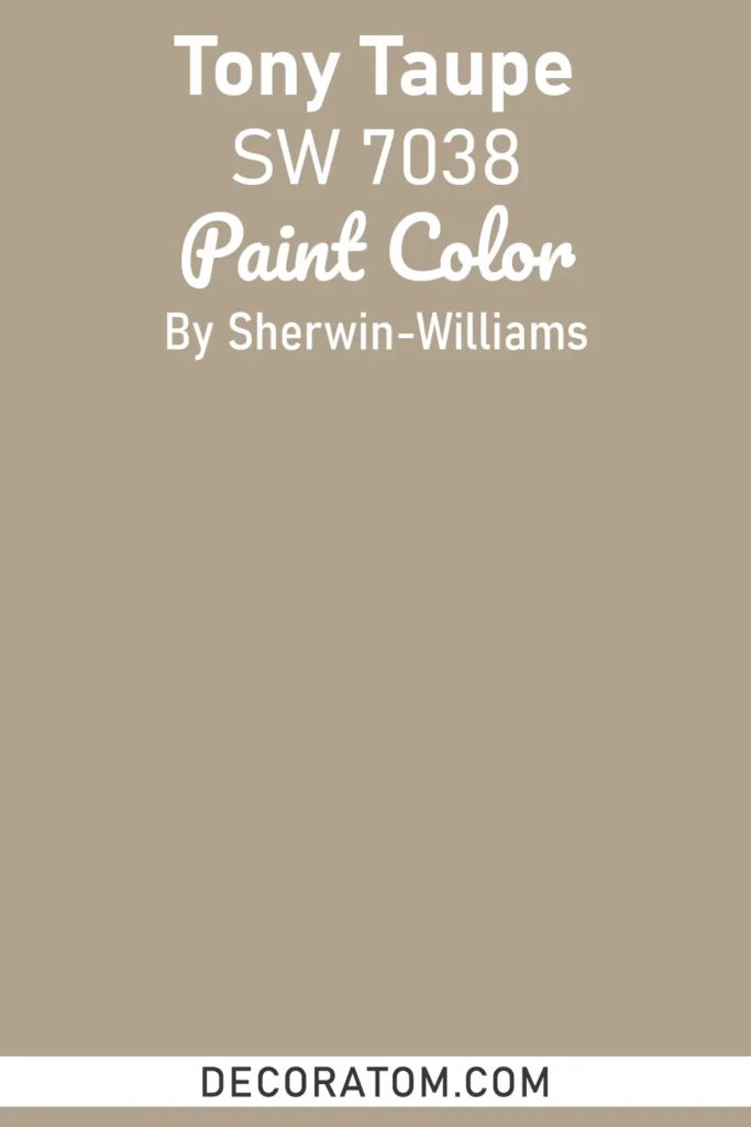
Tony Taupe is a warm, earthy taupe that blends beige and gray with just enough depth to qualify as moody. This color has a grounded, organic vibe that feels timeless and versatile, making it an excellent choice for both interiors and exteriors.
In living spaces, it creates a welcoming, understated elegance that pairs well with wood furniture, natural fabrics, and other earthy tones.
On exteriors, Tony Taupe complements stonework and landscaping beautifully, creating a harmonious, natural curb appeal. Its warm undertones keep it from feeling flat, making it a reliable choice for those who want a moody neutral that isn’t too dark.
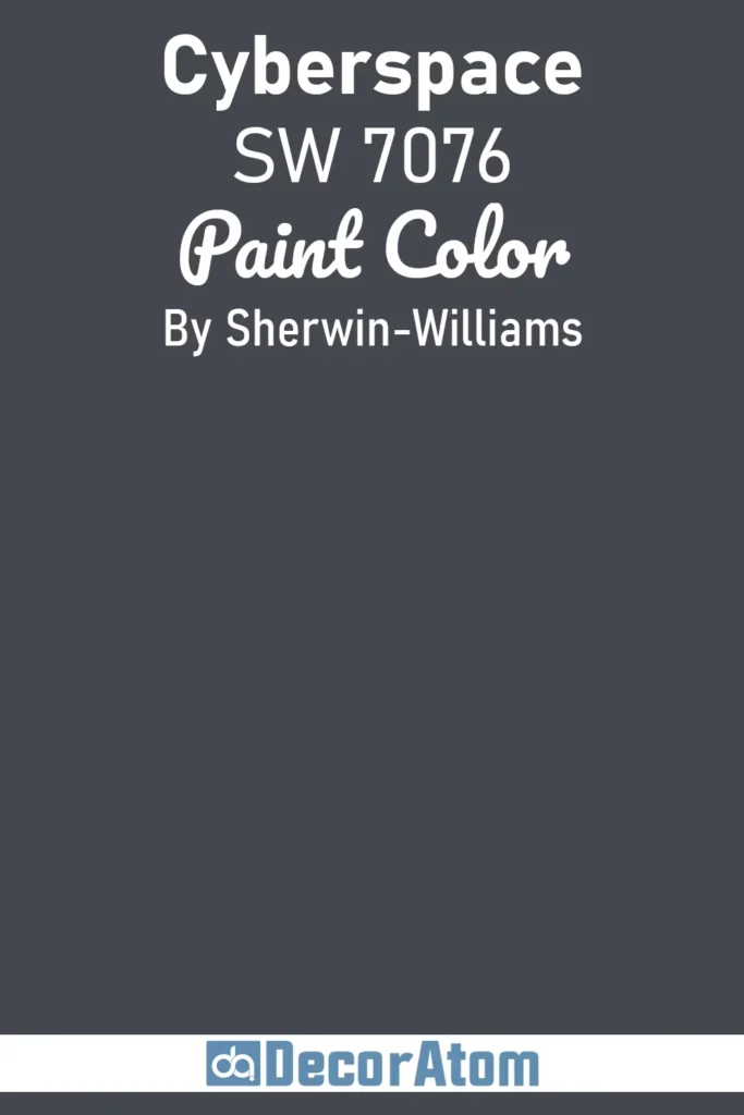
13. Cyberspace SW 7076
💥🎁 Christmas & Year-End Deals On Amazon !
Don't miss out on the best discounts and top-rated products available right now!
*As an Amazon Associate, I earn from qualifying purchases.
Cyberspace is a deep, almost-black navy with cool undertones, striking the perfect balance between blue and gray. Its sleek and modern vibe makes it a fantastic option for contemporary homes, yet its timeless richness also suits more traditional styles.
Cyberspace is often used as an alternative to black for those who want a touch of color depth. It works wonderfully on accent walls, front doors, or kitchen cabinetry, where its boldness feels stylish without being stark.
In well-lit rooms, Cyberspace creates a sophisticated contrast against light furnishings, while in smaller spaces it delivers a cozy, cocoon-like effect.
14. Dark Night SW 6237
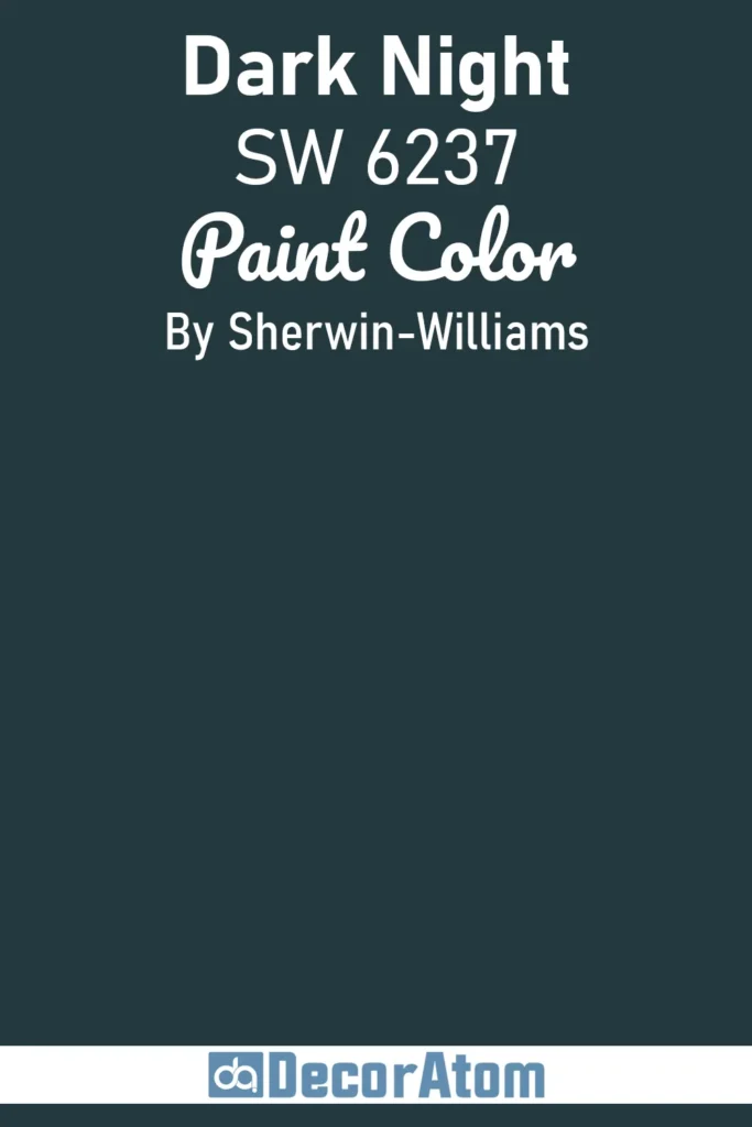
Dark Night is a luxurious deep teal that combines the sophistication of navy with the richness of green. This bold color carries a mysterious, enveloping mood, making it perfect for creating dramatic focal points in interiors.
Bedrooms and dining rooms painted in Dark Night instantly feel more elegant and intimate. It also works beautifully on cabinetry or accent walls, where its jewel-toned quality makes a strong style statement.
Pair it with gold hardware, natural woods, or crisp whites to highlight its depth. On exteriors, Dark Night offers a stunning alternative to standard navy or black, lending a touch of personality without sacrificing sophistication.
15. Urbane Bronze SW 7048
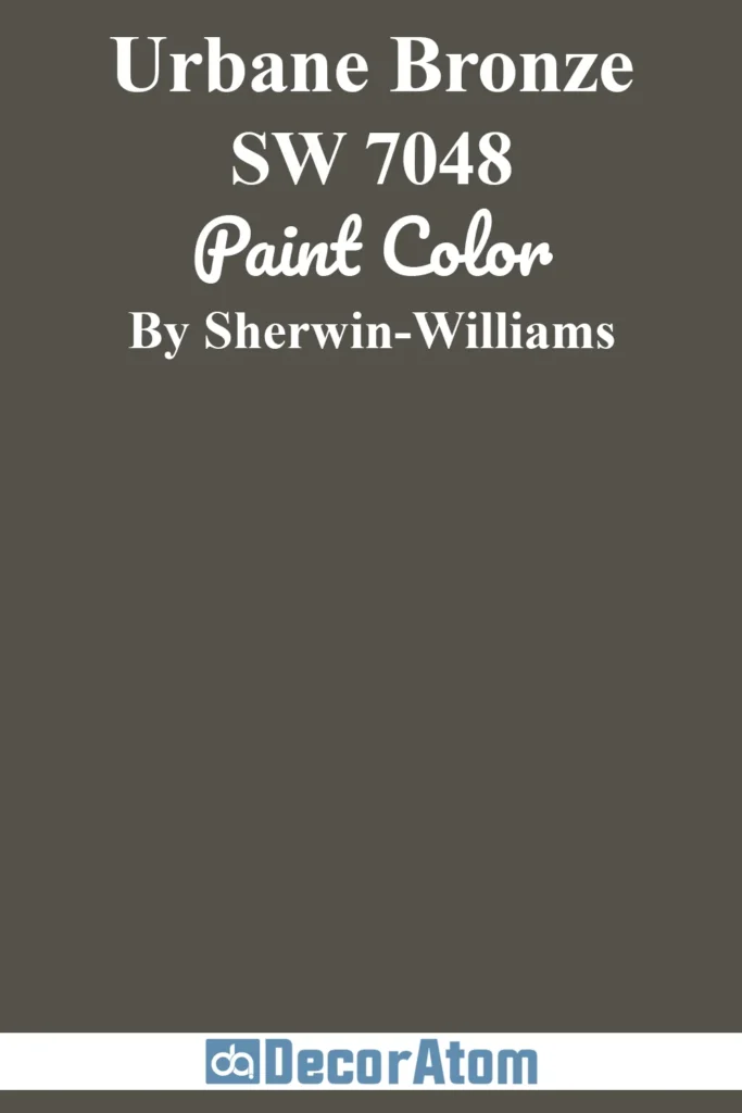
Chosen as Sherwin-Williams’ 2021 Color of the Year, Urbane Bronze is a deep, earthy bronze with warm undertones of brown and gray. It exudes a sense of grounded sophistication, perfect for creating cozy, serene interiors.
This versatile shade works especially well in living rooms, bedrooms, and offices where you want a calm yet luxurious mood. Urbane Bronze pairs beautifully with warm neutrals, natural stone, and wood finishes, enhancing its organic quality.
Outdoors, it makes for a stunning exterior paint or front door color, blending seamlessly into natural surroundings while still feeling bold and modern.
16. Oakmoss SW 6180

Oakmoss is a rich, earthy green that captures the essence of nature. With its deep olive undertones, this color feels moody, organic, and grounding. It’s an excellent choice for creating intimate, nature-inspired spaces such as studies, bedrooms, or dining rooms.
Oakmoss pairs especially well with rustic wood tones, woven textures, and warm metallic accents, creating a layered, cozy atmosphere.
On exteriors, it evokes a natural harmony with landscapes, making homes feel rooted in their surroundings. If you’re looking for a moody green that feels both dramatic and earthy, Oakmoss is a standout choice.
17. Expressive Plum SW 6271
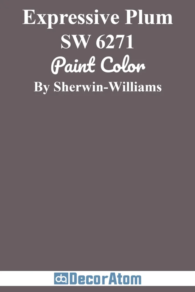
Expressive Plum is a rich, jewel-toned purple with subtle gray undertones that prevent it from feeling too bright or overwhelming. It’s moody, sophisticated, and just the right amount of dramatic, perfect for making a bold statement in interiors.
Dining rooms, bedrooms, and powder rooms painted in Expressive Plum exude an air of elegance and creativity. When paired with gold accents or velvet textures, the color takes on a glamorous quality.
In more casual settings, pairing it with neutral tones helps tone down its richness while still delivering depth and character.
18. Carnelian SW 7580
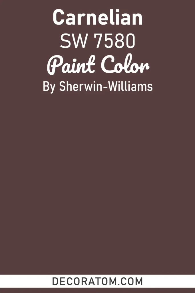
Carnelian is a deep, rusty red with earthy brown undertones, offering warmth, richness, and drama all in one. Its bold, fiery personality makes it a fantastic choice for accent walls, dining rooms, or spaces where you want to spark energy and conversation.
Despite its intensity, Carnelian is grounded by its earthy base, making it surprisingly versatile. Pair it with warm neutrals like beige or taupe for balance, or with dark wood finishes for a dramatic, cozy look. On exteriors, Carnelian brings vibrancy and warmth, creating a welcoming yet bold statement.
19. Canyon Clay SW 6054
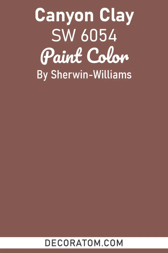
Canyon Clay is a warm, terracotta-inspired hue that captures the earthy beauty of desert landscapes. With its burnt orange undertones, it adds both vibrancy and grounding warmth to interiors.
Canyon Clay works wonderfully in living rooms or kitchens, where it brings energy without feeling overpowering. In bohemian or southwestern-inspired designs, it pairs effortlessly with woven textures, natural wood, and creamy whites.
Outdoors, it provides a striking complement to natural stone or stucco, giving exteriors a warm, inviting curb appeal. Its earthy richness makes it a perfect choice for anyone seeking a moody color with a natural edge.
FAQs About Moody Paint Colors
Are moody paint colors good for small rooms?
Yes, but with some care. Deep colors can make a small room feel cozy and intimate, but they can also feel cramped if there’s little natural light. Choosing moody shades with softer undertones or using them on a single accent wall can add drama without overwhelming the space.
Which Sherwin-Williams moody colors work best for bedrooms?
Shades like Naval SW 6244, Retreat SW 6207, or Oakmoss SW 6180 are perfect for bedrooms. They create a calm, cocooning atmosphere that’s ideal for relaxation and sleep while still adding a touch of sophistication.
How do lighting conditions affect moody paint colors?
Lighting has a huge impact on moody colors. Natural sunlight can soften the depth and reveal undertones, while artificial lighting can intensify the richness of the shade. It’s always a good idea to test a small patch on your wall and observe it at different times of the day before committing.
What trim or accent colors pair well with moody paint shades?
Crisp whites, soft grays, and warm neutrals often work beautifully with moody colors, providing contrast that highlights the depth of the main color. Metallics like brass, gold, or bronze can also elevate the space, adding a touch of elegance and sophistication.
Can moody colors be used in kitchens and bathrooms?
Absolutely. Moody shades on cabinetry, islands, or accent walls can create a modern, stylish look in kitchens and bathrooms. Pairing them with lighter countertops, backsplashes, or fixtures ensures the space feels balanced and inviting.
Are moody colors only for traditional homes?
Not at all. Moody colors are versatile and can work in a range of styles, from contemporary and modern to rustic and traditional. It’s all about pairing them with the right materials, textures, and lighting to match your desired aesthetic.

