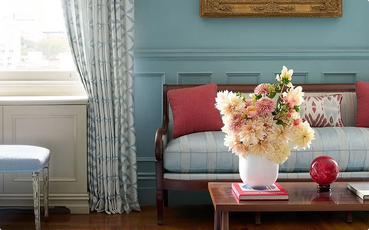
So here’s the thing about blue paint. It’s kind of magical, isn’t it? I mean, it can make a room feel calm, cozy, cheerful, or even downright luxurious depending on the shade. But… not all blues are created equal.
I’ve made the mistake (oh, trust me, I have) of picking a blue that looked amazing on a tiny swatch and then realizing my entire living room looked like an ice rink. Yeah, not my proudest moment.
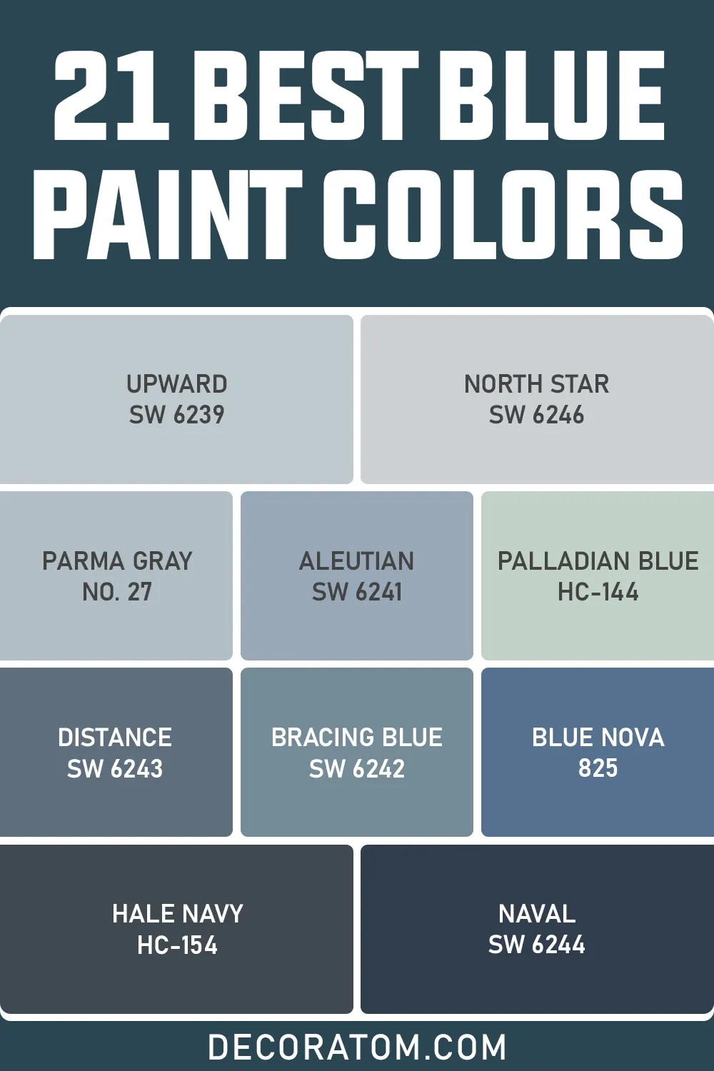
So, I thought, why not make this a little easier for all of us? I’ve rounded up 21 of the best blue paint colors, from light, airy shades that make your space feel like a cloud, to deep, moody navy tones that make you feel like you just stepped into a boutique hotel.
I’m talking shades you’ll actually want to live with, not regret at 2 a.m. while you’re staring at your walls.
Why Is Blue Such a Popular House Color?
Not gonna lie, blue has kind of stolen the spotlight in home design for decades, and there’s a bunch of reasons why it’s so dang popular. Let me break it down like we’re just chatting over coffee.
1. It’s calming and relaxing
Blue is basically the official “chill out” color. Lighter shades feel airy and open, like a clear sky, while medium blues feel friendly and approachable. Even darker blues can make a space feel cozy and safe, like you want to curl up with a blanket and a book. Honestly, who doesn’t want a room that makes them feel good?
2. It’s versatile
Blue comes in so many shades, powdery pastels, turquoise-ish teals, true navies, smoky gray-blues… you name it. This means it can fit almost any room or style. Modern, classic, coastal, farmhouse, even artsy eclectic spaces, it just works. It’s like the chameleon of paint colors.
3. It pairs well with everything
White trim, warm wood floors, gold hardware, pops of yellow, blush pink, gray, even bold reds or oranges, blue plays nicely with basically any accent color. That makes it a designer favorite because you can switch up furniture and décor without repainting your walls every year.
4. It can make a room feel bigger or cozier, depending on shade
Light blues reflect light, so small rooms can feel more open and airy. Dark blues absorb light, making bigger rooms feel intimate and inviting. Basically, blue is flexible, like a yoga instructor for your walls.
5. It evokes positive associations
Think about it: blue = sky, water, calm, trust, reliability. These vibes subconsciously make people feel happy and safe. That’s probably why you see so many blue front doors, it subconsciously says, “Hey, welcome in, this is a friendly house.”
Honestly, blue is like the friend who’s easygoing, dependable, and somehow effortlessly stylish. It rarely goes wrong, looks great in almost any light, and just… feels right. No wonder it’s such a favorite for homes.
Tips for Choosing The Best Blue Paint Colors
Alright, here’s where I get nitpicky (in a friendly way):
- Test samples first: I cannot stress this enough. Paint a patch on your wall and live with it for a few days. Lighting changes everything.
- Consider natural light: North-facing rooms tend to look cooler, south-facing warmer. Artificial light matters too, LED, fluorescent, incandescent, they all change the tone.
- Decide on mood: Light blues = airy, calm; medium blues = cheerful, balanced; dark blues = cozy, dramatic. Figure out what you want the room to “feel” before committing.
- Think about pairing colors: Even a gorgeous blue can feel off if it clashes with trim, flooring, or furniture. Make a mini mood board or swatches.
- Don’t be afraid to go bold: Darker blues can feel intimidating, but they’re stunning on accent walls, cabinets, or doors. Small doses can make a big impact.
- Consider undertones: Some blues lean green, some gray, some even purple. Check how it looks in morning and evening light.
How to Know if a Paint Color Is Right for You?
The best way to see if a paint color works for your home is to test it on your wall. Look at it over a few days in different lighting; morning, afternoon, and evening, to see how it really feels.
You can do this by getting a sample from the paint store and using a brush put it up on the walls, but then you are left with a can that you can’t do anything with. Those samples are used with poor-quality paint and aren’t meant for use on your walls permanently.
Instead, I recommend going with Samplize. They are a company that will send you a 9”x14.75” peel and stick swatch of a paint color that you can stick to the wall. When you are done just peel it off and throw it away.
It’s easy and much less messy!
Top 21 Blue Paint Colors
Here’s the full list divided by light, medium, and dark blues, ready for your walls to look absolutely gorgeous:
The Best Light Blue Paint Colors
1. Sherwin Williams Upward SW 6239
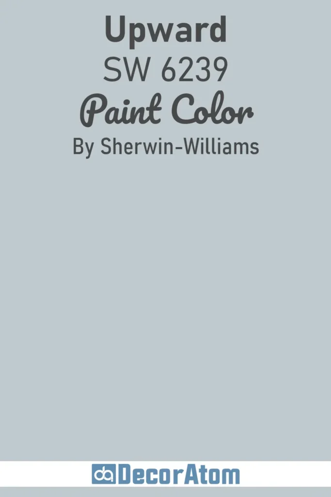
Upward is like that soft, whispery blue that makes you want to float on a cloud. Not too icy, not too pastel, just kind of there. Perfect for bedrooms or even a bathroom if you’re trying to feel like you’re showering in a spa instead of your tiny apartment tub. Honestly, it’s chill without being boring.
Click here to get a Peel & Stick paint sample of Upward
2. Benjamin Moore Iceberg 2122-50
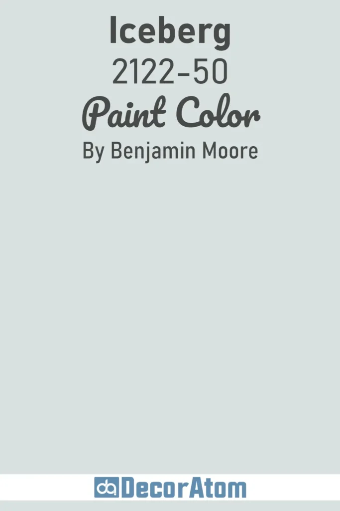
Iceberg… I mean, the name alone gives you chills, right? But in the best way. It’s crisp, light, and somehow makes a room feel bigger. I’ve used this in a living room once, and I swear, it looked like the sun was hitting every corner. Also, it pairs beautifully with wood tones, makes those oak floors pop.
Click here to get a Peel & Stick paint sample of Iceberg
3. Sherwin Williams North Star SW 6246
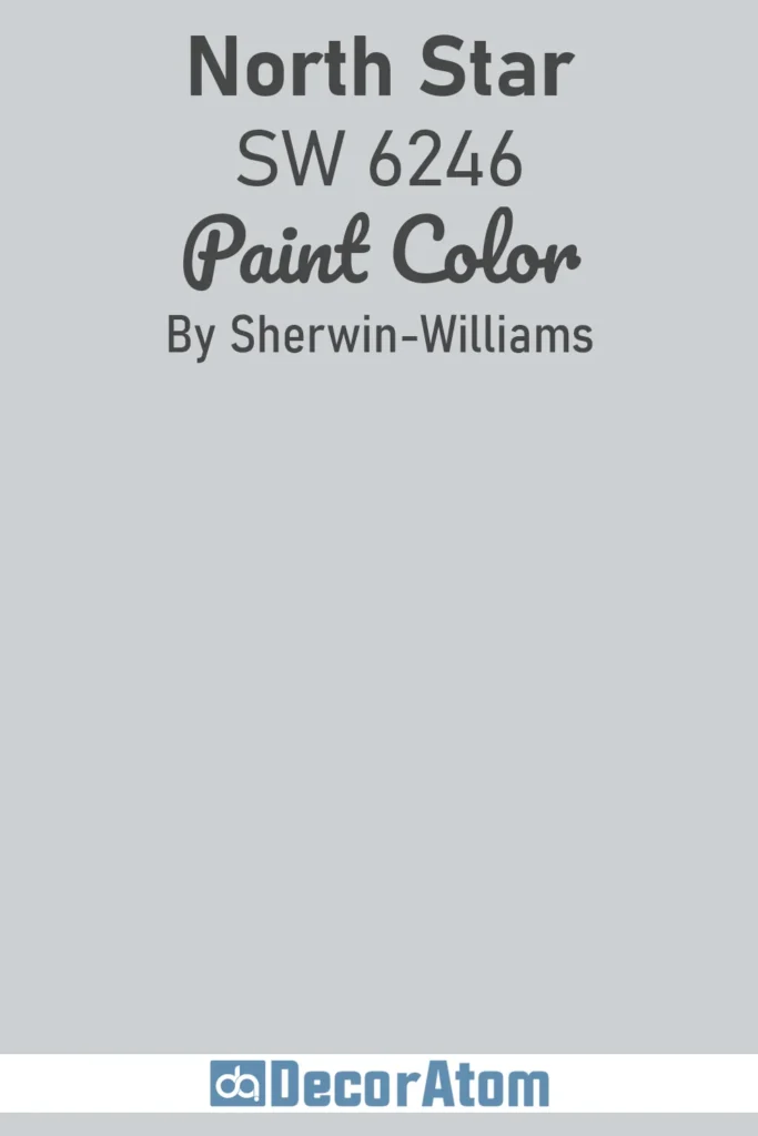
North Star is one of those blues that feels like a reliable friend. Not flashy, but solid. It’s got a slightly gray undertone, so it’s great if you don’t want a room that’s screaming “LOOK AT ME, I’M BLUE!” but still want some color. Works nicely in a home office if you need calm but not nap-inducing calm.
Click here to get a Peel & Stick paint sample of North Star
4. Benjamin Moore Palladian Blue HC-144
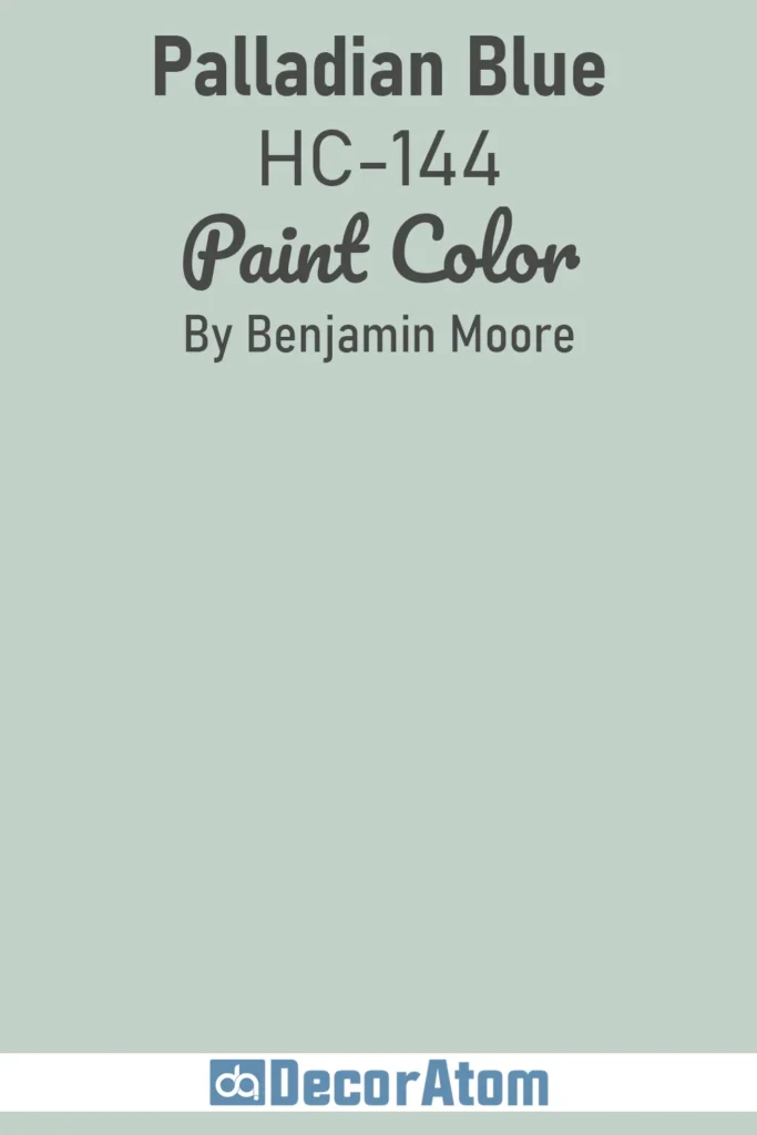
Palladian Blue is like a soft hug for your walls. It’s got a subtle green undertone, so sometimes it reads more like a muted teal depending on the light, tricky little thing. But when it works, oh, it really works. I used it in my kitchen once, and I’m still getting compliments years later. People love it.
Click here to get a Peel & Stick paint sample of Palladian Blue
5. Sherwin Williams Stardew SW 9138
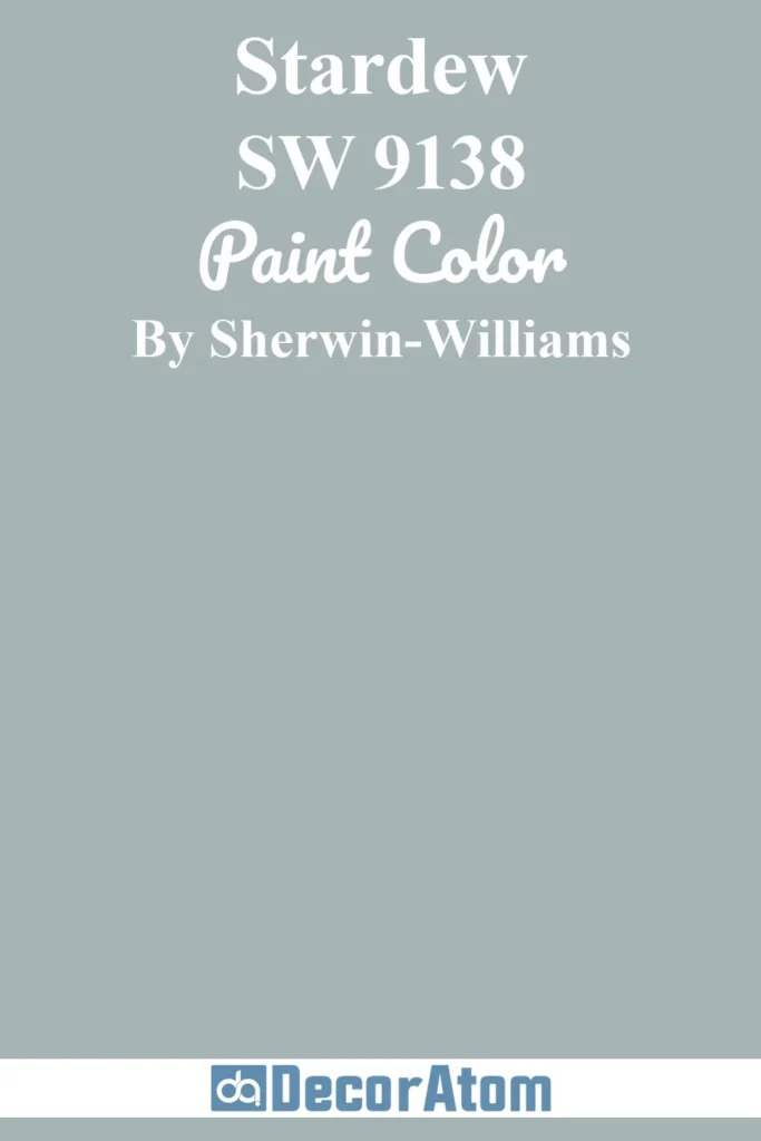
Stardew… I’m not kidding, this is like a quiet evening sky in your living room. It’s soft, light, and honestly, very forgiving if you’re not a pro at painting. You could probably spill coffee on the wall and it would still look… fine. Kind of like me on a Monday morning.
Click here to get a Peel & Stick paint sample of Stardew
6. Benjamin Moore Bird’s Egg 2051-60
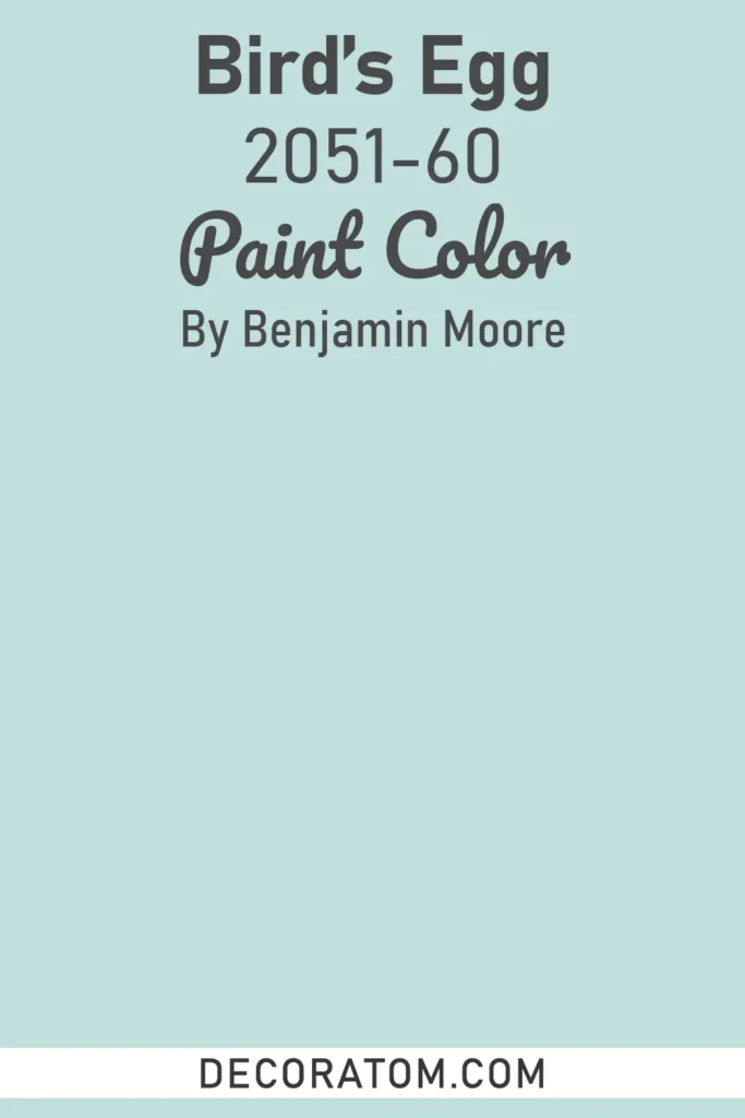
Bird’s Egg is just adorable, okay? It’s soft, kind of vintage-y, and you almost want to put little nests in the corners just to match. I used it in a nursery once, and oh boy, it was the coziest tiny room ever. It’s like springtime all year long, without pollen, thankfully.
Click here to get a Peel & Stick paint sample of Bird’s Egg
7. Farrow & Ball Parma Gray No. 27
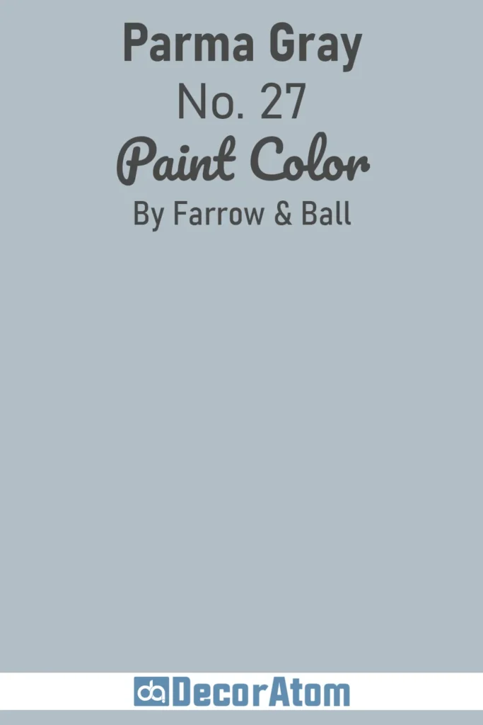
Okay, technically a “gray,” but hear me out, it’s got this faint blue cast that sneaks in depending on the light. It’s sophisticated without trying too hard. If you like a room that whispers elegance instead of shouting, Parma Gray is your friend. Perfect for living rooms or offices that double as Zoom backdrops.
8. Sherwin Williams Windy Blue SW 6240
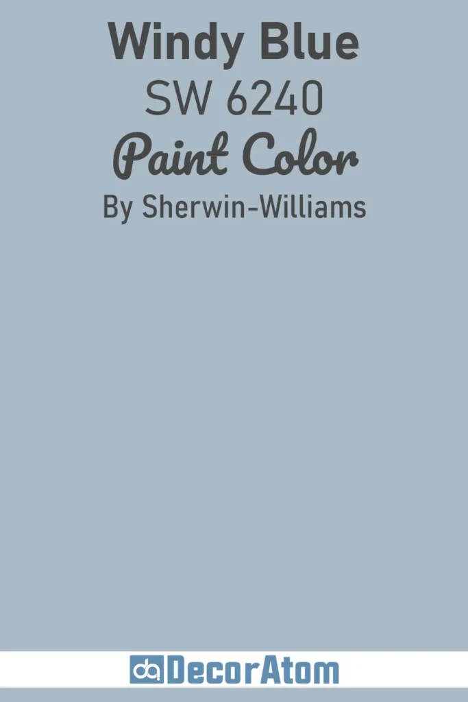
Windy Blue… you know how it feels when the wind hits your face at the beach? Yeah, that’s this color. It’s breezy, it’s light, and it just kind of lifts a room. I’ve used it in a hallway, and every time I walk by, I swear I almost feel like I’m at the coast. Almost.
Click here to get a Peel & Stick paint sample of Windy Blue
The Best Medium Blue Paint Colors
9. Sherwin Williams Aleutian SW 6241
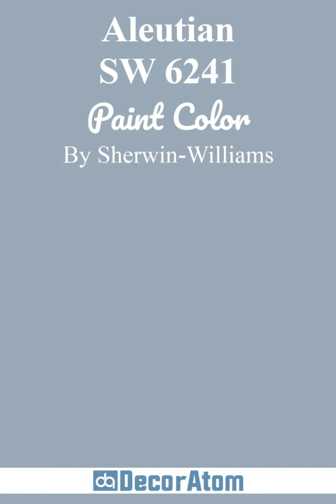
Aleutian is a bolder light-to-medium blue. Not too bright, not too dark, it’s like the Goldilocks of medium blues. It’s perfect if you want color without feeling like you accidentally painted your room Smurf-blue. Works great with white trim or even natural wood for that coastal-cottage vibe.
Click here to get a Peel & Stick paint sample of Aleutian
10. Benjamin Moore Santorini Blue 1634
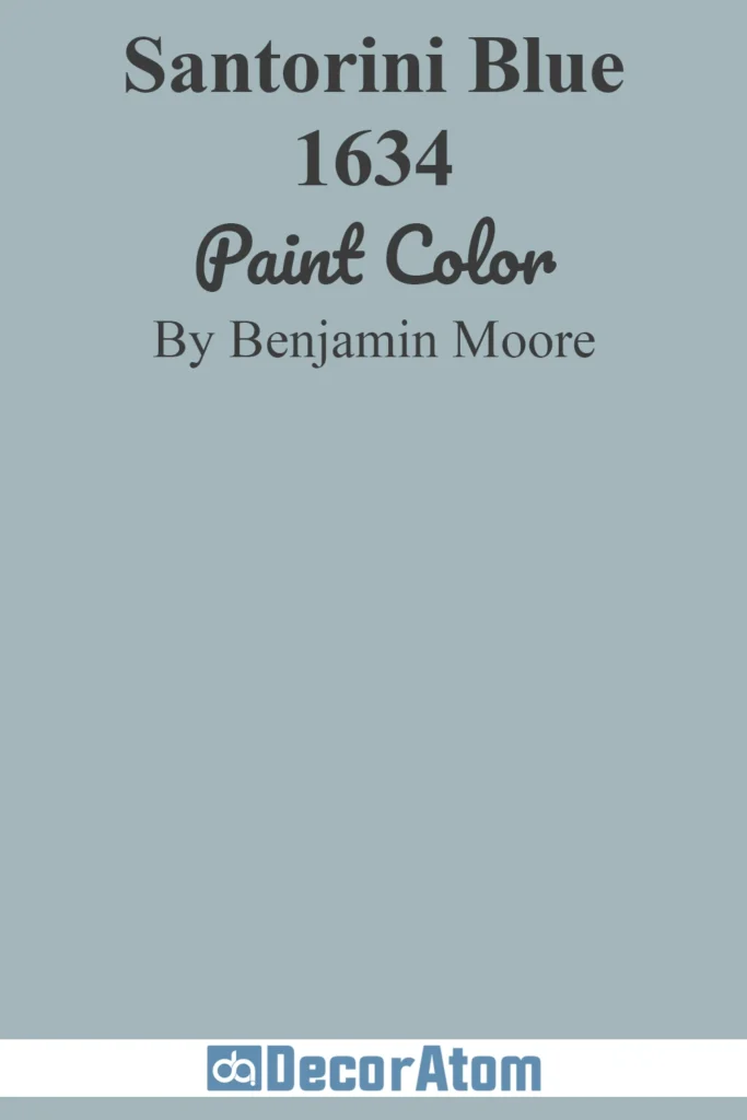
Santorini Blue is basically vacation in a can. Think Greek islands, white walls, sun, sea… okay, maybe minus the cocktails, but the vibe is there. It’s a medium blue that feels happy, kind of uplifting, and works anywhere you want to feel a little more open and bright.
Click here to get a Peel & Stick paint sample of Santorini Blue
11. Sherwin Williams Turkish Tile SW 7610
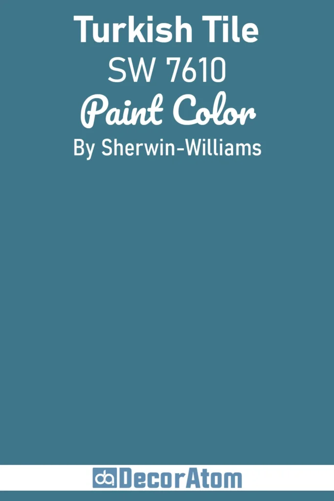
Oh, Turkish Tile, this one’s a stunner. Not your pale, timid blue, oh no. It’s vibrant without being aggressive, kind of like the blue you’d see on a gorgeous ceramic plate in Istanbul. I once painted a kitchen island in this color, and I swear, my friends were jealous of my cabinets. Works beautifully with brass hardware or even simple white for a pop of wow without going overboard.
Click here to get a Peel & Stick paint sample of Turkish Tile
12. Sherwin Williams Distance SW 6243
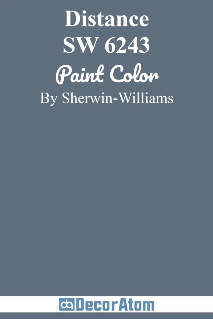
Distance is like… you know that soft blue you see when you look far across the ocean on a cloudy day? That. It’s calming, slightly moody, and somehow makes the room feel bigger, psychologically speaking, I guess. I’ve used this in a bedroom, and I swear, I slept like a log. Honestly, any room that could use some zen energy, this color’s your buddy.
Click here to get a Peel & Stick paint sample of Distance
13. Behr Atlantic Blue 600F-6
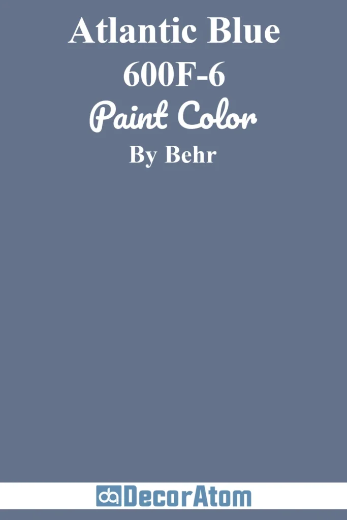
Atlantic Blue, and oh boy, it really does feel like the Atlantic. Deep, cool, and kind of classic. It’s not overpowering but definitely noticeable. I used it on a statement wall once, and it totally changed the vibe of the room from “meh” to “oh wow.” It pairs surprisingly well with warmer tones, like wood or brass, so you don’t feel like you’re living inside a giant ice cube.
14. Farrow & Ball St Giles Blue No. 280
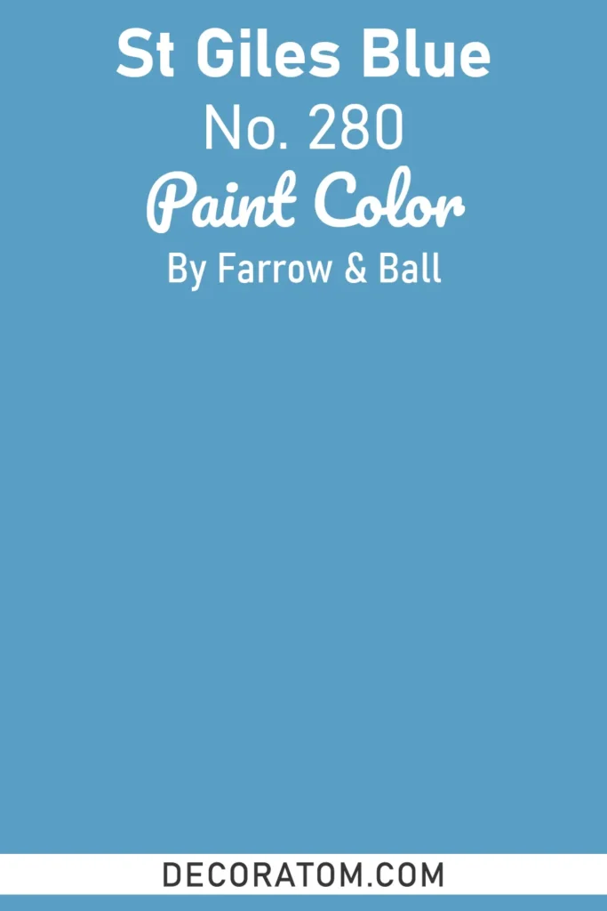
St Giles Blue is, let’s be honest, a grown-up kind of blue. Sophisticated, classy, and just a touch serious, like the friend who always has their life together (while the rest of us are Googling “how to cook rice”). Great for dining rooms, studies, or anywhere you want a subtle statement that isn’t shouting at you.
15. Sherwin Williams Bracing Blue SW 6242
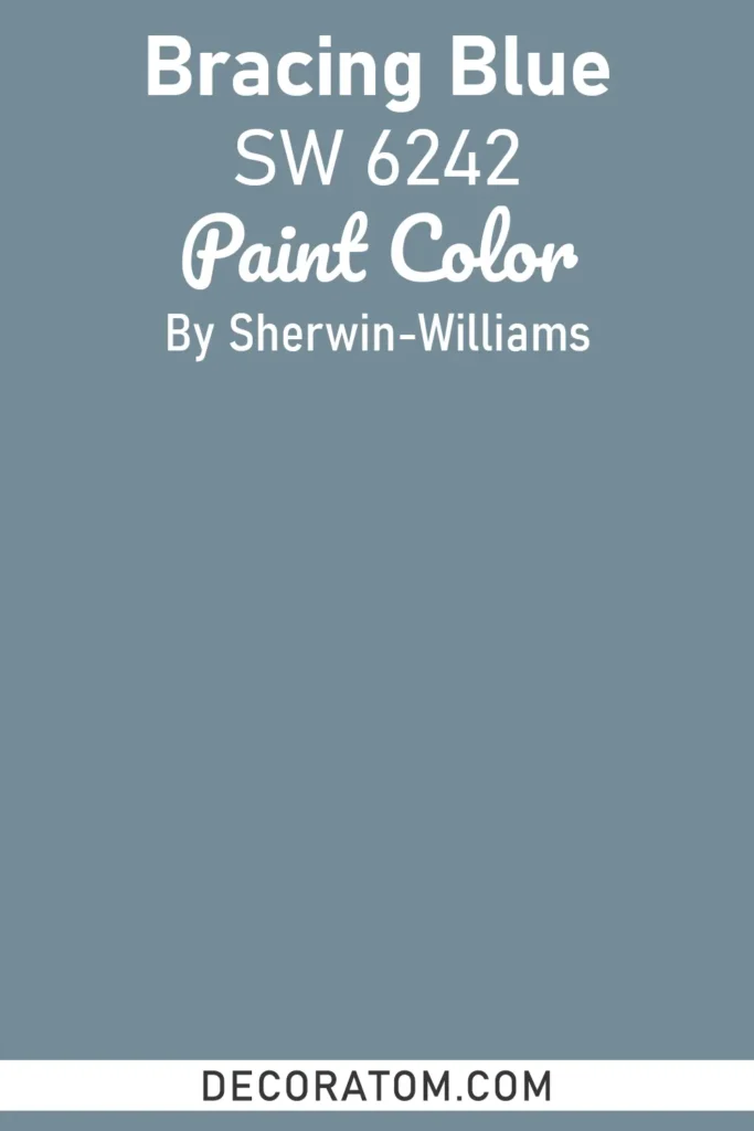
Bracing Blue, ah yes, the name says it all. It’s invigorating, fresh, and kind of wakes you up without the caffeine. I once painted a tiny bathroom with this, and I swear it made me feel like I was stepping into a fancy hotel every morning. It’s bright enough to make you happy, but grounded enough that it won’t give you a headache after a week.
Click here to get a Peel & Stick paint sample of Bracing Blue
The Best Dark Blue Paint Colors
16. Benjamin Moore Blue Nova 825
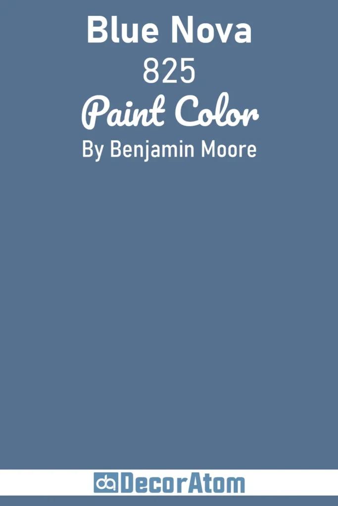
Blue Nova is rich and deep, but not so dark that you feel like you’re living in a cave. It’s the kind of blue that makes a room feel intimate and cozy, perfect for a reading nook or a bedroom where you just want to curl up with a book and ignore the world. Honestly, it’s one of those blues that makes everything else you put in the room pop.
Click here to get a Peel & Stick paint sample of Blue Nova
17. Benjamin Moore Hale Navy HC-154
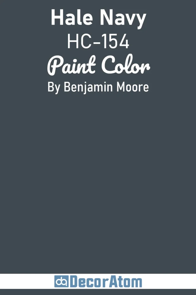
Oh, Hale Navy… people LOVE this one. It’s classic, strong, and gives any room that timeless, “I know what I’m doing” kind of energy. I used it in a home office once, and it felt like productivity just oozed from the walls. Well, maybe that’s exaggerating… but it does make a statement without screaming.
Click here to get a Peel & Stick paint sample of Hale Navy
18. Sherwin Williams Salty Dog SW 9177
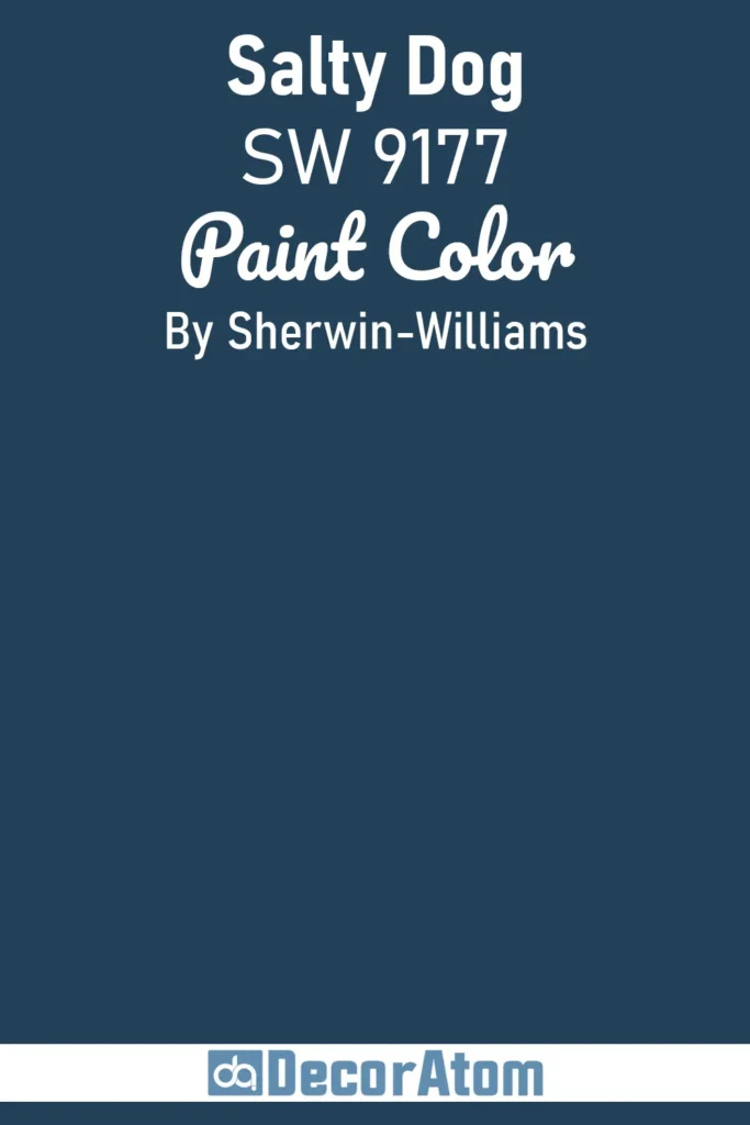
Salty Dog is playful yet deep. Not gonna lie, the name cracks me up every time, like, are we painting walls or naming a pirate? But the color itself? Gorgeous. It’s got depth, personality, and works well on cabinets, doors, or an accent wall if you want a bit of drama. It’s moody without being brooding, basically the perfect navy compromise.
Click here to get a Peel & Stick paint sample of Salty Dog
19. Sherwin Williams Naval SW 6244

Naval is one of those dependable blues you can trust. It’s deep, rich, and has that “navy uniform” vibe without feeling stiff or boring. I’ve painted a front door in this color once, and I swear, it instantly made the house feel more stately. Works beautifully with whites, grays, or even a punch of mustard yellow if you’re feeling wild.
Click here to get a Peel & Stick paint sample of Naval
20. Sherwin Williams In the Navy SW 9178
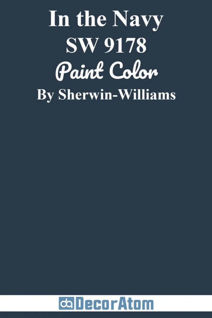
In the Navy is basically the bold cousin of Hale Navy. It’s deep, dramatic, and perfect if you’re going for that “wow” factor in a living room, bedroom, or even a kitchen island. Pair it with crisp whites, light wood, or even gold accents, you’ll feel like royalty. Honestly, it can get intense, so maybe don’t paint your whole tiny hallway with it… unless you’re brave.
Click here to get a Peel & Stick paint sample of In the Navy
21. Benjamin Moore Gentleman’s Gray 2062-20
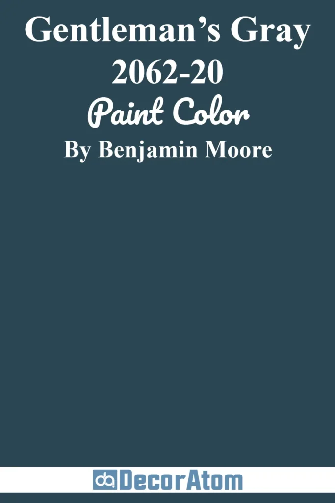
Gentleman’s Gray is a dark blue with a touch of sophistication, and maybe a little mystery. I feel like it belongs in a library or a study, somewhere with leather chairs and big windows. It’s not moody in a depressing way, more like “I’ve got taste and I know it.” Pairs beautifully with light neutrals and wood tones to create that old-world, classic vibe.
Related Paint Color Articles:
If you’re looking for even more paint color inspiration, be sure to check out these other posts by clicking on their titles below:
- 17 Best Blue Paint Colors for Living Room
- 17 Best Blue Paint Colors for Boys Bedrooms
- 13 Best French Blue Paint Colors for a Chic Home
FAQs About Blue Paint Colors
1. How do I choose the right blue paint color for my room?
Well, first off, think about the mood you want. Want calm and airy? Go light blue. Want drama and sophistication? Dark blue is your friend. Also, consider lighting. North-facing rooms can look cold with pale blues, while south-facing rooms can handle deeper shades. Honestly, grab a sample and test it, paint a patch and live with it for a few days. Trust me, your walls will tell you the truth.
2. Can blue paint make a small room look bigger?
Absolutely! Lighter blues reflect more light, making a room feel open and airy. I mean, it’s like instant breathing space without having to knock down a wall. Medium blues can also work if paired with light trim and accents, just avoid super dark blues in tiny spaces unless you’re going for moody and cozy.
3. How do I pair blue walls with furniture and decor?
Oh, this is fun! Blues are surprisingly versatile. Light blues go great with white, wood tones, or even pops of coral or mustard. Medium blues are fantastic with warm woods and gold accents. Dark blues? Think brass, rich woods, or crisp white trim. Honestly, you can mix and match, you’ll just need a little courage.
4. Do blue paint colors look different in various lighting?
Oh yes, and this trips up so many people. Morning light vs. evening light can make a huge difference. South-facing rooms make colors warmer, north-facing rooms cooler. Artificial lighting matters too, LED, fluorescent, incandescent… it all changes the look. That’s why testing samples in your room is non-negotiable, trust me.
5. Are there blues that work well in every room?
Kind of! Some lighter or medium blues are surprisingly flexible. Sherwin Williams Upward, Benjamin Moore Iceberg, or Palladian Blue tend to play nicely almost anywhere. Darker blues, like Hale Navy or In the Navy, are amazing for accent walls, cabinets, or bedrooms, but maybe not a tiny laundry room unless you like a bold statement.
*This post contains affiliate links. For more details see my full disclosure.

